In this documentation, we will discuss the customization of the Post Video Slider block, brought to you by Zoloblocks.
Enable the Post Video Slider Block
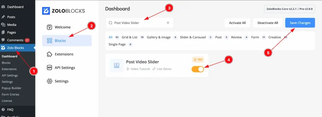
To use the Post Video Slider block from Zoloblocks, you must first enable the block.
- Go to WordPress Dashboard > Zoloblocks Plugin dashboard.
- Then Click the Blocks Tab.
- Search the Post Video Slider block Name.
- Enable the Post Video Slider block.
- Hit the Save Changes button.
Inserting The Block into the Editor
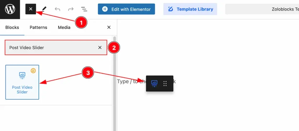
- Click the Toggle Block Inserter icon and a sidebar will appear on the left side, All the blocks will be visible here.
- Search the Post Video Slider Block Name inside the search Box. otherwise, select the Icon blocks ( with Zoloblocks logo T.R corner).
- Then Drag and Drop it on the page.
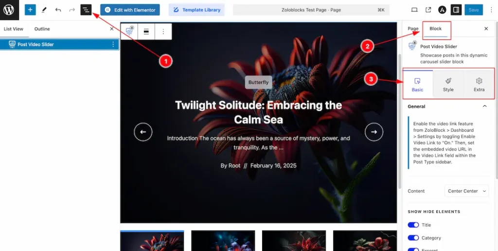
fter Inserting the blocks, Follow this.
- Click on the Document Overviewer button and the Blocks list view will appear.
- After on the right side, Click on the Block.
- Here show all the control tabs( Basic, Style, Extra ) of a block.
Basic Tab Customization
The Basic tab controller displayed here offers the flexibility to adjust the layout of blocks according to your preferences.
General Section
Go to Basic > General
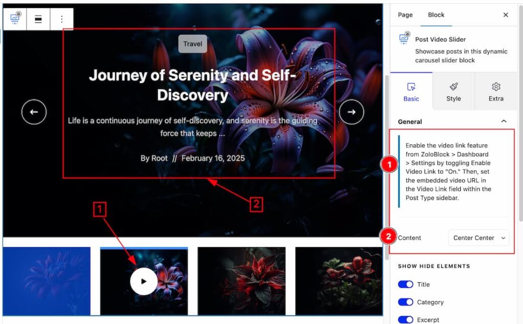
Come to the General Section, you will get the below customization options-
1. Video link feature: If you want to show the Video icon and also want to add a link under the icon then you should need to follow this instructions- Go to your WP plugin dashboard > Zoloblocks plugin dashboard > Seetings > Enable the Video Link feature. After Enablinh the feature then you will get a video link add option in your post. Please see the screenshot.
2. Content Position: This option lets you set the Content position as – Center Center, Center Left, Center Right, Bottom Left, Bottom Center, Bottom Right, Top Left, Top Right, & Top Center.
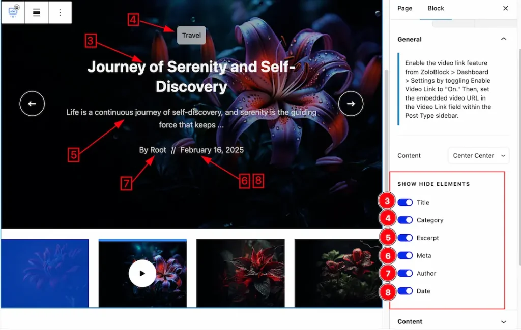
3. Title: Enable or Disable the Title switcher button to show/hide the Title from the slider.
4. Category: Enable or Disable the category switcher button to show/hide the Category from the slider.
5. Excerpt: Enable or Disable the Excerpt switcher button to show/hide the Excerpt from the slider.
6. Meta: Enable or Disable the Meta switcher button to show/hide the Meta from the slider.
7. Author: Enable or Disable the Author switcher button to show/hide the Author from the slider.
8. Date: Enable or Disable the date switcher button to show/hide the date from the slider.
Content Section
Go to Basic > Content
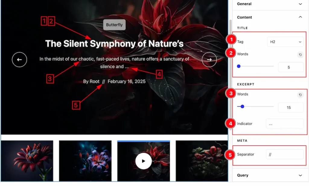
1. Title Tag: This option lets you select the Title HTML tag like- H1 to H6, P & Span.
2. Words Limit for Title: This option lets you set the Word Limit for the Title.
3. Words Limit for Excerpt: This option lets you set the Word Limit for the Excerpt.
4. Indicator: This option lets you set the indicator after the excerpt. The Indicator shows when the excerpt limit is over.
5. Separator: This option lets you set the seperator for meta.
Query Section
Go to Basic > Query
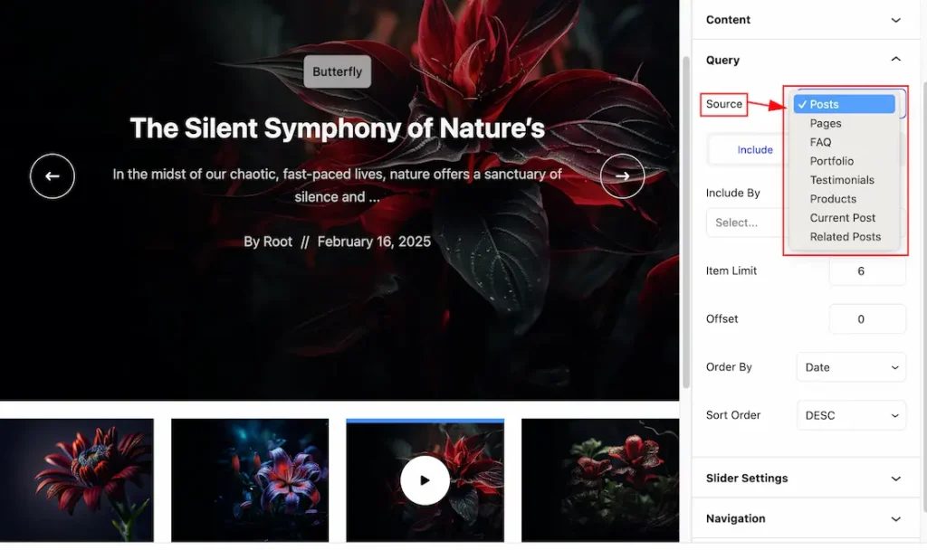
Source: Come to the Query section, you can select the source Type ( Like- Posts, Pages, Faq, Portfolio, Testimonials, Products, Current Post, & Related Posts) to show your Post video Slider. whatever you select, will appear on your editor page. We selected here Posts that’s why it shows all the Posts for the video slider.
Learn About The Include and Exclude Filter
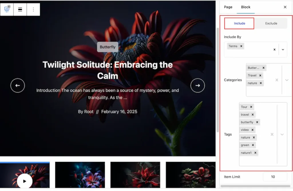
Come to the Query sections, You will get the Include & Exclude tab options. The Include option helps to show posts in the slider and the exclude tab option helps to hide the posts from the slider.
When you select the Include tab filter then you will get the below options-
Include By: This option lets you select the Terms or author to select the posts that you want to show on the Post Video Slider. Here we select the terms to filter the posts.
Categories: This field lets you select the category that you want to see. Your selected category posts will appear on your slider.
Tags: You also can show your post by using tags. This field lets you to select your post tags.
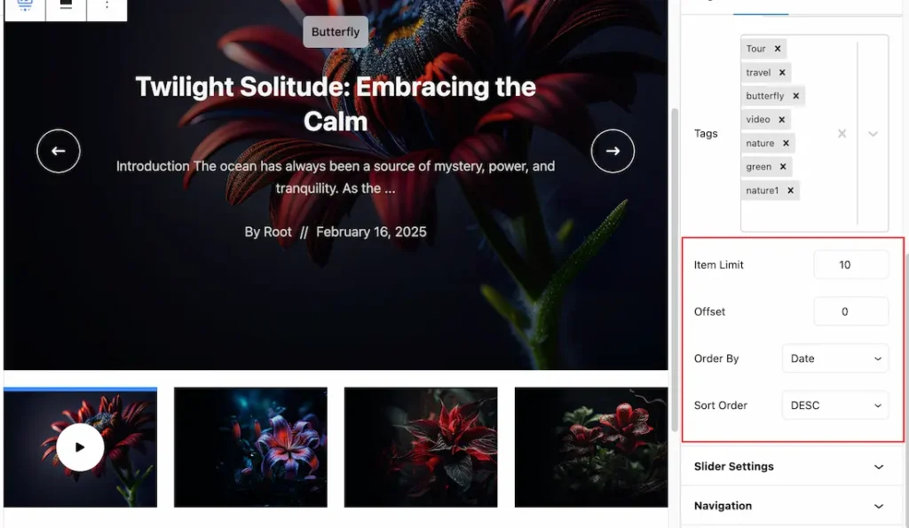
Item Limit: You can set the slider item show limit from here.
Offset: Offsets are useful because they can allow you to skip a certain number of posts slider item before starting output. For Example, if you have 10 posts slider item and you set the Offset value to 2 then the beginning 2 posts slider item will Hide.
Order By: you can decorate your selected post slider items using Order By options. Under this option, you can select ( Date, Author, Title, Last Modified date, Parent ID) any of them to show your selected post slider item on your Page.
Sort Order: you can show the selected Post slider items in Asc and Desc Order.
Slider Settings Section
Go to Basic > Slider Settings
Come to the slider settings section, you will get the below customization options-
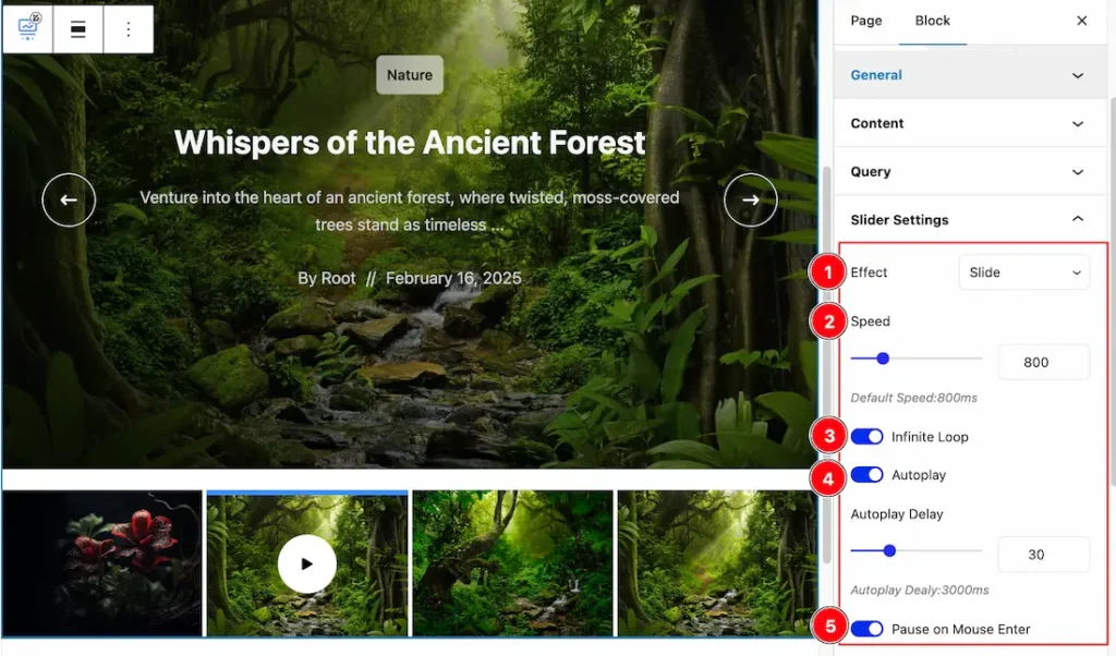
1. Effects: You can select the Effect type- Slide & Fade.
2. Speed: This option lets you set the slider speed.
3. Infinite Loop: An infinite loop option allows content to cycle endlessly without interruptions, creating a smooth browsing experience. It keeps users engaged by avoiding abrupt stops or empty endpoints. From here you can enable or disable the feature.
4. Autoplay: The autoplay feature allows automatically showcase content without user interaction, capturing attention instantly. From here you can enable or disable the feature.
5. Pause on mouse Enter: If you activate the pause on Hover button, when visitors Hover the mouse cursor on the slider, then your slider will Hold, otherwise your slider slide Autoplay.
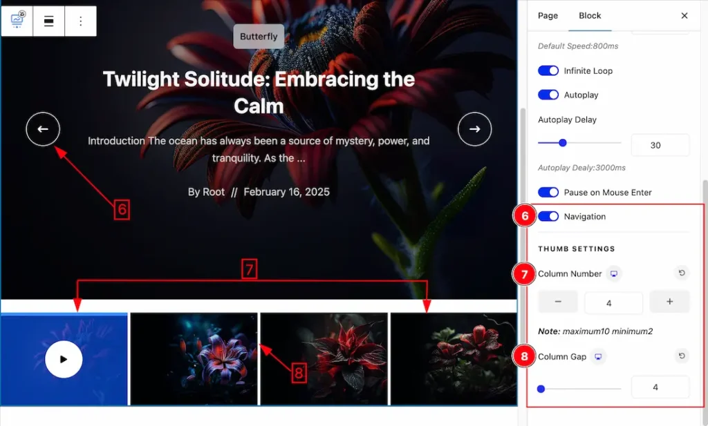
6. Navigation: Enable or disable the Navigation switcher button to show/hide the naviagtion from the slider.
7. Column Number: You can set the column number to show the Slider Thumbs.
8. Column Gap: This option lets you set the column gap between the thumbs item.
Navigation Section
Go to Basic > Navigation
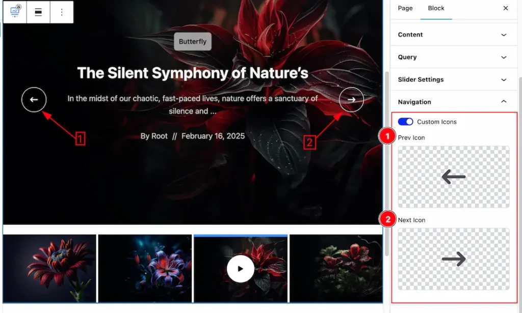
Come to the Navigation section, you can choose the custom icons for the Navigation.
1. Select Prev Icon: This option lets you to set the prev icon for the Navigation.
2. Select Next Icon: This option lets you to set the Next icon for the Navigation.
Custom Ordering Section
Go to Basic > Custom Ordering
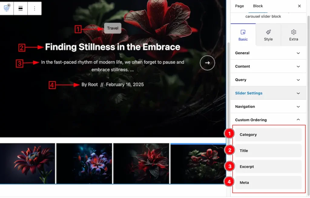
Custom Ordering: This option lets you ordering the Category, Title, Excerpt, & Meta to your needs. Just drag the (Category, Title, Excerpt, & Meta) any one of item and drop it up or down of any item then the item will order to your needs.
Work with The Style Tab
Main Slider Section
Go to Style > Main Slider
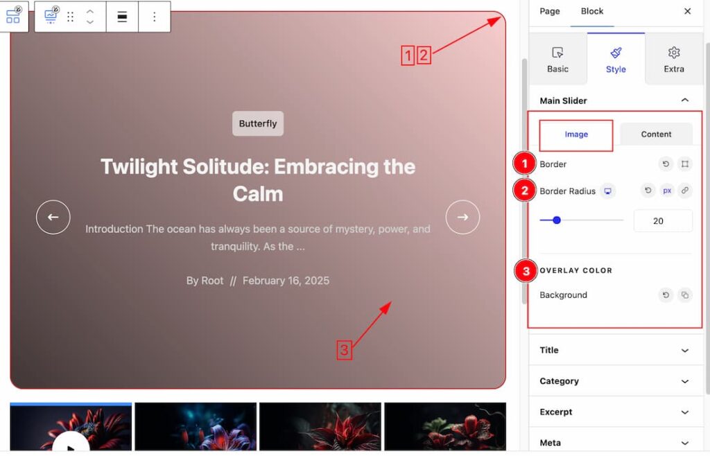
Come to the Main Slider section, you will get two subsections; Image & Content.
In the Image subsections, you will get the below options-
1. Border: you can set the Border Type to Default, None, Solid, Double, Dotted, Dashed, or Groove. We choose here the Border Type Solid. Also from here you also can set the Border width and Border color for the image.
2. Border Radius: Set the Border radius for the slider image.
3. Overlay Background: This option lets you set the Image Background Overlay.
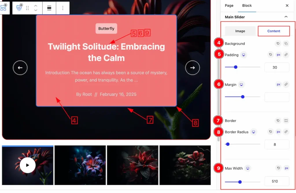
In the Content subsections, you will get the below options-
4. Background: This option lets you set the Content Background Color.
5. Padding: Add spaces around an object to increase the inner area. Padding allows you to control the internal space within an element.
6. Margin: Adjusts the position of an object over the canvas.
7. Border: you can set the Border Type to Default, None, Solid, Double, Dotted, Dashed, or Groove. We choose here the Border Type Solid. Also from here you also can set the Border width and Border color for the Content.
8. Border Radius: Add the border radius from here.
9. Max Width: You can set the Max Width for the content of the slider.
Title Section
Go to Style > Title
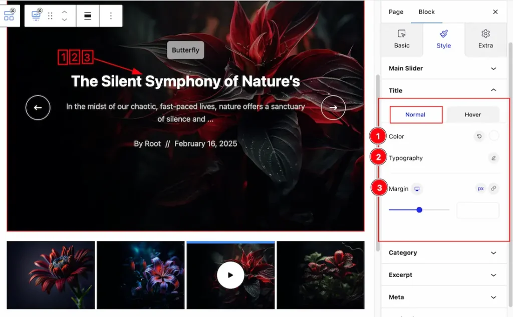
Come to the Title section, you will get two subsection; Normal & Hover.
In the Normal mode, you will get the below options to customize the section.
1. Color: This option lets you change the Title Normal color.
2. Typography: Change the font family, size, weight, style, transform, decoration, line height, letter spacing, and word spacing from here.
3. Margin: Set the margin for the Title.
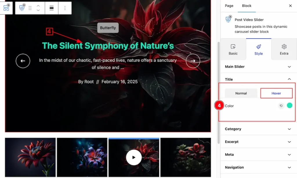
Come to the Hover subsection, you will get the below option –
4. Color: This option lets you change the Hover Title color.
Category Section
Go to Style > Category
Come to the Category section, you will get two subsection; Normal & Hover.
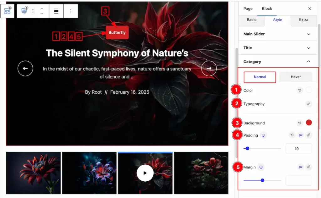
In the Normal mode, you will get the below options to customize the section.
1. Color: This option lets you set the Category Normal Color.
2. Typography: Change the font family, size, weight, style, transform, decoration, line height, letter spacing, and word spacing from here.
3. Background: This option lets you add the Category Normal Background Color.
4. Padding: Set the Padding for the Category.
5. Margin: Set the Margin for the Category.
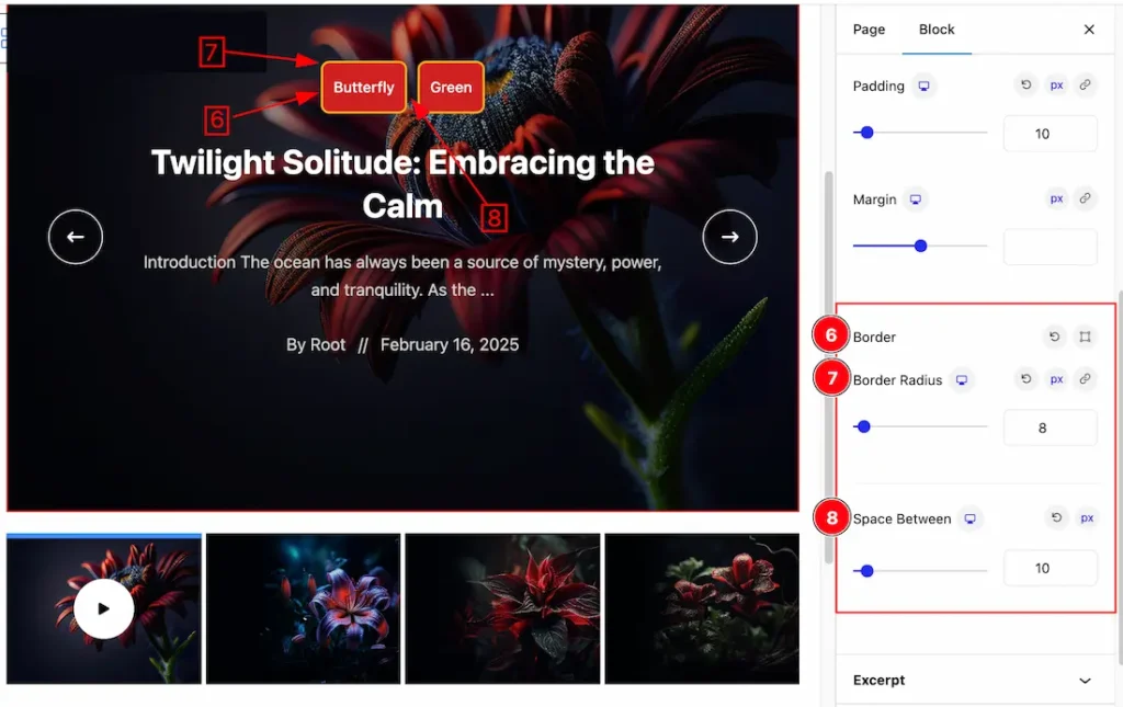
6. Border: Set the Border Type, color, Border Width from here for the Category.
7. Border Radius: Customizes the border corners for roundness.
8. Space Between: This option lets you set the space between categories.
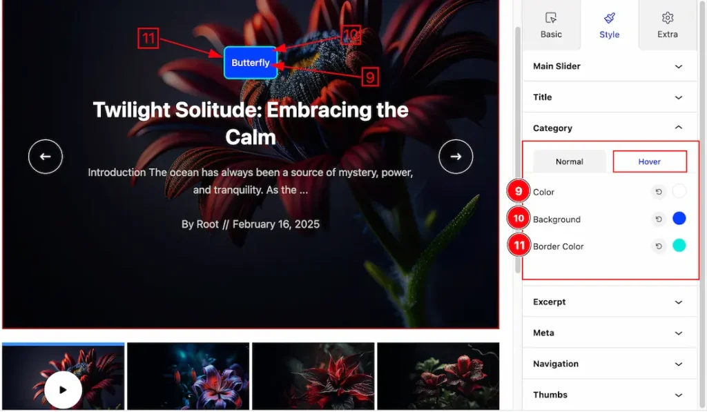
Come to the Hover subsection, you will get the below option –
9. Color: This option lets you change the Category Hover color.
10. Background: This option lets you change the Category Hover background color.
11. Border Color: This option lets you change the Category Border Hover color.
Excerpt Section
Go to Style > Excerpt
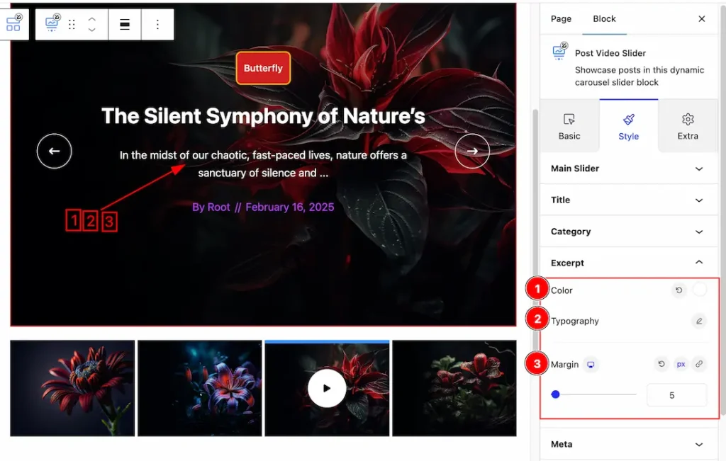
1. Color: This option lets you change the Excerpt Text Color.
2. Typography: Change the font family, size, weight, style, transform, decoration, line height, letter spacing, and word spacing from here.
3. Margin: Set the Margin from here for the Excerpt.
Meta Section
Go to Style > Meta
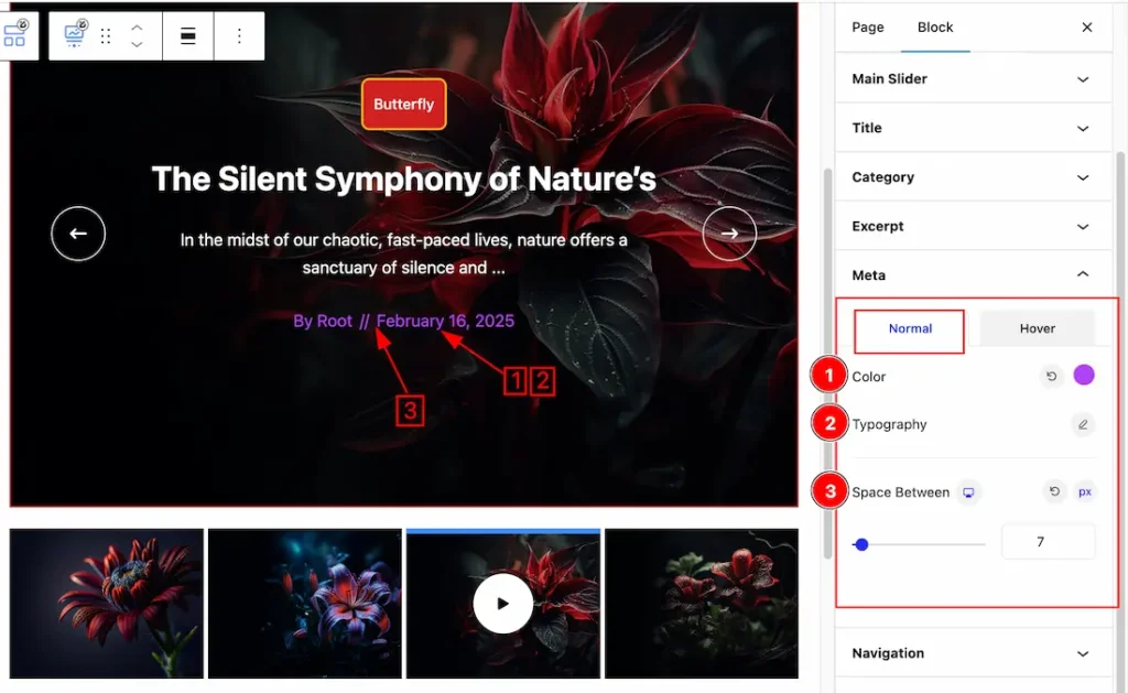
Come to the Meta section, you will get two subsections; Normal & Hover.
In the Normal subsections, you will get the below options-
1. Color: This option lets you change the Meta normal Color.
2. Typography: Change the font family, size, weight, style, transform, decoration, line height, letter spacing, and word spacing from here.
3. Space Between: This option lets you set the space between meta.
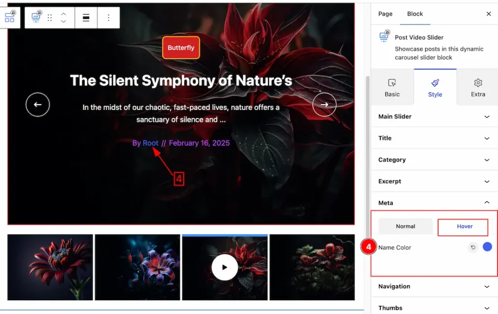
In the Hover subsections, you will get the below options-
4. Name Color: This option lets you change the Name hover color.
Navigation Section
Go to Style > Navigation
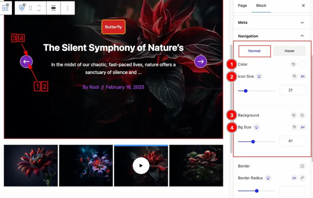
Come to the Navigation section, you will get two subsections; Normal & Hover.
In the Normal subsections, you will get the below options-
1. Color: This option lets you change the Navigation normal Color.
2. Icon Size: This option lets you change the Icon Size of the Navigation.
3. Background: This option lets you set the Navigation Background normal color.
4. Bg Size: This option lets you set the Bg size.
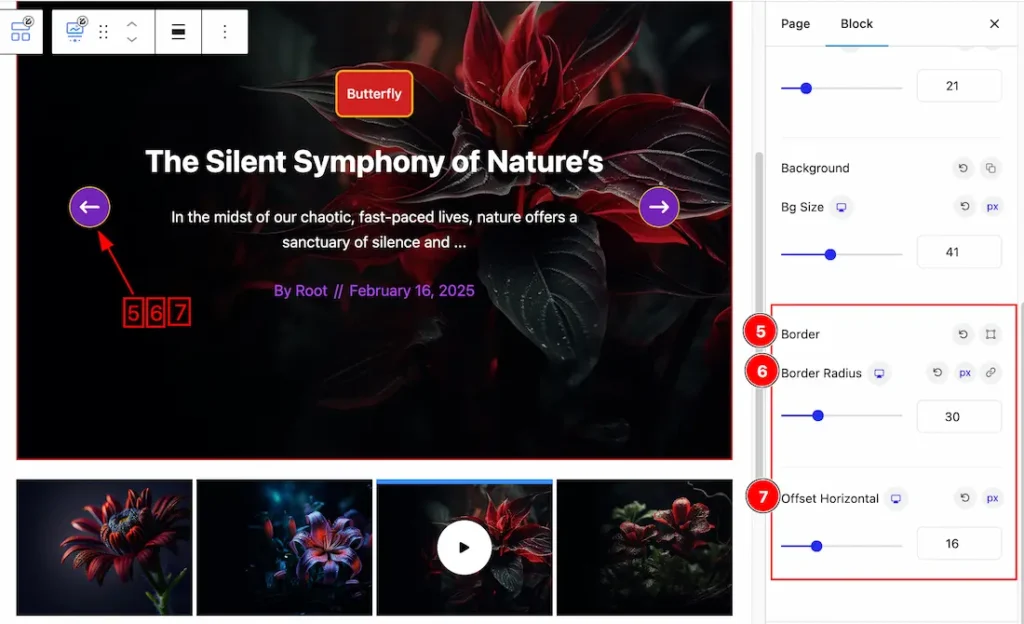
5. Border Color: Set the Border Type, color, Border Width from here for the Navigation.
6. Border Radius: Set the Pagination border redius.
7. Offset Horizontal: You can set the Horizontal Offset from here.
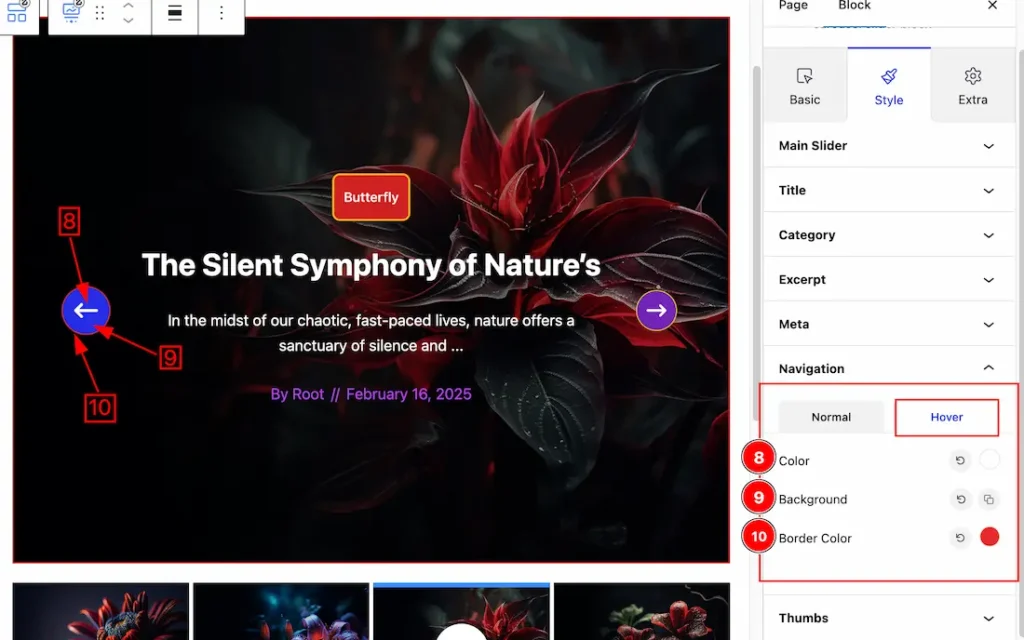
In the Hover subsections, you will get the below options-
8. Color: This option lets you change the Navigation Hover Color.
9. Background: This option lets you change the Navigation Hover Background Color.
10. Border Color: This option lets you change the Navigation Border Hover Color.
Thumbs Section
Go to Style > Thumbs
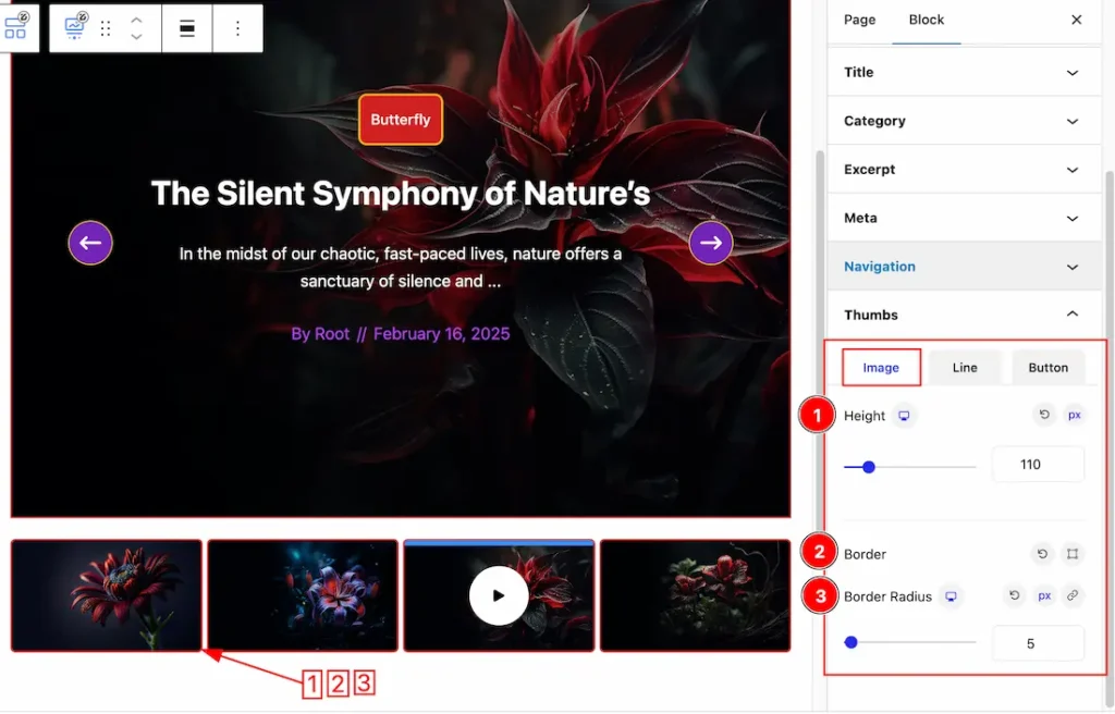
Come to the Thumbs section, you will get three subsections; Image, Line & Button.
In the Image subsections, you will get the below options-
1. Height: You can set the Thumbs image height from here.
2. Border: Set the Border Type, color, Border Width from here for the Thumbs image.
3. Border Radius: Set the Thumbs image border redius.
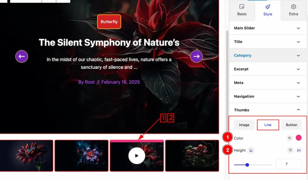
In the Line subsections, you will get the below options-
1. Color: This option lets you set the Line Color.
2. Height: You can set the Line Height from here.
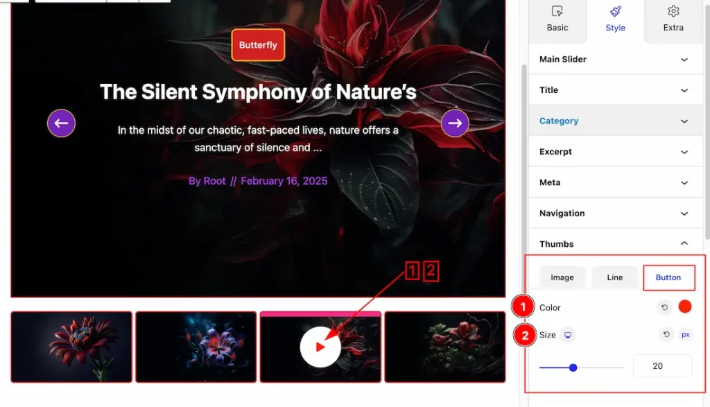
In the Button subsections, you will get the below options-
1. Color: This option lets you set the Button Color.
2. Size: This option lets you set the Button Size.
Extra Tab Controls
The extra tabs provide the controls of any blocks. You can make different visual layouts by following these Controls.
Click to learn more>>.
Video Assist
You can also watch the video tutorial Learn more about the Post Video Slider Block. Please visit the demo page for examples.
Thanks for being with us.