This documentation provides comprehensive insights into the Lightbox Block developed by Zoloblocks.
Adding a block to the editor
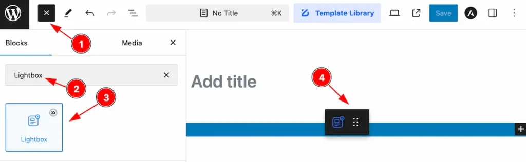
- Click the Toggle Block Inserter icon and a sidebar will appear on the left side, All the blocks will be visible here.
- Search by the Lightbox block name.
- Then select the appear blocks ( with zoloblocks logo T.R corner).
- After Drag and Drop it on the page.
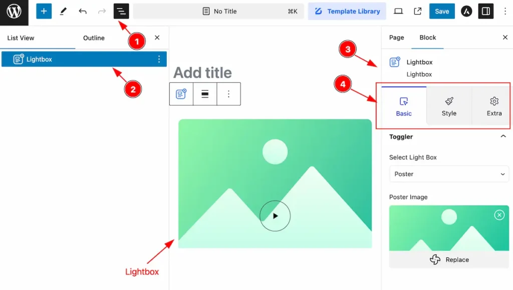
After Inserting the blocks, Follow this.
- Click on the Document Overviewer button and the Blocks list view will appear.
- Here appears the Lightbox block.
- After on the right side, Click on the Block. Then the Lightbox details appear.
- Here shows all the control tabs( Basic, Style, Extra ) of a block.
Basic Tab
The Basic tab controller displayed here offers the flexibility to adjust the layout of blocks according to your preferences.
Toggler Section
Go to Basic > Toggler
Button Explore
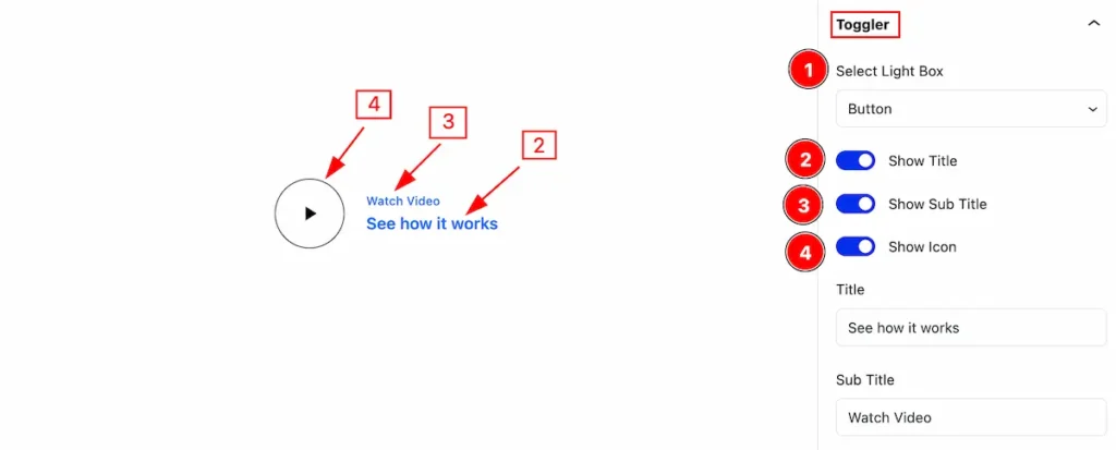
Set the toggler button and work with the following controls,
- Select Light Box: Set the lightbox as a button.
- Show Title: Enable the switcher to show the Title.
- Show Sub Title: Enable the switcher to show the Sub Title
- Show Icon: Enable it to show the Icon.
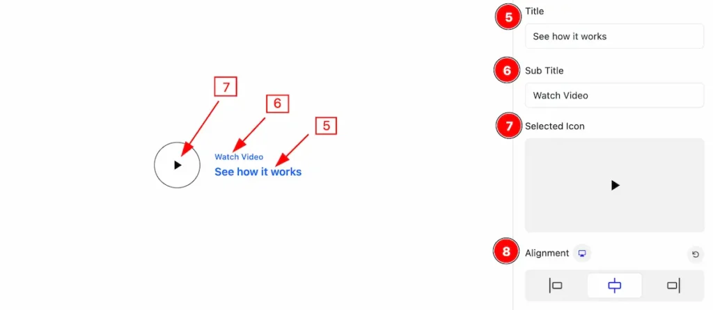
- Title: Set the title for the lightbox.
- Sub Title: Set the sub title.
- Selected Icon: Select the Icon.
- Alignment: Make alignment of the lightbox.
Poster Explore
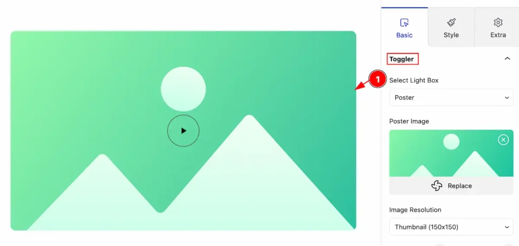
Select the poster for the lightbox and follow the controllers,
- Select Light Box: Select the lightbox as a Poster.
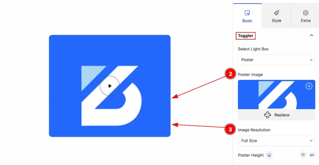
- Poster Image: Select the poster image.
- Image Resolution: Set resolution for the image.
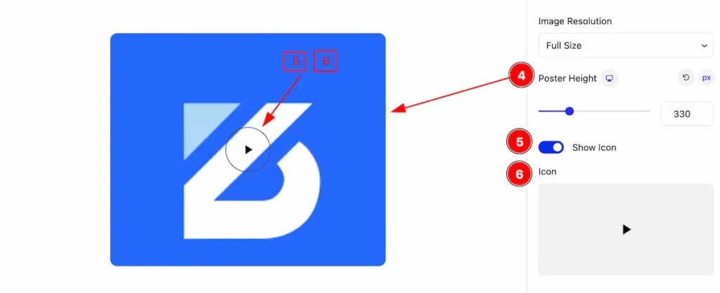
- Poster Height: Set height for the poster.
- Show Icon: Enable the switcher to show the Icon.
- Icon: Select the icon for it.
Lightbox Content Section
Go to Basic > Lightbox Content
Button Explore
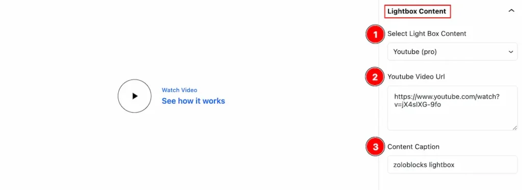
This controls appear is for the lightbox button.
- Select Light Box Content: Select the content for the lightbox ( e.g.: Image, Youtube, Vimeo, Google Map etc.)
- Youtube Video Url: Set the url for the youtube video.
- Content Caption: Set the caption for the content.
Poster Explore
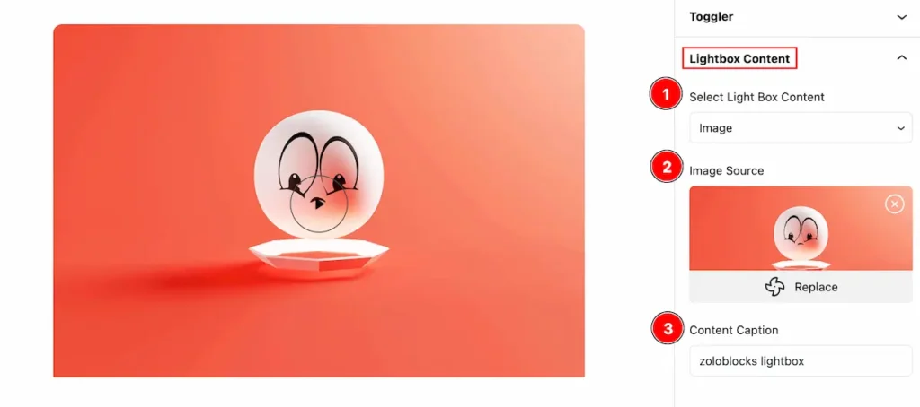
- Select Light Box Content: Select the light box content image.
- Image Source: Select the image for lightbox.
- Content Caption: Set the caption for the content.
Style Tab
Provide the controller to make the visual appearance or presentation of the tabs. This includes aspects visually appealing and cohesive with the overall design of the interface.
Button Section
Go to Style > Button
Normal State for Button
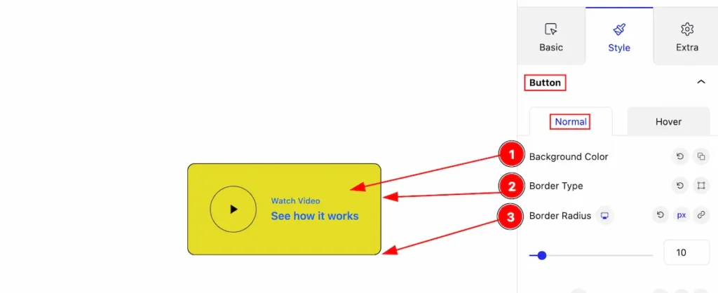
Customize the button,
- Background Color: Set the background for the border.
- Border Type: Set the border type.
- Border Radius: Make the border radius.
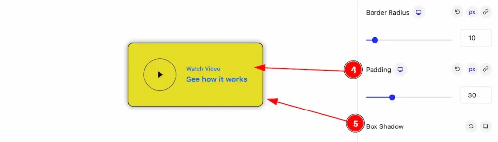
- Padding: Set the padding for the button.
- Box Shadow: Make the box shadow for it.
Hover State for Button
The changes will appear on mouse hover,
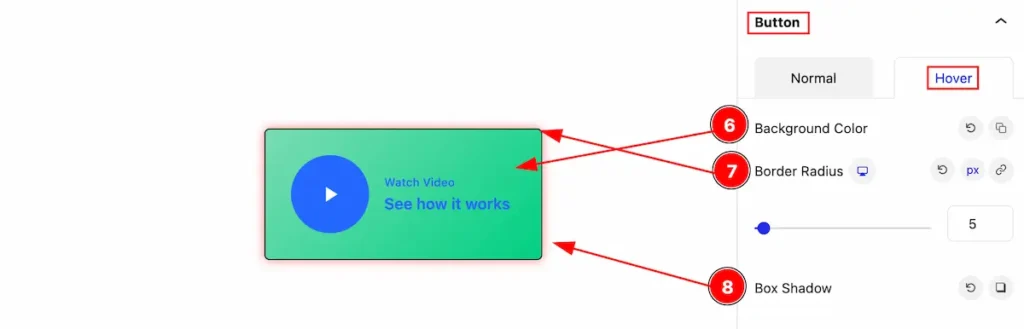
- Background Color: Set the background color for the button.
- Border Radius: Make the border radius.
- Box Shadow: Make the box shadow.
Button Title Section
Go to Style > Button Title
Normal State for Button Title
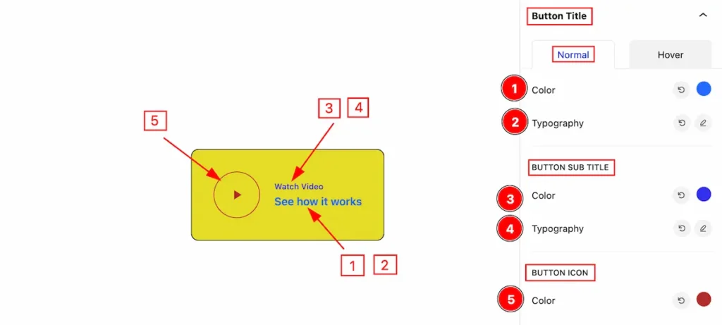
- Color: Set the color for the button Title.
- Typography: Set the typography for the button Title.
BUTTON SUB TITLE
- Color: Set the color for the button Sub Title.
- Typography: Set the typography for the button Sub Title.
BUTTON ICON
- Color: Set the color for the button Icon.
Hover State for Button Title
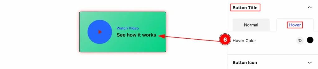
- Hover Color: Set the hover color for the button title.
Button Icon Section
Go to Style > Button Icon
Normal State for Button Icon
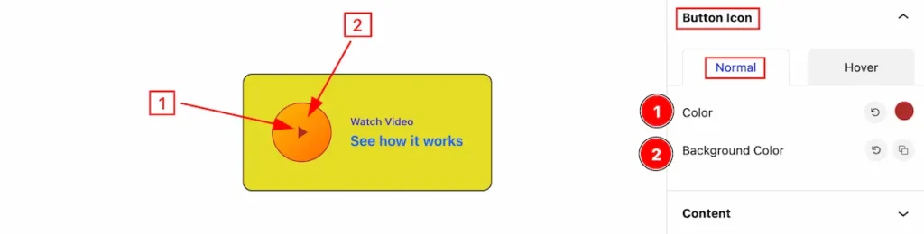
- Color: Set the Color for the button icon.
- Background Color: Set the background color.
Hover State for Button Icon
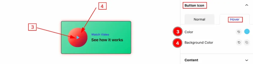
- Color: Set the Color for the button icon.
- Background Color: Set the background color.
Content Section
Go to Style > Content
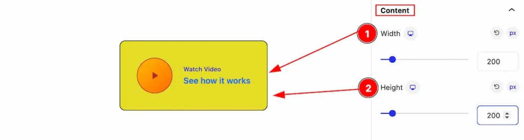
- Width: Set the width for the contnet.
- Height: Set the height for the content.
Extra Tab Control
The extra tabs provide the controls of any blocks. You can make different visual layouts by following these Controls.
Click to learn more>>.
Video Assist
The Video help you to learn more about the block. Please visit the demo page for examples.
Thanks for being with us.