In this documentation, we will discuss the customization of the Authors block, brought to you by Zoloblocks.
Enable the Authors Block
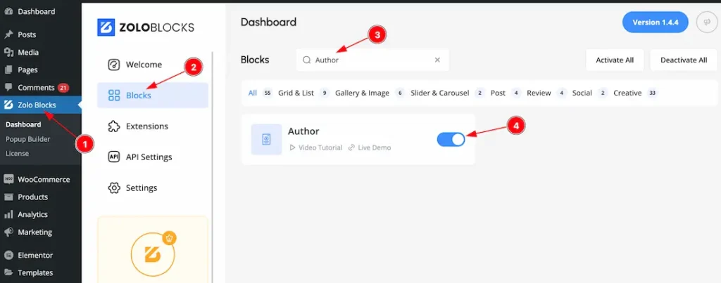
To use the Authors block from Zoloblocks, you must first enable the block.
- Go to WordPress Dashboard > Zoloblocks Plugin dashboard.
- Then Click the Blocks Tab.
- Search the Authors block Name.
- Enable the Authors block.
Inserting The Block into the Editor
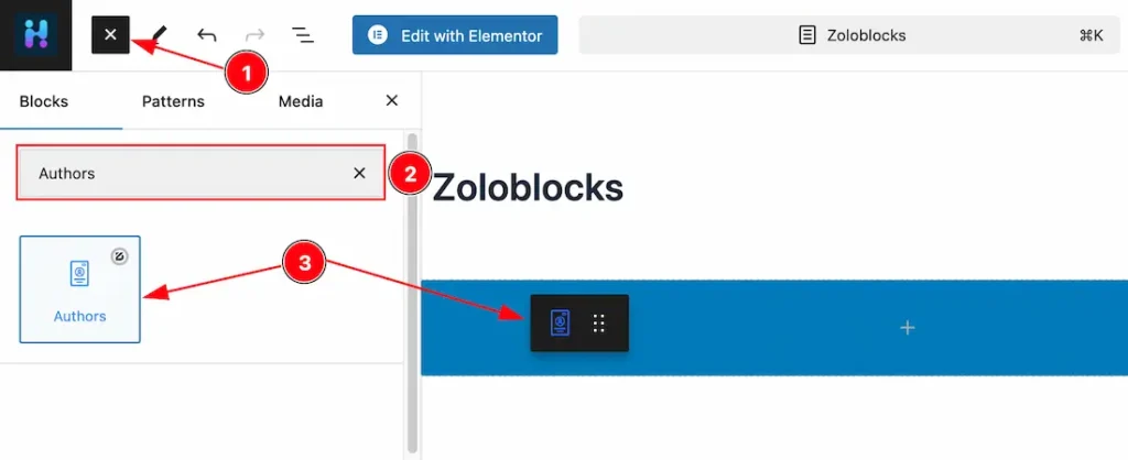
- Click the Toggle Block Inserter icon and a sidebar will appear on the left side, All the blocks will be visible here.
- Search the Authors Block Name inside the search Box. otherwise, select the Icon blocks ( with Zoloblocks logo T.R corner).
- Then Drag and Drop it on the page.
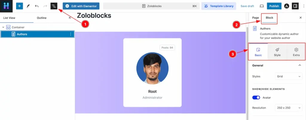
After Inserting the blocks, Follow this.
- Click on the Document Overviewer button and the Blocks list view will appear.
- After on the right side, Click on the Block.
- Here show all the control tabs( Basic, Style, Extra ) of a block.
Basic Tab Customization
The Basic tab controller displayed here offers the flexibility to adjust the layout of blocks according to your preferences.
General Section
Go to Basic > General
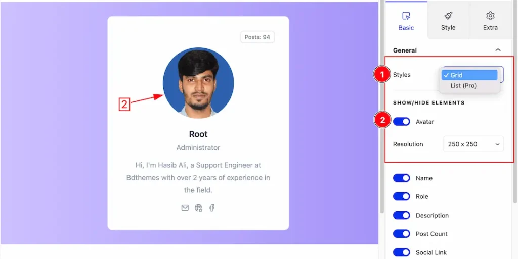
1. Styles: Here you will get two styles. One is Grid style and the other is list. Here we select the Grid style.
2. Avatar: Enable or disable the Avatar switcher button to show or hide the Avatar. Here you also can set a resolution for the Avatar.
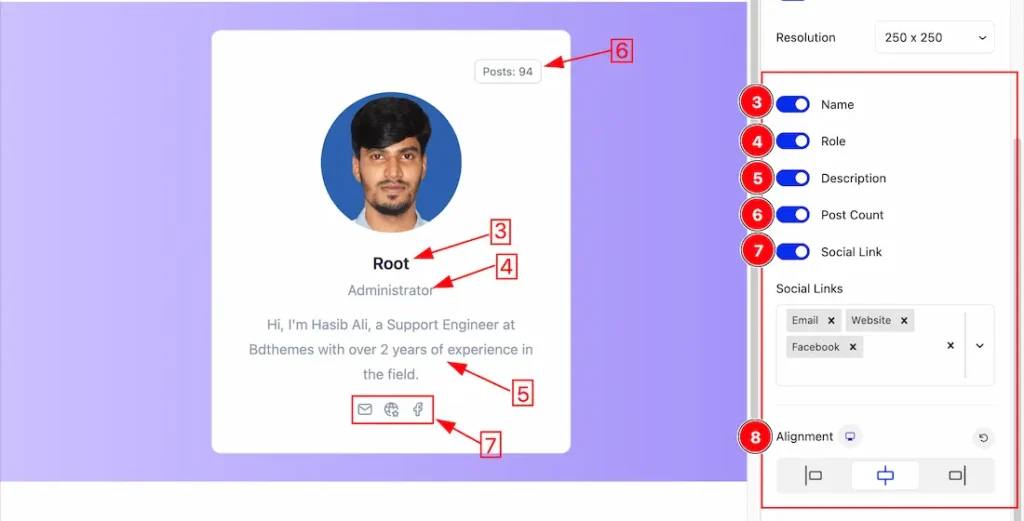
3. Name: Enable or disable the Name switcher button to show or hide the Name from the Authors Grid.
4. Role: Enable or disable the Role switcher button to show or hide the Role from the Authors Grid.
5. Description: Enable or disable the Description switcher button to show or hide the Description from the Authors Grid.
6. Post Count: Enable or disable the Post Count switcher button to show or hide the Post Count from the Authors Grid.
7. Social Link: Enable or disable the Social Link switcher button to show or hide the Social Link from the Authors Grid.
8. Alignment: You can set the Grid Alignment as Left, Center and Right from here.
Layout Section
Go to Basic > Layout
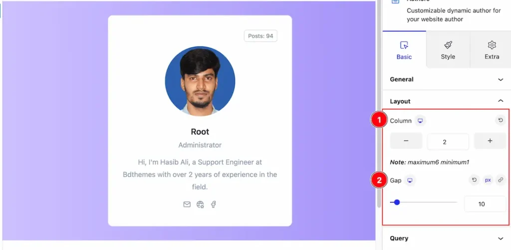
1. Column: The Columns options let you select Columns 1 to 6 to decorate the Authors grid. Here we select the Columns at 2.
2. Gap: You can set the Column and Row Gap to your working demand from here.
Query Section
Go to Content > Query
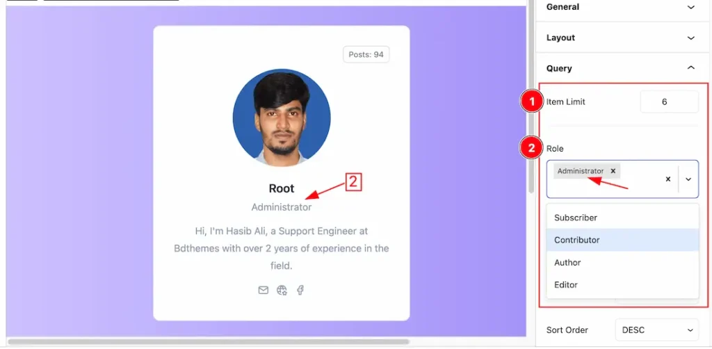
1. Item Limit: You can set the item show limit from here.
2. Role: This option lets you show the role wise authors. Your selected role authors will appear on your page.
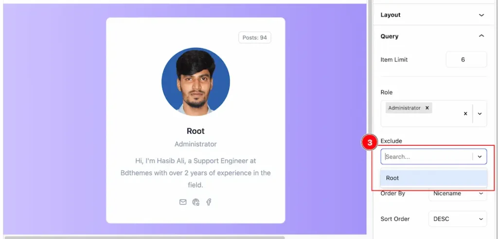
3. Exclude : If you hide or disappear any role authors from your page then you should need the Exclude Filter. Otherwise, you don’t need the feature. The Exclude filter helps you to hide your selected Role authors.
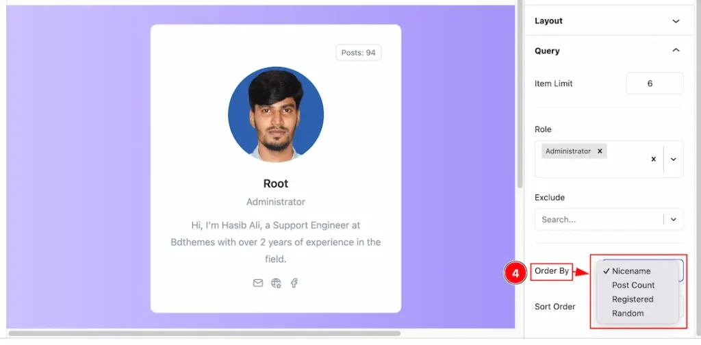
4. Order By: you can decorate your selected Authors using Order By options. Under this option, you can select ( Nickname, Post Count, Registered, and Random) any of them to show your selected Authors on your Page.
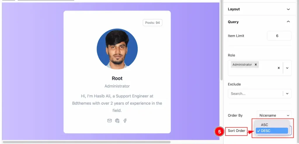
5. Sort Order: you can show the selected authors in Asc and Desc Order.
Work with The Style Tab
Items Section
Go to Style > Items
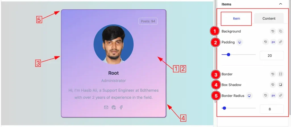
Come to the Items section, you will get two subsections; Item and Content.
In the Item mode, you will get the below options to customize the section.
1. Background: you can change the color of any object background to classic or gradient. Here we choose the Background type Gradient.
2. Padding: Add spaces around an object to increase the inner area. Padding allows you to control the internal space within an element.
3. Border: you can set the Border Type to Default, None, Solid, Double, Dotted, Dashed, or Groove. We choose here the Border Type Solid. From here you also can change the Border width and Border Color.
4. Box Shadow: The Box Shadow property is used to create the shadow around the Category Button. It takes Four values: Horizontal offset, Vertical offset, blur, and Spread to customize the Box shadow.
Position: you can set the Box Shadow position Outline and Inset. Here we set the Box Shadow position Outline.
Box Shadow Color: This lets you change the Box Shadow color.
5. Border Radius: Customizes the border corners for roundness.
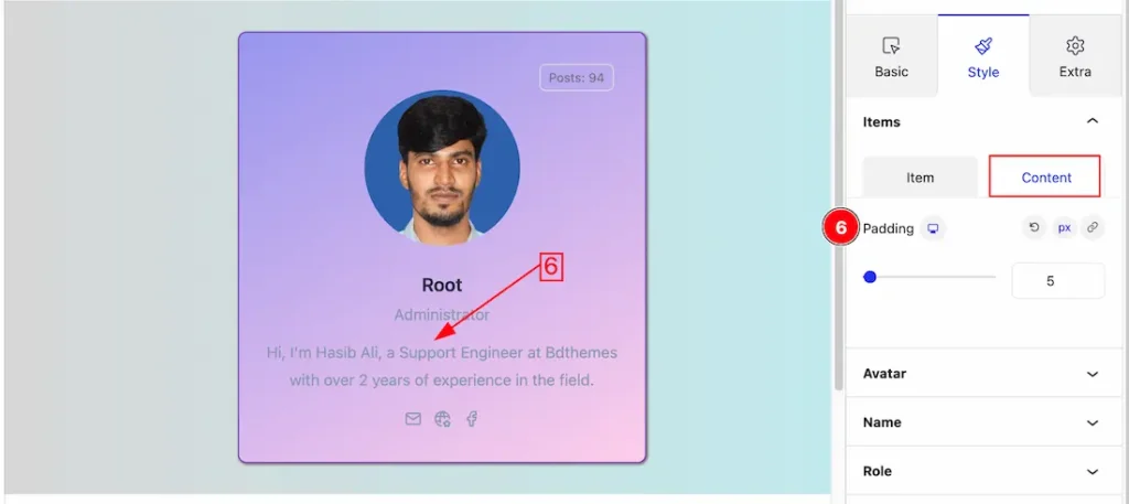
In the Content mode, you will get the below options to customize the section.
6. Padding: You can adjust the Content Padding to your working demand from here.
Avatar Section
Go to Style > Avatar
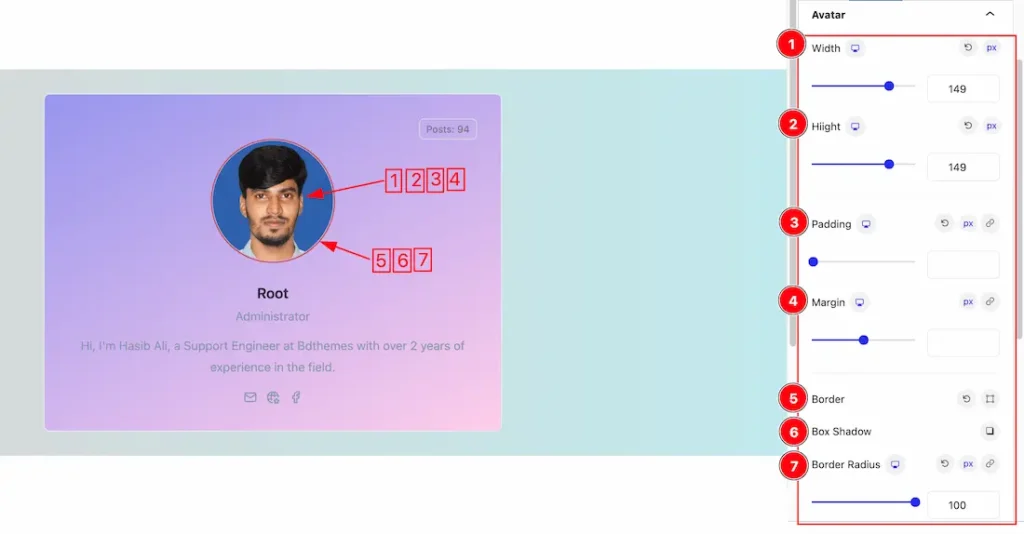
Come to the Avatar section, you will get the below options-
1. Width: This option lets you change the Width of the Avatar.
2. Height: This option lets you change the Height of the Avatar.
3. Padding: Add spaces around an object to increase the inner area. Padding allows you to control the internal space within an element.
4. Margin: Adjusts the position of an object over the canvas.
5. Border: you can set the Border Type to Default, None, Solid, Double, Dotted, Dashed, or Groove. We choose here the Border Type Solid. Here you also can change the Border width and Border Color to your working demand.
6. Box Shadow: The Box Shadow property is used to create the shadow around the Category Button. It takes Four values: Horizontal offset, Vertical offset, blur, and Spread to customize the Box shadow.
Position: you can set the Box Shadow position Outline and Inset. Here we set the Box Shadow position Outline.
Box Shadow Color: This lets you change the Box Shadow color.
7. Border Radius: Customizes the border corners for roundness.
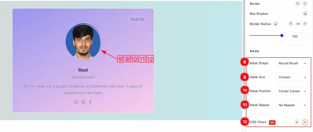
In this section, you will get the Avatar mask option to shape the avatar.
8. Mask Shape: Here you will get 1 to 26 styles of ready mask shapes for the Avatar. You can check all mask shapes and choose one of them for your work.
9. Mask Size: You can set the Mask Size type – Auto, Cover, and Contain for the Avatar.
10. Mask Position: You can set the Mask Position as – Center Center, Center Top, Center Bottom, Left Top, Left Center, Left Bottom, Right Top, Right Center, and Right Bottom.
11. Mask Repeat: You can set the Mask Repeat as – No Repeat, Repeat, Repeat X, and Repeat Y.
12. CSS Filters: This feature lets you customize the CSS to your working demand for the Avatar.
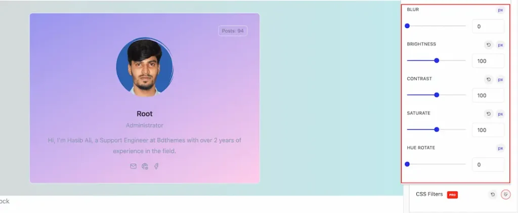
- Blur: Adjusts the blur effect applied to an element. The higher the value, the blurrier the element becomes. The unit is typically in pixels (
px). - Brightness: Controls the brightness of the element. A value of
100%means no change. Values higher than 100% make the element brighter, while values below 100% darken it. - Contrast: Adjusts the contrast of the element. A value of
100%is the default. Increasing the value enhances contrast, making darks darker and lights lighter, while decreasing the value reduces contrast. - Saturate: Controls the color saturation of the element. A value of
100%means no change. Higher values increase saturation (making colors more intense), while values below 100% desaturate the colors. - Hue Rotate: Rotates the hues of an element. The value is typically set in degrees (
deg), where0degleaves the colors unchanged, and rotating the hue shifts the colors through the spectrum.
Name Section
Go to Style > Name
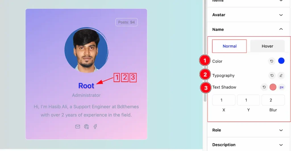
Come to the Name section, you will get two subsections; Normal and Hover.
In the Normal subsection, you will get the below customization options-
1. Color: Change the color of the Name text to match your design preferences.
2. Typography: Change the font family, size, weight, style, transform, decoration, line height, letter spacing, and word spacing from here.
3. Text Shadow: The Text Shadow property is used to create the shadow around the text. It takes three values: horizontal offset, vertical offset, and blur radius. Here you also can change the Text Shadow Color.
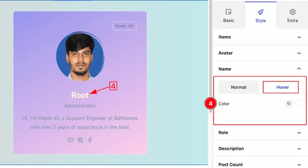
In the Hover subsection, you will get the below customization options-
4. Color: This option lets you change the Hover Name Color.
Role Section
Go to Style > Role
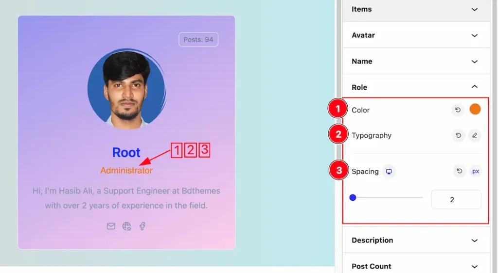
In the Role subsection, you will get the below options-
1. Color: Change the color of the Role text to match your design preferences.
2. Typography: Change the font family, size, weight, style, transform, decoration, line height, letter spacing, and word spacing from here.
3. Spacing: This option lets you add space between Name and Description Text.
Description Section
Go to Style > Description
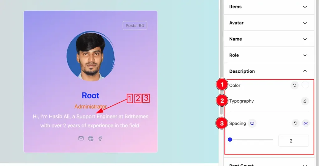
In the Description subsection, you have the following customization options:
- Color: Adjust the color of the Description text to align with your design preferences.
- Typography: Customize the font family, size, weight, style, text transform, decoration, line height, letter spacing, and word spacing to enhance the overall appearance of the Description text.
- Spacing: Add space between the Role and Social Link for better layout and readability.
Post Count Section
Go to Style > Post count
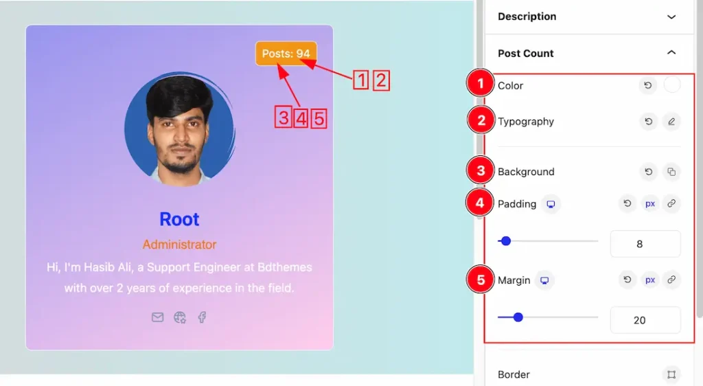
In the Post Count subsection, you have the following customization options:
1. Color: Adjust the color of the Post text to align with your design preferences.
2. Typography: Change the font family, size, weight, style, transform, decoration, line height, letter spacing, and word spacing from here.
3. Background: Change the Background color of the Post Count.
4. Padding: Add spaces around an object to increase the inner area. Padding allows you to control the internal space within an element.
5. Margin: Adjusts the position of an object over the canvas.
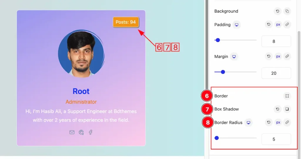
6. Border: you can set the Border Type to Default, None, Solid, Double, Dotted, Dashed, or Groove. We choose here the Border Type Solid. Here you also can change the Border width and Border Color to your working demand.
7. Box Shadow: The Box Shadow property is used to create the shadow around the Category Button. It takes Four values: Horizontal offset, Vertical offset, blur, and Spread to customize the Box shadow.
Position: you can set the Box Shadow position Outline and Inset. Here we set the Box Shadow position Outline.
Box Shadow Color: This lets you change the Box Shadow color.
8. Border Radius: Customizes the border corners for roundness.
Social Link Section
Go to Style > Social Link
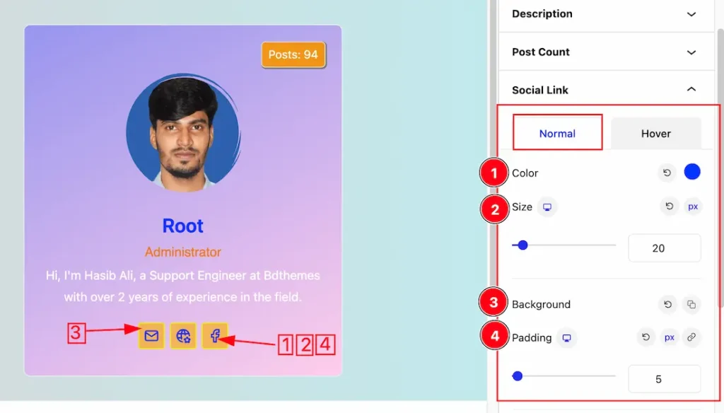
Come to the Social Link section, you will get two subsections; Normal and Hover.
In the Normal subsection, you will get the below options-
1. Color: Change the social link icon color.
2. Size: Adjust the size of the social link icons.
3. Background: Modify the background color of the icons.
3. Padding: Set the padding around the social icons for spacing.
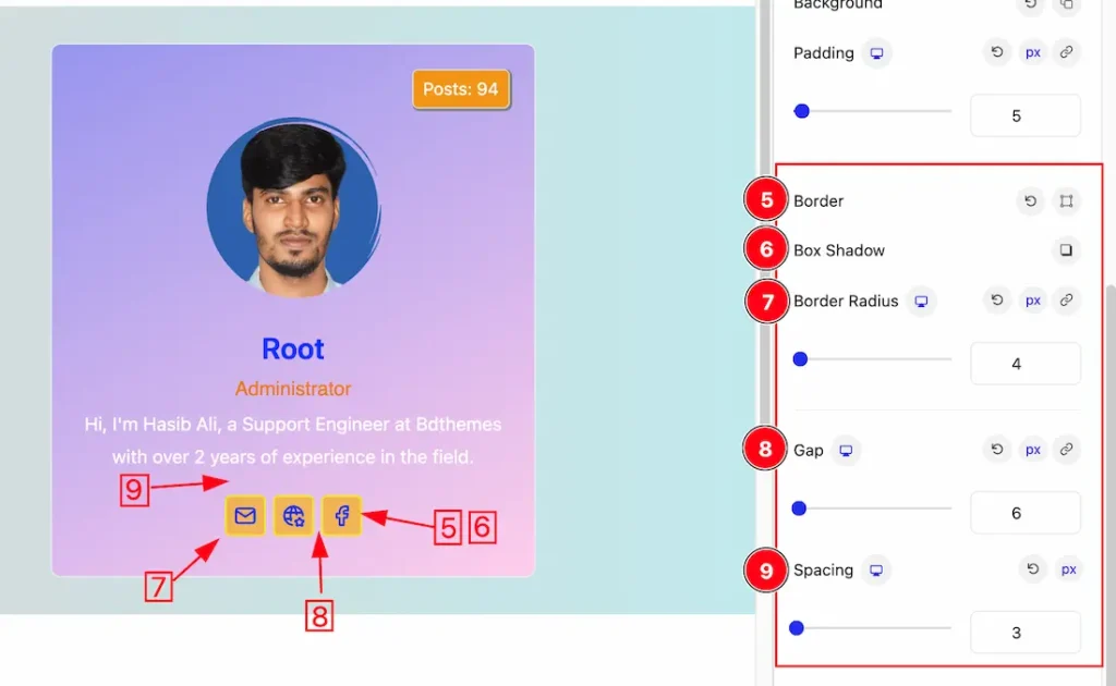
5. Border: you can set the Border Type to Default, None, Solid, Double, Dotted, Dashed, or Groove. We choose here the Border Type Solid. Here you also can change the Border width and Border Color to your working demand.
6. Box Shadow: The Box Shadow property is used to create the shadow around the Category Button. It takes Four values: Horizontal offset, Vertical offset, blur, and Spread to customize the Box shadow.
Position: you can set the Box Shadow position Outline and Inset. Here we set the Box Shadow position Outline.
Box Shadow Color: This lets you change the Box Shadow color.
7. Border Radius: Customizes the border corners for roundness.
8. Gap: You can adjust the Social Icons gap from here.
9. Spacing: Adjust the space between Social Icons and Description text.
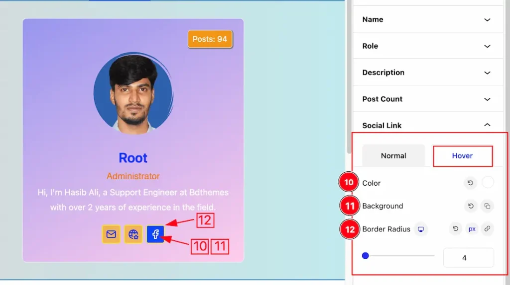
In the Hover subsection, you will get the below options-
10. Color: Change the social link icon Hover color.
11. Background: Modify the Hover Background color of the Social link icons.
12. Border Radius: Customizes the border corners for roundness.
Extra Tab Controls
The extra tabs provide the controls of any blocks. You can make different visual layouts by following these Controls.
Click to learn more>>.
Video Assist
You can also watch the video tutorial Learn more about the Author Block. Please visit the demo page for examples.
Thanks for being with us.
