
This documentation provides comprehensive insights into the Form Blocks developed by Zoloblocks.
Adding a block to the editor
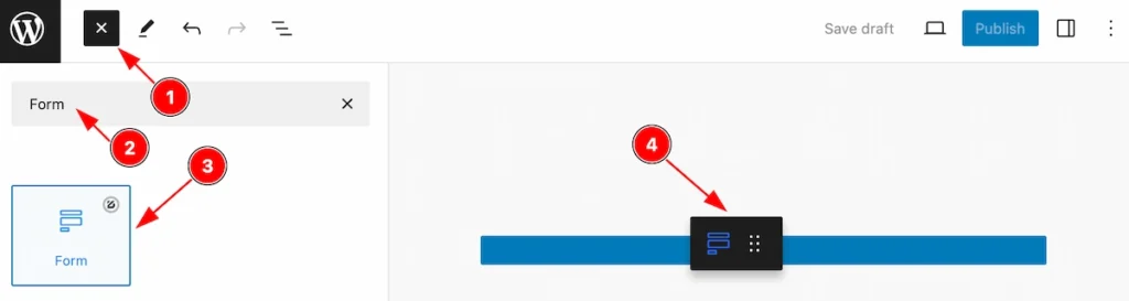
- Click the Toggle Block Inserter icon and a sidebar will appear on the left side, All the blocks will be visible here.
- Search by the Form block name.
- Then select the appear block ( with zoloblocks logo T.R corner).
- After Drag and Drop it on the page.
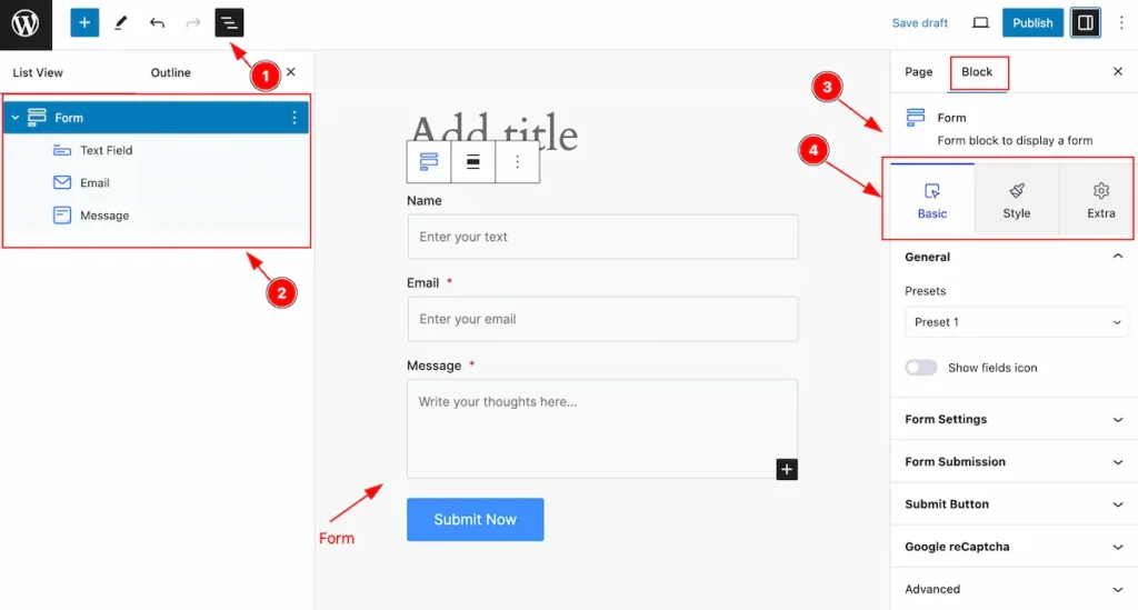
After Inserting the blocks, Follow this.
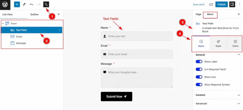
- Click on the Document Overviewer button and the Blocks list view will appear.
- Here appears the Form and its child block.
- After on the right side, Click on the Block. Then the Form details appear.
- Here show all the control tabs( Basic, Style, Extra ) of a block.
Basic Tab (Parents Blocks)
The Basic tab controller displayed here offers the flexibility to adjust the layout of blocks according to your preferences. Customize for the Parent’s blocks. Any changes will applied to all items.
General Section
Go to Basic > General
Presets of Form
There are different presets available, Select any that prefer your choose.
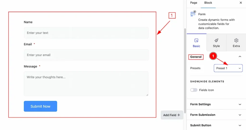
- Presets: Select the Preset 1 from the selection panel and it appear here.
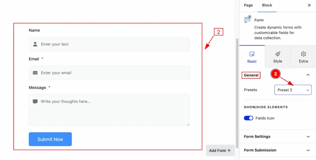
- Presets: Select the Preset 2 from the selection panel and it appear here.
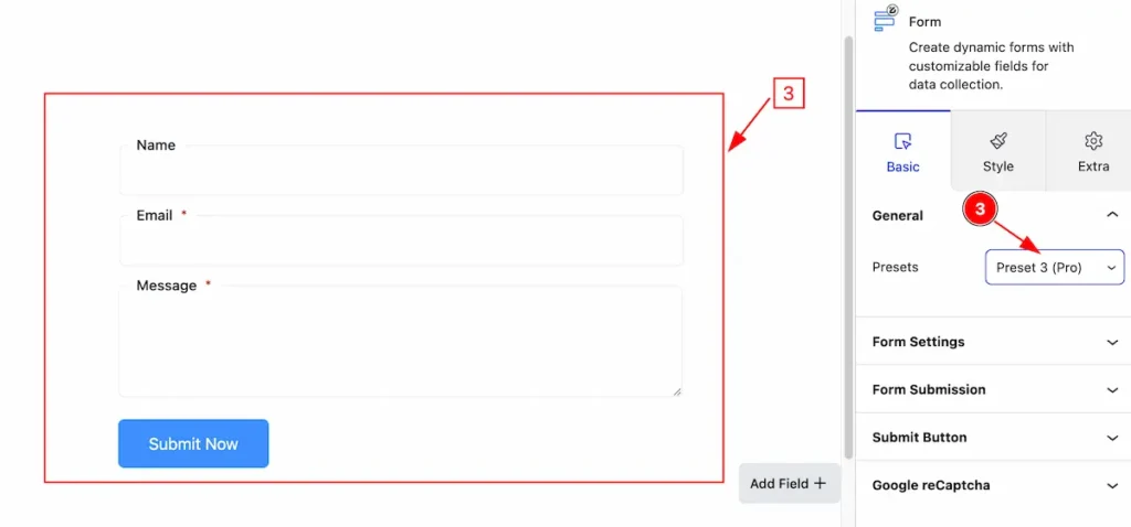
- Presets: Select the Preset 3 from the selection panel and it appear here.
Customize General Section
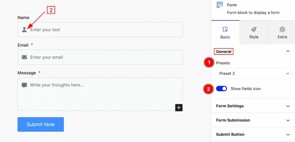
This section provides a control for the general,
- Presets: Click on the presets selector and the pre-made styles will appear. you can select any.
- Show fields icon: Enable the switcher to show the Icon.
ADD NEW FORM FIELDS
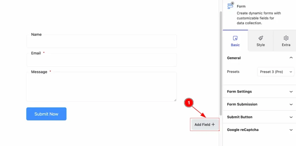
- Click on the ” Add Field + ” button on the bottom right section of Form Fields. It will appear a modal with embed form blocks.
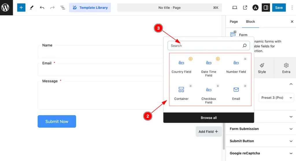
- Search by the block name.
- Select the exiting block from the section.
Country Field Add
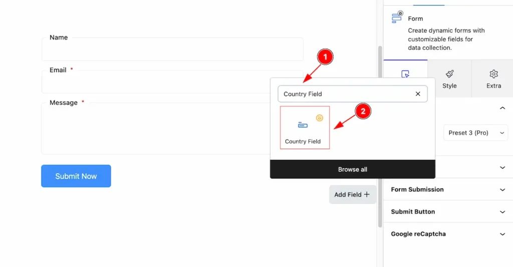
- Search by “ Country Field ” and it will appear the country field block
- Select the searched block, “ Country Field “.
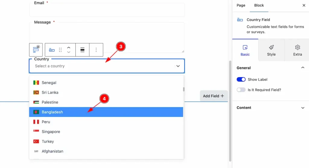
- After appearing the ” Country Field ” Just click on it and it will appear a popup will appear.
- Select the Country from there. The country and the Country Flag appear left side of the country.
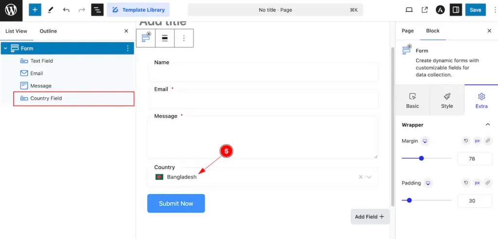
- After selecting the country, It will appear on the right.
Date Time Field Add
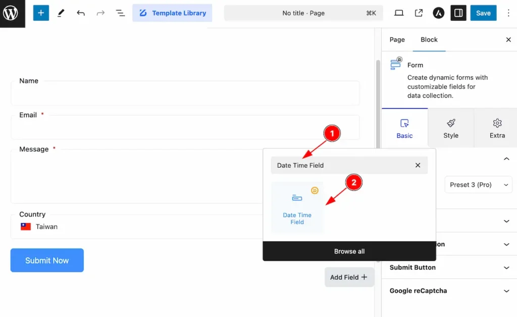
- Search by “ Date Time Field ” and it will appear the country field block
- Select the searched block, “ Date Time Field “.
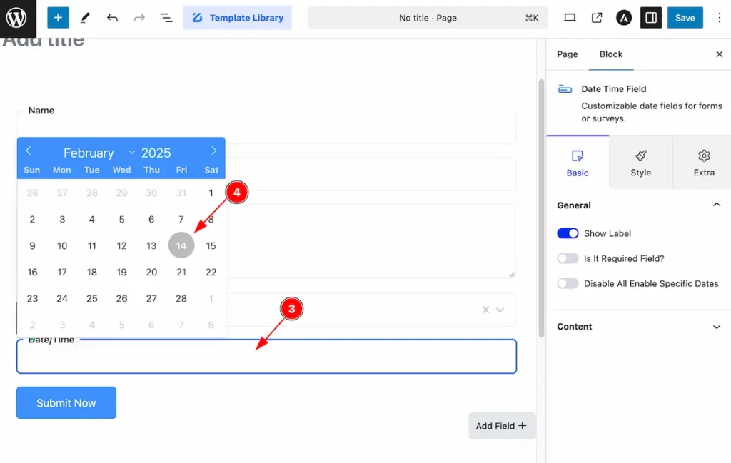
- Just click on the Date Time Field and it will appear a selection template of Calendar.
- Pic a date from there, The Months, Year and Day appear on there. Select any of them.
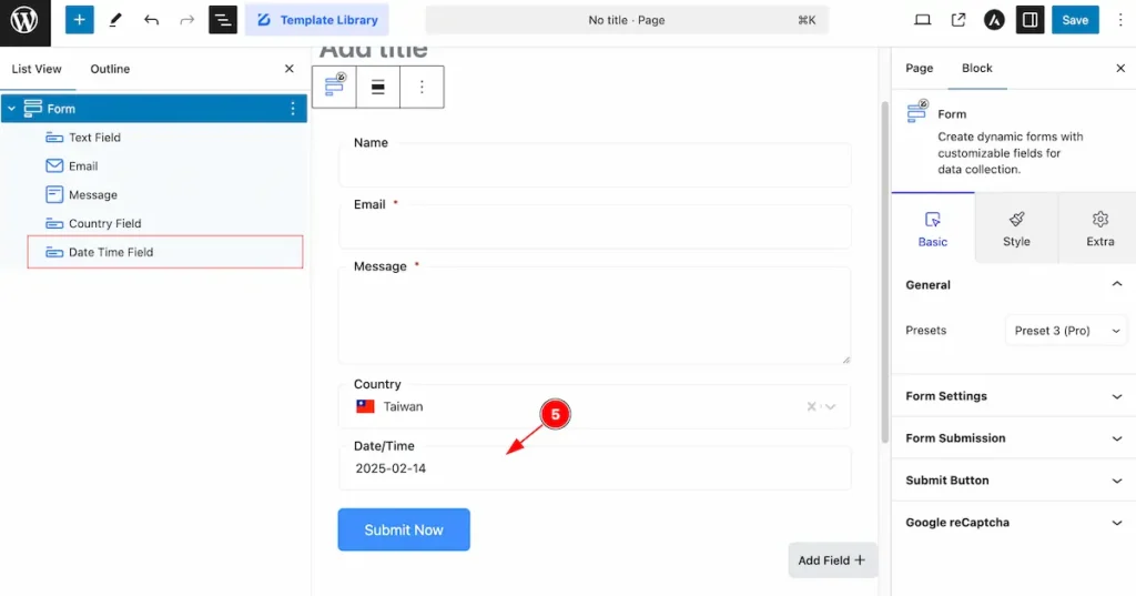
- After selecting the date it will appear on this fields.
Phone Number Field Add
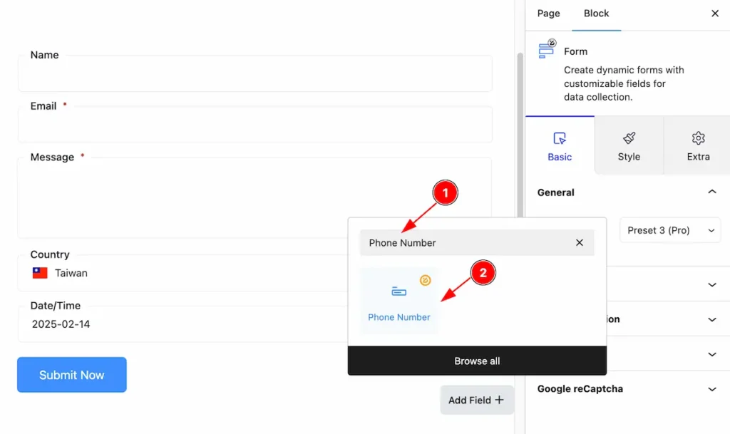
- Search by “ Phone Number Field ” and it will appear the country field block
- Select the searched block, “ Date Time Field “.
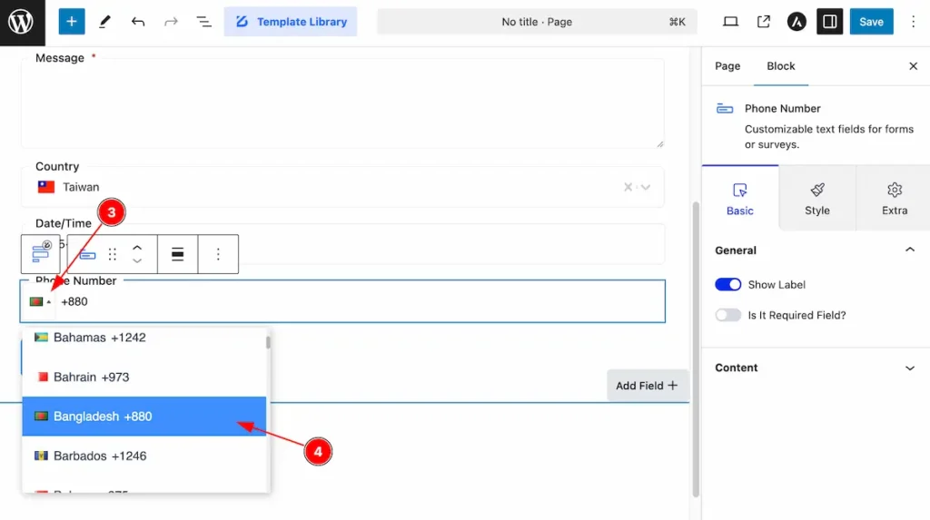
- Select the Country Dialling Code on the Left side. It will appear the Country Flag, Name and Dialling Code.
- Choose the country code you want to select.
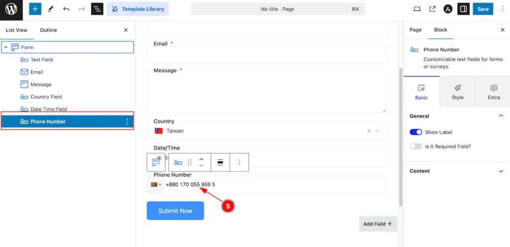
- After select the Country code write the Phone Number.
Checkbox Field Add
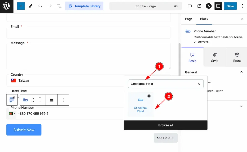
- Search by “ Checkbox Field ” and it will appear the country field block
- Select the searched block, “ Date Time Field “.
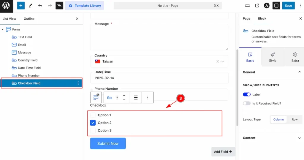
- The selected checkbox appear on the right there.
Number Field Add
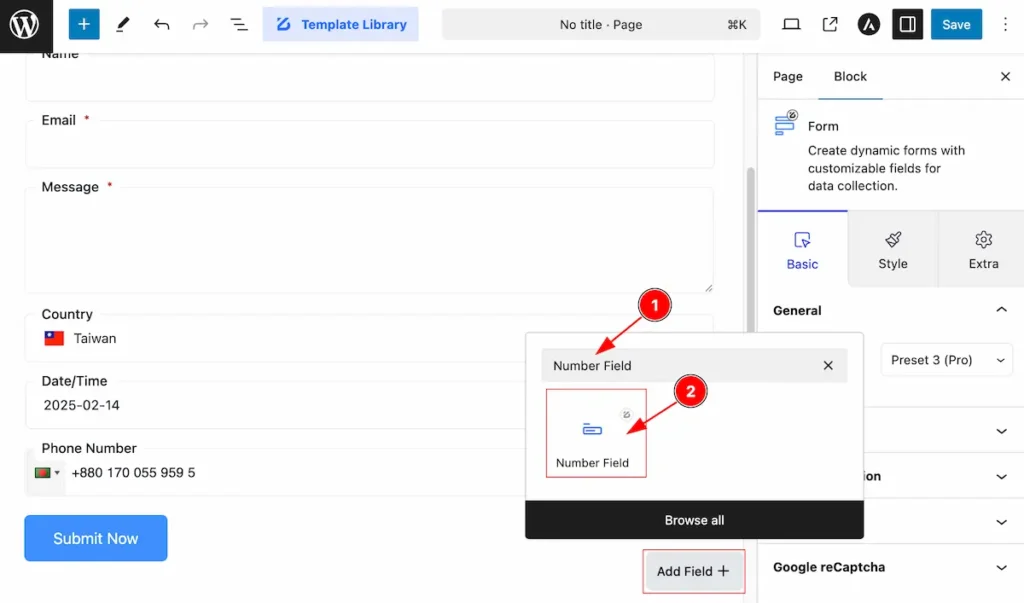
- Search by “ Number Field ” and it will appear the country field block
- Select the searched block, “ Number Field “.
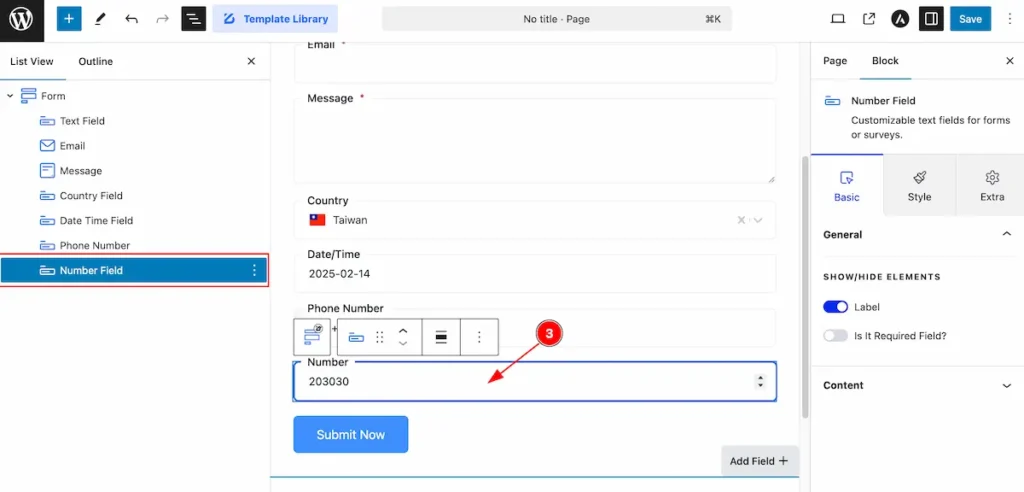
- Number Fields appear on there, It will allow number only.
By following this From relevant fields can be added on there.
Form Settings Section
Go to Basic > Form Settings Section
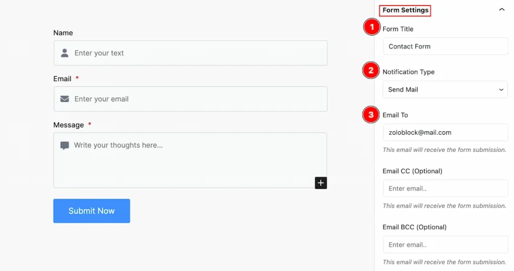
Set settings for the form,
- Form Title: Set the title form.
- Notification Type: Set the type for notification (e.g.: Send Mail, Save Response (Pro), Save Response & Send Mail (Pro) ).
- Email To: Set an email that email will receive the form submission.
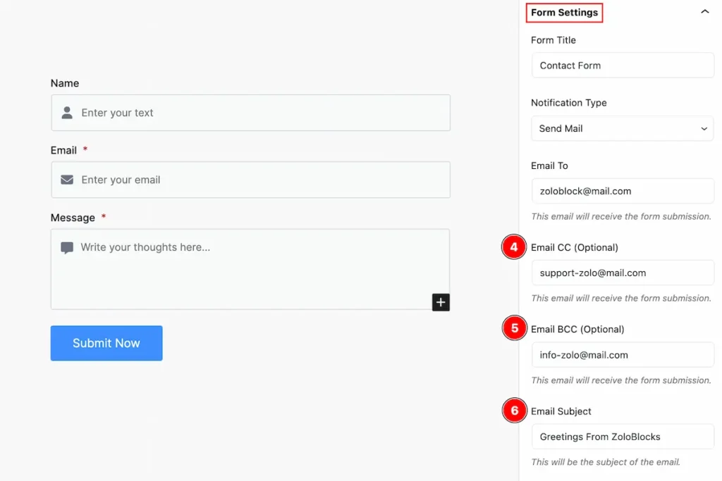
- Email CC (Optional): Set email cc for receiving the form submission. “cc” stands for “carbon copy. It’s used to include additional recipients who should be informed but aren’t directly responsible for any action items.
- Email BCC ( Optional ): Set email cc for receiving the form submission. “BCC” stands for “blind carbon copy.” It secretly includes recipients in an email without others seeing their addresses.
- Email Subject: The email subject is a concise summary of the content or purpose of the email. It helps recipients understand the context and importance of the message at a glance.
Form Submission Section
Go to Style > Form Submission
Set form submission settings by following this,
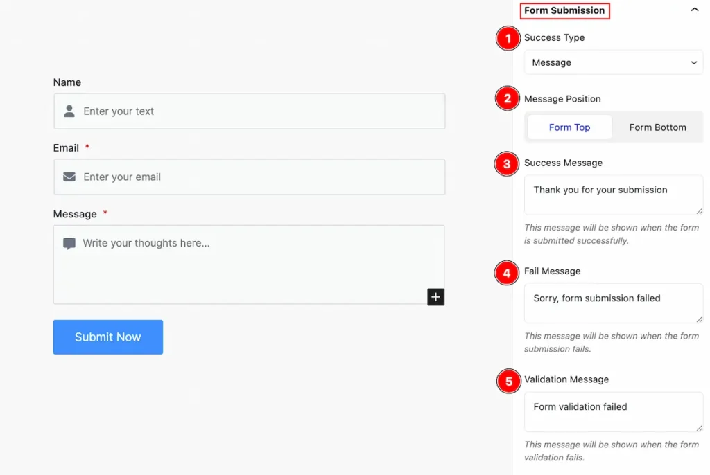
- Success Type: Set the success type (e.g.: Message, Redirect(Pro)).
- Message Position: Set the position for the message (e.g.: Form Top, Form Bottom).
- Success Message: Set a message for success.
- Fail Message: Set message for the email failed.
- Validation Message: Set the message for the validation form.
Submit Button Section
Go to Basic > Submit Button
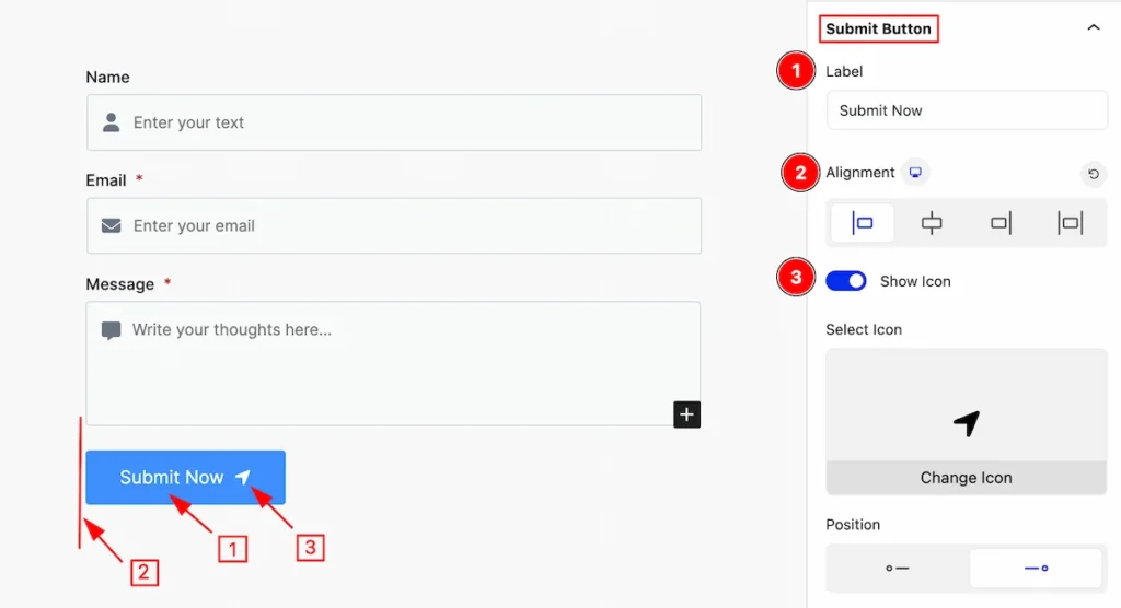
This section provides control for the Submit Button,
- Label: Set the label for the submit button.
- Alignment: Set alignment for position.
- Show Icon: Enable the switcher to show the Icon.
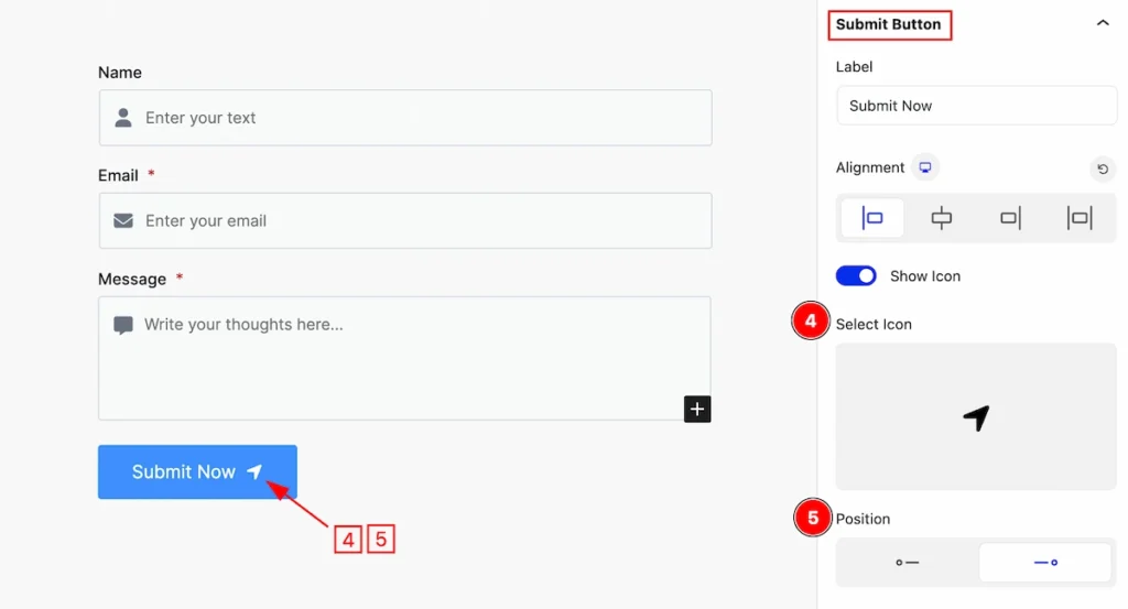
- Select Icon: Select the icon from the icon library.
- Position: Set the position for the icon (e.g.: left, right).
Google Recaptcha Section
Go to Basic > Recaptcha
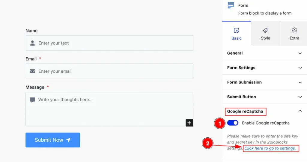
Set the Google recaptcha settings for the form,
- Enable Google reCaptcha:
- Click on the link to set the settings. It will navigate to the dashboard of Zoloblocks.
Go to API Settings Tabs
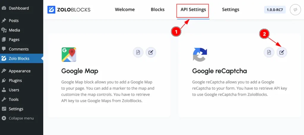
- Click on the API Settings tabs, It appears the tabs control the setting API keys for different sections.
- Click on the Edit Settings Button.
Set SITE KEY
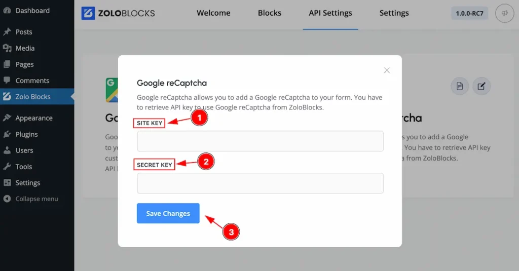
- SITE KEY: Set the site key.
- SECRET KEY: Set the secret key.
- Click on the ” Save Changes ” button and save it.
Style Tab (Parents Blocks)
Provide the controller to make the visual appearance or presentation of the tabs. This includes aspects visually appealing and cohesive with the overall design of the interface.
Label Section
Go to Style > Label
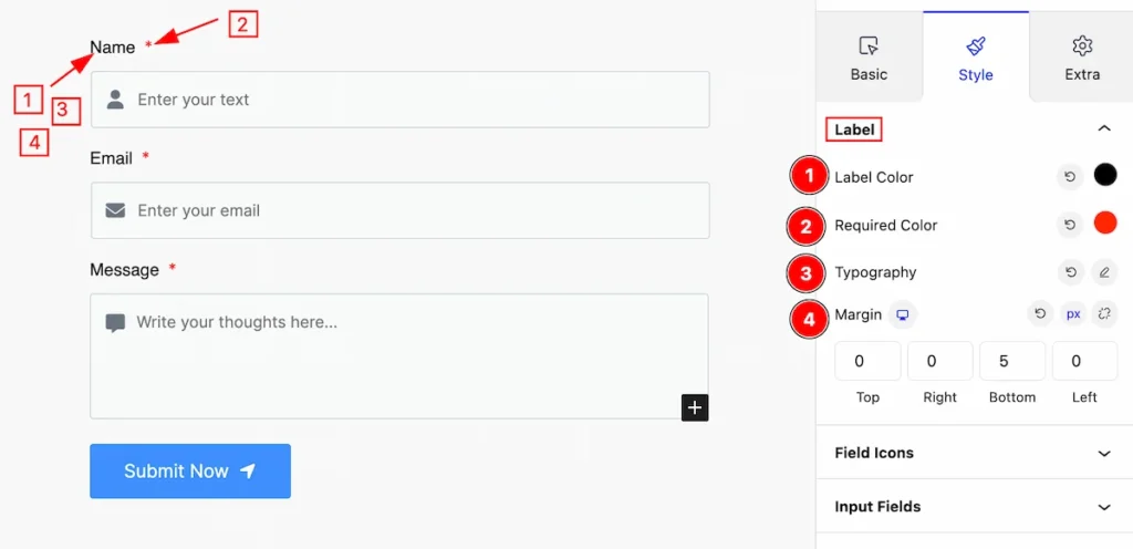
Set the label for the section,
- Label Color: Set the color for the label.
- Required Color: Set the required color.
- Typography: Set the typography for the label.
- Margin: Set margin for the label.
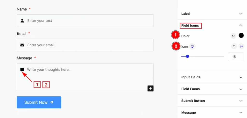
Field Icons Section
Go to Style > Field Icons
- Color: Set color for the field icons.
- Icon: Set the size for the icon.
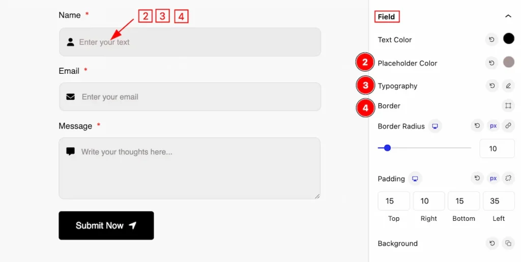
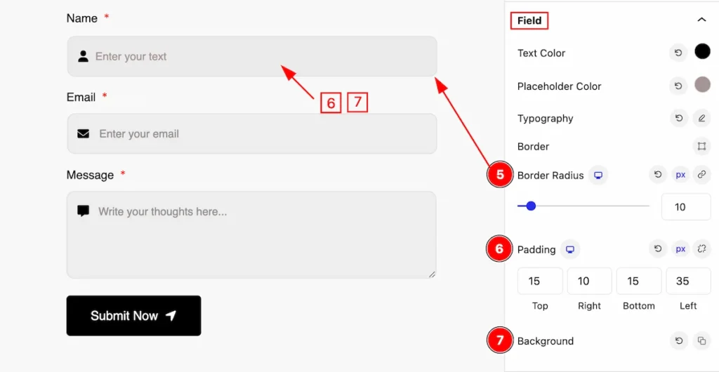
Input Fields Section
Go to Style > Input Fields
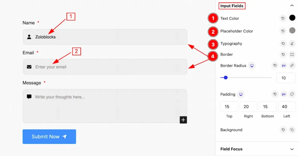
This section provides control for the input fields,
- Text Color: Set the color for the input text.
- Placeholder Color: Set the placeholder color.
- Typography: Set typography for the input fields.
- Border: Set a border for the input.
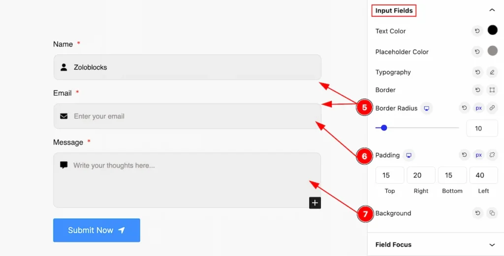
- Border Radius: Set the border corner edges rounded.
- Padding: Set padding for the input fields.
- Background: Set background color.
Fields Focus Section
Go to Style > Fields Focus
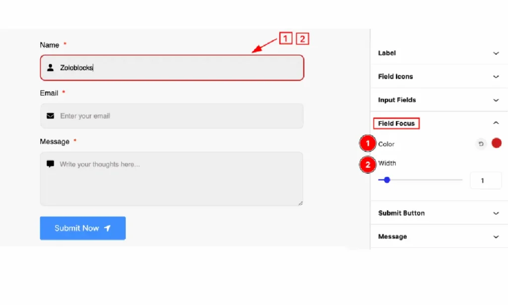
Set focus for the input fields,
- Color: Set the color for the field focus.
- Width: Set the width for the fields.
Submit Button Section
Go to Style > Submit Button
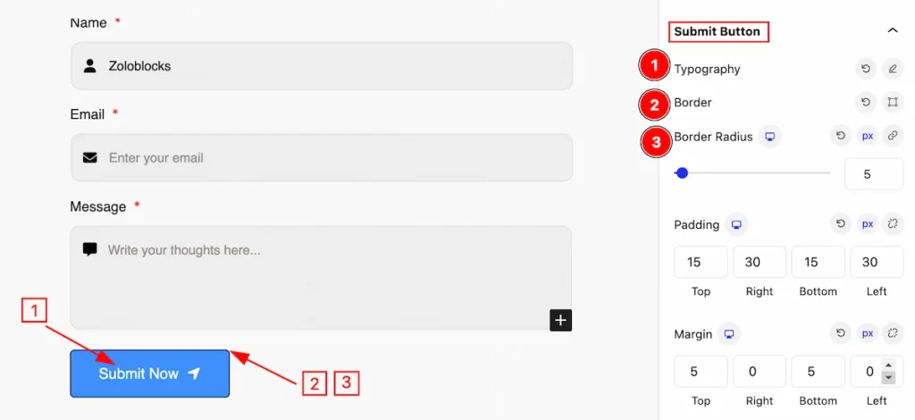
This section provides control for the submit button,
- Typography: Set the typography for the submit button.
- Border: Set the border for the button.
- Border Radius: Set the border corner edges rounded.
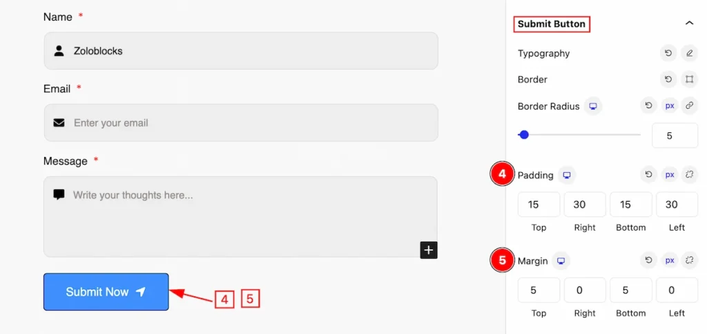
- Padding: Set padding for the inner space.
- Margin: Set the margin for the button.
Normal State for Submit Button
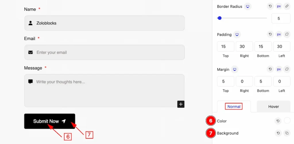
- Color: Set the color for the submit button.
- Background: Set the background for the button.
Hover Stae for Submit Button
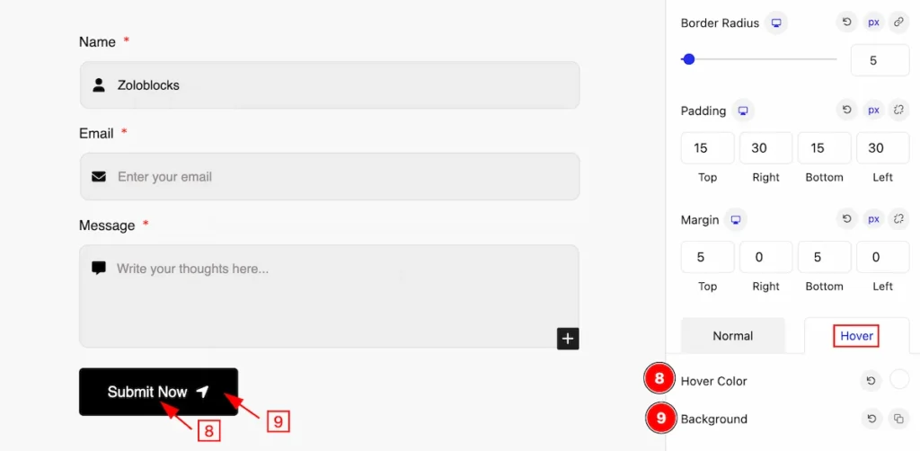
The changes will appear on mouse hover,
- Hover Color: Set the hover color for the button.
- Background: Set the background for the button.
Message Section
Go to Style > Message
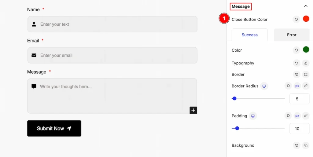
This section provides control for the message, This message will appear on success or error occurs after submitting the form.
- Close Button Color: Set the close button color for the message.
Success Tab
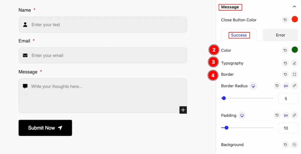
- Color: Set the color for the success message.
- Typography: Set typography for the message.
- Border: Set a border for the success message.
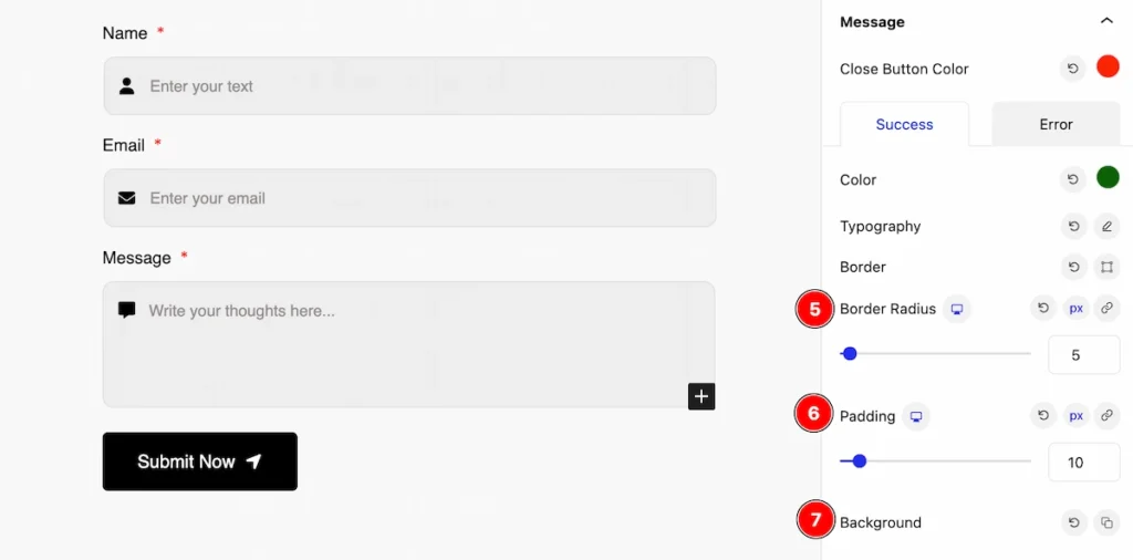
- Border Radius: Set the border rounded.
- Padding: Set the padding.
- Background: Set the background for the message.
Error Tab
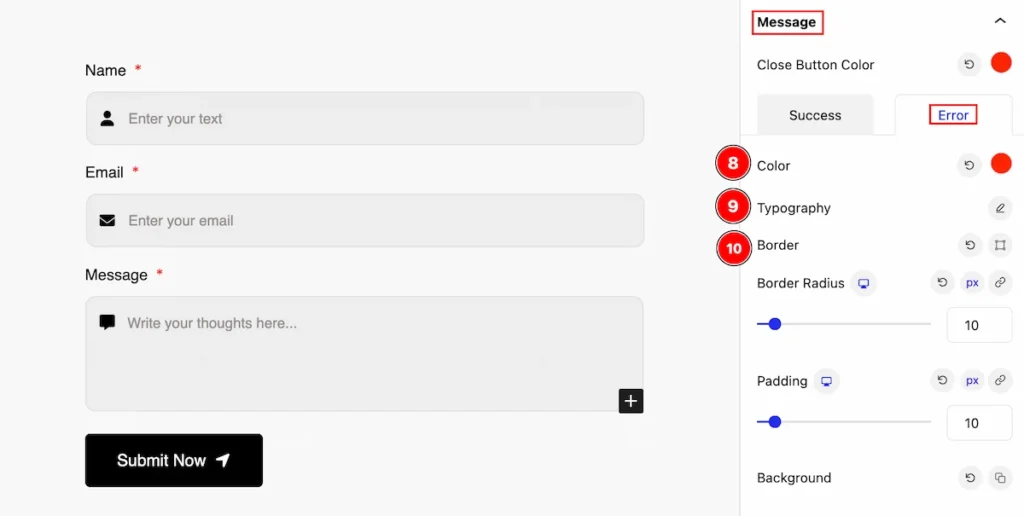
- Color: Set the color for the error message.
- Typography: Set typography for it.
- Border: Set the border for the error.
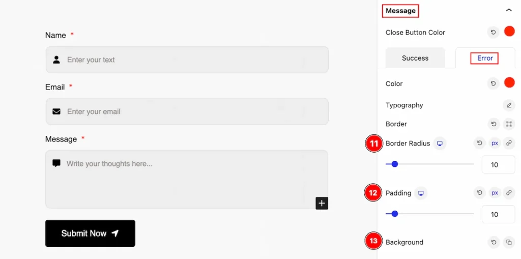
- Border Radius: Set the border radius for the error message.
- Padding: Set padding for the error message area.
- Background: Set the background.
Form (Child Blocks)
Here we will work with the Child blocks of the Form. The changes will applied to the relevant item only. Let’s follow this.
- Click on the Document Overviewer button and the Blocks list view will appear.
- Select the Form Child block under the Progress Bar parent blocks.
- On the right side, the selected Form Child details will appear.
- The Form Child controls will appear here. ( Basic, Style, Extra ).
Basic Tab ( Child Block )
This tab provides control to customize the child item of the Form child.
General Section
Go to Basic > General
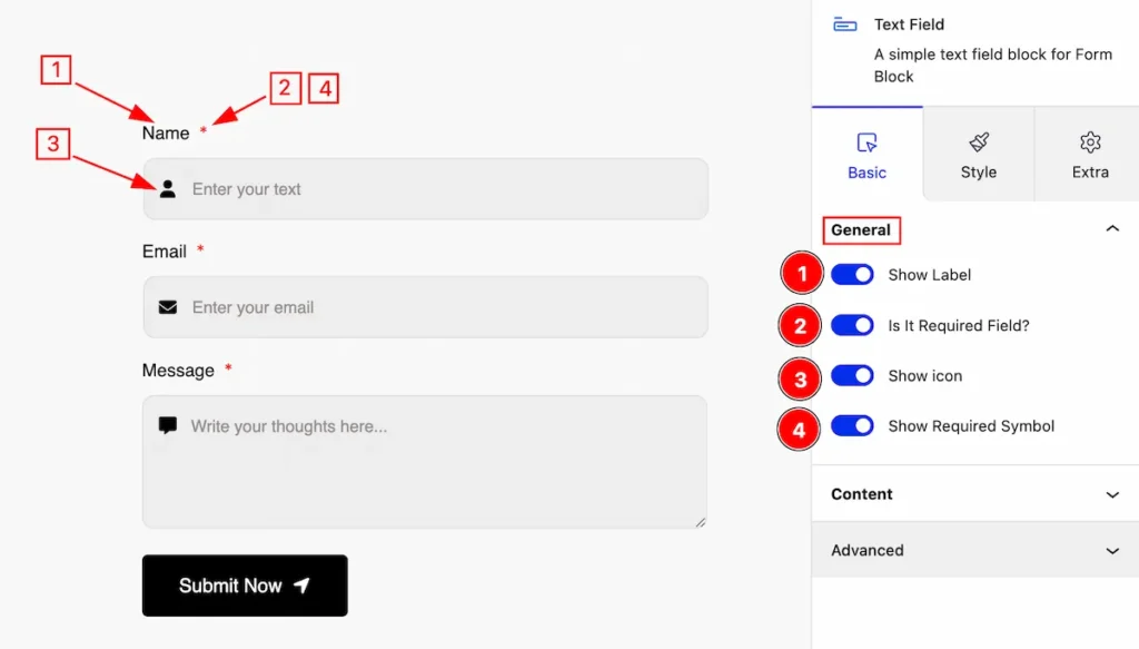
This section provides control for the general section,
- Show Label: Enable the switcher to show the label for the icon.
- Is it Required Fields?: Enable the switcher to show the required fields.
- Show Icon: Enable the switcher to show the Icon.
- Show Requreid Symbol: Enable the switcher to show the required symbol.
Content Section
Go to Basic > Content
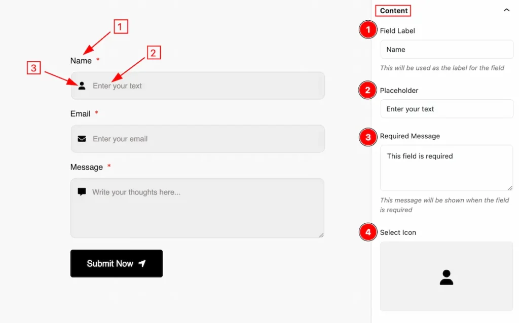
Set customization for the content fields,
- Field Label: Set the Field label for the content.
- Placeholder: Set the placeholder for the text fields.
- Required Message: Set the required message.
- Select Icon: Select the icon for the text fields.
Style Tab ( Child Block )
This tab provides the controls of the Progress Bar Child Items. The changes will apply only to relevant items. Let’s Explore all the controls.
Label Section
Go to Style > Label
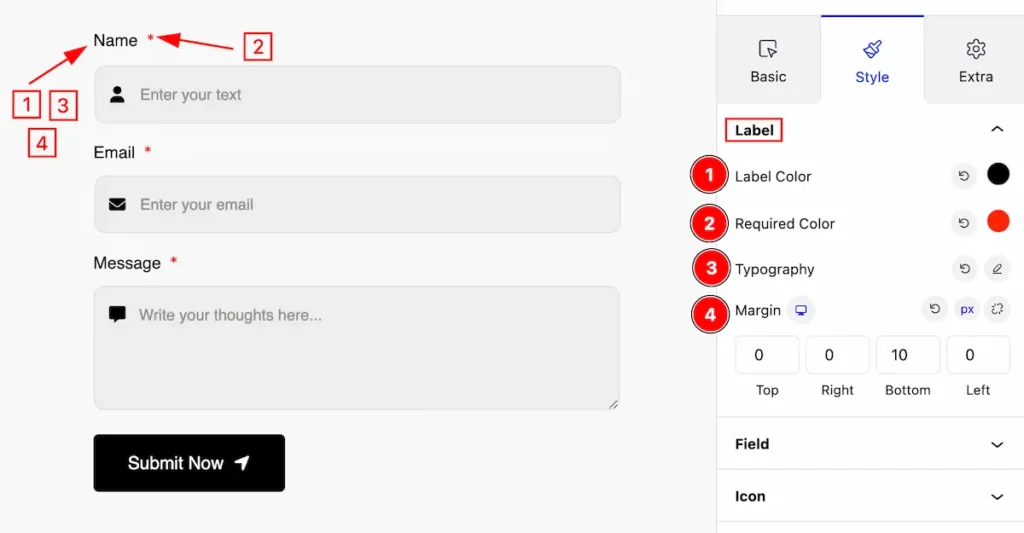
Make the appearance changes by following this,
- Lable Color: Set the color for the label.
- Required Color: Set the required Color.
- Typography: Set the typography for the label.
- Margin: Set outer space by setting the margin.
Field Section
Go to Style > Field
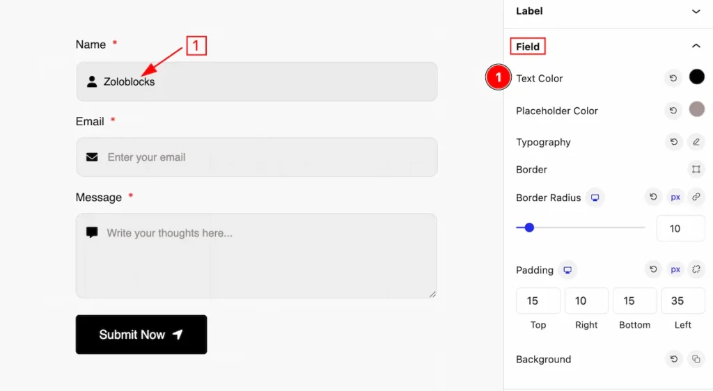
Make appearance changes for the fields section,
- Text Color: Set the color for the text.
- Placeholder Color: Set the placeholder color for the input fields.
- Typography: Set the typography for the field.
- Border: Set the border color.
- Border Radius: Set the border corner radius.
- Padding: Set inner spacing by padding.
- Background: Set the background for the input fields.
Icon Section
Go to Style > Icon
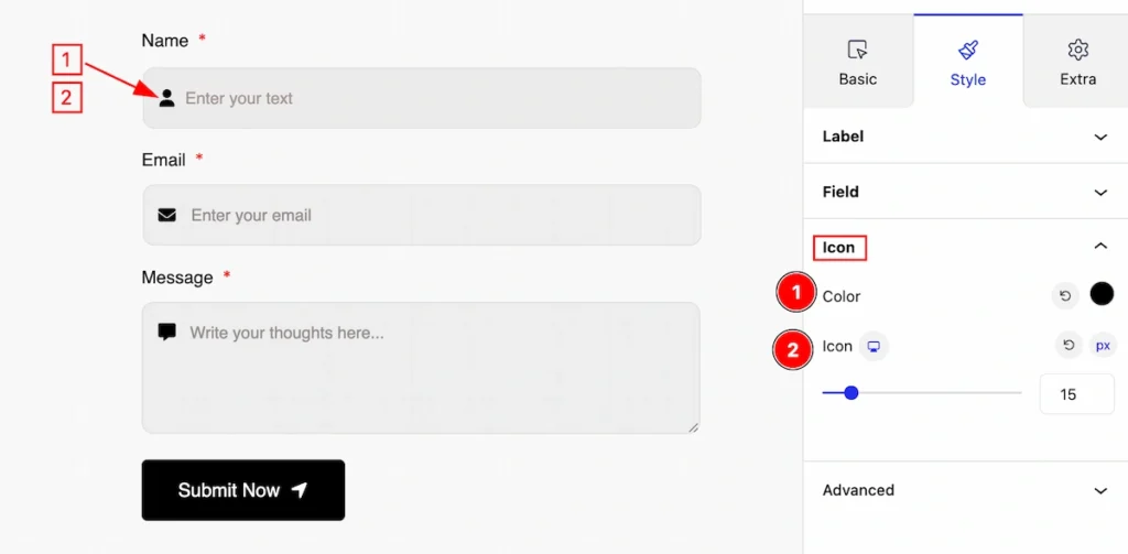
Make the icon customization,
- Color: Set the color for the icon.
- Icon: Set the icon size.
Extra Tab Controls
The extra tabs provide the controls of any blocks. You can make different visual layouts by following these Controls.
Click to learn more>>.
Video Assist
The Video help you to learn more about the block. Please visit the demo page for examples.
Thanks for being with us.