In this documentation, we will discuss the customization of the Profile Card block, brought to you by Zoloblocks.
Inserting The Block into the Editor
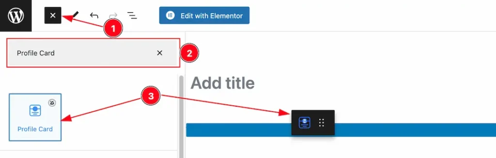
- Click the Toggle Block Inserter icon and a sidebar will appear on the left side, All the blocks will be visible here.
- Search the Profile Card Block Name inside the search Box. otherwise, select the Profile Card blocks ( with Zoloblocks logo T.R corner).
- Then Drag and Drop it on the page.
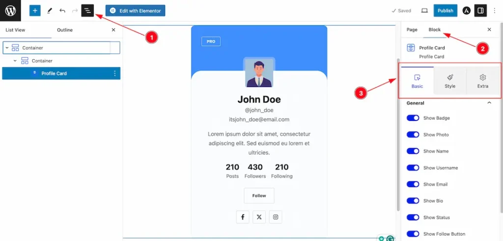
After Inserting the blocks, Follow this.
- Click on the Document Overviewer button and the Blocks list view will appear.
- After on the right side, Click on the Block.
- Here show all the control tabs( Basic, Style, Extra ) of a block.
Basic Tab Customization
The Basic tab controller displayed here offers the flexibility to adjust the layout of blocks according to your preferences.
General Section
Go to Basic > General
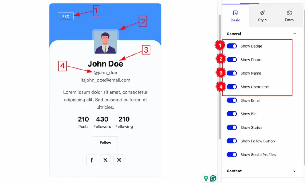
1. Show Badge: The Show Badge switcher button lets you show or hide the Badge from the Profile Card.
2. Show Photo: The Show Photo switcher button lets you show or hide the Photo from the Profile Card.
3. Show Name: The Show Name switcher button lets you show or hide the Name from the Profile Card.
4. Show Username: The Show Username switcher button lets you show or hide the Username from the Profile Card.
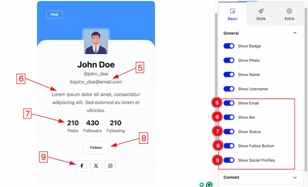
5. Show Email: The Show Email switcher button lets you show or hide the Email from the Profile Card.
6. Show Bio: The Show Bio switcher button lets you show or hide the Bio from the Profile Card.
7. Show Status: The Show Status switcher button lets you show or hide the Status from the Profile Card.
8. Show Follow Button: The Show Follow Button switcher button lets you show or hide the Follow Button from the Profile Card.
9. Show Social Profiles: The Show Social Profiles switcher button lets you show or hide the Social Profiles from the Profile Card.
Content Section
Go to Basic > Content
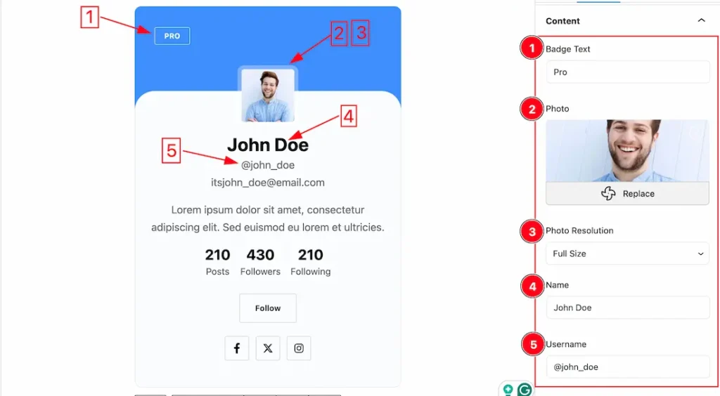
1. Badge Text: The Badge Text option lets you change the Badge Text as your working demand.
2. Photo: you can change the Photo here for your Profile Card.
3. Photo Resolution: you can set the Photo Resolution (Full Size, Large, Medium, and Thumbnail) here.
4. Name: This option lets you change the Name of the Profile Card.
5. Username: This option lets you change the Username of your Profile Card.
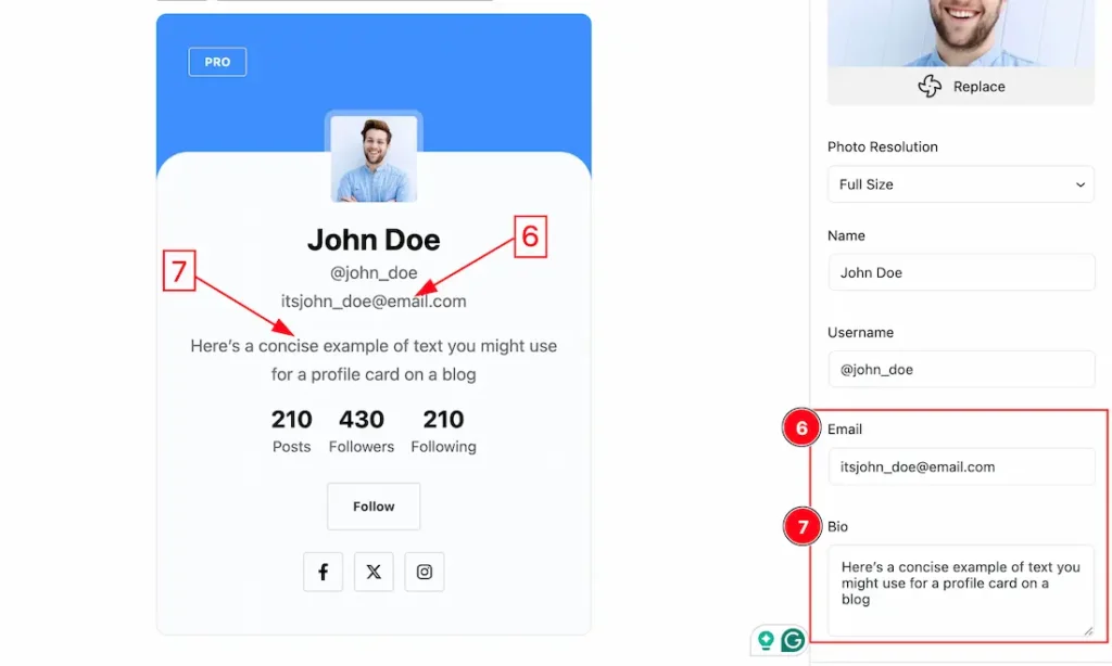
6. Email: This option lets you change the Email of your Profile Card.
7. Bio: you can add your Bio easily here.
Status Section
Go to Basic > Status
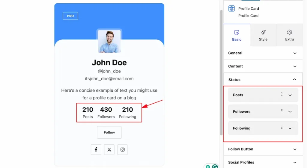
Come to the Status section, you will get 3 items like – Posts, Followers, and Following.
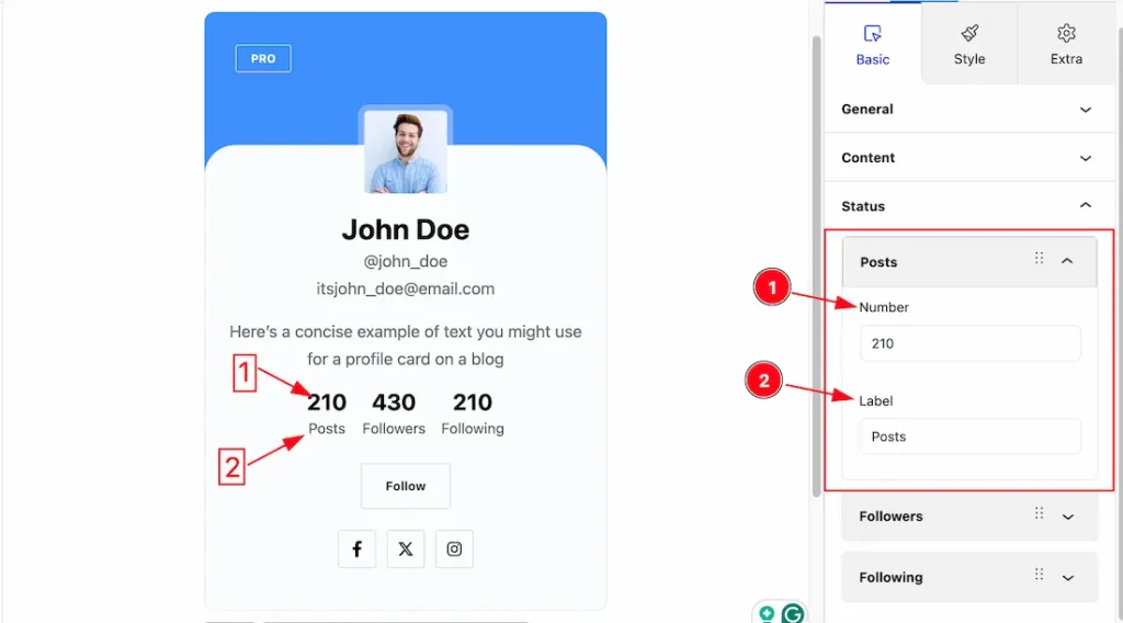
Click on each item, you will get a similar customization option like the number and Label that we show in the above screenshot.
1. Number: This option lets you change the number of the posts status.
2: Label: This option lets you change the Label of the status.
In the same procedure, you can customize the other items.
Follow Button Section
Go to Basic > Follow Button
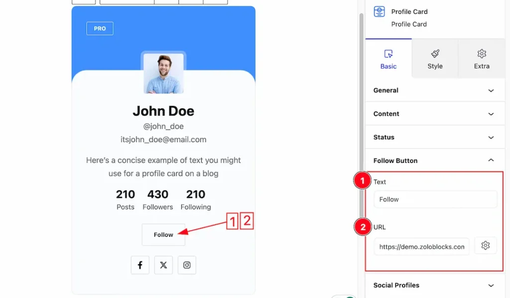
Come to the Follow Button section, you will get Text and URL options.
1. Text: This option lets you change the Text of the Follow Button.
2. URL: This option lets you add a URL under the Follow Button.
Social Profiles Section
Go to Basic > Social Profiles
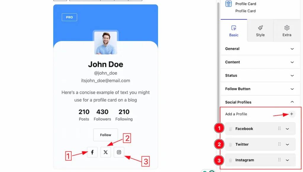
Come to the Social Profiles section, you will get the (+) icon button to add Social Profiles. you can easily add your social profiles from here. Here we add 3 social profiles – Facebook, Twitter, and Instagram.
Click on each Social Profiles item, you will get similar customization options.
1. Facebook: This option lets you change the Data of your Facebook social profile.
2. Twitter: This option lets you change the Data of your Twitter social profile.
3. Instagram: This option lets you change the Data of your Instagram social profile.
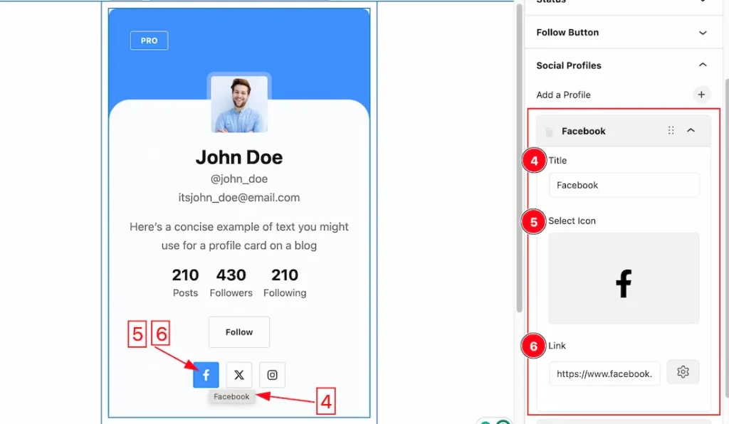
4. Title: This option lets you change the Title of the Social Profiles.
5. Select Icon: you can change the icon of the Social Profiles to your needs.
6. Link: This option lets you set a URL Link under the Social Profile button.
In the same procedure, you can customize the other items.
Work with The Style Tab
Header Area Section
Go to Style > Header Area
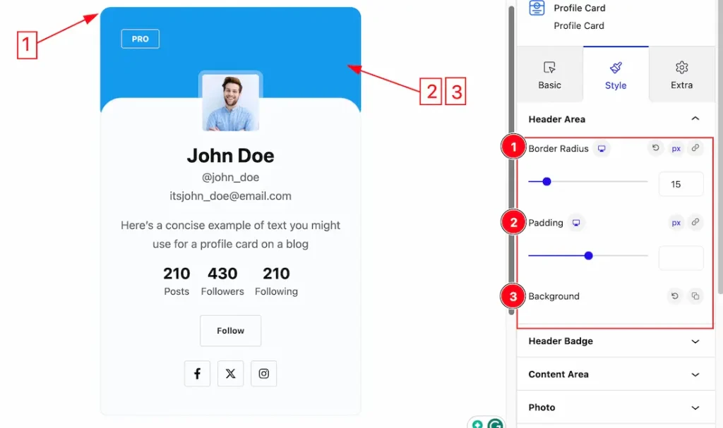
1. Border Radius: Customizes the border corners for roundness.
2. Padding: Add spaces around an object to increase the inner area. Padding allows you to control the internal space within an element.
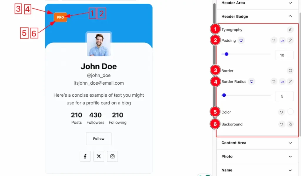
Header Badge Section
Go to Style > Header Badge
1. Typography: Changes the font family, size, weight, style, transform, decoration, line height, letter spacing, and word spacing from here.
2. Padding: Add spaces around an object to increase the inner area. Padding allows you to control the internal space within an element.
3. Border: you can set the Border Color and Border Type to None, Solid, and Custom. We choose here the Border Type Solid.
4. Border Radius: Customizes the border corners for roundness.
5. Color: This option lets you change the Text color of the Badge.
6. Background: you can change the color of the image background to classic or gradient. Here we choose the Background type Classic. If you want, you also can set an image as the Background.
Content Area Section
Go to Style > Content Area
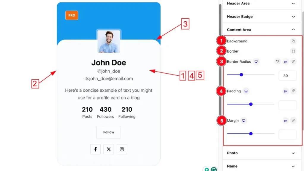
1. Background: you can change the color of the image background to classic or gradient. Here we choose the Background type Classic. If you want, you also can set an image as the Background.
2. Border: you can set the Border Color and Border Type to None, Solid, and Custom. We choose here the Border Type Solid.
3. Border Radius: Customizes the border corners for roundness.
4. Padding: Add spaces around an object to increase the inner area. Padding allows you to control the internal space within an element.
5. Margin: Adjusts the position of an object over the canvas.
Photo Section
Go to Style > Photo
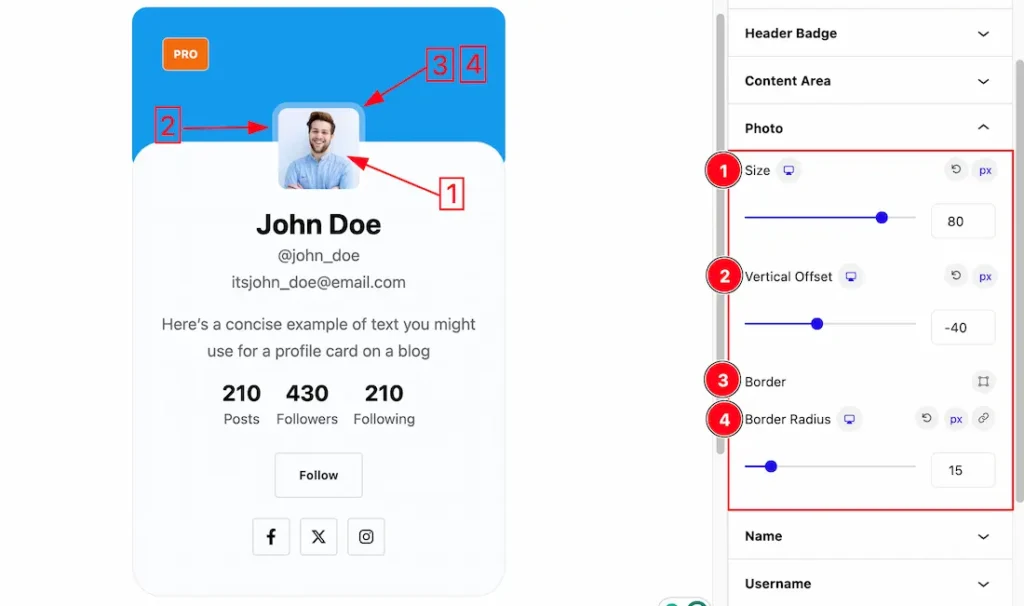
1. Size: This option lets you change the size of the Photo.
2. Vertical Offset: Set the Vertical Offset moving the Image vertically.
3. Border: you can set the Border Color and Border Type to None, Solid, and Custom. We choose here the Border Type Solid.
4. Border Radius: Customizes the border corners for roundness.
Name Section
Go to Style > Name
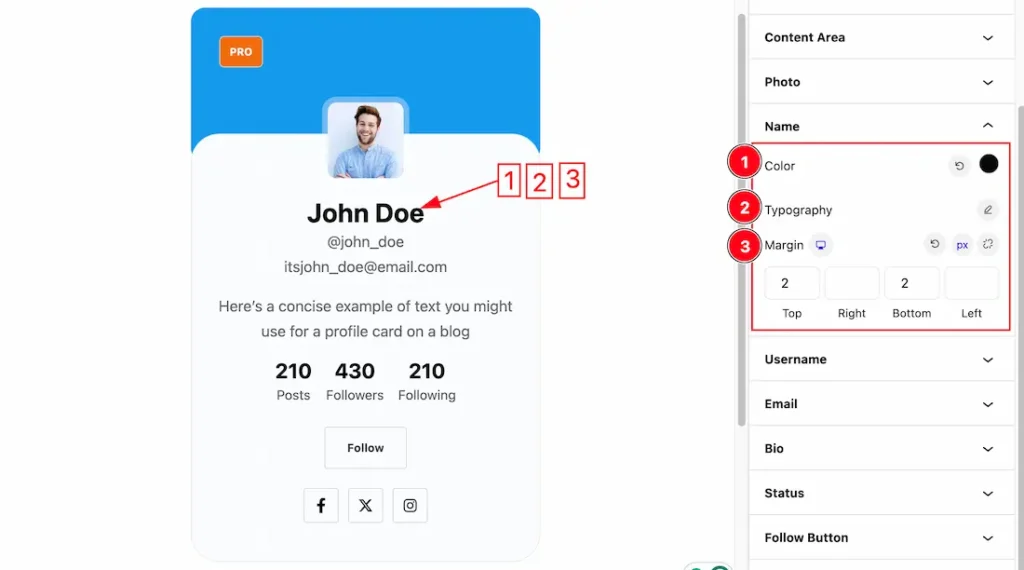
1. Color: This option lets you change the Text color of the Name.
2. Typography: Change the font family, size, weight, style, transform, decoration, line height, letter spacing, and word spacing from here.
3. Margin: Adjusts the position of an object over the canvas.
Username Section
Go to Style > Username
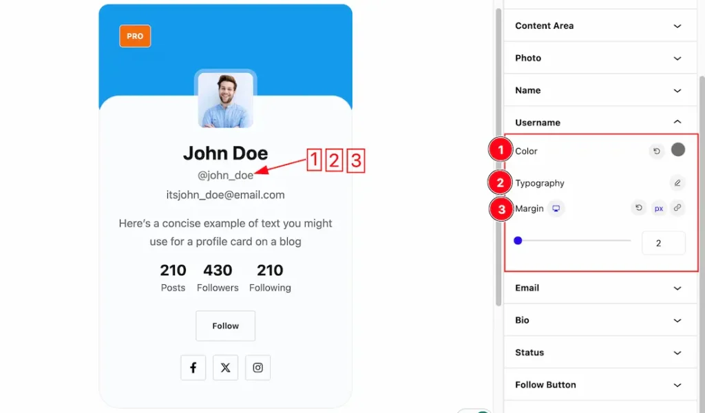
Come to the Username section, you will get a similar customization option as in the Name section. Please try it yourself.
Email Section
Go to Style > Email
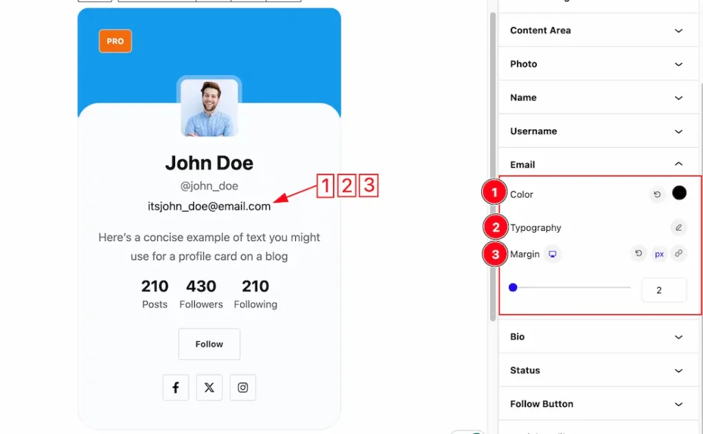
Come to the Email section, you will get a similar customization option as in the Name and Username section. Please try it yourself.
Bio Section
Go to Style > Bio
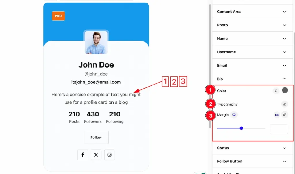
Come to the Bio section, you will get a similar customization option as in the Name and Username and Email section. Please try it yourself.
Status Section
Go to Style > Status
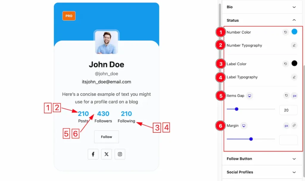
1. Number Color: This option lets you change the Number Color of the Status.
2. Number Typography: Changes the font family, size, weight, style, transform, decoration, line height, letter spacing, and word spacing from here.
3. Label Color: This option lets you change the Label Color of the Status.
4. Label Typography: Change the font family, size, weight, style, transform, decoration, line height, letter spacing, and word spacing of the Label from here.
5. Item Gap: This option lets you make the Gap of the Status.
6. Margin: Adjusts the position of an object over the canvas.
Follow Button Section
Go to Style > Follow Button
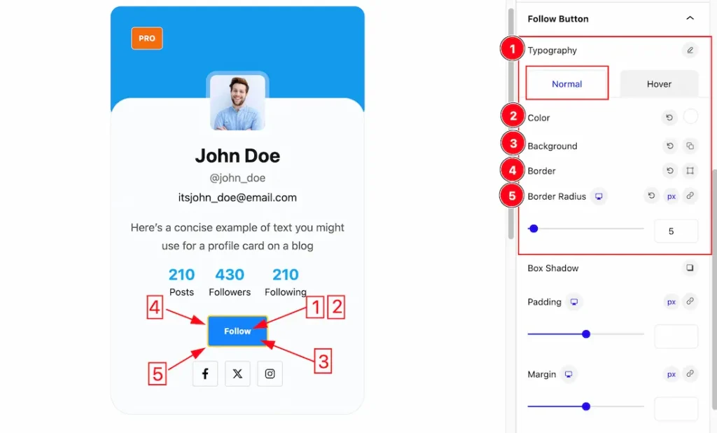
Come to the Follow button section, you will get two subsections; Normal and Hover.
In the Normal mode, you will get the below options to customize the section.
1. Typography: Changes the font family, size, weight, style, transform, decoration, line height, letter spacing, and word spacing from here.
2. Color: This option lets you change the Follow Button Color.
3. Background: This option lets you change the Background Color of the Follow Button. you can change the color of the Button background to classic or gradient. Here we choose the Background type Classic. If you want, you also can set an image as the Background.
4. Border: you can set the Border Color and Border Type to None, Solid, and Custom. We choose here the Border Type Solid.
5. Border Radius: Customizes the border corners for roundness.
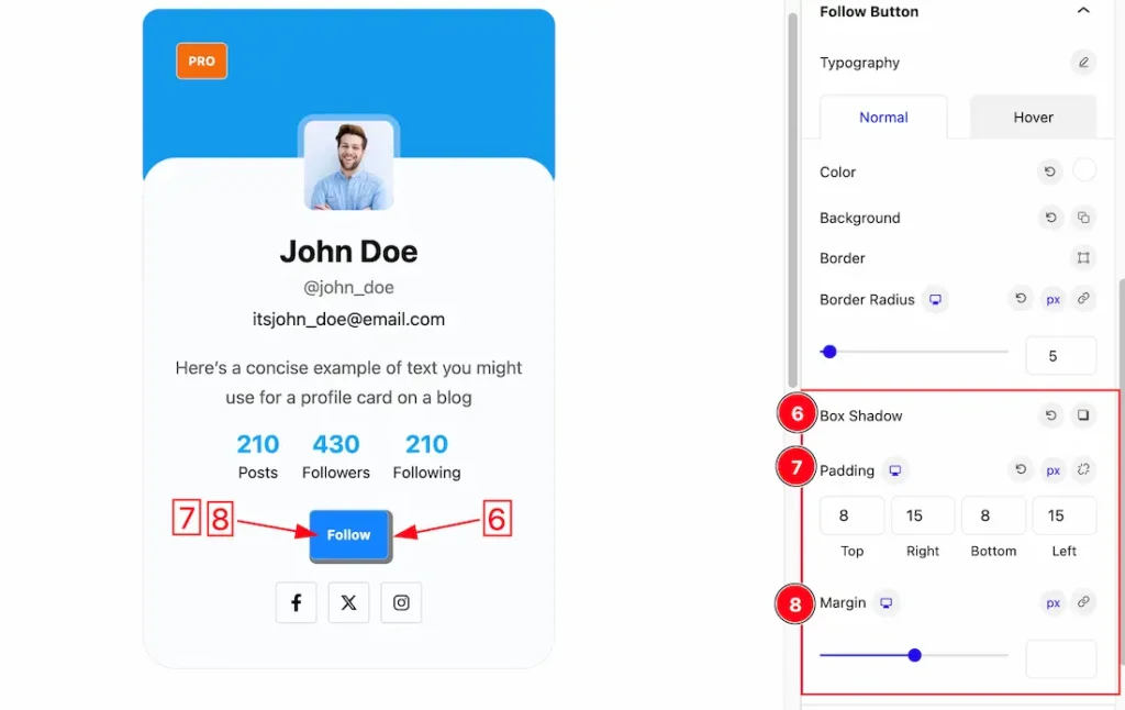
6. Box Shadow: The Box Shadow property is used to create the shadow around the image. It takes Four values: Horizontal offset (X), Vertical offset (Y), blur, and Spread to customize the Box shadow.
- Box Shadow Color: This lets you change the Box Shadow color.
- Position: you can set the Box Shadow position Outer and Inner. Here we set the Box Shadow position Outer.
7. Padding: Add spaces around an object to increase the inner area. Padding allows you to control the internal space within an element.
8. Margin: Adjusts the position of an object over the canvas.
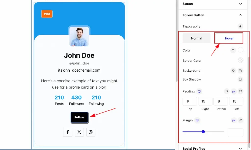
In the Hover mode, you will get a similar customization option as in the Normal mode. So please try it yourself.
Social Profiles Section
Go to Style > Social Profiles
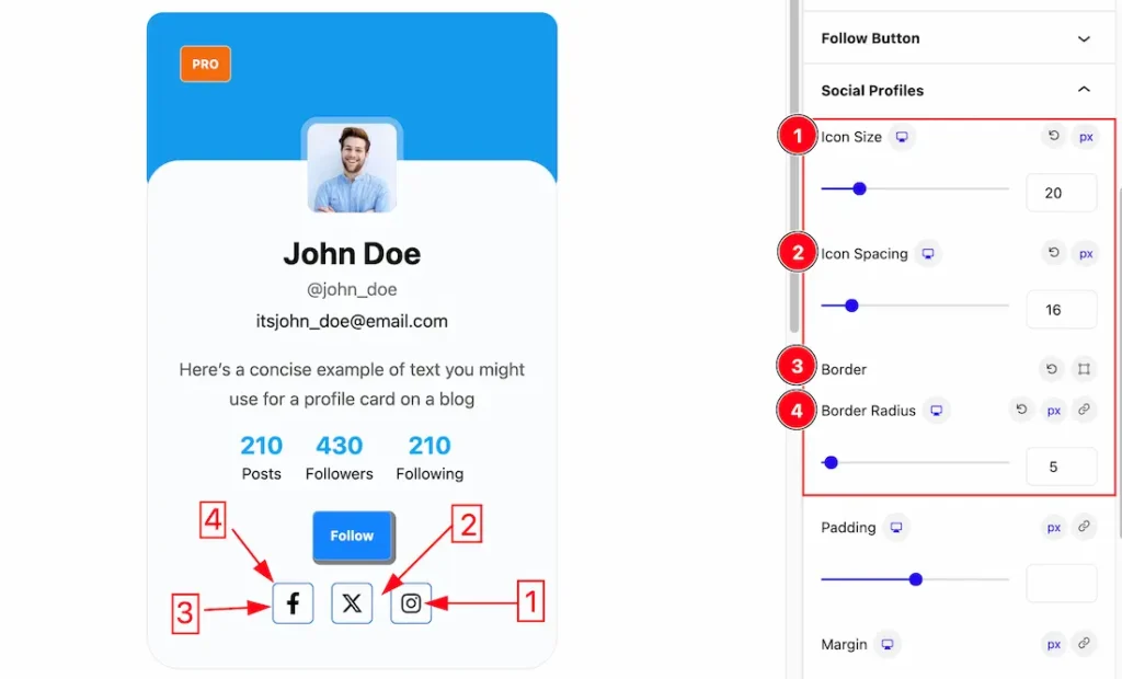
Come to the Social Profiles section, you will get two subsections; Normal and Hover.
In the Normal mode, you will get the below options to customize the section.
1. Icon Size: This option lets you set the size of the icon of the Social Profiles.
2. Icon Spacing: This option lets you set the Spacing between the icons of the Social Profiles.
3. Border: you can set the Border Color and Border Type to None, Solid, and Custom. We choose here the Border Type Solid.
4. Border Radius: Customizes the border corners for roundness.
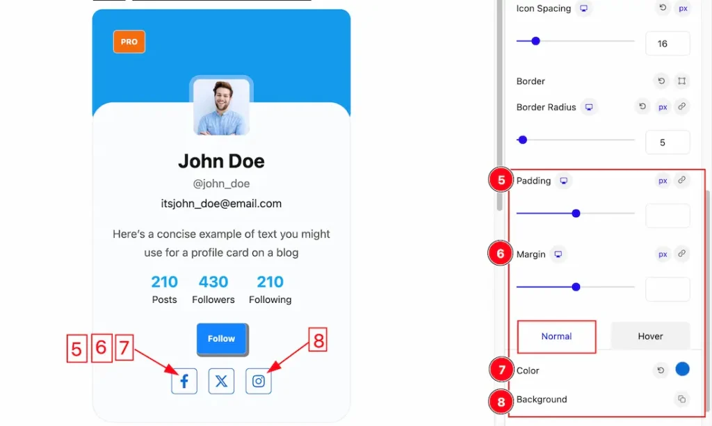
5. Padding: Add spaces around an object to increase the inner area. Padding allows you to control the internal space within an element.
6. Margin: Adjusts the position of an object over the canvas.
7. Color: This option lets you change the Color of the Social Profiles icon.
8. Background: This option lets you change the Background Color of the Social Profiles. you can change the color of the background to classic or gradient. Here we choose the Background type Classic. If you want, you also can set an image as the Background.
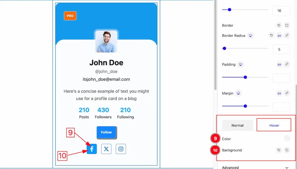
In the Hover mode, you will get a similar customization option as in the Normal mode. So please try it yourself.
Extra Tab Controls
The extra tabs provide the controls of any blocks. You can make different visual layouts by following these Controls.
Click to learn more>>.
Video Assist
The Video help you to learn more about the block. Please visit the demo page for examples.
Thanks for being with us.