This documentation provides comprehensive insights into the Shape Divider Extension developed by Zoloblocks.
Activate the Shape Divider Extension
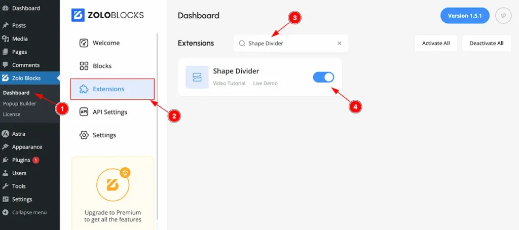
On WordPress Dashboard Navigate to ZoloBlocks from the sidebar menu.
- Select the Dashboard option under ZoloBlocks.
- Go to the Extension tab.
- Use the search bar to search for “Shape Divider”
- Click Enable to activate the Shape Divider extension.
Where to Find the Extension
Select Container and Go to Style Tab Section
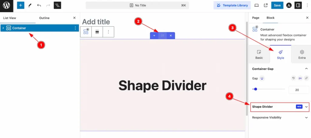
- Select Container from the lists view.
- Select the Container.
- Go to Style Tab of the container.
- Find the section named ” Shape Divider “.
Shape Divider
A shape divider is a design element used to create visually appealing transitions between different sections on a webpage. Instead of using straight horizontal lines, shape dividers introduce creative curves, waves, angles, or other geometric shapes to separate content areas.
Type: None
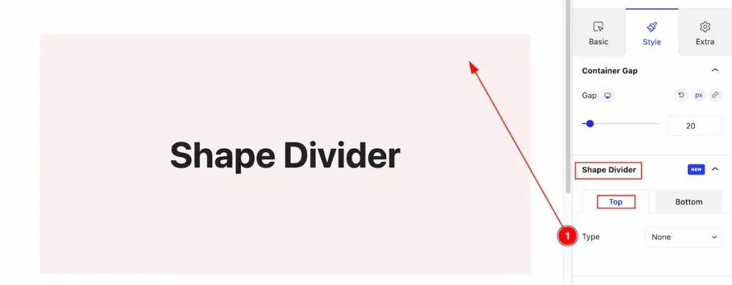
- Type : Default selected None. It will display nothing.
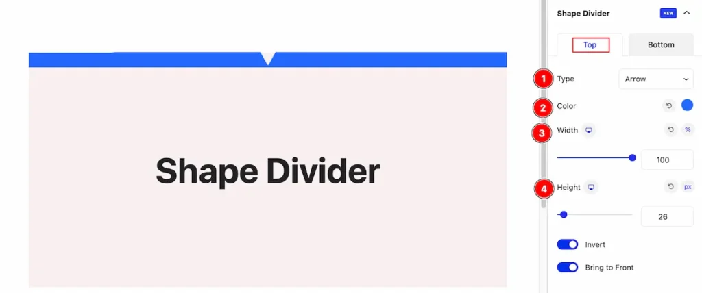
Type: Arrow
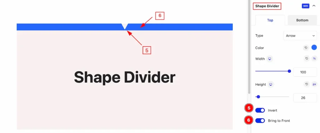
Top
- Type: Select the shape divider type Arrow.
- Color: Set the color for arrow.
- Width: Set the width for the arrow.
- Height: Set the height for it.
- Invert: Enable the switcher to invert the arrow.
- Bring to Front: Enable the switcher to bright to front the arrow.
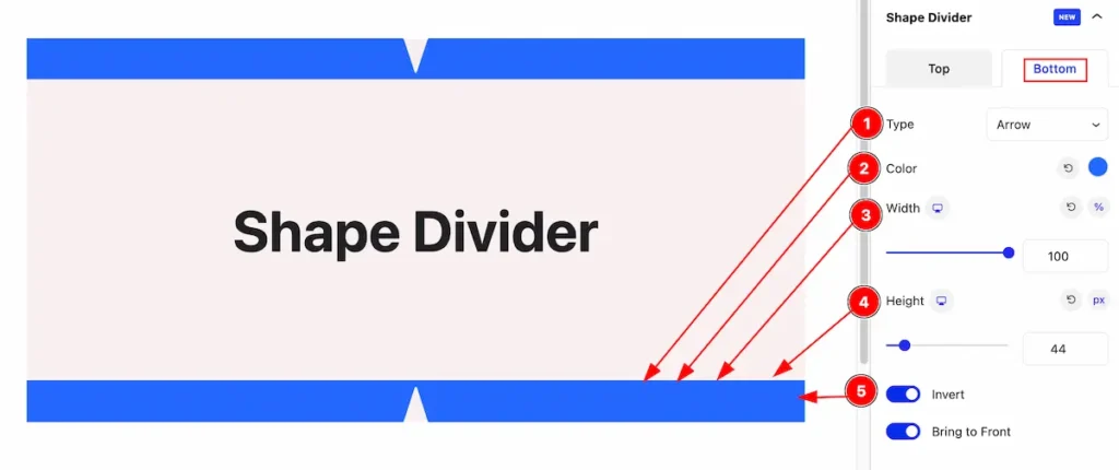
Bottom
- Type: Select the type Arrow.
- Color: Select the color for arrow.
- Width: Set the width for the arrow.
- Height: Set the height for it.
Type: Book
Top
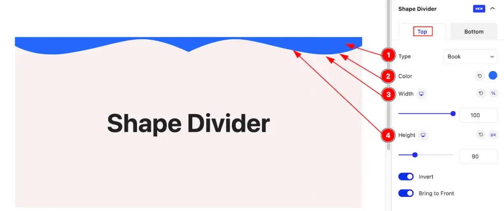
- Type: Select the type Book.
- Color: Select the color for book.
- Width: Set the width for the book.
- Height: Set the height for it.
Bottom
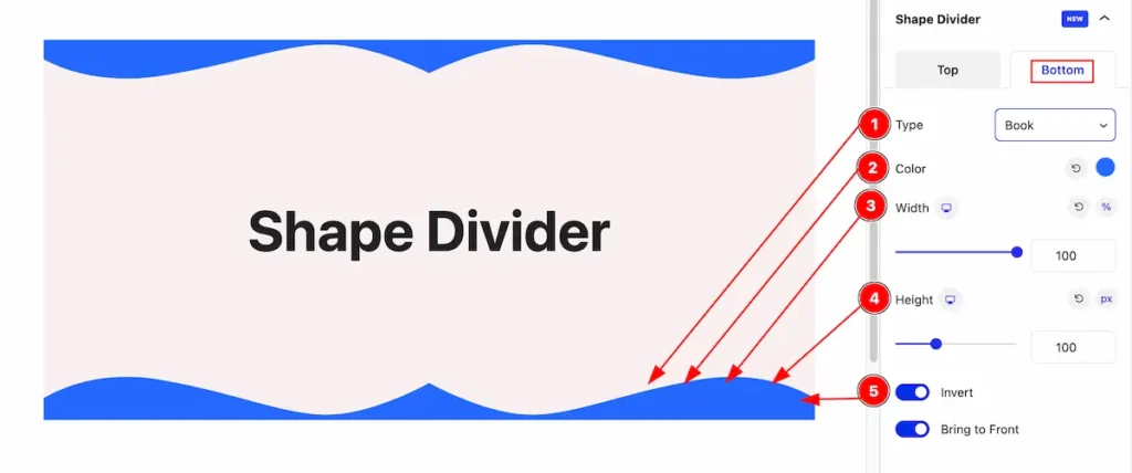
- Type: Select the type Arrow.
- Color: Select the color for arrow.
- Width: Set the width for the arrow.
- Height: Set the height for it.
- Invert: Enable the switcher to invert it.
Type: Clouds
Top
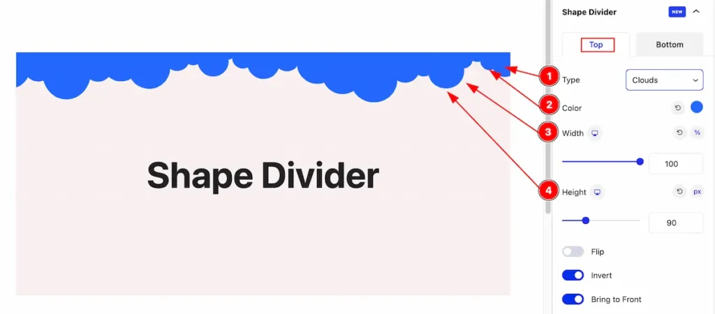
- Type: Select the type Clouds.
- Color: Select the color for clouds.
- Width: Set the width for the clouds.
- Height: Set the height for it.
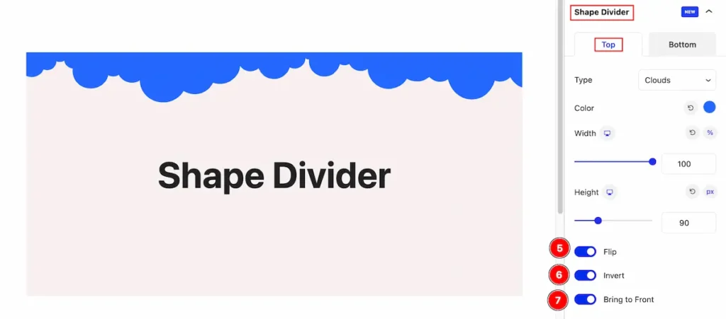
- Flip: Enable the switcher to flip the clouds.
- Invert: Enable the switcher to invert it.
- Bring to Front: Enable the switcher to bring it front.
Type: Triangle
Top
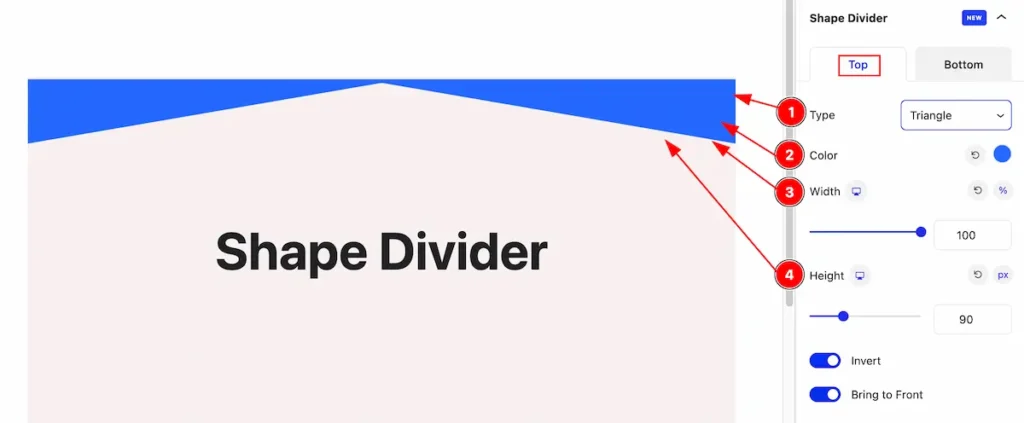
- Type: Select the type Triangle.
- Color: Select the color for triangle.
- Width: Set the width for the triangle.
- Height: Set the height for it.
Bottom
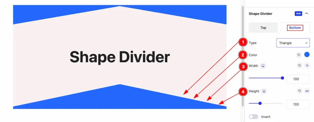
- Type: Select the type Triangle.
- Color: Select the color for Triangle.
- Width: Set the width for the Triangle.
- Height: Set the height for it.
Type: Waves
Top
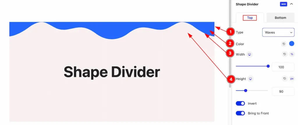
- Type: Select the type Waves.
- Color: Select the color for waves.
- Width: Set the width for the waves.
- Height: Set the height for it.
Bottom
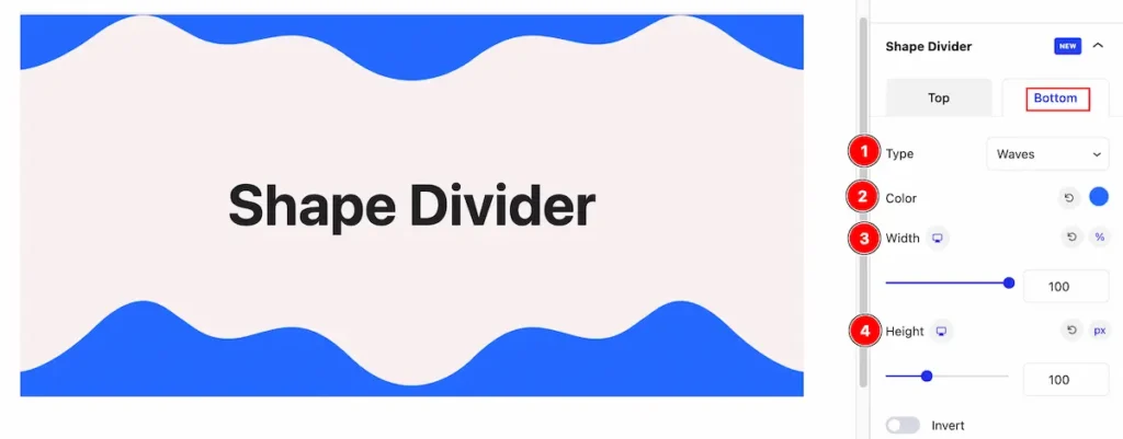
- Type: Select the type waves.
- Color: Select the color for waves.
- Width: Set the width for the waves.
- Height: Set the height for it.
By following these instructions, you can use the Shape Divider extension to transform a regular container into a stunning design.
Video Assist
The Video help you to learn more about the block. Please visit the demo page for examples.
Thanks for being with us.