This documentation provides comprehensive insights into the Post Tab Block developed by Zoloblocks.
Adding a block to the editor

- Click the Toggle Block Inserter icon and a sidebar will appear on the left side, All the blocks will be visible here.
- Search by the Post Tab block name.
- Then select the appear blocks ( with zoloblocks logo T.R corner).
- After Drag and Drop it on the page.
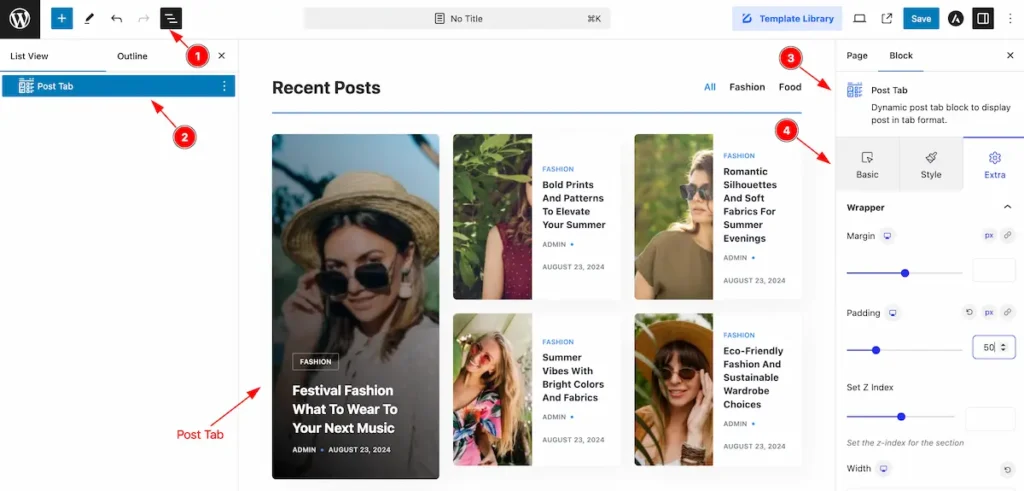
After Inserting the blocks, Follow this.
- Click on the Document Overviewer button and the Blocks list view will appear.
- Here appears the Post Tab block.
- After on the right side, Click on the Block. Then the Post Tab details appear.
- Here shows all the control tabs( Basic, Style, Extra ) of a block.
Basic Tab
The Basic tab controller displayed here offers the flexibility to adjust the layout of blocks according to your preferences.
General Section
Go to Basic > General
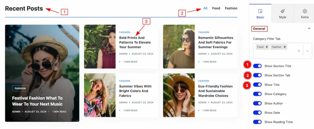
Make the post tabs by following,
- Show Section Title: Enable the switcher to show the title.
- Show Section Tab: Enable the switcher to show the section tab.
- Show Title: Enable the switcher to show the title.
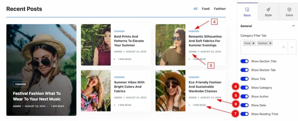
- Show Category: Enable the switcher to show the category.
- Show Author: Enable the switcher to show the author.
- Show Date: Enable the switcher to show the date.
- Show Reading Time: Enable the switcher to show the reading time.
Content Section
Go to Basic > Content
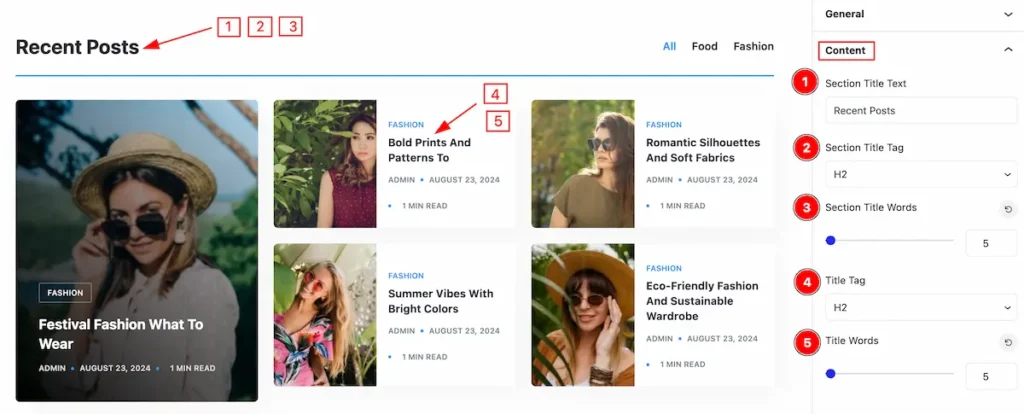
Make the content section stylish by following,
- Section Title Text: Set the content for the title.
- Section Title Tag: Set any HTML Tag for Title ( H1, H2, H3, H4, H5, H6, p, span ). The title tag is essential for both user experience and search engine optimization (SEO).
- Section Title Words: Set limit for the section title words.
- Title Tag: Set any HTML Tag for Title ( H1, H2, H3, H4, H5, H6, p, span ). The title tag is essential for both user experience and search engine optimization (SEO).
- Title Words: Set limit for the title words.
Query Section
Go to Basic > Query
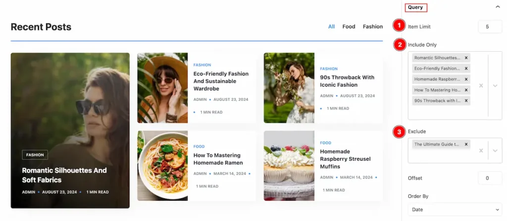
Set query for the post tab,
- Item Limit: Set the item limit for post tabs. It display the limited item only.
- Include Only: Select included post to show only.
- Exclude: Exclude the post to prevent from displaying.
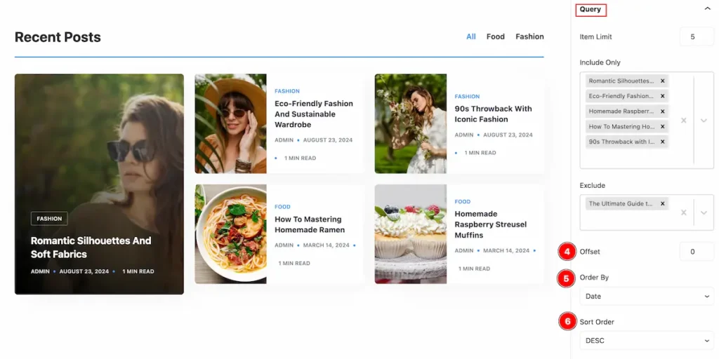
- Offset: Set offset for the post tabs.
- Order By: Set query order by (e.g.: Date,Author, Title..).
- Sort Order: Set sort order by ( DESC, ASC).
Style Tab
Provide the controller to make the visual appearance or presentation of the tabs. This includes aspects visually appealing and cohesive with the overall design of the interface.
Tab Section
Go to Style > Tab
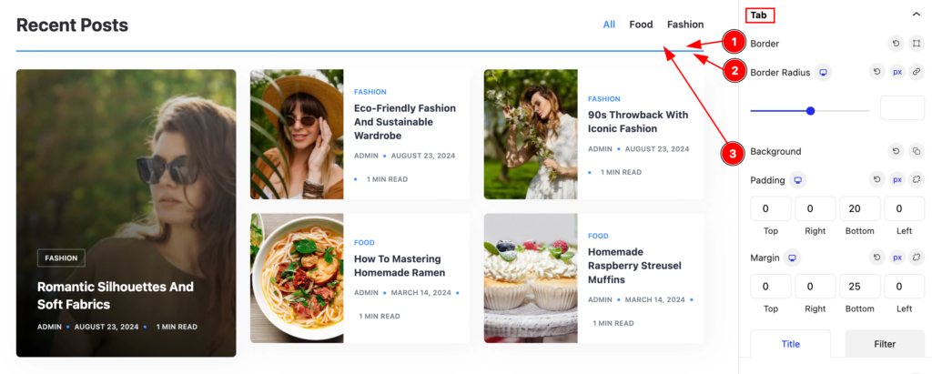
Make the tab section stylish by following,
- Border: Set the border for the tab.
- Border Radius: Set the border radius.
- Background: Set the background for the border.
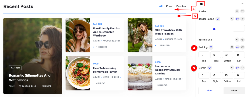
- Padding: Set padding for the tab.
- Margin: Set margin for the tab.
Title
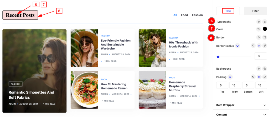
- Typography: Set the typography for the title.
- Color: Set color for it.
- Border: Set the border.
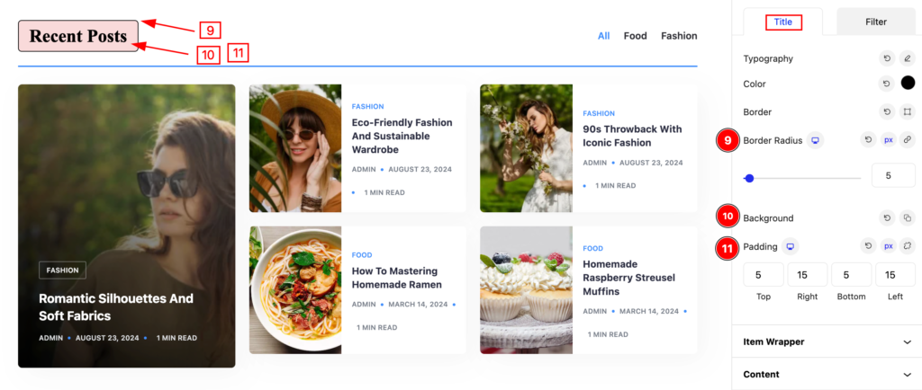
- Border Radius: Set the radius for the border.
- Background: Set the background.
- Padding: Set the padding for the title.
Filter
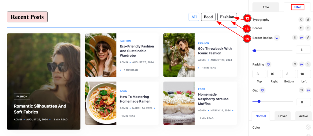
- Typography: Set the typography for the filter section.
- Border: Set the border for the it.
- Border Radius: Make the border radius.
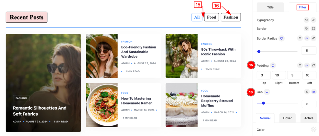
- Padding: Set the padding for the filter.
- Gap: Set the gap between the filters.
Normal State for Filter
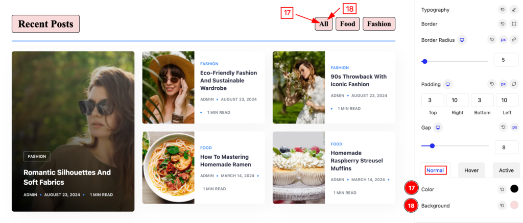
The changes will appear on the normal state,
- Color: Set the color for the filter tab.
- Background: Set the background.
Hover State for Filter
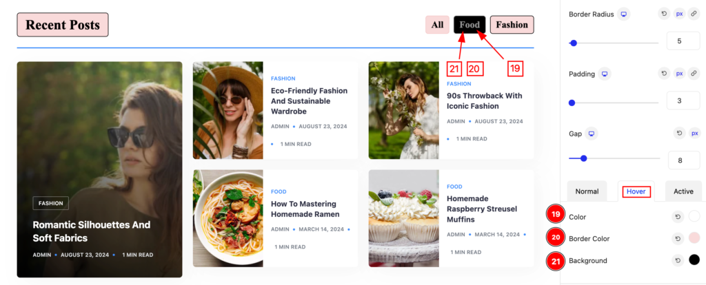
The changes will appear on mouse hover.
- Color: Set the color for the filter
- Border Color: Set the border.
- Background: Set the background.
Active state for Filter
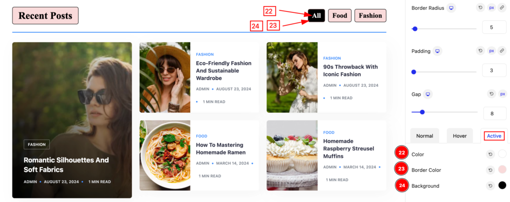
The changes will appear on the active state of the filter.
- Color: Set the color for the filter
- Border Color: Set the border color.
- Background: Set the background.
Item Wrapper Section
Go to Style > Item Wrapper
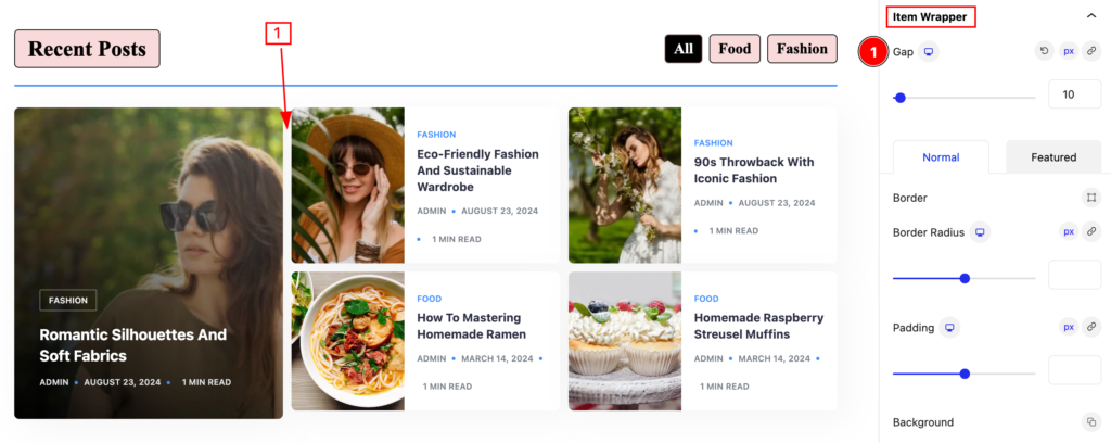
Make the item wrapper stylish by following,
- Gap: Set the gap between the items.
Normal Item Wrapper
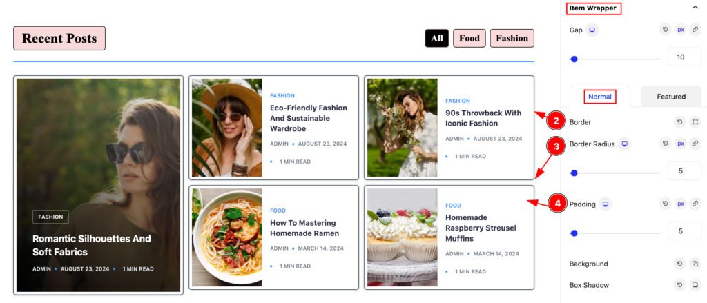
The changes will appear for the normal items,
- Border: Set the border for the item wrapper.
- Border Radius: Make the border radius.
- Padding: Set the padding for the items.
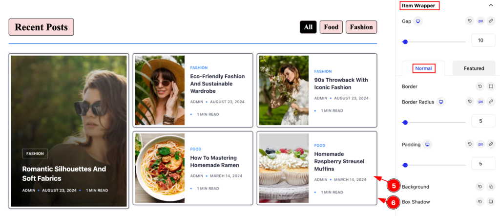
- Background: Set the background for the items.
- Box Shadow: Make the box shadow for it.
Featured Item Wrapper
The changes will appear for the featured item,
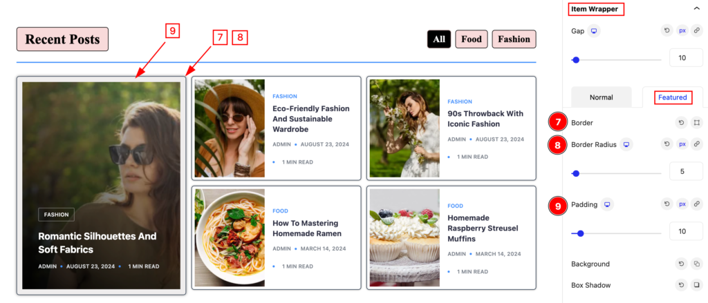
- Border: Set the border for the featured item.
- Border Radius: Set the radius for the border.
- Padding: Set the padding for the features.
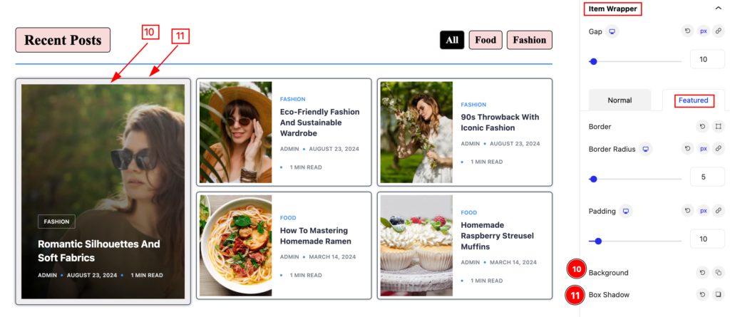
- Background: Set the background for the featured.
- Box Shadow: Make shadow for the box.
Content Section
Go to Style > Content
Normal
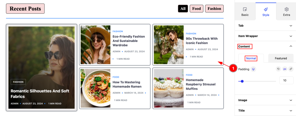
- Padding: Set the padding for the items.
Featured
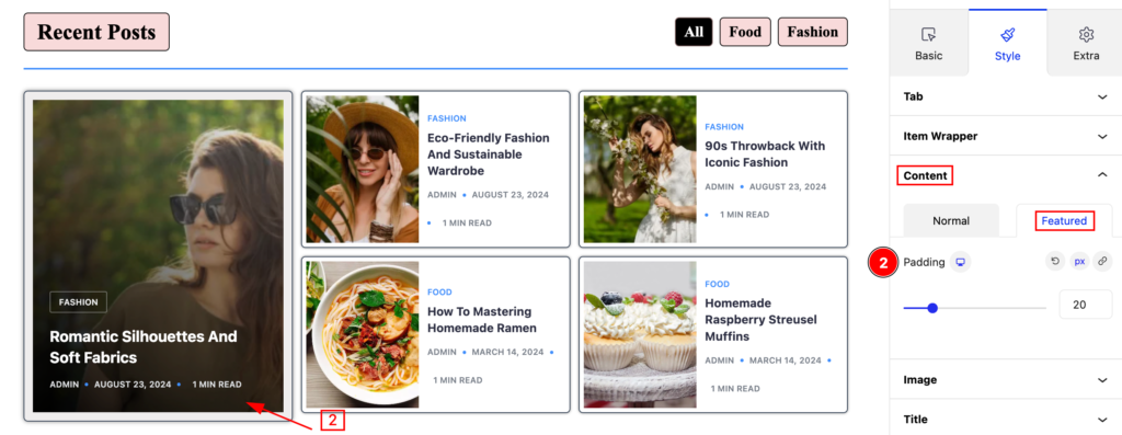
- Padding: Set the padding for the Featured.
Image Section
Go to Style > Image
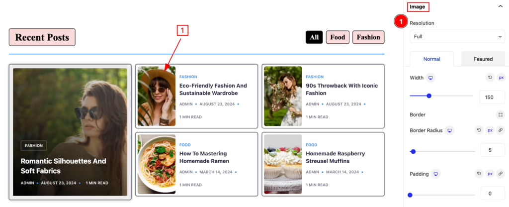
Make the images interactive by following,
- Resolution: Set the resolution for the image.
Normal Image
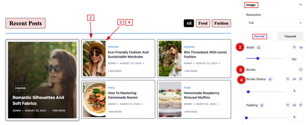
The changes will appear for the normal images,
- Width: Set the width for the image.
- Border: Set border for the image.
- Border Radius: Make the border radius.
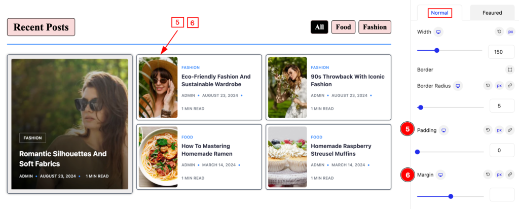
- Padding: Set the padding for the image.
- Margin: Set margin for the image.
Featured Image
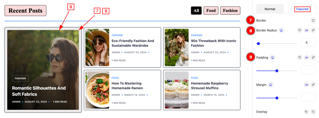
- Border: Set the border for the featured image.
- Border Radius: Set the border radius.
- Padding: Set the padding for the featured item.
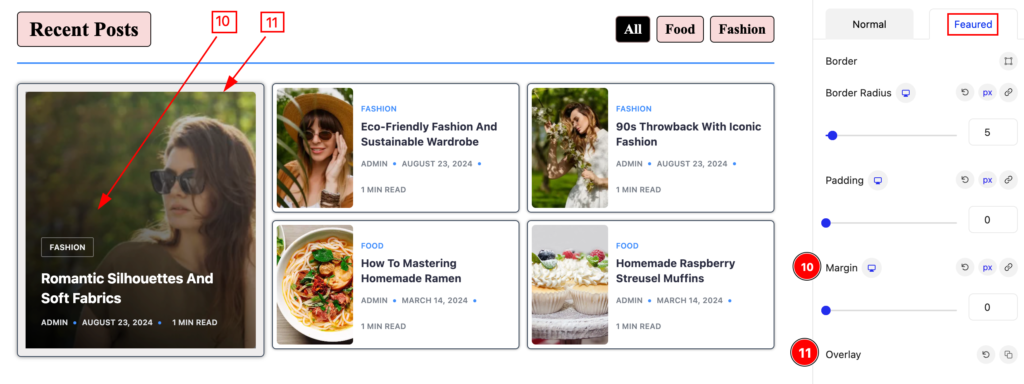
- Margin: Set the margin for the featured image.
- Overlay: Set the overlay.
Title Section
Go to Style > Title
Normal
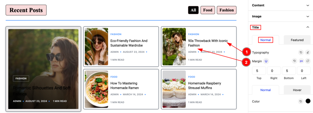
- Typography: Set the typography for the title.
- Margin: Set the margin for the title.
Normal Normal
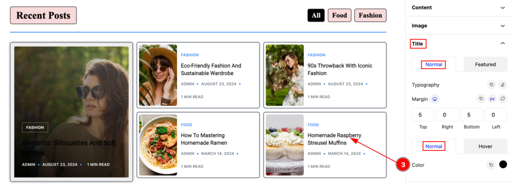
- Color: Set the color for the normal title.
Normal Hover
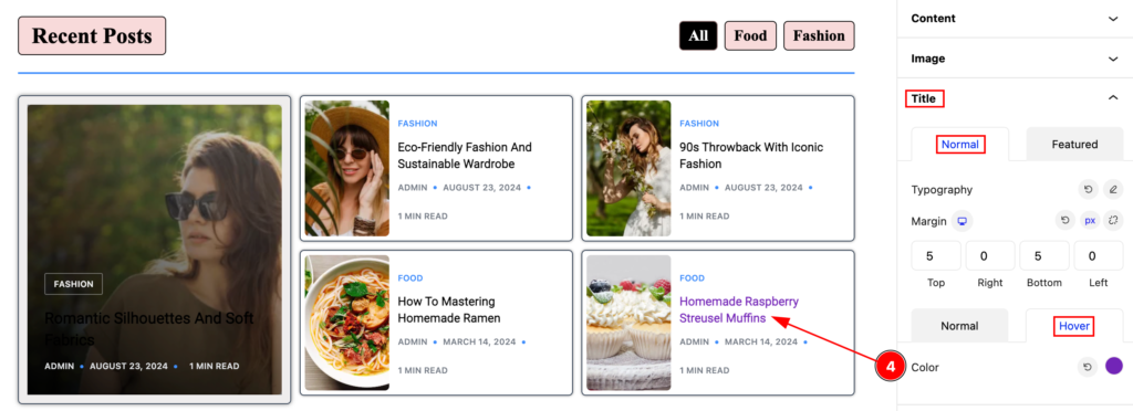
- Color: Set the color for the title hover.
Featured
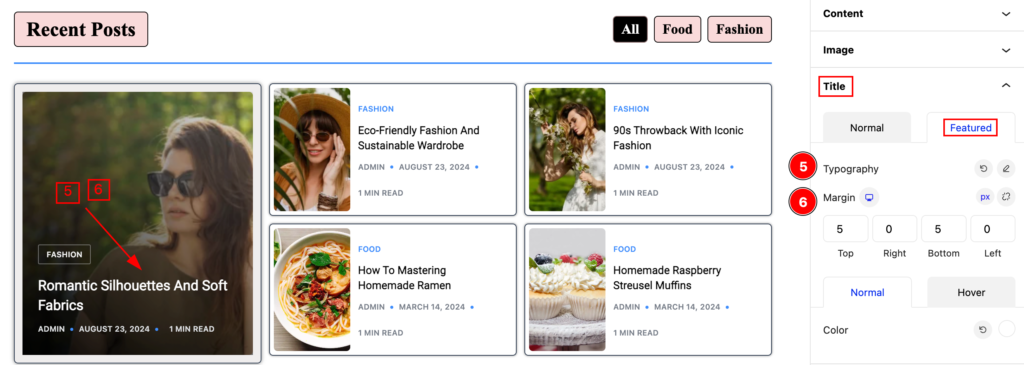
- Typography: Set the typography for the featured title.
- Margin: Set margin for it.
Featured Normal
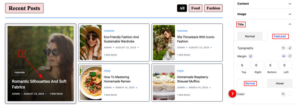
- Color: Set the color for the featured item.
Featured Hover
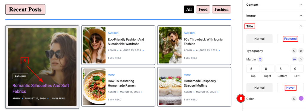
- Color: Set the featured hover color.
Meta Section
Go to Style > Meta
Normal
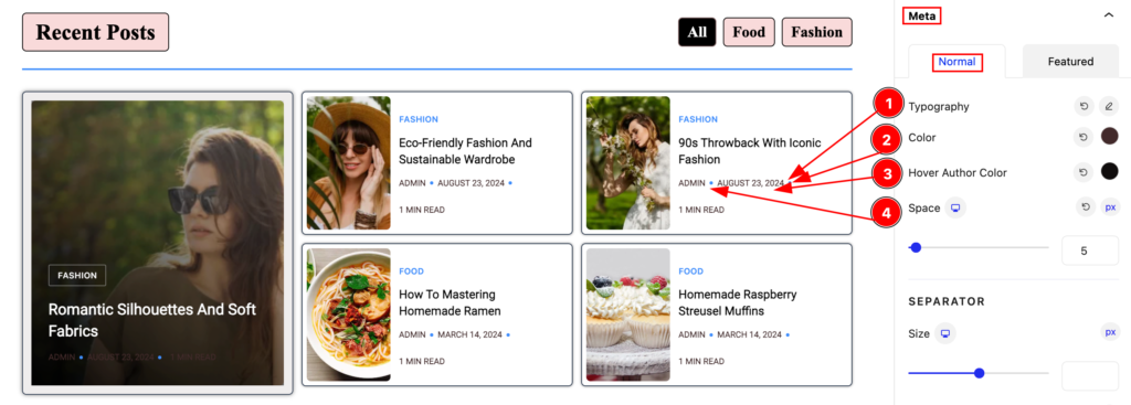
Make stylish for the meta section,
- Typography: Set the typography for the meta.
- Color: Set the color for the meta.
- Hover Author Color: Set the hover author color.
SEPARATOR
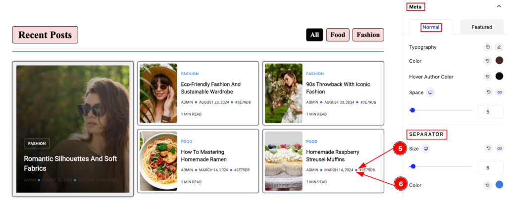
- Size: Set the size for the separator.
- Color: Set the color for the separator.
Featured
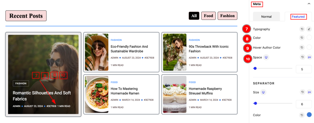
Set stylish for the featured,
- Typography: Set the typography for the meta.
- Color: Set the color.
- Hover Author Color: Set the hover color.
- Space: Make the space.
Category Section
Go to Style > Category
Normal
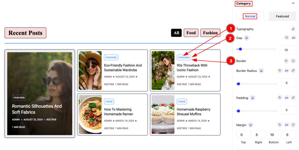
- Typography: Set the typography for the category.
- Gap: Set the gap.
- Border: Set the border type.
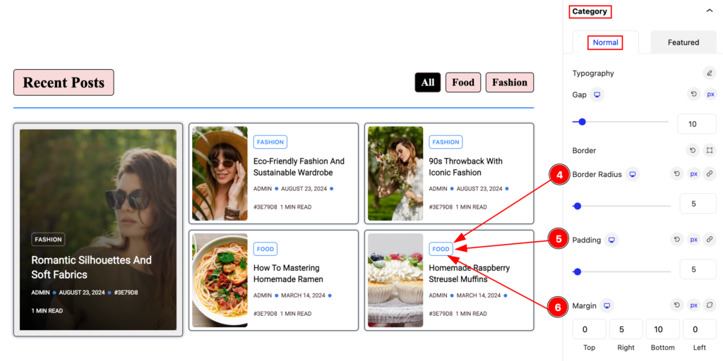
- Border Radius: Set the border radius for the category.
- Padding: Set the padding.
- Margin: Set the margin.
Normal Normal
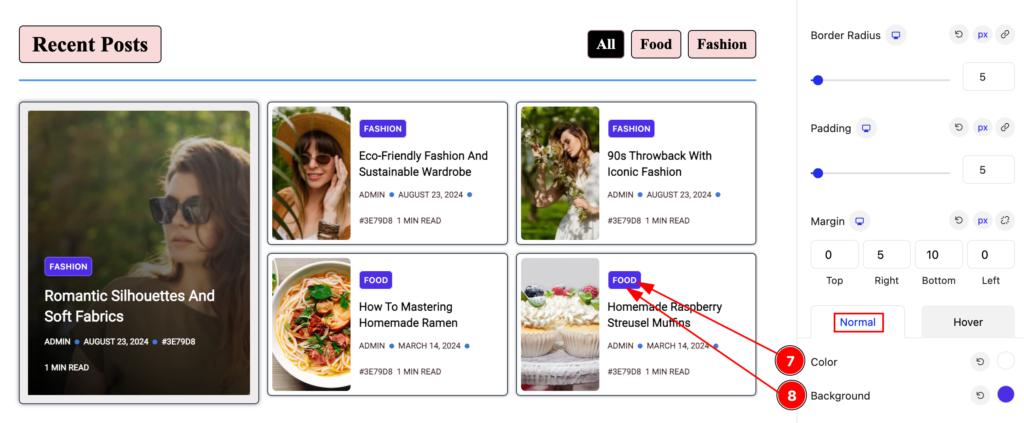
- Color: Set the color for the normal normal.
- Background: Set the background color for category.
Normal Hover
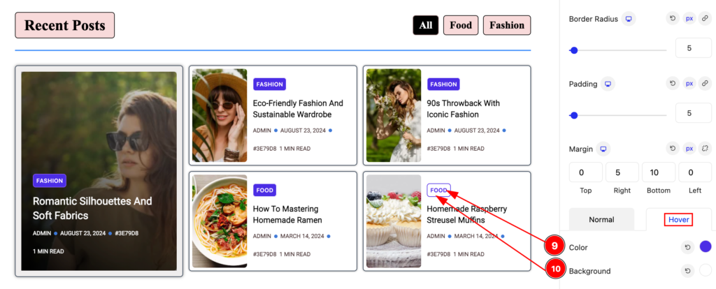
- Color: Set the color for the featured.
- Background: Set the background color.
Featured
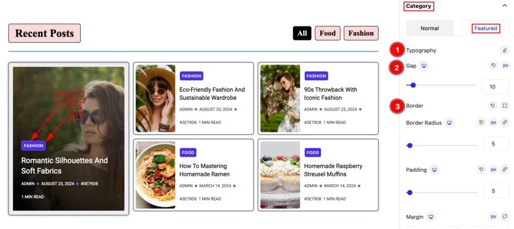
Make the featured category stylish by following,
- Typography: Set the typography for the category.
- Gap: Set the gap.
- Border: Set the border type.
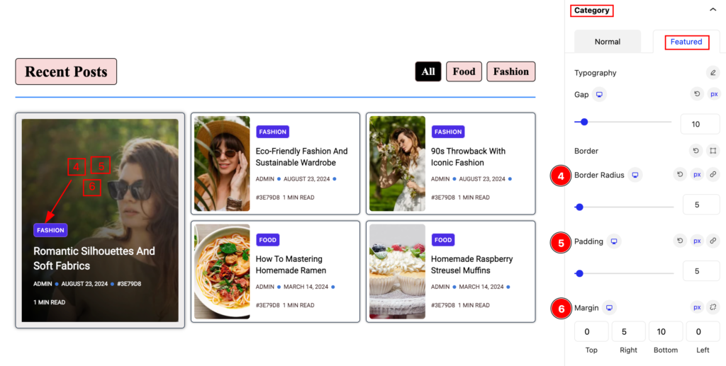
- Border Radius: Set the border radius.
- Padding: Set the padding.
- Margin: Set the margin for the category.
Featured Normal
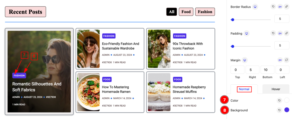
- Color: Set the color for the featured.
- Background: Set the background color.
Featured Hover
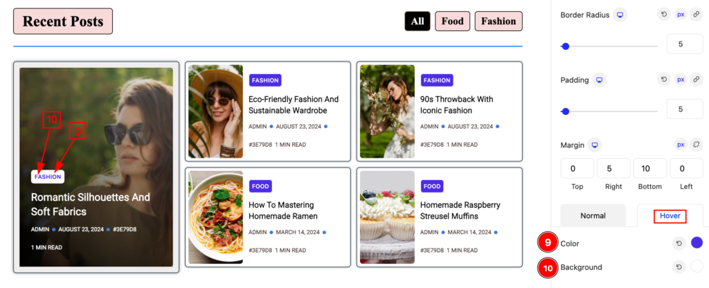
- Color: Set the featured color.
- Background: Set the background color.
Video Assist
Please check the video to learn about the Post Tab Block, Please visit the demo page for examples.
Thanks for staying with us.
