This documentation provides comprehensive insights into the Popup Builder developed by Zoloblocks.
Activate the Popup Builder
Go to Dashboard Zoloblock > Popup Builder
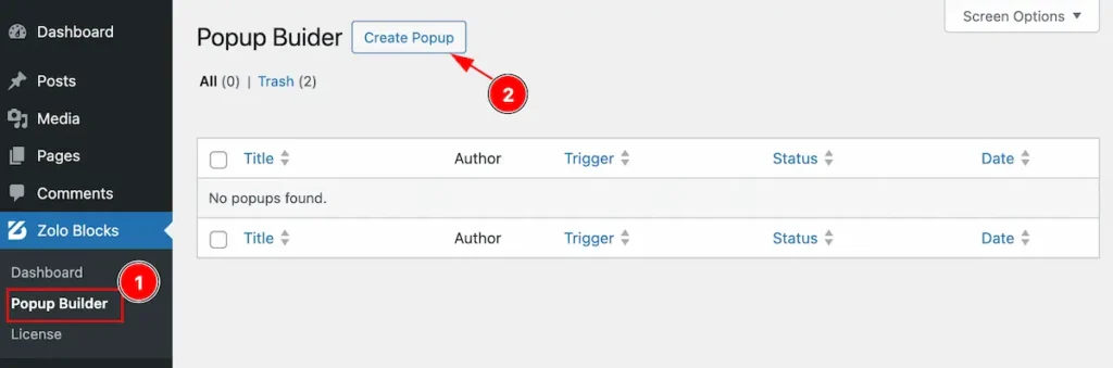
- Popup Builder: Go to Zoloblocks Dashboard and select the Popup builder tab.
- Create Popup: Click on the Create popup button to create new popup builder.
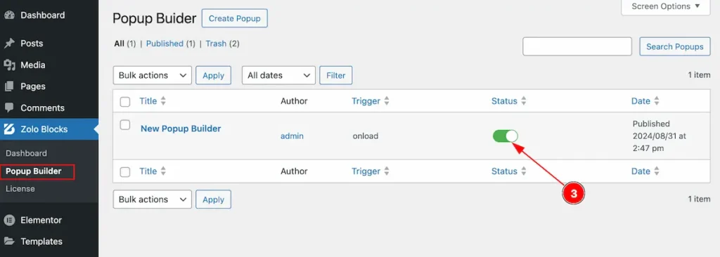
After creating the popup, It will appear on the list.
- Enable the switcher to show the popup builder on the page.
Select Popup Builder and Controls
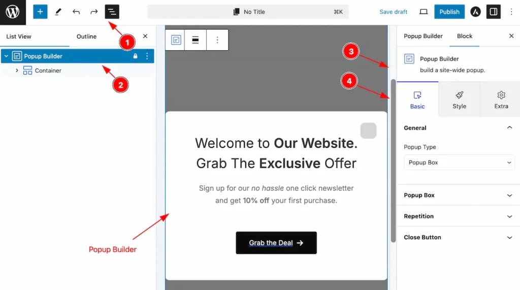
- Click on the Document Overviewer button and the Blocks list view will appear.
- Here appears the Popup Builder block.
- After on the right side, Click on the Block. Then the Popup Builder details appear.
- Here shows all the control tabs( Basic, Style, Extra ) of a block.
Basic Tab
The Basic tab controller displayed here offers the flexibility to adjust the layout of blocks according to your preferences.
General Section
Go to Basic > General
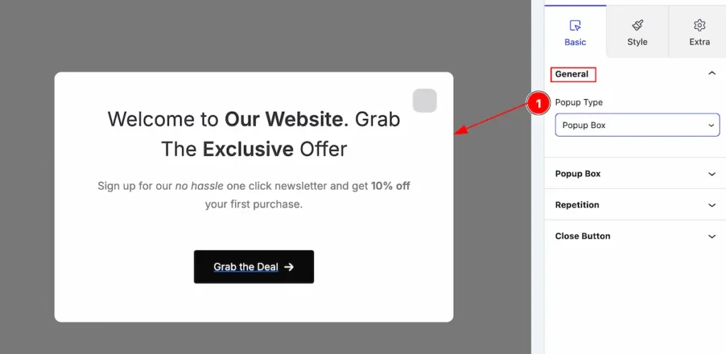
- Popup Type: Select the type (e.g.: Popup Box, Info Bar).
Popup Box Section
Go to Basic > Popup box
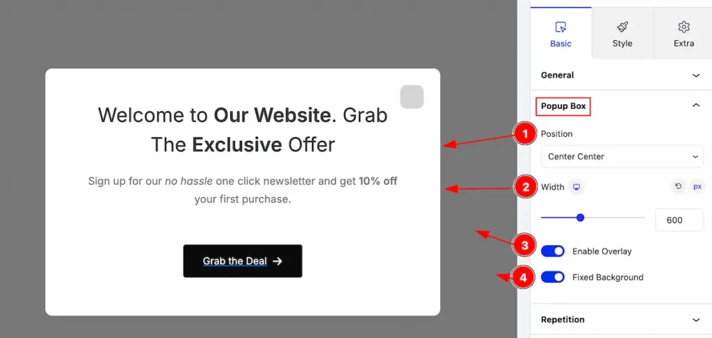
Make the popup controls by following,
- Position: Set the position for the pop box.
- Width: Set the width for it.
- Enable Overlay: Enable the switcher to show the popup box.
- Fixed Background: Enable the swithce to fixed the background.
Repetition Section
Go to Basic > Repetition
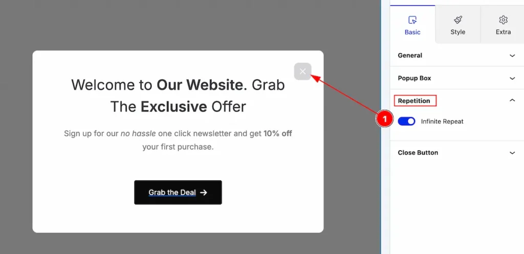
- Infinite Repeat: Enable the switcher to enable the popup builder repetition.
Close Button Section
Go to Basic > Close Button
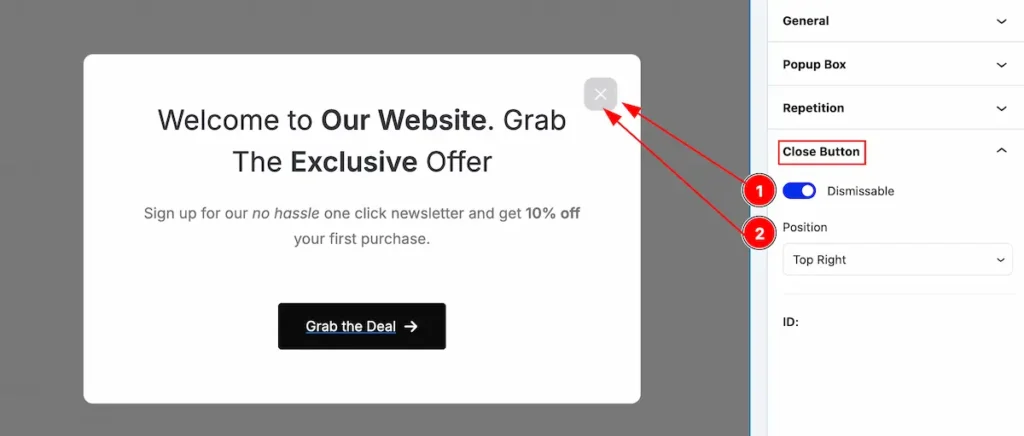
Follow this to show the close button,
- Dismissable: Enable the switcher to show the close button.
- Position: Set the position for the button.
Style Tab
Provide the controller to make the visual appearance or presentation of the tabs. This includes aspects visually appealing and cohesive with the overall design of the interface.
Popup Box Section
Go to Style > Popup Box
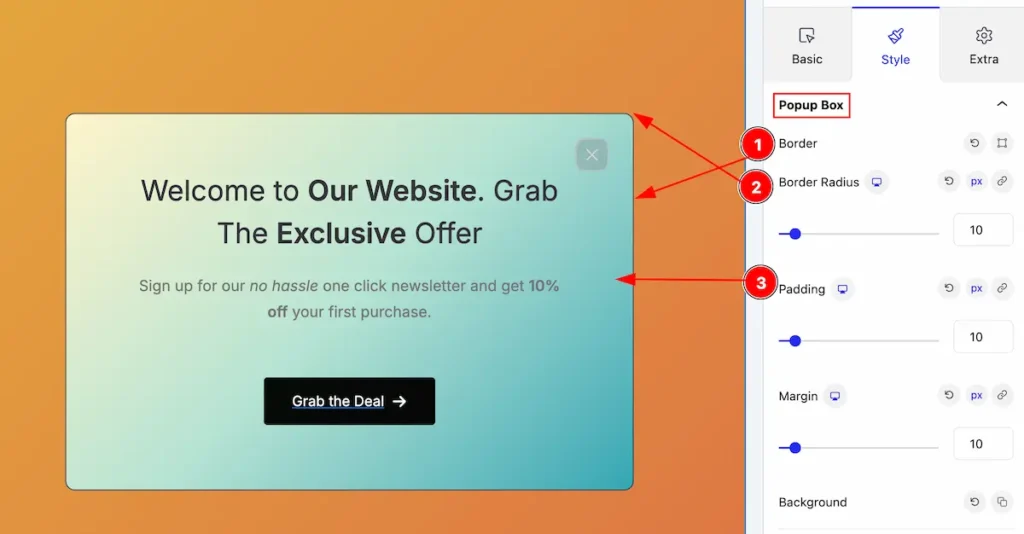
Enhance the popup box with a chic and modern design.
- Border: Enable the switcher to show the border.
- Border Radius: Make the border radius.
- Padding: Set the padding for it.
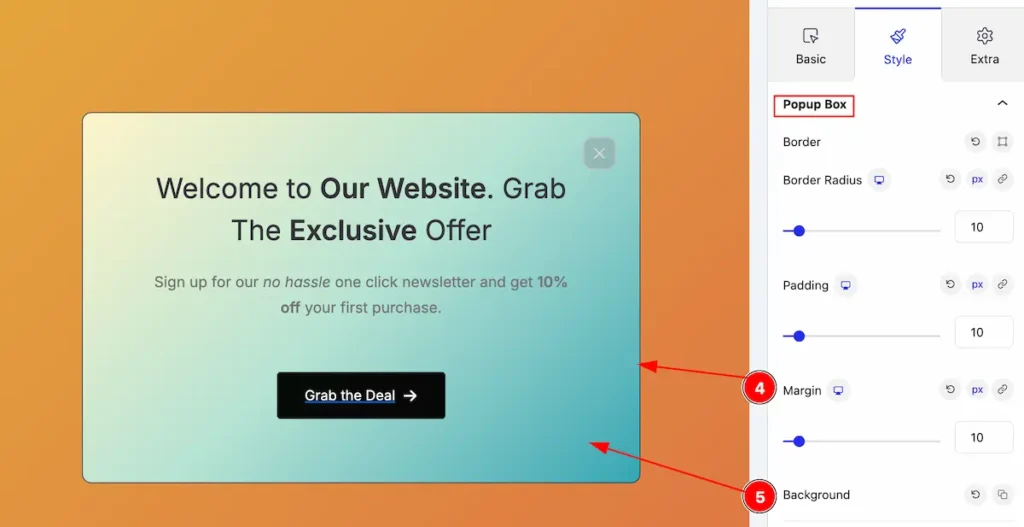
- Margin: Set the margin for it.
- Background: Set the background for the popup box.
POPUP OVERLAY
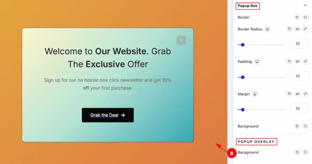
- Background: Set the background for the overlay.
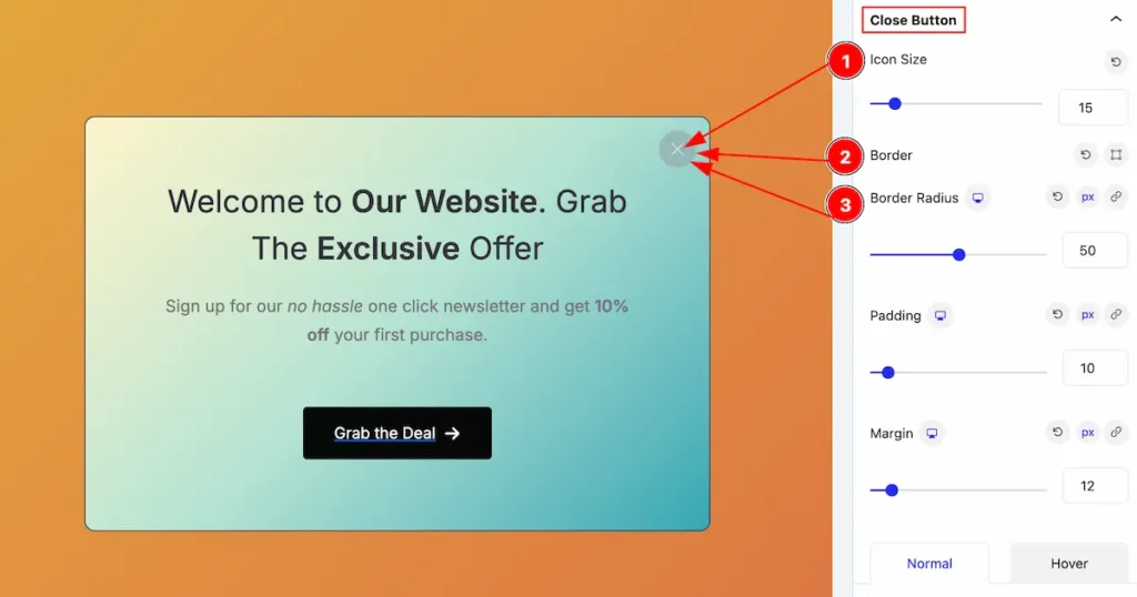
Close Button Section
Go to Style > Close Button
Enhance the Close button with a chic and modern design.
- Icon Size: Set the size for the button icon.
- Border: Set the border of it.
- Border Radius: Make the border radius.
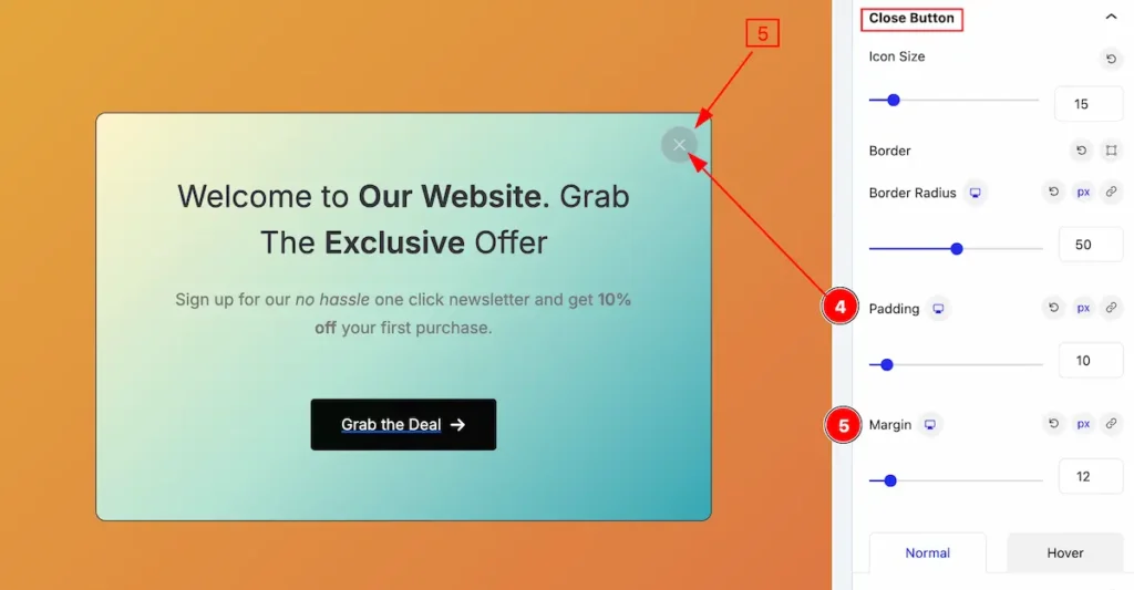
- Padding: Set the padding for the button.
- Margin: Set margin for it.
Normal State for Close Button
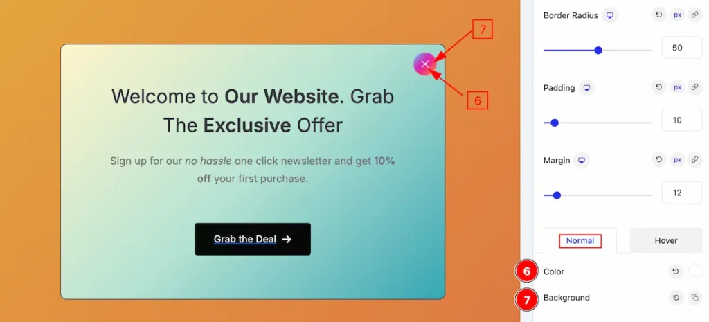
- Color: Set the color for the close button.
- Background: Set the background.
Hover State for Close Button
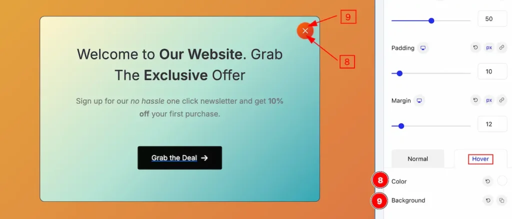
The changes will appear on mouse hover,
- Color: Set the color for the close button.
- Background: Set the background.
Add blocks on the Popup Builder
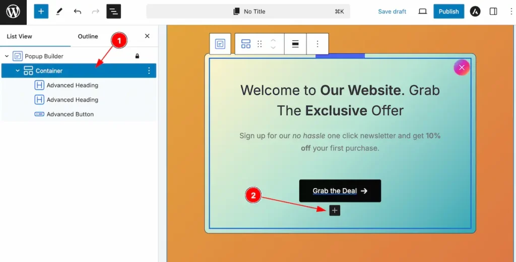
- Select the container to add blocks for the popup builder.
- Click ont he “ + ” icon to add new block.
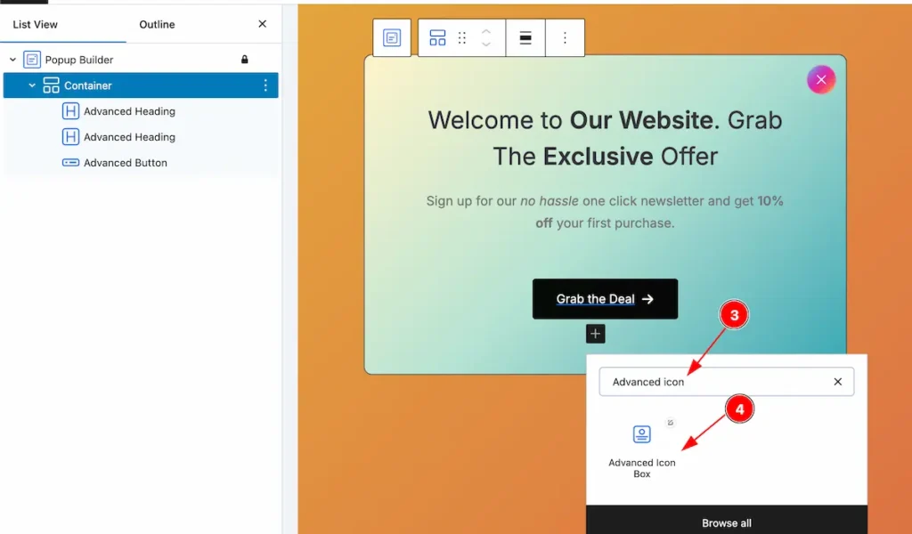
- Search by the ” blocks ” name.
- The searched appear on the block.
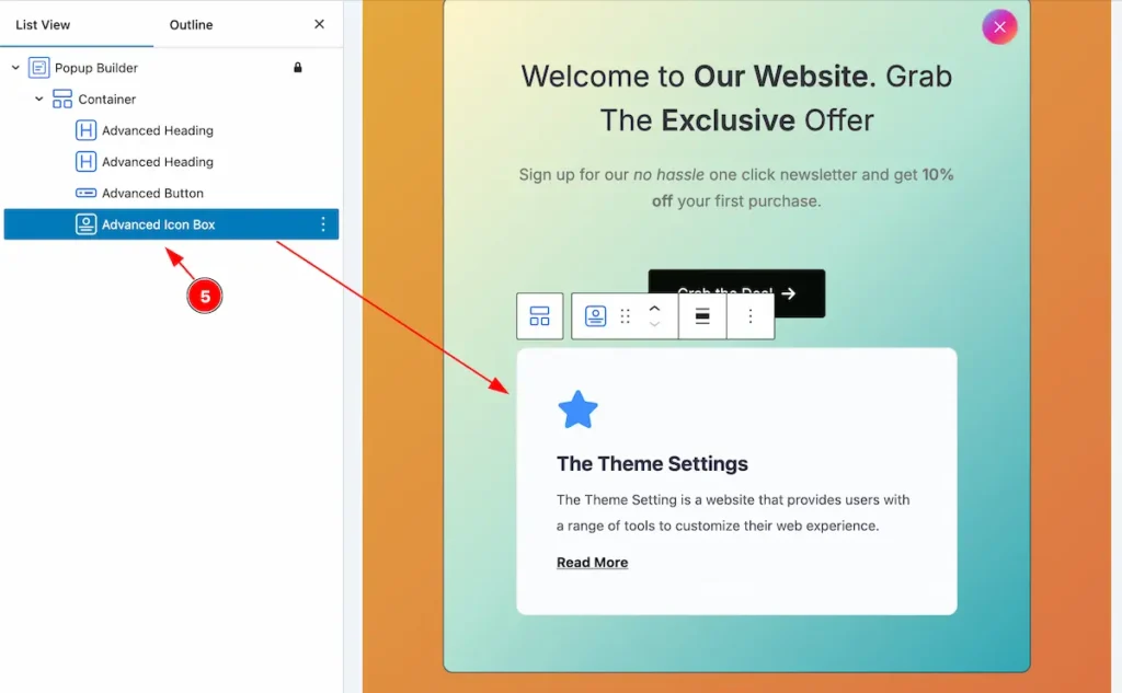
- After added the icon it appear on the popup builder.
By following this it will appear on the popup builder.
Video Assist
You can also watch the video tutorial Learn more about the Popup Builder Block. Please visit the demo page for examples.
Thanks for being with us.