This documentation provides comprehensive insights into the Entrance Animation Extension developed by Zoloblocks.
Activate the Shape Divider Extension
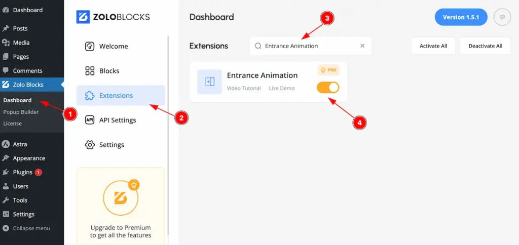
On WordPress Dashboard Navigate to ZoloBlocks from the sidebar menu.
- Select the Dashboard option under ZoloBlocks.
- Go to the Extension tab.
- Use the search bar to search for “Entrance Animation”
- Click Enable to activate the Entrance Animation extension.
Where to Find the Extension
Select Container/Blocks and go to Extra Tab
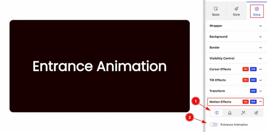
- Find the ” Motion Effects ” section and select the Icon.
- Entrance animation is disabled by default.
Entrance Animation
Entrance Animation refers to the effect applied to elements when they first appear on a webpage, creating smooth and engaging transitions. These animations make the content visually appealing and help grab users’ attention.
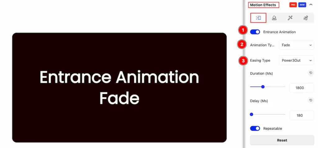
- Entrance Animation: Enable the switcher and all the options will visible.
- Animation Type: Set the animation type for the animation ( e.g.: Fade, Top, Right, Left, etc. ).
- Easing Type: Set easing type (e.g.: Power3Out, Ciric, Expo, Sine, Back, etc. ).
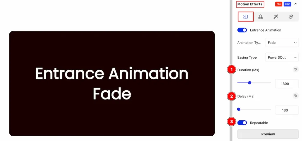
- Duration(Ms): Set duration for the animation.
- Delay(Ms): Set the delay response for the animation.
- Repeatable: Enable the feature to repeat.
Animation Type: Custom
Custom animation allows you to create unique, tailored motion effects beyond predefined ones. It gives complete control over the animation properties such as translate, rotate, skew, scale.
Translate
The translate property allows you to move an element along the X, Y, or Z axis without affecting the surrounding elements.
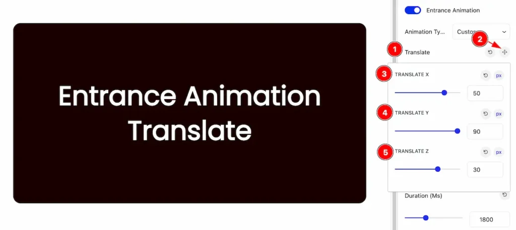
- Translate: Select the translate.
- Click on the ” compass rose ” icon and it will appear a pop up.
- TRANSLATE X: Set the position to x, it direct to vertical axis.
- TRANSLATE Y: Set the position to y, it direct to horizontal axis.
- TRANSLATE Z: Set the position to z for setting position in 3D.
Rotate
Rotates an element around a fixed point (usually its center) on a 2D or 3D plane.
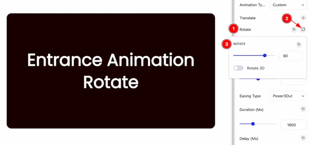
- Select the Rotate.
- Click on the ” Rotate ” icon and popup will appear.
- Rotate: Set the rotate position in number.
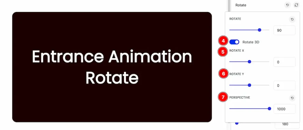
- Rotate 3D: Enable the switcher and it will appear new options.
- ROTATE X: Set position in horizontally.
- ROTATE Y: Set position in vertically.
- PERSPECTIVE: Set the perspective for the rotating.
Scale
The scale property allows you to change the size of elements.
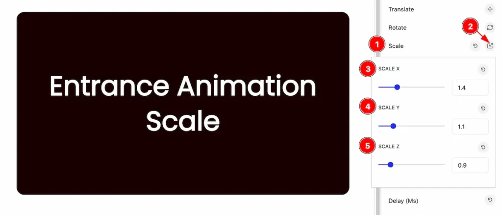
- Select the Scale.
- Click on the ” Scale ” icon and a popup will appear.
- SCALE X: Set the scale in vertically.
- SCALE Y: Set the scale in horizontally.
- SCALE Z: Set the scale in 3D position.
Skew
The skew transformation allows to tilt an element along the X and/or Y axes, creating a slanted appearance.
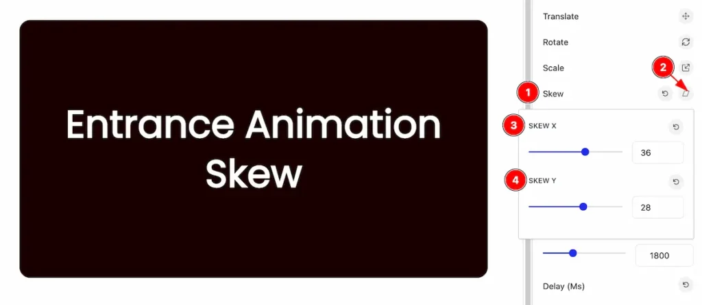
- Select the Skew.
- Click on the ” Skew ” icon on the right and a popup will appear.
- SKEW X: Set the skew horizontally.
- SKEW Y: Set the skew vertically.
Opacity
Opacity in CSS refers to the transparency level of an element. It determines how see-through an element is, with a range from 0 to 1.
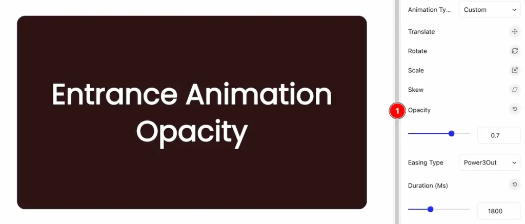
- Opacity: Set the opacity for the element.
By following these instructions, you can use the Entrance Animation extension for animation.
Video Assist
You can also watch the video tutorial Learn more about the Entrance Animation Extension. Please visit the demo page for examples.
Thanks for being with us.
