The Vertex Slider widget will be a unique addition to your blogging website by arranging the blog posts in a dynamic slider window that pops open to reveal the whole content upon clicking any post.
This documentation will help you familiarize yourself with the slider widget.
Inserting the Vertex Slider widget by Prime Slider

You can add the Vertex slider widget to WordPress by opening the page you want to use it on in Elementor and then dragging and dropping the Vertex slider into that page. Please note that you need both Elementor and Prime Slider installed before you can use this widget.
Introduction of Content Tab
The content tab is the foundation for your widget, much like a frame of a house. Using the content tab, you’ll be able to make a layout of a particular part (Vertex slider) of a website.
Layout Section Customizations
Go to Content > Layout.
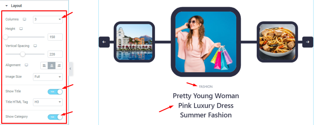
Here, you can set the number of Columns between 1, 3, and 5. The Height option lets you change the item height for all sliders on the display. You can adjust Vertical Spacing, Alignment, and Image Size for the Vertex slider as your need.
The Show Title and Show Category Switchers let you show/hide the title and category info on the screen.
Query Section Customizations
Go to Content > Query.
Step-1
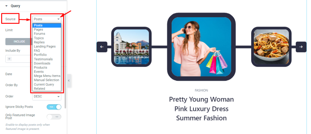
Here you can easily select the Source of the displayed item from the list as you want.
Step-2
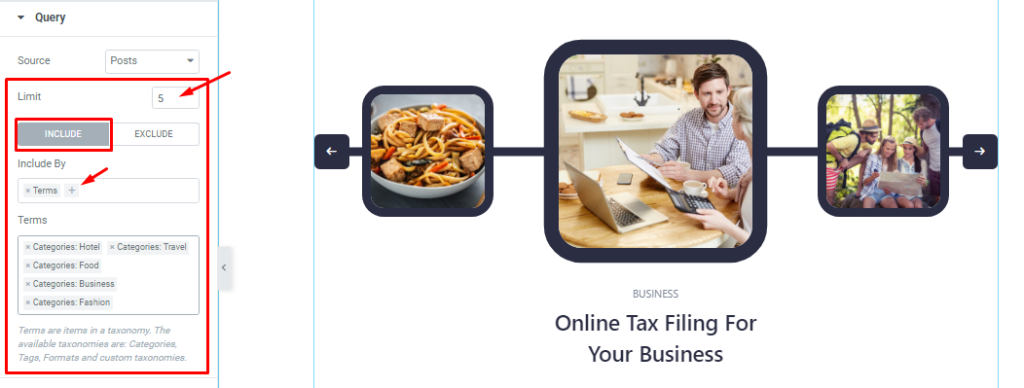
You can set your post Limit which will determine how many items will stay in the query. The Include filter lets you show only certain posts (i.e. by category, author, tags, individual posts, etc.) on the display.
Step-3
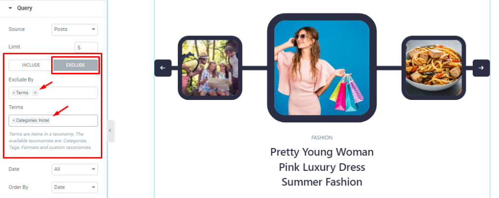
The Exclude filter works exactly in the opposite way from the Include filter.
Step-4
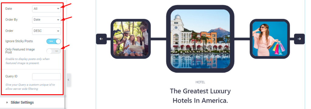
The Date, Order By, and Order options are for sorting the sequence in which order the items will be displayed. Here, the two switcher options (Ignore Sticky Posts, Only Featured Image Posts) let you exclude certain posts.
Lastly, you can set the Query ID that gives your Query a custom unique id to allow server-side filtering.
Slider Settings Customizations
Go to Content > Slider Settings
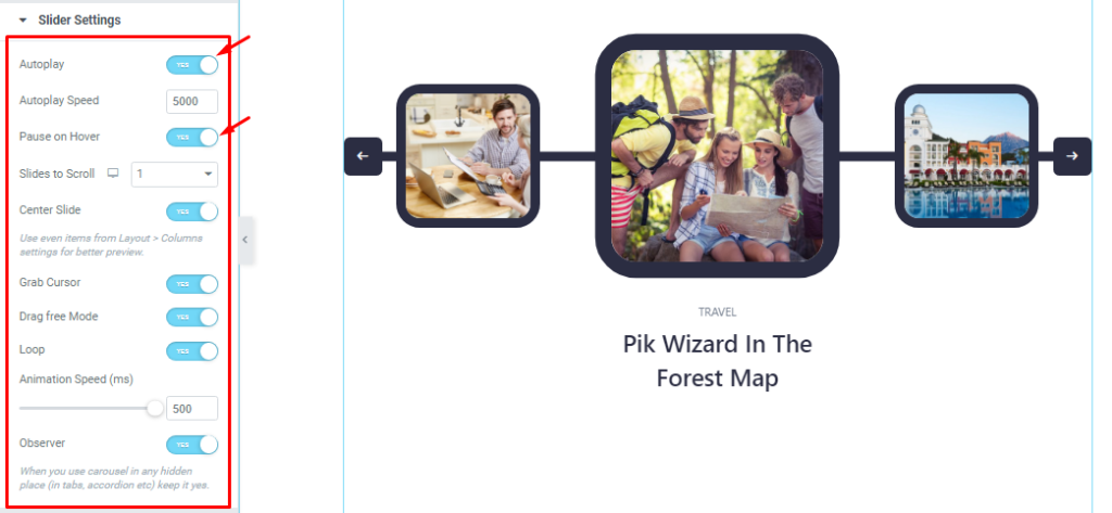
In this section, you will be able to see a bunch of Switchers like Auto Play, Auto Play speed, pause on Hover, Slides to Scroll, Center Slide, Grab Cursor, Drag free Mode, Loop, Animation Speed, and Observer.
What they do-
Autoplay switcher: If you Enable the Autoplay switcher button, your slider will slide into Autoplay mode, and you can set the Autoplay Speed as your wish.
Pause on Hover: If you activate the pause on Hover button, when visitors Hover the mouse cursor on the slider, then your slider will Hold, otherwise your slider slide Autoplay.
Slides to scroll: It represents how many slides will slide at once.
Center Slide: If you enable the Switcher option, then your Active slider will show the center (depending on your widget style).
Grab The Cursor: Your mouse pointer icon will be changed into a grab cursor. Visitors can slide your slider manually with your mouse cursor.
Drag Free Mode: In this mode, you can easily make it visible by Dragging your slider into the slide Area.
Loop: When you activate the Loop switcher button, your slider will loop at a certain time interval. You also set up the loop animation speed here.
Observer: If you enable the option then you are able to use the slider/carousel in any hidden places (such as in tabs, Accordion, etc).
Style tab for customizing widget interface Appearance
Now, let’s work with Style Tab. The tab will easily have you style the web content (text, image, video, etc.) of the page you require to design. Styling with the tab in Elementor will always give you a wonderful experience.
Let’s explore.
Customization of Sliders Section
Go to Style > Sliders.
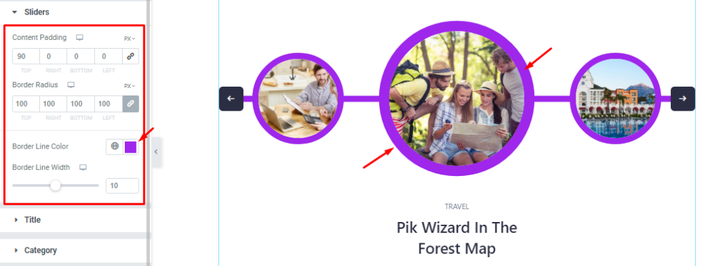
Here, you can customize the Content padding, Border Radius, Border Line Color, and Border Line Width options. With a maximum border radius, the slider items will turn into circular shapes.
Title Section Customizations
Go to Style >Title
Step-1
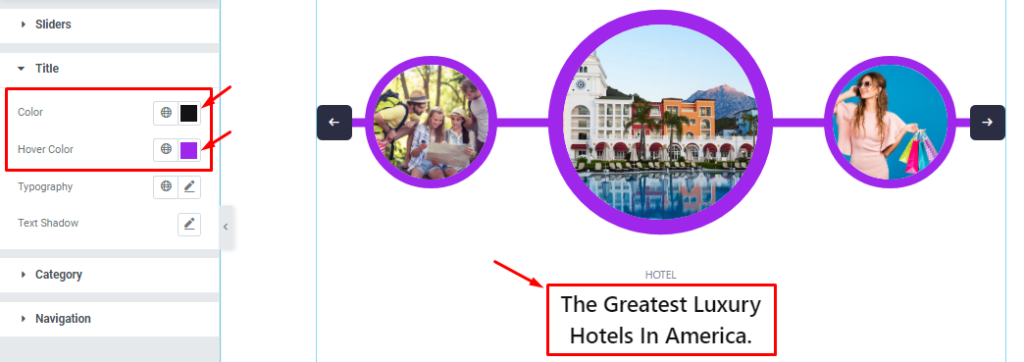
You can easily set the Title color and Title Hover color for the Vertex slider.
Step-2
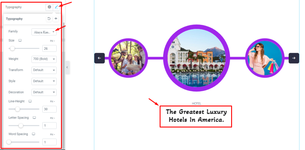
You can also customize The Typography (Font Family, Size, Weight, Transform, Style, decoration, Line Height, Letter Spacing, and Word Spacing) as your wish to decorate the title text font.
Step-3
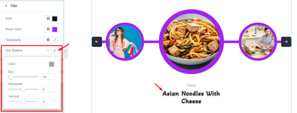
The Text Shadow (Color, Blur, Horizontal, Vertical) option lets you add a drop shadow to the texts and here you can create various shadow styles.
Category Section Customizations
Step-1
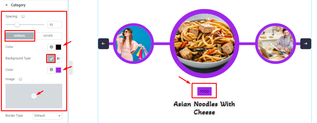
In this section, you will be able to adjust the Spacing between the title and category. The rest of the options are divided into two subsections; Normal and Hover.
In Normal mode, you can set the Category text color, Background color, and also set the Background image.
The Hover subsection offers the same type of modifications. Please try it yourself.
Step-2
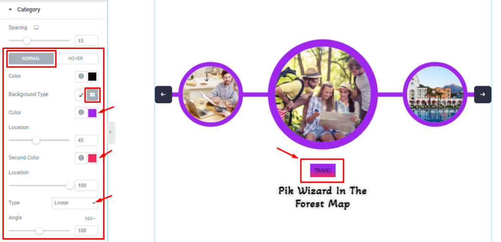
Additionally, you can also set the Background type to Gradient and configure the gradient colors, locations, type, and angle.
Step-3
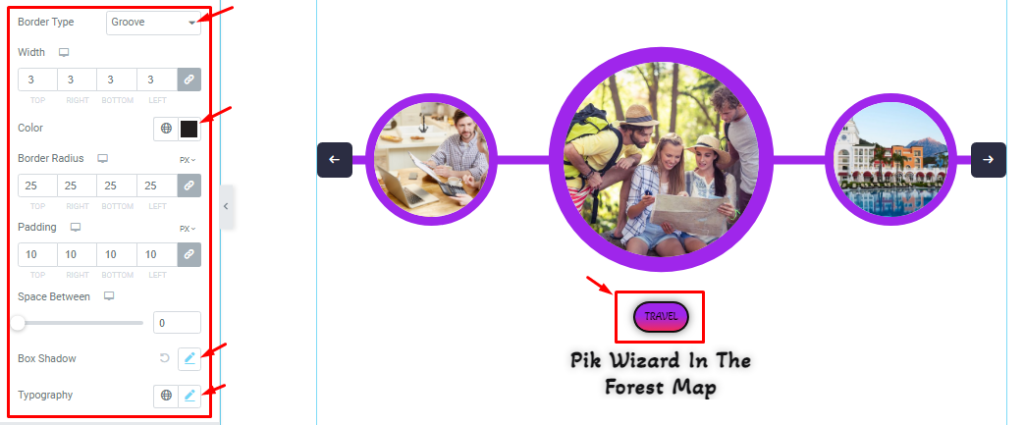
Below, you can configure the Border Type, Border Radius, Padding, Box Shadow, and Typography options.
Navigation Section Customization
Go to Style > Navigation.
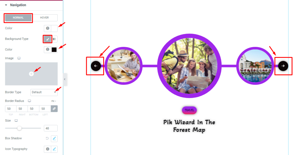
In this section, you can change the Navigation icon color, Background Type, Border Type, Border Radius, Padding, Box Shadow, and Icon Typography in Normal Mode.
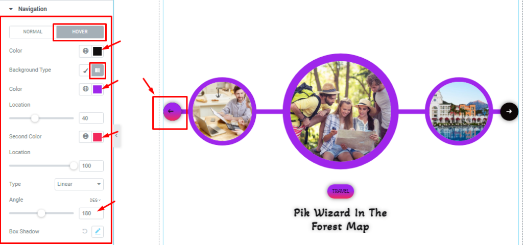
You can also change the Same things in Hover Mode.
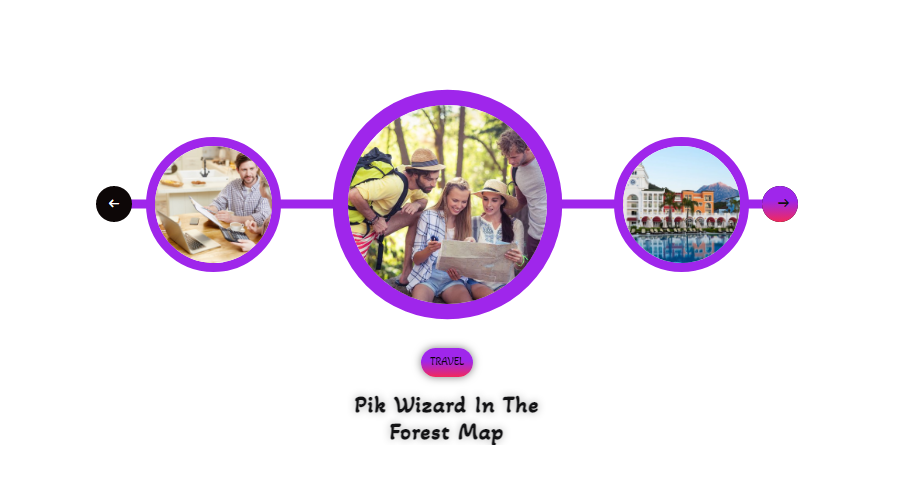
All done! You have successfully customized the Vertex Slider widget on your website. Following the guideline, you can create a beautiful slider interface like the picture above, by using the Vertex Slider widget.
Video Assist
You can watch this quick video to learn more about the Vertex Slider widget. To see the examples, please go to the demo page.
Thanks for staying with us.