
In this documentation, we will show you how to customize the Image Hotspot Widget by Ultimate Store Kit.
Enable the Image Hotspot Widget
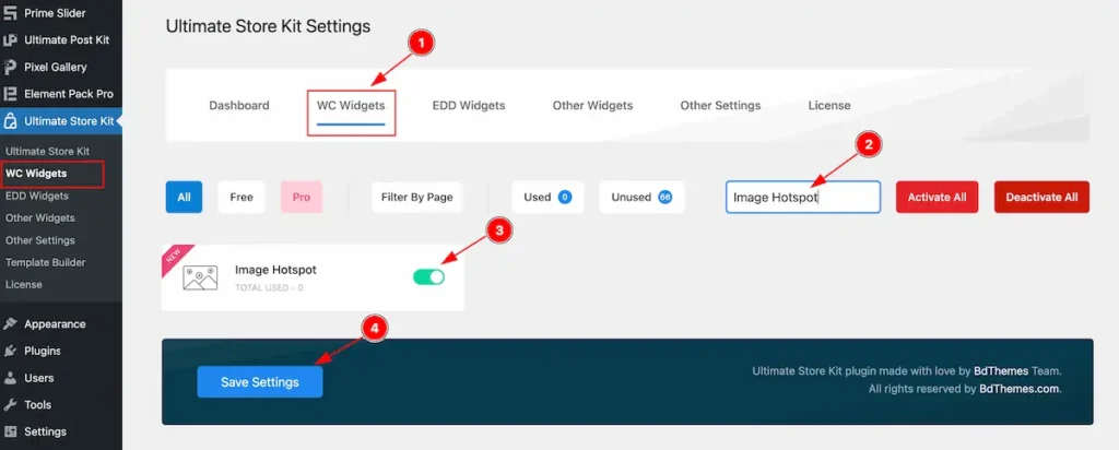
To use the Image Hotspot from Ultimate Store Kit Widget must be enabled. Navigate to WordPress Dashboard > Ultimate Store Kit Plugin dashboard.
- Navigate to Other Widgets Tab.
- Search by the Image Hotspot Widget Name.
- Enable the Image Hotspot Widget.
- Hit the Save Settings Button.
Inserting The Image Hotspot widget
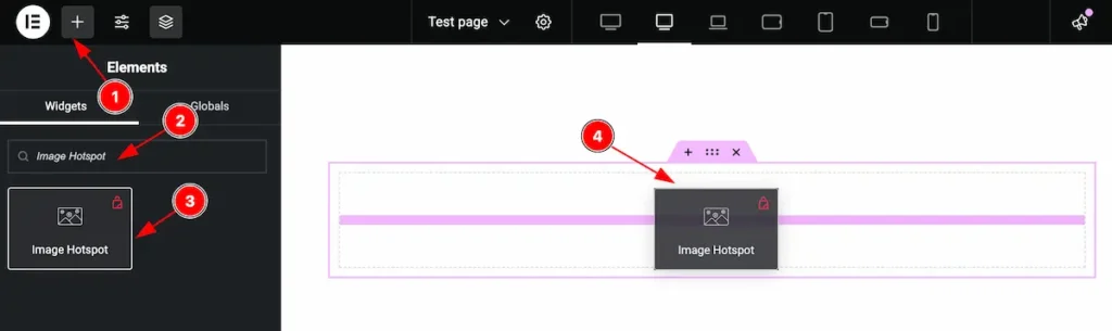
- Go to the Elementor Editor Page and Hit the Add Element ” + ” Icon.
- Search by the Image Hotspot widget name.
- The widget will appear, Check the Ultimate Store Kit logo on top right corner.
- Select the widget then Drag and Drop it on the editor page.
Configuring the Content Tab
The Content Tab provides options to manage and structure the core settings of elements. It allows to define the content and functionality to align with design goals.
Image Hotspot Section
Go to Content > Image Hotspot
The layout section contains the basic controls of the featured box. Make any changes by following the instruction.
Layout
Choose the different layout available on there.
Slider
This is interesting slider layout. It It works with the slider when select the Tooltip.
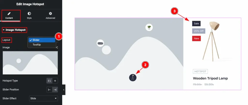
- Layout: Select the Slider layout for the image hotpsot.
- Select any Hotspot section.
- The Slider info will appear on the left section.
Tooltip
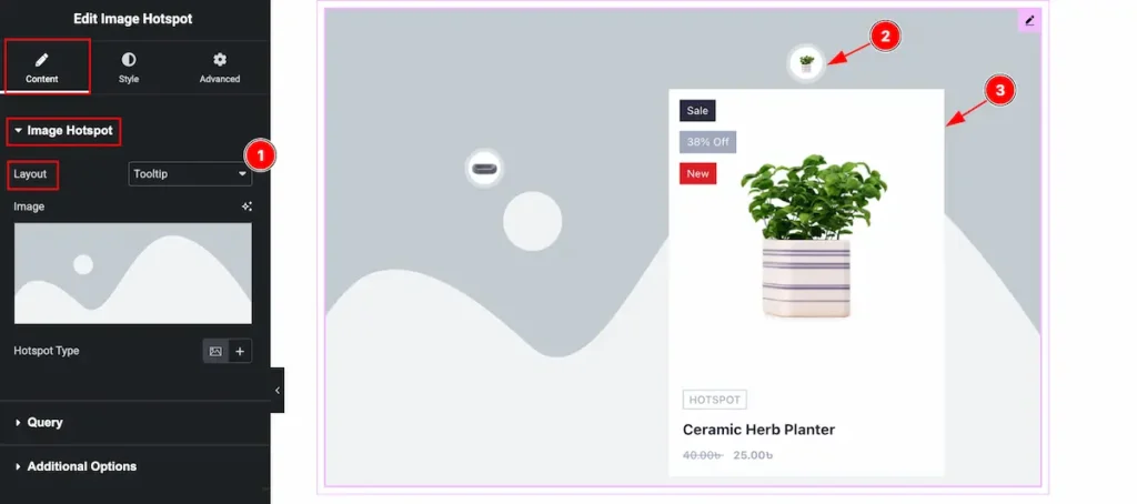
- Layout: Select the Tooltip layout.
- Hover over the Image hotspot section.
- The hotspot info will appear as Tooltip.
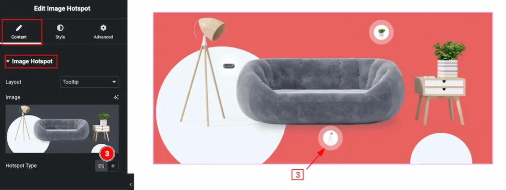
Work with Tooltip Layout
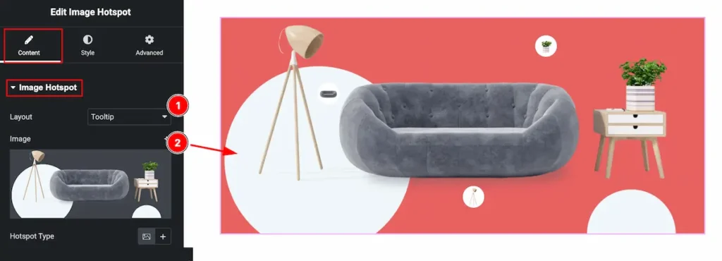
- Layout: Select the Tooltip layout.
- Image: Select the image from the tooltip section.
- Hotspot Type: Select the Type for the Hotspot Image. The Query based product image will appear on there.
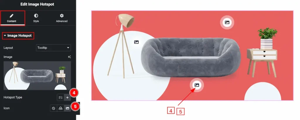
- Hotspot Type: Select the Type of Hotspot Icon. The Icon will appear.
- Icon: Choose the icon from the icon library for the Hotspot.
Query Section
Go to Content > Query
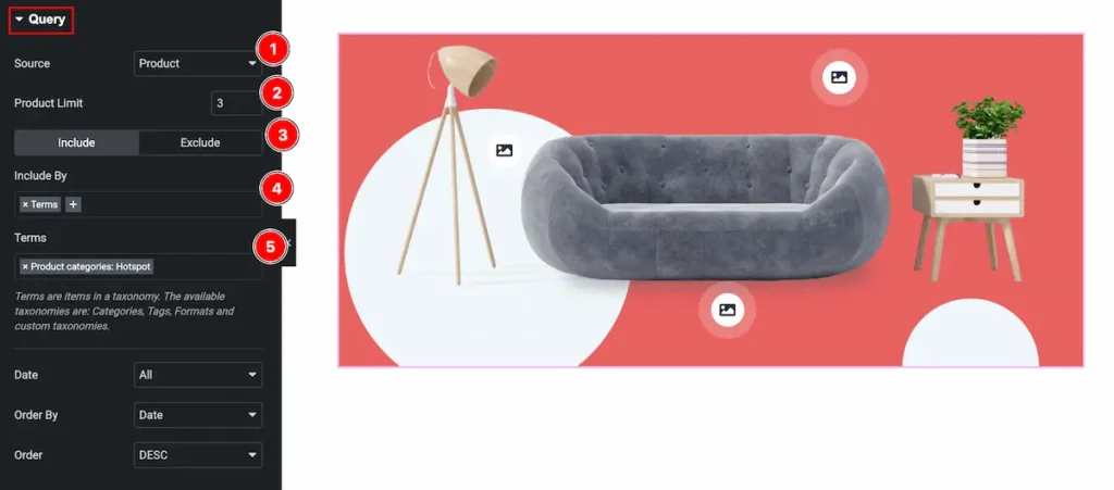
- Source: Select the source for the image hotspot.
- Product Limit: Set the limitation for appearing the product item.
- Select Include / Exclude for being more specify of the source.
- Include By: Select the Include by condition( Author or Terms ). Choose the Terms.
- Terms: Select the terms for specify. Here it will appear the Category or Tags.
Learn more about the Query.
Additional Option Section
Go to Content > Additional Options
Content Tab
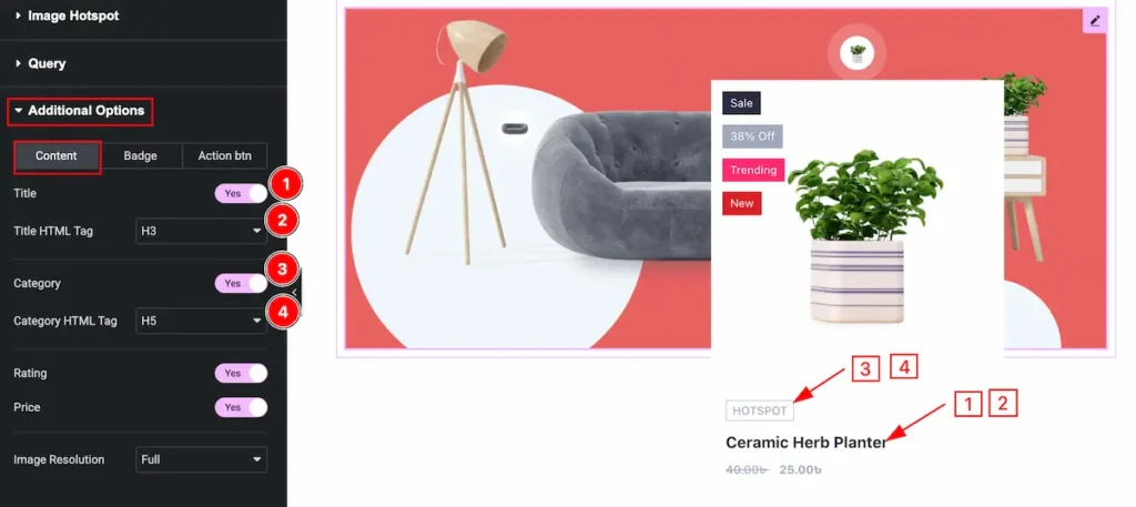
- Title: Set the title for the Content tab.
- Title HTML Tag: Set any HTML Tag for Title ( H1, H2, H3, H4, H5, H6, p, span ). The title tag is essential for both user experience and search engine optimization (SEO).
- Category: Enable the switcher to show the Category.
- Category HTML Tag: Set any HTML Tag for Category ( H1, H2, H3, H4, H5, H6, p, span ). The Category tag is essential for both user experience and search engine optimization (SEO).
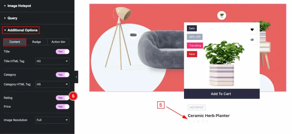
- Rating: Enable the switcher to show the Rating of the Content. The rating appear on mouse hover over the Content.
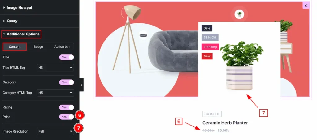
- Price: Enable the switcher to show the Price of the
- Image Resolution: Set the image resolution for the image.
Badge Tab
- Sale: Enable the switcher to show the Sale for this.
- Percentage: Enable the switcher to show the percentage of it.
- Stock Status: Check the stock status ( In Stock or Out of Stock ).
- Trending: Set the product as Trending. Enable the switcher to show it.
- New: Enable the switcher to show it new.
- Newness Day: Select the day to appear as Newness Day.
Action Btn
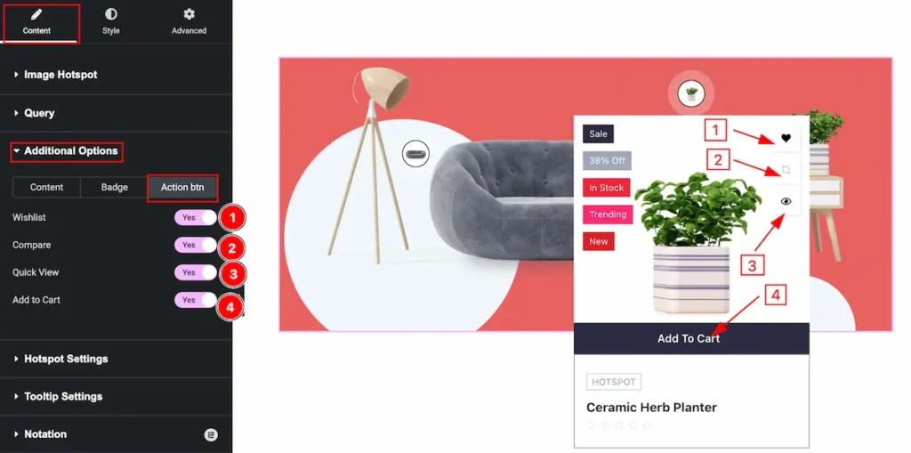
- Wishlist: Enable the switcher to show the wishlist The Wishlist appear on mouse hover over it.
- Compare: Comparing the Product is good things. Enable it to show the compare product.
- Quick View: Enable the switcher to Quick view. It will take new page and provide product details info.
- Add to Cart: Enable the switcher to adding the product to the Cart.
Hotspot Settings Section
Go to Content > Hotspot Settings
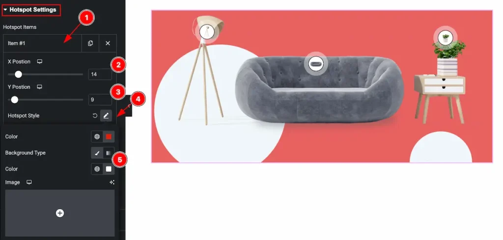
- Hotspot item will appear on there, Click on it and item will toggle.
- X Position: Adjust the position of Horizontally.
- Y Position: Set the position of it Vertically.
- Hotspot Style: Select the style for the Hotspot.
- Background Color: Set the background color of it.
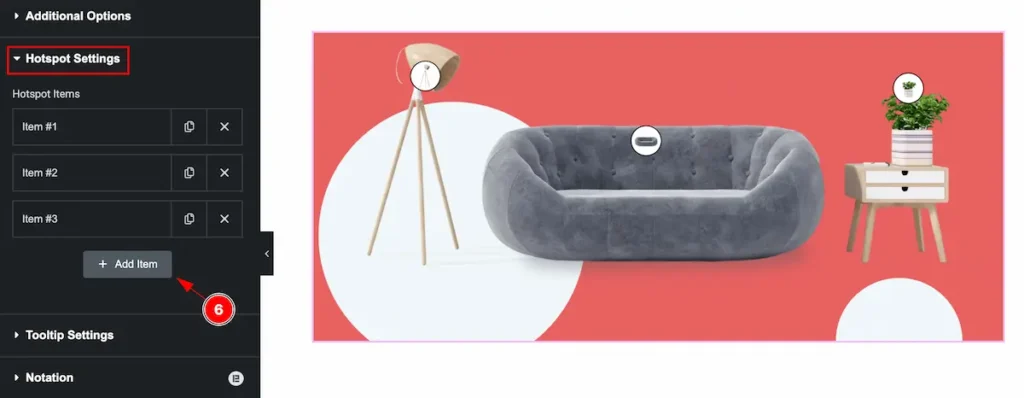
- Add more item by clicking on the “ + Add Item ” button.
Tooltip Settings Section
Go to Content > Tooltip Settings
Animation
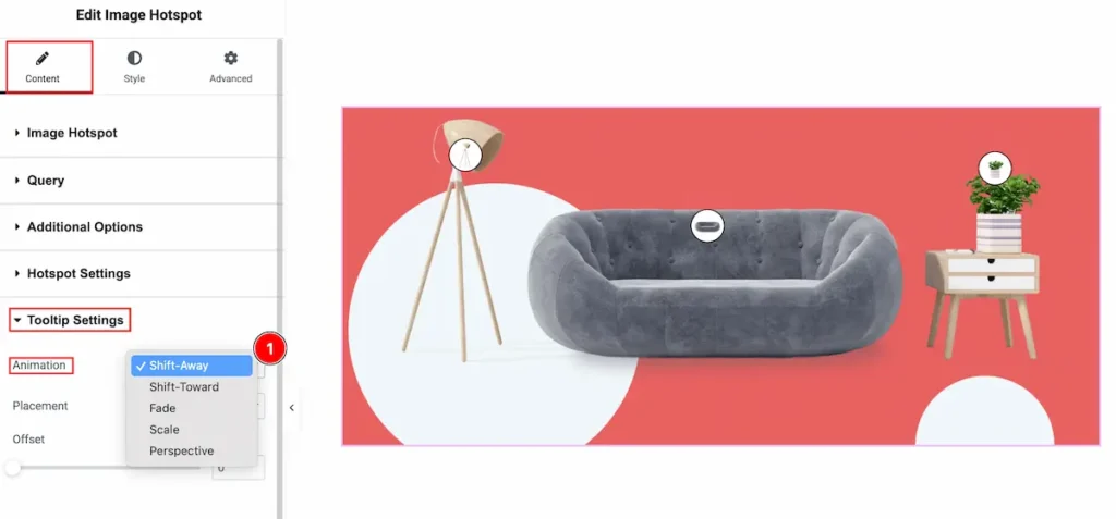
- Animation: Different tooltip animation appear on there. Select the Shift-Away, Shift-Toward, Fade, Scale, Perspective animation style from there.
Placement
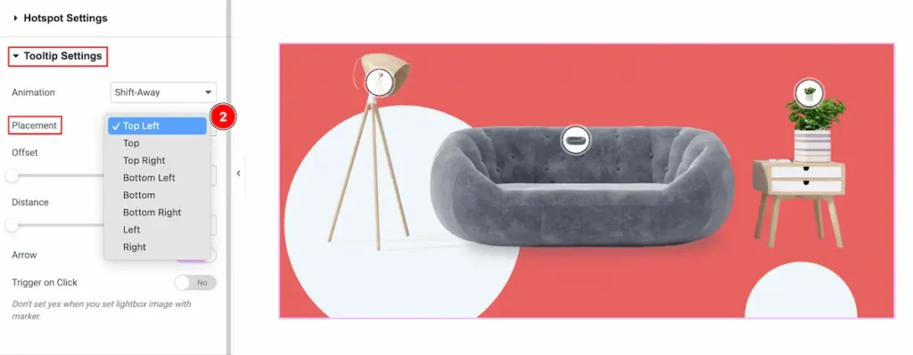
- Placement: Select the placement position for the tooltip. Available placement is Top Left, Top, Top Right, Bottom Left, Bottom, Bottom Right, Left, Right.
Other Controls
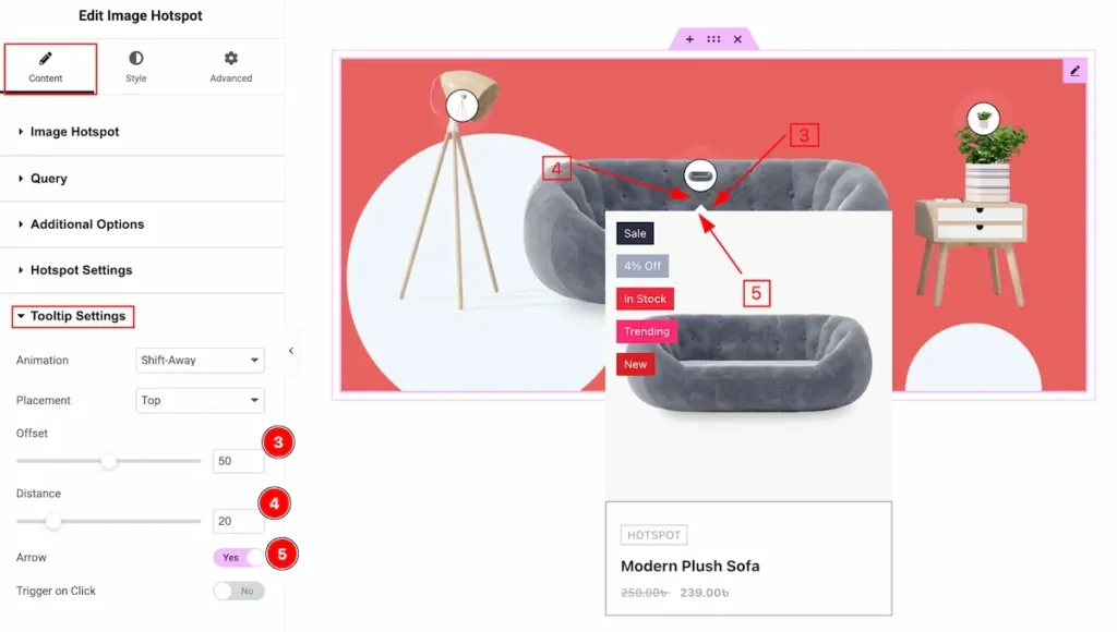
- Offset: Set the offset position for the Tooltip settings.
- Distance: Set the distance of it.
- Arrow: Enable the switcher to show the Arrow.
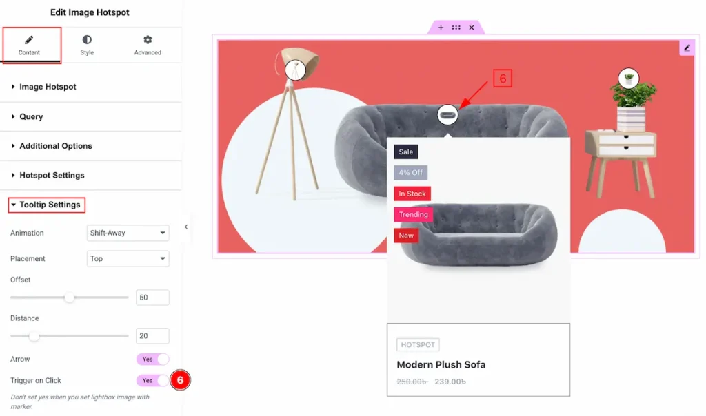
- Trigger on Click: Enable the switcher to enable it by clicking on the rtigger.
Designing with the Style Tab
The Style Tab offers a range of options to enhance the visual appearance of elements, enabling precise adjustments and creative design possibilities. It helps create polished and engaging layouts effortlessly.
Image Hotspot Section
Go to Style > Image Hotspot
Normal Tab
- Background Type: Set the background type color.
- Border Type: Set the type of the border ( None, Solid, Dashed, Dotted, Double ).
- Border Width: Set the width for the border. It’s thickness of the border.
- Border Color: Set the color for the border.
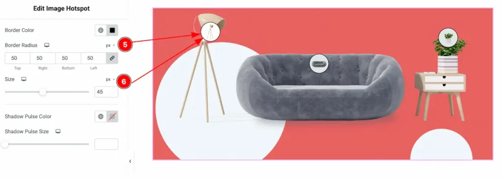
- Border Radius: Set the border corner edges round by following the border.
- Size: Set the size of the border.
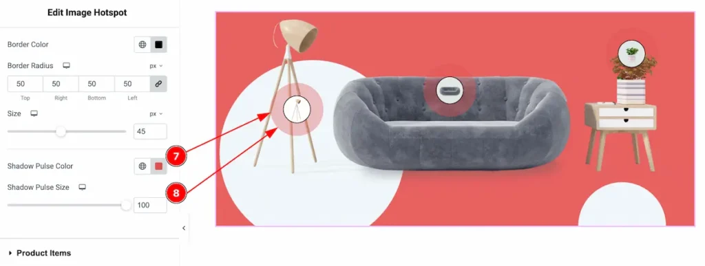
- Shadow Pulse Color: Set the color for the image hotspot.
- Shadow Pulse Size: Set the size for the shadow pulse. It’s a special effect of animation.
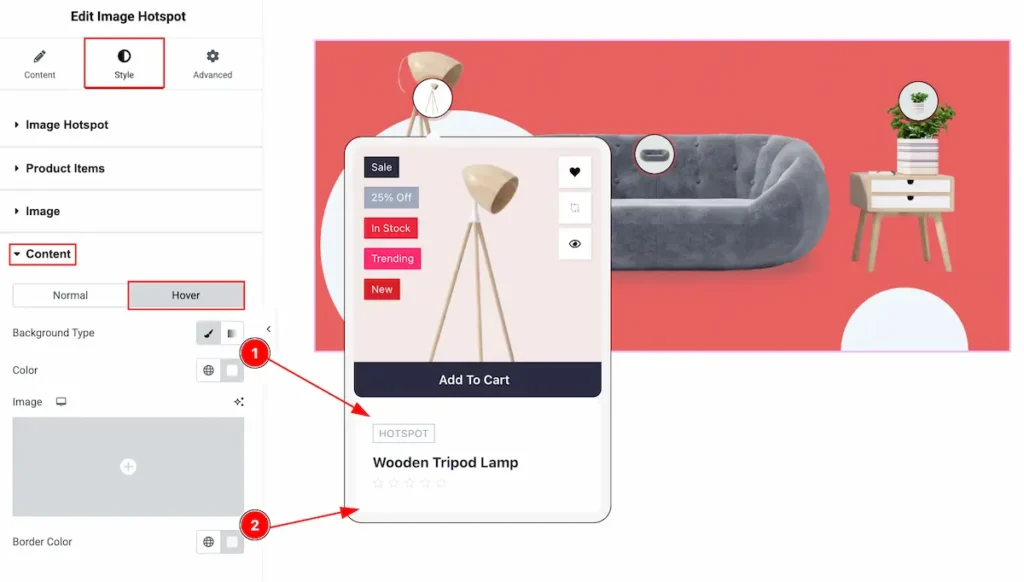
Hover Tab
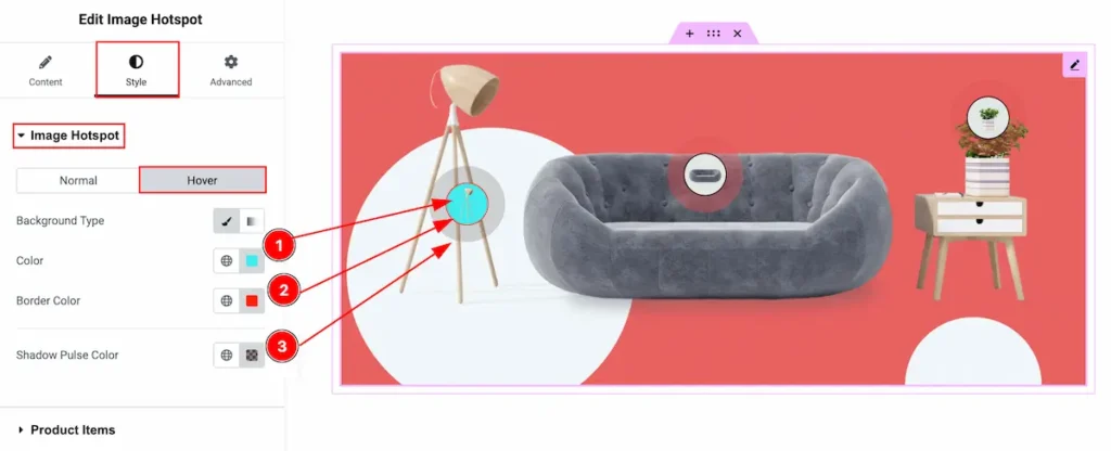
- Background Type: Set the Background type color for the hover overing the image hotspot.
- Color: Set the color of it.
- Shadow Pulse Color: Set the shadow pulse color. It will reflect on mouse hover.
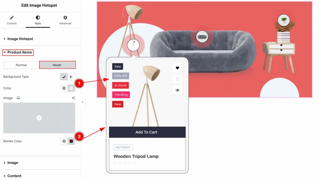
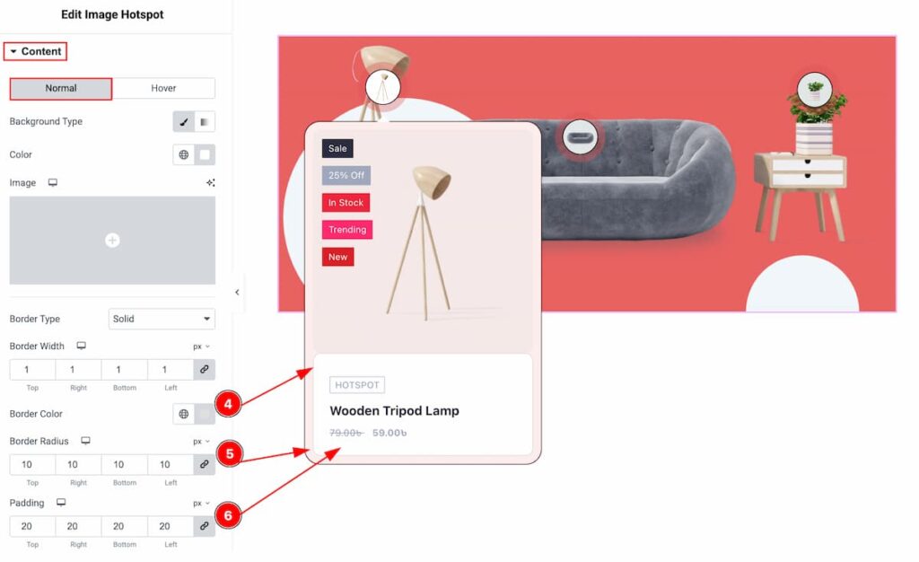
Product Items Section
Go to Style > Product Items
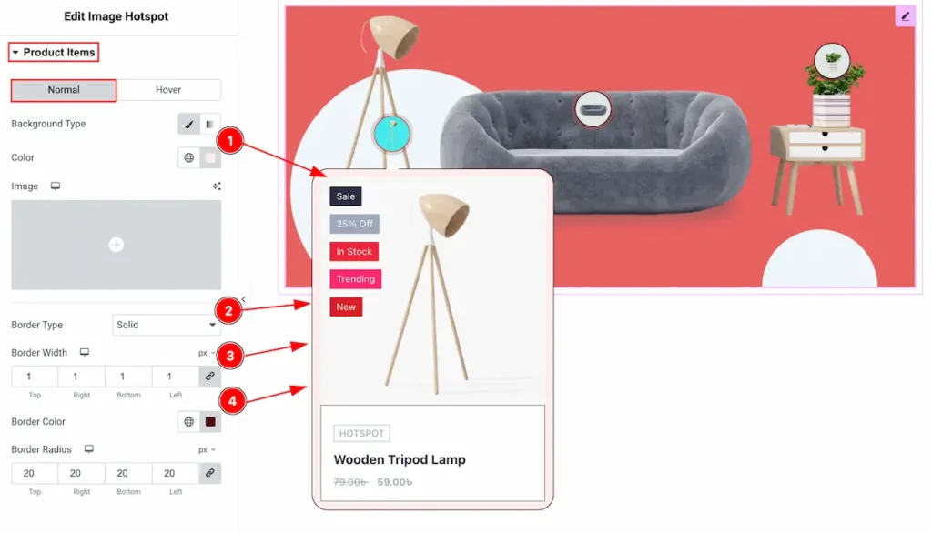
- Background Type: Select the type for the Background color for the product items.
- Border Type: Select the type for the border.
- Border Width: Set the thickness of the border.
- Border Color: Set the color for the border.
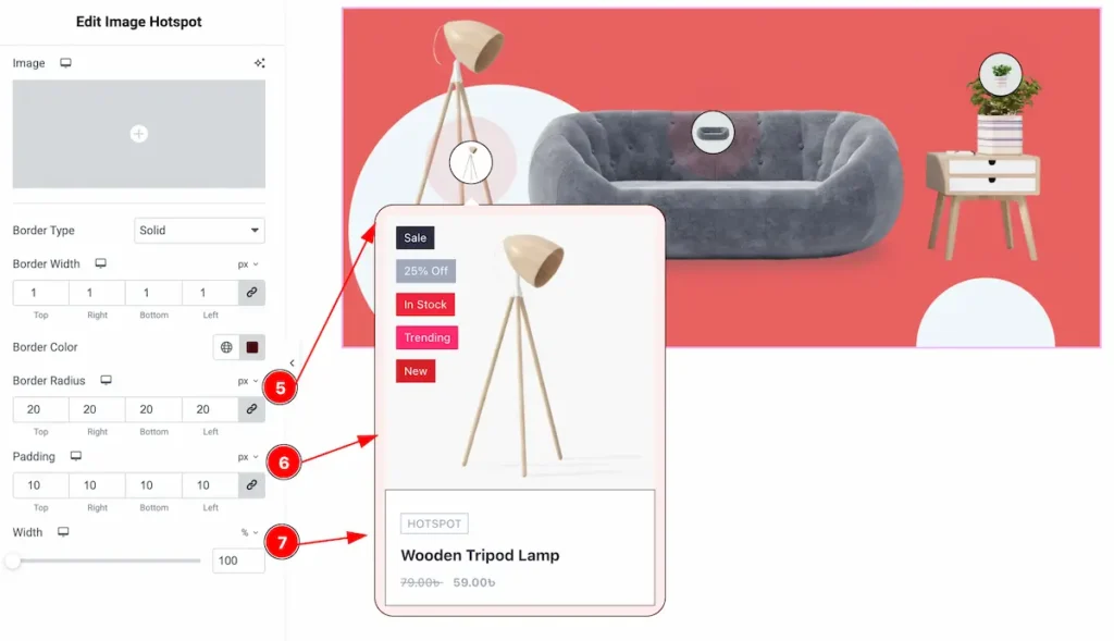
- Border Radius: Set the radius for the border.
- Padding: Set the padding for the inner space of the content.
- Width: Set the width of the content. Set it with % or px.
Hover Tab
- Background Type: Set the background type color for the image
- Border Color: Set the border color.
Image Section
Go to Style > Image
Normal Tab
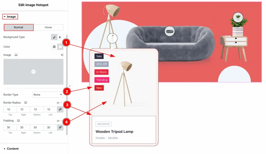
- Background Type: Set the background type color for the image.
- Border Type: Set the border type.
- Border Radius: Make the border corner radius.
- Padding: Set the padding for the image.
Hover Tab
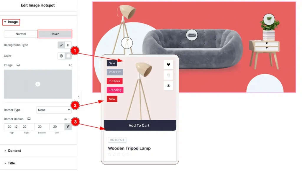
- Background Type: Set the background type for the image.
- Border Type: Set the border type.
- Border: Set the border for the image.
Content Section
Go to Style > Content
Normal Tab
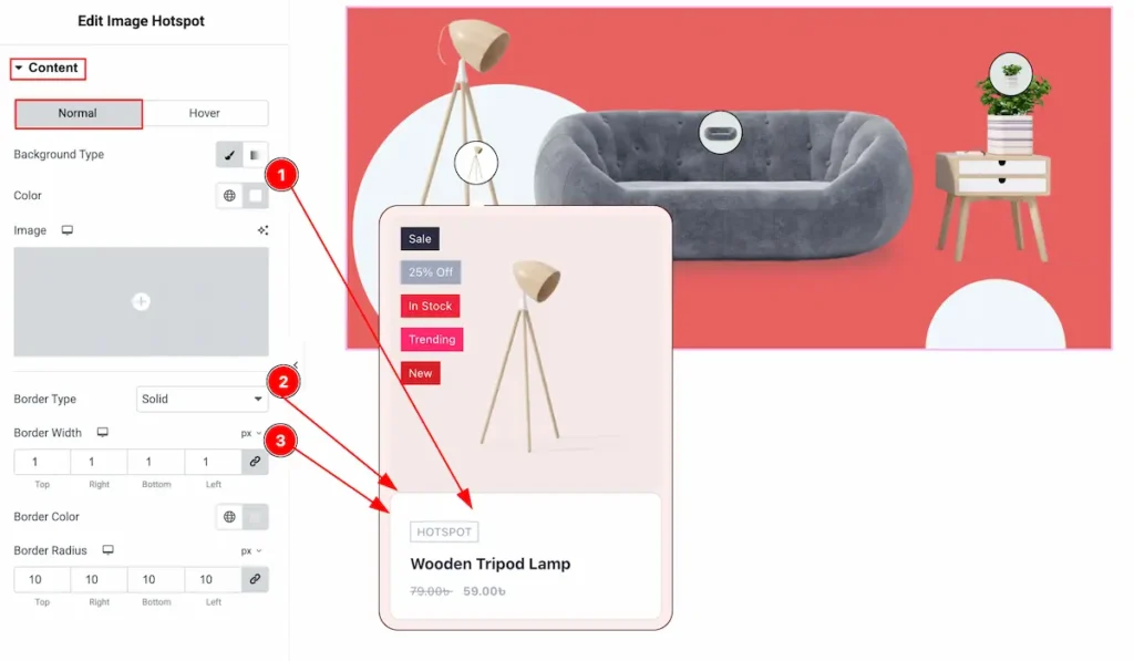
- Background Type: Set the background type for the content.
- Border Type: Set the border type.
- Border Width: Set the width for the border.
- Border Color: Set the color for the border.
- Border Radius: Set the border radius.
- Padding: Set the padding for the content.
Hover Tab
- Background Type: Set the background type for the content.
- Border Color: Set th border color.
Title Section
Go to Style > Title
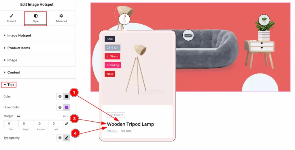
- Color: Set the color for the Title.
- Margin: Set the margin for the title.
- Typography: Set the typography for the title.
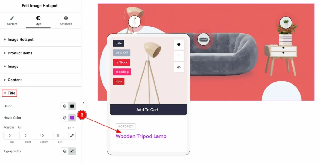
- Hover Color: Set the hover color for the title.
Category Section
Go to Style > Category
Normal Tab
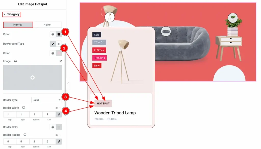
- Color: Set the color for the category text.
- Background Type: Select the background type color and set the color for the background.
- Border Type: Different border type are available select any e.g: Solid, Dashed. Dotted. Double.
- Border Width: Select the thickness of the border select the border width.
- Border Color: Select the border color of the category.
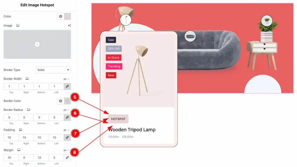
- Border Radius: Make the border edges rounded by setting the border radius.
- Padding: Set the padding for the inner space.
- Margin: Set the margin for outer space.
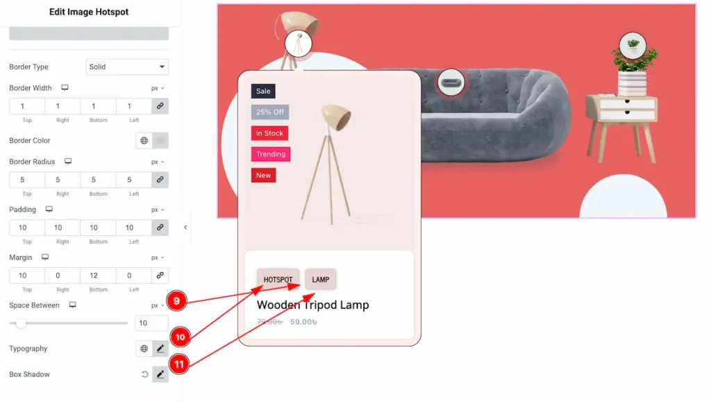
- Space Between: Make spaces between the categories.
- Typography: Set the typography of it.
- Box Shadow: Set the box shadow for the category.
Hover Tab
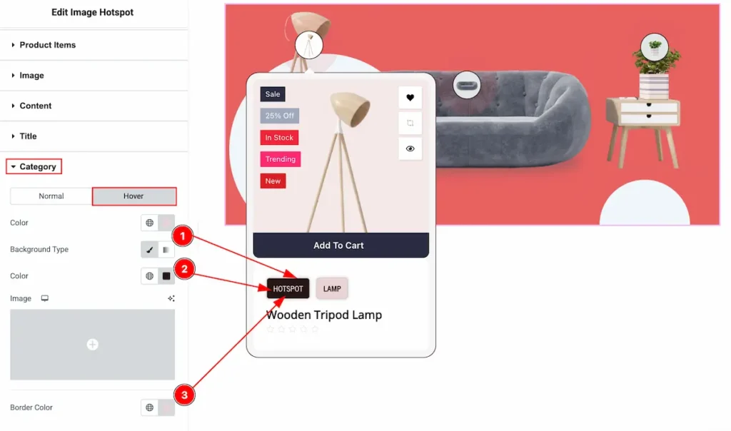
- Color: Select the hover color for the category.
- Background Type: Set the background type color for this.
- Border Color: Set the border color.
Price Section
Go to Style > Price
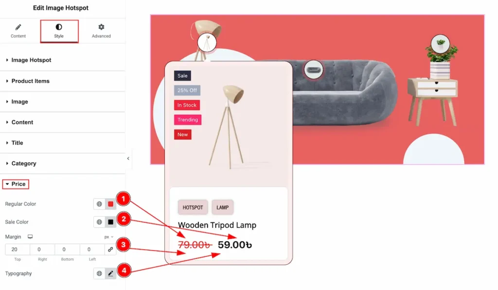
- Regular Color: Set the Regular Price Color of the Products.
- Sale Color: Select the Sale color from the section.
- Margin: Set spacing around by inputting the value of margin.
- Typography: Select the Typo for the Regular and Sale text, Font family, size, weight, line height etc.
Rating Section
Go to Style > Rating
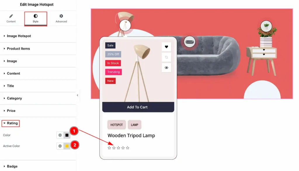
- Color: Set the color for the Rating, The Color appear while the rating is not fill.
- Active Color: Select the Color for the Active state of the Rating.
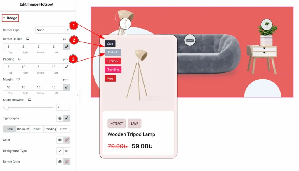
Badge Section
Go to Style > Badge
- Border Type: Select the border type for the badge. Available border type is none, solid, dotted, dashed, double.
- Border Radius: Make the border corner edges rounded by setting the border radius.
- Padding: Set the padding for the inner space.
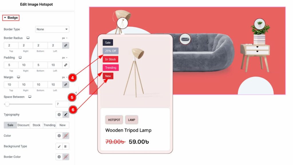
- Margin: Make outer space by setting the margin.
- Space Between: Make space between the badges. Click the sleek bar to add value.
- Typography: Select the Typo for the Regular and Sale text, Font family, size, weight, line height etc.
Sale Badge
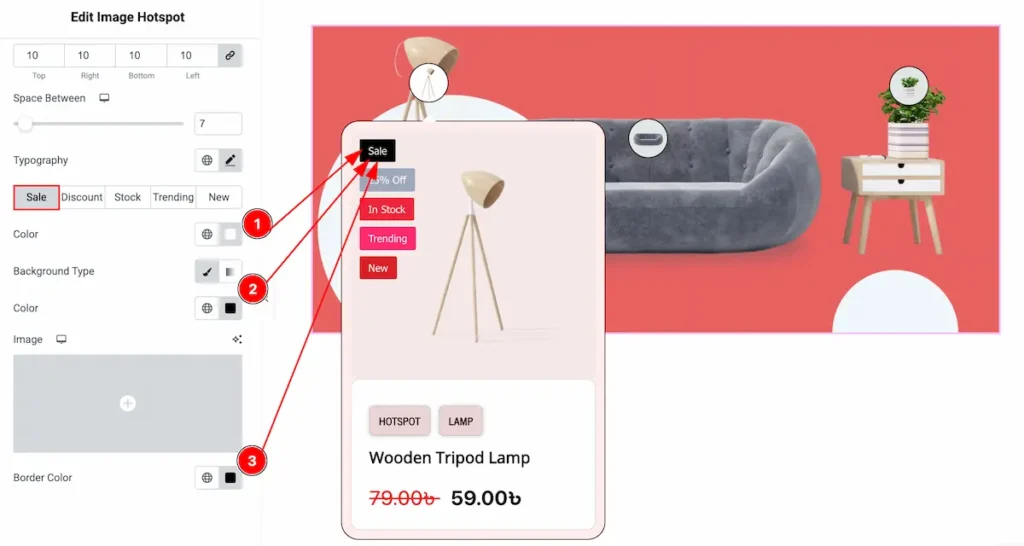
- Color: Choose the color for the sale badge text.
- Background Type: Select the background type Color and choose the color for the Sale badge.
- Border Color: Set the border color for the Sale badge.
Discount Badge
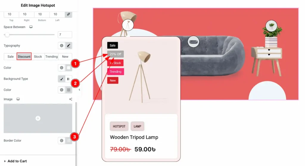
- Color: Choose the color for the discount badge text.
- Background Type: Select the background type Color and choose the color for the Discount badge.
- Border Color: Set the border color for the Discount.
Stock Badge
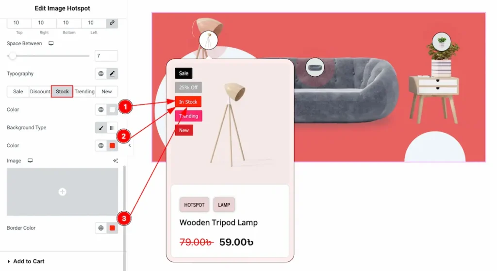
- Color: Choose the color for the Stock badge text.
- Background Type: Select the background type Color and choose the color for the Stock badge.
- Border Color: Set the border color for the Stock.
Trending Badge
- Color: Choose the color for the Trending badge text.
- Background Type: Select the background type Color and choose the color for the Trending badge.
- Border Color: Set the border color for the Trending.
New Badge
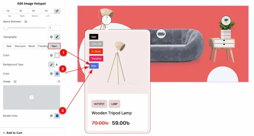
- Color: Choose the color for the New badge text.
- Background Type: Select the background type Color and choose the color for the New badge.
- Border Color: Set the border color for the New.
Add to Cart Section
Go to Style > Add to Cart
Normal Tab
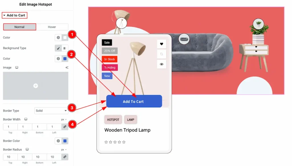
- Color: Choose the color for the add to cart text button.
- Background Type: Select the background type Color and choose the color for it.
- Border Type: Select the border type for the add to cart button. Available border type is none, solid, dotted, dashed, double.
- Border Width: Set the thikness of the border by setting the Width.
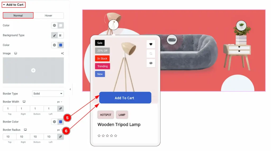
- Border Color: Select the color for the border.
- Border Radius: Make the border corner edges rounded by setting the radius.
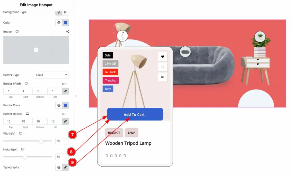
- Width(%): Set the width for the button. The measure will appear in percentage.
- Height(px): Ser the height for the button. The value will add in pixel.
- Typography: Select the Typo for the Regular and Sale text, Font family, size, weight, line height etc.
Hover Tab
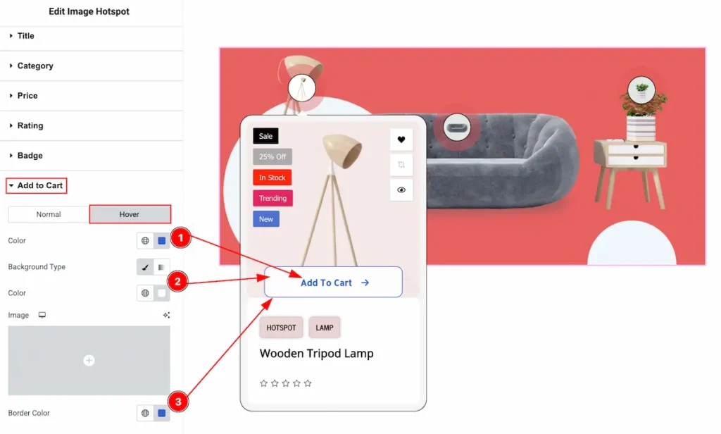
- Color: Choose the color for the Add to Cart text.
- Background Type: Select the background type Color and choose the color of it.
- Border Color: Set the border color for the add to cart button.
Action Button Section
Go to Style > Action Button
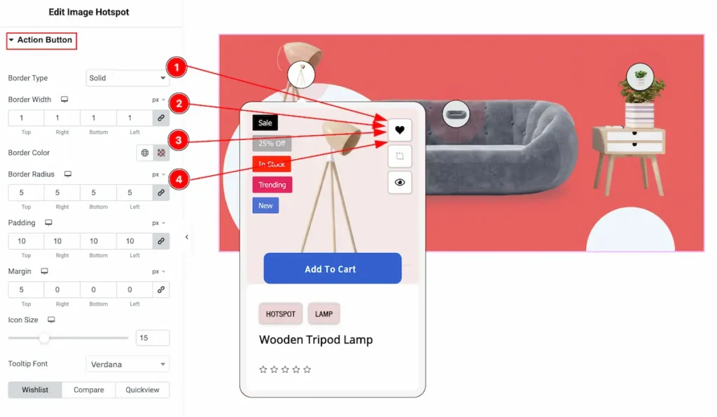
- Border Type: Select the border type for the Action button. Available border type is none, solid, dotted, dashed, double.
- Border Width: Set the thickness of the border border by selecting the width.
- Border Color: Choose the color for the border.
- Border Radius: Make the border corner edges rounded by setting the border radius.
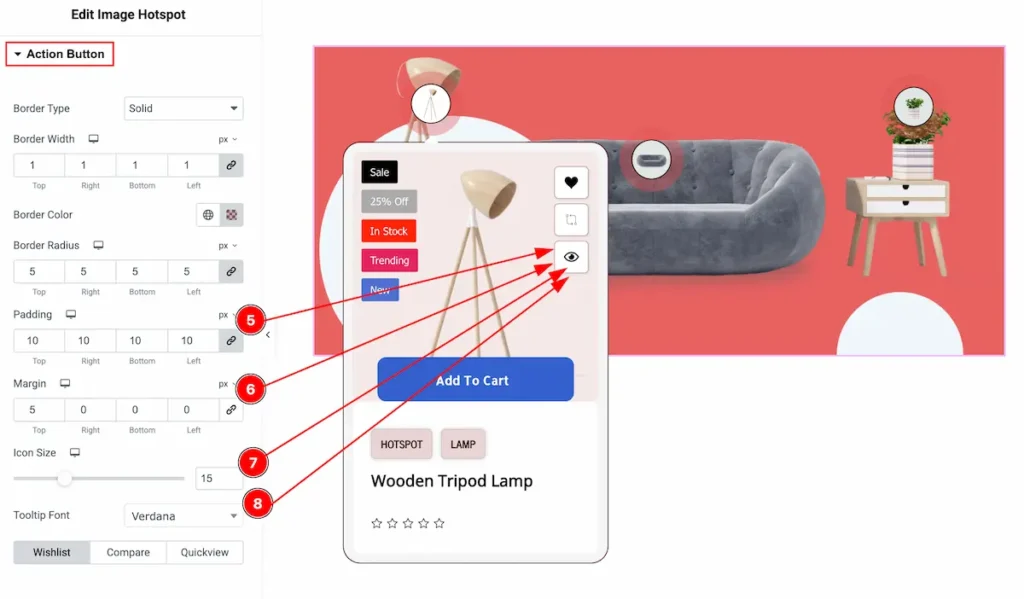
- Padding: Make inner space by setting the padding of the Action button.
- Margin: Add outer space by adding the value of Margin.
- Icon Size: Set the size of the Icon.
- Tooltip Font: Select the font for the Tooltip. All the fonts are available on there.
Wishlist Button
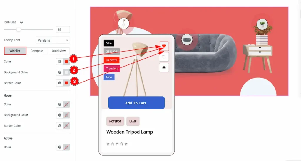
- Color: Choose the color for the Wishlist button.
- Background Type: Select the background type Color and choose the color of it.
- Border Color: Set the border color for the Wishlist button.
Hover State
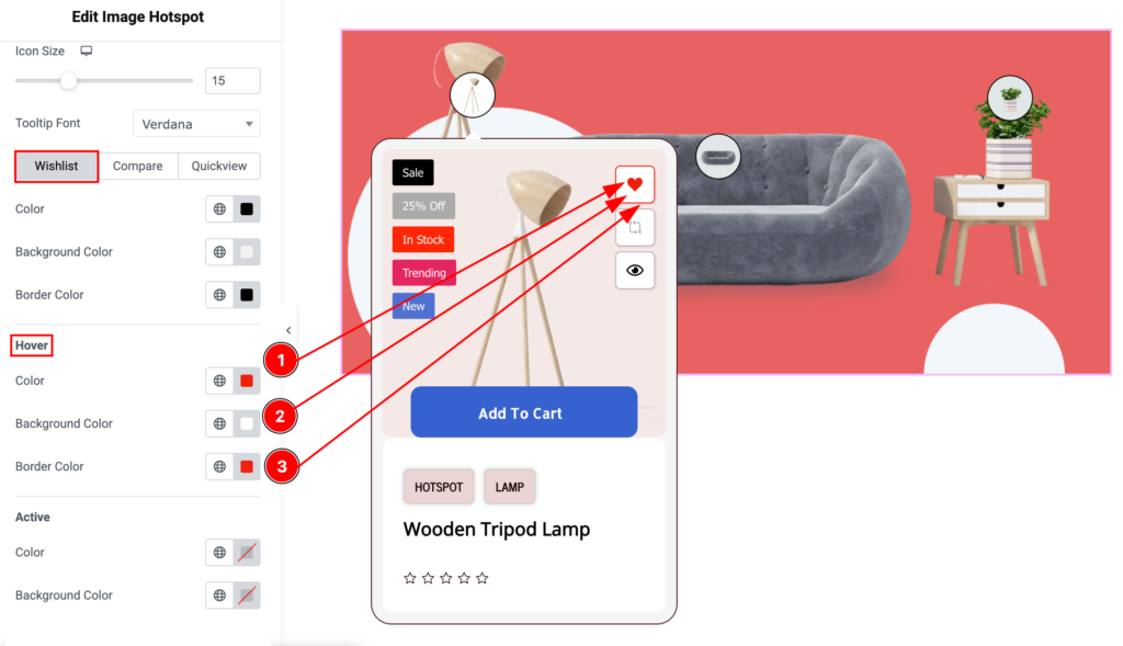
- Color: Choose the color for the Wishlist button.
- Background Color: Select the background type Color and choose the color of it.
- Border Color: Set the border color for the Wishlist button.
Active State
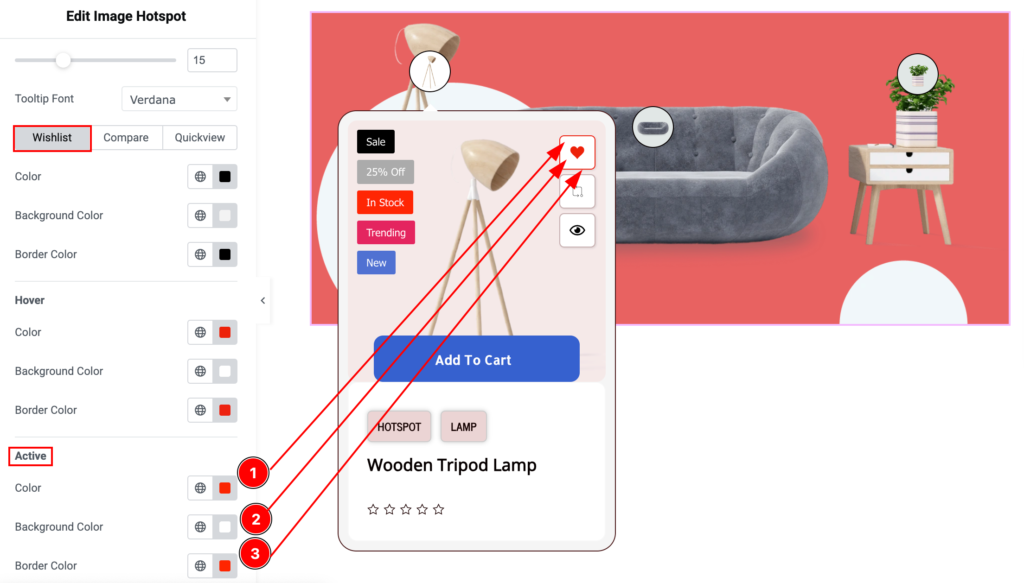
- Color: Choose the color for the Wishlist button active state.
- Background Type: Select the background type Color and choose the color of it.
- Border Color: Set the border color for the Wishlist button.
Compare Button
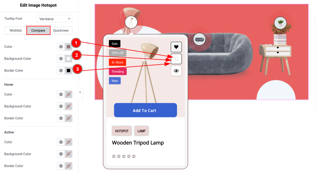
- Color: Choose the color for the Compare button.
- Background Type: Select the background type Color and choose the color of it.
- Border Color: Set the border color for the Compare button.
Hover State
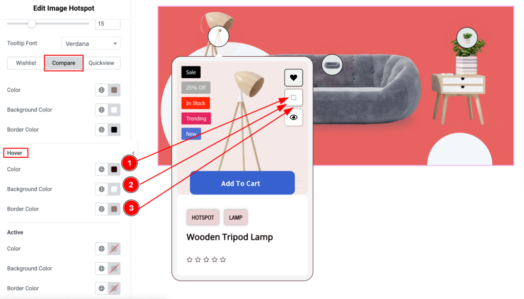
- Color: Choose the color for the Compare button.
- Background Type: Select the background type Color and choose the color of it.
- Border Color: Set the border color for the Compare button.
Active State
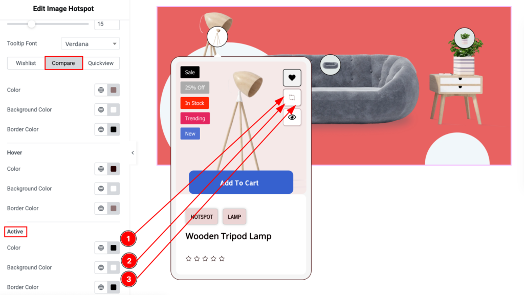
- Color: Choose the color for the Compare button.
- Background Type: Select the background type Color and choose the color of it.
- Border Color: Set the border color for the Compare button.
Quickview
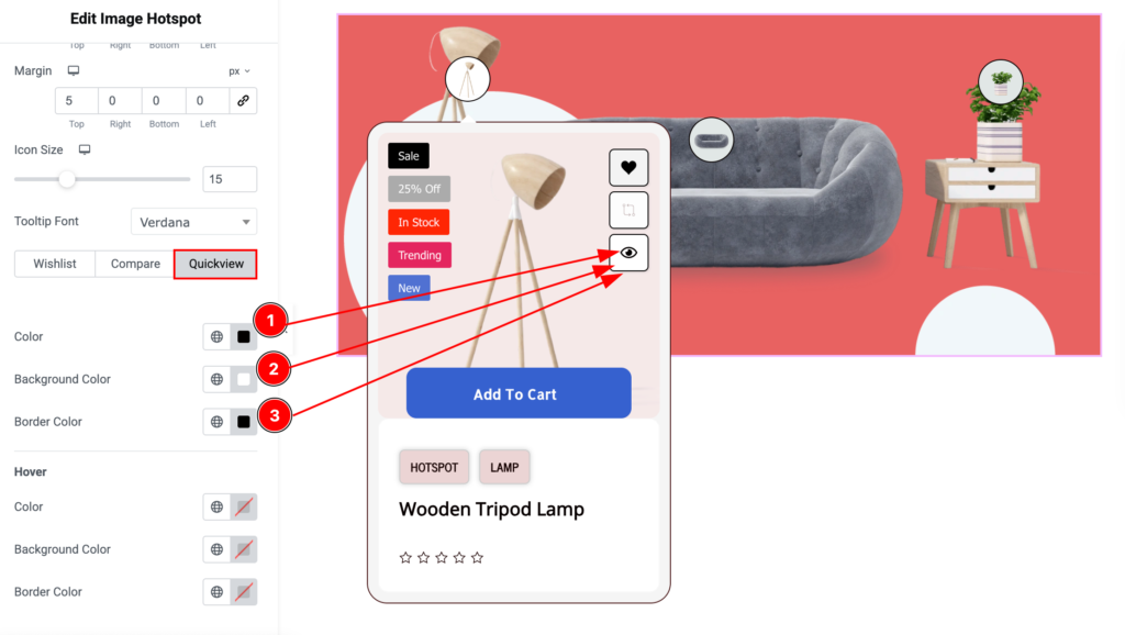
- Color: Choose the color for the Quickview button.
- Background Type: Select the background type Color and choose the color of it.
- Border Color: Set the border color for the Quickview button.
Hover State
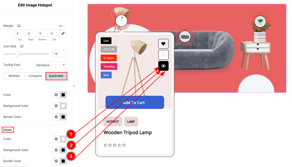
- Color: Choose the color for the Quickview button.
- Background Type: Select the background type Color and choose the color of it.
- Border Color: Set the border color for the Quickview button.
Video Assist
Please check the Image Hotspot video tutorial to learn more about the widget and visit the demo page for examples.
Thanks for being with us.