In this documentation, we will show you how to customize the Featured Box Widget by Ultimate Store Kit.
Enable the Featured Box Widget
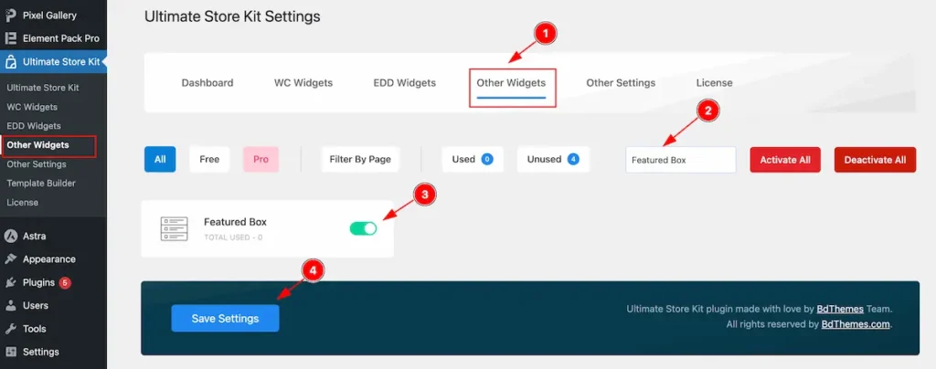
To use the Featured Box from Ultimate Store Kit Widget must be enabled. Navigate to WordPress Dashboard > Ultimate Store Kit Plugin dashboard.
- Navigate to Other Widgets Tab.
- Search by the Featured Box Widget Name.
- Enable the Featured Box Widget.
- Hit the Save Settings Button.
Inserting The Featured Box widget

- Go to the Elementor Editor Page and Hit the Add Element ” + ” Icon.
- Search by the Featured Box widget name.
- The widget will appear, Check the Ultimate Store Kit logo on top right corner.
- Select the widget then Drag and Drop it on the editor page.
Configuring the Content Tab
The Content Tab provides options to manage and structure the core settings of elements. It allows to define the content and functionality to align with design goals.
Layout Section
Go to Content > Layout
The layout section contains the basic controls of the featured box. Make any changes by following the instruction.
Content Tab
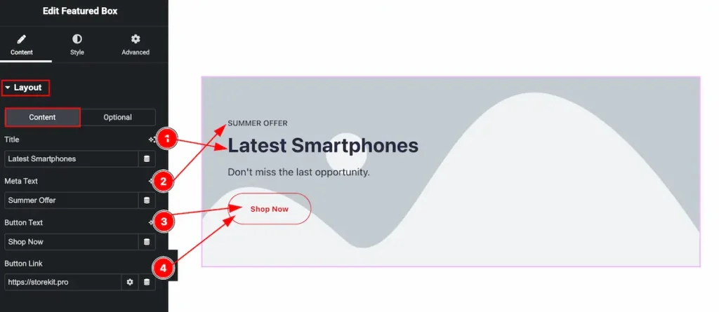
- Title: Set the title of the featured box.
- Meta Text: Set the text for the meta section.
- Button Text: Set the text for the button.
- Button Link: Set the link for the button.
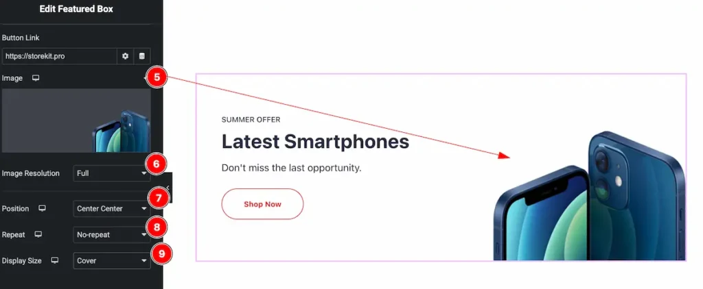
- Image: Set the image for the featured box.
- Image Resolution: Image resolution is crucial to display the image. Available image resolution ( Full, Medium, Small, Thumbnails, ect.).
- Position: Set the position for the image ( Center Center, Center Top, Center Right, etc.) Adjust position according to your preference.
- Repeat: Repeating controls are ( No-Repeat, Repeat, Repeat-x, Repeat-y) select any to adjust image.
- Display Size: Set the display size for the image ( Cover, Contain, Custom, Auto, Default ).
Optional Tab
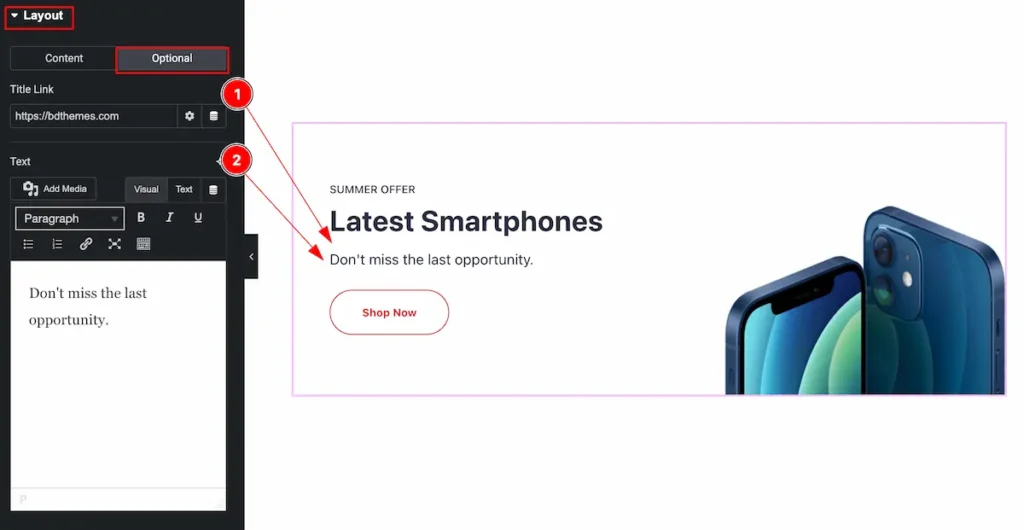
- Title Link: Set the link for the title to navigate.
- Text: Optional Text appear right after the Title. Set the optional text.
Additional Section
Go to Content > Additional
These controls are available for adjusting feature for featured box.
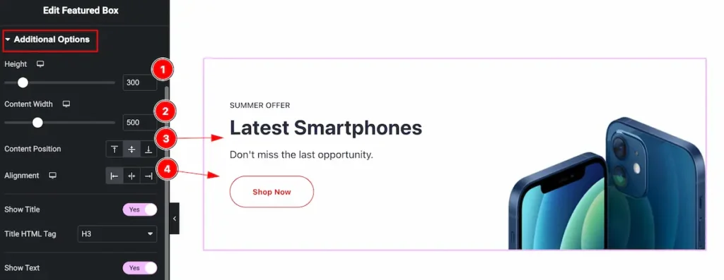
- Height: Set the height for the featured box, Input the value as height preferable, The measure are in px.
- Content Width: Set the width for the content. It will not impact on the while featured box.
- Content Position: Set the position for the content.
- Alignment: Adjust the position of the alighnemt.
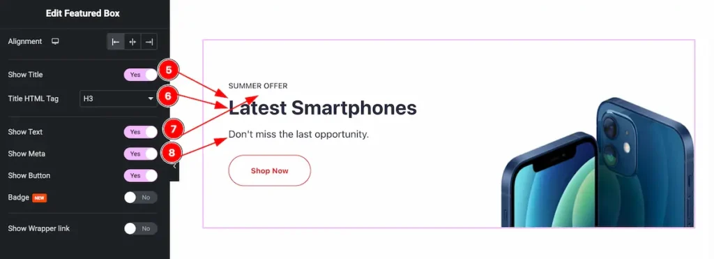
- Show Title: Enable the switcher to show the title for the featured box.
- Title HTML Tag: Set any HTML Tag for Title ( H1, H2, H3, H4, H5, H6, p, span ). The title tag is essential for both user experience and search engine optimization (SEO).
- Show Text: Enable the switcher to show the text.
- Show Meta: Enable the switcher to show the meta content on featured box.
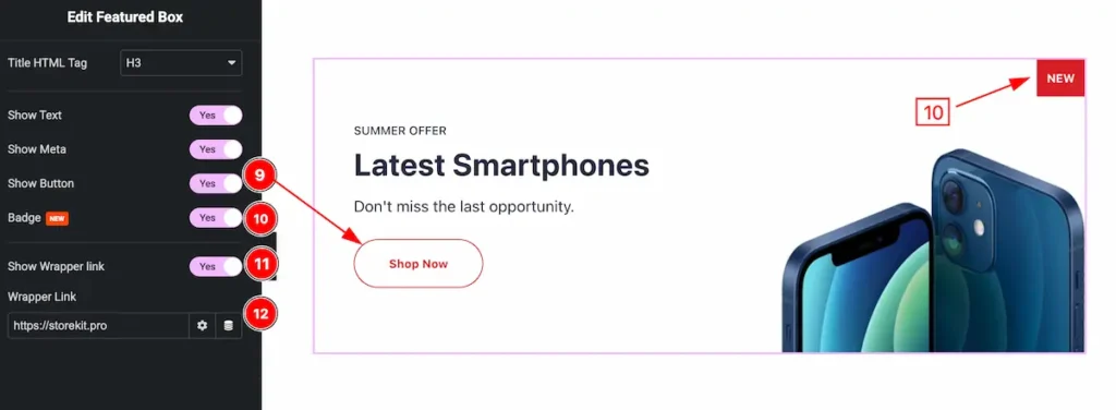
- Show Button: Enable the switcher to show the button.
- Badge: Enable the switcher to show the badge for the featured box.
- Show Wrapper Link: Enable the switcher to show the wrapper link input field and works while box as link.
- Wrapper Link: Set the link for the wrapper navigation.
Designing with the Style Tab
The Style Tab offers a range of options to enhance the visual appearance of elements, enabling precise adjustments and creative design possibilities. It helps create polished and engaging layouts effortlessly.
Featured Box Section
Go to Style > Featured Box
Normal Tab
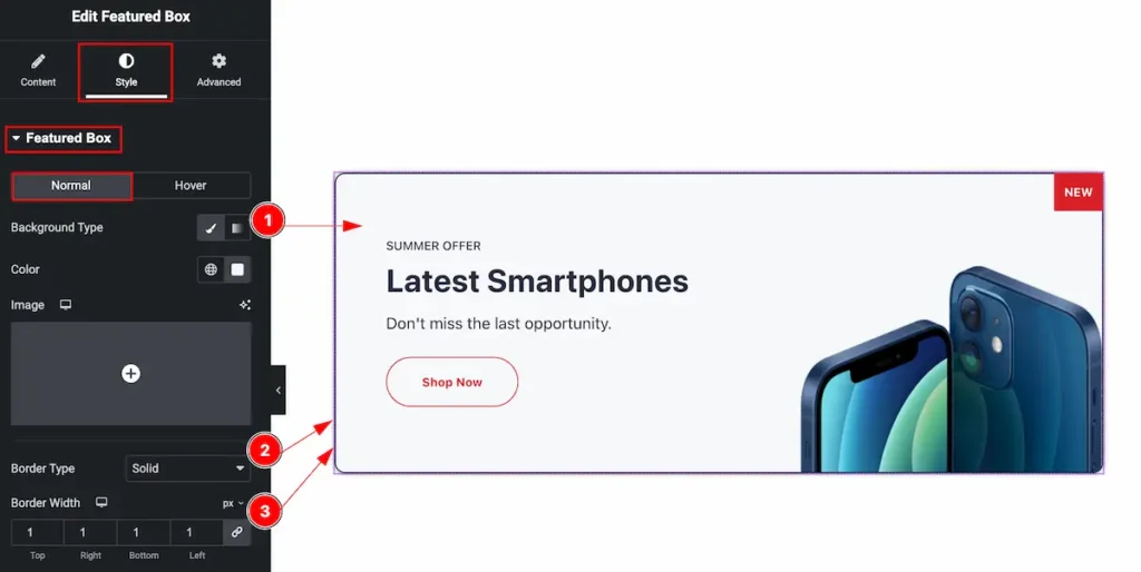
- Background Type: Set the background type color and set color for the background of the featured box.
- Border Type: Set the border type solid for the border area ( None, Solid, Dashed, Dotted ).
- Border Width: Set the width for the border. The value as for the thickness of border.
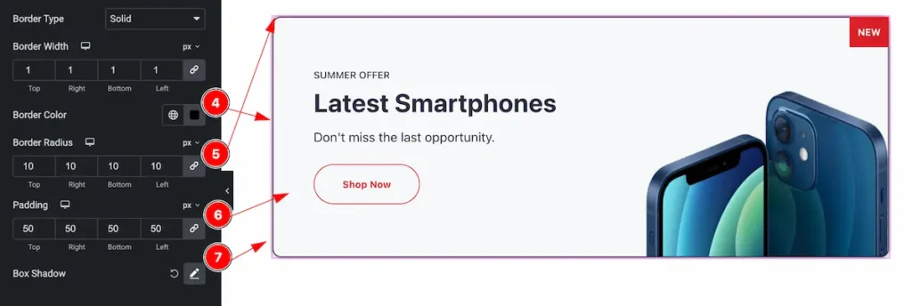
- Border Color: Set the border color.
- Border Radius: Make the border corner radius by setting the value.
- Padding: Make inner space for the content to set the padding.
- Box Shadow: Set the box shadow for the content.
Hover Tab
The changes will appear on hover overing the mouse.
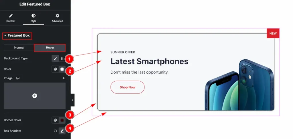
- Background Type: Set the Background Type Color for the background.
- Color: Set the color for the text
- Border Color: Set the border color.
- Box Shadow: Make the shadow for the box.
Title Section
Go to Style > Title
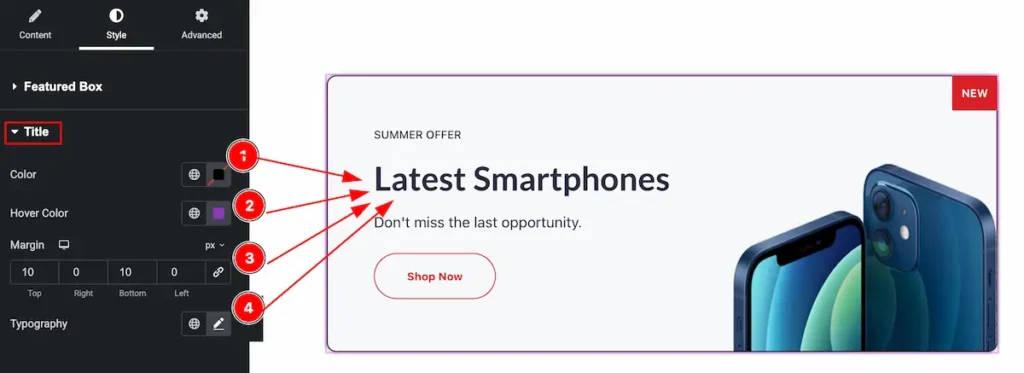
- Color: Set the color for the Title.
- Hover Color: Set the color for the hover.
- Margin: Set margin to adjust the position Title from the another content.
- Typography: Set the typography for the Title and set Fonts, Font Family, Size, Weight, Letter Spacing etc.
Text Section
Go to Style > Text

- Color: Set the color for the Text.
- Margin: Set margin to adjust the position of Text from the another content.
- Typography: Set the typography for the Text and set Fonts, Font Family, Size, Weight, Letter Spacing etc.
Meta Section
Go to Style > Meta

- Color: Set the color for the Meta.
- Hover Color: Set the color for the hover for the meta.
- Margin: Set margin to adjust the position Meta from the another content.
- Typography: Set the typography for the Meta and set Fonts, Font Family, Size, Weight, Letter Spacing etc.
Button Section
Go to Style > Button
Normal Tab
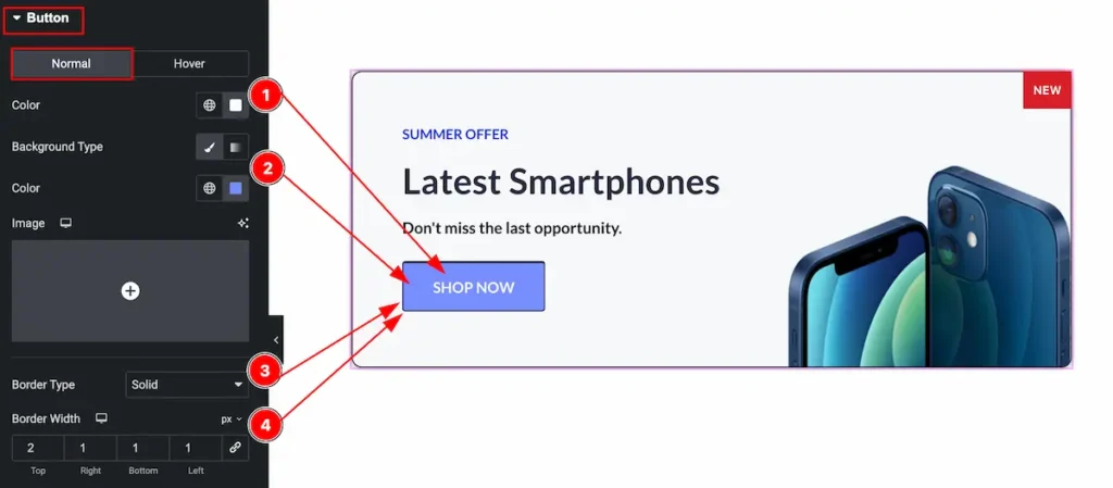
- Color: Set the color for the button text.
- Background Type: Set the background type color and choose color from the color plate.
- Border Type: Set the border type for the border of the button.
- Border Width: Set width for the border.
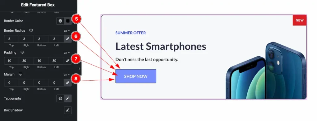
- Border Color: Set the border color for the button.
- Border Radius: Make the border radius.
- Padding: Set the padding.
- Margin: Set the margin for the button.
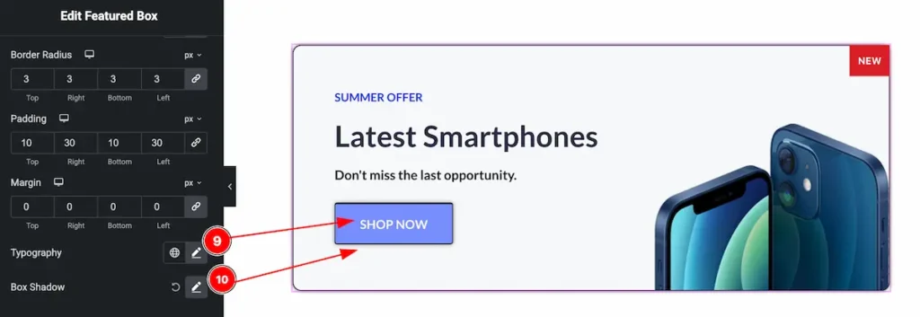
- Typography: Set the typography for the button.
- Box Shadow: Set the box shadow for the button.
Hover Tab
The changes will appear on mouse hover over on it.
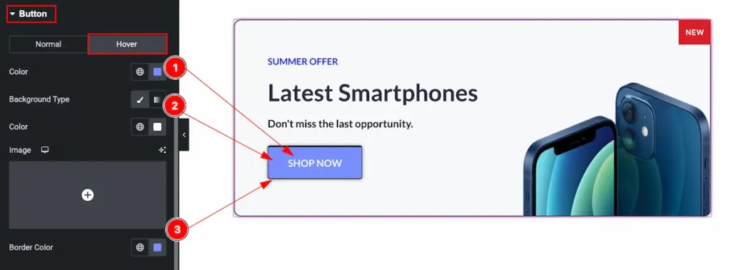
- Color: Set the color for button.
- Background Type: Set the background type for the background.
- Border Color: Set the border color for the button.
Badge Section
Go to Style > Badge
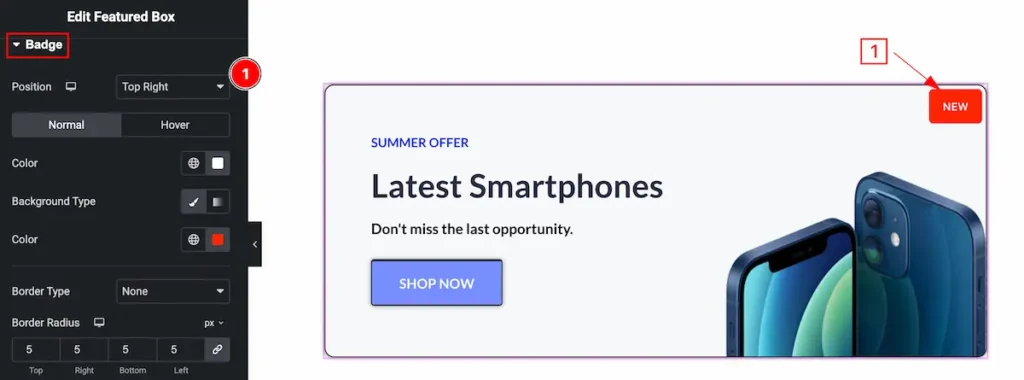
- Position: Set the position for the badge.
Normal Tab
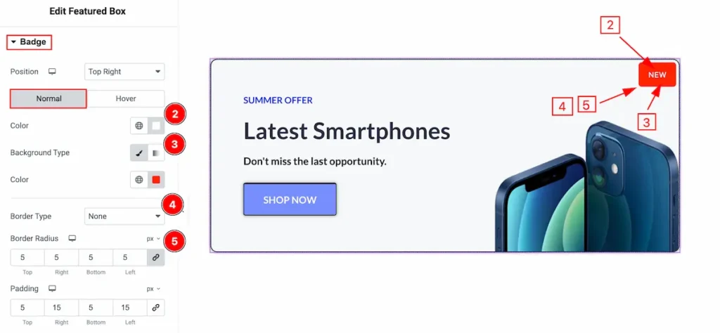
- Color: Set the color for the badge.
- Background Type: Set the background type color and choose color from the color plate.
- Border Type: Set the border type for the border of the badge.
- Border Width: Set width for the badge.
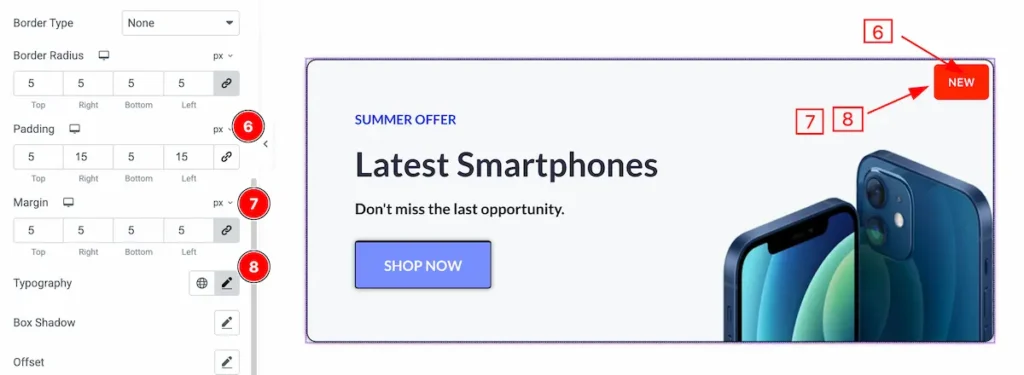
- Padding: Set the padding.
- Margin: Set the margin for the badge.
- Typography: Set the typography for the badge.

- Box Shadow: Set the box shadow for the button.
- Offset: Set the position for the badge.
Hover Tab

- Color: Set the color for the badge text.
- Background Type: Set the background type color for the badge.
- Border Color: Set the border color for the badge.
Video Assist
Please visit the demo page for examples.
Thanks for being with us.
