In this documentation, we will discuss the customization of the Trailer Box widget, brought to you by the Element Pack addon for Elementor.
Enable the Trailer Box Widget
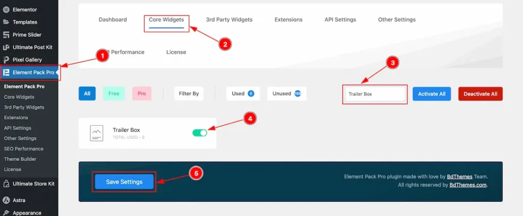
To use the Elementor Trailer Box widget from Element Pack, first, you have to enable the widget.
- Go to WordPress > Element Pack Plugin dashboard.
- Then Click the Core Widgets Tab.
- Search the Trailer Box Widget Name.
- Enable the Trailer Box Widget.
- Hit the Save Settings Button.
Inserting The Trailer Box widget
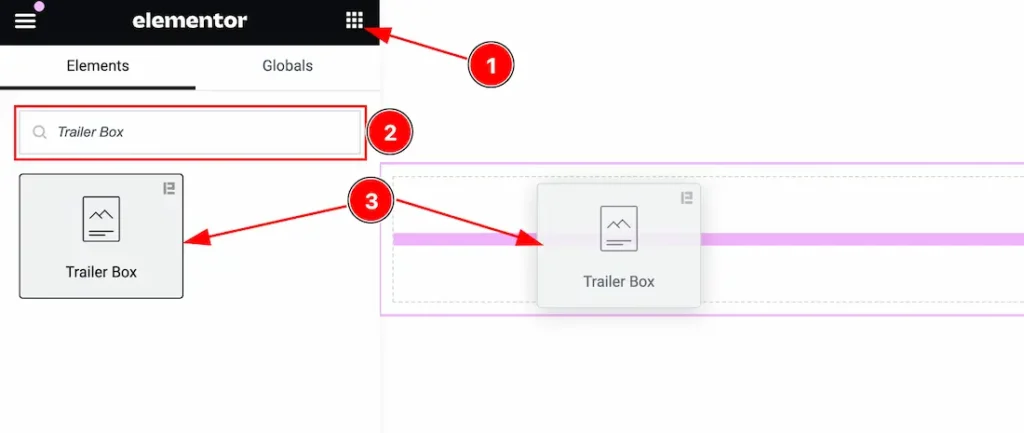
- Go to the Elementor Editor Page and Hit the Get Back To Button.
- Search the Trailer Box widget.
- Drag the widget and Drop it on the editor page.
Note: You need both Elementor and Element Pack installed to use this widget.
Work With The Content Tab
Layout Section
Go to Content > Layout
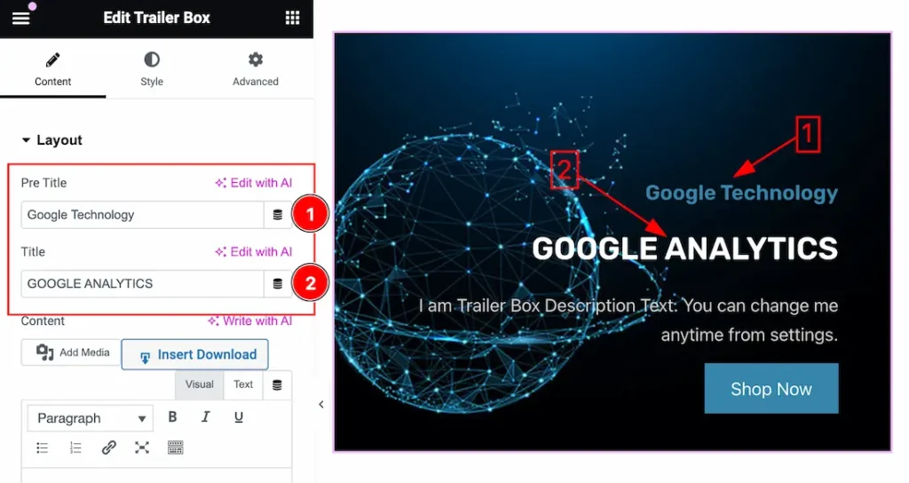
1. Pre Title: This option lets you change the Pre Title of the Trailer Box.
2. Title: This option lets you change the Title of the Trailer Box.
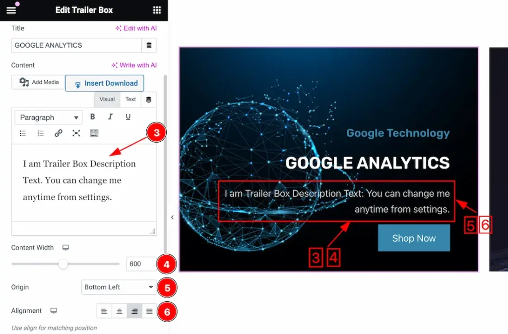
3. Content: This option lets you change the Content of the Trailer Box.
4. Content Width: you can set the Content Width as your working demand.
5. Origin: This option lets you change the Content Origin. Here you will get these options for the Origin – Default, Top Left, Top Right, Top Center, Center, Center Left, Center Right, Bottom Left, Botton Center, and Bottom Right.
6. Alignment: Alignment may refer to the positioning of Content within a specified space or column. you can set the Alignment – Left, Center, Right, and Justified.
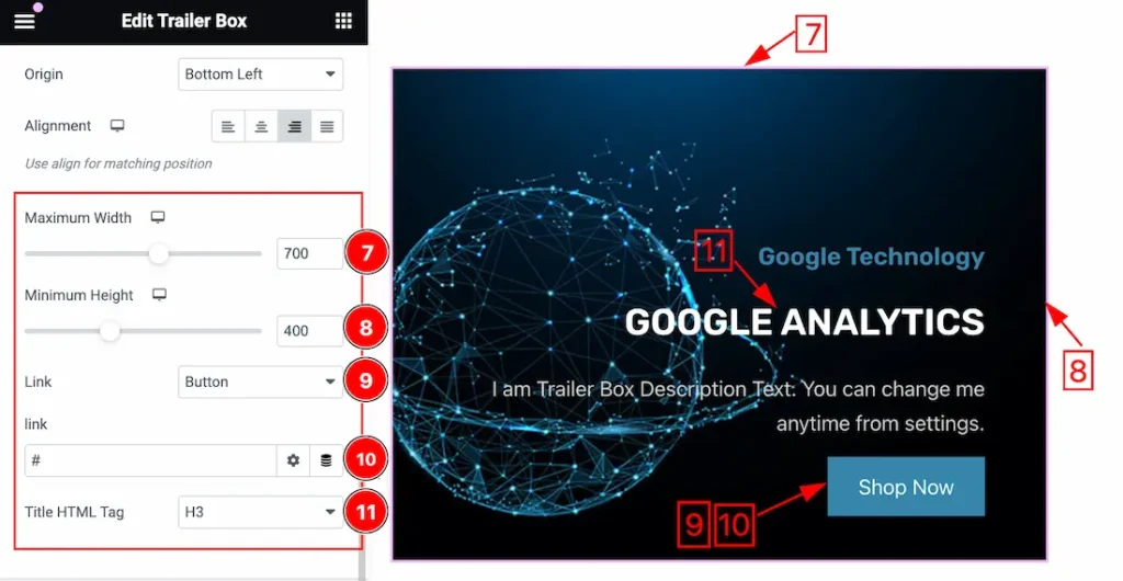
7. Maximum Width: This option lets you change the Maximum Width of the Trailer Box.
8. Maximum Height: This option lets you change the Maximum Height of the Trailer Box.
9. Link Type: This option lets you set a Link under the Button and the whole Item. You also can set the Link type to None.
10. Link Url: you can set a link for the selected item.
11. Title HTML Tag: Here you also get the Title HTML Tag options to decorate your Title in different Tags, like as H1 to H6, Div, Span, and P.
Button Section
Go to Content > Button
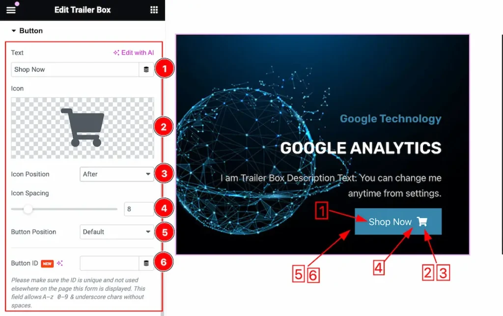
1. Text: This option lets you change the button text.
2. Icon: This option lets you change the button Icon.
3. Icon Position: you can change the icon position from here. Here you get the Icon Position as Before and After.
4. Icon Spacing: The Icon Spacing option lets you set the Spacing between Icon and Text.
5. Button Position: you can change the button position from here. you will get these options – Default, Top Left, Top Center, Top Right, Center, Center Left, Center Right, Bottom Left, Bottom Center, and Bottom Right.
6. Button ID: A Button ID allows developers to attach event listeners to specific buttons, enabling the execution of custom code when the button is interacted with.
Note: Please make sure the ID is unique and not used elsewhere on the page this form is displayed. This field allows A-z 0-9 & underscore chars without spaces.
Work with The Style Tab
Trailer Box Section
Go to Style > Trailer Box
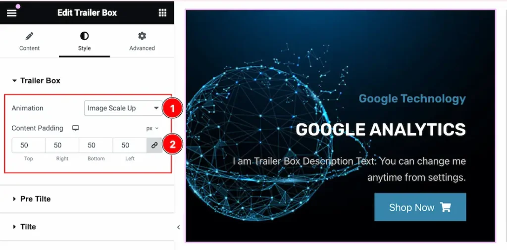
1. Animation: This option lets you set an Animation for the Trailer Box. Here you get this option for Animation – Content, Image Scale Up, Image Scale Down, and None.
2. Content Padding: Add spaces around an object to increase the inner area. Padding allows you to control the internal space within an element. you can set padding for the content as your working demand.
Pre Title Section
Go to Style > Pre Title
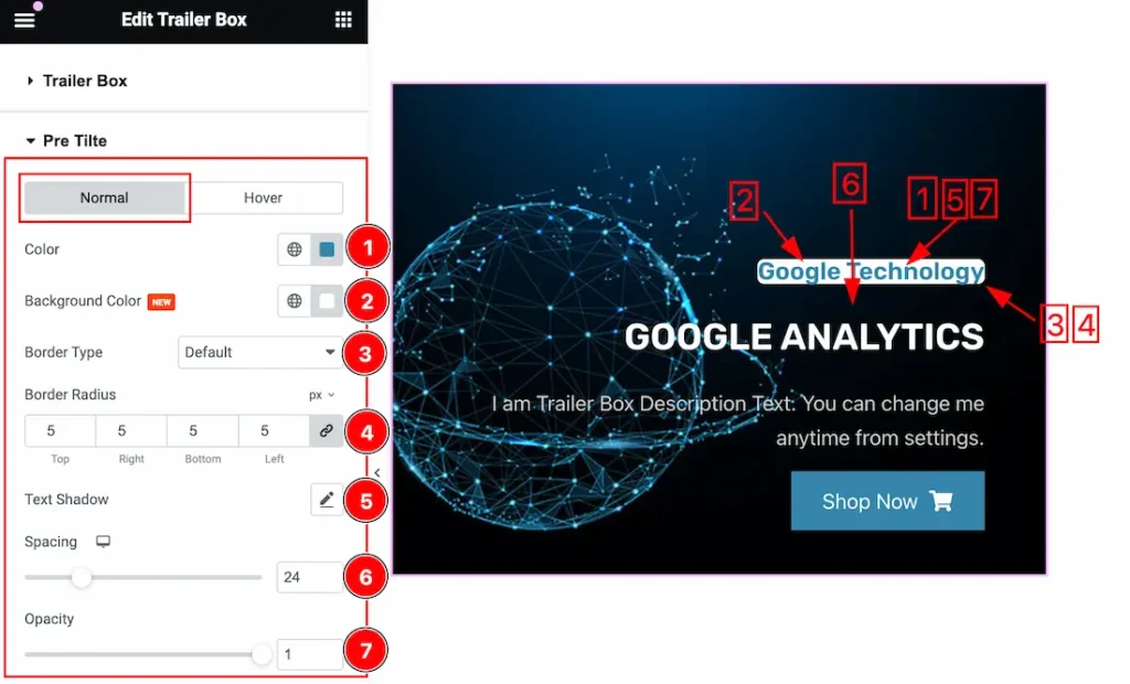
Come to the Pre Title section, you will find two tabs section; Normal and Hover.
In the Normal tab section, you can customize the following-
1. Color: This lets you change the Pre Title color.
2. Background Color: This lets you change the Category Background color. If you want, you also can change an image to the Background.
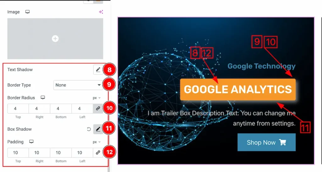
3. Border Type: you can set the Border Type to Default, None, Solid, Double, Dotted, Dashed, or Groove. We choose here the Border Type Solid.
4. Border Radius: Customizes the border corners for roundness.
5. Text Shadow: The Text Shadow property is used to create the shadow around the text. It takes three values: horizontal offset, vertical offset, and blur radius. Here you also can change the Text Shadow Color.
6. Spacing: The Spacing option lets you set the Spacing between Pre Title and Title.
7. Opacity: Here the opacity property is used to transparent or visible the Pre Title. You can set the opacity to your working demand.
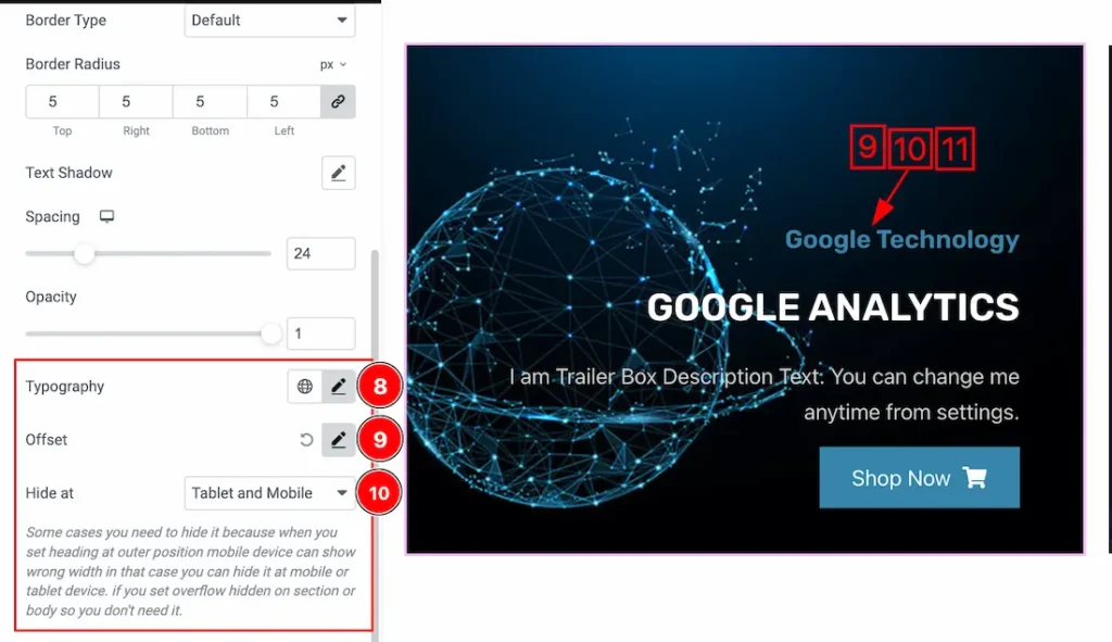
8. Typography: Change the font family, size, weight, style, transform, decoration, line height, letter spacing, and word spacing from here.
9. Offset: The Offset property lets you set the Pre Title positioning. Inside the Offset property, you will get the X Offset, Y Offset, and Rotate options to position the Pre Title.
10. Hide at: The Hide at option lets you hide the Pre Title for Nothing, Mobile, Tablet and Mobile devices. Just select the device then the Pre Title will hide for that device.
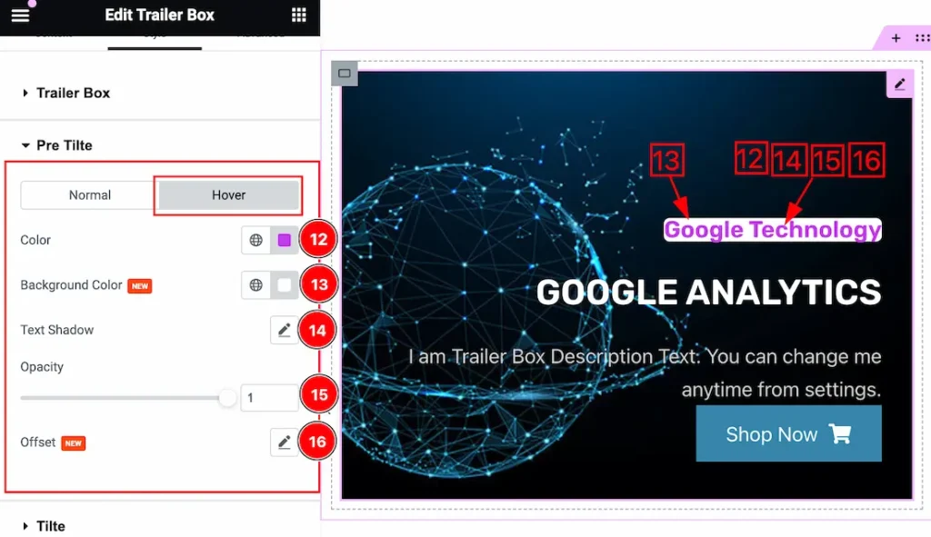
In the Hover sub-section, you can access the same customization options as in the Normal sub-section. This allows you to create distinct styles and effects for when users hover over your slider Pre Title.
Title Section
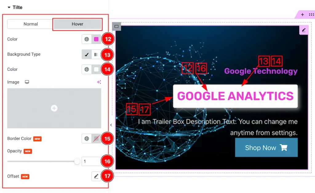
Go to Style > Title
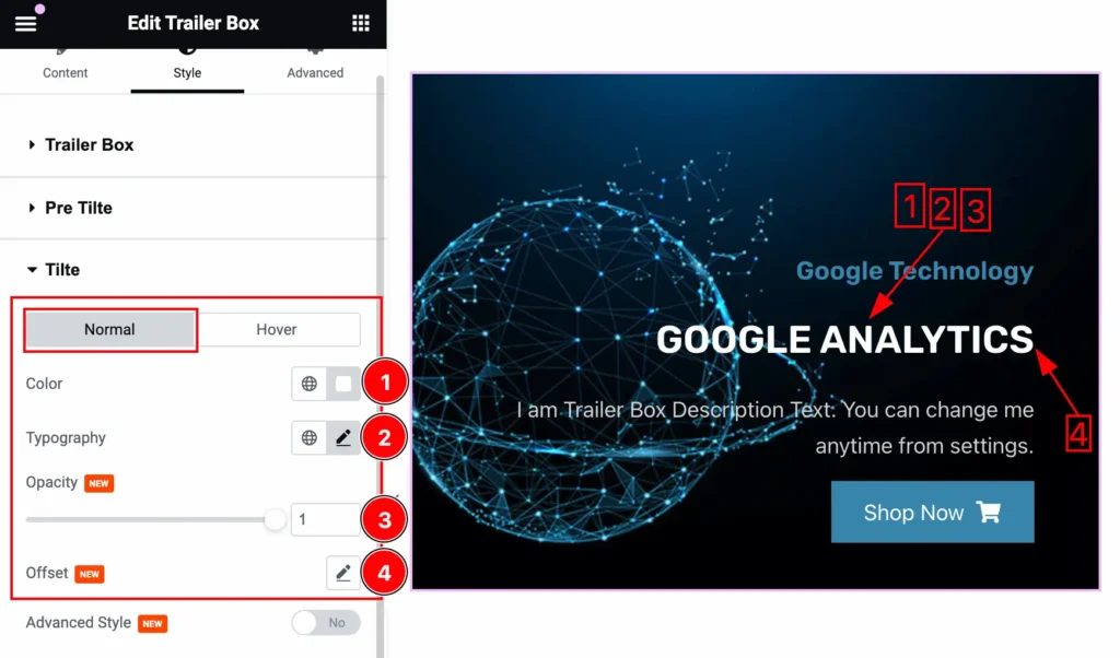
Come to the Title section, you will find two tabs section; Normal and Hover.
In the Normal tab section, you can customize the following-
1. Color: This lets you change the Title color.
2. Typography: Change the font family, size, weight, style, transform, decoration, line height, letter spacing, and word spacing from here.
3. Opacity: Here the opacity property is used to transparent or visible the Title. You can set the opacity to your working demand.
4. Offset: The Offset property lets you set the Title positioning. Inside the Offset property, you will get the X Offset, Y Offset, and Rotate options to position the Title.
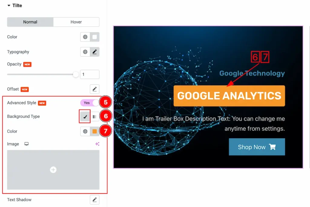
5. Advanced Style: When you enable the Advanced Style Switcher button, you unlock additional features and controls to design your Title. Below is a description of the options available:
6. Background type: you can change the color of any Title background to classic or gradient. Here we choose the Background type Classic.
7. Background Color: This lets you change the Title Background color. If you want, you also can change an image to the Background.
8. Text Shadow: The Text Shadow property is used to create the shadow around the text. It takes three values: horizontal offset, vertical offset, and blur radius. Here you also can change the Text Shadow Color.
9. Border Type: you can set the Border Type to Default, None, Solid, Double, Dotted, Dashed, or Groove. We choose here the Border Type Solid.
10. Border Radius: Customizes the border corners for roundness.
11. Box Shadow: The Box Shadow property is used to create the shadow around the Category Button. It takes Four values: Horizontal offset, Vertical offset, blur, and Spread to customize the Box shadow.
- Box Shadow Color: This lets you change the Box Shadow color.
- Position: you can set the Box Shadow position Outline and Inset. Here we set the Box Shadow position Outline.
12. Padding: Add spaces around an object to increase the inner area. Padding allows you to control the internal space within an element.
In the Hover sub-section, you have access to the same customization options as in the Normal sub-section. This allows you to create distinct styles and effects for when users hover over your slider Title. So please try it yourself.
Text Section
Go to Style > Text
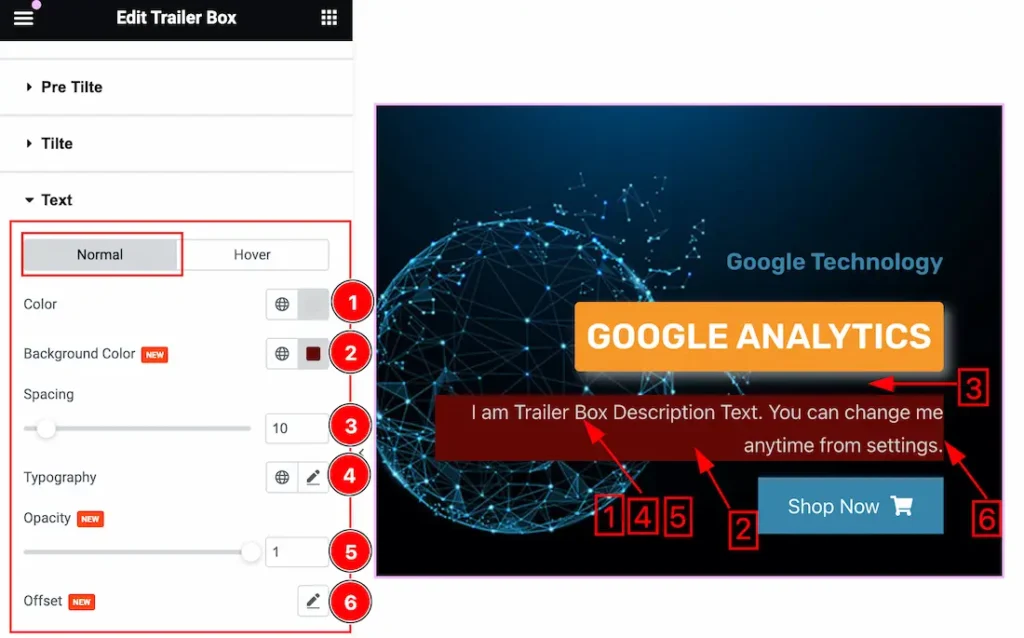
Come to the Text section, you will find two tabs section; Normal and Hover.
In the Normal tab section, you can customize the following-
1. Color: This lets you change the Text color.
2. Background Color: This lets you change the Text Background color. If you want, you also can change an image to the Background.
3. Spacing: The Spacing option lets you set the Spacing between Title and Text.
4. Typography: Change the font family, size, weight, style, transform, decoration, line height, letter spacing, and word spacing from here.
5. Opacity: Here the opacity property is used to transparent or visible the Text. You can set the opacity to your working demand.
6. Offset: The Offset property lets you set the Text positioning. Inside the Offset property, you will get the X Offset, Y Offset, and Rotate options to position the Text.
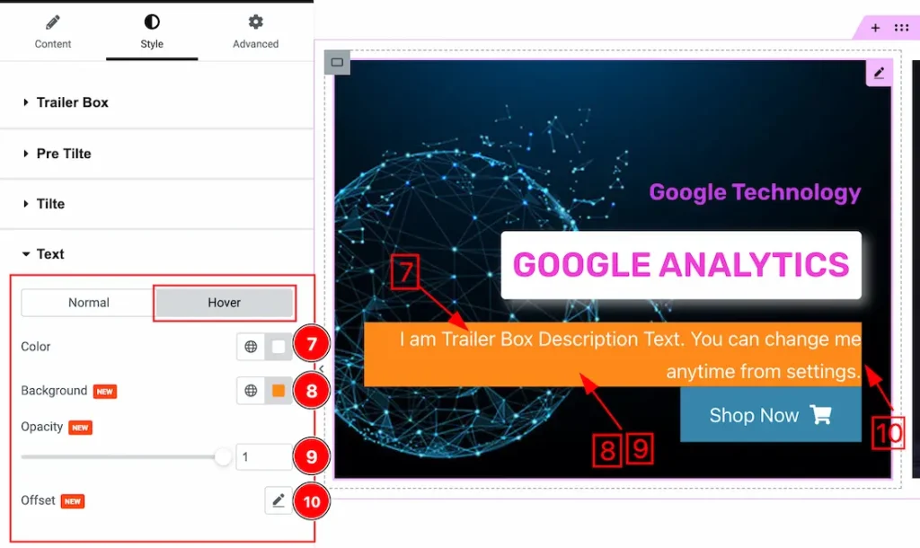
In the Hover sub-section, you can access the same customization options as in the Normal sub-section. So try it yourself.
Button Section
Go to Style > Button
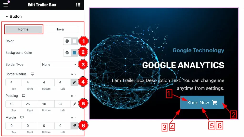
Come to the Button section, you will find two tabs section; Normal and Hover.
In the Normal tab section, you can customize the following-
1. Color: This lets you change the Text color of the Button.
2. Background Color: This lets you change the Text Background color. If you want, you also can change an image to the Background.
3. Border Type: you can set the Border Type to Default, None, Solid, Double, Dotted, Dashed, or Groove. We choose here the Border Type Solid.
4. Border Radius: Customizes the border corners for roundness.
5. Padding: Add spaces around an object to increase the inner area. Padding allows you to control the internal space within an element.
6. Margin: Adjusts the position of an object over the canvas.
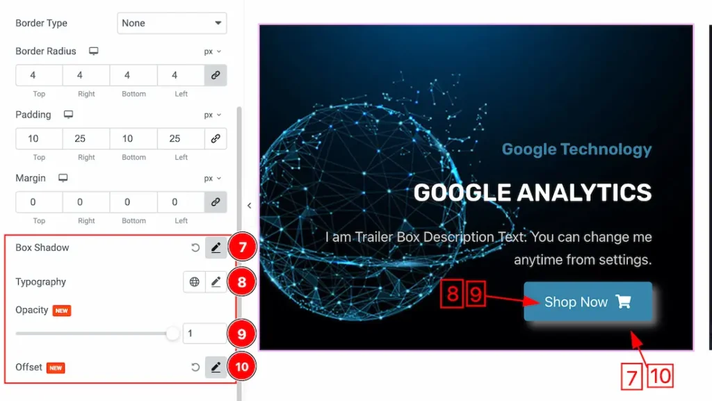
7. Box Shadow: The Box Shadow property is used to create the shadow around the Category Button. It takes Four values: Horizontal offset, Vertical offset, blur, and Spread to customize the Box shadow.
- Box Shadow Color: This lets you change the Box Shadow color.
- Position: you can set the Box Shadow position Outline and Inset. Here we set the Box Shadow position Outline.
8. Typography: Change the font family, size, weight, style, transform, decoration, line height, letter spacing, and word spacing from here.
9. Opacity: Here the opacity property is used to transparent or visible the button. You can set the opacity to your working demand.
10. Offset: The Offset property lets you set the Text positioning. Inside the Offset property, you will get the X Offset, Y Offset, and Rotate options to position the Text.
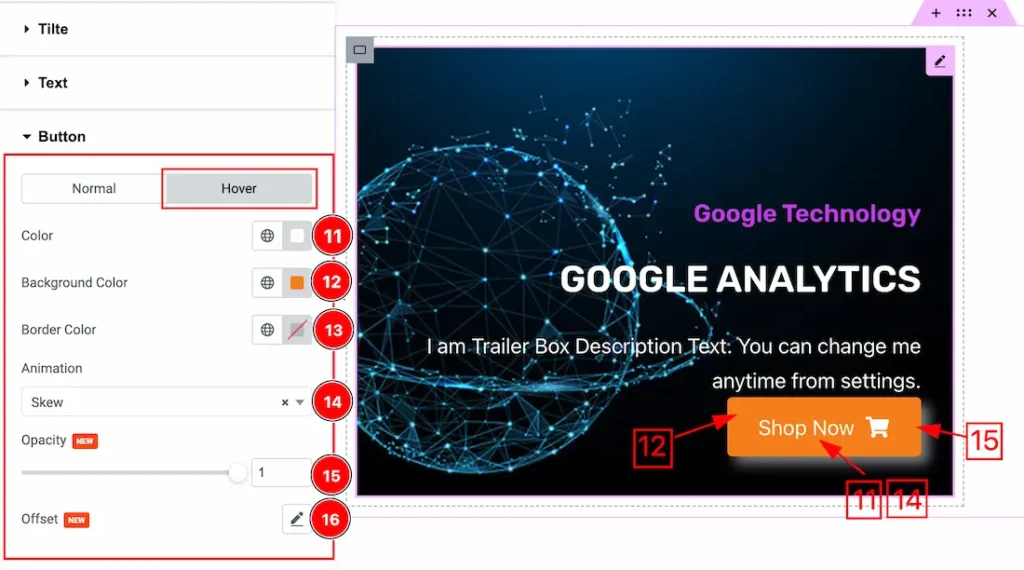
11. Color: This option lets you set the Text Hover Color.
12. Background Color: This option lets you set the Background Text Hover Color.
13. Border Color: This option lets you set the Border Color.
14. Animation: you can set the Animation for the button. Here you will get 1 to 27 types of animation for the button.
15. Opacity: Here the opacity property is used to transparent or visible the Text in hover mode. You can set the opacity to your working demand.
16. Offset: The Offset property lets you set the button positioning. Inside the Offset property, you will get the X Offset, Y Offset, and Rotate options to position the button.
All done! You have successfully customized the Trailer Box widget on your website.
Video Assist
You can also watch the video tutorial Learn more about the Trailer Box widget. Please visit the demo page for examples.
Thanks for being with us.