Elementor Slider widget is a versatile user-friendly tool, used in your websites to show simple images or information in a slideshow, video, or animated layer slider. To use this easy-to-use widget effectively, you need to know how it works. Let me give you a complete guide to it!
To Insert Widget

Inserting the widget is just a matter of drag and drop. However, click and hold on the widget icon from the menu and drag the image sliders to the drop point. Follow the picture above.
Content Tab
Using the Content tab, you can basically make a layout of a particular part of the website.
Sliders

Go to Content Tab> Slider
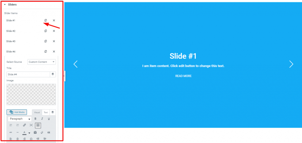
In the first section, you can see a bunch of repeaters. You can increase or reduce the number of repeaters easily by clicking ADD ITEM to increase the carousel images. Each repeater can hold your information in their description.
Layout

Go to Content Tab> Layout
In the Layout section, you can adjust the height of the slide, adjust its alignment and position. The repeaters in the image above show/hide the Title, Button, and scroll in section. Also, you can change the title HTML tag here.
Slider Settings

In this section, you can change the navigation and transition(Slide, Fade, Cube, Coverflow, and Flip ) from the drop-down controllers. Also, you can see some switchers here. They are mainly to control animation, autoplay, loop, etc.
Go to Content Tab> Slider Settings> and see the functions of the switchers.
Button

Go to Content Tab> Button
This is the last part section of the Content tab. Here, you can edit the text, add an icon, icon position, and spacing of the Button under the description for the Elementor Slider Widget.
Style Tab
Now, time for some Style. In this Style tab, you will have more options to create your unique Slider widget as you like. Let’s have a look.
Slider

Go to Style Tab> Slider
This is the first section of the Style tab. In this section, you can change the background color and padding of the slider.
Title

Go to Style Tab> Title
With this section, you can customize the title of the Slider. You can change the color, add padding, typography, and space to it.
Text

Go to Style Tab> Text
This section lets you edit the appearance of the text under the title of the Slider.
Button

Go to Style Tab> Button
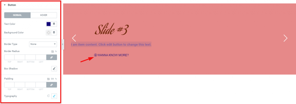
You can change the color, border, add box-shadow, or padding to the button down below. Also, you can change the typography of its content.
Navigation

Go to Style Tab> Navigation
Lastly, you can change the arrow color to white or dark from this section. You can change the arrow position or size also for the slider widget.
Video Assist
Well done. Seems you have learned the whole thing and how it works. It is easy and fun. Watch Video Assist and to get more in-depth ideas about the usage of the Slider widget and awesome image sliders, take a tour to the demo page.
[Note- on-page video link]

