Sequester slider is another minimalistic slider for WordPress that was intended to increase your brand value, social engagement, and promote products with customizable animated navigations, mega heading, button social share, and more.
Now, let’s explore widget customization.
Inserting The Sequester Slider widget

You can add this Sequester Slider addon to WordPress by opening the page you want to use it on in Elementor and then dragging and dropping the Sequester Slider widget into that page. Please note that you need both Elementor and Prime Slider installed before you can use this widget.
Work With The Content Tab
Layout Section Customizations
Go to Content > Layout
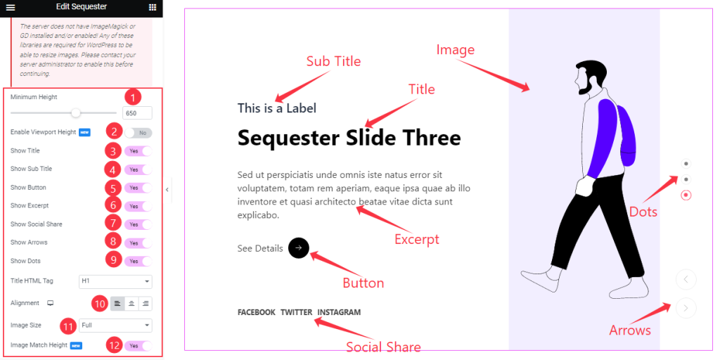
The Sequester Slider Layout section gives you a Minimum Height option to adjust the net height of all slides and also the On/Off Viewport Height. The viewport height of the slider is the height of the element containing the slider visible to the display screen size.
Then you will get the Show Title, Show Sub Title, Show Button, Show Excerpt, Show Social Share, Show Arrows, Show Dots, and Image Match Height switchers which you can turn on/off to show/hide these elements from the Sequester slider interface.
Then comes a text content Alignment option, and you can also customize all Image Size as your working demand.
Sliders Section Customizations
Go to Content > Sliders
Step-1
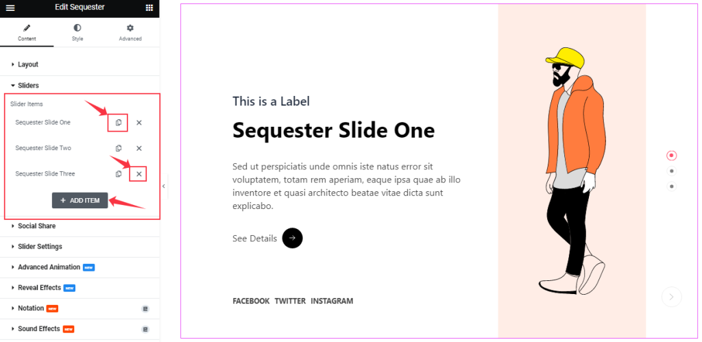
Here, you can easily add a Sequester slider item by clicking Add Item button. Otherwise, you may increase the Items by clicking the Duplicate Sign symbol, and you can also decrease/remove your item by clicking the Cross sign as shown in the screenshot above.
Step-2
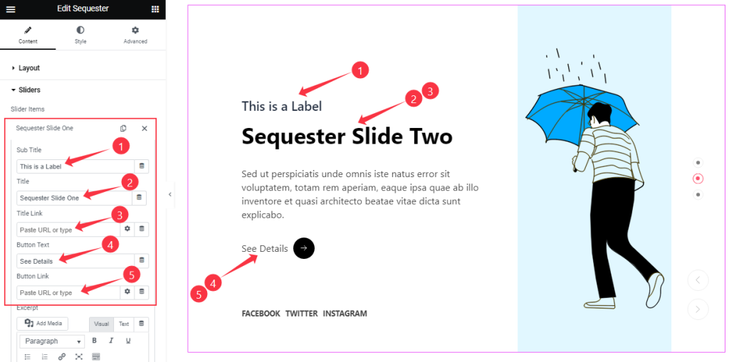
Clicking on a slider item, you will get to change the Title, Sub Title, Title Link, Button Text, and Button Link to set up your slider items.
Step-3
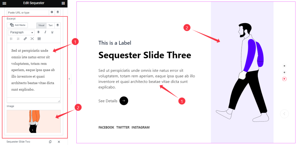
Also, you can change the description Text that sits below the title and set an Image for each slide.
Customizations Of The Social Share Section
Go to Content > Social Share
Step-1
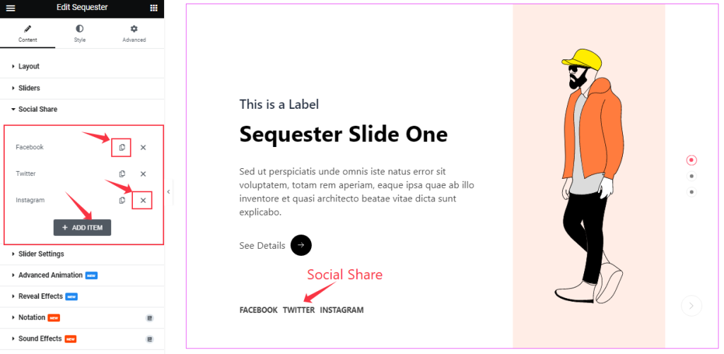
Similar to the Sliders section, the Social Share icons in the Sequester Slider also come in box shape options. You can duplicate current ones, reduce them by clicking the Cross icon, or add new ones with the Add Item button.
Step-2
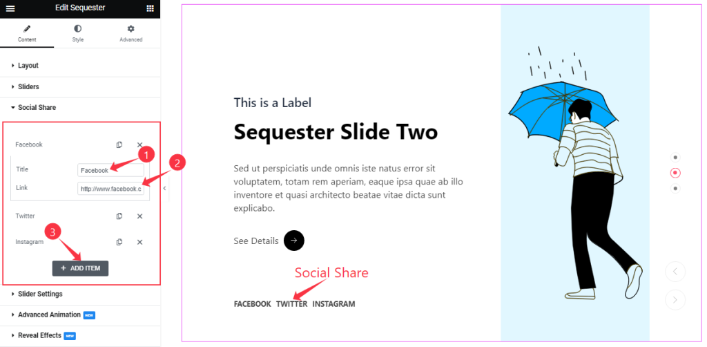
Each social share box/item gives you a Title and Link field to onboard social links as text-type buttons.
Slider Settings Section Customizations
Go to Content > Slider Settings
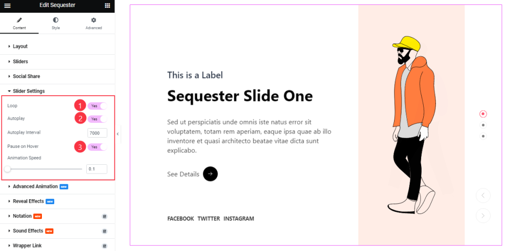
Here, you can toggle some options such as Auto Play, Pause on Hover, and Loop. The options also come with Autoplay Interval and Animation Speed settings for the Sequester slider.
What they do-
Autoplay switcher: Enable the switcher to make the slider slide Automatically with a customizable Autoplay Speed control.
Pause on Hover: If turned on, when you Hover your mouse cursor on the slider, then your slider will Hold; otherwise, your slider will Autoplay.
Loop: The slider will loop infinitely at a certain time interval. You can also set up the loop animation speed here.
Advanced Animation Section Customizations
Go to Content > Advanced Animation
Step-1
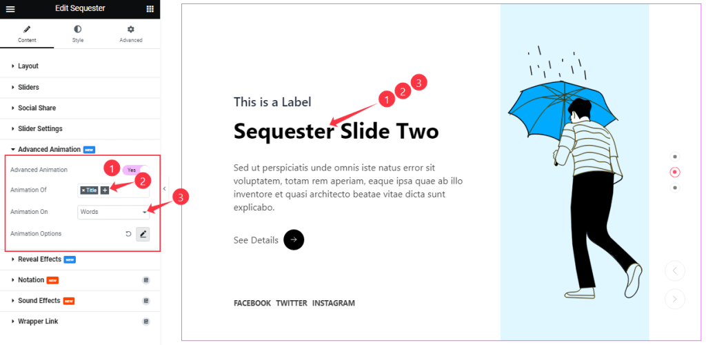
In the Advanced Animation section, you can easily turn on/off the switcher to show/hide the additional Animation Effect for the slider.
The animation can be configured for the Title and Sub Title. Also, you can select the Animation on Words, Characters, and Lines.
Step-2
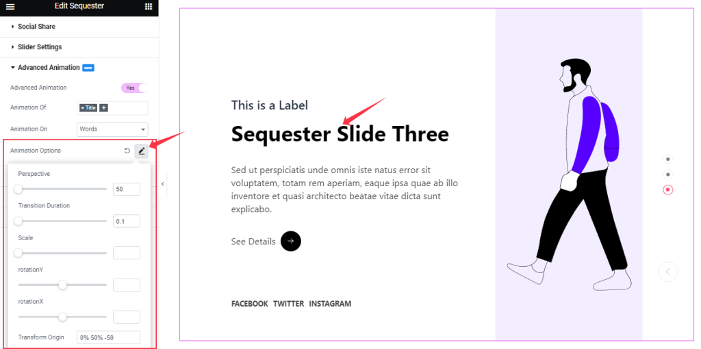
You can further do tuning on the animation from the Animation Options as your working demand.
Work With The Style Tab
Style The Sliders Section
Step-1
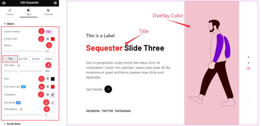
In the Sliders section, you can apply a Custom Overlay, and choosing a background for overlay lets you choose an Overlay Color, which will cover the background image. Also comes with Opacity adjustments for the overlay.
Below, the options are divided into 4 subsections. For the Title sub-section, you change the Title Width, Title Color, First Word Color, Typography, Text Stroke, and Title Spacing.
Step-2
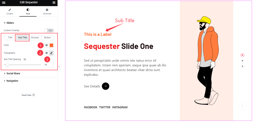
By clicking the Sub Title sub-section, you can change the Sub Title Color, Typography, and Sub Title Spacing for a better-looking slider.
Step-3
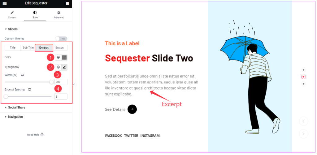
For Excerpt, you can customize the Color, excerpt Width, Typography, and Excerpt Spacing separately.
Step-4
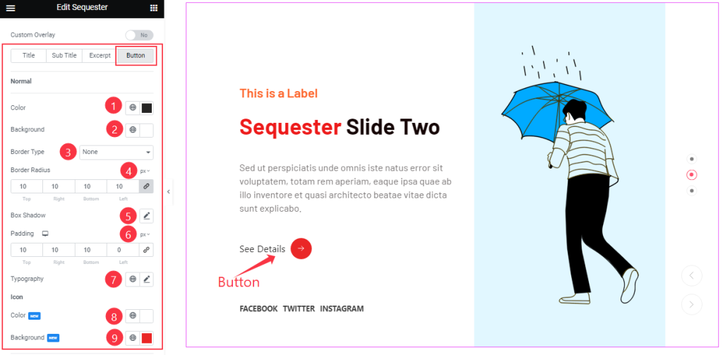
In the Button sub-section, the options expand into Color settings, Border settings, Padding, Box Shadow, Typography, and Icon Color.
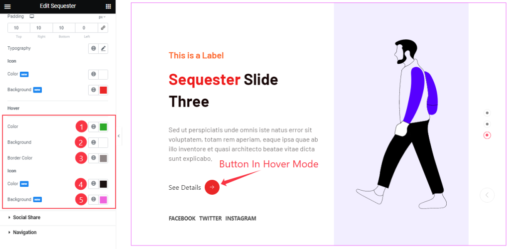
The color options are available for adding hover effects also, and you will find those options when you scroll down.
Customizations Of The Social Share Section
Go to Style > Social Share
Step-1
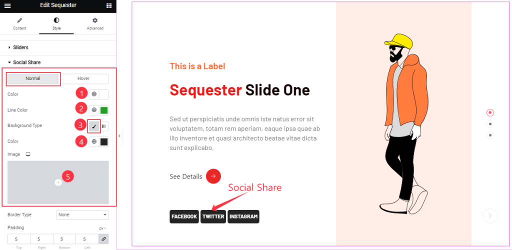
The social share section is divided into Normal and Hover subsections. For Normal, you can change the icon text Color, Line Color, and icon Background Type.
Step-2
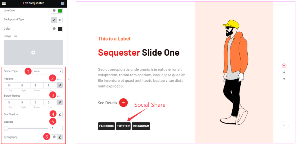
The Normal mode also lets you customize Border Type, Border Radius, Padding, Box shadow, Spacing, and Typography options.
Step-3
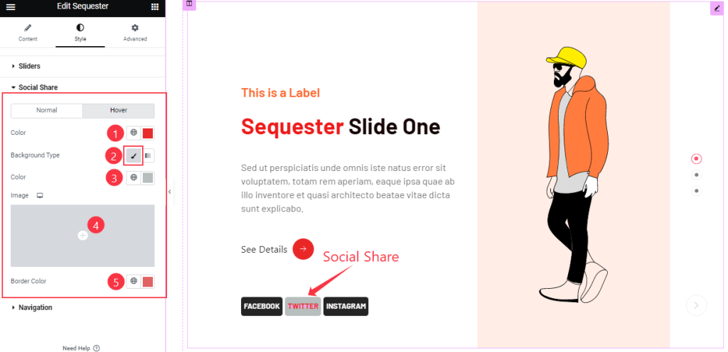
In Hover mode, you will get similar customization options to modify the appearance of this section like Normal mode.
Work with the Navigation Section
Go to Style > Navigation
Step-1
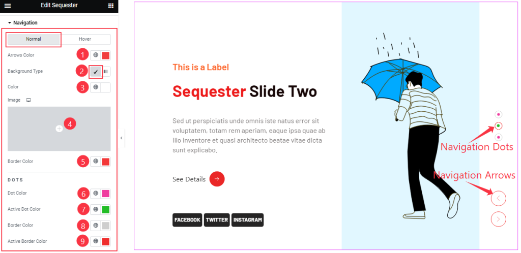
The last section in Normal Mode lets you change the Navigation Arrows Color, Dots Color, Active Dot Color, Border Color, Active Border Color, and Background Type.
Step-2
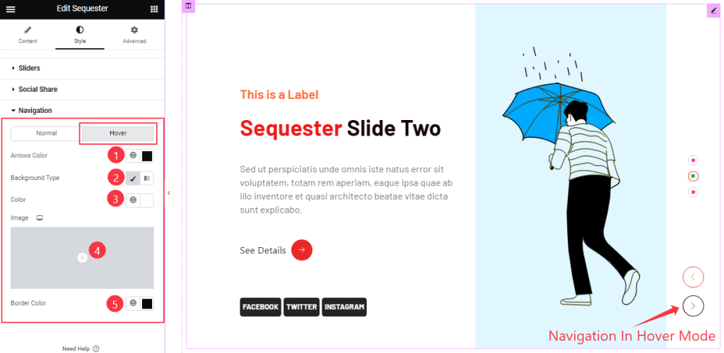
In Hover mode, you can modify the color options for the icon, background, and border for the arrows.
All done! You have successfully customized the Sequester Slider widget on your website.
Video Assist
You can visit the demo page to learn more about the Sequester Slider widget.
Thanks for staying with us.