The Review Card Grid widget is a wonderful feature presented by BDthemes and it is a part of the Element Pack Pro. It helps you show the customer review in grid view and grow more visitors.
Now, let’s learn how to use the widget on your site.
Insert the widget

To insert the widget on your page, type Review Card Grid in the search field, then just drag-drop the widget in the text area.
Check the default view of the Review Card Grid Layout
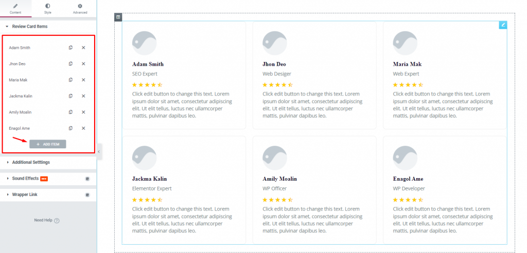
After inserting the widget, you will see a default view of the review grid. Notice that the review cards are comprised of an image along with name and designation, and a rating indicator with a text below it which is the info of the reviewer.
On the left, you see the item or card list, and below is a button to add more items.
Let’s create the Review Card Grid Layout
Now, we are going to create the layout. Let’s proceed!
Step 1 – Customize the grid items
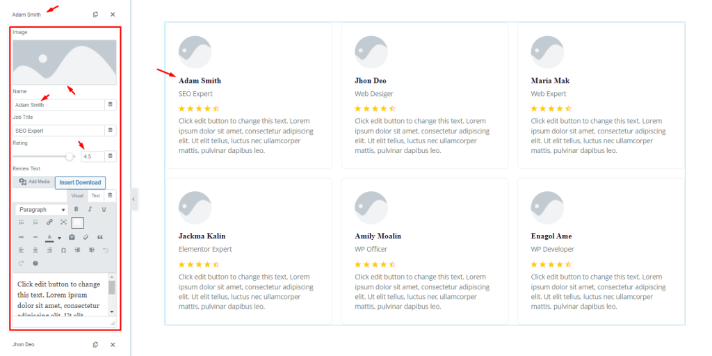
To start, first, click on the 1st item, then change the image, after that, change the name, next, set the review rating as 4.5 using the scrollbar. Don’t forget to put text in the description field.
Step 2 – Customize grid items settings
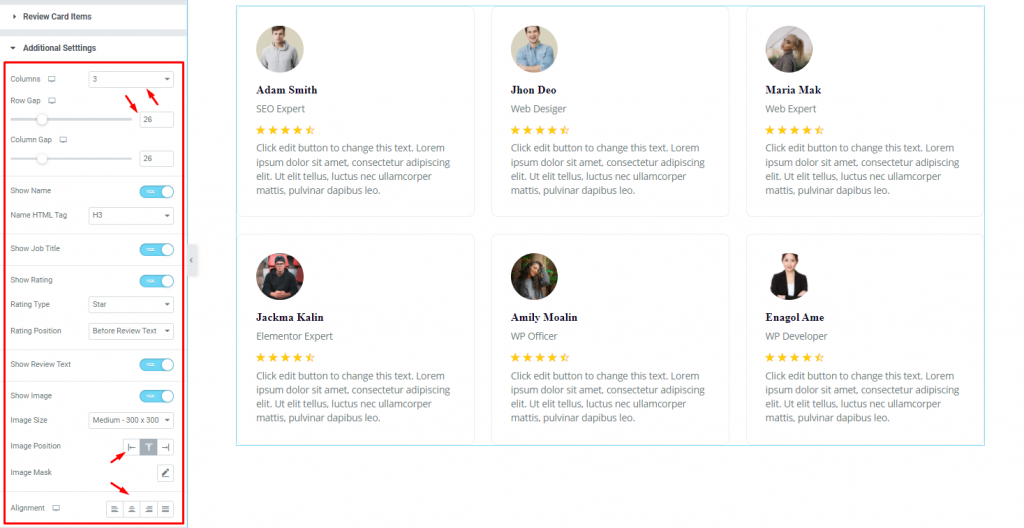
Go to Content> Additional Settings
In this section, you can select the column number, set the Row Gap using the scrollbar, and you can set the Image Position and text Alignment.
There are some switchers in this section i.e.: Show Name, Show Job Title, Show Rating, Show Review Text, and Show Image, you can enable or disable them as you want to decorate the grid view, and some drop-down option fields i.e.: Name HTML Tag, Rating Type, Rating Position, and Image Size, you can choose one from these as you like.
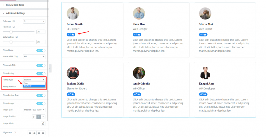
In the same section, you can set the earlier mentioned Rating Type to either Star or Number, and select the rating position either before or after the review text. See the effect on the page.
Customize the Review Card Grid with the Style tab
Let’s customize the Review Card Grid using color, border, padding, etc., using the style options.
Items section customization
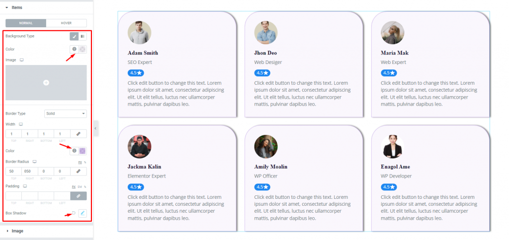
Go to Style> Items
In this section, you can change the Background Type, set the background color, add a thin border and set a color, add Border Radius, and set Box Shadow as you wish.
Image section customization
Step-1
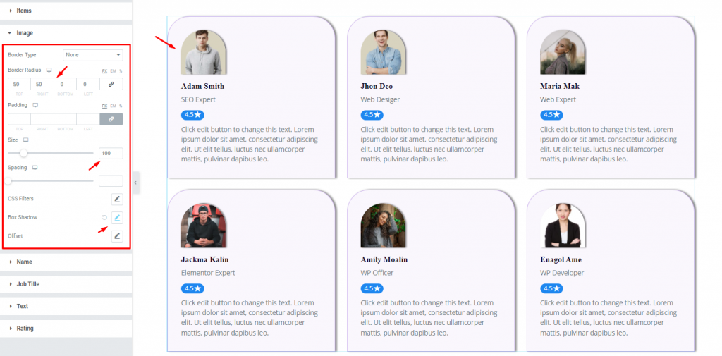
Go to Style> Image
In the Image section, you can set the image Border Radius, select the image size, and set a Box Shadow. You can also change the other options here. The effect is shown on the page.
Step-2
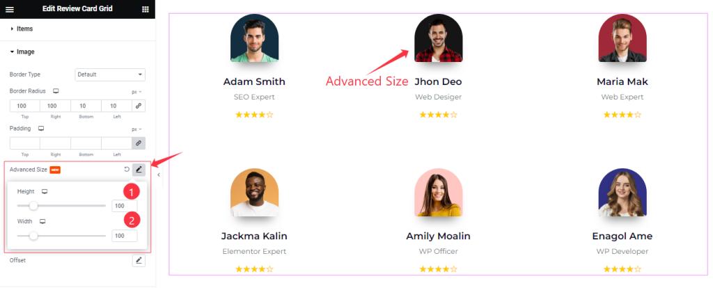
Here also Find the Advanced Image Size (Height, and Width) options.
Name section customization
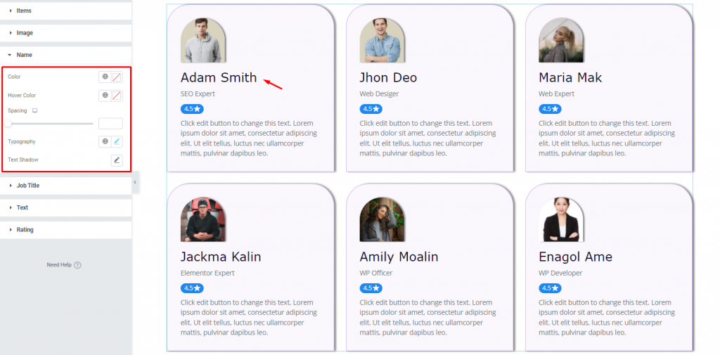
Go to Style> Name
In this section, you can change the name Color and Hover Color, set Spacing, set the Typography and Text Shadow as you like.
Rating section customization
Go to Style> Rating
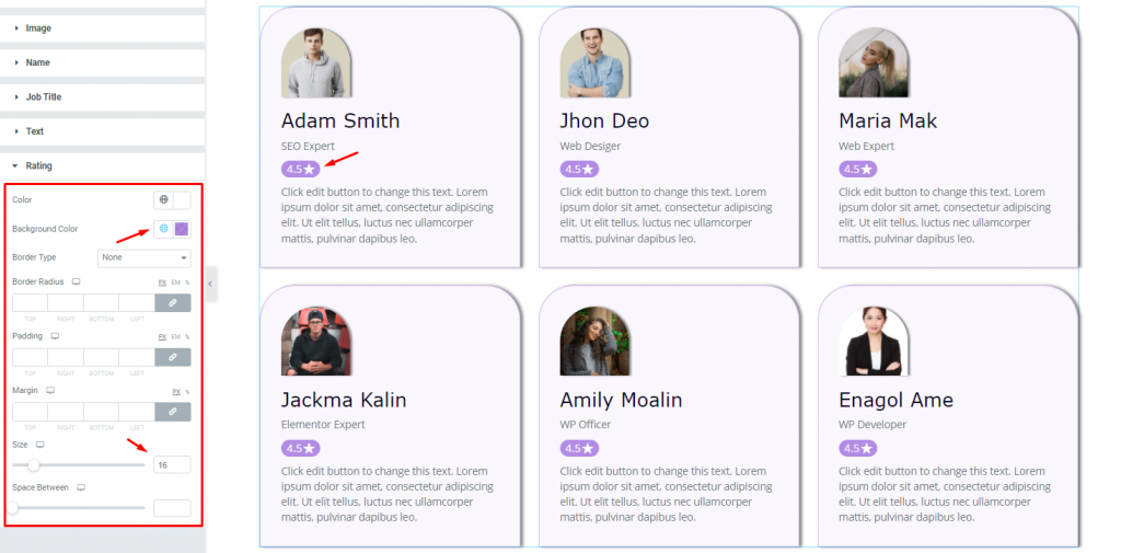
Lastly, in the Rating section, you can change the rating Color, rating Background Color, and select the size. There are other options you can change at your will to beautify the view.
Addition Style section customization
Go to Style> Addition Style
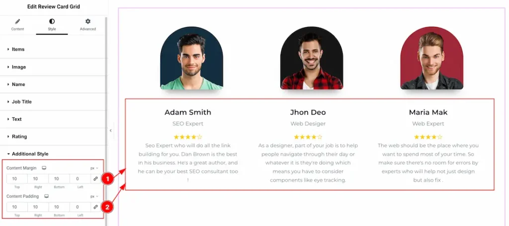
1. Content Margin: You can adjust the Content margin from here.
2. Content Padding: You can adjust the Content Padding from here.
All done! You have successfully customized the Review Card Grid widget on your website.
Video Assist
You can watch this quick video to learn more about the Review Card Grid widget and visit the demo page for more examples.
This document is presented by BdThemes.

