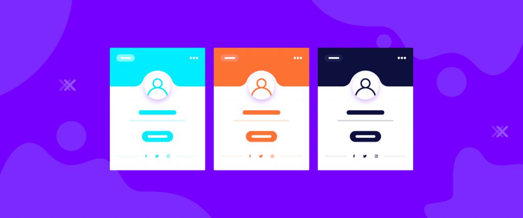
Elementor Profile Card widget is a smart widget that shows your profile with a unique style. The goal of this widget is to showcase a stunning profile to the visitors. As you have the option to showcase your posts, blogs, followers all over in the internet world, this widget hits on the spot.
To use this easy-to-use widget effectively, you need to know how it operates. Let me give you a complete guide to it!
To Insert Widget

Inserting widget is just a matter of drag and drop. However, click and hold on the widget icon from the menu and drag the profile card widget to the drop point. Follow the picture above.
Content Tab
Using the Content tab, you can lay the basic foundation of the Profile Card widget. Let’s begin!
Layout
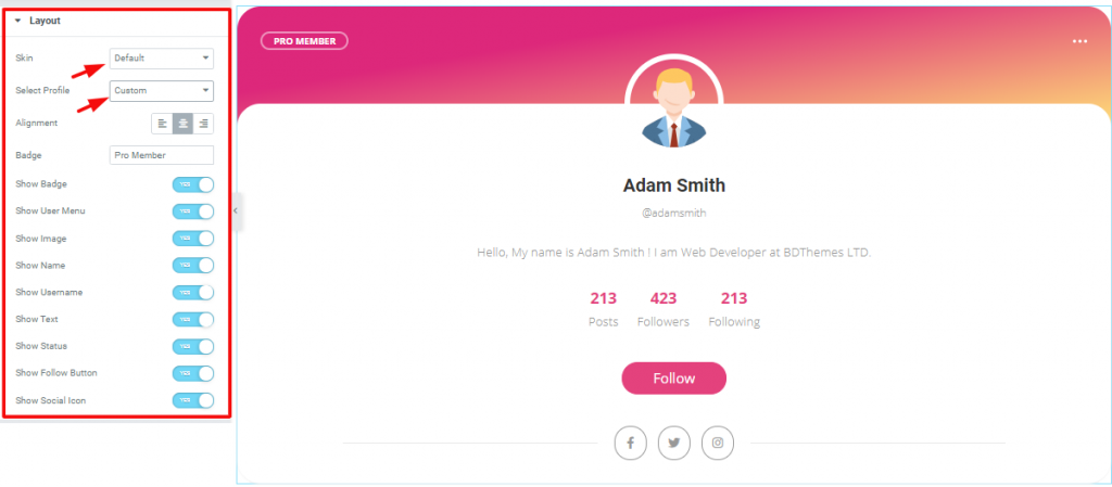
Go to Content Tab> Layout
The first section Layout has some controllers and a lot of switchers. You can select different appearances from Skin, which is currently on Default. Remember, each Skin comes with a slightly different set of editable sections.
Also, you can select what profile cards you want to show from Select Profile. However, you can use the switchers to show/hide information on the screen.
Custom Profile

Go to Content Tab> Custom Profile
In this section, you can insert any images, edit the name and username, edit the profile description, etc. Also, you can change the numbers and titles under the summary as posts or followers or anything you like on the Elementor Profile Card Widget.
Social Icon
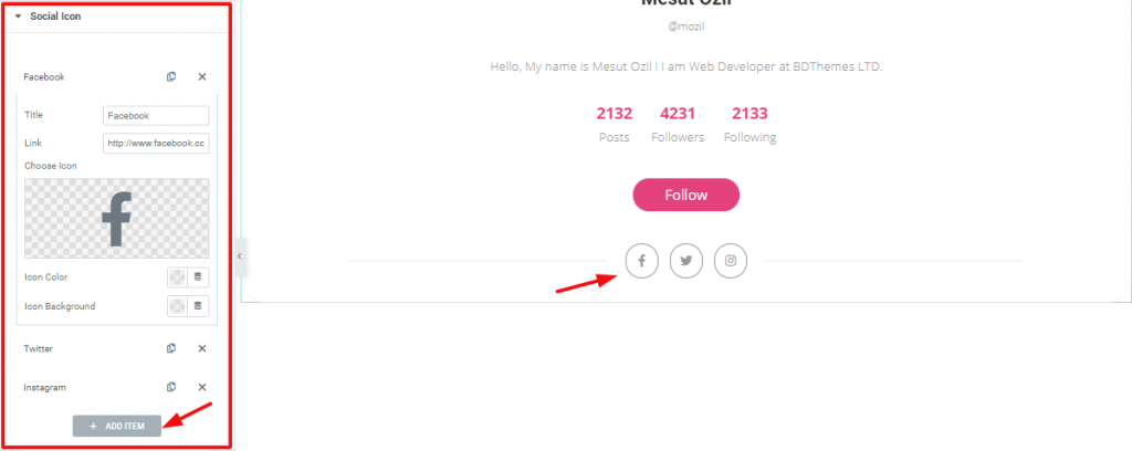
Go to Content Tab> Social Icon
This section mainly lets you place social icons below the Follow button. You can add/remove the repeaters and edit the details of each repeater from this section.
User Menu

Go to Content Tab> User Menu
Similar to the Social Icon section, the User Menu lets you customize the actual user menu on the top right corner of the Profile Card widget. You can add a link to each repeater on the user menu that redirects the visitor upon clicking it.
Additional Settings

Go to Content Tab> Additional Settings
In this section, you can edit the width, position, offset of the User Menu.
Style Tab
Now, time for some Style. In this Style tab, you will have more options to create your unique Profile Card widget as you like. Let’s have a look.
Header Area
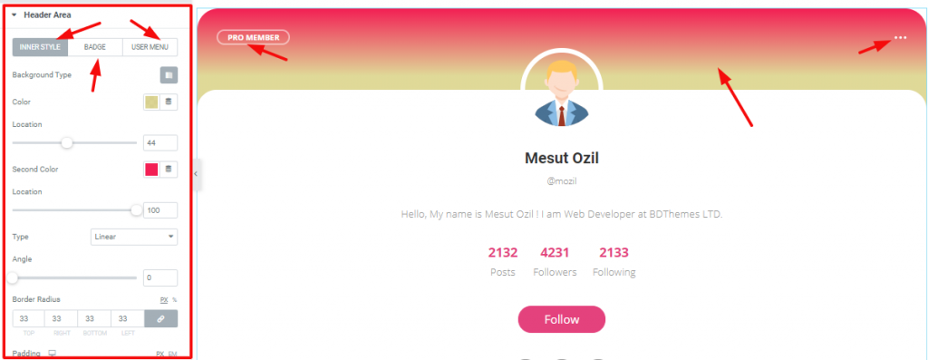
Go to Style Tab> Header Area
The first section of the Style tab is the Header Area. In this section, you can change the color, width, border, etc. of the header part. Similarly, the Badge and User Menu also includes in the header area for further customization of the Elementor cards.
Content Area
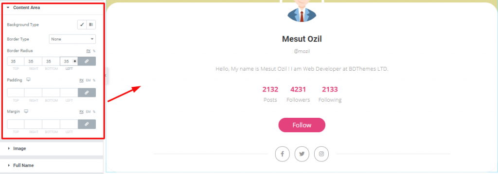
Go to Style Tab> Content Area
You can basically change the color, border, add padding, or margin to the remaining part excluding the header area of the Profile Card widget.
Image

Go to Style Tab> Image
You can determine the size of the image form this Image section. Moreover, you can change the border, border-radius, or vertical position from Match Spacing from here.
Full Name

Go to Style Tab> Full Name
You can change the color, spacing, and typography of the name of the Profile Card from this section.
User Name

Go to Style Tab> User Name
You can edit the color and typography of the user name from here.
Bio

Go to Style Tab> Bio
This section lets you edit the color, spacing, and typography of the bio of the Profile Card.
Status

Go to Style Tab> Status
Change the color and typography of the status area of the Profile Card from this section.
Follow Button

Go to Style Tab> Follow Button
Basically, in this section, you can customize the appearance of the Follow button on the screen. You can however add a hover effect to it also.
Social Icon
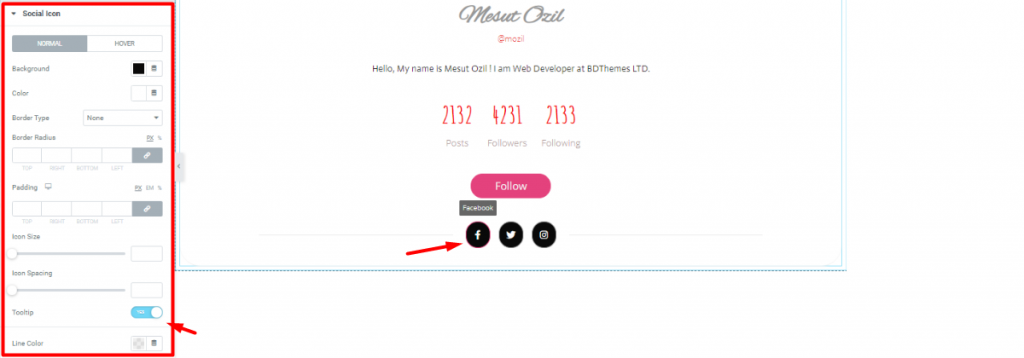
Go to Style Tab> Social Icon
Lastly, you can customize the appearance of the social icons down at the bottom of the Profile Card. You can change their colors, increase their size, and select border type. Also, you will get a switcher to show/hide the Tooltip.
Video Assist
Well done. Seems you have learned the whole thing and how it works. It is easy and fun. Watch Video Assist and to get more in-depth ideas about the usage of the Profile Card widget by Bdthemes, take a tour to the demo page.

