The Prism slider presents a dignified post layout having a pristine background graphic and centered item image to drag the focus of your visitors on your product into your WordPress website. It’s a beast if you want your website go viral with the awesome Prism slider widget for WordPress.
Let’s explore the customizations now.
Inserting The Prism Slider widget

You can add this Prism Slider addon to WordPress by opening the page you want to use it on in Elementor and then dragging and dropping the Prism Slider widget into that page. Please note that you need both Elementor and Prime Slider installed before you can use this widget.
Work With The Content Tab
Layout Section Customizations
Go to Content > Layout
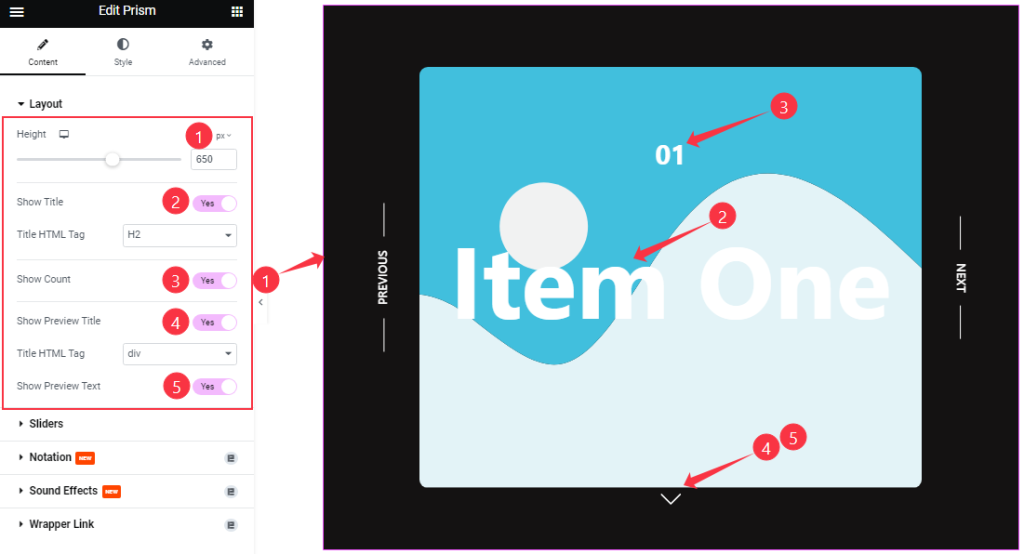
From the Layout section, you can adjust the Height scrollbar to adjust the net height of all slides. The following switchers Show Title, Show Count, Show Preview Title, and Show Preview Text let you show/hide these elements from the Prism slider by turning those switchers on/off.
Sliders Section Customizations
Go to Content > Sliders
Step-1
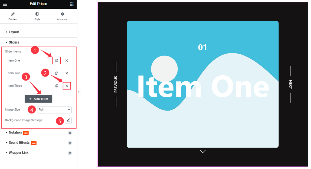
Here, you can easily add a Prism slider item by clicking Add Item button. Otherwise, you may increase the Items by clicking the Duplicate Sign symbol and you can also decrease/remove your item by clicking the Cross sign as shown in the screenshot above.
The options also let you customize all the Slider Image size and customize the Background Image Settings from single points.
Step-2
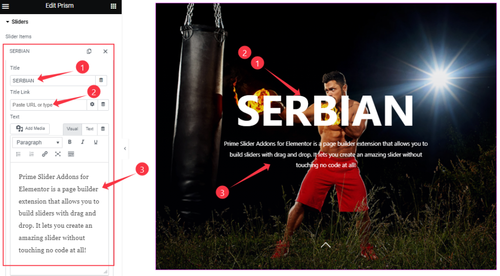
Clicking on a slider item, you will get to change the Title, Title Link, and description Text to set up your slider items.
Step-3
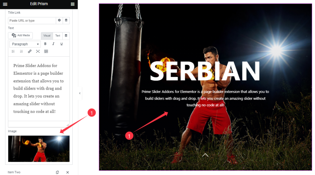
The slider Image option is the last thing you will find there. All slider items will provide the same set of options for customization.
Work With The Style Tab
Sliders Section Customizations
Go to Style > Sliders
Step-1
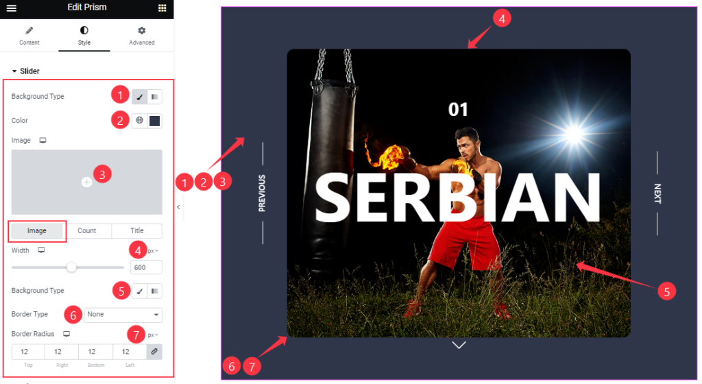
In this section, you can change the Background Type and Background Color. The background is the visible area behind the image and other content around the slider image.
The section further expands into 3 subsections to customize the Image, Count, and Title separately.
For the image, you can change the maximum image Width, and set a Border Type, and Border Radius.
Step-2
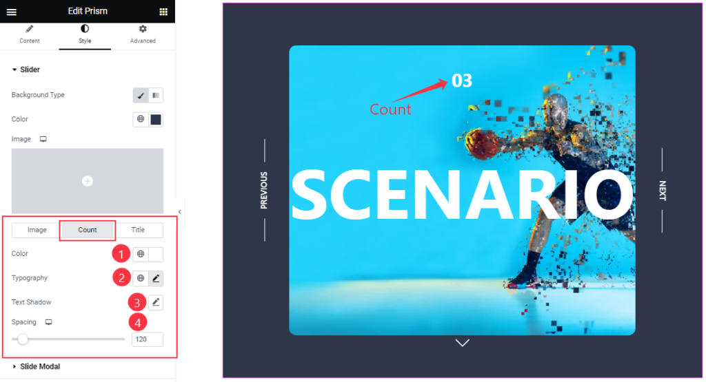
For the count number, you can change the Count Color, customize Typography, and configure Text Shadow. Also, the Spacing between the count and title can be adjusted.
Step-3
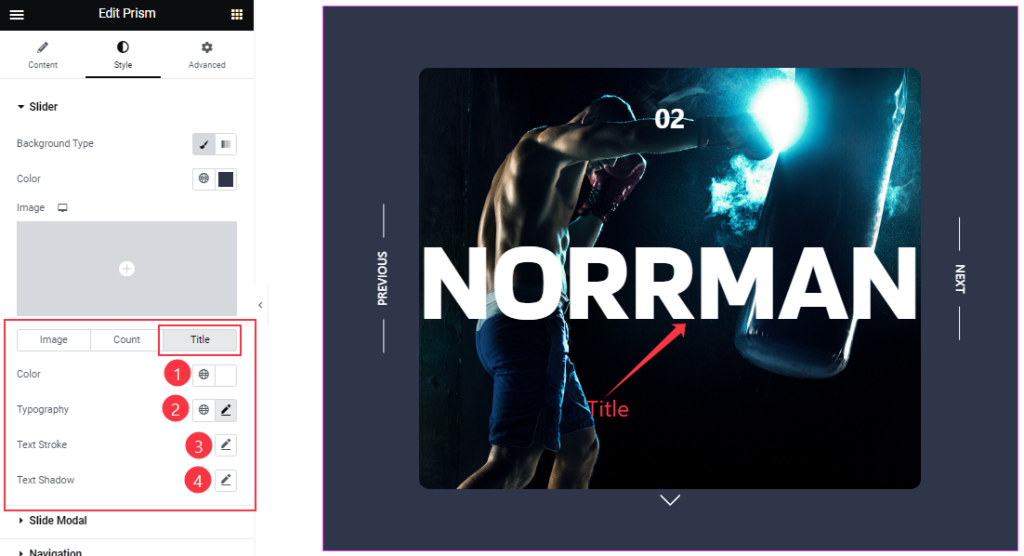
From the Title sub-section, you will get to customize text Color, Typography, Text Stroke, and Text Shadow options.
Slide Modal Section Customizations
Go to Style > Slide Modal
Clickin on the tiny arrowhead below the slider image opens the image in Modal/Lightbox view. The Slide Modal section is responsible for customizing the content inside the modal window.
Step-1
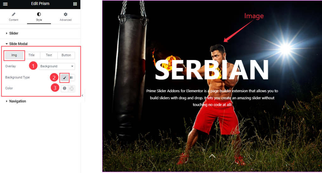
The first of the Four sub-sections lets you change the Overlay Type and Color for the Image.
Step-2
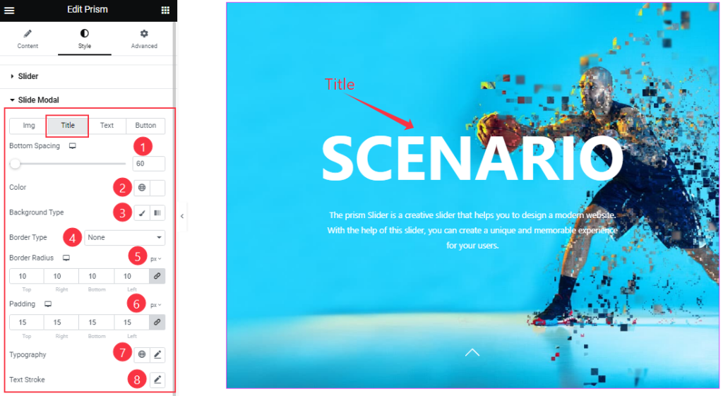
For the Title, you can change the Bottom Spacing, text Color, Background Type, Border Type, Border Radius, and Padding. Here, you also configure the Typography and Text Stroke.
Step-3
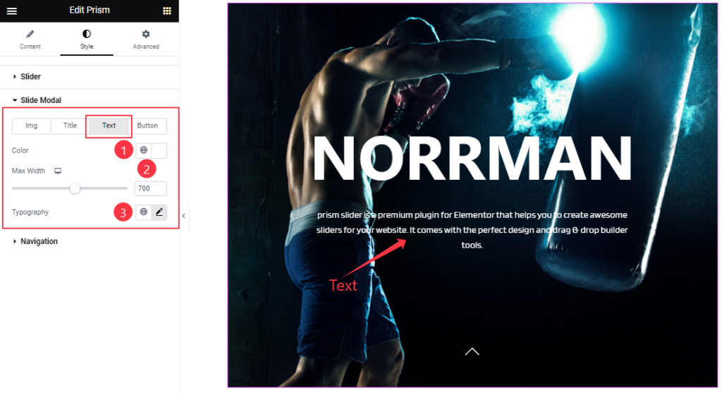
For Text, you can customize the Color, Max Width, and Typography.
Step-4
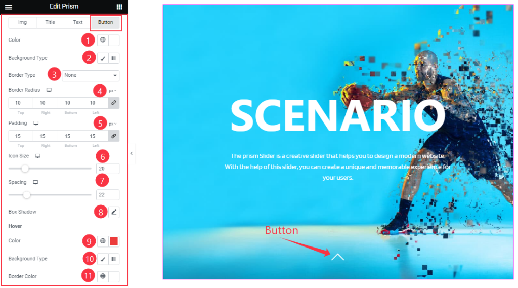
In the Button sub-section, the options expand into Color settings, Border settings, Padding, Icon Size, Spacing, and Box Shadow. The color options are available for adding hover effects also.
Work with the Navigation Section
Go to Style > Navigation
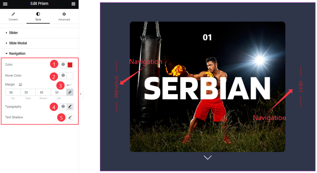
The last section lets you change the Navigation Color, Hover Color, Margin, and Typography. You can also configure Text Shadow for the navigations if you like.
All done! You have successfully customized the Prism Slider widget on your website.
Video Assist
Video Coming Soon!
You can this visit the demo page to learn more about the Prism Slider widget.
Thanks for staying with us.