The Marble slider is a unique and tricky slider widget that presents your posts resembling a horizontal timeline. The whole slider can be customized to perfectly fit as a featured section on your site.
Let’s explore how you can customize the slider.
Inserting the Marble Slider widget by Prime Slider

You can add the Marble slider to WordPress by opening the page you want to use it on in Elementor and then dragging and dropping the Marble slider widget into that page. Please note that you need both Elementor and Prime Slider installed before you can use this widget.
Introduction of Content Tab
The content tab is the foundation for your widget, much like a frame of a house. Using the content tab, you’ll be able to make a layout of a particular part (Marble slider) of a website.
Layout Section Customizations
Go to Content > Layout.
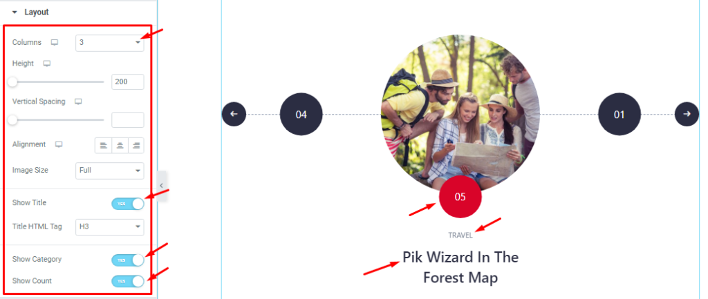
Here, you can set the number of Columns between 1, 3, and 5 for the displayed items on the slider. The Height option lets you change the item height for all sliders on the display. You can adjust Vertical Spacing, Alignment, and Image Size for the Vertex slider as your need.
The Show Title, Show Category, and Show Count Switchers let you show/hide these info on the screen.
Query Section Customizations
Go to Content > Query.
This section sets the source location of data that you need to display by references like Author, Categories, Tags, and Formats. The references can be different in accordance with the source location.
Step-1
Here you can easily select the Source of the displayed items as your wish that you want to see. You may select from posts, pages, forums, landing pages, portfolios, etc.
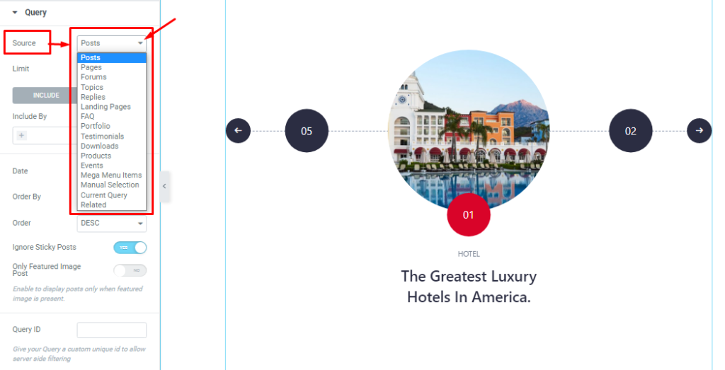
Step-2
Then you can set a Post Limit to limit the number of items to be displayed. Also, you can use the Include filter to show only posts belonging to certain categories, tags, authors, etc.
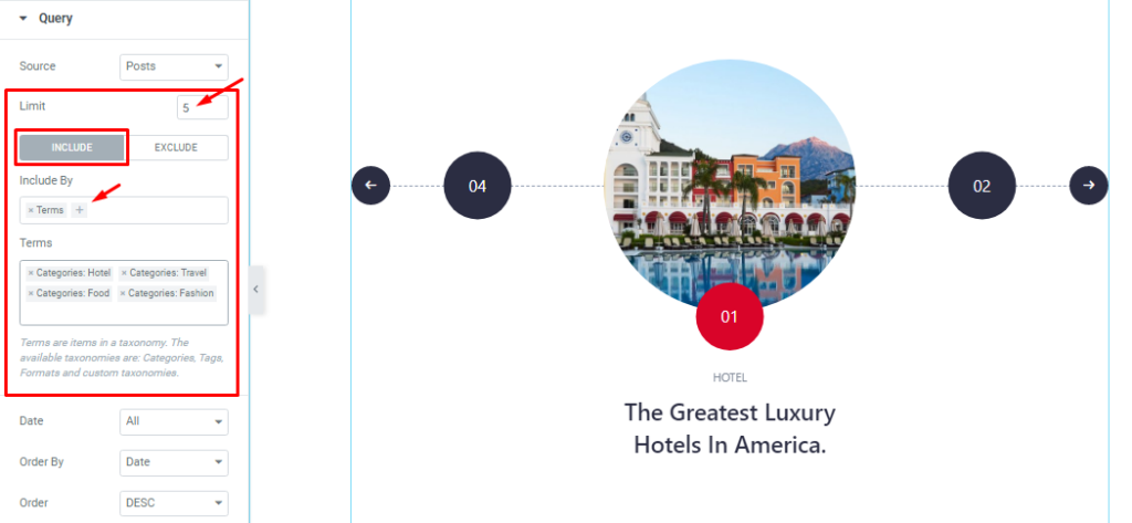
Step-3
The Exclude filter acts in the opposite way than the Include field.
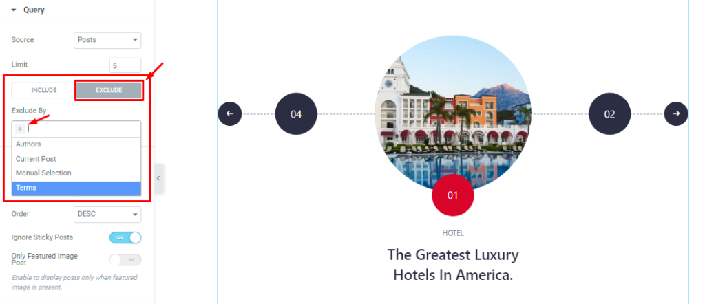
Step-4
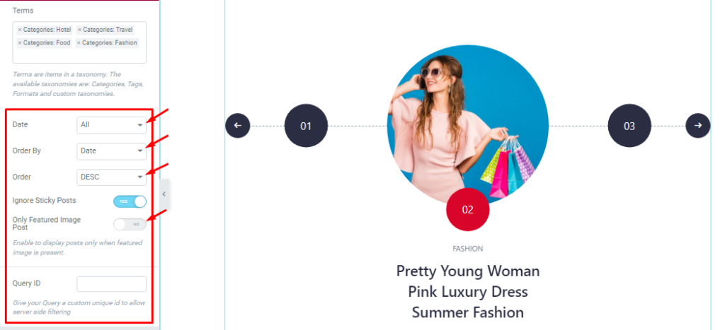
The Date, Order By, and Order controls are here to arrange the data you want to display through Random, Title, Date, or Menu order-wise and also in ascending or descending order.
You can also see more two switchers (Ignore Sticky Posts, Only Featured Image Posts). With them turned on, no sticky posts and posts without featured images won’t be displayed with the slider.
The Query ID option lets you use a customized query over the native query provided by the Marble slider.
Slider Settings Customization
Go to Content > Slider Settings.
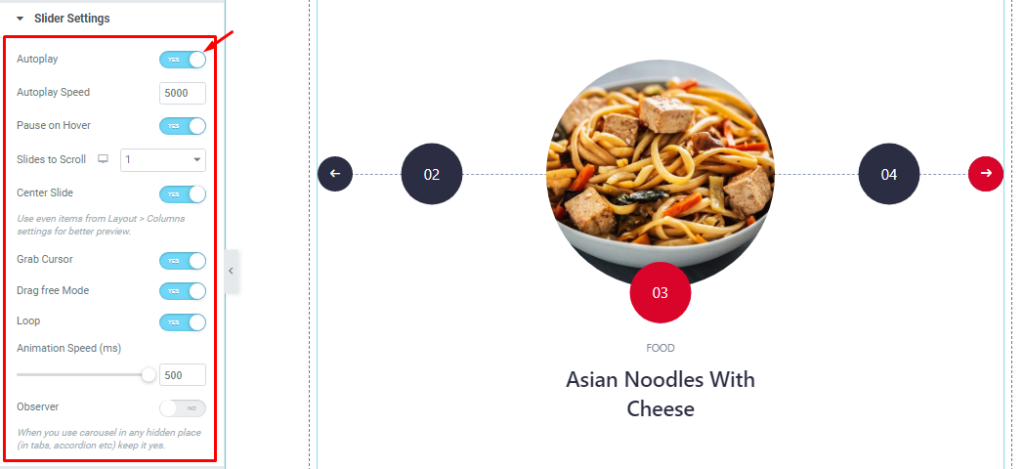
In this section, you will be able to see some Switchers like Auto Play, Auto play speed, pause on Hover, Slides to Scroll, Center Slide, Grab Cursor, Drag free mode, Loop, Animation Speed, and Observer.
What they do-
Autoplay switcher: If you Enable the Autoplay switcher, then your slider will slide Auto play, and you can set the Autoplay Speed as your wish.
pause on Hover: If you activate the pause on Hover button, then when someone Hovers the mouse cursor on the slider, the slider will Hold. Otherwise, your slider will slide Autoplay.
Slides to scroll: Here, you also set the slider to scroll as your need. It represents how many sliders will slide after.
Center Slide: If you enable the Switcher option, your Active slider will show at the center. But it depends on your widget style.
Grab The Cursor: If you enable the option, then you are able to grab the slider with your mouse pointer, and your mouse pointer icon will be changed.
You can slide your slider manually with your mouse cursor.
Drag Free Mode: In this mode, you can easily make it visible by Dragging your slider into the slide Area.
Loop: you can easily enable or disable the switcher button. When you activate the Loop switcher, then your slider will loop at a certain time interval. You also set up the loop animation speed here.
Observer: If you enable the option then you are able to use the carousel in any hidden places(such as in tabs, Accordion, etc).
Style tab for customizing widget interface Appearance
Now, let’s work with Style Tab. The tab will easily have you style the web content (text, image, video, etc.) of the page you require to design. Styling with the tab in Elementor will always give you a wonderful experience.
Let’s explore.
Customization of Sliders Section
Go to Style > Sliders.
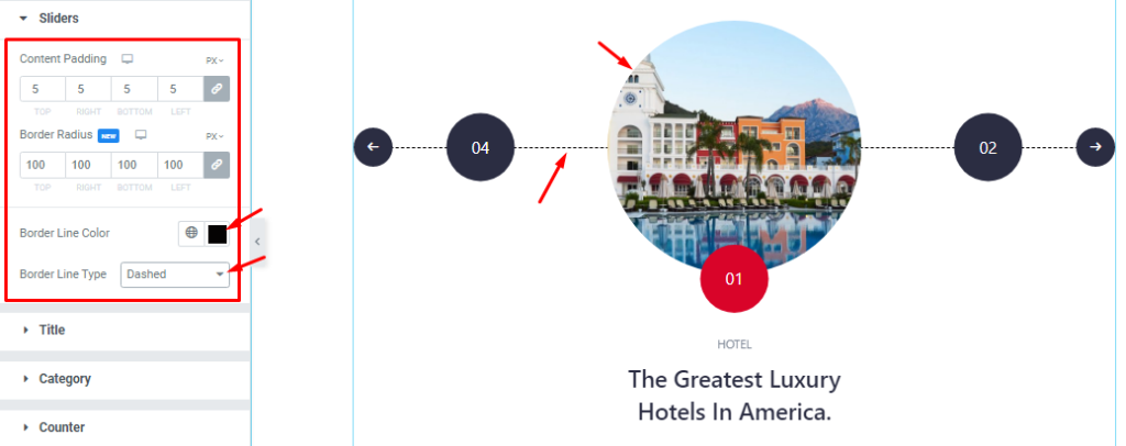
Here you can customize the Content padding, Border Radius, Border Line Color, and Border Line Type option.
Title Section Customizations
Go to Style > Title.
Step-1
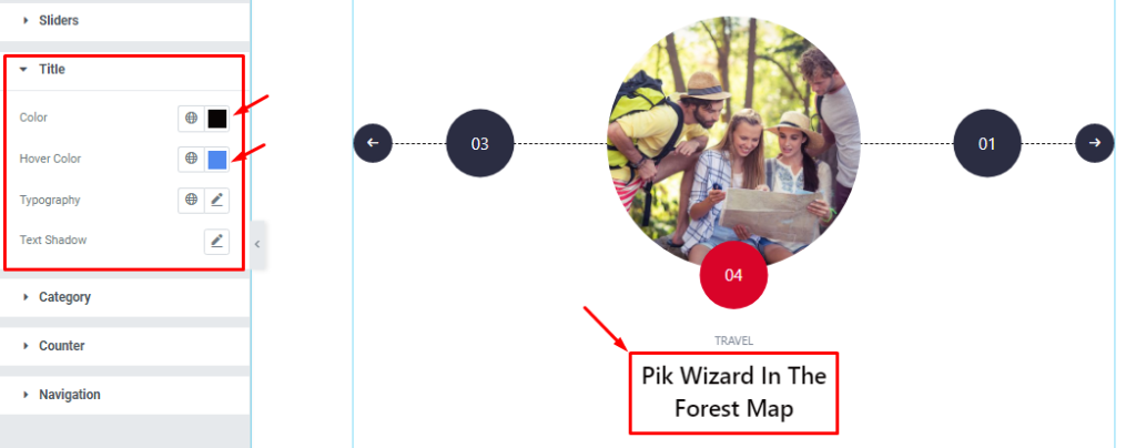
You can easily set the Title Color, Title Hover Color, Typography, and Text Shadow.
Step-2
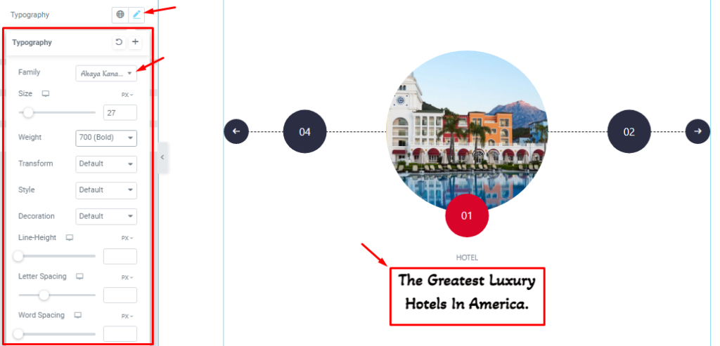
With the Typography (Font Family, Size, Weight, Transform, Style, decoration, Line Height, Letter Spacing, and Word Spacing.) option, you can easily customize the font.
Step-3
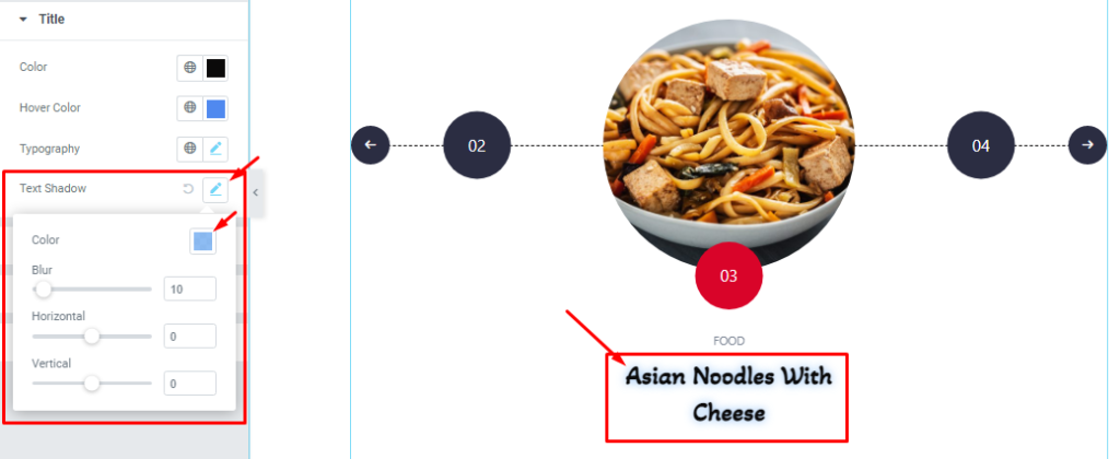
Then, you will able to set the Text Shadow (Color, Blur, Horizontal, Vertical) as your need.
Category Section Customizations
Go to Style > Category.
Step-1
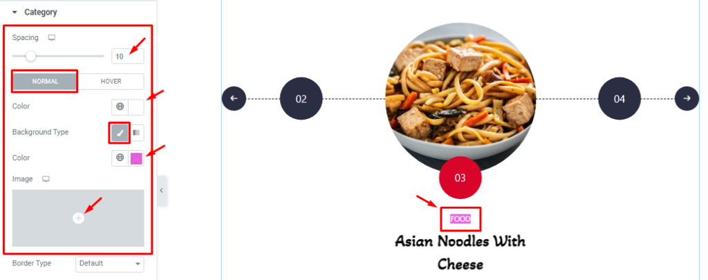
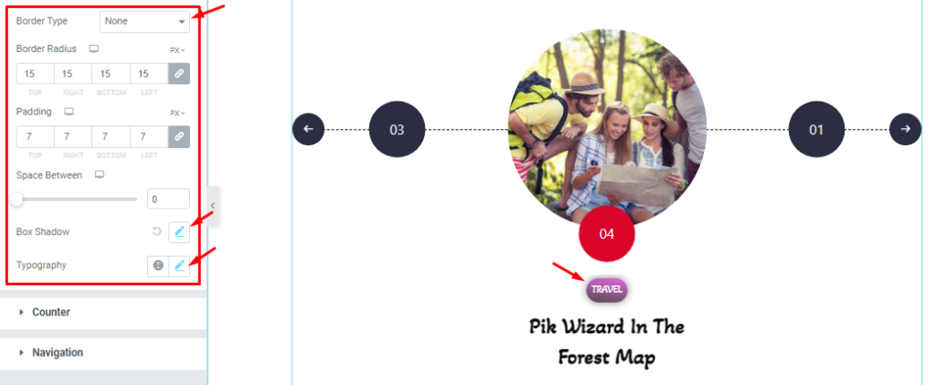
First, you can adjust the Spacing between the category and title. Then the options get divided into; Normal and Hover.
In Normal mode, Here You can set the Category text Color, Background Color, and also set the Background image that I have shown you. One more thing The Hover Tab all functions the same as the Normal mode, so please try it yourself.
Step-2
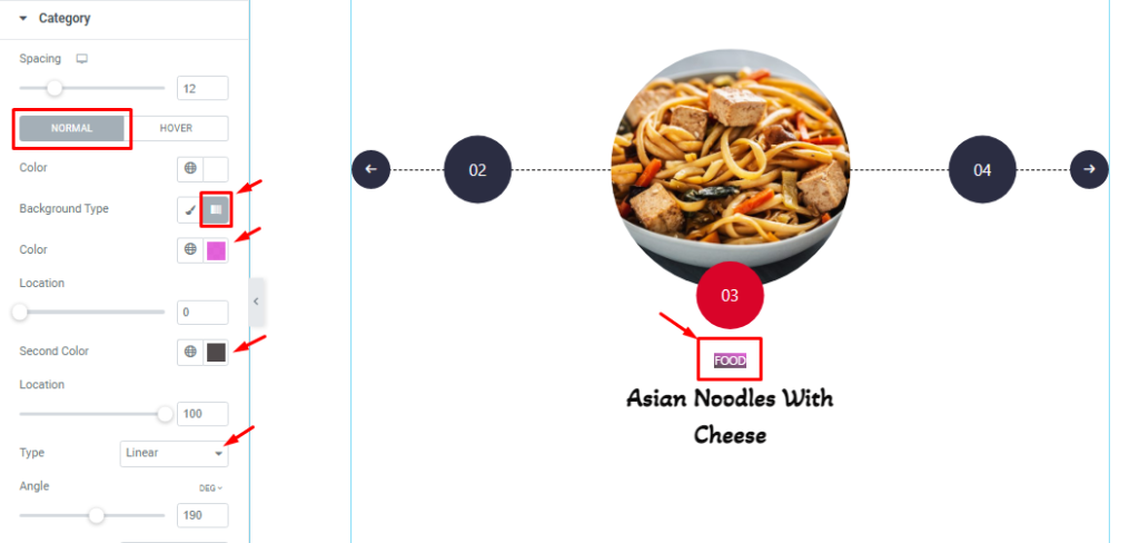
Here you can also set your Background type Gradient. The gradient color function comes with two color picker, color location, type, and angle.
Step-3
Further below, you can set the Border Type, Border Radius, Padding, Box Shadow, and Typography.
Counter Section Customizations
Go to Style > Counter.
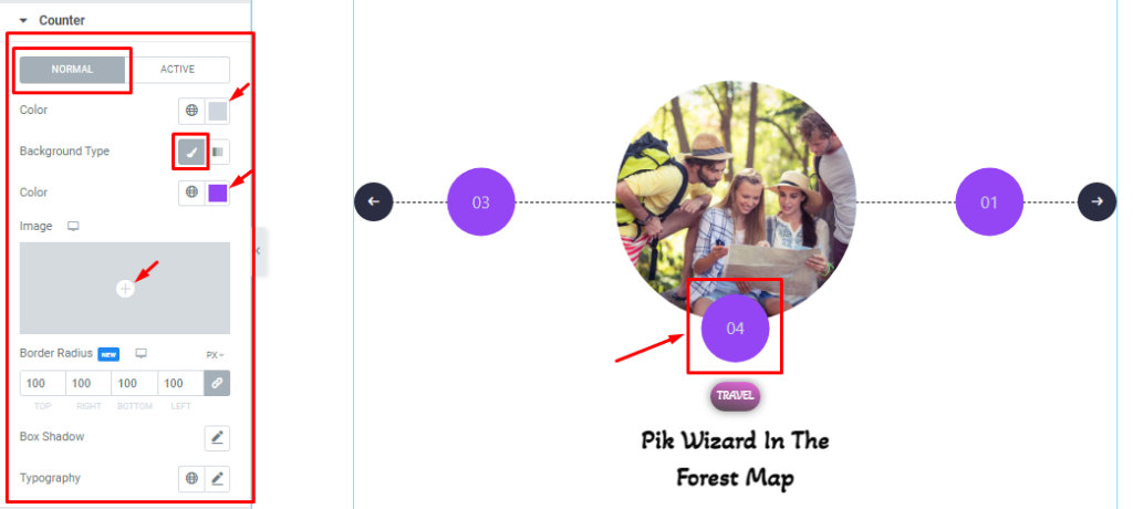
Step-1
In this section, you will see two subsections Normal and Active. In Normal mode, you can customize the Counter text Color, Background Type, Border Radius, Box Shadow, and Typography.
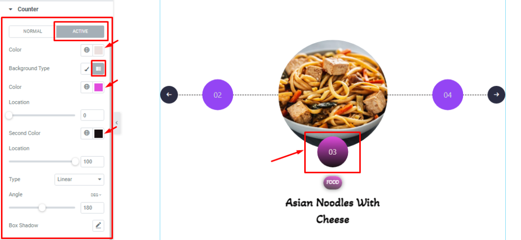
Step-2
In Active mode, you can change Everything just like how you did it in the Normal mode, apart from one or two options.
Navigation Section Customization
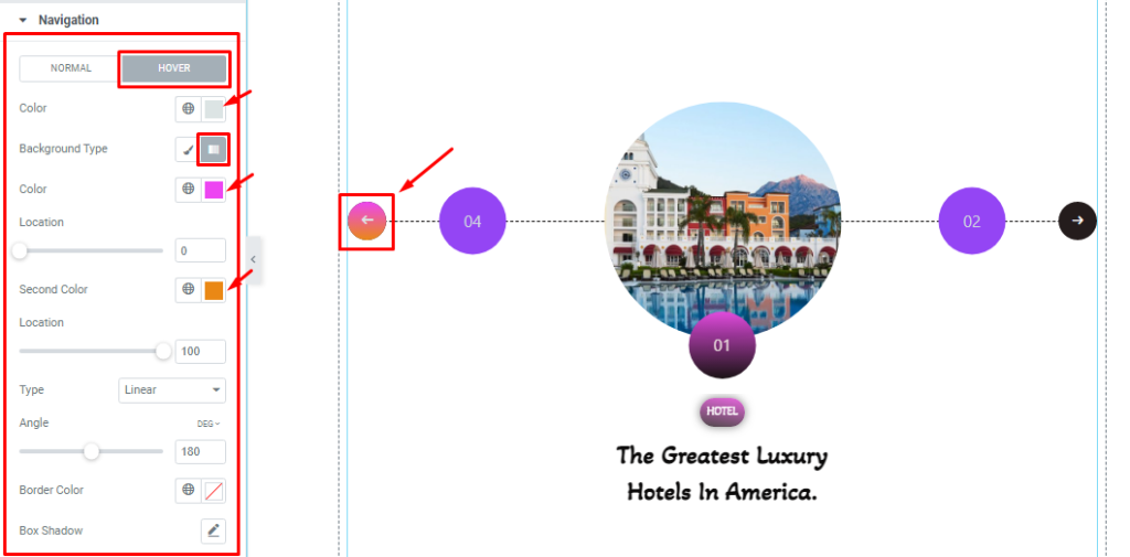
Go to Style > Navigation.
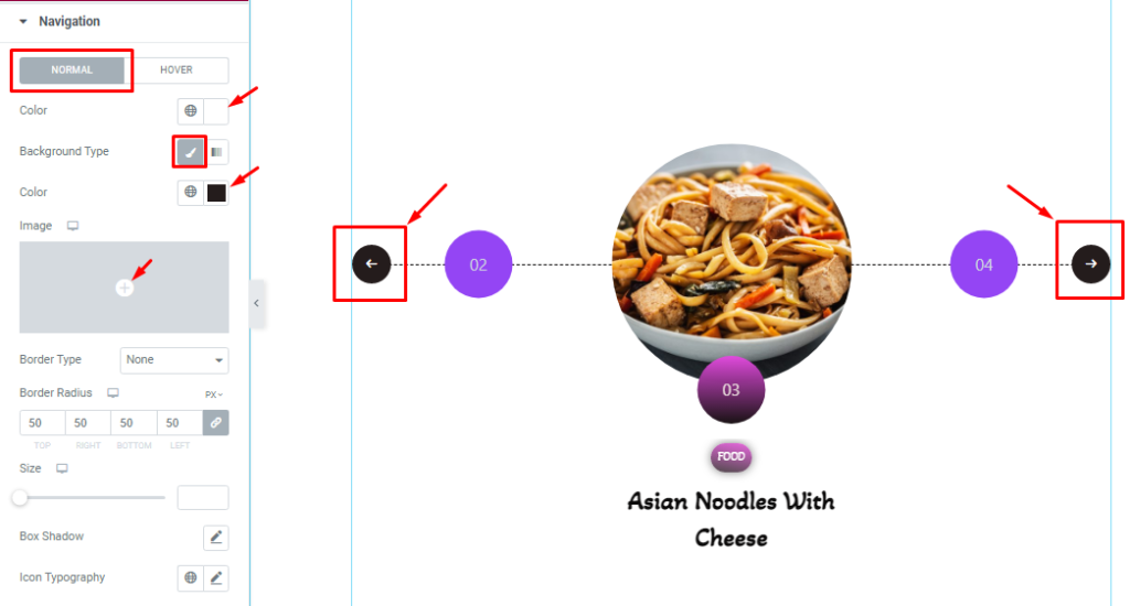
Step-1
In this section, you can change the Navigation icon Color, icon Background Type, Border Type, Border Radius, Padding, Box Shadow, and Icon Typography in Normal Mode.
Step-2
In the Hover Mode, you can customize the Colors and Box Shadow to add a nice hover effect to the Marble slider.
All done! You have successfully customized the Marble Slider widget on your website.
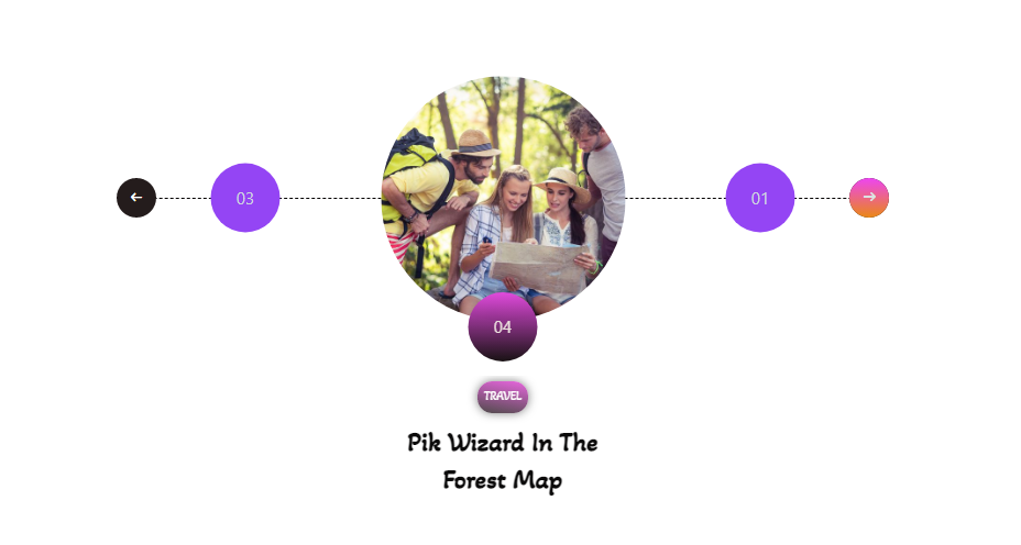
After Completing your design, you will see this type of Marble Slider like in the screenshot.
Video Assist
You can watch this quick video to learn more about the Marble Slider widget. Please visit the demo page for examples.
Thanks for staying with us.