The Monster Slider widget will be a unique addition to your blogging website by arranging the blog posts in a dynamic slider window that pops open to reveal the whole content upon clicking any post. In this documentation, we’ll include instructions and pictures detailed to help you get started with it.
Inserting the Monster Slider widget
You can add this Prime Slider addon to WordPress by opening the page you want to use it on in Elementor and then dragging and dropping the Monster widget into that page. Please note that you need both Elementor and Prime Slider installed before you can use this widget.

Introduction of Content Tab
The content tab holds the vital options responsible for the foundation of your widget, much like a frame of a house. Using the content tab, you’ll be able to make a layout of a particular part (Monster slider) of a website. And in this regard, some handy sections in the tab will assist you a lot.
Layout Section Customizations
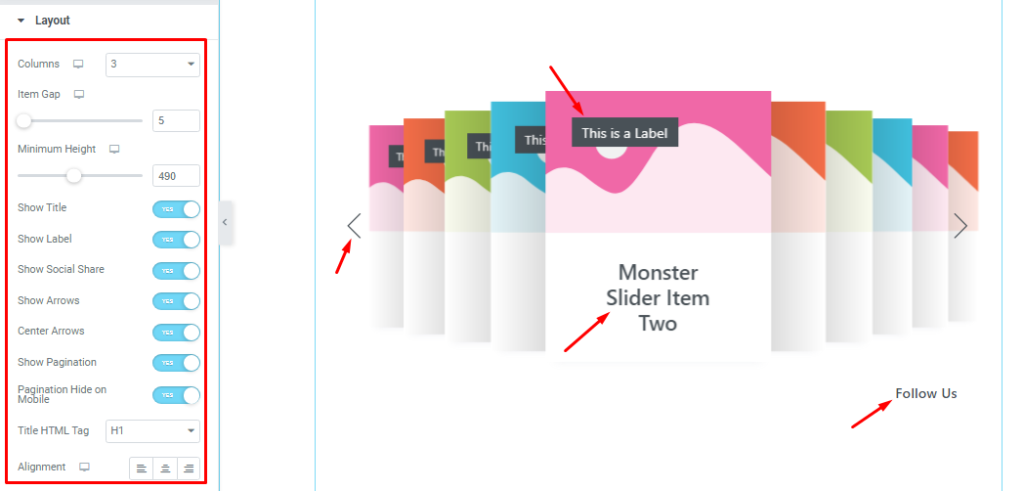
Go to the Content tab > Layout.
Come to the Layout section. Here you can set the number of Columns for the slider. You can adjust Item Gap to spread out the slides and the Minimum Height scrollbar to adjust the net height of all slides.
Then you will get the Show Title, Show Lebel, Show Social Share, Show Arrows, Center Arrows, Show Pagination, and Pagination Hide on Mobile switchers which you can turn on/off to show/hide these elements from the slider.
Also, the Alignment option works on the text content so you can easily select the best text position on the Monster Slider.
Sliders Section Customizations
Step-1
Go to the Content tab >Sliders
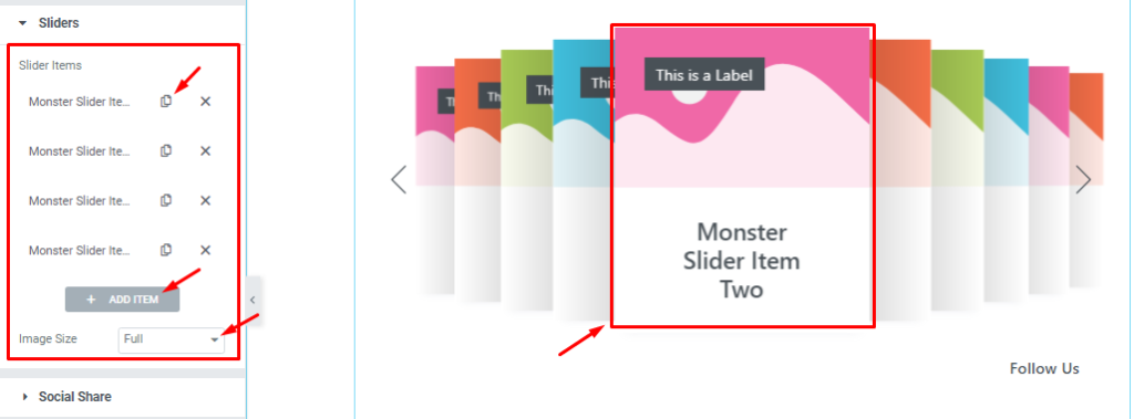
In this section, you can easily add a slider item by clicking Add Item button. Otherwise, you can easily increase your Item by clicking the Duplicate Sign symbol and also you can set the image size for all images in the slides from here.
Step-2
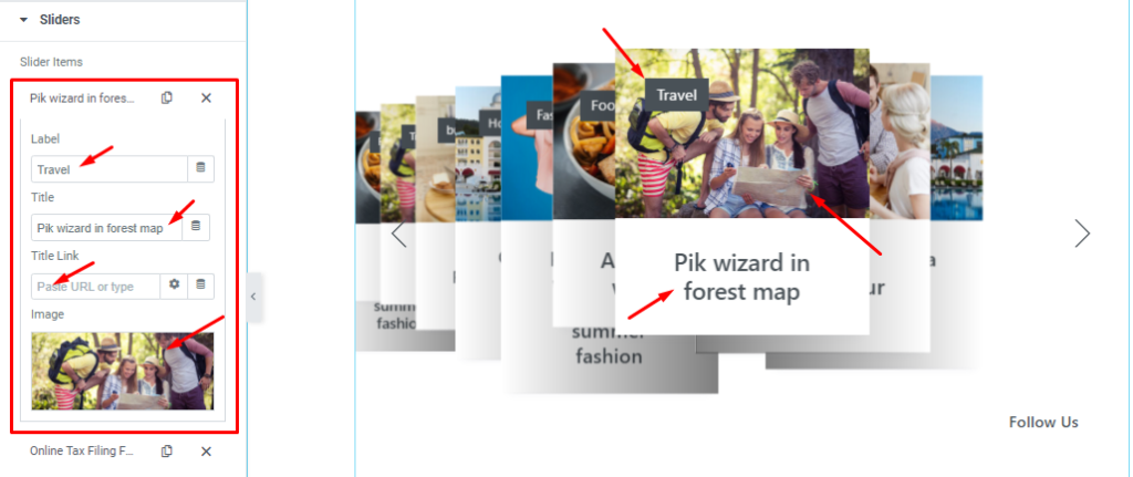
Let’s click the 1st slider item. Here, you are able to change The Lebel name, and Title name and you can set a link under your Title. Also, you can set your slider image as you wish, as shown in the screenshot.
Customizations of Social Share Section
Go to the Content tab >Social Share
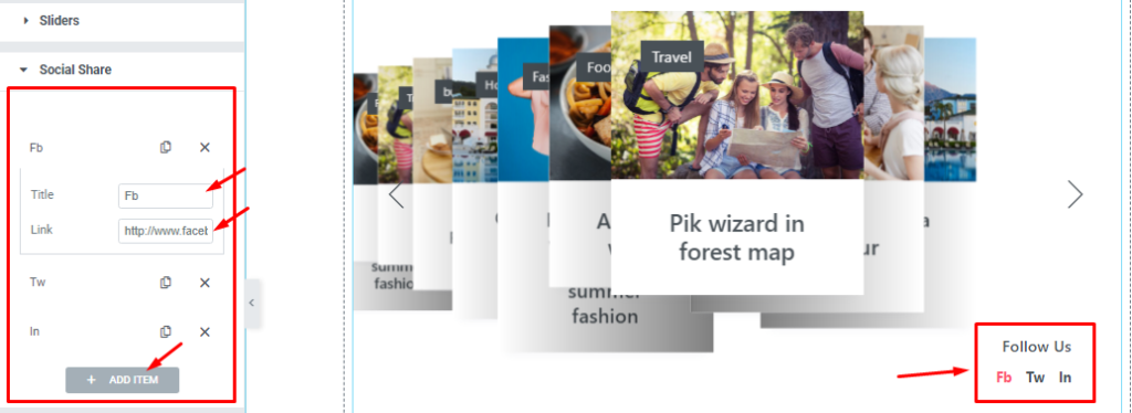
In this section, you can easily add and customize social share buttons. Each item or button lets you add a Title and a custom link to onboard your social media channel within the slider.
Slider Settings Customizations
Step-1
Go to the Content tab >Slider Settings.
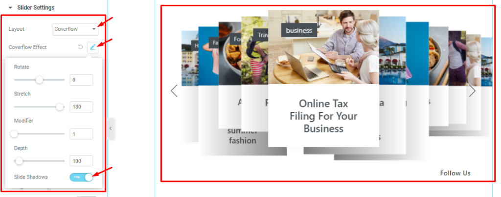
In this section, you can switch the slider Layout (Carousel and Overflow) from layout controls. After selecting the Coverflow layout, you also set the Coverflow Effect that I have shown below screenshot.
Step-2
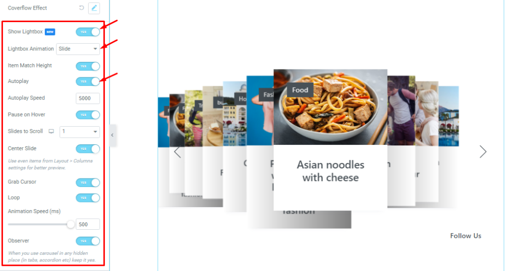
Below, you will be able to see some Switchers that are Show Light Box, Auto Play, pause on Hover, Center Slide, Grab Cursor, Loop, and Observer. You can easily enable or disable those switcher buttons to apply specific effects. Also, you can customize the lightbox animation, Autoplay Speed, Slides to Scroll, and Animation Speed for the slider.
Show Light Box: Enable the switcher button to see the lightbox effect on your post image.
Light Box Animation: 3 types of animation styles are included for Lightbox (Slide, Fade, and Scale).
Item Match Height: If you enable the Item Match Height switcher button then all posts will appear at the same Height.
Autoplay switcher: Enable the switcher to make the slider slide Automatically with a customizable Autoplay Speed control.
Pause on Hover: If turned on, when you Hover your mouse cursor on the slider then your slider will Hold, otherwise, your slider will Autoplay.
Slider to scroll: Here you also set the slider to scroll as your need. It represents how many sliders will slide after.
Center Slide: If you enable the Switcher option, your Active slider will show the center. But it depends on your widget style.
Grab Cursor: Change your mouse pointer icon into a hand-grab cursor when hovering on the slider.
Loop: When you activate the Loop switcher button then your slider will loop at a certain time interval. You also set up the loop animation speed here.
Observer: If you enable the option then you are able to use the carousel in any hidden places (such as in tabs, Accordion, etc).
Style tab for customizing widget interface Appearance
Now, let’s work with Style Tab. The tab will easily let you style the web content of the page or Monster Slider to design using colors, borders, margins, etc. Styling with the tab in Elementor will always give you a wonderful experience.
Let’s have a look.
Customization of Sliders Section
Go to the Style Tab >Sliders.
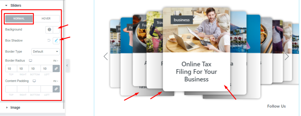
Here in Normal mode, you can easily customize Background Color, Box Shadow, Border Type, Border Radius, and content padding as your need as shown in the screenshot. Box shadow adds a layer of color under the slides which adds a 3D-like feature to the eyes.
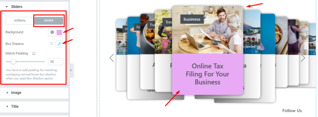
In Hover mode, you can easily change Background Color, Box Shadow, And Match padding as your need to separate the hovering effect from the regular effect.
Image Section Customizations
Go to the Style Tab >Image
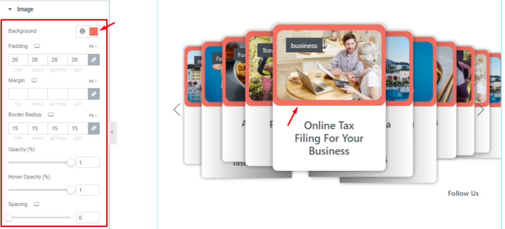
In this section, you can easily change the Image Background Color, Padding, Margin, Border Radius, Opacity, Hover Opacity, and Spacing. All options in Monster Slider are named as per their functionality and followed by the common option naming standards.
Title Section Customizations
Go to the Style Tab >Title.
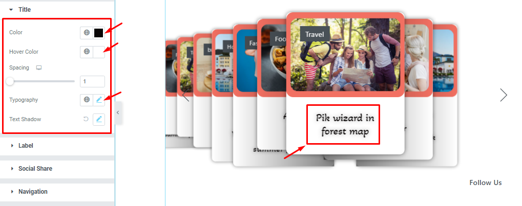
Here, you will see options to customize the Title color, Title Hover color, Typography, And add Text Shadow.
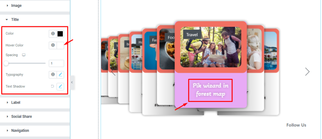
After configuring the hover title color for the Monster Slider, your design looks like in hover.
Lebel Section Customizations
Go to the Style Tab >Lebel.
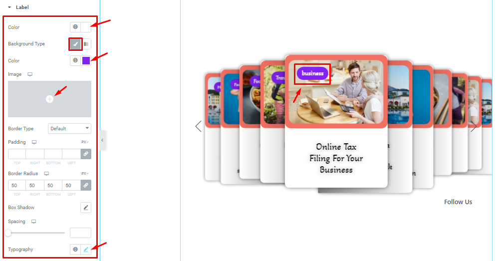
In this section, you can easily change the Lebel Color, Lebel Background Type, Background Color, Border Type, Padding, Border Radius, Box Shadow, Spacing, and Typography. Note that you can add images as the label Background from the options.
Social Share Section Customizations
Step-1
Go to the Style Tab >Social Share
Here, you can customize the text color above the social icons and the Typography.
Below, you can change between two modes and customize the color, background, border, border radius, padding, box shadow, spacing, and typography for the social icons.
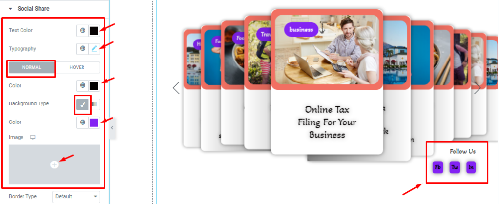
For Normal Mode, In this section, you can easily change the Text Color, Background Type, Background Color, and Typography. You can also set the Background image as I have shown in the screenshot.
Step-2
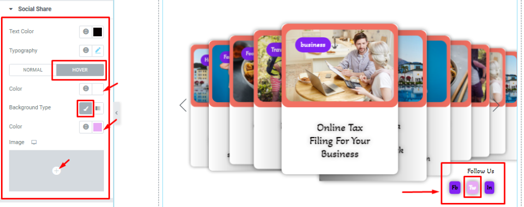
Here in Hover mode, you will get a similar set of controls to modify the appearance of the social share icons.
Step-3
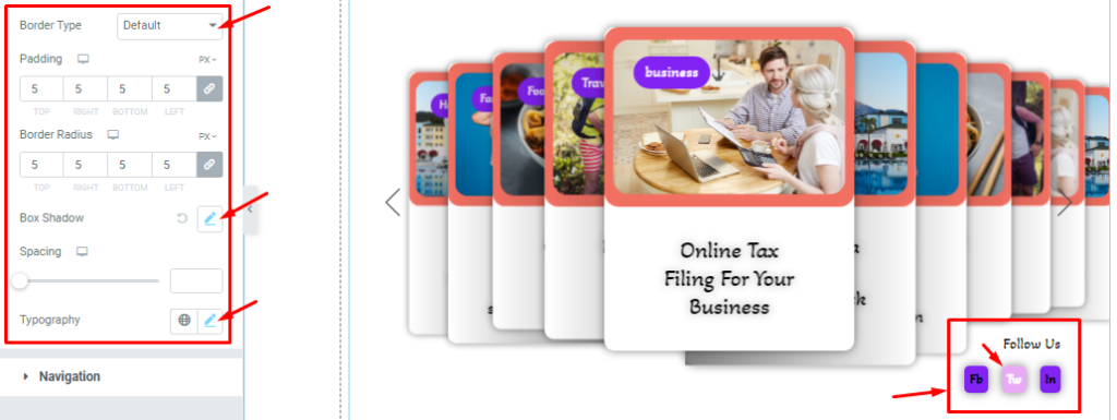
Lastly, scrolling down a bit will reveal the last set of options we already mentioned above. Use them to change the final look of the social part of the slider.
Navigation Section Customization
Go to the Style Tab >Navigation.
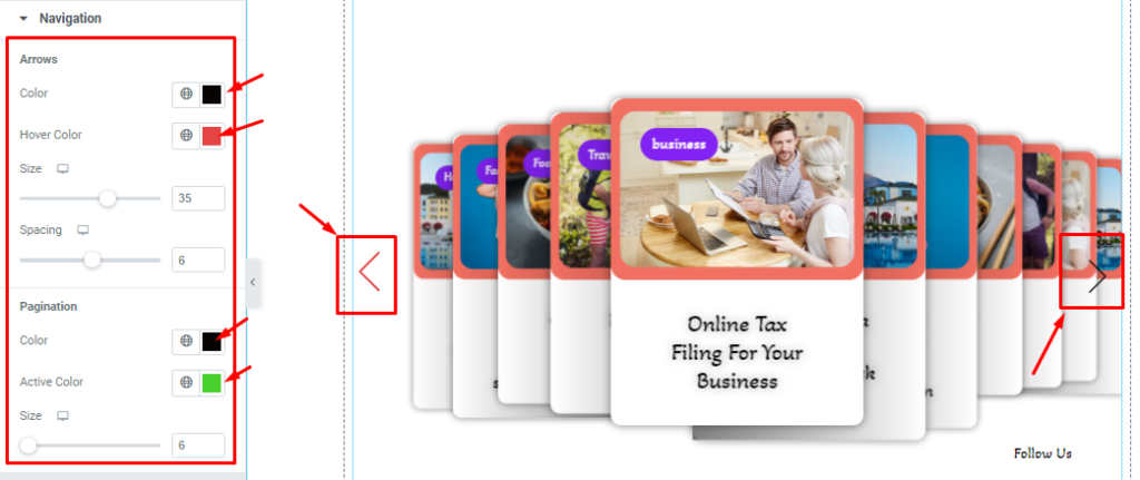
Here, you can change the navigation appearance or the Arrows Color, Hover Color, Arrows Size, and Spacing. Also, you would find pagination customizations like Color, Active Color, and Size as shown in the screenshot.
All done! You have successfully customized the Monster Slider widget on your website.
Video Assist
You can watch this quick video to learn more about the Monster Slider widget.
Thanks for staying with us.