In this documentation, we will show you how to customize the Icon Nav widget presented by Element Pack Pro.
Inserting The Icon Nav Button Widget
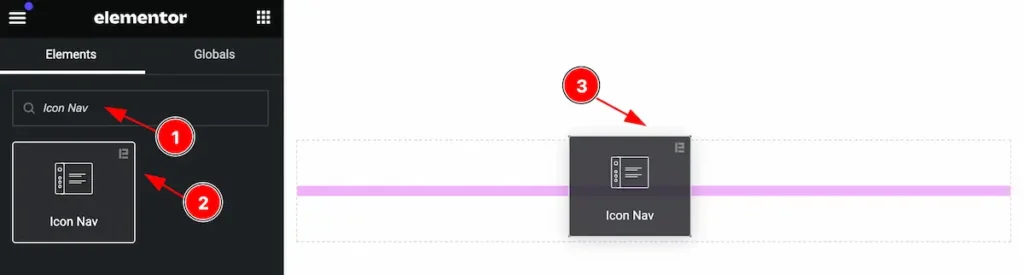
Inserting the widget by following this,
- Search by the Icon Nav widget name.
- Then select the appear widget ( with Element Pack Pro logo T.R corner).
- After Drag and Drop it on the Elmentor Editor page.
Content Tab
The Content tab controller displayed here offers the flexibility to adjust the layout of the widget according to your preferences.
Icon Nav Section
Go to Content > Icon Nav
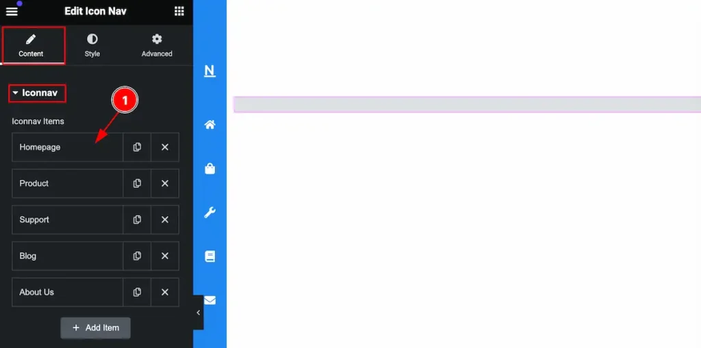
Let’s customize the icon nav by following it.
- Click on Any item and it will expand the item and there you can edit it.
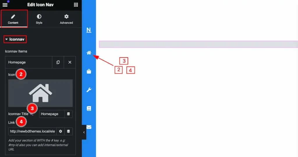
- Icon: Set the icon for the nav item.
- Iconnav Title: Set the title for it.
- Link: Set a link for it. Set the section id for navigation.
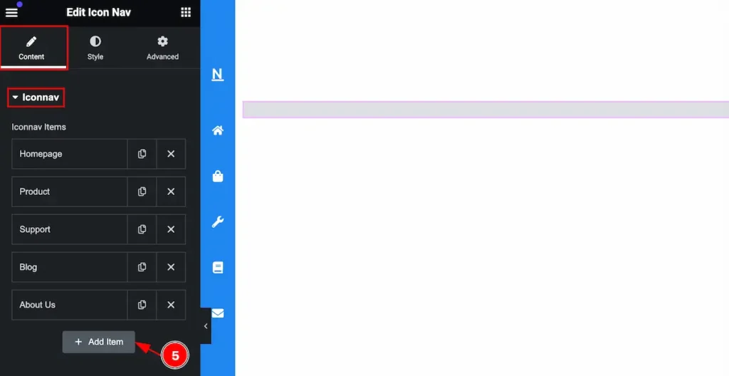
- Click on the ” + Add Item ” button to add more items to the icon nav. You can add as many items as you want.
Offcanvas Menu Section
Go to Style > Offcanvas Menu
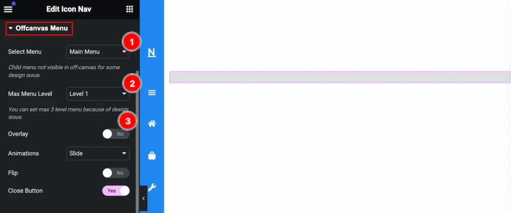
Customize the off-canvas menu item,
- Select Menu: Select a menu for the canvas.
- Max Menu level: Set the level for the menu (e.g.: Level1, Level2, Level3).
- Overlay: Enabling the swither to show the overlay.
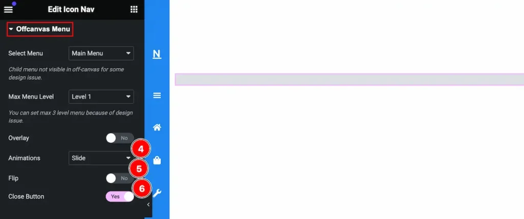
- Animation: Set the for the off-canvas (e.g.: Slide, Push, Revel, None).
- Flip: Enable the switcher to Flip it.
- Close Button: Enable the switcher to show the close button.
Branding Section
Go to Content > Branding
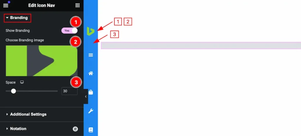
Customize the branding section by following,
- Show Branding: Enable the switcher to show the branding.
- Choose Branding Image: Set branding image by choosing from the media library.
- Space: Set the space between the Brand image and Icon nav.
Additional Settings Section
Go to Content > Additional Settings
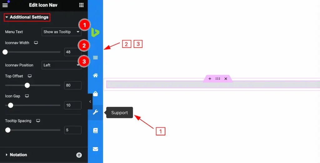
Set the settings for the additional feature,
- Menu Text: Set the Menu text by selecting ( e.g.: Show as Tooltip, Show as Icon).
- Iconnav Width: Set the width for the iconnav.
- Iconnav Position: Set the position for the icon nav.
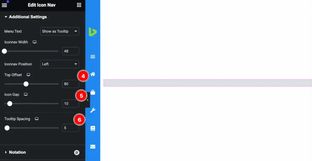
- Top Offset: Set the position for the Top.
- Icon Gap: Set the gap for the Icon.
- Tooltip Spacing: Set spacing for the tooltip.
Style Tab
Provide the controller to make the visual appearance or presentation of the tabs. This includes aspects that are visually appealing and cohesive with the overall design of the interface.
Icon Nav Section
Go to Style > Icon nav
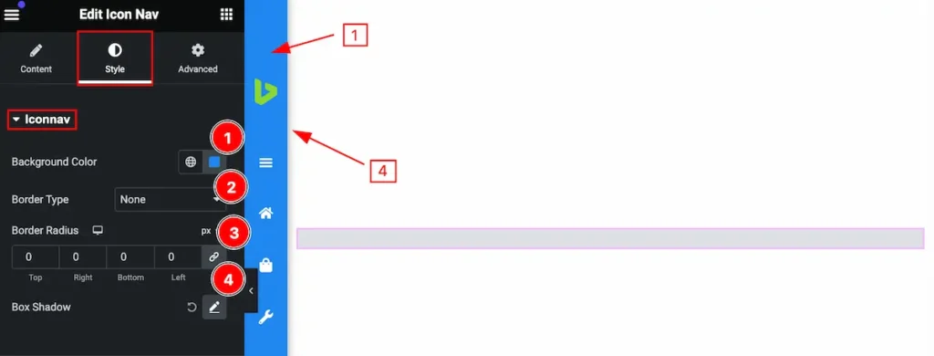
Make this section most customizable by following it,
- Background Color: Set the background color for the Iconnav.
- Border Type: Set the border for the icon nav.
- Border Radius: Make the border section radius.
- Box Shadow: Make the shadow for the box.
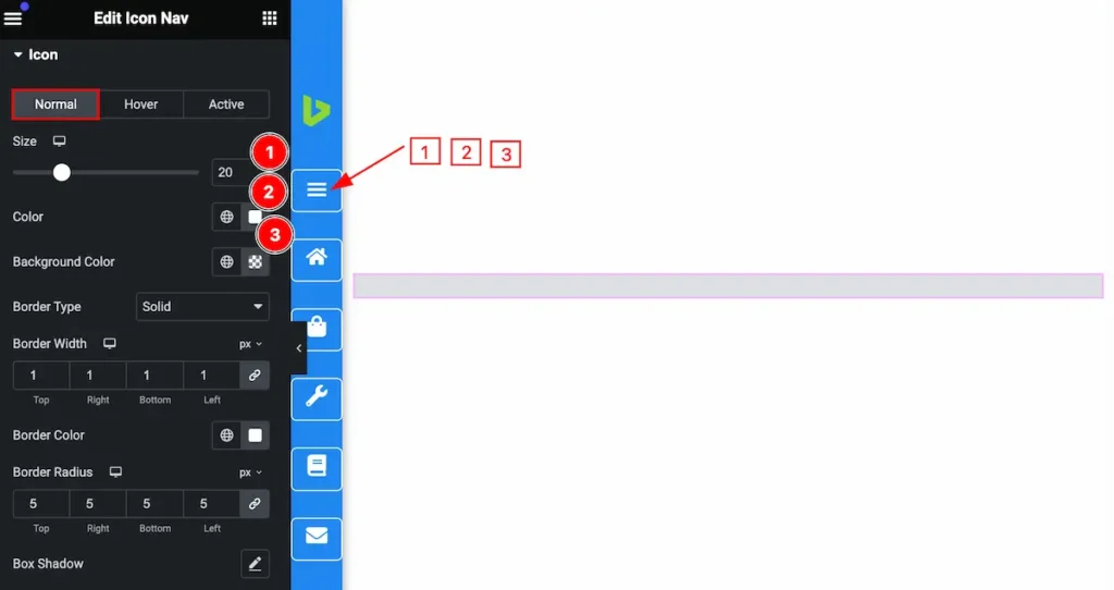
Icon Section
Go to Style > Icon
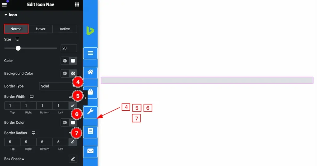
Customize the Normal State
Make this section interactive by following the style,
- Size: Set the size for the icon.
- Color: Set the color for it.
- Background Color: Set the background for Icon.
- Border Type: Set the type for the border.
- Border Width: Set the widget for the
- Border Color: Set the border color.
- Border Radius: Make the border-radius.
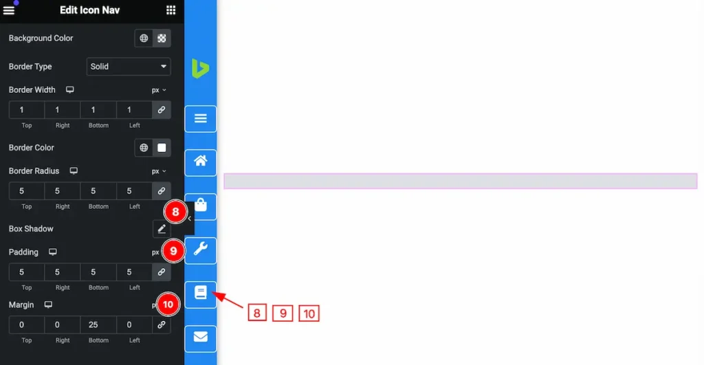
- Box Shadow: Set the shadow for the box.
- Padding: Make the padding for the icon.
- Margin: Set the margin for the icon.
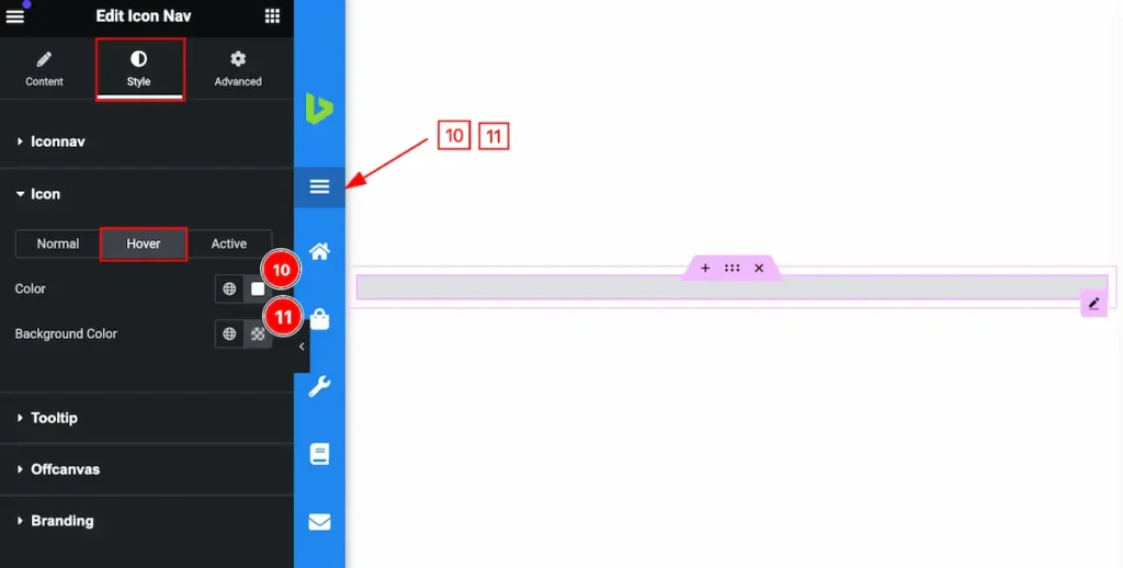
Customize the Hover State
Make customize for the hover section,
- Color: Set the color for the Icon.
- Background Color: Make the background for the icon.
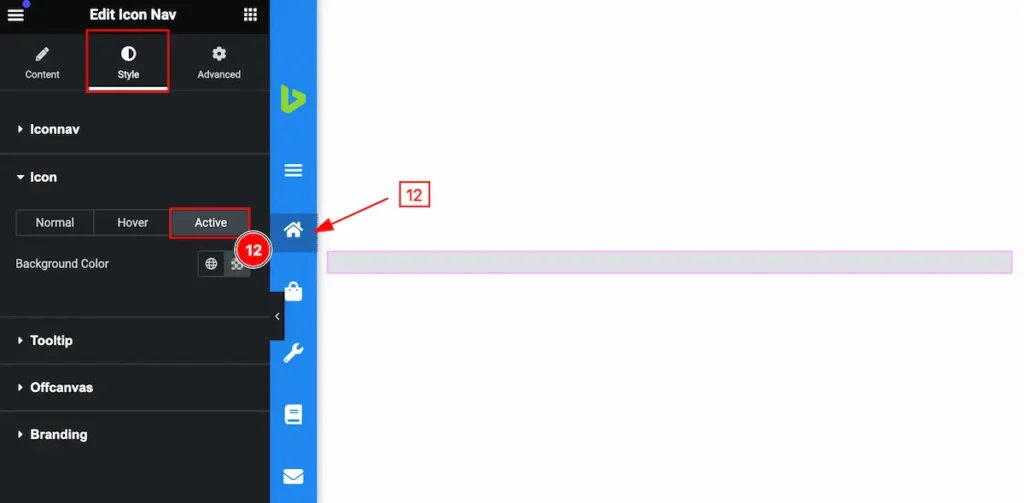
Customize the Active State
- Background Color: Set the background for the color.
Tooltip Section
Go to Style > Tooltip
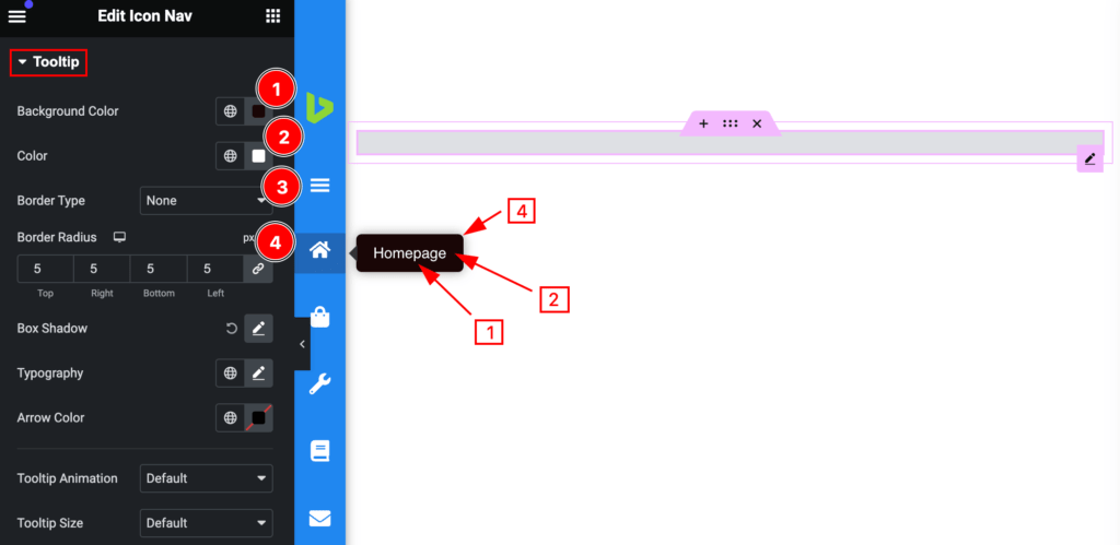
Make the tooltip customizable by following it,
- Background Color: Set the background tooltip settings more customizable.
- Color: Set the color for the tooltip.
- Border Type: Set the type for the border.
- Border Radius: Set the border for radius.
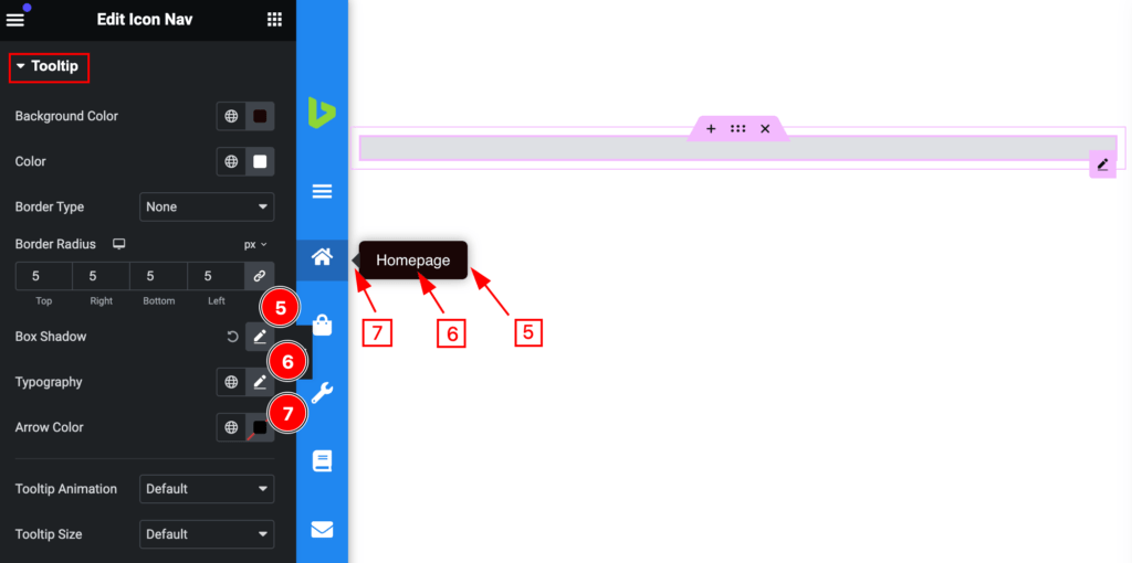
- Box Shadow: Make the shadow for the box.
- Typography: Set the typography for the tooltip.
- Arrow Color: Make the arrow for color.
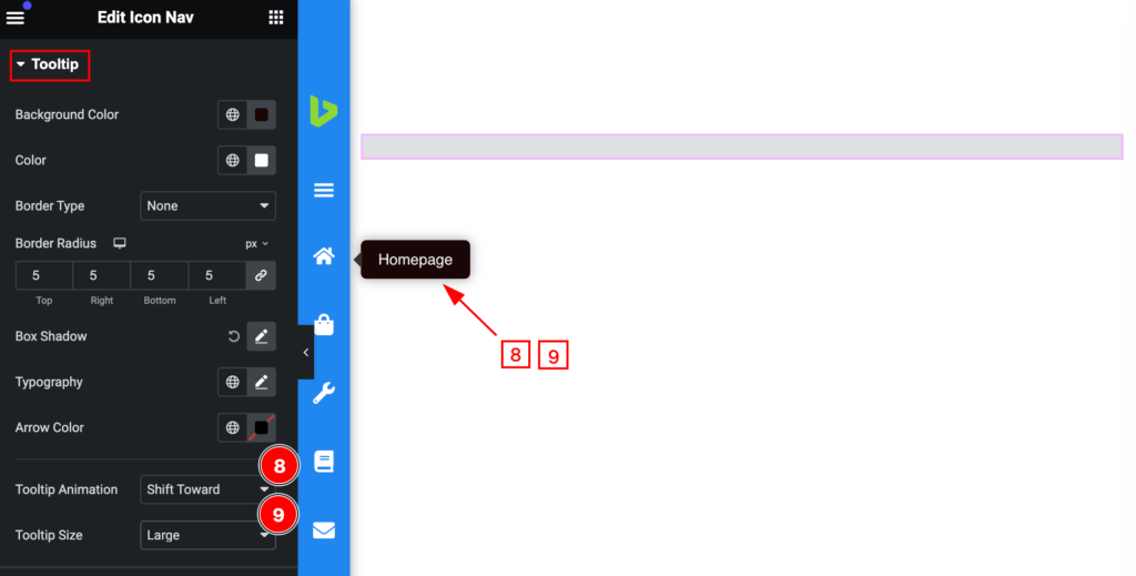
- Tooltip Animation: Set the animation for the tooltip(e.g.: Shift Forward, Fade, Scale, etc.).
- Tooltip Size: Set the size for the Tooltip (e.g.: Default, Large, Small ).
Offcanvas Section
Go to Style > Offcanvas
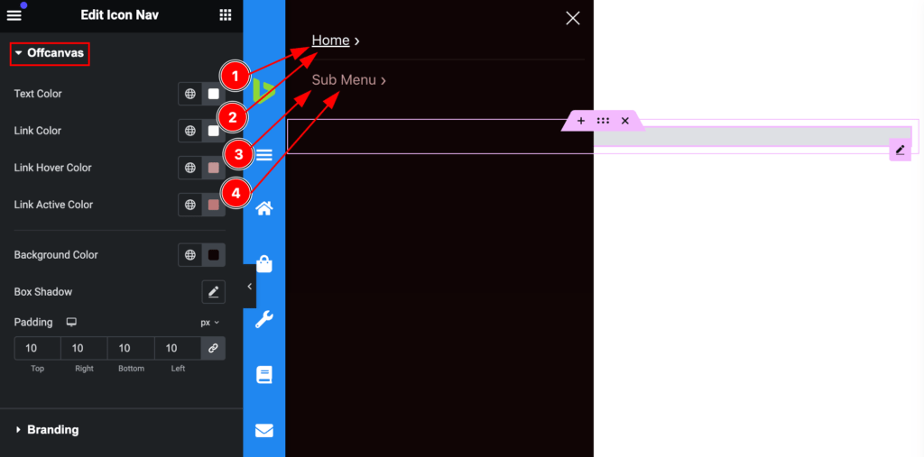
Make the off-canvas section interactive by following the controls,
- Text Color: Make the text color more customizable.
- Link Color: Set the link color.
- Link hover Color: Make the hover color, this changes appear on mouse hover.
- Link Active Color: Make the link active color.
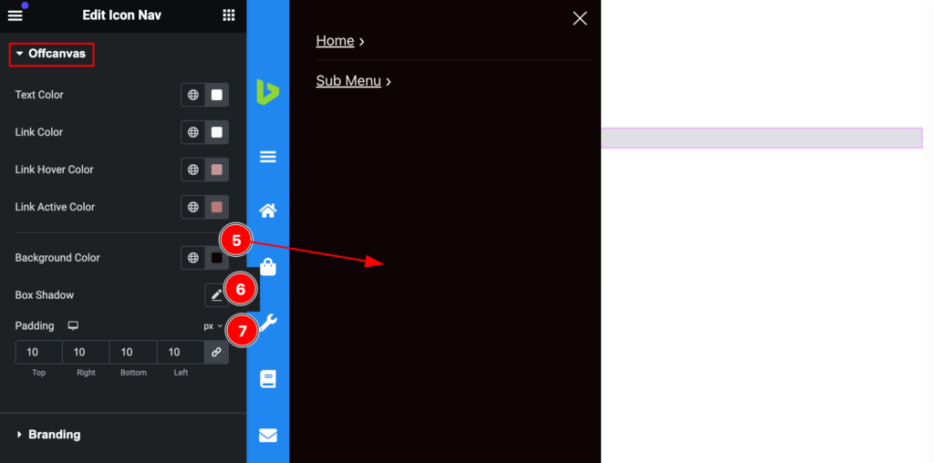
- Background Color: Set the background color.
- Box Shadow: Set the shadow for the box.
- Padding: Make inner spacing by setting the padding.
Branding Section
Go to Style > Branding
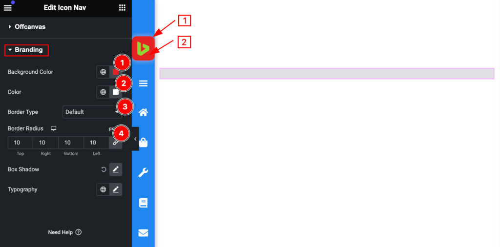
Make the branding section stylish by following the controls,
- Background Color: Set the background color for the branding.
- Color: Set the color for the branding.
- Border Type: Set the type for the border.
- Border Radius: Set the border-radius.
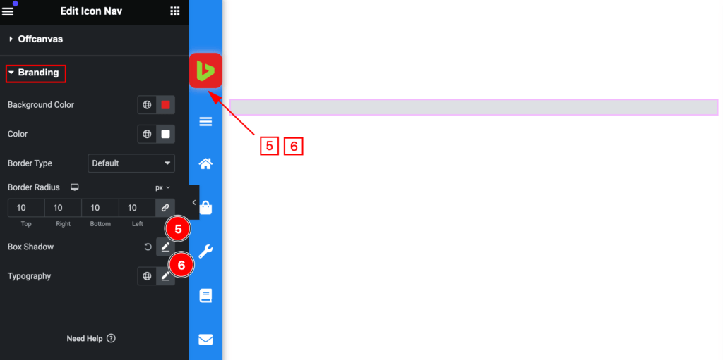
- Box Shadow: Make the shadow for the branding.
- Typography: Set typography for the branding.
Video Assist
You can watch the video above to learn about the Search widget.
Please visit the demo page for examples.
Thanks for staying with us.