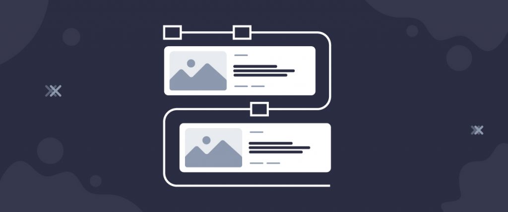
The Timeline widget is a specialty for bloggers that uses a dynamic flow chart to display posts, pages, or events in a timely manner. It is developed by the Ultimate Post Kit plugin to boost the user experience of your blogging site.
Let’s see how it works.
Inserting widget

Find the Timeline widget from the widget menu in the Elementor page editor and drag it inside your webpage.
Content tab
The Content tab holds the base settings for the widget and lays the foundation of the layout of the final content. It’s divided into two parts for the Timeline widget.
Layout
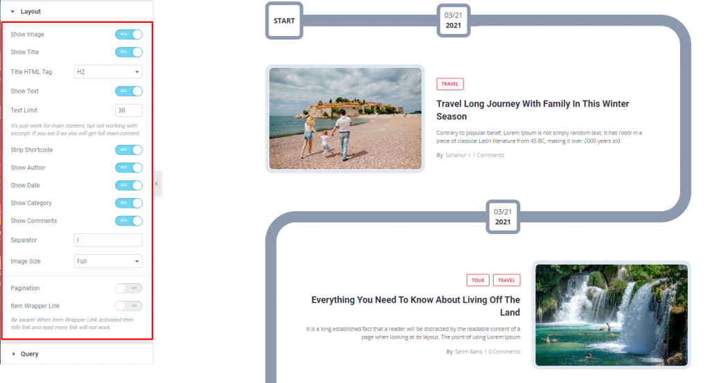
Go to Content> Layout
The Layout section is full of switchers that show/hide specific content on the display upon switching. Here, blogs are on the display according to their publishing date in a flow chart manner on the WordPress timeline plugin. It delivers a lot of information such as tags, title, image, author, description, in a compact style.
Query
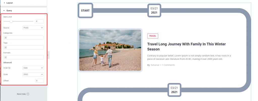
Go to Content> Query
Here, you need to define the number of posts shown on the vertical timeline by the option named Item Limit. By the way, you can select the source of display from category, tags, & events throughout different post sections.
Style tab
The style tab allows you to change or customize the appearance of the Timeline for website content layout. The options include color settings, borders, paddings, etc.
There are several sections on this tab.
Items
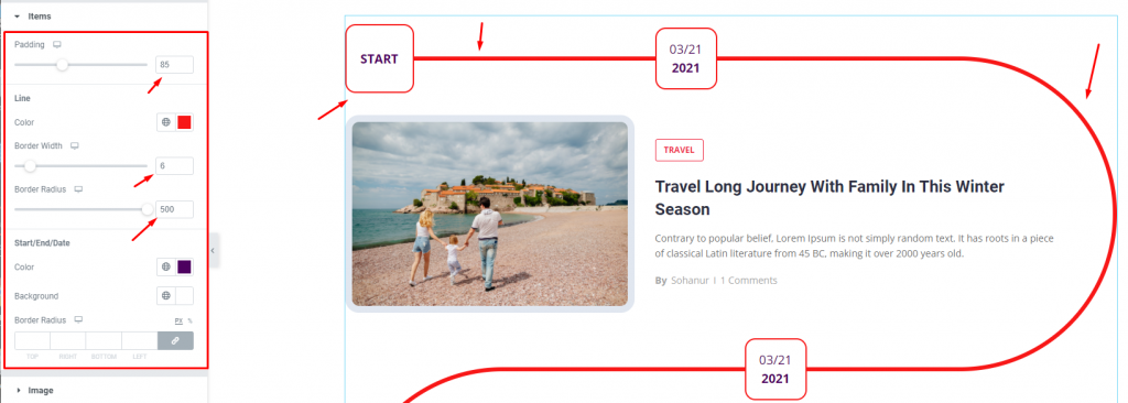
Go to Style> Items
First of all, the padding option on top is for separating the flow line from the blog post content on the timeline widget. Increase or decrease padding to maintain a certain gap between the line & content.
The width of the line, as well as the border radius of the date fields, are also adjustable. You can pick any color for the dates.
Image
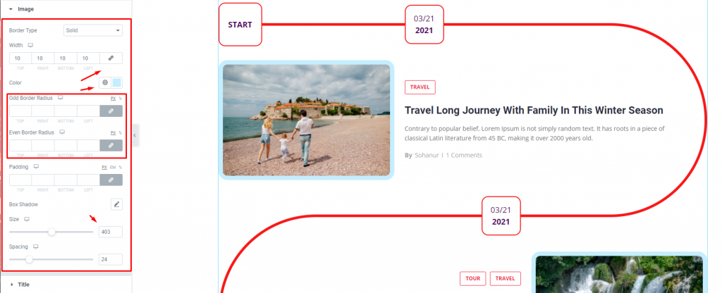
Go to Style> Image
Post images have a default border as a pre-set option for the WordPress Timeline plugin. The minimum width is set to 10 which is adjustable. Choose a suitable color for the borders. Notice, there are even & odd border-radius options available.
With an even radius option, you can change the border-radius for all even number posts on this timeline. The same goes for the odds. The size of the image can be varied using the scrollbar at the end. Use the spacing bar to place a gap between the image & the content.
Title

Go to Style> Title
The Title section mainly gives you the option to change the text color, spacing, text shadow, and typography of the titles. The color option is available for both active & hover modes.
Text

Go to Style> Text
For texts, you have color, typography, & margin options available.
Meta

Go to Style> Meta
Of course, each post has author information along with a post date that will be displayed at the bottom of the post title. You can change their text color, spacing, & typography in this section.
Date

Go to Style> Date
The date section is a bit tricky. By default, you will see the post date in line with the time flow line. Once you turn it off (switcher control) from the layout section, the date will jump under the title. From this section, you can customize the date which is below the title area.
Category
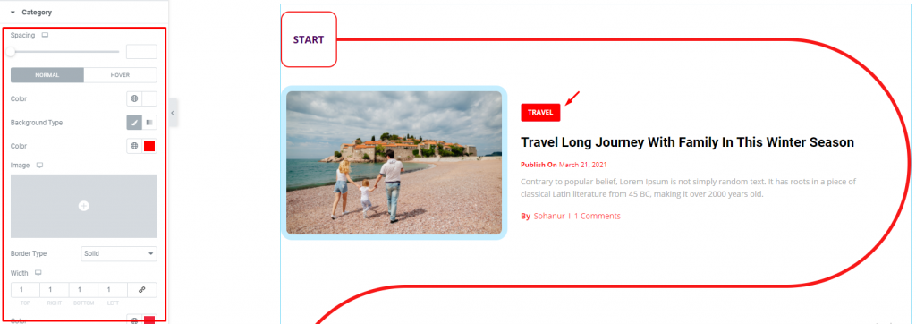
Go to Style> Category
The category option enables you to customize the category text on top of the post title. Set their color, border, typography and make it more eye-catching.
Conclusion
Still, stuck?
Watch this quick video for visual instruction and see the demo page for more examples, provided by Bdthemes.

