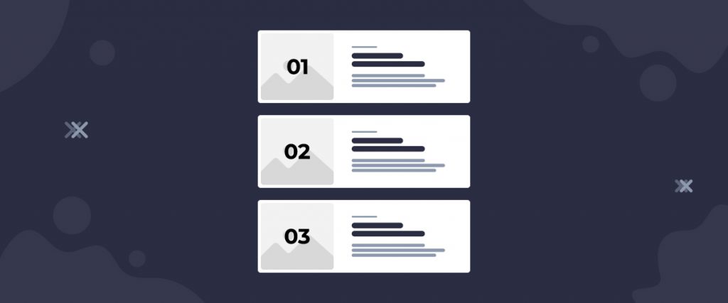
Scott List widget is a blog navigator type widget, developed by the Ultimate Post Kit plugin to enhance your blogging experience. The blog posts are displayed in a list formation with basic information & counter numbers on top of the post images.
Inserting widget

Find the Scott List widget from the widget menu in the Elementor page editor and drag it inside your webpage.
Content tab
The Content tab holds the base settings for the widget and lays the foundation of the layout of the final content. It’s divided into three parts for the Scott List widget.
Layout
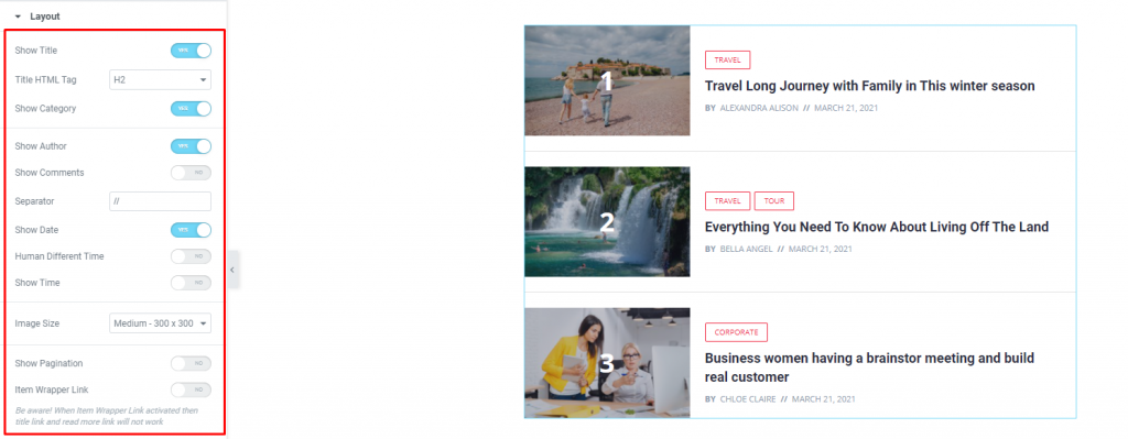
Go to Content> Layout
For the layout, you will find that the section has a bunch of switchers to turn on/off specific items on the display (date, author, time, pagination, etc.) of the WordPress post list. You can increase the Image Size to make them look more refined.
Query
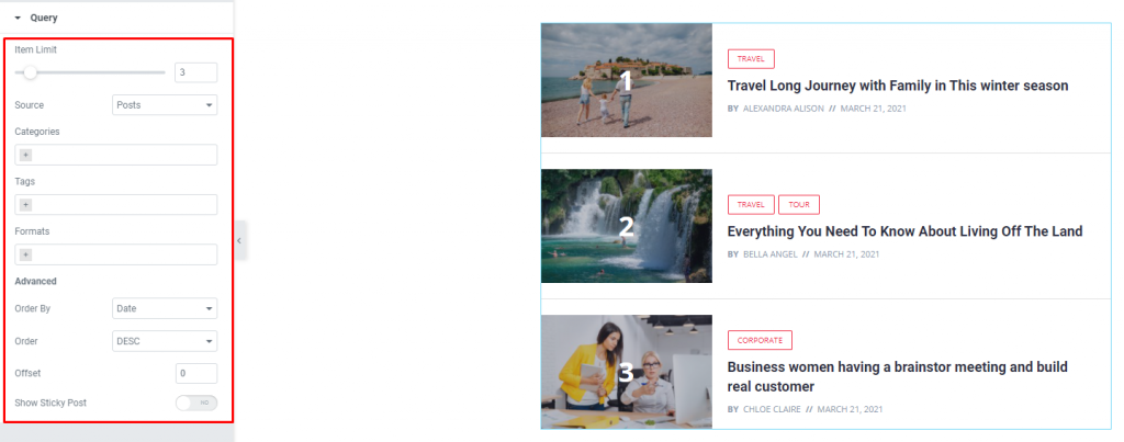
Go to Content> Query
Here, you need to define the number of posts shown on the display. The source can be selected from posts, pages, and landing pages. You can limit the posts by categories, tags, as well as set the order of the posts for the blog list.
Style tab
The style tab allows you to change or customize the appearance of the Scott List widget, by Ultimate Post Kit, content layout. The options include color settings, borders, paddings, etc.
There are several sections on this tab.
Items
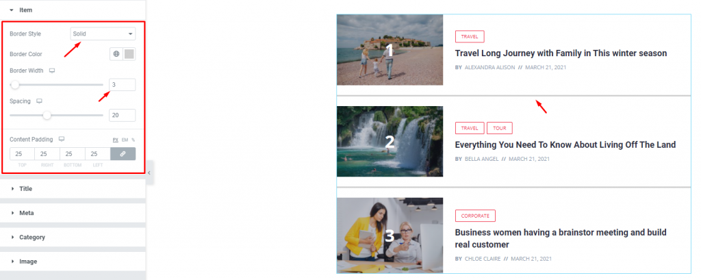
Go to Style> Items
First of all, you can add border & border color inside the list. The border width & spacing can be changed with scrollbars. Increasing the content padding will evenly distribute the text of all the posts.
Title
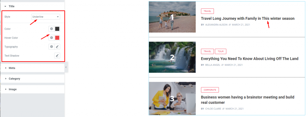
Go to Style> Title
Here, you can add a hover style for the title. It can be the underline style which is one of the 4 styles we provided.
You will also get the option to change the text color and typography of the titles. The color option is available for both active & hover modes for the WordPress post list.
Meta
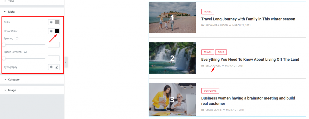
Go to Style> Meta
The meta is displayed below the post titles. You can change the color for normal & hover modes, adjust the spacing from the title & between them, and the typography of the blog list.
Category
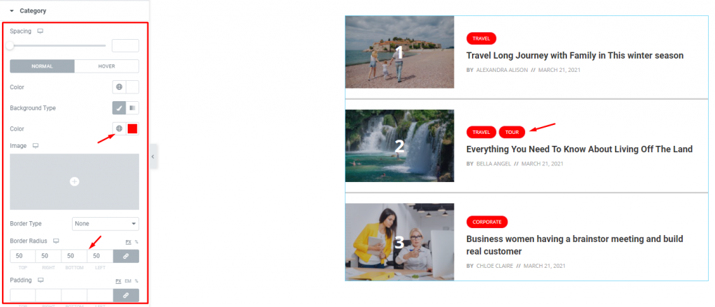
Go to Style> Category
The category, displayed above the title, has a lot of options for customization. Except for the colors, you can change the spacing, border, padding, & use box-shadow to make it look more realistic.
Let’s go for some paddings & border radius with white colored text surrounded by a bright red colored background.
Image
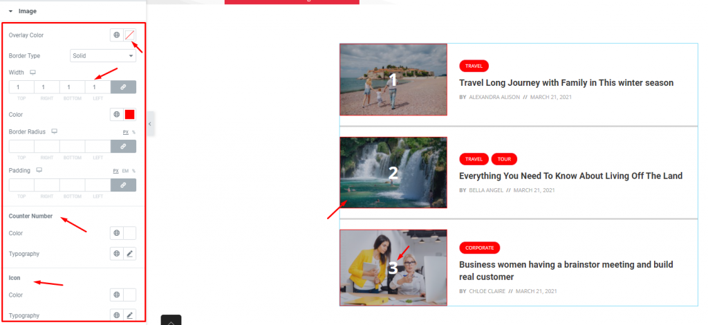
Go to Style> Image
Lastly, you will see border options for the post images. Notice that there are separate segments to customize the counter number & icon with color & typography.
You can also add an overlay color for the images. However, it will only work in the normal mode.
Conclusion
Still, stuck?
Watch this quick video for visual instruction and see the demo page for more examples, provided by Bdthemes.

