The Maple Carousel widget is a tailor-made element of the Ultimate Post Kit add-on. This tool helps you make the perfect website by displaying posts into a carousel formation.
Let’s have a look at how it works!
Inserting widget

Find the Maple Carousel widget from the widget menu in the Elementor page editor and drag it inside your webpage.
Content tab
The Content tab holds the base settings for the widget and lays the foundation of the layout of the final content.
Layout

Go to Content> Layout
In this section, you can adjust column numbers and item gaps of the posts of the carousel for blogs. You can also change the image size by selecting the mentioned dimension according to your needs.
Query

Go to Content> Query
Here, you need to define the number of posts shown on the display of the post carousel. The source can be selected from posts, pages, and landing pages. You can show categories, tags, as well as set the order of the posts.
Additional

Go to Content> Additional
This section is made with a number of switchers that can be turned on/off to show/hide the specific item on the display for the Maple Carousel widget. These are for the titles, category, avatar, date, etc.
Navigation

Go to Content> Navigation
The Maple Carousel widget has a separate section to set up the navigation. It can either be arrows or dots, or both combined. Let’s select arrows and choose an arrow style from over 20 arrow-head styles. Flip on the Hide Arrow on Mobile switcher if needed.
Carousel Settings

Go to Content> Carousel settings
Lastly, you will get the settings for the carousel animation. The Layout is changeable between Carousel & Coverflow. You can set it to Autoplay mode and put a time value for the autoplay speed for the carousel widget.
By turning on the Center Slide switcher, you can make the center post your post-representative and move the animations centering it. There is a switcher that makes the default cursor into a Grab Cursor whenever you hover over the carousel.
Style tab
The style tab allows you to change or customize the appearance of the Maple Carousel widget content layout. The options include color settings, borders, paddings, etc.
There are several sections on this tab.
Items

Go to Style> Items
Add borders around the posts with a decent radius and change the background color as well as add decent padding. You can use the box-shadow option to add a 3D vibe to the post blocks for the post carousel.
Title

Go to Style> Title
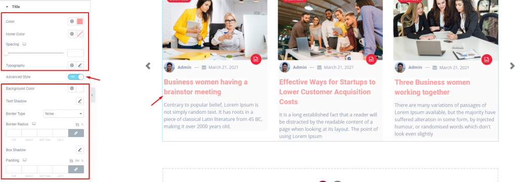
The Title section mainly gives you the option to change the text color, spacing, and typography of the titles on the Maple Carousel widget. The color option is available for both active & hover modes. There is another switcher called Advanced Style at the bottom.
Turning it on will reveal more options such as background type & color, text-shadow, border, padding, etc. These options will give extra visual effects on the titles.
Text

Go to Style> Text
Change color & typography of the post description from this section.
Author

Go to Style> Author
Of course, each post has an author that will be displayed below the post image. However, the author’s name can be customized by color & typography through this section.
Date

Go to Style> Date
Change the text color and typography of the date beside the author info for all posts.
Category

Go to Style> Category
The category option enables you to customize the category text on top of the content area. Set their color, border, typography and make it more eye-catching.
Navigation

Go to Style> Navigation
You can customize the navigation pointers in this section. For arrows, you can customize the arrow color, width, border, padding, border-radius, etc. You can increase the arrow size to match your taste.
This section displays different options for different type of navigation system.
Post Format

Go to Style> Post Format
The Maple Carousel post layout shows the type of post format you have chosen for the displayed posts. The tiny icon at the bottom of the post images shows the format type using standard icon series by WordPress.

You can go to Dashboard> Posts> Edit> and will find the Post Format settings on your right-hand side. From there, you can select the post type and save it. Maple Carousel widget will display the format on every post it shows.
In this section, you can customize the post format icon by color, border, padding, spacing, size, etc.
Conclusion
Still stuck?
Watch this quick video for visual instruction and see the demo page for more examples, provided by Bdthemes.

