Buzz List Carousel widget is for listing your blogs in the features section using hidden cover images behind the white background. It’s the carousel version of the original Buzz List widget, with extras.
Let’s see how it works.
Inserting widget

Find the Buzz List Carousel widget from the widget menu in the Elementor page editor and drag it inside your webpage.
Content tab
The Content tab holds the base settings for the widget and lays the foundation of the layout of the final content. It’s divided into three parts for the Buzz List Carousel widget.
Layout
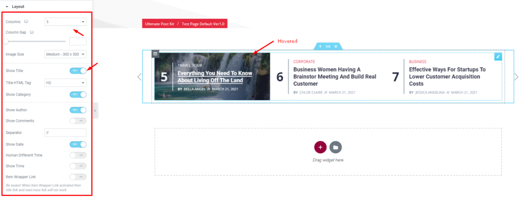
Go to Content> Layout
In this section, you can adjust the column number, column gap, & size of the images. The maximum number of columns on the display can be up to 4 on the WordPress post list.
The second segment of the section has a bunch of switchers to turn on/off specific items on the display (date, author, time, pagination, etc.).
Query

Go to Content> Query
Here, you need to define the number of posts shown on the display. The source can be selected from posts, pages, and landing pages. You can limit the posts by categories, tags, as well as set the order of the posts on the carousel sliders.
Navigation

Go to Content> Navigation
For navigations, you can either choose arrows or dots or both combined. Let’s go with arrows. Take a note that you can choose from 23 different arrowhead styles for the post list carousel.
Carousel Settings
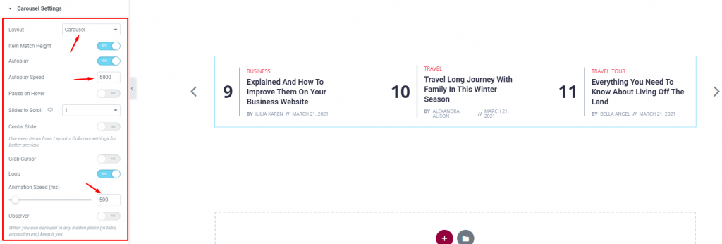
Go to Content> Carousel settings
Lastly, you will get the settings for the carousel animation. The Layout is changeable between Carousel & Coverflow. You can set it to Autoplay mode and put a time value for the autoplay speed.
By turning on the Center Slide switcher, you can make the center post your post-representative and move the animations centering it. There is a switcher that makes the default cursor into a Grab Cursor whenever you hover over the carousel sliders.
Style tab
The style tab allows you to change or customize the appearance of the Buzz List Carousel widget content layout. The options include color settings, borders, paddings, etc.
There are several sections on this tab.
Items

Go to Style> Items
First of all, you can add an Overlay color to the content background. It works for both the normal & hover modes. Remember, choosing a non-transparent overlay color will automatically hide the hover post image function.
Adding border, border radius, & padding will help you make the list more unique.
Title

Go to Style> Title
Here, you can add a hover style for the title. It can be the underline style which is one of the 4 styles we provided.
You will also get the option to change the text color and typography of the titles. The color option is available for both active & hover modes for the WordPress post list.
Meta

Go to Style> Meta
The meta is displayed below the post titles. You can change the color for normal & hover modes, adjust the spacing from the title & between them, and the typography of the post list carousel.
Category
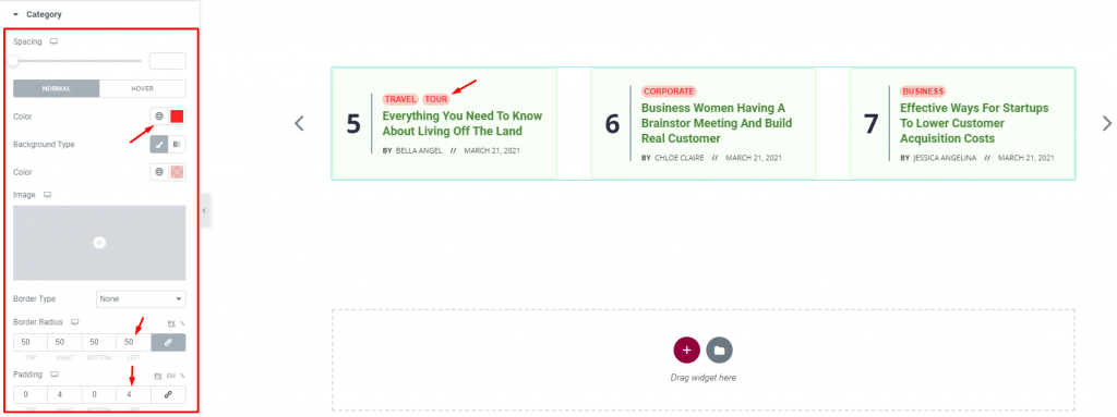
Go to Style> Category
The category, displayed above the title, has a lot of options for customization. Except for the colors, you can change the spacing, border, padding, & use box-shadow to make it look more realistic.
Let’s go for some paddings & border radius with a lighter color and a white hover color.
Counter Number

Go to Style> Counter Number
Lastly, the counter number on the left side of the post title is parted with a separator. Both the counter & the separator has normal & hover color options, spacing, and typography.
Navigation
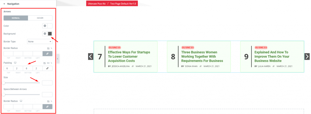
Go to Style> Navigation
Lastly, you can customize the navigation pointers in this section. Let’s shape the arrows with some colors, padding, & border. You can also increase the arrow size by the scrollbar (pointed with red).
This section displays different options for different types of navigation systems.
Conclusion
Still, stuck?
Watch this quick video for visual instruction and see the demo page for more examples, provided by Bdthemes.

