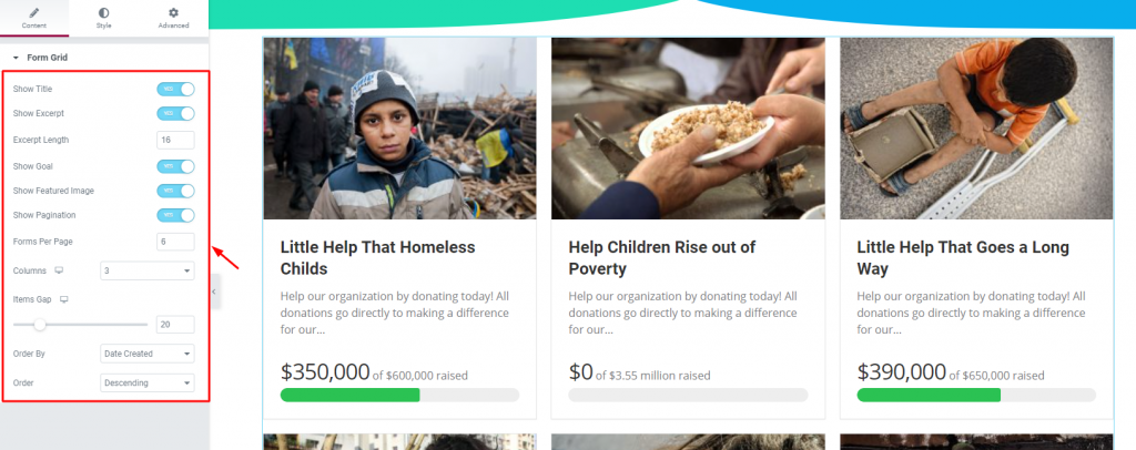
The Give Form Grid widget lets you display all of your running campaigns in a grid manner. Just to let you know how to operate it quickly, please follow this tutorial.
Inserting Widget

Find the Give Form Grid from the widget menu and drag-drop it inside your page.
Content tab
There is a single section under the Content tab holding every basic setting included in one place.

There are a visible number of switchers that control specific content on the display. Turning them on/off will show/hide the title, excerpt, image, pagination, and goal on the WordPress charitable grid.
Also, you have options for limiting the number of visible campaigns as well as the display order.
That’s it for the content tab. Now, let’s move on to the Style tab.
Style tab
The Style tab for the Give Form Grid widget has several sections commanding several parts of the content. We have listed them serially for ease of view.
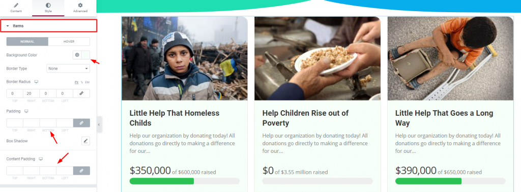
Items

Go to Style> Items
You can change the background color and add borders, paddings to the whole grid from the first section. Again, there is another padding option for the inner content as well.
Image

Go to Style> Image
You can add a border and adjust the border-radius for the image part of the grid. Add padding or the box-shadow if you want to style it up more.
Title

Go to Style> Title
Customize the titles of your campaigns from this section by color, spacing, and typography of the Give Form Grid widget.
Text

Go to Style> Text
Same settings as the title section but for the texts/excerpts.
Goal

Go to Style> Goal
You can change the color and typography for the raised amount, target amount, and the progress bar from this section.
Pagination

And lastly, the Pagination section lets you customize the pagination at the bottom of the grid. Here, you have options for alignment, normal color, hover color, and active color.
Conclusion
Watch this video to get more visuals on the Give Form Grid widget and visit this demo page, by Bdthemes, for more examples.
Thanks for staying up.

