Fluent Forms widget is a brilliant multi-purpose tool you can easily grab for your website. This widget presents a huge forms template library with a large category. You can custom create any form you like or select from their vast template library also.
Note that, the WP Fluent Forms widget is a 3rd party widget in Element Pack Pro. To use this easy-to-use widget effectively, you need to know how it works. Let me give you a complete guide to it!
Installing Fluent Forms Widget
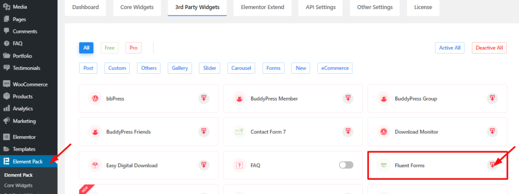
To install Fluent Forms, you can go to your dashboard, click on Element Pack, and go to 3rd Party Widgets. There, you will see the Fluent Forms widget on the list with a mini download button. You can click on the download button and activate it from there.
Fluent Forms

After the installation is completed, you will get a new item Fluent Forms in your dashboard. From there, click on it and tap on Add a New Form.
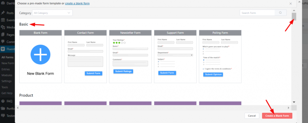
You can just create a blank form by clicking on the red button as the image shows. This will give you a completely blank form page to build the WP form.
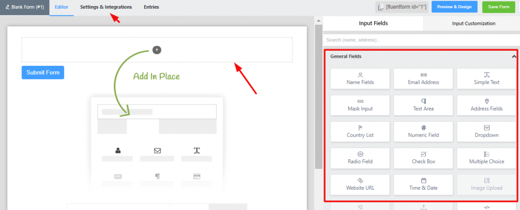
This blank page comes with all kinds of items you can place inside it to make a complete form.
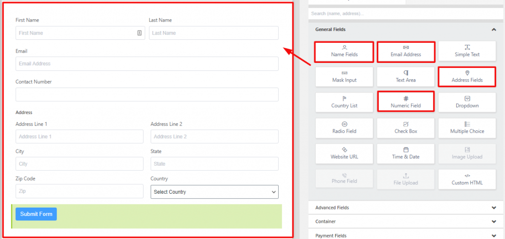
You can easily create your own form by using the drag and drop items menu. This is far easier than any other form on the whole internet community.
Moreover, you can select WordPress forms from the template library to save time. Easy and efficient.
To Insert Widget

On a new page, drag and drop the Fluent Forms widget from the Widget selection menu.
Content Tab
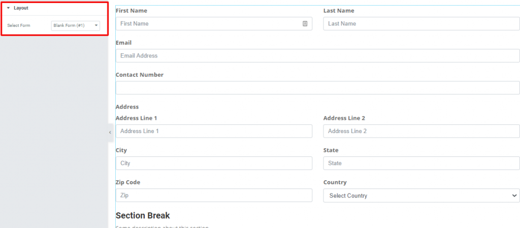
Go to Content Tab
After the widget is placed inside your page, you can see this part inside the Content Tab. You can select a form from the drop-down controller Select Form.
Style Tab
Now, time for some Style. In this Style tab, you will have more options to create your unique Fluent Form widget as you like. Let’s have a look.
Labels

Go to Style Tab> Labels
In this section, you can change the color and typography of the labels in your form.
Input & Textarea

Go to Style Tab> Input & Textarea
Here, you can customize the input area of the form. You can change the color, border, alignment, and the dimension of the textarea from this section.
Placeholder

Go to Style Tab> Place Holder
You can change the color of the placeholder text here.
Radio & Checkbox

Go to Style Tab> Radio & Checkbox
This section lets you change the color, size, border of the radio & checkbox fields.
Section Break Style

Go to Style Tab> Section Break Style
In this section, you can customize the section break part. You can change the color, typography, add padding, adjust margin here for both label and description of the section break for the WP Fluent Forms.
Address Line Style

Go to Style Tab> Address Line Style
In this section, you can change the color and typography of the address line.
Submit Button

Go to Style Tab> Submit Button
You can customize the color, background, border, width, and alignment of the submit button from this section for the WordPress Forms.
Success Message

Go to Style Tab> Success Message
After you complete the form and hit the submit button, you will get a success message. This section lets you customize the color, border, typography of the message box.
Error

Go to Style Tab> Error
Finally, you can change the typography, padding, and margin of the error message if any occurs.
Video Assist
Well done. Seems you have learned the whole thing and how it works. It is easy and fun. Watch Video Assist and to get more in-depth ideas about the usage of the Fluent Forms widget, by Bdthemes, take a tour to the demo page.
