
The Fever gallery widget is one of the most minimalistic and classy widgets brought to you by the Pixel Gallery addon for Elementor. This widget gives you a quite blended hover animation that helps pull attention from your visitors and engage with them more.
Continue reading this article to learn about the customizations for the Fever gallery widgets.
Inserting the Fever Gallery widget
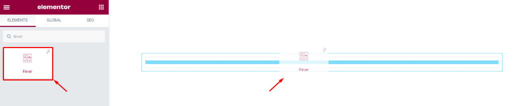
The Fever widget can be easily added to any page on your WordPress website that is built with Elementor. Simply open the page you want to use it on in Elementor, and drag and drop the widget into the desired spot. Please note that both Elementor and Pixel Gallery must be installed on your website before you’ll be able to use this particular widget.
Introduction to Layout customizations
The Content tab is where you’ll find the controls for the basic structure of the Fever gallery widget. Here, you can adjust the dimensions, number of columns, element spacing, and information about each element to create the foundation for your widget. Let’s take a closer look at how to use these features.
Take a look at the default appearance
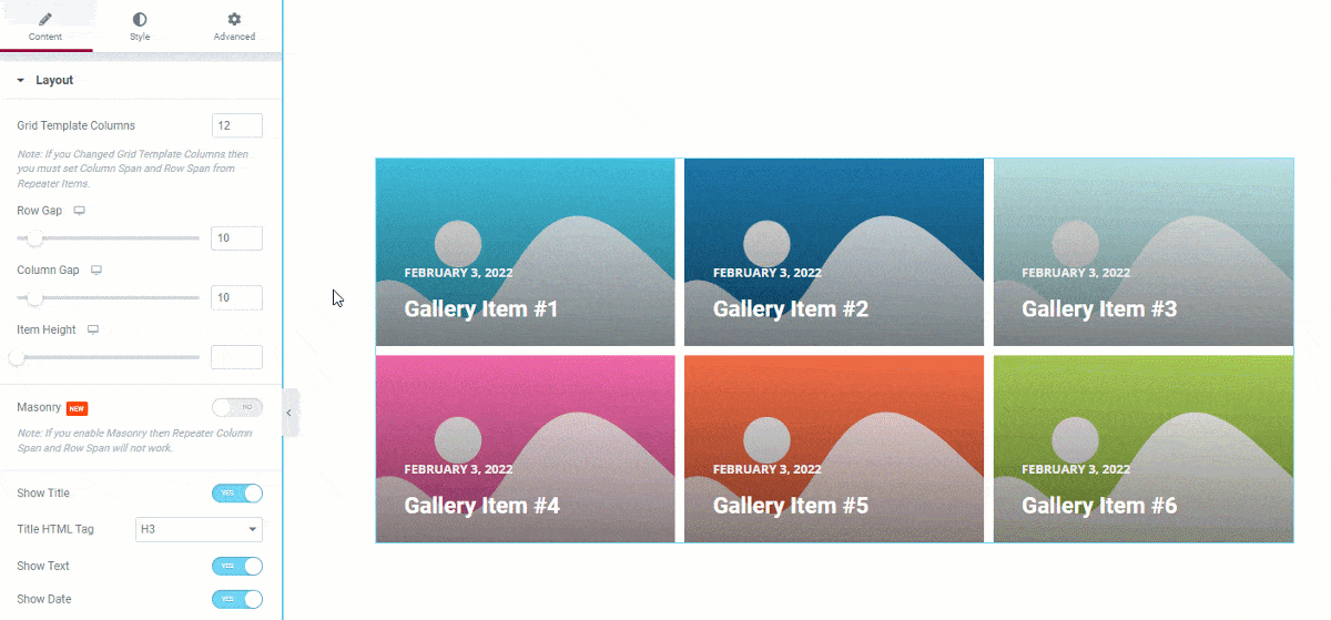
By default, Elementor’s Grid gallery contains 6 images, but you have the option to change this number to display more or less as desired. Additionally, a hover effect appears over the background image showing the date, title, and description text.
Customize the layout of the Epoch photo gallery widget
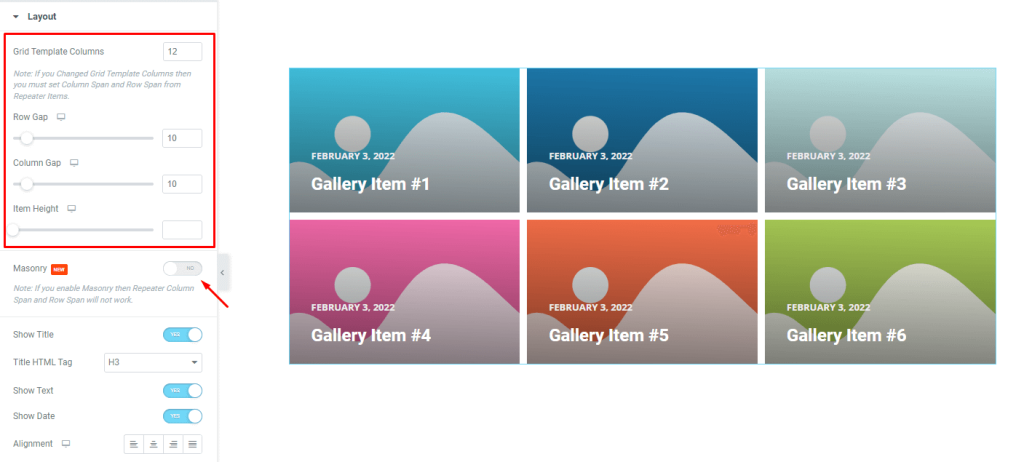
Go to Content> Layout
You can choose the number of columns for your grid template in the Layout section of the Fever gallery widget. You can also customize the look of your gallery by adjusting the item gap, column gap, and item height.
You can turn on the masonry toggle if the images in the gallery are different sizes and you want your own placement.
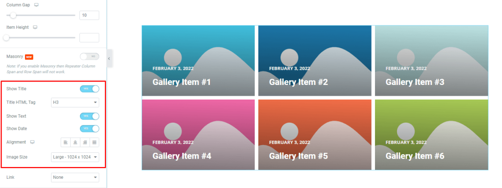
You can control the visibility of the title, date, and meta text with the switchers below. You can also choose custom HTML tags for the title. You can change the image size of the Fever Gallery widget using the Image Size option.
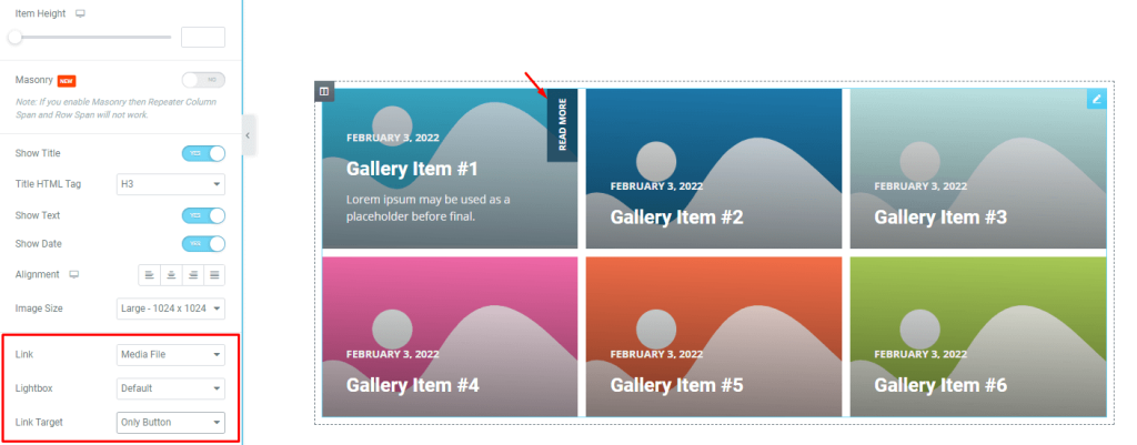
The Link field at the bottom of the page allows you to enable the media file link functionality of the WordPress Gallery Widget element. Simply click the Link field and select Media File or Custom URL to open the item’s link field.
You can choose Lightbox for the image as an addition. You can also select a read more button or the entire image as the link destination. Notice that selecting Only Button puts a read more button on the top right position on the images and shows on hover.
Customize Fever gallery widget items individually
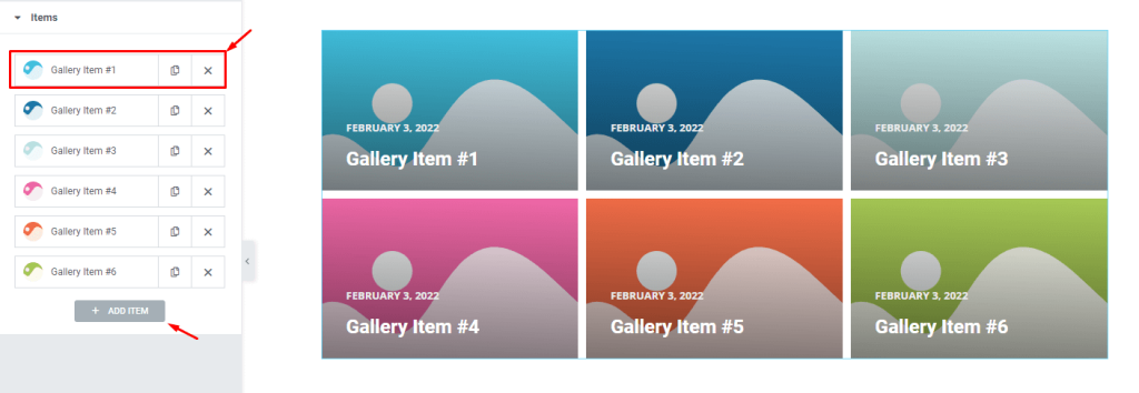
Go to Content> Items
Here you can find all your gallery items in one place. They appear as small white boxes with avatars, titles, and copy/close buttons. You can click the Add Item button to add more items or click the X button in the article field to close all listed articles.
Content subsection controls
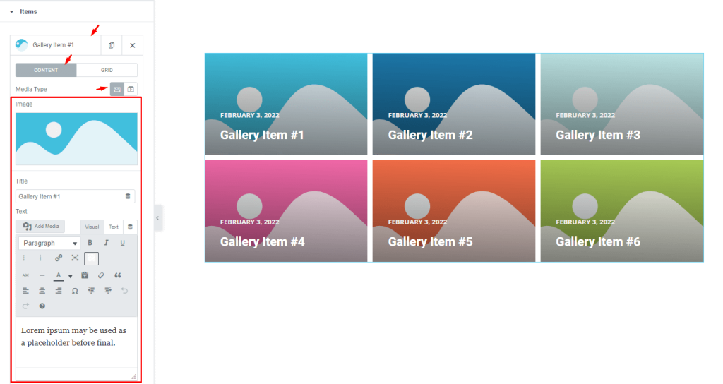
Click an item box to see the options it contains. Notice that the Content subsection is selected and the Media Type is set to Images. You can switch the media type to video if you want.
There are fields for customizing the image, title, and description to your liking.
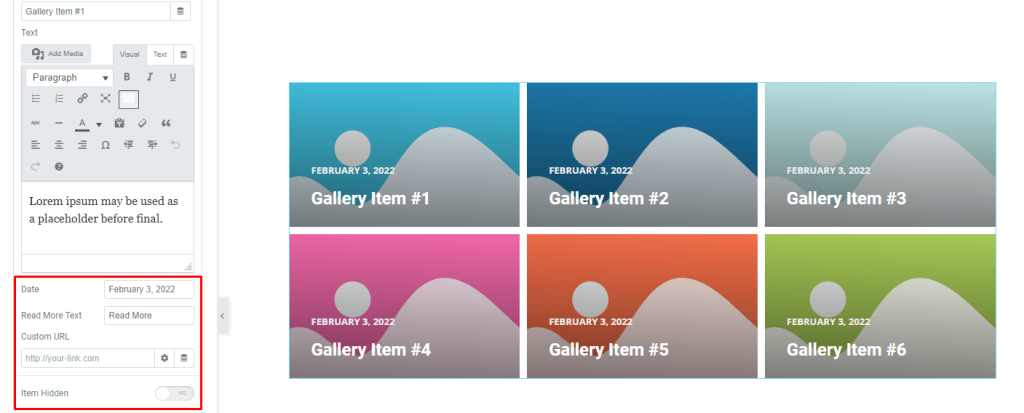
A little below, you will find fields for customizing the date and the read more button text. Also, you get a custom URL field for injecting links and an item hidden switcher to hide the selected item while keep holding its position on the display.
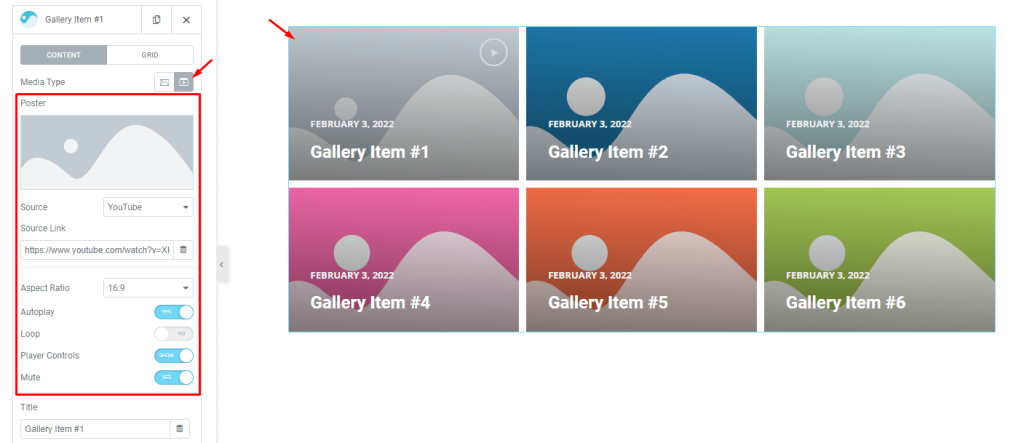
Also, you can embed videos in a single Fever Gallery widget item by selecting Video as the media type. This will give you access to additional control options such as video source options, source link, aspect ratio control, as well as switchers for autoplay, loop, player controls, mute, etc.
Grid subsection controls
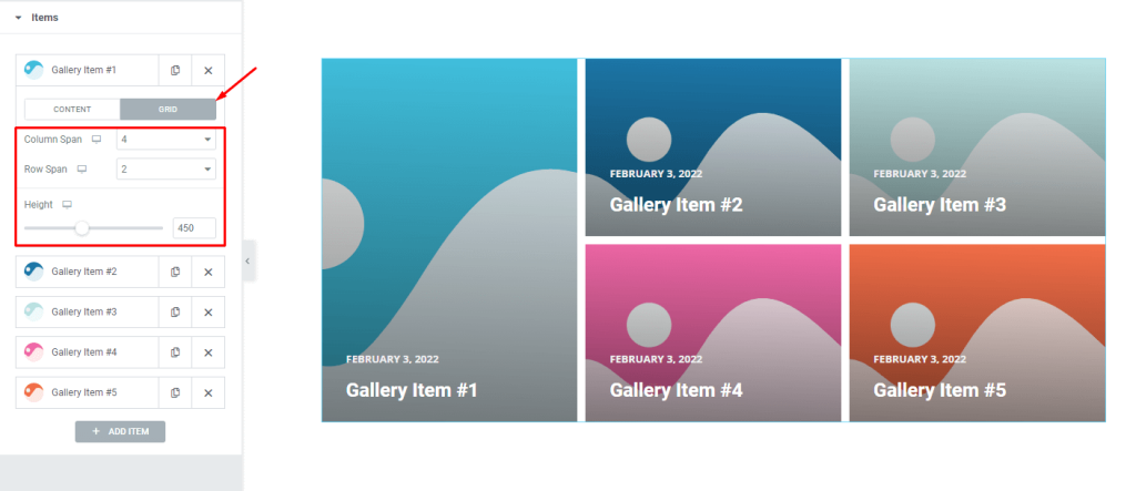
A grid control allows you to select the dimensions of each element like the number of columns or rows that can be occupied. Height options let you change the height of each element to further customize its size.
For example, keep the column span to 4 and change the row span to 2. The first element now occupies 4 of the 12 column bars and 2 rows. By default, column span is set to 4, and row span is set to 1. This is why you will see the rest of the 4 items on the right side of the first gallery item.
Remember that you can always experiment with different settings to see what works best for your project.
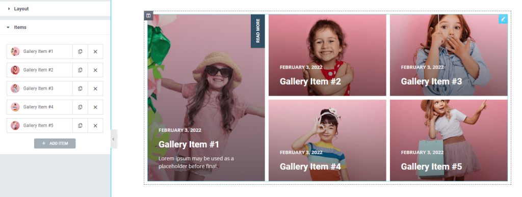
After customizing the grid items, the UI looks like this: This layout can be easily created by adjusting the individual item grid controls in Fever Grid Gallery widget.
Now, we will do more customizations from the style tab.
Style tab for customizing Fever gallery widget interface appearance
Customizing the look of your layout is one of the great things about Pixel Gallery. You can easily modify it to create your own interface to suit your needs.
Here is how it’s done:
Items section customizations
Go to Style> Items
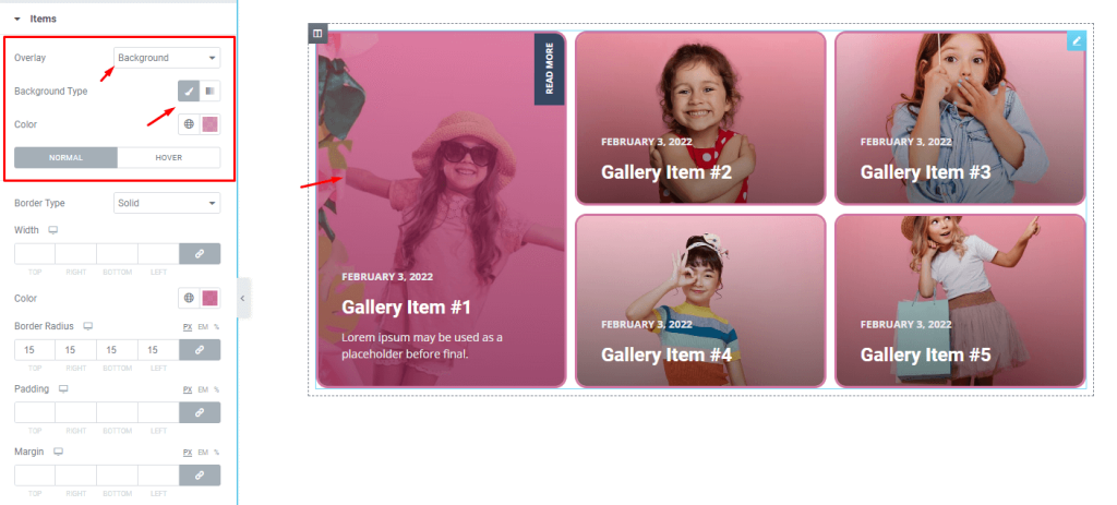
First, let’s apply a monotone color to the overlay background of the widget. The controls are on the top as you can see.
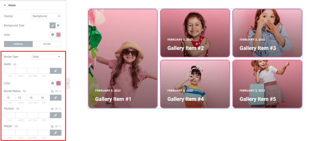
Below, you can put up a border with a matching color tone around the images. We used border radius to curve the edges a bit. You can use padding and margin fields on the whole gallery layout.
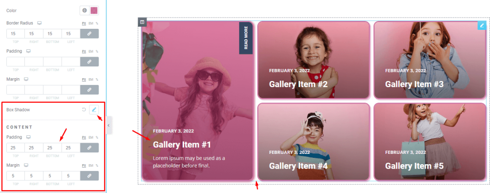
Then, you can configure the box shadow color properties to add a glow or shadow effect around the images like this. Box shadow can be configured for both normal and hover modes. Here, we kept it dark in normal mode and made it glow in hover mode.
After that, you can use content padding and margin to position the content of the gallery items nicely.
Customize the play icon
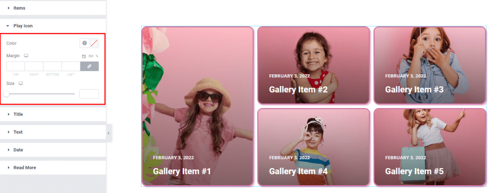
Go to Style> Play Icon
If you select Video from the media type option in the Layout section, a play button will appear on the selected grid item. You can then customize the color, margin, and size of this button to suit your needs.
Fever gallery widget title customization
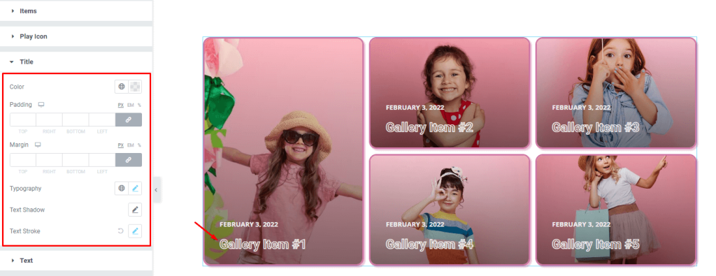
Go to Style> Title
Here you can change the color, padding, margin, typography, text shadow, and stroke to make your content title more appreciating and beautiful.
Description text customizations
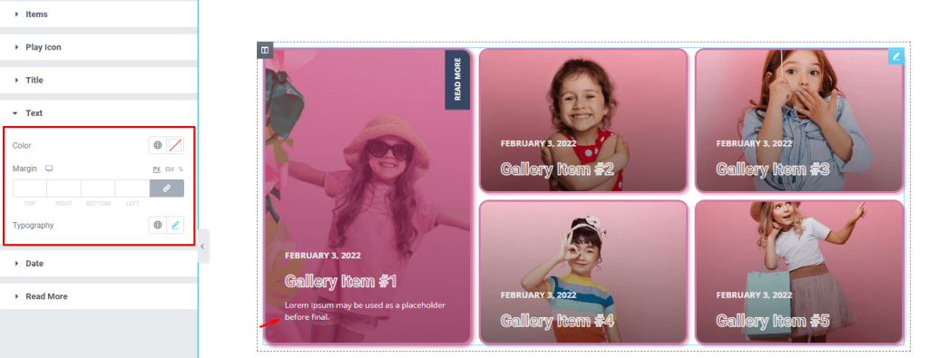
Go to Style> Text
Here you can customize the color, margin, and typography of the text to match them with your gallery interface.
Customize dates on the gallery widget
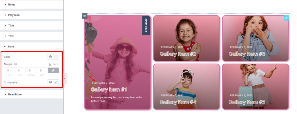
Go to Style> Date
To customize the date text on the images, you can use color, margin, and typography options from here.
Customize the read more button
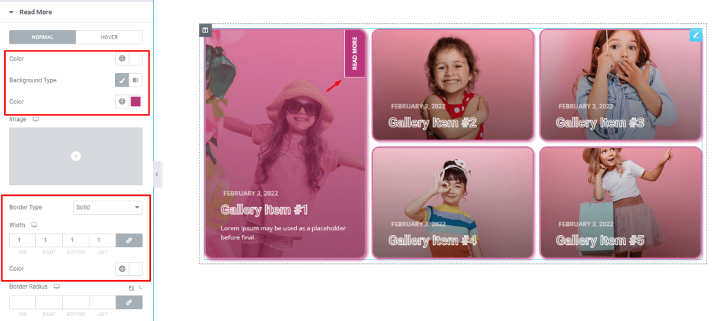
Go to Style> Read More
Now all that’s left is the read more button hanging on the top-right corner of the images when hovered. From this section, you can change the text and background color of the button to your liking. For the background, you can go for a single color, a gradient color, or choose other media (images) as the background.
Then you can add border around the button to make it pop out. The border width and radius can be customized. Also, you can go with box shadow for the button.
The finished design looks great! The Fever gallery elements are neatly arranged and the hover effects are very elegant and professional. Elementor’s Pixel Gallery add-on makes it easy to create clean and bold galleries like this one.
Video Assist
Watch this video to see the whole tutorial with more visual details, or check out the demo page for similar examples.