
Event Carousel widget is a vastly used user-friendly tool. By using a smart carousel system, this widget is used to showcase events like donations, charity, medical services, and many other things. You can use it on your websites to present the events professionally to your visitors.
To use this easy-to-use widget effectively, you need to know how it operates. Let me give you a complete guide to it!
To Insert Widget
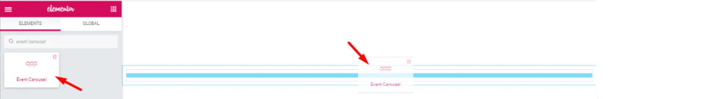
Inserting the widget is just a matter of drag and drop. However, click and hold on the widget icon from the menu and drag the Elementor Event Carousel widget to the drop point. Follow the picture above.
Point to be Noted:
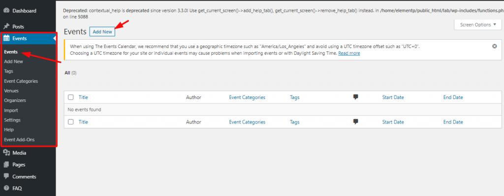
To use this widget, you must have events inserted in your WordPress Events dashboard. If it’s blank, the Event Carousel widget will show nothing on the screen.
Content Tab
Using the Content tab, you can basically make a layout of a particular part of the website. Let’s get you started!
Layout
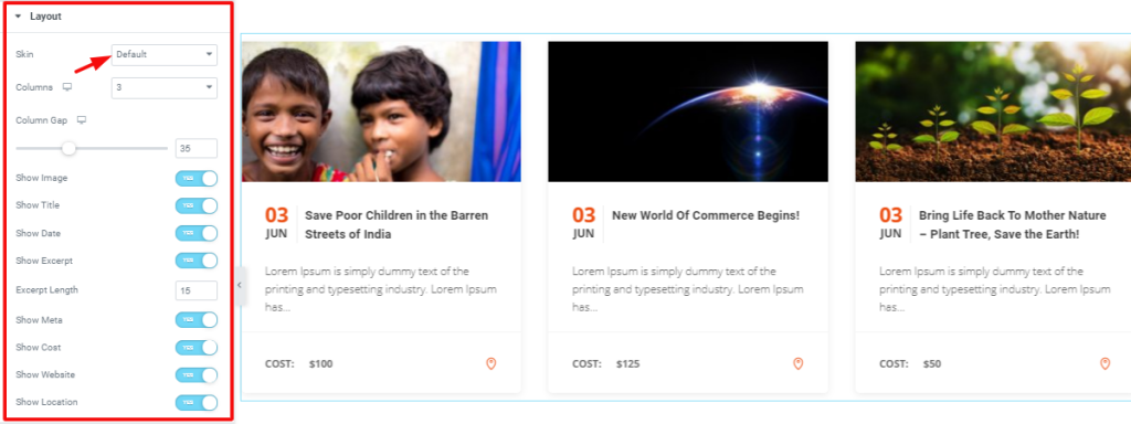
Go to Content Tab> Layout
The first section Layout gives you the drop-down controller to change the theme of the carousel by Skin.
Now, remember, each Skin comes with a slightly different editable set of sections. You can insert a maximum number of 4 columns in this event carousel widget by Element Pack. The switcher each shows/hides information on the screen.
Image
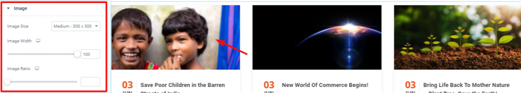
Go to Content Tab> Image
In this section, you can adjust the size of the image on the carousel.
Query
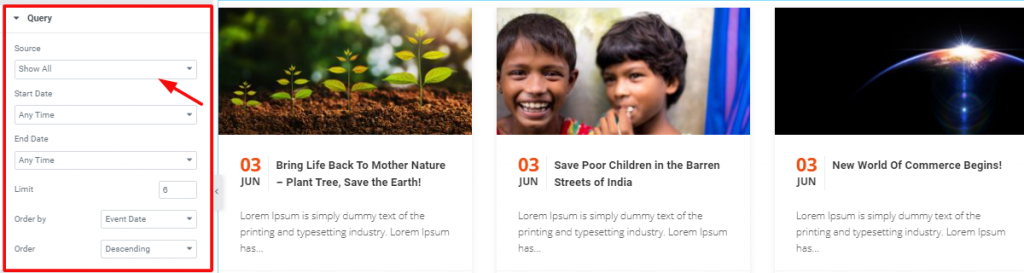
Go to Content Tab> Query
In this section, you can select the event source to showcase on the screen. You can, however, select the start and end date and time of the event carousel widget from here.
Navigation
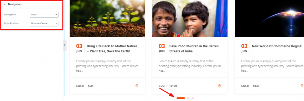
Go to Content Tab> Navigation
Here, you can select the style and position of the navigation button to make the perfect Elementor event template.
Carousel Settings
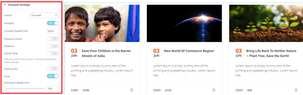
Go to Content Tab> Carousel Settings
This section is for customizing the layout and animation style. You can either select a carousel or coverflow from the drop-down controller Layout.
Style Tab
Now, time for some Style. In this Style tab, you will have more options to create your unique Event Carousel widget as you like. Let’s have a look.
Items
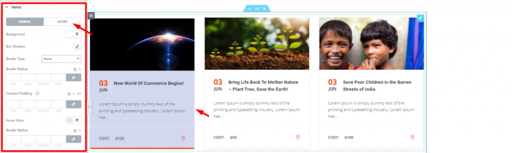
Go to Style Tab> Items
The first section of the Style tab, Items, lets you change the color, add padding or border to the content part below the image. The Hover Style controller adds a line of color underneath the content part. Check on the hover mode for more style.
Image
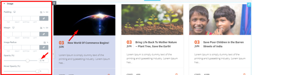
Go to Style Tab> Image
With this section, you can add padding, margin, or border to the image part. Also, you can change the transparency of the image for normal and hover mode.
Title
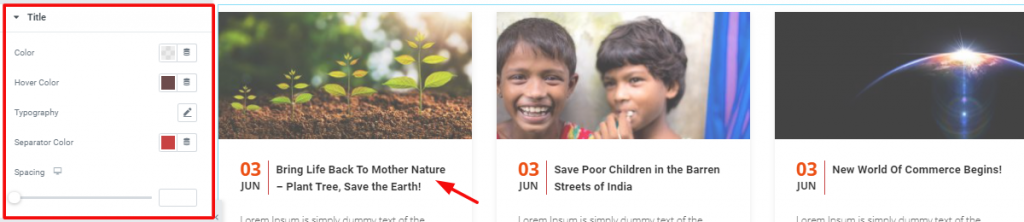
Go to Style Tab> Title
Here, you can change the color, spacing, and typography of the title and separator.
Date
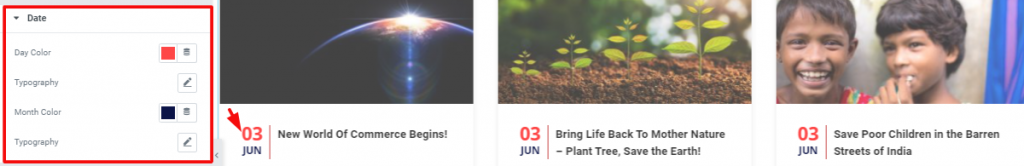
Go to Style Tab> Date
In this section, you can change the color and typography of the data and time besides the title.
Excerpt
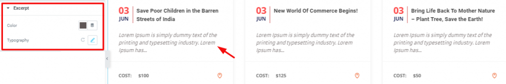
Go to Style Tab> Excerpt
You can change the color and typography of the excerpt from here.
Meta
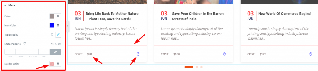
Go to Style Tab> Meta
With the Meta section, you may change the color of the borderline, location icon, and cost.
Address
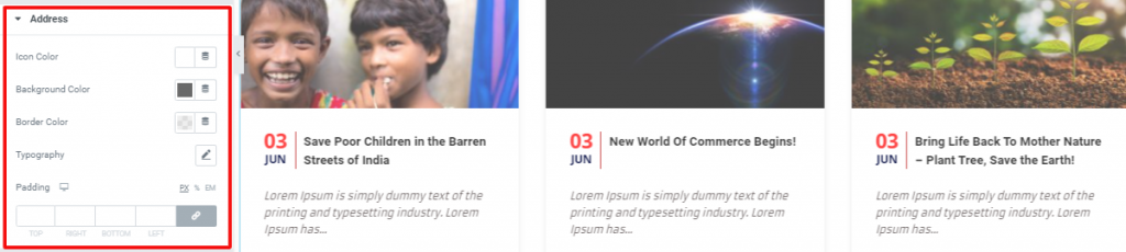
Go to Style Tab> Address
From this section, you can change the color, typography, padding, and border of the address from here.
Navigation
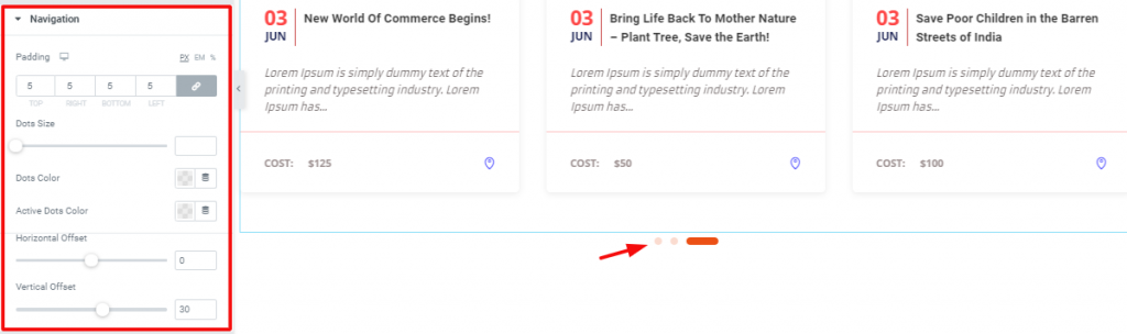
Go to Style Tab> Navigation
Lastly, you have the Navigation section. Here, you can customize the navigation button at the bottom of the carousel.
Video Assist
Well done. Seems you have learned the whole thing and how it works. It is easy and fun. Watch Video Assist and to get more in-depth ideas about the usage of the Event Carousel widget by Bdthemes, take a tour to the demo page.