The Event Calendar slider comes with the Event Calendar Countdown feature. The Slider is designed based on the visitors’ needs and can be awesome if you are building event-based sites.
Let’s explore the customizations from the inside.
Inserting The Event Calendar Slider widget

You can add the Event Calendar Slider addon to WordPress by opening the page you want to use it on in Elementor and then dragging and dropping the Event Calendar Slider widget into that page. Please note that you need both Elementor and Prime Slider installed before you can use this widget.
Work With The Content Tab
Layout Section Customizations
Go to Content > Layout
Step-1

Here, you can set the Height to adjust the net height of all slides. Also, set Alignment for the best text position for your text content.
You will get the Show Title, Show Date, Show Excerpt, Show Buy Button, and Show Location switchers which you can turn on/off to show/hide these elements from the slider. Also, set a Custom Link under the Show Buy Button and also set the Excerpt Length from the options.
Lastly, you can customize the Event Calendar Slider Image Size and customize the Background Image Settings as your working demand.
Step-3
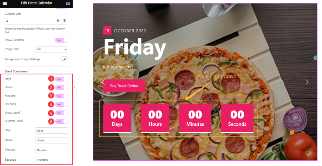
Further below, you will get the Event Countdown Days, Hours, Minutes, Second, Show Lebel, and Custom Lebel switchers which you can turn on/off to show/hide these elements from the slider. Also, there are Days, Hours, Minutes, and Seconds text fields to customize those labels.
Query Section Customizations
Go to Content > Query
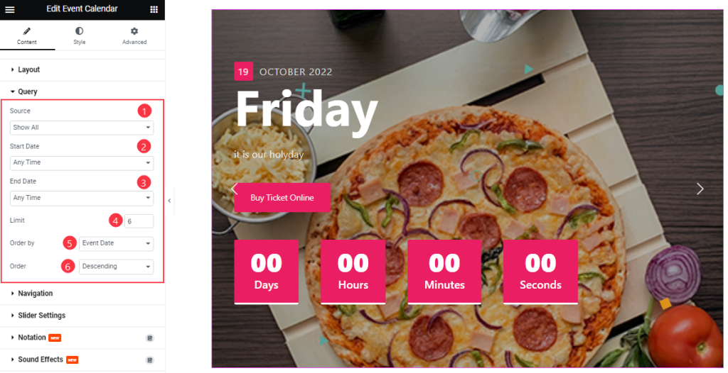
From the Query section, you can easily select the Source that you for the slider. Also, select the Start Date and End Date type to show your Event on your slide.
You can set your Post Limit as your need. Order By and Order controls are here to arrange the data you want to display through Event Date, Category, Random, Title order wise, and also with ascending or descending order.
Customizations Of Navigation Sections
Go to Content > Navigation

Come to the Navigation section, you can select the Navigation Type (Arrows and Dots, Arrows, Dots, None), Arrows Position and you can click the Hide Arrows on Mobile switcher to hide Arrows on Mobile displays.
Slider Settings Section Customization
Go to Content > Slider Settings
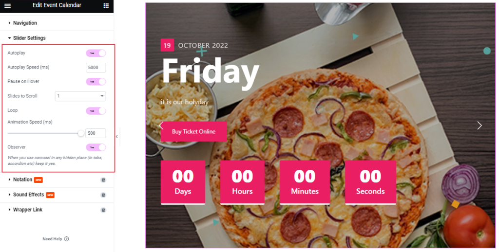
In this section, you will be able to see a bunch of Switchers like Auto Play, Auto Play speed, pause on Hover, Slides to Scroll, Loop, Animation Speed, and Observer.
What they do-
Autoplay switcher: If you Enable the Autoplay switcher button, your slider will slide into Autoplay mode, and you can set the Autoplay Speed as your wish.
Pause on Hover: If you activate the pause on Hover button, when visitors Hover the mouse cursor on the slider, then your slider will Hold, otherwise your slider slide Autoplay.
Slides to scroll: It represents how many slides will slide at once.
Loop: When you activate the Loop switcher button, your slider will loop at a certain time interval. You also set up the loop animation speed here.
Observer: If you enable the option then you are able to use the slider/carousel in any hidden places (such as in tabs, Accordion, etc).
Work With The Style Tab
Item Section Customizations
Go to Style > Items
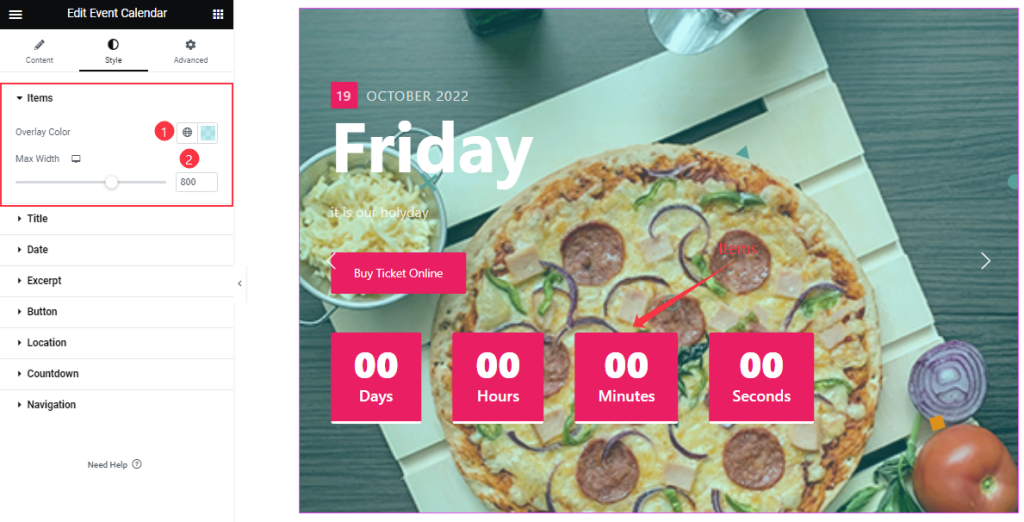
In the Items section, you can change the Overlay Color and Items Max Width like in the above screenshot.
Title Section Customization
Go to Style > Title
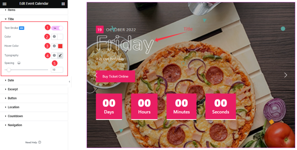
In this section, you are able to change the Title Color and Hover Color. You may turn on/off the Text Stroke switcher button to show or hide the Title effect.
You can customize the title font by the Typography option and adjust the Title Spacing as per your working demand.
Date Section Customizations
Go to Style > Date

In this section, you can change Date Color, Background Color, and Typography as your wish.
Style The Excerpt Section
Go to Style > Excerpt
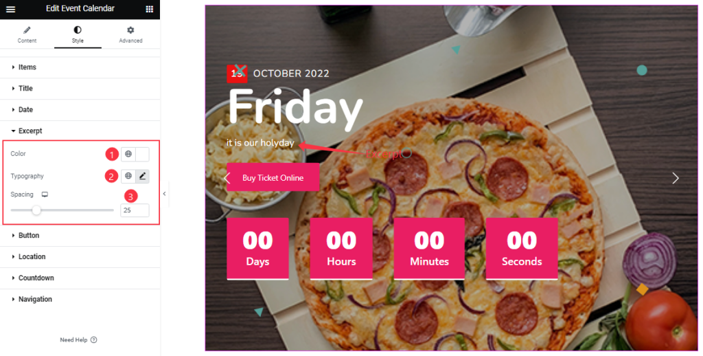
Here, you will get to change the Event Calendar slider excerpt’s Color, Typography, and Spacing.
Button Section Customizations
Go to Style > Button
Step-1
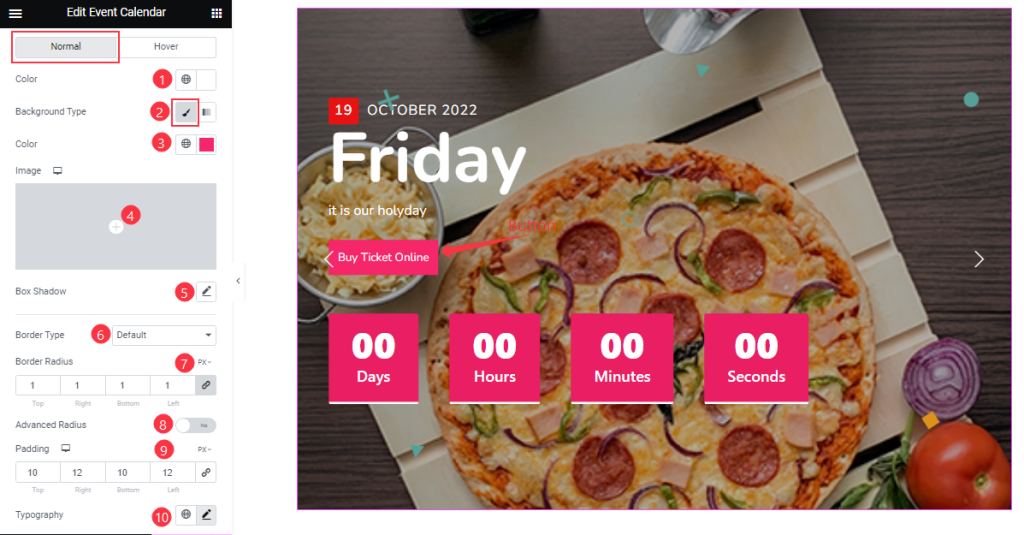
Come to the Button Section, in Normal mode, you can change the Button Color, Background Type, and Background Color and also set an image as button Background.
Below, you can change the Border Type, Border Radius, and Padding as your wish and add the Box Shadow effect to your Button section. You also on/off the Advanced Radius switcher button to show/hide the Advanced Radius option on your slide.
Step-2
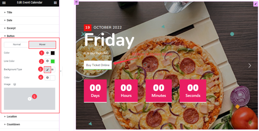
In Hover mode, you will get similar customization options as normal mode and easily customize those options.
Countdown Section Customizations
Go to Style > Countdown
Step-1
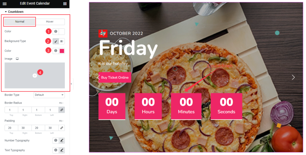
In Normal mode, you will get similar customization options like the Button section and easily customize those options for the Event Calendar slider.
Step-2
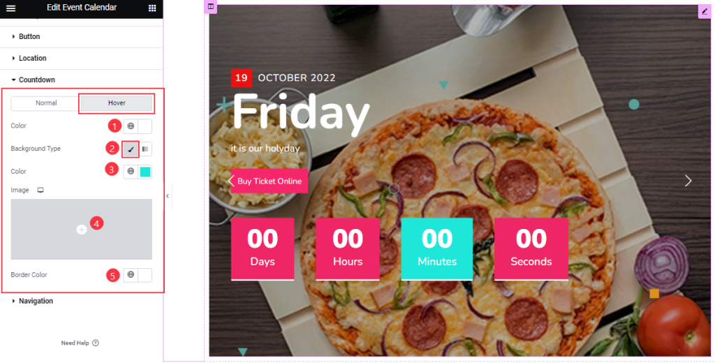
Even the Hover options are in a similar manner.
Step-3
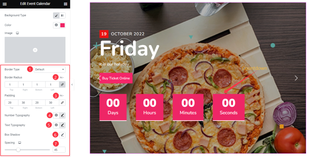
In this section, you can change the Number Typography and Spacing and the other function are the same as before.
Style The Navigation Section
Go to Style > Navigation
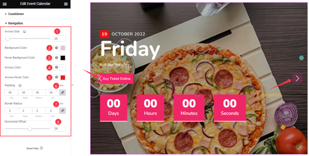
In the Navigation section, you can change the Background Color, Hover Background Color, Arrows Color, and Arrows Hover Color as your wish. You also can adjust the Arrows Size, Padding, Border Radius, and Horizontal Offset to your working demand.
All done! You have successfully customized the Event Calendar Slider widget on your website.
Video Assist
You can watch this quick video to learn more about the Event Calendar Slider widget.
Thanks for staying with us.