In this documentation, we will discuss the customization of the Event Calendar Countdown widget, brought to you by the Element Pack addon for Elementor.
Download And Activate The Events Calendar Plugin
Since the Event Calendar is 3rd Party widget that’s why need to download the plugin first. Just follow the below instructions-
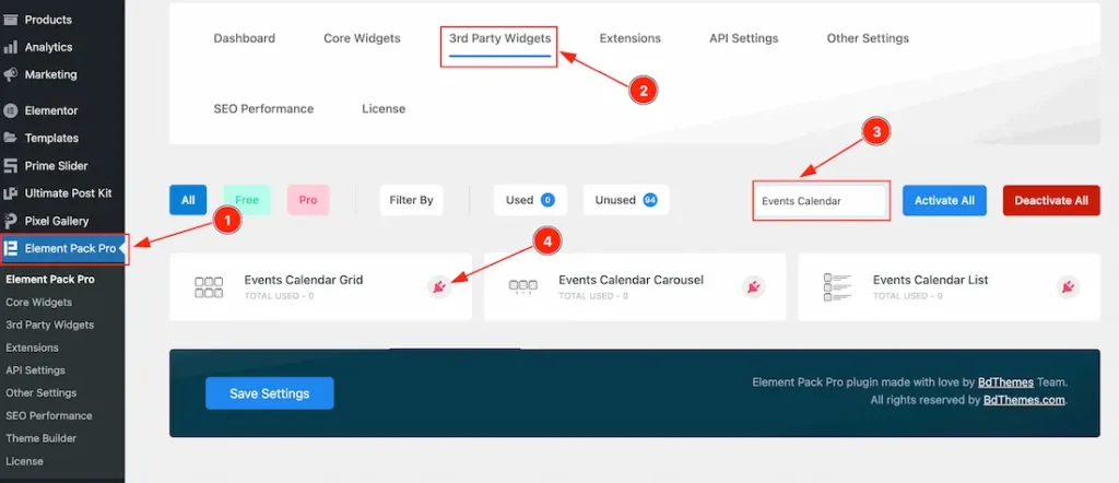
- Go to WordPress dashboard > Element Pack Plugin dashboard.
- Then Click the 3rd Patry Widgets Tab.
- Search the Events Calendar Widget Name.
- Choose one of the options. Click on the plugin icon button, download the Event Calendar Plugin, and then activate it.
If you want then you can also download the plugin from WordPress.Org. Just visit the link and download and activate the plugin. Here is the link.
Enable the Countdown Widget
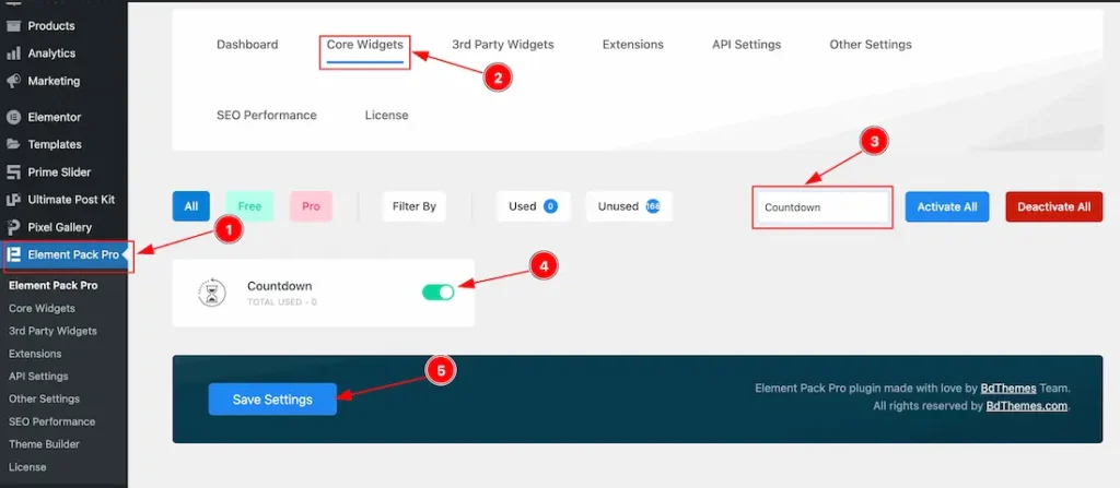
To use the Elementor Countdown widget from Element Pack, first, you have to enable the widget.
- Go to WordPress > Element Pack Plugin dashboard.
- Then Click the Core Widgets Tab.
- Search the Countdown Widget Name.
- Enable the Countdown Widget.
- Hit the Save Settings Button.
Inserting The Countdown widget
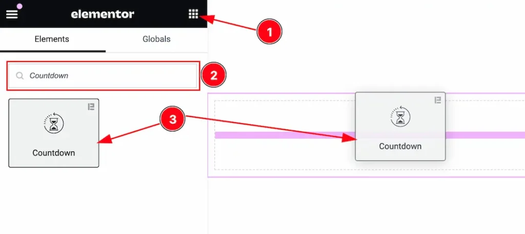
- Go to the Elementor Editor Page and Hit the Get Back To Button.
- Search the Countdown widget.
- Drag the widget and Drop it on the editor page.
Note: You need both Elementor and Element Pack installed to use this widget.
Work With The Content Tab
Layout Section
Go to Content > Layout
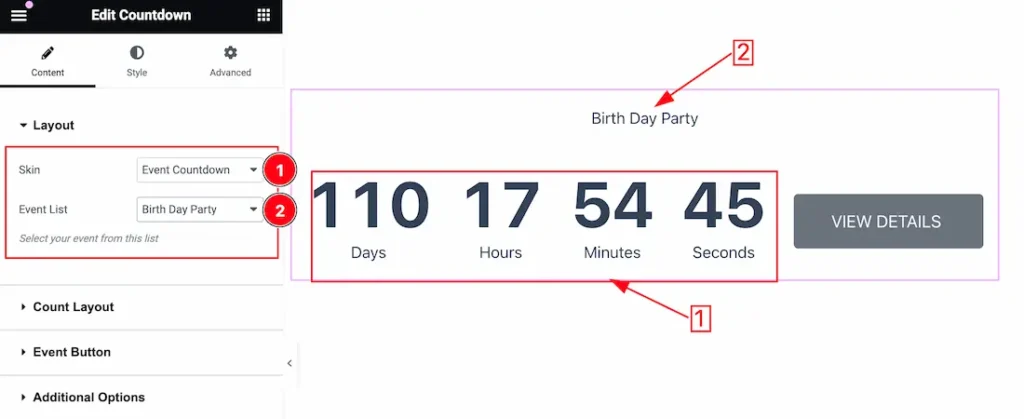
Come to the Layout section, you will get the below options-
1. Skin: You can set the Countdown skin as Default, Event Countdown, and Tiny Countdown. Please select the Skin Event Countdown.
2. Event List: This option lets you select the Event that you want to appear on your page. Just select the Event Here.
Count Layout Section
Go to Content > Count Layout
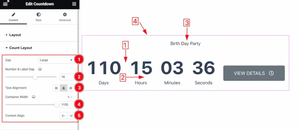
1. Gap: This option lets you change the gaps between the counters. Here you get this gap option – Default, Small, Medium, Large, and Collapse.
2. Number & Label Gap: This option lets you change the gaps between the Number and Label.
3. Text Align: This option lets you change the Text Align – Left, Center, and Right.
4. Container Width: you can set the Container width from here.
5. Content Align: The Content Align option works on the whole content of the countdown widget.
Event Button Section
Go to Content > Event Button
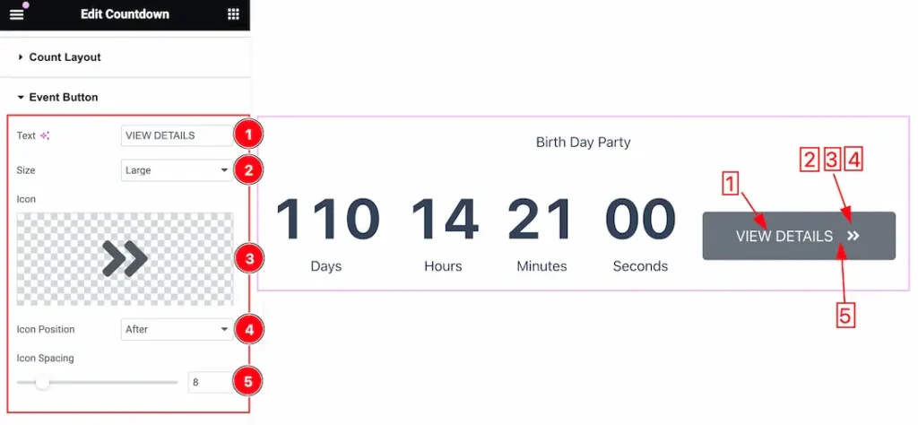
1. Text: This option lets you change the Event Button Text.
2. Size: You can set the Button Size – Extra Small, Small, Medium, Large, and Extra Large.
3. Icon: you can set the Event Button Icon from here.
4. Icon Position: You can set the Icon Position as Before, and After.
5. Icon Spacing: This option lets you set the Icon Spacing between Icon and Event Button Text.
Additional Options Section
Go to Content > Additional Options
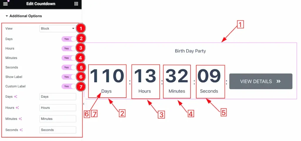
1. View: The view option lets you set the Countdown layout in Block and Inline mode.
2. Days: Enable or disable the Days switcher button to show or hide the days from the countdown.
3. Hours: Enable or disable the Hours switcher button to show or hide the Hours from the countdown.
4. Minutes: Enable or disable the Minutes switcher button to show or hide the Minutes from the countdown.
5. Seconds: Enable or disable the Second switcher button to show or hide the Second from the countdown.
6. Show Label: Enable or disable the Show Label switcher button to show or hide the Label from the countdown.
7. Custom Label: If you enable the Custom Label switcher button then the Custom label will appear and you can easily customize the label to your needs instead of Days, Hours, Minutes, and Second.
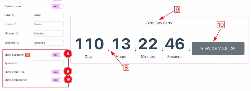
8. Show Separator: Enable or disable the Show Separator switcher button to show or hide the Separator from the countdown.
9. Show Event Title: Enable or disable the Show Event Title switcher button to show or hide the Event Title from the countdown.
10. Show Event Button: Enable or disable the Show Event Button switcher button to show or hide the Event Button from the countdown.
End Action
Go to Content > End Action
If you want the Countdown widget to take action after the countdown ends, this section provides the options to configure the end action.
There are a total number of 5 options.
None type
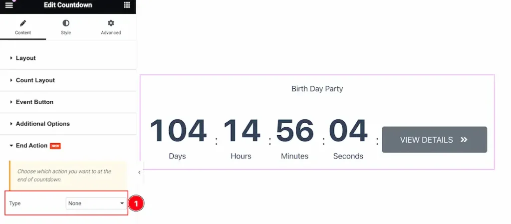
1. None: Selecting the none option will not trigger any action after the countdown ends.
Message type
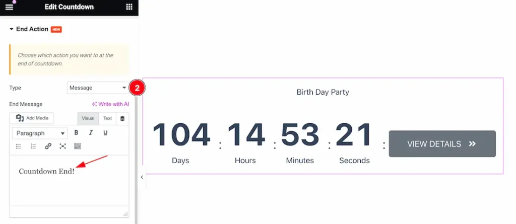
2. Message: Selecting the message option will provide an additional field to insert a custom message that will show up once the countdown is finished.
Redirection link
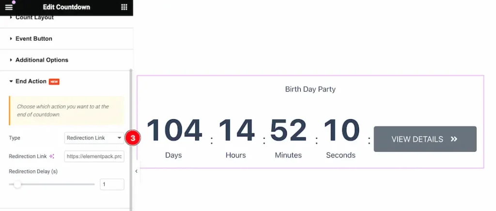
3. Redirection Link: You can select the redirection link option and set a custom link in the next field, along with a delay configuration. After the countdown ends, visitors on that page will be redirected to the given link automatically.
Coupon code
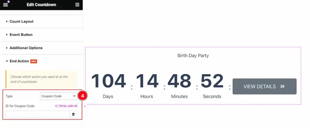
4. Coupon Code:
You can choose the coupon code option to integrate the countdown widget with a coupon code type widget and reveal the code when the countdown ends.
An example of this type is given below.
Here is the Example video link.
On Trigger
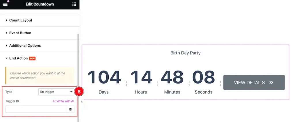
5. On Trigger: Selecting on trigger option will let you link up the countdown widget with any element on the web page and trigger a program click action once the countdown is finished (like an automatic remote).
Work with The Style Tab
Items Style Section
Go to Style > Items Style
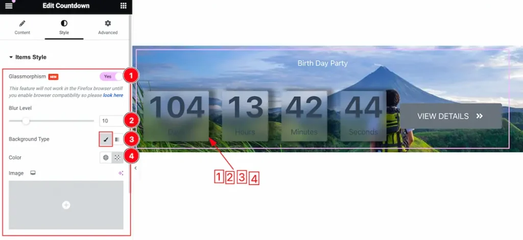
1. Glassmorphism: Actually, the Glassmorphism is used to blur the slider background. That we shown in the above screenshot. you can easily enable or disable the Glassmorphism switcher button to show or hide the effect on your slider.
2. Blur Label: Adjust the blur level to create a glass-like texture on the countdown backgrounds.
3. Background Type: you can change the color of any object background to classic or gradient. Here we choose the Background type Classic.
4. Background Color: This lets you change the Background color. If you want, you also can change an image to the Background.
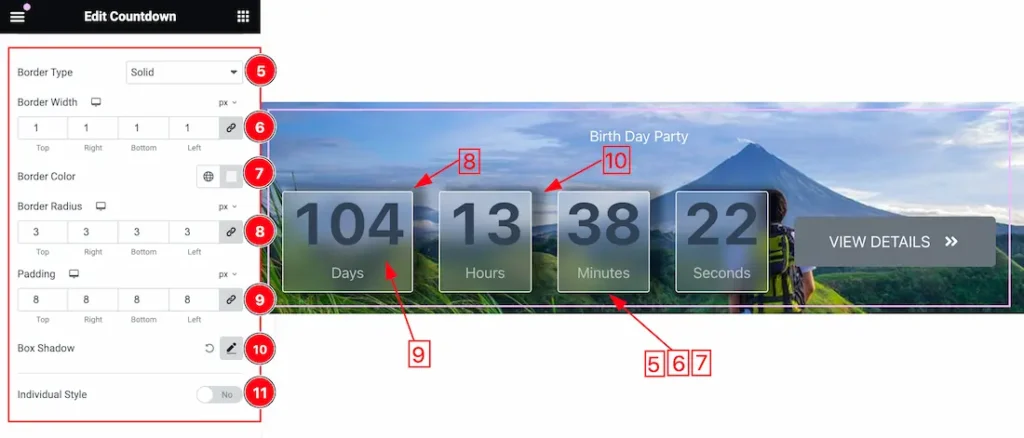
1. Border Type: you can set the Border Type to Default, None, Solid, Double, Dotted, Dashed, or Groove. We choose here the Border Type Solid.
2. Border Width: The border width property allows developers or designers to control how thick or thin the border around a widget should be.
3. Border Radius: Customizes the border corners for roundness.
4. Padding: Add spaces around an object to increase the inner area. Padding allows you to control the internal space within an element.
5. Box Shadow: The Box Shadow property is used to create the shadow around the Category Button. It takes Four values: Horizontal offset, Vertical offset, blur, and Spread to customize the Box shadow.
- Box Shadow Color: This lets you change the Box Shadow color.
- Position: you can set the Box Shadow position Outline and Inset. Here we set the Box Shadow position Outline.
6. Individual Style: Turning on the Individual Style removes the generalized controls and creates control sets for each counter item separately.
Title Section
Go to Style > Title
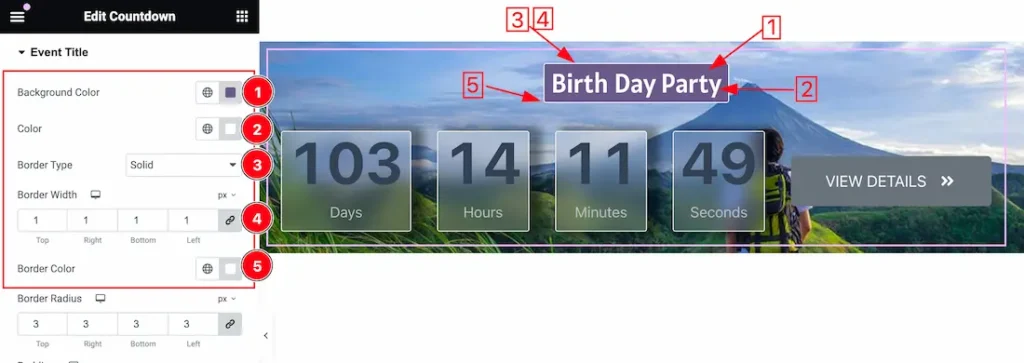
1. Background Color: This lets you change the Background color. If you want, you also can change an image to the Background.
2. Title Color: This option lets you to change the Title Color.
3. Border Type: you can set the Border Type to Default, None, Solid, Double, Dotted, Dashed, or Groove. We choose here the Border Type Solid.
4. Border Width: The border width property allows developers or designers to control how thick or thin the border around a widget should be.
5. Border Color: This option lets you change the Border Color.
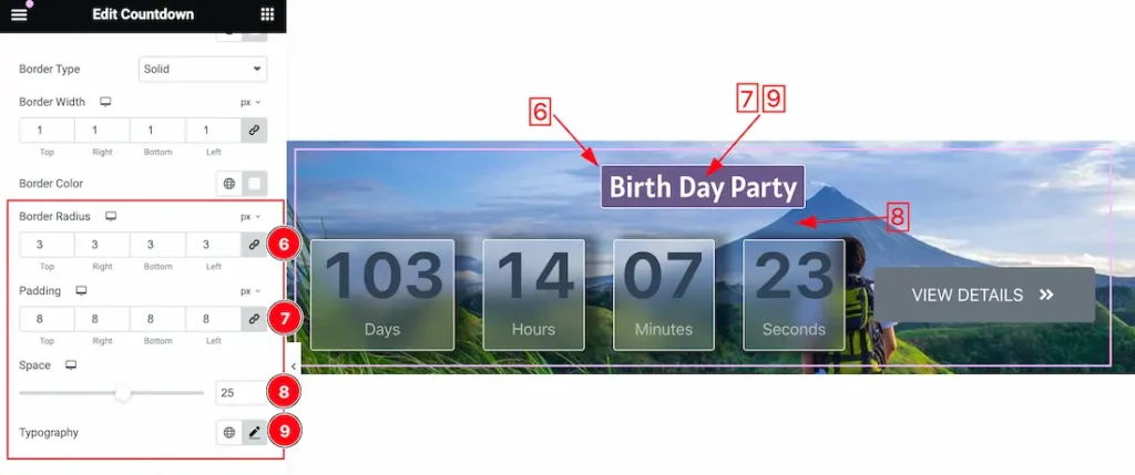
6. Border Radius: Customizes the border corners for roundness.
7. Padding: Add spaces around an object to increase the inner area. Padding allows you to control the internal space within an element.
8. Space: This option lets you set the Spacing between the Title and the counter.
9. Typography: Change the font family, size, weight, style, transform, decoration, line height, letter spacing, and word spacing from here.
Number Section
Go to Style > Number
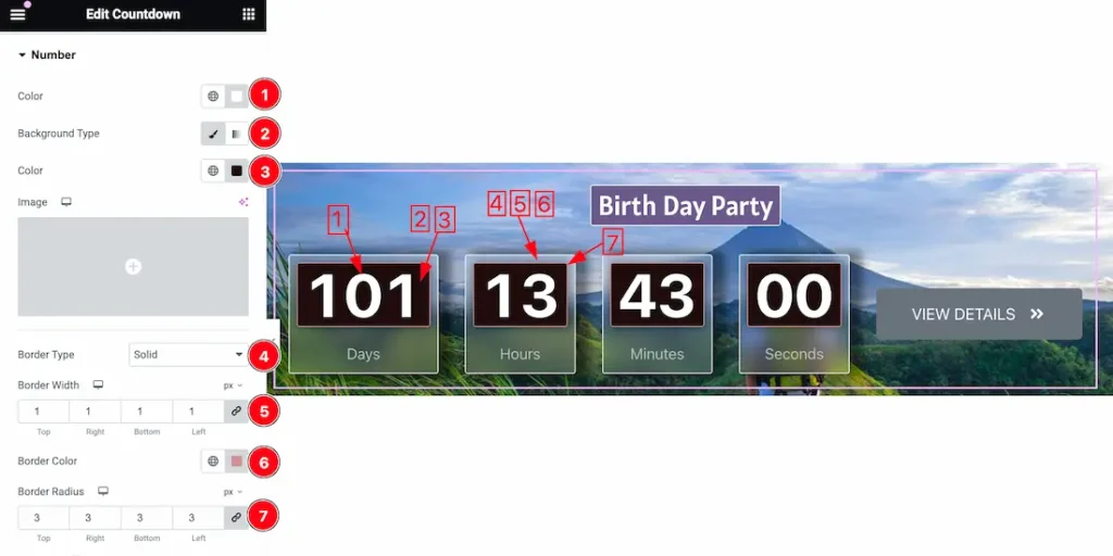
1. Color: This option lets you change the Number Color.
2. Background Type: you can change the color of any object background to classic or gradient. Here we choose the Background type Classic.
3. Background Color: This lets you change the Background color. If you want, you also can change an image to the Background.
4. Border Type: you can set the Border Type to Default, None, Solid, Double, Dotted, Dashed, or Groove. We choose here the Border Type Solid.
5. Border Color: This option lets you change the Border Color.
6. Border Radius: Customizes the border corners for roundness.
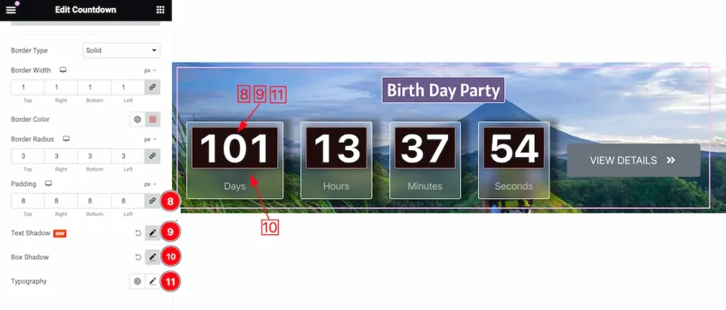
8. Padding: Add spaces around an object to increase the inner area. Padding allows you to control the internal space within an element.
9. Text Shadow: The Text Shadow property is used to create the shadow around the text. It takes three values: horizontal offset, vertical offset, and blur radius. Here you also can change the Text Shadow Color.
10. Box Shadow: The Box Shadow property is used to create the shadow around the Category Button. It takes Four values: Horizontal offset, Vertical offset, blur, and Spread to customize the Box shadow.
- Box Shadow Color: This lets you change the Box Shadow color.
- Position: you can set the Box Shadow position Outline and Inset. Here we set the Box Shadow position Outline.
11. Typography: Change the font family, size, weight, style, transform, decoration, line height, letter spacing, and word spacing from here.
Label Section
Go to Style > Label
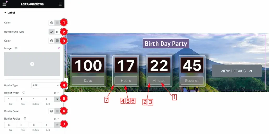
1. Color: This option lets you change the Label Color.
2. Background Type: you can change the color of any object background to classic or gradient. Here we choose the Background type Classic.
3. Background Color: This lets you change the Background color. If you want, you also can change an image to the Background.
4. Border Type: you can set the Border Type to Default, None, Solid, Double, Dotted, Dashed, or Groove. We choose here the Border Type Solid.
5. Border Width: The border width property allows developers or designers to control how thick or thin the border around a widget should be.
6. Border Color: This option lets you change the Border Color.
7. Border Radius: Customizes the border corners for roundness.
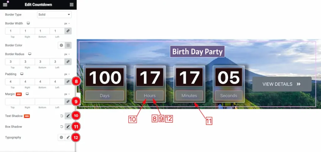
8. Padding: Add spaces around an object to increase the inner area. Padding allows you to control the internal space within an element.
9. Margin: Adjusts the position of an object over the canvas.
10. Text Shadow: The Text Shadow property is used to create the shadow around the text. It takes three values: horizontal offset, vertical offset, and blur radius. Here you also can change the Text Shadow Color.
11. Box Shadow: The Box Shadow property is used to create the shadow around the Category Button. It takes Four values: Horizontal offset, Vertical offset, blur, and Spread to customize the Box shadow.
- Box Shadow Color: This lets you change the Box Shadow color.
- Position: you can set the Box Shadow position Outline and Inset. Here we set the Box Shadow position Outline.
12. Typography: Change the font family, size, weight, style, transform, decoration, line height, letter spacing, and word spacing from here.
Event Button Section
Go to Style > Event Button
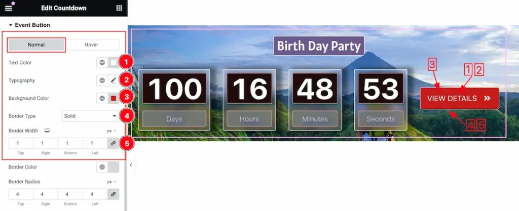
Come to the Event Button section, you will find two tabs section; Normal and Hover.
In the Normal tab section, you can customize the following-
1. Text Color: This option lets you change the Event Button Text Color.
2. Typography: Change the font family, size, weight, style, transform, decoration, line height, letter spacing, and word spacing from here.
3. Background Color: This lets you change the Background color. If you want, you also can change an image to the Background.
4. Border Type: you can set the Border Type to Default, None, Solid, Double, Dotted, Dashed, or Groove. We choose here the Border Type Solid.
5. Border Width: The border width property allows developers or designers to control how thick or thin the border around a widget should be.
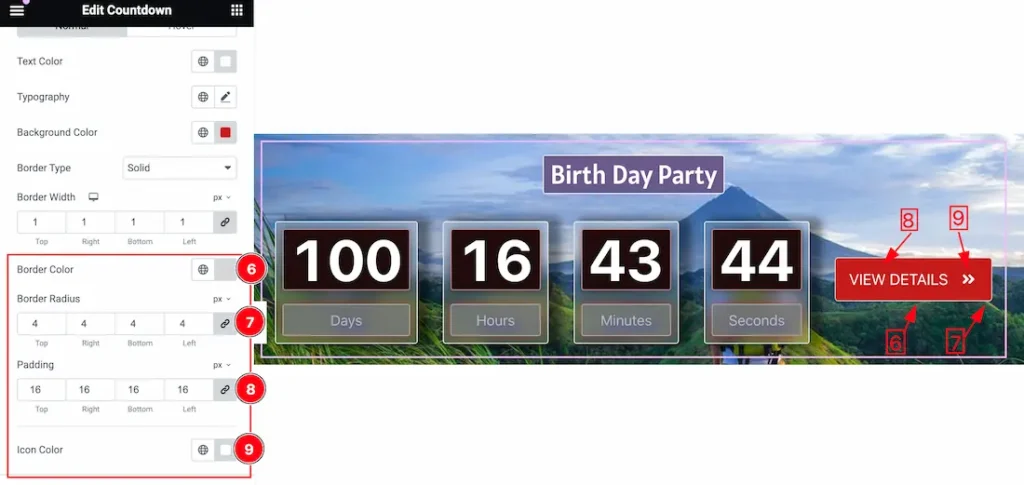
6. Border Color: This option lets you change the Border Color.
7. Border Radius: Customizes the border corners for roundness.
8. Padding: Add spaces around an object to increase the inner area. Padding allows you to control the internal space within an element.
9. Icon Color: This option lets you change the Event Button Icon Color.
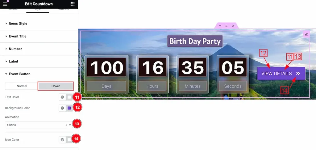
In the Hover tab section, you can customize the following-
11. Text Color: This option lets you change the Text Color in Hover mode.
12. Background Color: This option lets you change the Background Color in hover mode.
13. Animation: you can set an Animation for the Event Button. Here you will get 1 to 27 animation styles. You can choose one of them.
14. Icon Color: This option lets you change the Icon Color in Hover mode.
Separator Section
Go to Style > Separator
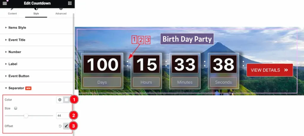
1. Color: This option lets you change the Separator Color.
2. Size: you can change the Separator Size from here.
3. Offset: The Offset property lets you set the Separator positioning. Inside the Offset property, you will get the Horizontal, Vertical, and Rotate options to position the Separator.
All done! You have successfully customized the Event Calendar Countdown widget on your website.
Video Assist
You can also watch the video tutorial Learn more about the Event Calendar Countdown widget. Please visit the demo page for examples.
Thanks for being with us.
