In this documentation, we will show you how to customize the WooCommerce Slider Widget presented by Element Pack Pro.
Enable the WooCommerce Slider Widget
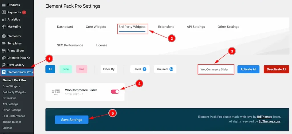
To use the Elementor WooCommerce Slider widget from Element Pack, you must first enable the widget.
- Go to WordPress Dashboard > Element Pack Plugin dashboard.
- Then Click the 3rd Party Widgets Tab.
- Search the WooCommerce Slider Widget Name.
- Enable the WooCommerce Slider Widget.
- Hit the Save Settings Button.
Note: You should install the WooCommerce plugin separately for use this widget in the Elementor editor.
Inserting The WooCommerce Slider widget
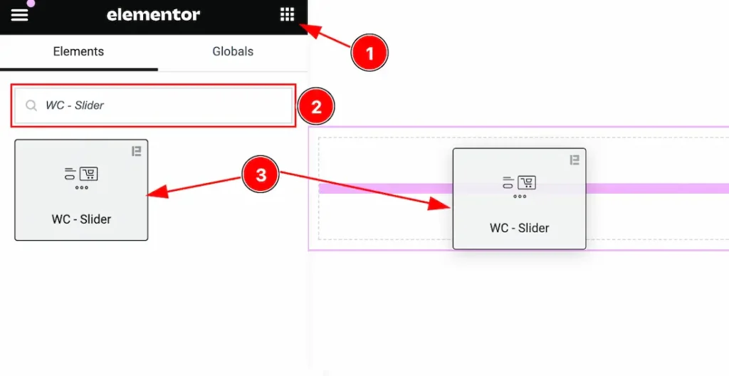
- Go to the Elementor Editor Page and Hit the Get Back To Button.
- Search the WooCommerce Slider widget.
- Drag the widget and Drop it on the editor page.
Work With The Content Tab
Layout Section
Go to Content > Layout
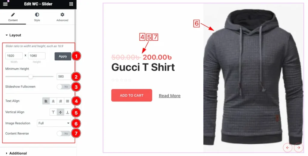
1. Slider Ratio: This option lets you set the Slider ratio to show the slider to your working demand.
2. Minimum Height: You can set the minimum height for the slider.
3. SlideShow Fullscreen: If you enable the Slideshow Fullscreen switcher button then the Slider will show Fullscreen.
4. Text Align: This option lets you change the Text Align – Left, Right, Center, and Justified.
5. Vertical Align: This option lets you set the Text vertical Align – Top, Middle, and Buttom.
6. Image Resolution: You can adjust the image resolution for the products. Here you will get various image resolution options such as – Thumbnails, Medium, Medium Large, Large, Woocommerce Thumbnails, Woocommerce Gallery Thumbnail, Woocommerce Single, and Full options. You can choose any one of them.
7. Content Reverse: If you enable the Content Reverse switcher button then the Slider Content will show reverse of the Slider image.
Additional Section
Go to Content > Additional
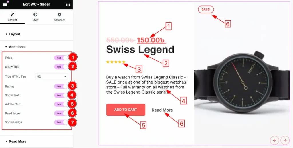
1. Price: Enable or Disable the Price Switcher button to show or hide the price.
2. Show Title: Enable or Disable the Title Switcher button to show or hide the Title. Here you also can change the Title HTML tag.
3. Rating: Enable or Disable the Rating Switcher button to show or hide the Rating.
4. Show Text: Enable or Disable the Show Text Switcher button to show or hide the Text.
5. Add to Cart: Enable or Disable the Add to Cart Switcher button to show or hide the Add to Cart button.
6. Read More: Enable or Disable the Read More Switcher button to show or hide the Read More option.
7. Show Badge: Enable or Disable the Badge Switcher button to show or hide the Badge.
Read More Section
Go to Content > Read More
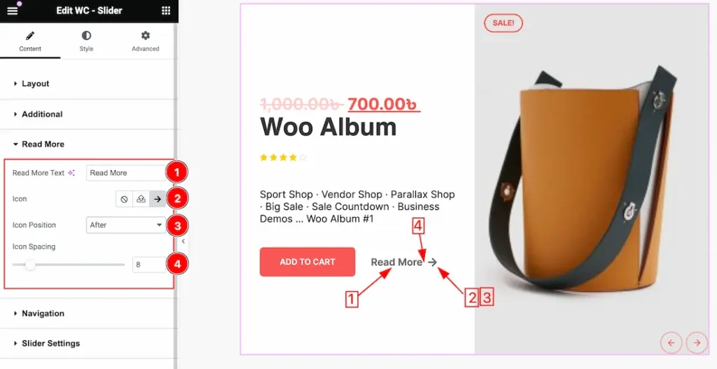
1. Read More Text: You can change the Read More text to your working demand instead the Read More Text.
2. Icon: This option lets you set a Icon for the read more button. you can choose your favourite icon here.
3. Icon Position: You can set the icon position from here. You can set the icon position as Before and After the Read More Text.
4. Icon Spacing: You can adjust the Icon Spacing from here.
Navigation Section
Go to Content > Navigation
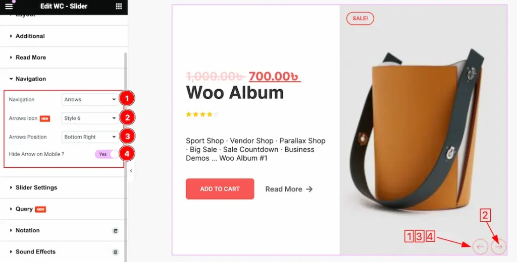
1. Navigation: You can set the navigation type as – Arrows and Dots, Arrows, Dots, and None.
2. Arrows Icon: This option lets you set the Arrows Icon Style from here. Here you will get 1 to 23 styles. You can choose any one of them.
3. Arrows Position: This option lets you set the position for the Navigation. You can set the navigation Position as – Top Left, Top Center, Top Right, Center, Center Left, Center Right, Bottom Left, Buttom Center, and Bottom Right.
4. Hide Arrow on Mobile: If you enable the Hide Arrow on Mobile switcher button then the Navigation Button will hidden for the Mobile devices.
Slider Settings Section
Go to Content > Slider Settings
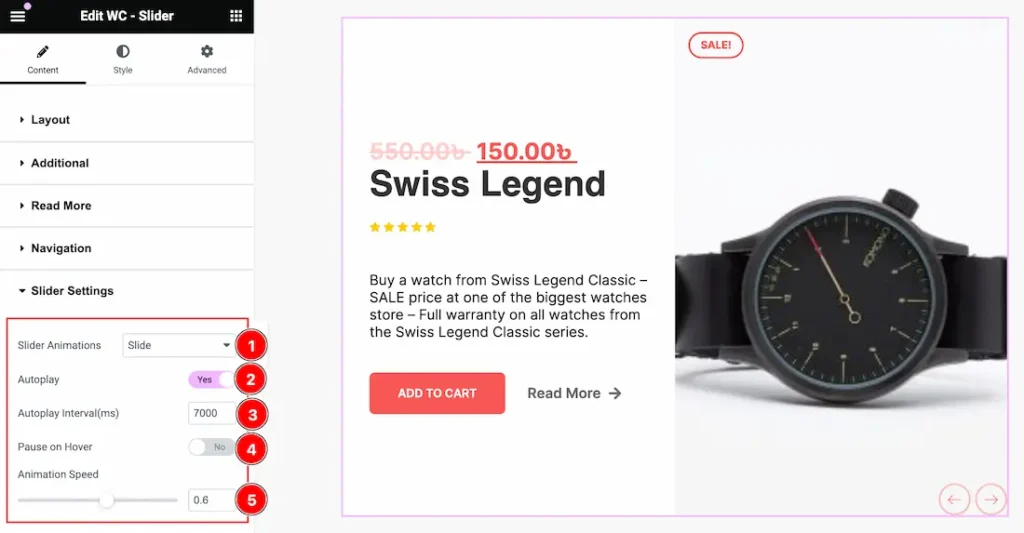
1. Slider Animation: This option lets you set an animation for the slider. Here you will get these type animations – Slide, Fade, Scale, Push, and Pull.
2. Autoplay: If you Enable the Autoplay switcher button, your slider will slide into Autoplay mode.
3. Autoplay Interval: This option lets you set the Interval time for the Autoplay. You can set the interval time to your working demand.
4. Pause on Hover: If you activate the pause on Hover button, when visitors Hover the mouse cursor on the slider, then your slider will Hold, otherwise your slider slide Autoplay.
5. Animation Speed: You can set the animation time from here to your needs.
Query Section
Go to Content > Query
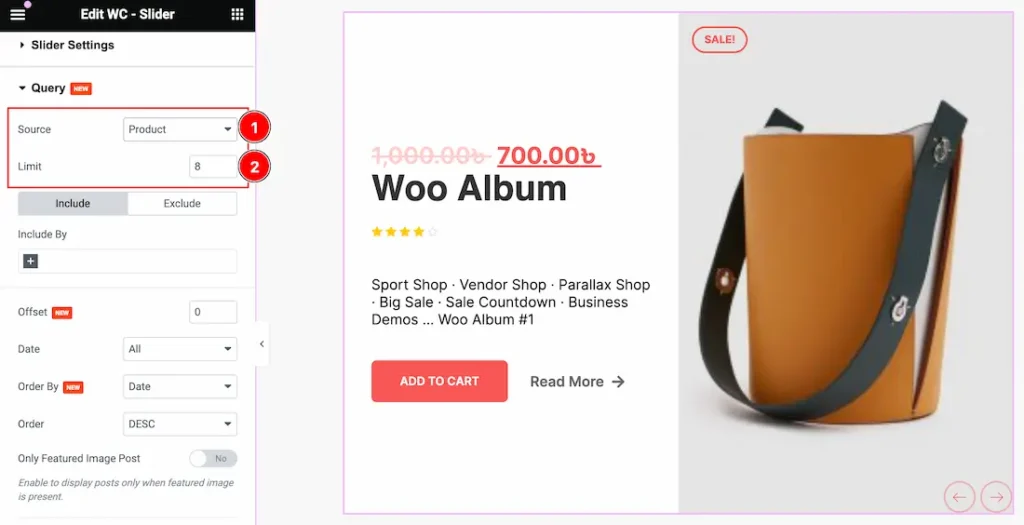
1. Source: Come to the Query section, you can select the Source Type ( Like- Product, Manual Selection, Current Query, and Related) to show your Categories. whatever you select, will appear on your editor page. We selected here Product that’s why it shows all the Products.
2. Limit: You can set the Product show limit from here.
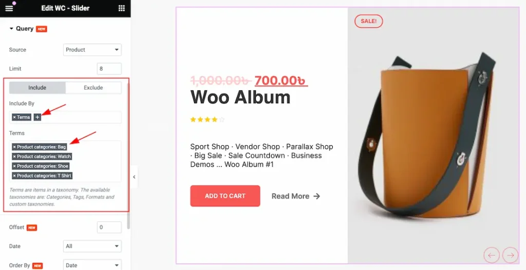
a. Click the Include Tab > Include By. The Include filter helps show only selected products.
b. After clicking the Terms (+) icons, you can select the specific Category or Tags to show the specific products on your page.
Note: The Exclude filter does exactly the opposite of the Include filter and helps hide selected products. Here you can hide your elements by selecting these options( Authors, Current Post, Manual Selection, and Terms).
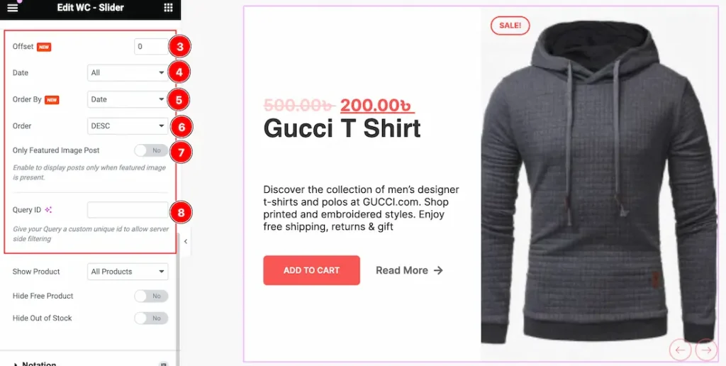
3. Offset: Offsets are useful because they can allow you to skip a certain number of WordPress Products before starting output. For Example, if you have 10 Products and you set the Offset value to 2 then the beginning 2 Products will Hide.
4. Date: Date: Here you can show your selected Source in Date category-wise. Here you will get the All, Past Day, Past Week, Past Month, Past Quarter, Past Year, and Custom options to show your selected Source(As Like Posts). Whichever your selected day Products will appear on your page.
- All: This lets you show All Products on your page.
- Past Day: If you select the Past Day then only the Past Days Products will appear on your page. If you haven’t any Past day Products then the section will show empty.
- Past Week: This option lets you show only the Past weeks Products on your page. If you haven’t any Past Week Products then the section will show empty.
- Past Month: This option lets you show only the Past Month Products on your page.
- Past Quarter: This lets you show Past Quarter Products on your page.
- Past Year: This option lets you show only the Past Year products on your page.
- Custom: If you want then you also set the custom Date and Time to show your products.
To Learn More About The Custom Date follow the below instructions-
Custom Date: if you select the Date Type as Custom then you will get two options “Before” and “After”. Here you can easily select your Before and After Date and Time to show your products.
- Before: The “Before” date will display all products published until the chosen date, including the specified date itself.
- After: When you set an “After” date, it typically retrieves and shows all products or items that were published on or after the chosen date, including the specified date itself.
5. Order By: you can decorate your selected product using Order By options. Under this option, you can select ( Title, ID, Date, Author, Comment Count, Menu Order, Random, Price, and Sales) any of them to show your selected posts on your Page.
6. Order: you can show the selected products in Asc and Desc Order.
7. Only Featured Image Post: If you enable the Only Featured Image Post switcher button then the Only Featured Image products will show on your page and the other products will hide from your page.
8. Query ID: The Query ID field is an extra feature. To learn more please visit the link Custom Queries.
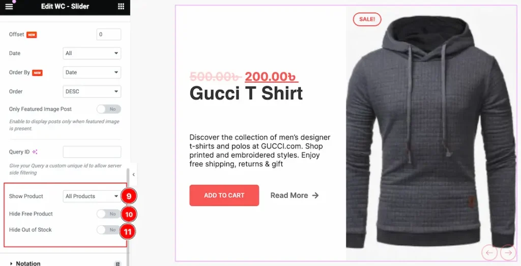
9. Show Product: This option lets you show specific products on your page. Here you will get these options to show your products – All Products, On Sale, and Featured.
10. Hide Free Product: Enable or Disable the Hide Free Product to show or hide the free products on your page. If you enable the Hide Free Product switcher button then the Free product will hide from your page.
11. Hide Out of Stock: Enable or Disable the Hide Out of Stock to show or hide the Out of Stock products on your page. If you enable the Hide Out of Stock switcher button then the Out of Stock product will hide from your page.
Work With The Style Tab
Content Section
Go to Style > Content
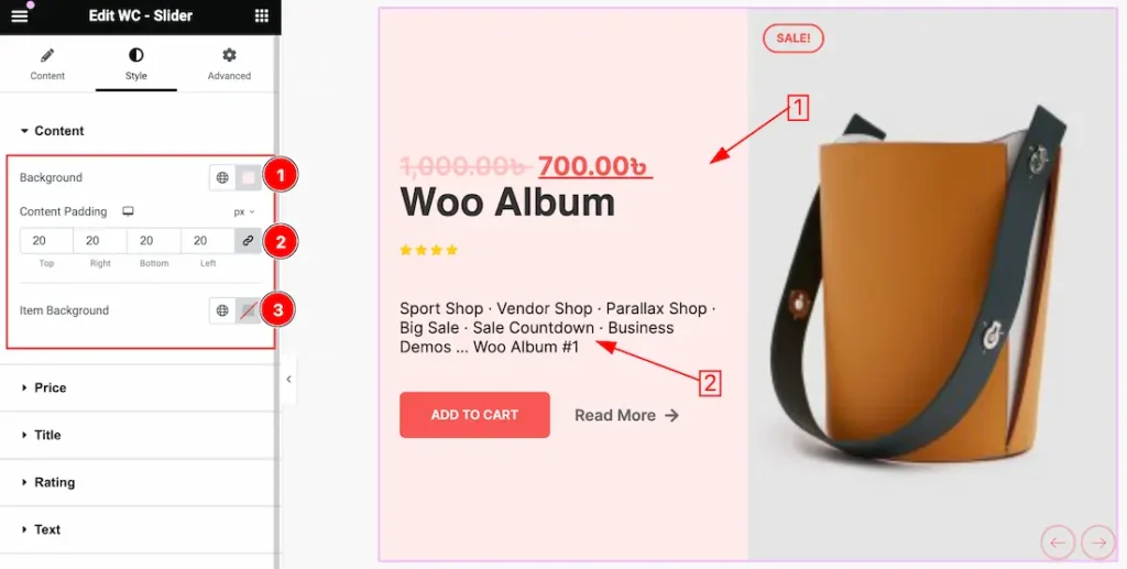
1. Background: This option lets you change the Content Background.
2. Content Padding: You can adjust the Content Padding from here.
3. Item Background: This option lets you change the Item Background.
Price Section
Go to Style > Price
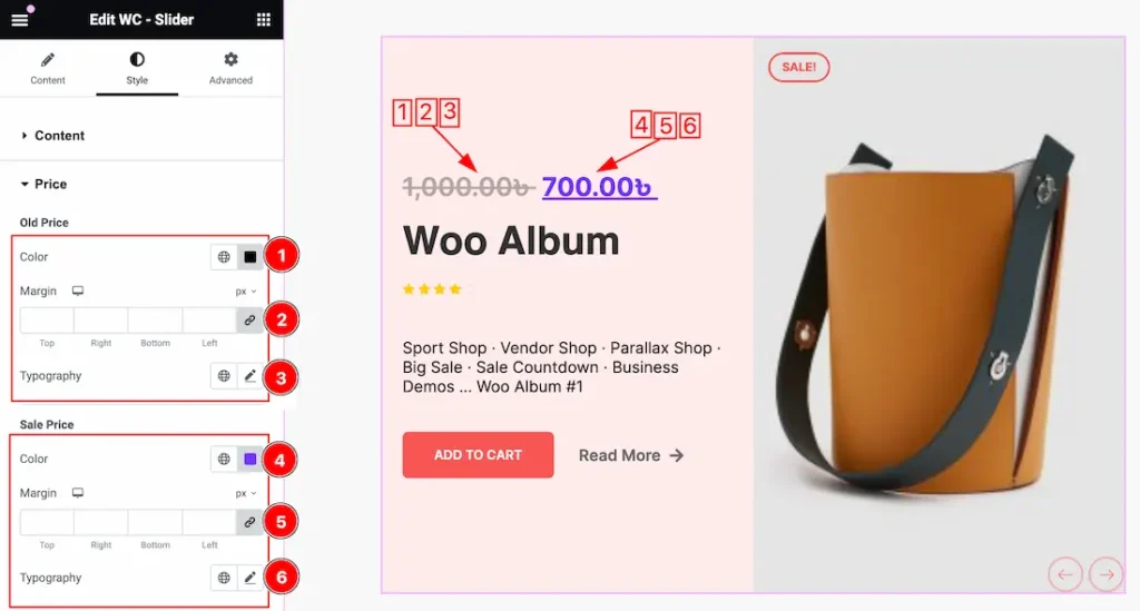
1. Old Price Color: This option lets you change the Old Price Color.
2. Margin: Adjust the margin for the modal Old Price.
3. Typography: Change the font family, size, weight, style, transform, decoration, line height, letter spacing, and word spacing from here for the Old Price.
4. Sale Price Color: This option lets you change the Sale Price Color.
5. Margin: Adjust the margin for the modal Sale Price.
6. Typography: Change the font family, size, weight, style, transform, decoration, line height, letter spacing, and word spacing from here for the sale price.
Title Section
Go to Style > Title
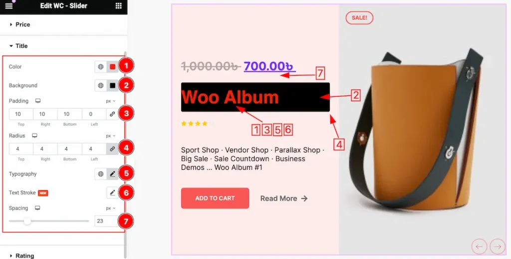
1. Color: This option lets you change the Title Color.
2. Background: This option lets you change the Title Background Color.
3. Padding: Adjust the Title Padding from here. Add spaces around an object to increase the inner area. Padding allows you to control the internal space within an element.
4. Radius: Customizes the border corners for roundness.
5. Typography: Change the font family, size, weight, style, transform, decoration, line height, letter spacing, and word spacing from here.
6. Text Stroke: If you want to add a stroke (outline) around the text, you can use the Text Stroke property. you also can change the Text Stroke Color as your working demand.
7. Spacing: You can add a space between Title and Price.
Rating Section
Go to Style > Rating
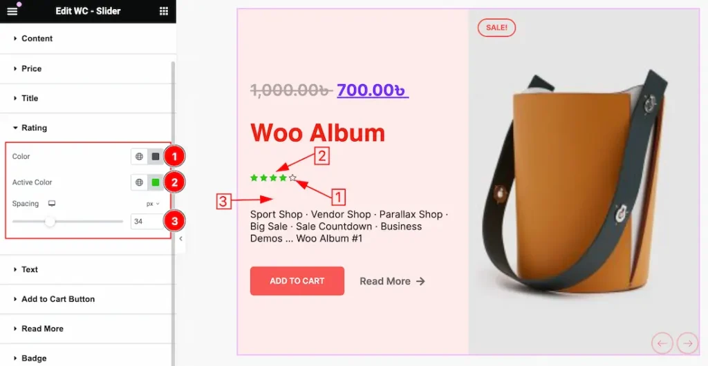
1. Color: This option lets you change the Rating Color.
2. Active Color: This option lets you change the Active Color for the Rating.
3. Spacing: you can add a space between Title and Rating.
Text Section
Go to Style > Text
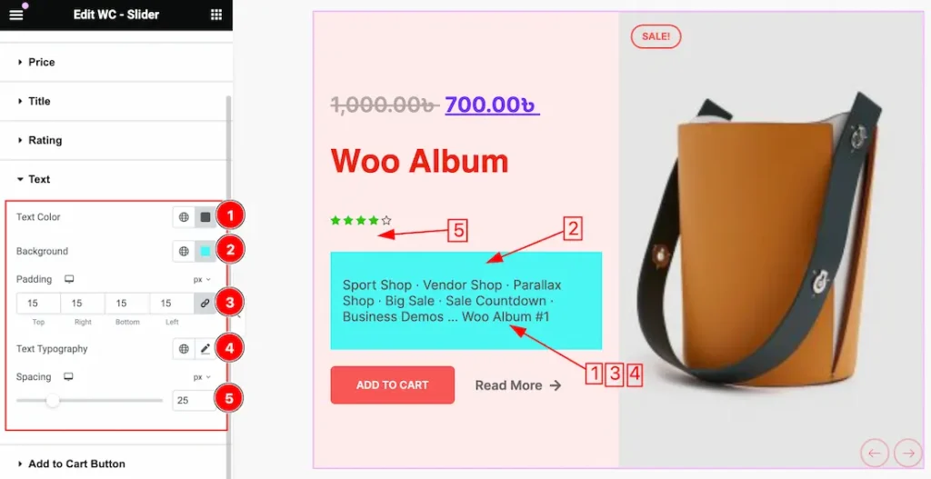
1. Text Color: This option lets you change the Text Color.
2. Background Color: This option lets you change the Text Background Color.
3. Padding: You can adjust the Padding for the Text.
4. Text Typography: Change the font family, size, weight, style, transform, decoration, line height, letter spacing, and word spacing from here for the Text.
5. Spacing: you can add a space between Rating and Text.
Add to Cart Button Section
Go to Style > Add to Cart Button
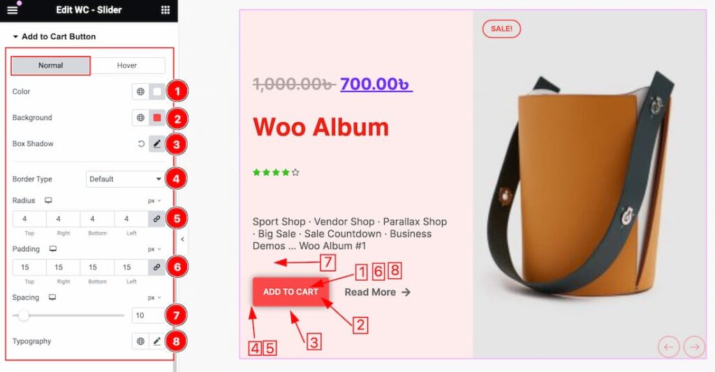
Come to the Add to Cart button subsection, you will get two subsections; Normal and Hover.
In the Normal subsection, you will get the below options-
1. Color: This option lets you change the Add to Cart button text color.
2. Background: This option lets you change the Add to Cart button Background color.
3. Box Shadow: The Box Shadow property is used to create the shadow around the items. It takes Four values: Horizontal offset, Vertical offset, blur, and Spread to customize the Box shadow.
Position: you can set the Box Shadow position Outline and Inset. Here we set the Box Shadow position Outline.
Box Shadow Color: This lets you change the Box Shadow color.
4. Border Type: you can set the Border Type to Default, None, Solid, Double, Dotted, Dashed, or Groove. We choose here the Border Type Solid.
5. Radius: Customizes the border corners for roundness.
6. Padding: Adjust the Padding for the Add to Cart button.
7. Spacing: You can adjust the Space between the Slider text and the Add to Cart Button.
8. Typography: Change the font family, size, weight, style, transform, decoration, line height, letter spacing, and word spacing from here.
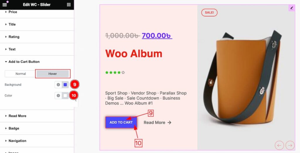
In the Hover subsection, you will get the below options-
9. Color: This option lets you change the Add to Cart button text Hover color.
10. Background Color: This option lets you change the Add to Cart Button Background hover color.
Read More Section
Go to Style > Read More
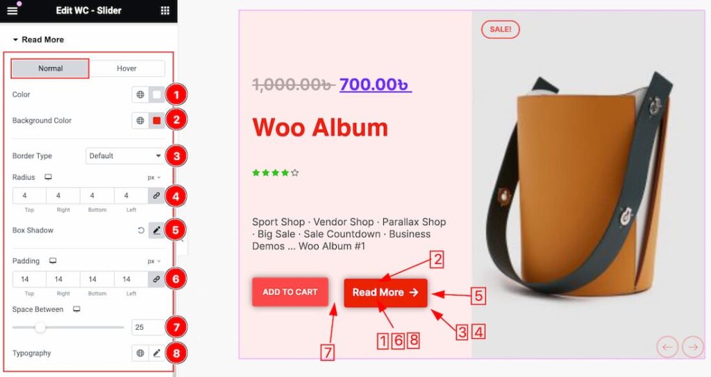
Come to the Read More subsection, you will get two subsections; Normal and Hover.
In the Normal subsection, you will get the below options-
1. Color: This option lets you change the Read More button text color.
2. Background: This option lets you change the Read More button Background color.
3. Border Type: you can set the Border Type to Default, None, Solid, Double, Dotted, Dashed, or Groove. We choose here the Border Type Solid.
4. Radius: Customizes the border corners for roundness.
5. Box Shadow: The Box Shadow property is used to create the shadow around the items. It takes Four values: Horizontal offset, Vertical offset, blur, and Spread to customize the Box shadow.
Position: you can set the Box Shadow position Outline and Inset. Here we set the Box Shadow position Outline.
Box Shadow Color: This lets you change the Box Shadow color.
6. Padding: Adjust the Padding for the Read More button.
7. Spacing: You can adjust the Space between the Add to Cart button and the Read More Button.
8. Typography: Change the font family, size, weight, style, transform, decoration, line height, letter spacing, and word spacing from here.
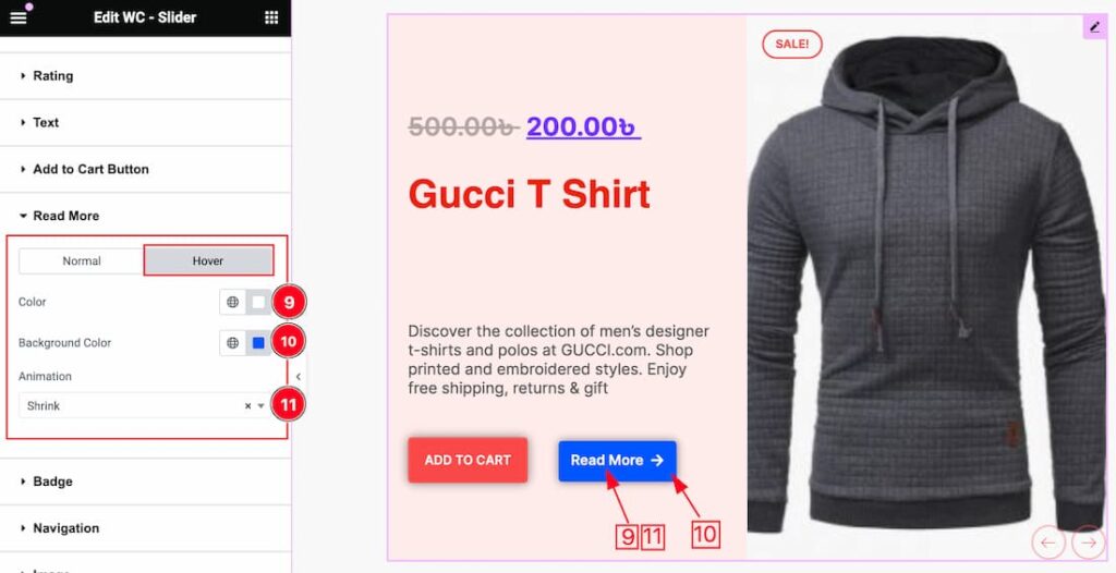
In the Hover subsection, you will get the below options-
9. Color: This option lets you change the Read More text Hover color.
10. Background Color: This option lets you change the Read More Button Background hover color.
11. Animation: Here you will get 1 to 27 animation styles for the Read More button. You can choose any one of them.
Badge Section
Go to Style > Badge
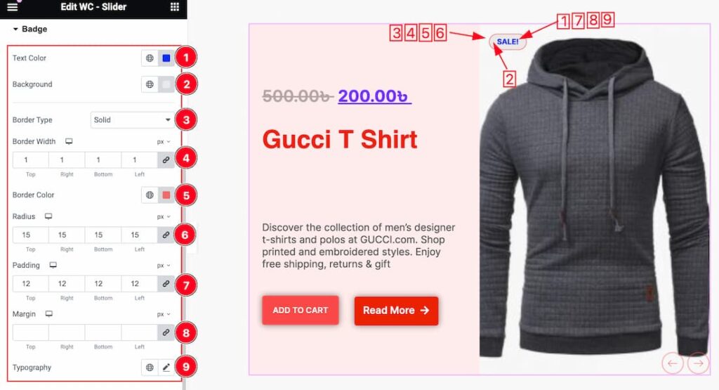
1. Text Color: This option lets you change the text color for the Badge.
2. Background: This option lets you change the Background color for the badge.
3. Border Type: you can set the Border Type to Default, None, Solid, Double, Dotted, Dashed, or Groove. We choose here the Border Type Solid.
4. Border Width: The border width property allows you to control how thick or thin the border is.
5. Border Color: This lets you change the Border color.
6. Radius: Customizes the border corners for roundness.
7. Padding: Add spaces around an object to increase the inner area. Padding allows you to control the internal space within an element.
8. Margin: Adjusts the position of an object over the canvas.
9. Typography: Change the font family, size, weight, style, transform, decoration, line height, letter spacing, and word spacing from here.
Navigation Section
Go to Style > Navigation
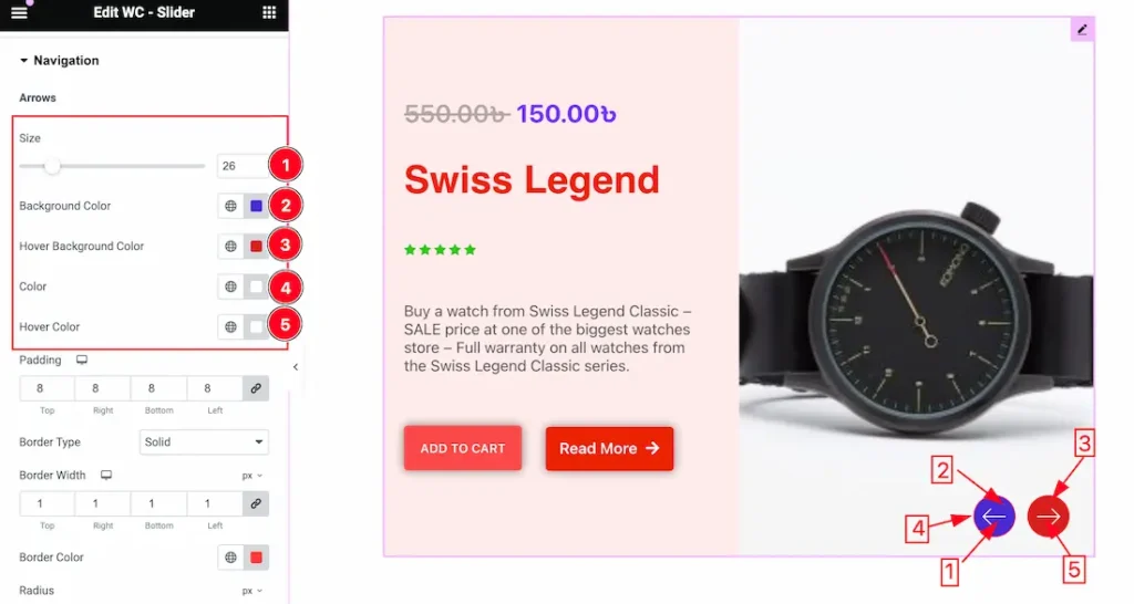
1. Arrows Size: This option lets you change the Arrows Size.
2. Background Color: This option lets you change the Arrows Background Color.
3. Hover Background Color: This option lets you change the Arrows Hover Background Color.
4. Color: This option lets you change the Arrows Normal Color.
5. Hover Color: This option lets you change the Arrows Hover Color.
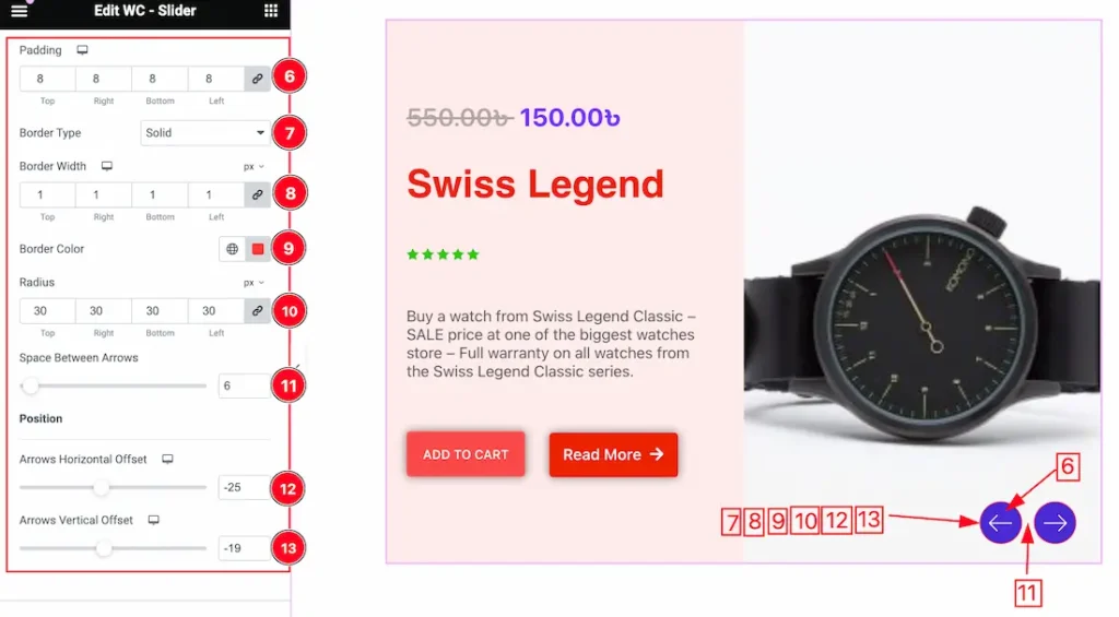
6. Padding: Add spaces around an object to increase the inner area. Padding allows you to control the internal space within an element.
7. Border Type: you can set the Border Type to Default, None, Solid, Double, Dotted, Dashed, or Groove. We choose here the Border Type Solid.
8. Border Width: The border width property allows you to control how thick or thin the border is.
9. Radius: Customizes the border corners for roundness.
10. Space Between Arrows: This option lets you adjust the Space between arrows.
11. Arrows Horizontal Offset: You can adjust the Arrows Horizontal Offset from here.
12. Arrows Vertical Offset: You can adjust the Arrows Vertical Offset from here.
Image Section
Go to Style > Image
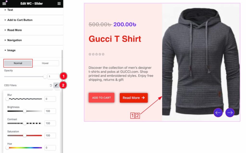
Come to the Image section, you will get two subsections; Normal and Hover.
In the Normal subsection, you will get the below options-
1. Opacity: You can set the Opacity label for the slider image.
2. CSS Filter: You can customize the CSS Filter option to add visual effects like(Blur, Brightness, Contrast, saturation, and Hue) for the Slider image.
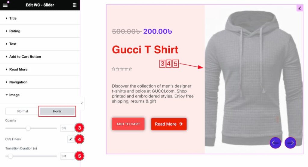
In the Hover mode, you will get a similar customization option as in the Normal mode. So please try it yourself.
All done! You have successfully customized the WooCommerce Slider widget on your website.
Video Assist
You can also watch the video tutorial Learn more about the WooCommerce Slider widget. Please visit the demo page for examples.
Thanks for being with us.
