In this documentation, we will show you how to customize the Tablepress widget presented by Element Pack Pro.
Inserting The Tablepress Widget

Inserting the widget by following this,
- Search by the Tablepress widget name.
- Then select the appear widget ( with Element Pack Pro logo T.R corner).
- After Drag and Drop it on the Elmentor Editor page.
Content Tab
The Content tab controller displayed here offers the flexibility to adjust the layout of the widget according to your preferences.
Layout Section
Go to Content > Layout
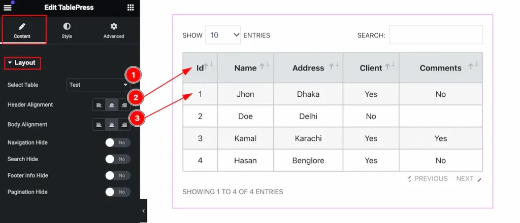
Customize the changes controls of the tablepress,
- Select Table: Select table from the source.
- Header Alignment: Set alignment for the table header.
- Body Alignment: Set alignment for the body content.
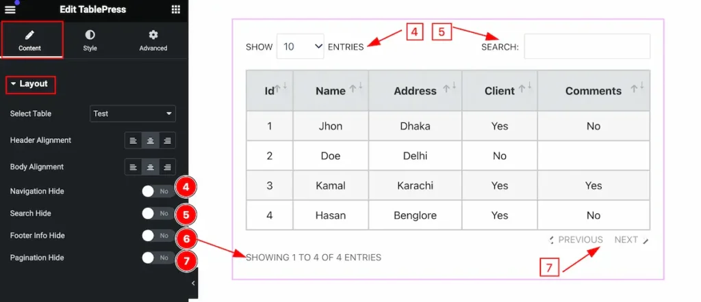
- Navigation Hide: Enable this to hide the naviagtion.
- Search Hide: Enable this to hide the Search.
- Footer Info Hide: Enable this to hide the footer info.
- Pagination Hide: Enable this to hide the pagination.
Style Tab
Provide the controller to make the visual appearance or presentation of the tabs. This includes aspects that are visually appealing and cohesive with the overall design of the interface.
Table Section
Go to Style > Table
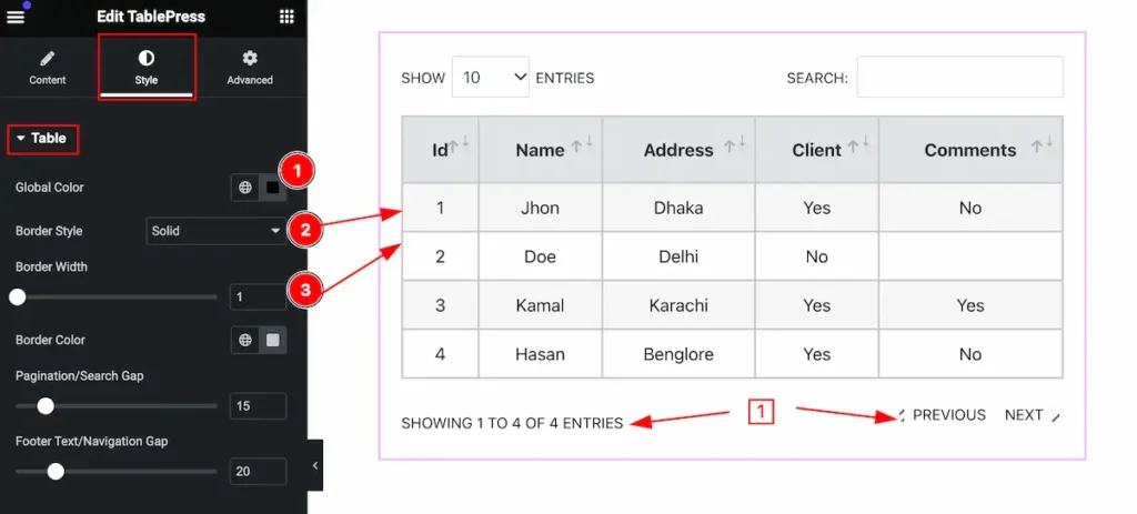
Make the table section stylish by following,
- Global Color: Set the global color for the text.
- Border Style: Set the border style.
- Border Width: Set the width for the border.
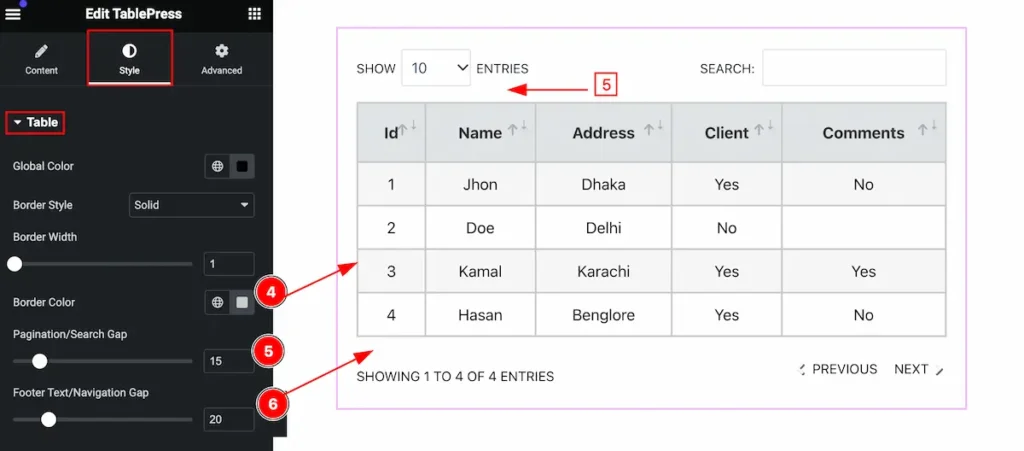
- Border Color: Set the border color.
- Pagination/Search Gap: Set the gap between the paginatio/search from the table.
- Footer Text/Navigation Gap: Set the gap between the text/navigation from the table.
Header Section
Go to Style > Header
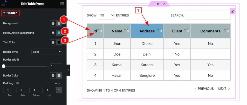
Make the header section beautifully customize,
- Background: Set the background for the header.
- Hover/Active Background: Set hover/active background.
- Text Color: Set the text color.
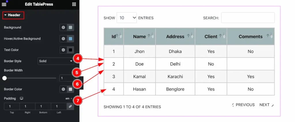
- Border Style: Set the style for the border.
- Border Width: Set the width for the border.
- Border Color: Set border color.
- Padding: Set padding for inner space.
Body Section
Go to Style > Body
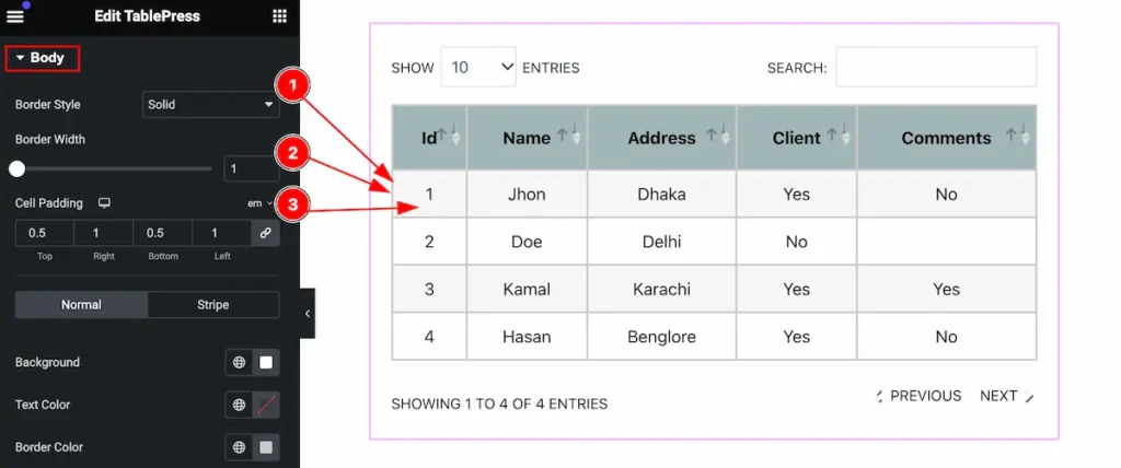
Make the body section more interactive by following the controls,
- Border Style: Set the style for the border.
- Border Width: Set width for border.
- Cell Padding: Set cell padding.
Normal Tab for Body
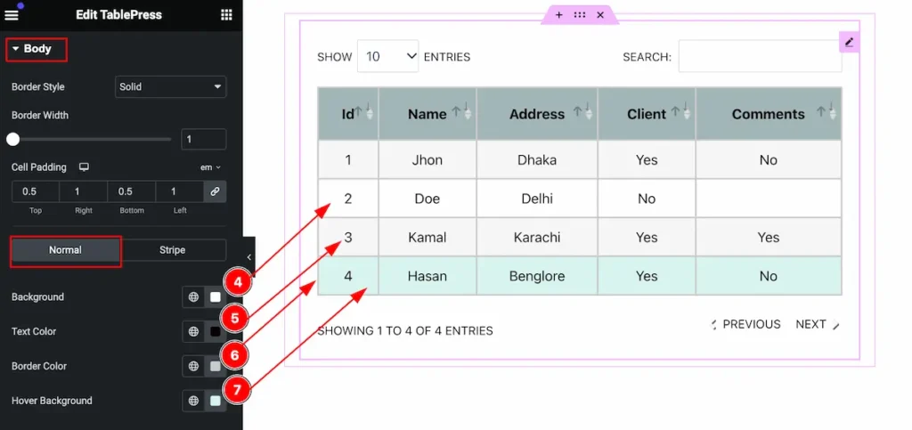
- Background: Set the backgroud for normal row.
- Text Color: Set the text color.
- Border Color: Set the border color.
- Hover Background: Set the hover background color.
Stripe Tab for Body
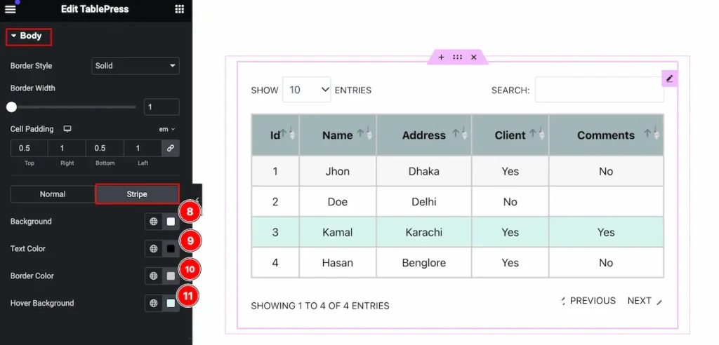
- Background: Set the backgroud for stripe row.
- Text Color: Set the text color.
- Border Color: Set the border color.
- Hover Background: Set the hover background color.
Navigation/Search Section
Go to Style > Navigation/Search
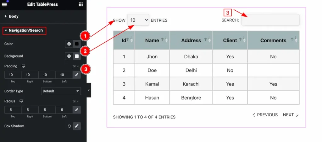
Customize the navigation/search section,
- Color: Set the color for the navigation/search section.
- Background: Set the background color.
- Padding: Set the padding.
Video Assist
You can watch the video above to learn about the Search widget.
Please visit the demo page for examples.
Thanks for staying with us.
