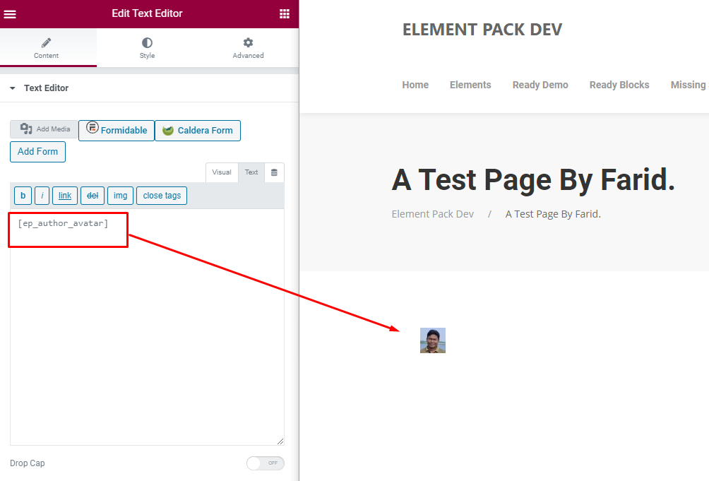
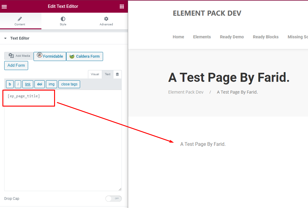
For example:
Preview:
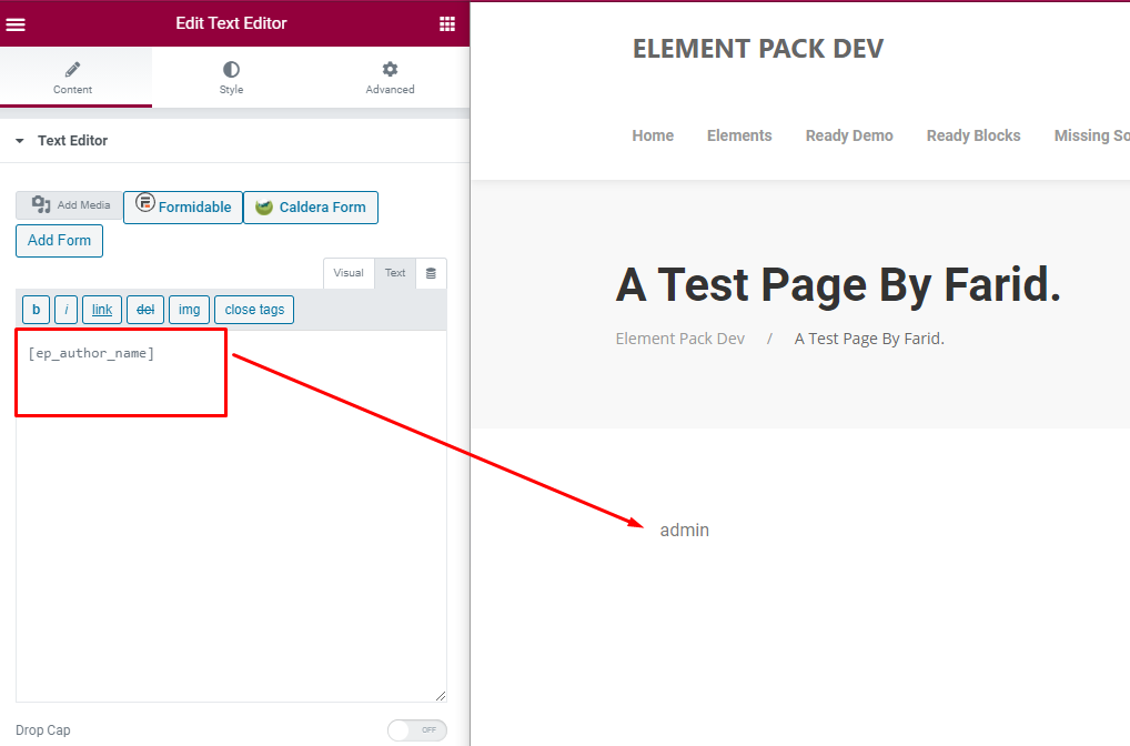
For example:
Preview:
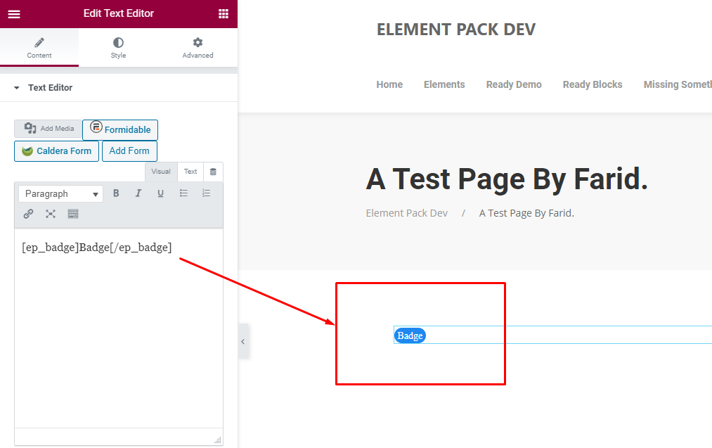
For example:
Badge Text Here
Preview:
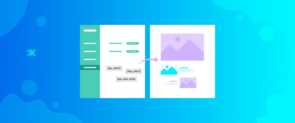
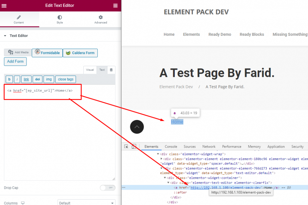
If you use Breadcrumbs shortcode , you will get current page breadcrumbs. You can use it anywhere, for example:
Preview:
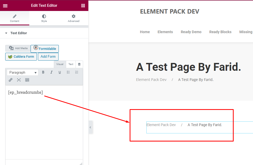 Breadcrumbs Preview Image.
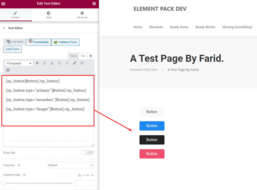
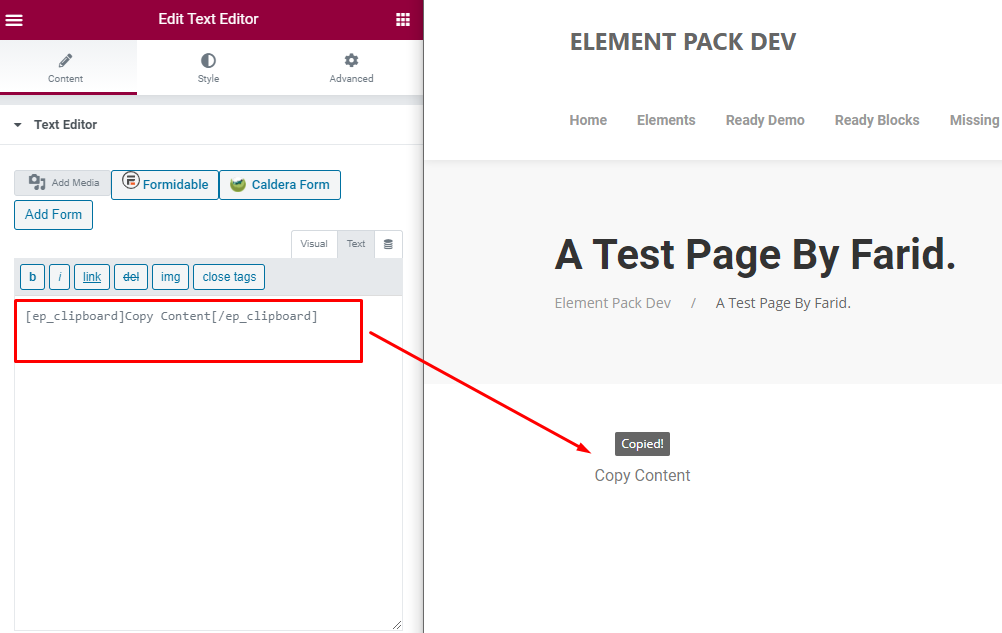
For example:
Copy Content
Preview:
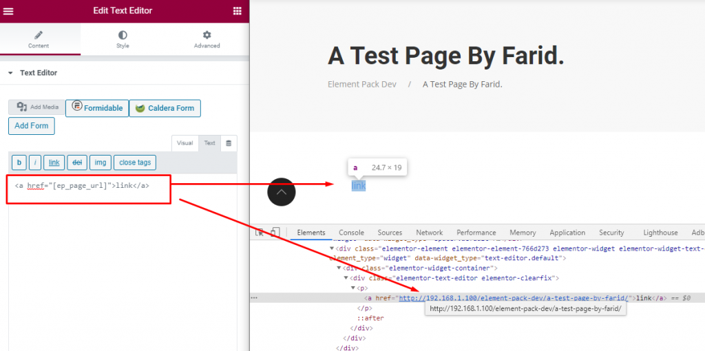
For Example:
        :

        :

        :
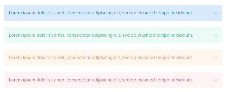
Preview:
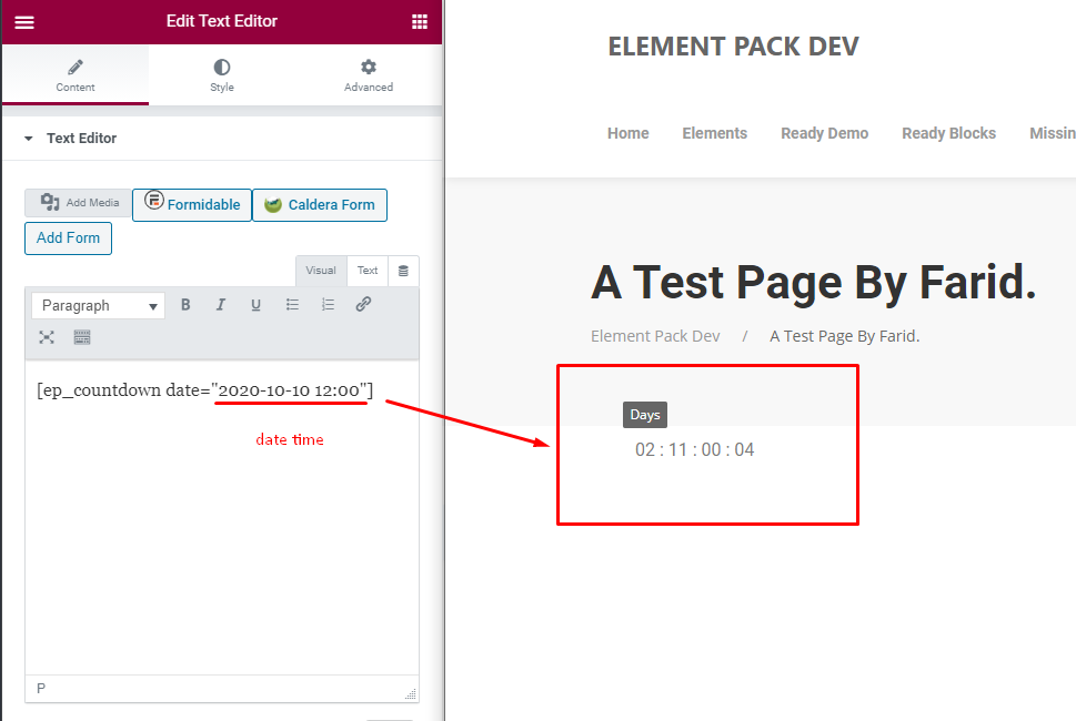
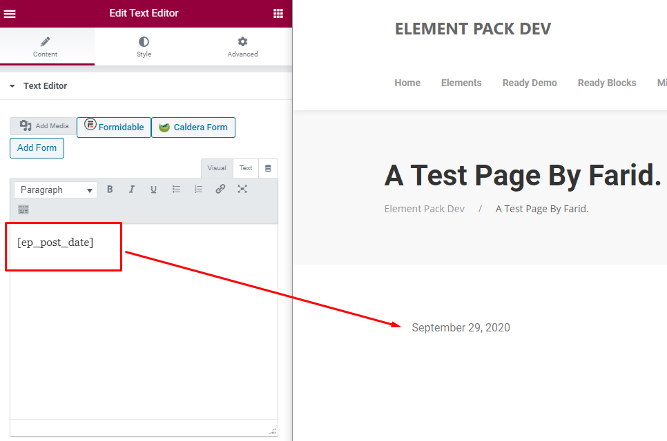
For example:
April 11, 2026
Preview:
For example:
Preview:
For Example:
Label
Preview:


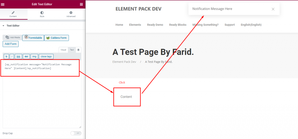
For Example:
Content
Preview:
For example:
How to Use Element Pack Essential Shortcodes
Preview:
For example:
https://bdthemes.com/element-pack-essential-shortcodes/
Preview:
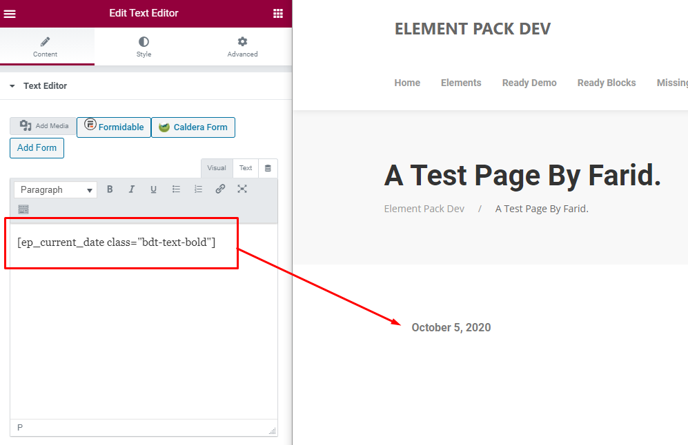
For example:
October 4, 2020
Preview:
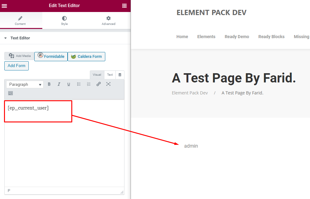
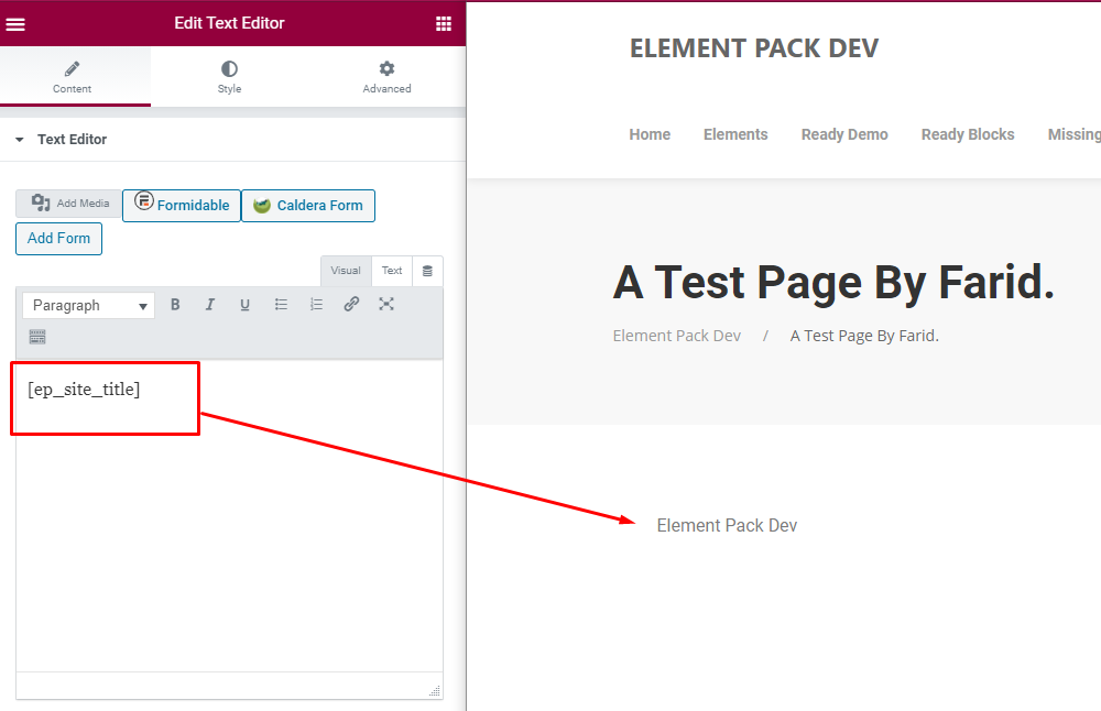
For example:
BdThemes
Preview:
For example:
https://bdthemes.com
Preview:
accessibility for visually impaired
accessible website
accessible website design
active installations
ada accessible website
ada for websites
Add reCAPTCHA
Advanced Elementor Development
AI form builder
AI language model guide
ai plugins for wordpress
Alternative to YayMail
apple products accessible for visually impaired users
apps for visually impaired
artificial intelligence wordpress themes
assistive technology for visually impaired
automate WooCommerce
automate WooCommerce orders
backup wordpress to cloud
bdthemes epic wins
bdthemes features review
bdthemes milestones 2025
bdthemes new release
bdthemes pros and cons
bdthemes review 2025
bdthemes update 2025
bdthemes vs competitors
best accessibility plugins for the disabled wordpress
best ai chatbot plugin for wordpress
best ai wordpress theme
Best drag and drop WordPress page builder
best free ai chatbot plugin for wordpress
best free chatbot plugin for wordpress
Best free WordPress page builder with templates
Best gutenberg builder
best plugins
best plugins for customize the wordpress login page
best plugins for wordpress
best plugins iframe
best search plugins
best website themes 2025
best WooCommerce automation plugins
best wordpress accessbility plugins
best wordpress accessibility plugin
best wordpress admin dashboard plugins
best wordpress admin search plugin
best WordPress block plugin
best WordPress block plugins
best WordPress builder
best WordPress cloud hosting
Best wordpress coming soon plugin
Best WordPress page builder
Best WordPress page builder for beginners
Best WordPress page builder for SEO
best wordpress search plugins for your website
block editor for wordpress
blog design
blog layout
blog layout design
blog layout ideas
Christmas deals
cloud hosting for WordPress websitesm best cloud hosting services WordPress
coming soon page plugin WordPress
create a beautiful wordpress contact form
create a contact form in wordpress
create a custom form in wordpress
Create a WordPress Contact Form
Create an Online Survey Form
Create an Online Survey Form in WordPress
create forms with AI
customer retention
Customize the WordPress Admin Dashboard
customize wordpress dashboard and login
customize wordpress dashboard without plugin
customize wordpress website to make it mobile friendly
dark mode plugins
dark reader
design a simple wordpress form for convenience
designing for the visually impaired
digital storefront themes
do websites have to be ada compliant
Drag and drop builder
ecommerce
editor loading issue solved
Element Pack
elementor
Elementor alternative
Elementor Custom Development
Elementor Default Kit Missing
Elementor Performance Optimization
elementor pro kits
elementor site kits
enhance wordpress website for mobile users
Fastest WordPress page builder in 2025
fix mobile suability issues
force a WordPress website into dark mode
Free WordPress page builder
gemini ai assistant plugin
google pixel 9 new features
Gutenberg builder WordPress
Gutenberg plugin WordPress
Holiday deals
how accessible are websites for blind people?
how install wordpress on localhost
how to add a coming soon page in WordPress
how to add email optin in wordpress
how to automate WooCommerce shipping
how to automate WooCommerce store
how to build websites using nvda
how to change wordpress dashboard admin menu
how to create a a form on your wordpress website
how to create a coming soon page
how to create a maintenance mode page
how to create a maintenance mode page in elementor
how to create a maintenance mode page in wordpress
how to create a maintenance page
how to create a wordpress website
how to create accessible website in wordpress
how to create free website
how to create maintenance mode in wordpress
how to create maintenance mode page
how to create maintenance mode page in wordpress
how to create maintenance mode page in wordpress website
how to create wordpress accesible
how to create wordpress maintenance mode page
how to customize & design any wordpress theme
how to customize css on a wordpress theme
how to customize the admin menu in wordpress
how to customize the wordpress dashboard
how to customize wordpress dashboard
how to customize wordpress dashboard for users
how to customize wordpress theme
how to customize wordpress theme 2018
how to customize wordpress theme free
how to customize wordpress theme header
how to customize wordpress theme in hindi
how to customize wordpress theme step by step
how to customize your wordpress theme
how to design for the visually impaired
how to design the wordpress admin dashboard
how to design the wordpress admin dashboard 2022
how to edit a wordpress theme
how to install a wordpress theme
how to install plugins
how to install plugins in wordpress
how to install wordpress
how to install wordpress plugins
how to install wordpress plugins for beginners
how to make a black friday landing page with wordpress
how to make a custom wordpress theme
how to make a website ada compliant
how to make a wordpress website
how to make a wordpress website with elementor
how to make accessible website
how to make website ada
how to make websites ada compliant
how to make wordpress accessible
how to make your website ada compliant
how to make your website ada compliant in minutes
how to pick a wordpress theme
how to put a wordpress site in maintenance mode
how to secure a wordpress website
how to setup wordpress on localhost
how to update wordpress website
how to use jaws to create a website
iframe plugin for WordPress
install plugins for wordpress website
install wordpress
install wordpress on localhost
install wordpress plugins free
install wordpress to localhost
large language model book
Lunch Guard - Coming Soon Plugin
machine learning books
make website accessible
make your website ada compliant
managed WordPress cloud hosting
modern blog layout
new wordpress blocks
New Year Deals
NLP book for beginners
One Accessibility- WordPress Accessibility
Online Survey Form in WordPress
Page builder
Page builder for WordPress
phones for visually impaired
plugin to customise wordpress admin dashboard
plugins
Popular WordPress block plugin
pre-launch landing page WordPress
quickfix
security on wordpress
Sigma Forms
smart admin assistant
Smart Admin Assistant Plugin
Smart AI-Powered Form Builder - Sigma Form
support plugin wordpress
the best wordpress admin search plugin
things to know about wordpress
to make your website ada compliant
top cloud hosting for WordPress
top features on pixel 9 pro
top WordPress Gutenberg plugins
top wordpress plugins
ultimate post active installations
under construction page WordPress
Virfice Review
web design inspiration 2025
web design trends 2025
webpage coming soon
website blog design
website coming soon wordpress
website customization tools
website development 2025
website themes 2025
website workflow
what to know about wordpress
WooCommerce automated processes
WooCommerce automation
WooCommerce automation for customer emails
WooCommerce automation for order processing
woocommerce automation plugin
WooCommerce automation tools
WooCommerce custom form builder
woocommerce email
WooCommerce Email Customizer
WooCommerce form builder
WooCommerce form plugin
WooCommerce inventory automation
WooCommerce marketing automation
WooCommerce product form builder
WooCommerce workflow automation
WordPress 6.8
wordpress 6.9 features
WordPress accessibility
WordPress Accessibility Plugin (Level AA & Level AAA)
wordpress addons
wordpress ai assistant
wordpress ai plugin
wordpress block editor
WordPress block plugins
WordPress builder
wordpress chatbot plugin free
WordPress cloud hosting providers
WordPress coming soon mode
WordPress Contact Form
wordpress customer support plugin
WordPress deals
WordPress design tool
WordPress form builder sigma forms
wordpress forms
WordPress Gutenberg builder
wordpress iframe plugins
wordpress localhost install
WordPress maintenance mode page
wordpress new features
wordpress notes feature
WordPress page builder
wordpress plugin
wordpress plugin to enable maintenance mode
wordpress plugin to overcome limitations
wordpress plugins
wordpress plugins for accessibility
wordpress plugins for search
wordpress plugins to customize admin dashbaord
wordpress security
WordPress Security Guide
wordpress security plugins
wordpress themes with ai integration
wordpress time to read block
WordPress website builder
wp plugin coming soon
YayMail
Year end deals
ZoloBlocks
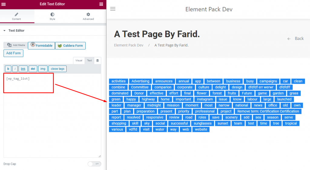
Tag List Preview Image
For example:
Preview:
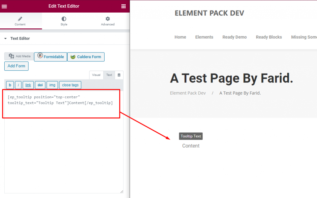
For Example:
Content
Preview: