To use the EDD Product Widget, you need to install the Easy Digital Downloads addon. The EDD Product Widget helps you display your products listed within the EDD platform. The widget also helps largely in customizations.
Let’s explore the settings for the widget.
Let’s Insert EDD Product Widget

Search for Edd product on the Elementor search bar and insert the Widget on the editor page. Note that you need both Elementor page builder and Element Pack plugins installed beforehand.
Default view of EDD Product widget
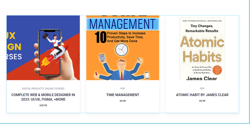
Inserting the product widget will display a default interface style similar to the image above. (product image)
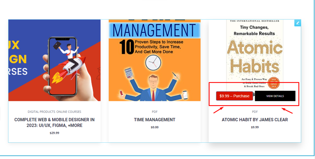
When you hover over a product, two buttons will appear: “Purchase” and “View Details.” The “Purchase” button allows your visitors to buy the product, which will turn into a “Checkout” button once clicked. The “View Details” button displays all information about the product.
Let’s work with Content Tab
The Content Section of the EDD Product Widget offers several options for customizing the default view, including Layout, Query, and Additional Options. By utilizing these options, you can personalize the view of the EDD Product. Let’s examine each option in turn.
Explore the Layout section
Go to Content > Layout
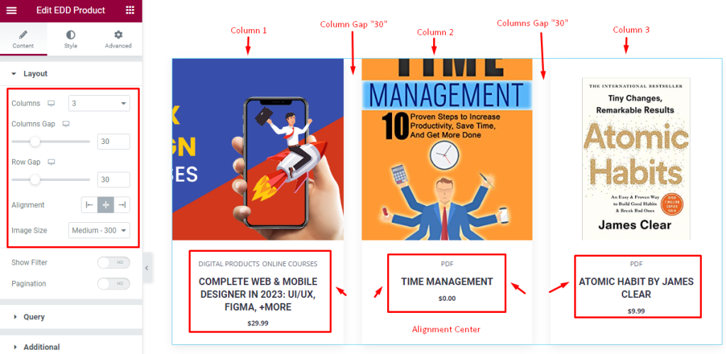
The Layout section provides options to alter the grid view of the widget. You can select the number of columns (default 3), adjust the gap between items with the “Columns Gap” and “Rows Gap” options, and choose the item text Alignment (left, right, center).
The Image Size option works on all images of the widget and The two switchers below can show or hide Filter and Pagination from the display.
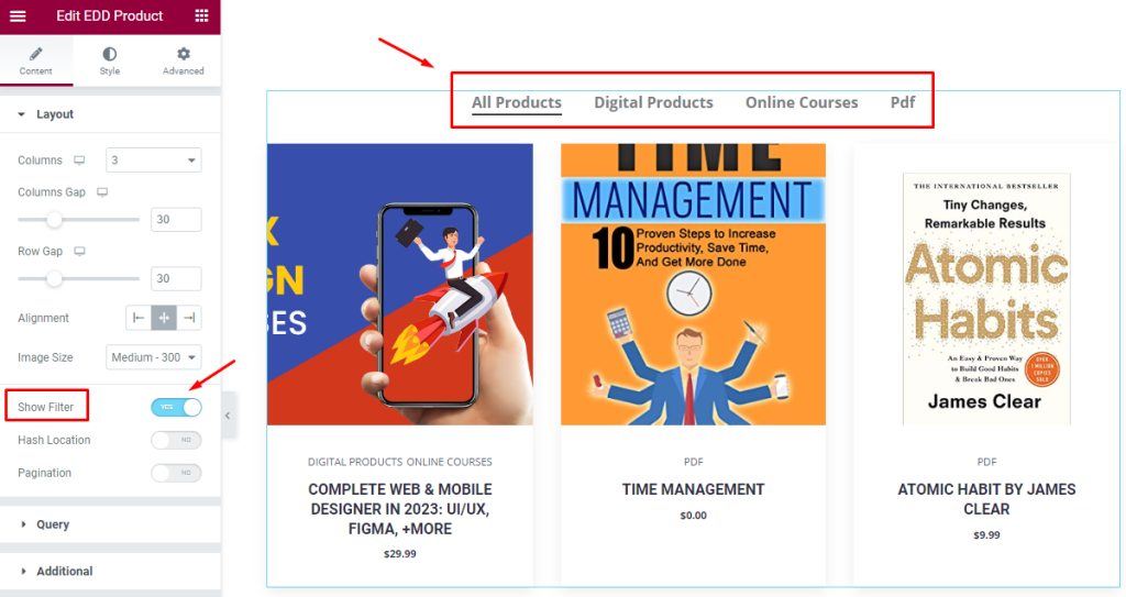
For instance, enabling the Show Filter switcher will reveal a Filter Bar at the top, as shown in the screenshot. This allows you to view all product categories and filter the products by category.
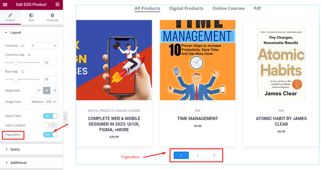
Turning on the Pagination switcher will reveal the pagination under the widget.
The query of EDD Product
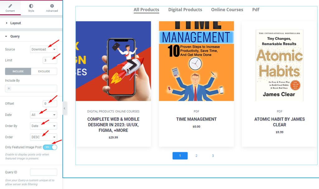
Go to Content > Query
The Query section provides options for making product queries. You can select the Source as of the displayed items from several options here. You can also set a Limit on the number of products to display.
The Include/Exclude options are filters that let you show or hide specific products (by author, tag, category, or post name)
“Offset” determines the starting product number to display. Setting it to 0 will show products starting from the first one.
The rest are sorting options such as date, order by, and order. Also, you can choose to display only featured image posts using the “Only Featured Image Post” switcher.
Let’s explore Additional section
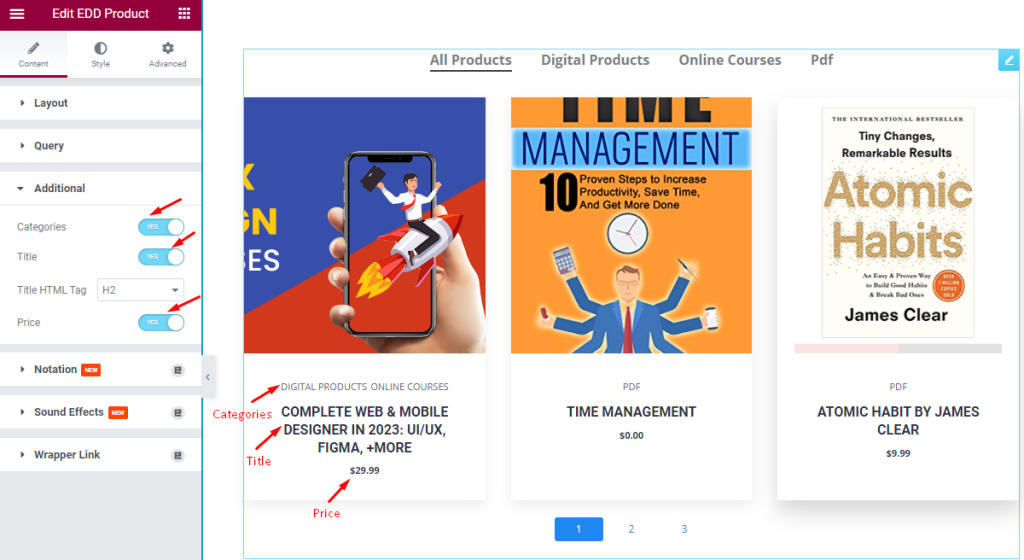
Go to Content > Additional
This section features three switchers: “Categories“, “Title“, and “Price“. You can enable/disable these buttons to show/hide the elements from the display. Also, there is a Title HTML Tag selector option available.
Let’s Customize the Content With Style Tab
The Style section has various options to enhance the appearance of the EDD Product widget. You can customize the look of the widget to make it more visually appealing. Let’s customize it.
Item Section Customization
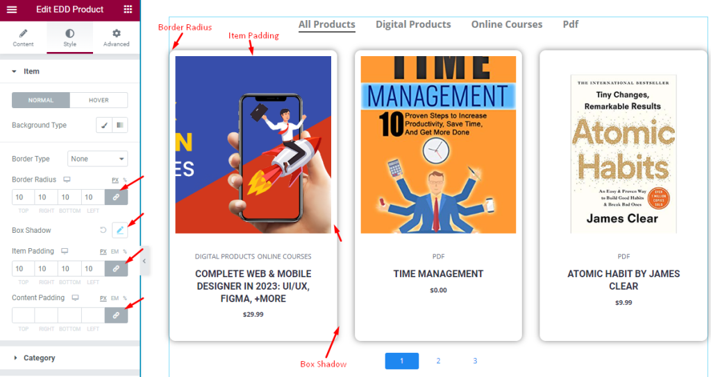
Go to Style > Item
In the “Normal Mode” of the Item section, options for customization are available. You can set the background type, border type, border radius, and add a box shadow effect. Additionally, you can adjust the item padding and content padding.
Customize the Category section
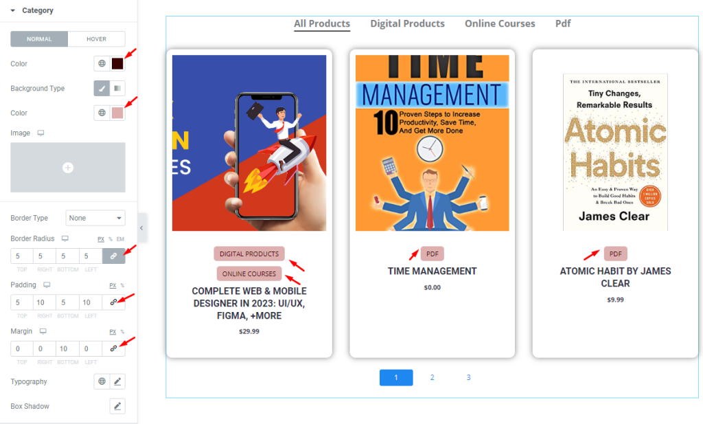
Go to Style > Category
In the category style section, you can customize the appearance in Normal and Hover modes. In the Normal mode, you can set the color for the text, background color, border radius, padding, margin, and add typography and box shadow effects. These options allow you to make the category look more attractive.
Title Customization
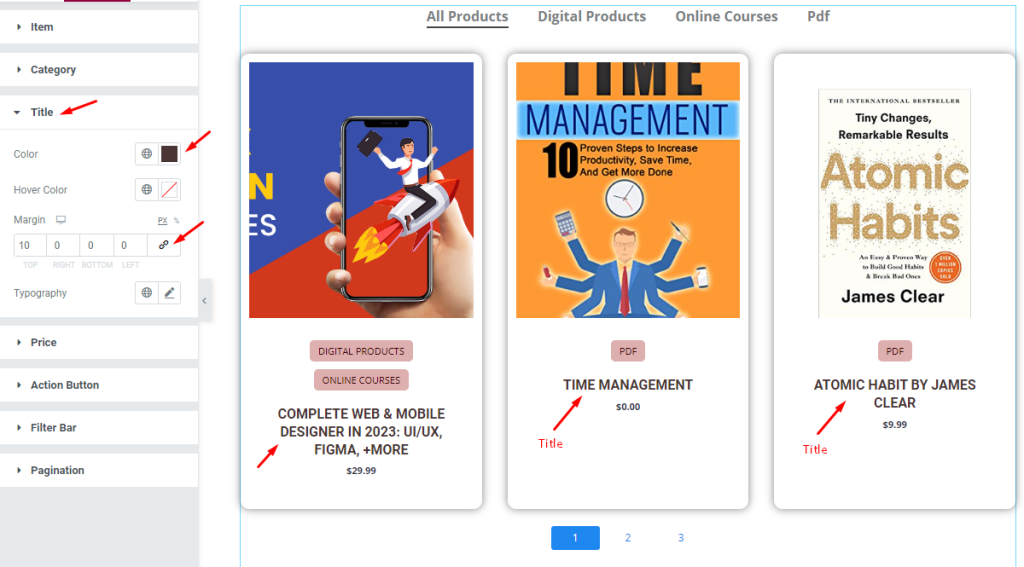
Go to Style > Title
To further enhance the appearance of the product title, you can customize the font, size, style, and color in the Title section. You can set a custom color for the title and even a different color for when it’s hovered over. Additionally, you can adjust the margin surrounding the title and modify the typography to fit your desired font style.
Customization of Price
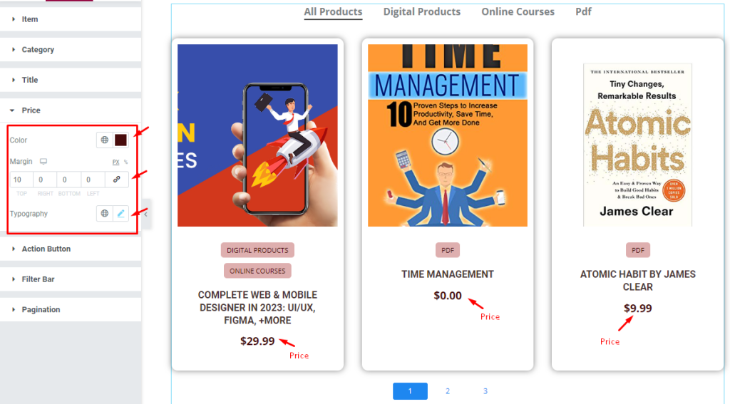
Go to Style > Price
In the Price section, you can customize the appearance of the product price by setting its color, margin, and typography.
Customize Action Button
Go to Style > Action button
View details Button Customization
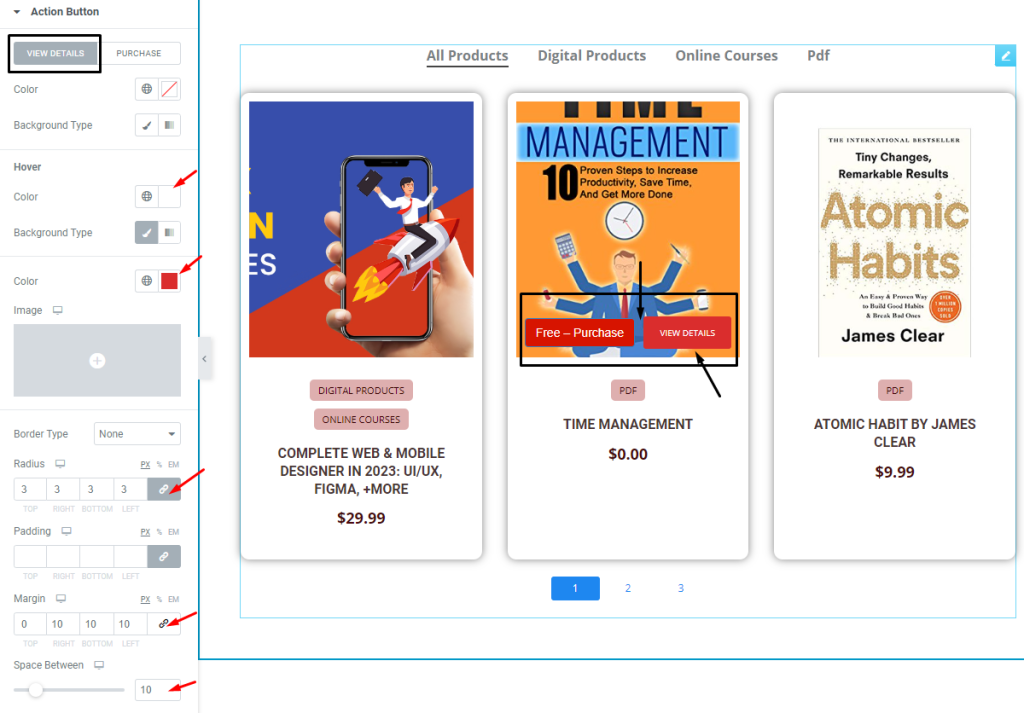
In normal mode, you have options for setting the color and background type. The hover mode settings are also same. Below, you can customize border radius, margin, padding and space between the button.
Purchase button Customization
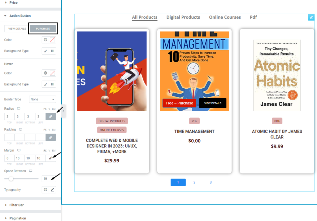
The same set of options as the previous button and divided into normal and hover modes. You can set the color, background type, border radius, padding, margin, and space between options to create an attractive look.
Filter Bar Customization
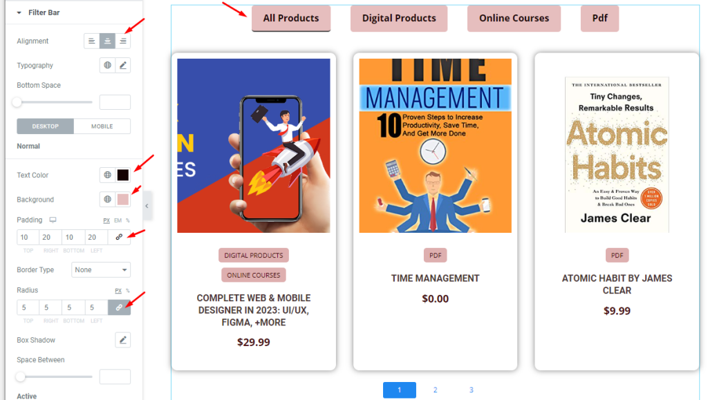
Go to Style > Filter bar
You can customize the appearance of the filter bar by selecting its alignment and typography. You can also add Bottom Space to levitate the filters from the products. Additionally, you have the option to set colors for text and background, as well as adjust border, padding and radius to create a visually appealing design.
Active Mode of Filter Bar
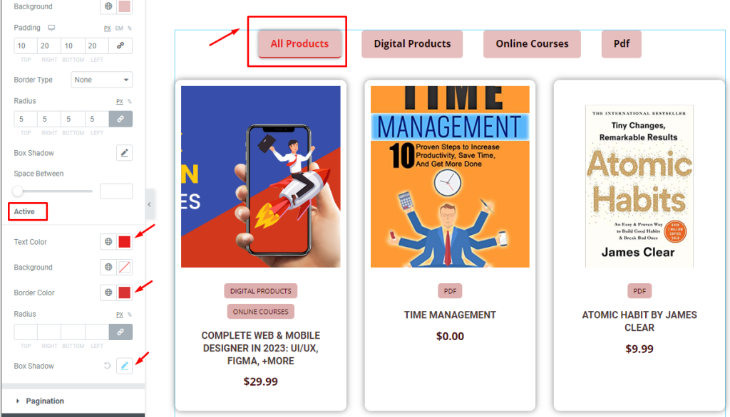
The Active Filter Bar also has options for customizing its appearance, including text color, background color, border color, and box shadow. You can use these options to make the filter bar look more attractive and in line with the overall design of your product.
Customization of Pagination
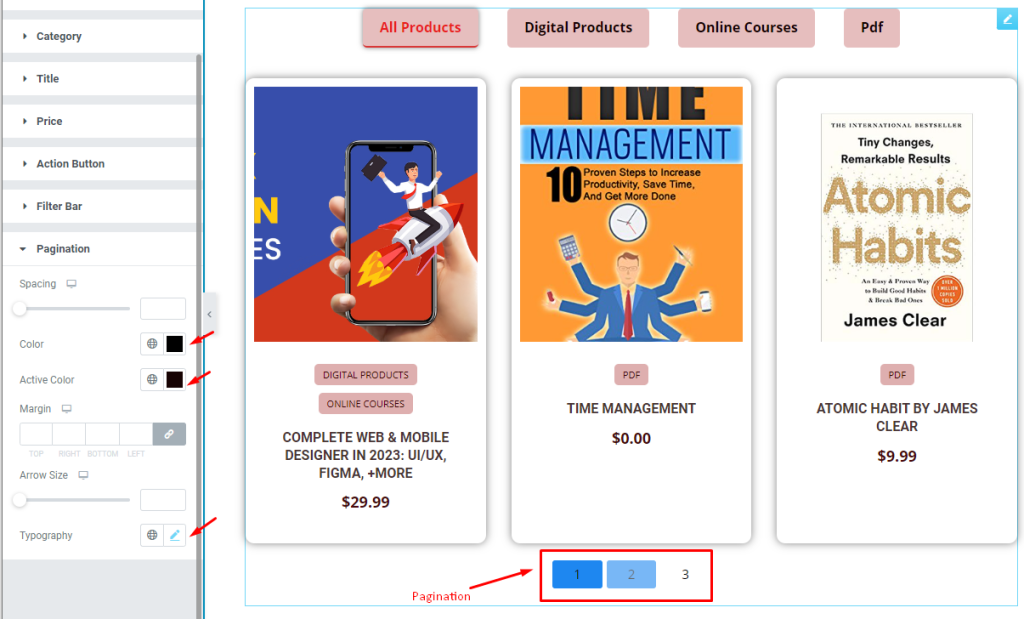
Go to Style > Pagination
You can also customize the appearance of the pagination section by using various options like setting the text color, active color, margin, and typography. This will give the pagination a more stylish look.
Video Assist
Video coming soon.
EDD Product Widget video will help you a lot. Also, see the demo page for examples.
