In this documentation, we will discuss the customization of the Custom Slider widget, brought to you by the Prime Slider addon for Elementor.
Enable The Custom Slider Widget
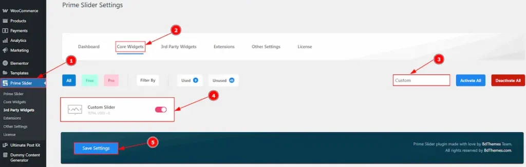
To use the Custom Slider widget from Prime Slider, first, you have to enable the widget.
- Go to WordPress dashboard > Prime Slider Plugin dashboard.
- Then, Click the Core Widgets Tab.
- Search the Custom Slider Widget Name.
- Enable the Custom Slider Widget.
- Hit the Save Settings Button.
Inserting The Custom Slider widget
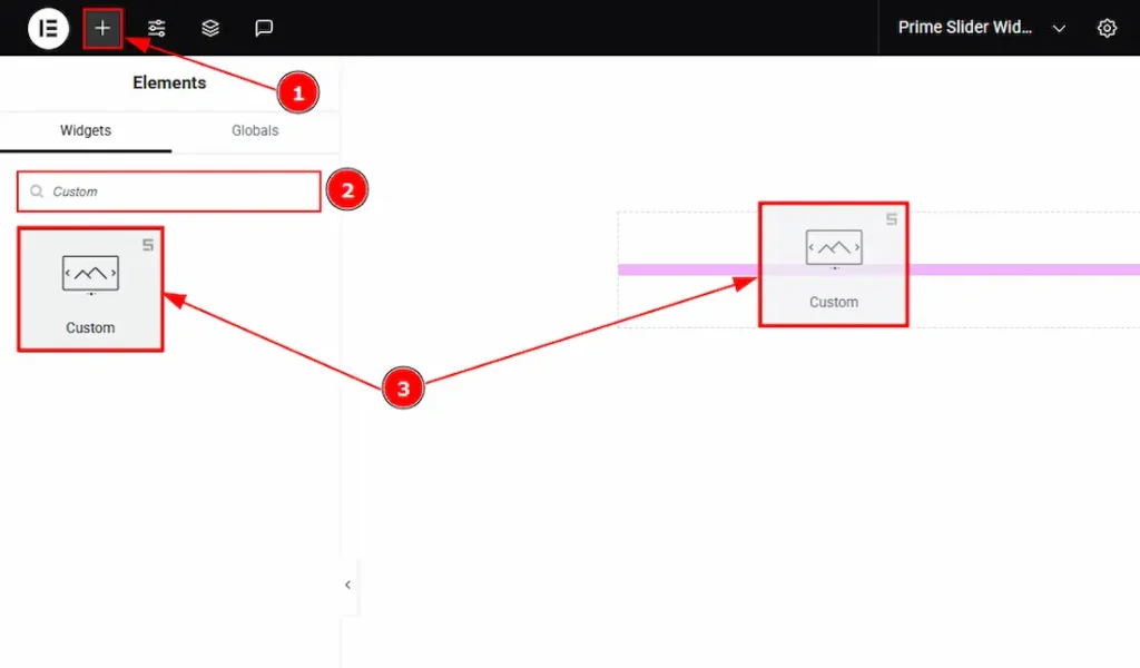
1. Go to the Elementor Editor Page and hit the “+” icon Button.
2. Search the Custom Slider widget.
3. Drag the widget and drop it on the editor page.
Work With The Content Tab
Layout Section
Go to Content > Layout
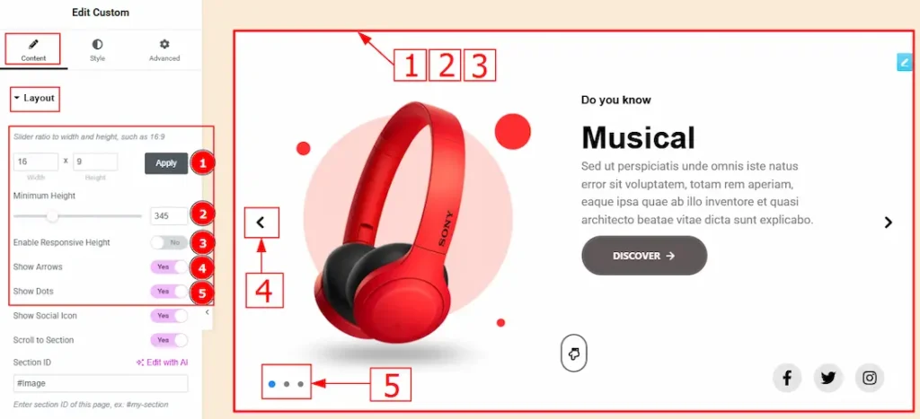
1. Slider Ratio: You can adjust the slider ratio to width & height with this option.
2. Minimum Height: You can adjust the slider height with this option.
3. Enable Response Height: Enable the switcher to set the slider height as responsive for all device.
4. Show Arrows: Enable or disable the switcher to show or hide the arrows from the slider.
5. Show Dots: Enable or disable the switcher to show or hide the dots from the slider.
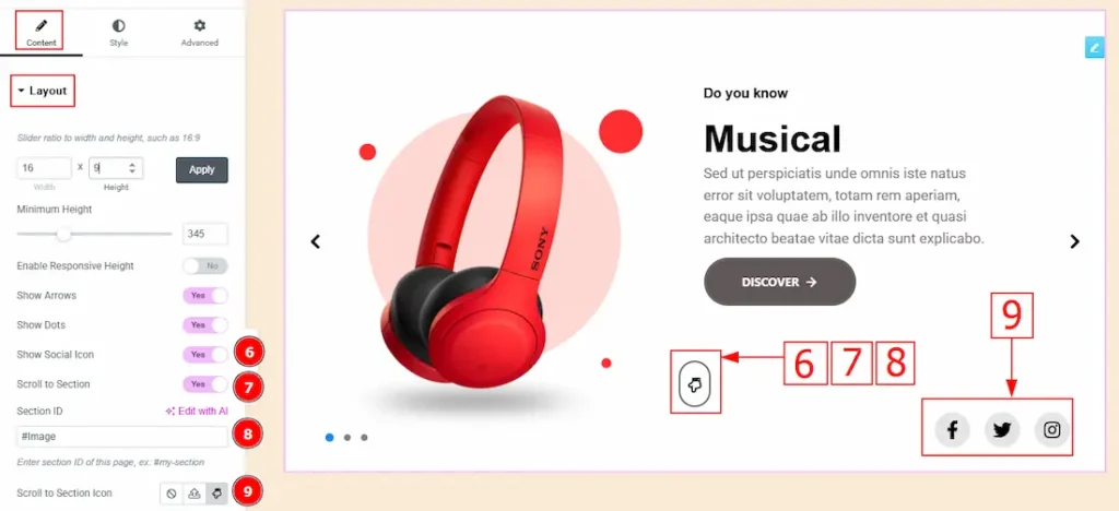
6. Show Social Link: You can show the social icon to the audience by enabling this option.
7. Scroll to Section: Enable the switcher to enable the option to scroll to the section.
8. Section ID: You can enter the section name here, where you want to scroll by clicking on the scroll to section icon.
9. Scroll to Section Icon: You can set the scroll to section icon with this option.
Sliders Section
Go to Content > Sliders
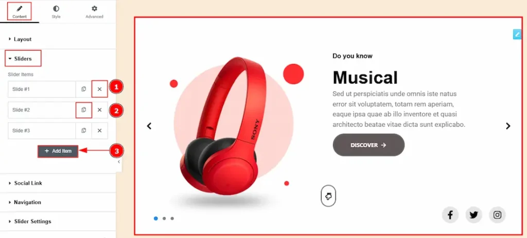
1. Close Item: You can delete the Slider item by clicking the Close icon button.
2. Copy Item: This option lets you copy the same item.
3. Add Item: You can add a new item by clicking the “+”Add Item button.
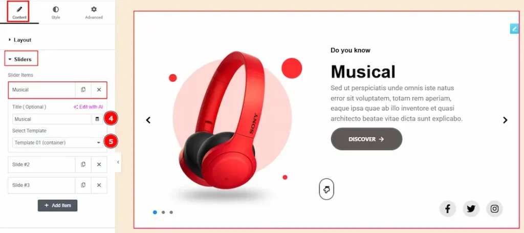
Now, let’s proceed to the inner options of the sliders –
4. Title (Optional): You can add a title to your slider with this option.
5. Select Template: This option allows you to select the template that you want to add to your slider.
(Note: To work with the custom slider, you have to manually create templates as per your sliders first.)
Social Link Section
Go to Content > Social Link
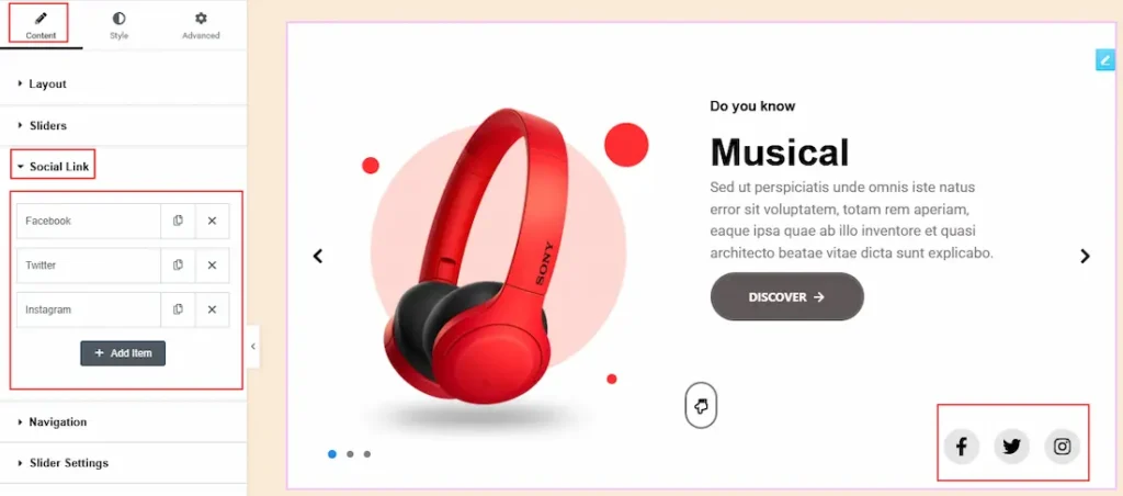
The settings in this section are the same as those in the Sliders section described above. For a detailed explanation, please refer to the Slider section to understand how these options work.
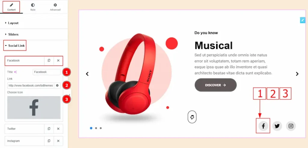
Now, let’s proceed to the inner options of the social icon –
1. Title: You can add a title to your social icon with this option.
2. Link: This option allows you to add a link to the social icon.
3. Choose Icon: You can choose an icon with this option.
Navigation Section
Go to Content > Navigation
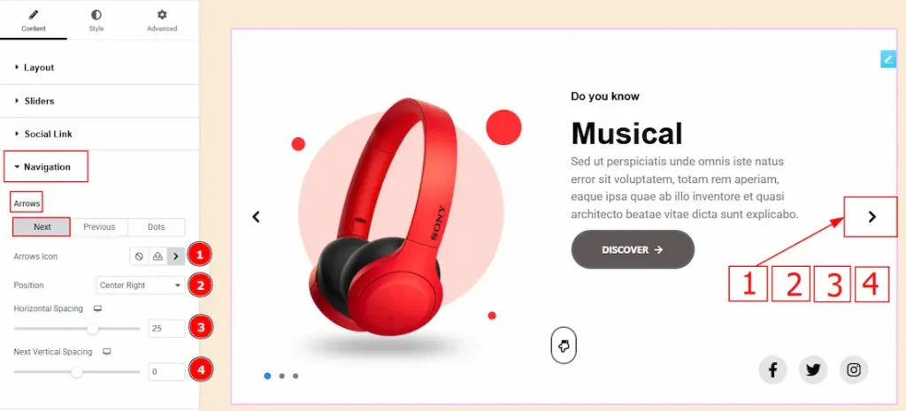
In this section, we have two Sub Secitons. These are Arrows & Dots. In the Arrows Sub Section we have two more tabs. These are Next and Previous. Let’s start with the Next Tab –
1. Arrows Icon: This option allows you to select the next arrow’s icon.
2. Position: You can select the next arrow’s position to top left, top right, center left, center right, bottom left or bottom right with this option. Here we selected the position at the center right.
3. Horizontal Spacing: You can move the icon position horizontally with this option.
4. Next Vertical Spacing: You can move the icon position vertically with this option.
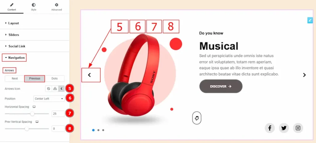
Now, let’s proceed to the Previous Arrows Tab –
5. Arrows Icon: This option allows you to select the previous arrow’s icon.
6. Position: You can select the previous arrow’s position to top left, top right, center left, center right, bottom left or bottom right with this option. Here we selected the position at the center left.
7. Horizontal Spacing: You can move the icon position horizontally with this option.
8. Next Vertical Spacing: You can move the icon position vertically with this option.
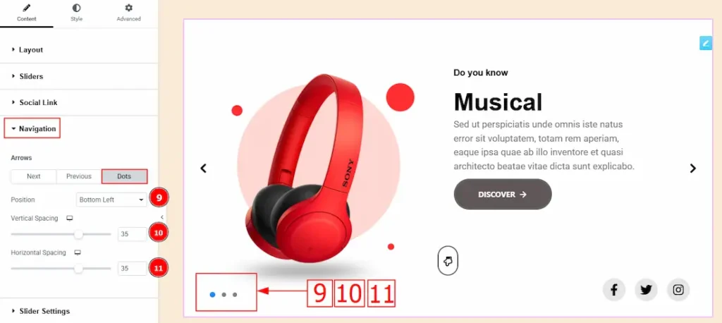
Now, let’s proceed to the Dots Sub-Section –
9. Position: You can select the dot’s position to top left, top right, center left, center right, bottom left or bottom right with this option. Here we selected the position at the bottom left.
10. Vertical Spacing: You can move the dots’ position vertically with this option.
11. Horizontal Spacing: You can move the dots’ position horizontally with this option.
Slider Settings Section
Go to Content > Slider Settings
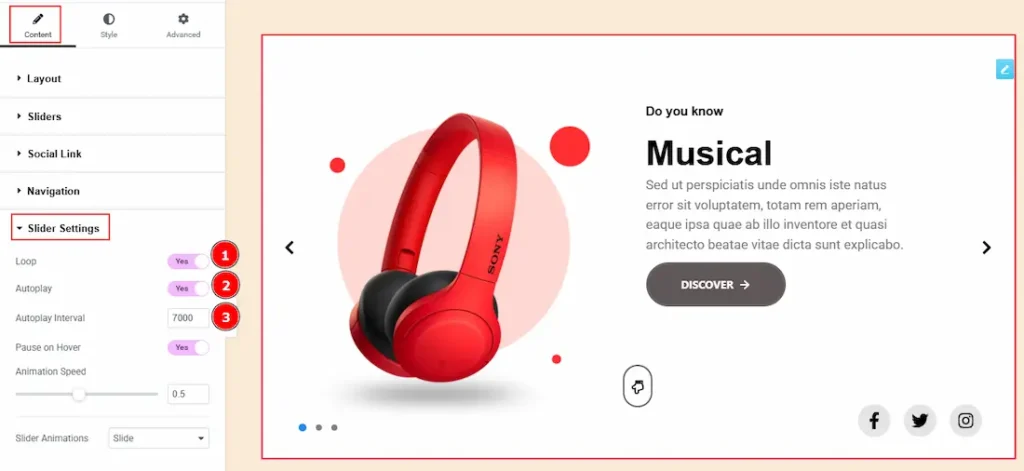
1. Loop: Enable the switcher to go back to the first automatically after the last slide.
2. Autoplay: By enabling this option, you can automatically play the slides one after another.
3. Autoplay Interval (ms): This option lets you set the time delay between each slide transition.
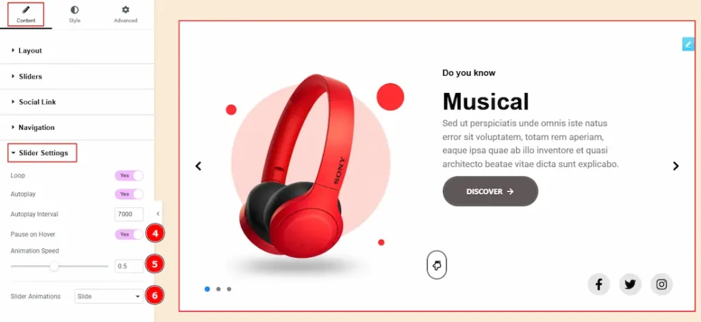
4. Pause on Hover: Enable the switcher to pause autoplay when the user hovers over the slider.
5. Animation Speed: This option controls how fast the transition animation occurs between slides.
6. Slider Animations: This option allows you to select the animation style from Slide, Fade, Scale, Push & Pull. Here we selected the slide animation style.
Work with The Style Tab
Slider Section
Go to Style > Slider
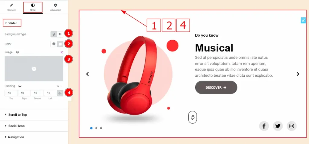
1. Background Type: You can change the background type here. There are two options in background type. These are Classic & Gradient.
In Classic, you can change the background color and also set an image as the background. In the gradient option, you can also set background color along with locations and angle for each breakpoint to ensure the gradient adapts to different screen sizes. Also, you can change the gradient type (Radial & Linear) and positions.
2. Color: You can change the background color with this option.
3. Image: You can change the background image with this option.
4. Padding: Add spaces around an object to increase the inner area. Padding allows you to control the internal space within an element.
Scroll To Top
Go to Style > Scroll to Top
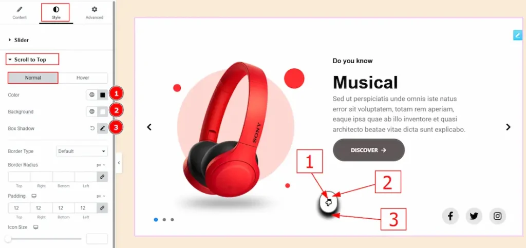
In this tab, we have two more tabs. One is Normal & the other is Hover. Let’s start with the Normal Tab –
1. Color: You can change the scroll to top icon color with this option.
2. Background: You can change the background color with this option.
3.Box Shadow: While working with this option, you will get three more options (Blur, Horizontal & Vertical). Blur Controls how sharp or soft the shadow will appear. By using the horizontal option you can move the shadow left or right and by using the vertical option you can move the shadow up or down.
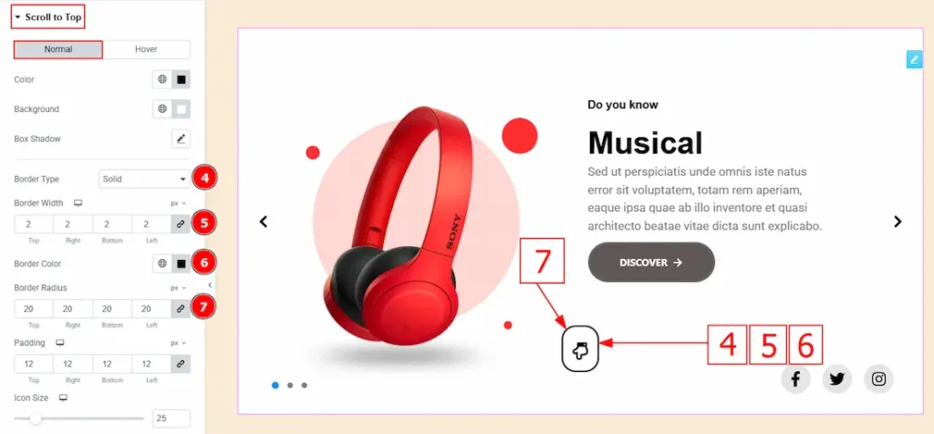
4. Border Type: This option allows you to add borders to your items. You can select various border types from this option. Such as Solid, Double, Dotted, Dashed, Groove.
5. Border Width: Set the thickness of the border with this option.
6. Border Color: You can change the border color with this option.
7. Border Radius: This option controls the roundness of the border.
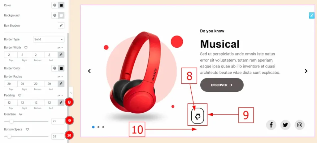
8. Padding: Add spaces around an object to increase the inner area. Padding allows you to control the internal space within an element.
9. Icon Size: You can make changes to the icon size with this option.
10. Bottom Space: This option controls the space and gaps between the bottom and the scroll-to-up icon.
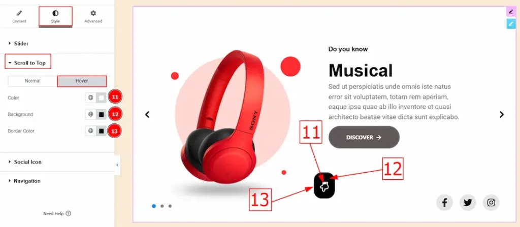
Now, let’s proceed to the Hover Tab –
11. Color: You can change the icon hover color with this option.
12. Background: You can change the background hover color with this option.
13. Border Color: You can change the border hover color with this option.
Social Icon Section
Go to Style > Social Icon
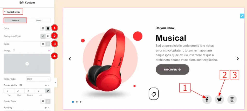
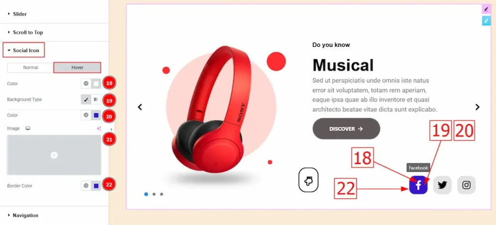
In this Section, we have two tabs. These are Normal & Hover. Let’s start with the Normal Tab –
1. Color: You can change the social icon color with this option.
2. Background Type: You can select the background type to Classic or Gradient from here. Here we selected Classic.
3.Color: You can change the background hover color with this option.
4. Image: You can change the background image with this option.
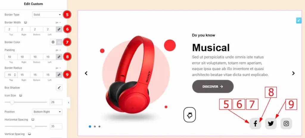
5. Border Type: You can add a border to the social icon with this option.
6. Border Width: Set the thickness of the border with this option.
7. Border Color: You can change the border color with this option.
8. Padding: You can adjust the inner space of the social icon with this option.
9. Border Radius: This option controls the roundness of the border with this option.
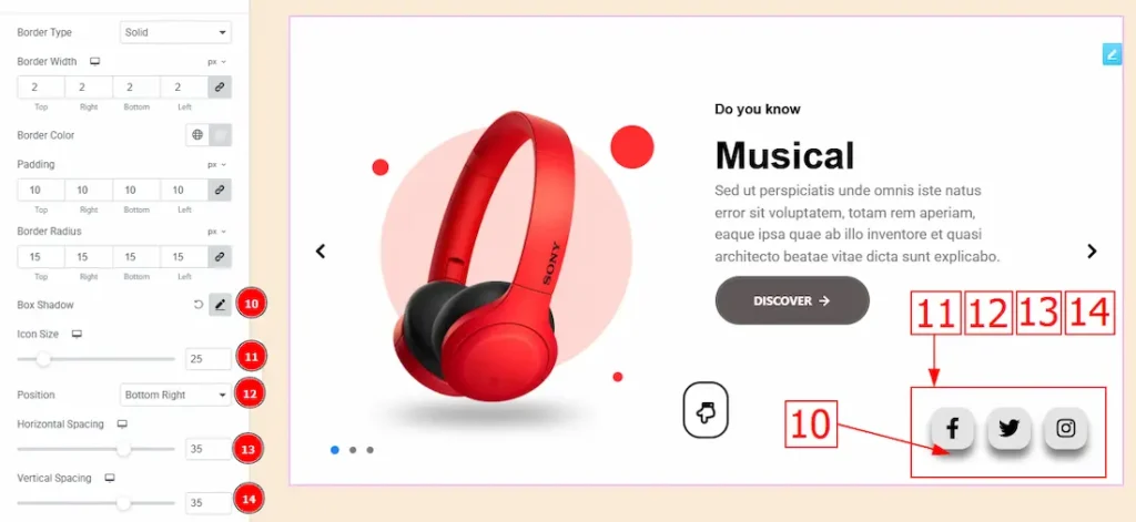
10. Box Shadow: You can add a shadow effect with this option.
11. Icon Size: You can make changes to the social icon size with this option.
12. Position: You can make changes to the social icons’ position with this option.
13. Horizontal Spacing: This option allows you to move the icons horizontally.
14. Vertical Spacing: This option allows you to move the icons vertically.
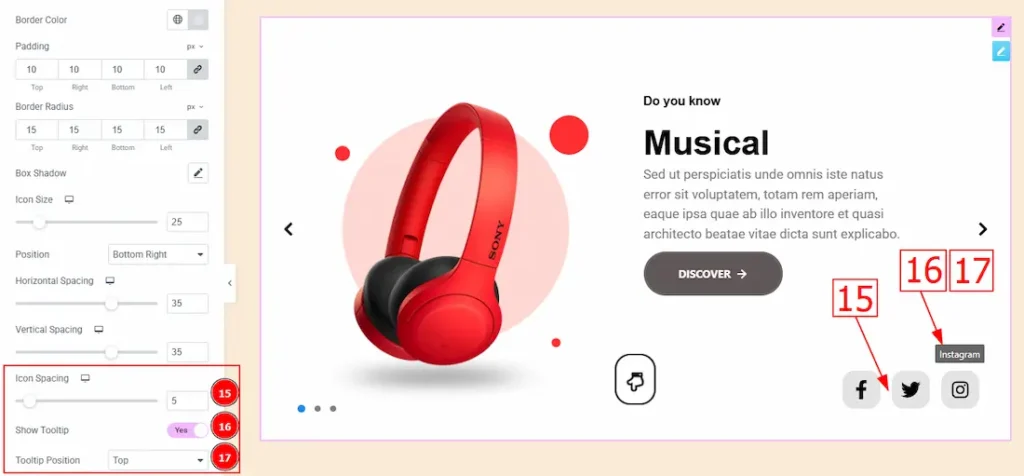
15. Icon Spacing: This option allows you to adjust the space between the social icons.
16. Show Tooltip: Enable the switcher to show the icon name when the mouse hovers over the icon.
17. Tooltip Position: You can set the tooltip position to top, left right, or bottom with this option. Here we selected the position to top.
Now, let’s proceed to the Hover Tab –
18. Color: You can change the button text hover color with this option.
19. Background Type: You can select the background type to Classic or Gradient from here. Here we selected the Classic.
20. Color: You can change the background hover color with this option.
21. Image: You can change the background image with this option.
22. Border Color: You can change the border hover color with this option.
Navigation Section
Go to Style > Navigation
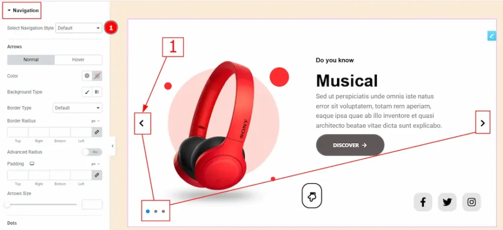
1. Select Navigation Style: There are a total of 5 styles to design your navigation. Here we selected the default navigation style.
Arrows Sub Section
In this sub-section, we have two tabs. These are Normal & Hover. Let’s start with the Normal Tab –
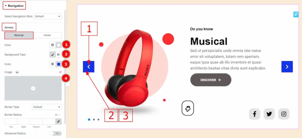
1. Arrows Color: This option allows you to change the arrows’ color.
2. Background Type: You can select the background type to Classic or Gradient from here. Here we selected the Classic.
3. Color: You can change the background hover color with this option.
4. Image: You can change the background image with this option.
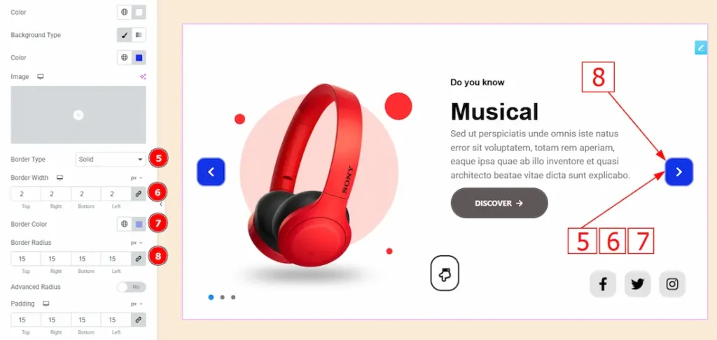
5. Border Type: This option allows you to add a border.
6. Border Width: Set the thickness of the border with this option.
7. Border Color: You can change the border color with this option.
8. Border Radius: This option controls the roundness of the border with this option.
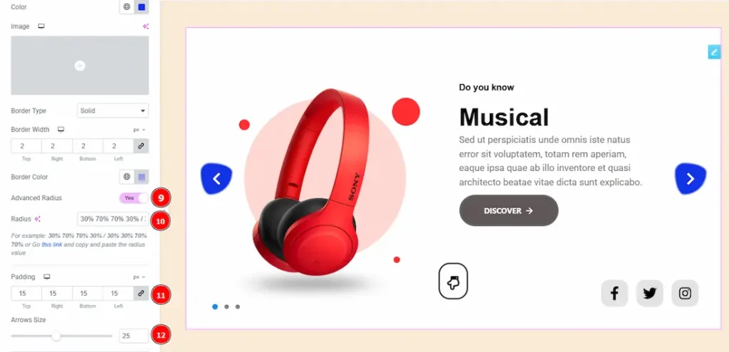
9. Advanced Radius: Enable the switcher to get an option to design the radius each corner.
10. Radius: You can make changes to the border radius with this option. (Note: Here you will get an option to click “this link” and you can make changes to the radius.)
11. Padding: This option allows you to adjust the space and gaps in the navigation arrows.
12. Arrows Size: You can make changes to the arrow size with this option.
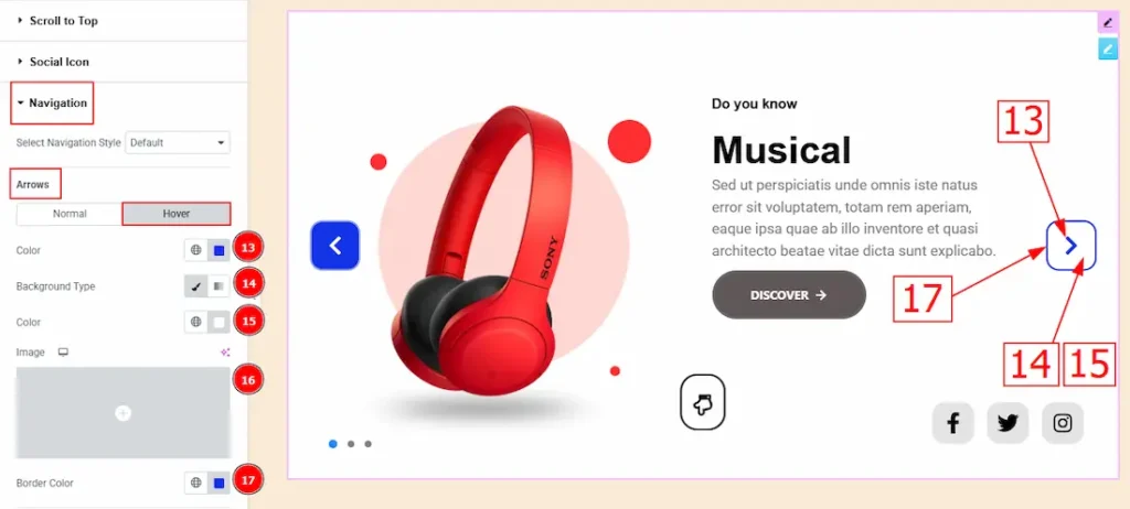
Now, let’s proceed to the Hover Tab –
13. Arrows Color: You can change the arrows icon hover color with this option.
14. Background Type: You can select the background type to Classic or Gradient from here. Here we selected the Classic.
15. Color: You can change the background hover color with this option.
16. Image: You can change the background image with this option.
17. Border Color: You can change the border hover color with this option.
Dots Sub Section
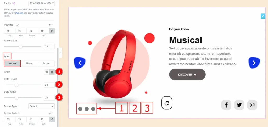
In this sub-section, we have 3 tabs. These are Normal, Hover & Active. Let’s start with the Normal Tab first –
1. Color: You can change the dot color with this option.
2. Dots Height: You can make changes to the dots’ height with this option.
3. Dots Weight: You can make changes to the dots’ width with this option.
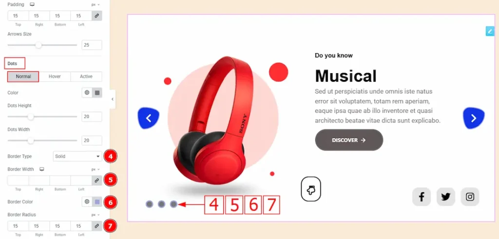
4. Border Type: You can add a border to the dots with this option.
5. Border Width: Set the thickness of the border with this option.
6. Border Color: You can change the border color with this option.
7. Border Radius: Customizes the border corners for roundness.
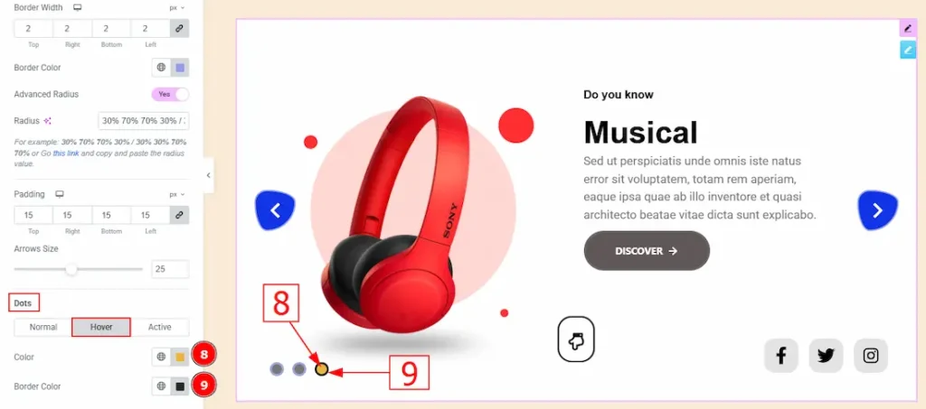
Now, let’s proceed to the Hover Tab –
8. Color: You can change the dots hover color with this option.
9. Border Color: You can change the border hover color with this option.
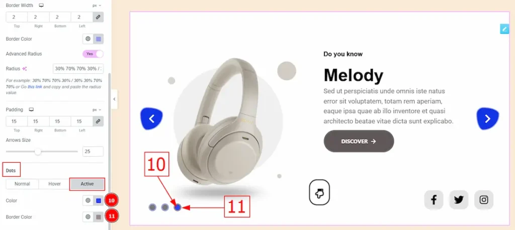
Now, let’s proceed to the Active Tab –
10. Color: You can change the dots active color with this option.
11. Border Color: You can change the active border color with this option.
All done! You have successfully customized the Custom Slider Widget on your website.
Video Assist
You can also watch the video tutorial to learn more about the Custom Slider widget. Please visit the demo page for examples.
Thanks for being with us.