
To create a minimalistic yet fully custom and functional WordPress gallery, Pixel Gallery presents the Axen grid gallery widget. Continue reading the whole document to know about the widget in detail.
Inserting the Grid Gallery
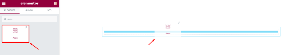
To use this Elementor image gallery widget, go to your target page and open it with Elementor. Then drag and drop the Axen widget inside the page. Of course, you need both Elementor and Pixel Gallery installed on your WordPress website.
Introduction to Layout customizations
The content tab holds the base structure controls of a widget. Here, you can freely customize the dimension, required number of columns, item spacing, and individual item information of the widget to make your base design. Let’s explore.
Customize the layout of the Axen grid gallery
[Custom Content Activated]
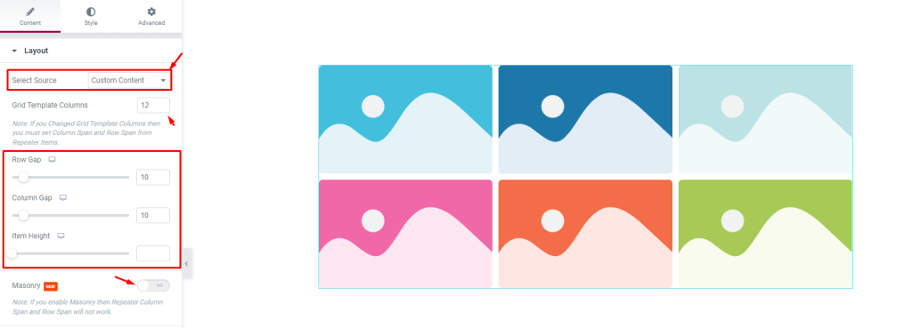
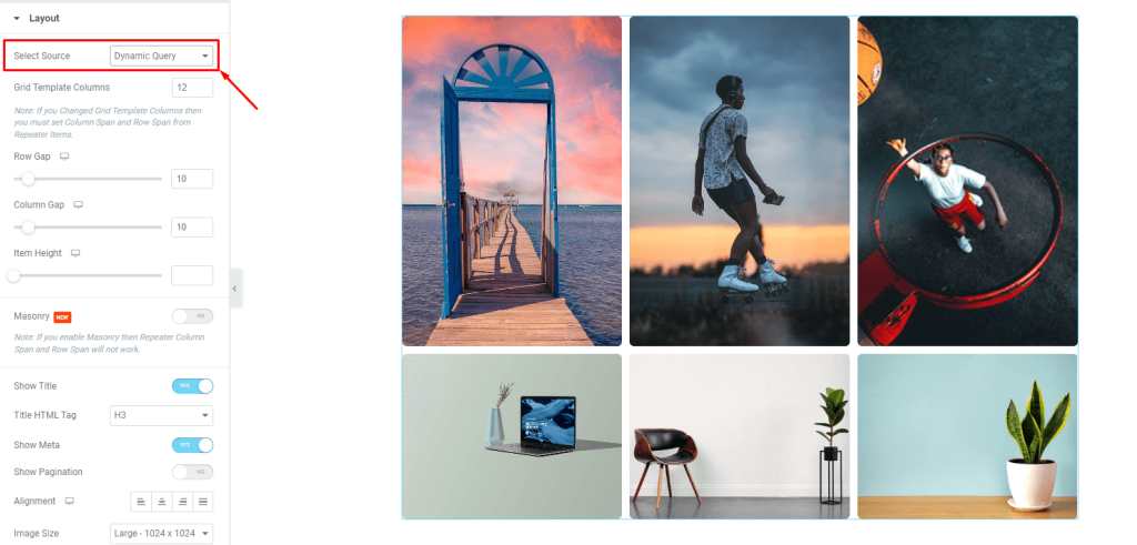
Go to Content> Layout
The first section is named Layout. Here, you can first select the source of the grid gallery for either custom inputs or dynamic inputs. We will first show the custom content inputs.
The three scrollbars here are for customizing the item gap, column gap, and item height for all the grid items. There is a switcher that you can turn on to create a masonry gallery layout in case the images have different sizes.
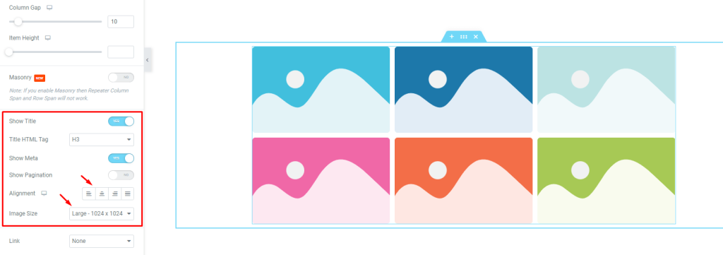
Then there are three switchers below for the title, meta, and pagination. Turning on or turning off them will show or hide these three elements on the grid. The alignment option works on the texts. Also, you can fix a certain dimension for all the images used in this grid gallery from the Image Size option.
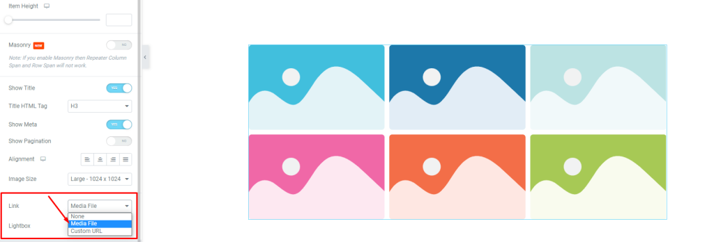
At the bottom, you will find the link option which you can use to turn on the media file linking function to the grid items. Just click on the Link field and choose Media File or Custom URL to open the link fields on the items.
Selecting the 2nd option will pop out the Lightbox control for the grid. You can select it to open any attached link to the grid gallery in a popup window.
Customize grid gallery items individually
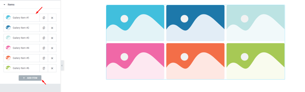
Go to Content> Items
The next section holds all the grid gallery items in one place. They are lined up as little boxes while showing the image as an avatar, the title, and copy/close buttons.
You can add more items by clicking the Add Item button or close any listed item by clicking the X button on the item boxes.
Content subsection controls
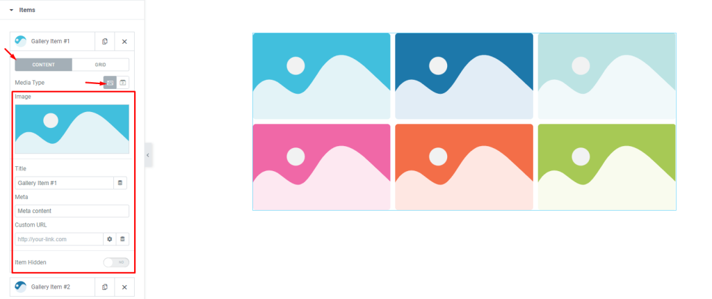
Clicking on any item box will reveal the options inside it. Here, you can see the Content subsection selected and the Media type is set to images. There are some fields here for customizing the image, title, meta, custom URL, and items hidden switcher.
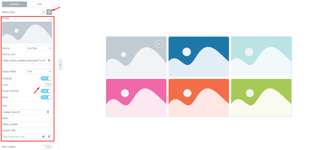
Selecting Video as the Media Type will change the set of controls to embed a video to the individual grid gallery item. Including the previous control options, you will further get a video Source option, source link, aspect ratio control, Autoplay, loop, player controls, and mute switcher.
Notice that switching to video media type will add a play button on the top right corner of the Elementor grid gallery items.
Grid subsection controls
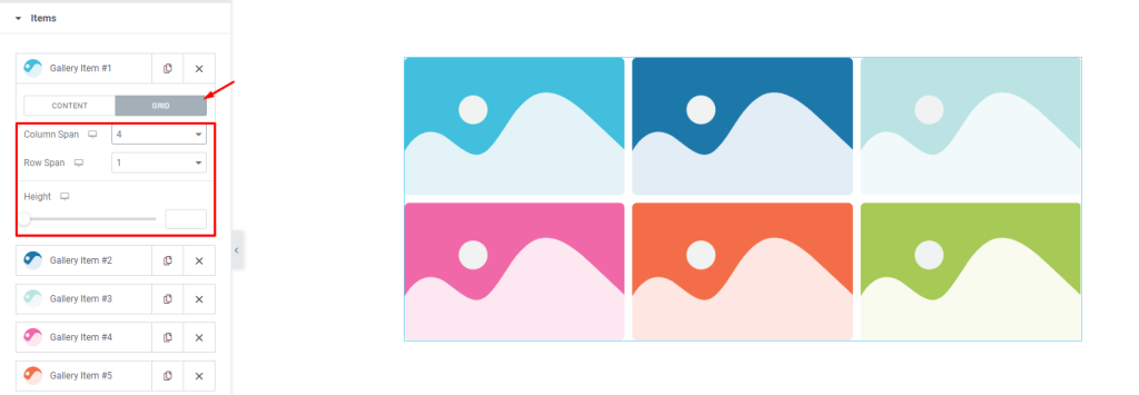
The grid controls for the items let you choose the correct dimension for individual items such as how many columns or rows each item can occupy. The height option is to change the height of each item to further adjust the size.
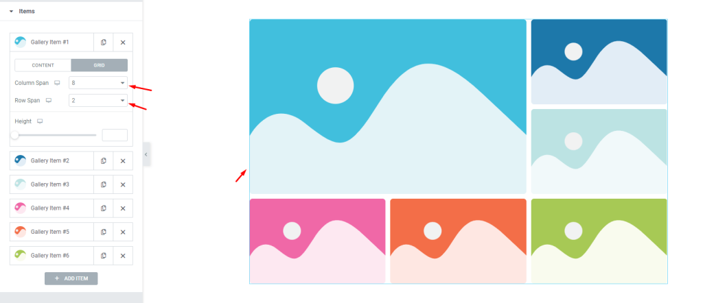
For instance, let’s change the column span to 8 and the row span to 2. Now, the 1st item will occupy 8 of the 12 column bars and as much space as 2 item rows. By default, the column span is set to 4 and the row span is set to 1. That’s why the next two items occupied the space on the right side of the first grid gallery item.
Layout Customizations for Dynamic Query
[Dynamic Query Activated]
Go back to Content> Layout
Selecting Dynamic Query as the source of the grid gallery will import saved content on WordPress like posts, pages, or templates and show their images on the gallery layout.
For your concern, only Pixel Gallery allows users to use advanced query controls that no other plugin does not.
Query controls for Axen widget
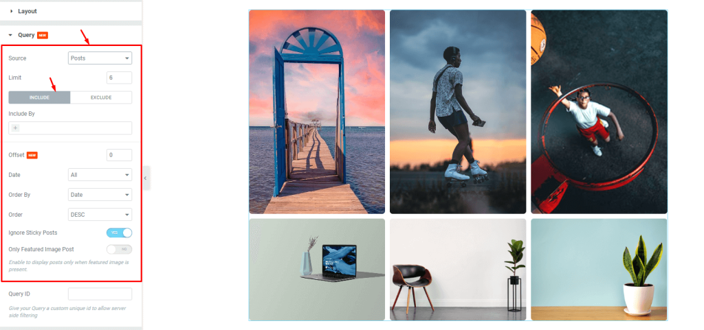
Go to Content> Query [Dynamic Query selected]
In this section, you can select the source of the grid as well as sort them out using the include / exclude fields. Selecting any category, tag, or author from the include field will make the grid display content belonging only to the selected category. The opposite happens with the exclude field where the selected category will be omitted.
The rest of the controls below are some more sorting options like date, order, etc. The two switchers here are for showing or hiding sticky posts as well as making the grid gallery display posts that have featured images.
Grid item span controls
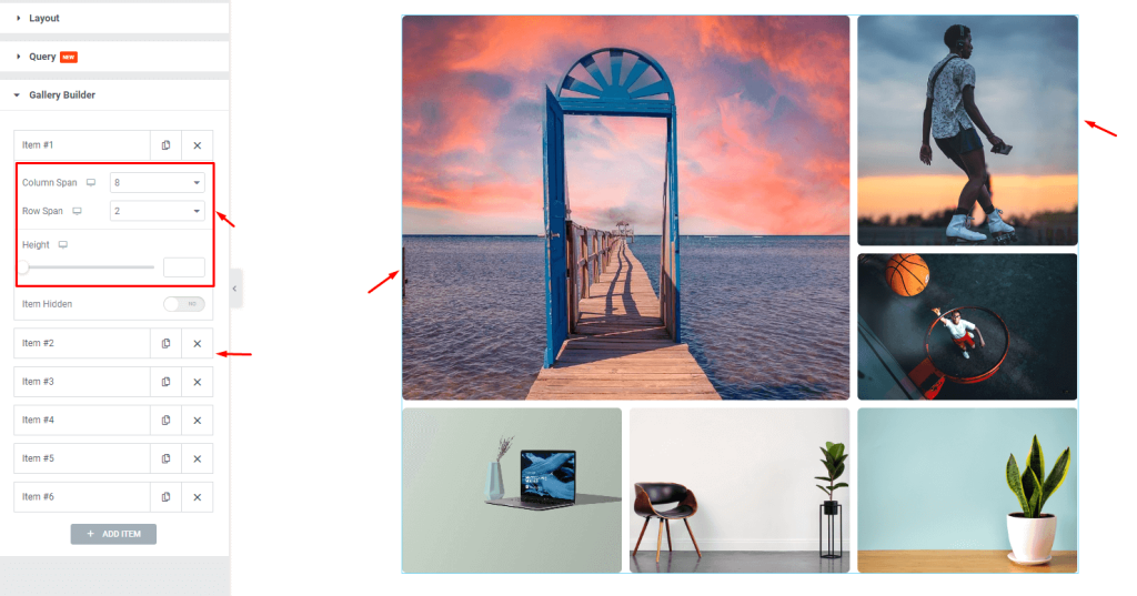
Go to Content> Gallery Builder
Consider this section the items section for the custom gallery mode. But on the dynamic query mode, the custom grid items option is omitted and only the grid row span, column span, and height controls are available.
Use these scrollbars to customize the grid layout by mixing the item size.
Style tab for customizing interface appearance
As Pixel Gallery excels in providing smart and beginner-friendly customizing controls so you can easily make dynamic changes to the layout to make unique interfaces.
Let’s see that step by step below.
Items section customizations
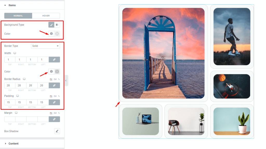
Go to Style> Items
On the top, you will find the background type option which lets you choose a single color or a gradient for the background of the items. As each gallery item here has images occupying the whole area, you can only see the changed background color after adding some padding.
Then we will add a thin border around the items with semi-transparent color to match it. With some border radius value, we can curve the edges of the grid gallery items starting with the border.
Content modification controls
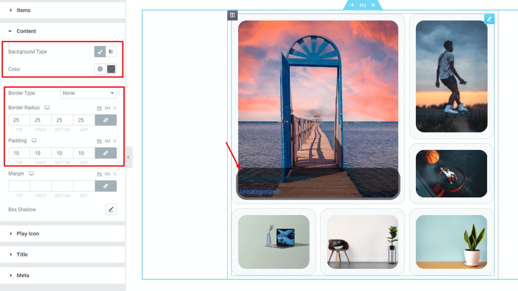
Go to Style> Content
When hovered, the axen gallery widget displays a content box that pops up from below while displaying the grid item title and meta. Here, we can change the background color of the content box as well as customize its border, border radius, padding, and margin. The box shadow option adds a depth-of-field effect with full shadow customizations.
Customize the play icon
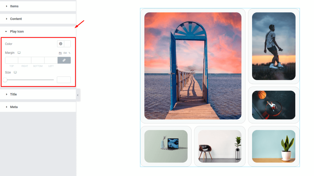
Go to Style> Play Icon
If you had selected Video from the media type option inside the items section, a play icon would appear on the selected grid item. From this section, you can customize the color, margin, and size of that button.
Grid gallery title customization
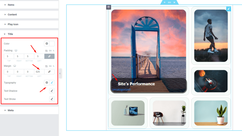
Go to Style> Title
Here, you can customize the title text inside the content box by changing its color, padding, margin, typography, text shadow, and stroke.
Meta text customizations
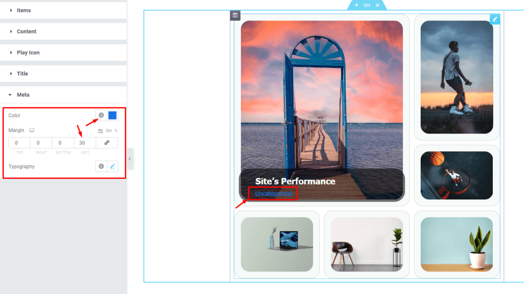
Go to Style> Meta
And lastly, you can customize the meta text using the options like color, margin, and typography.
This was all about the Axen gallery widget.
Video assist
Watch this quick video if you are tired of reading texts. Also, visit the demo page for more examples.