The Avatar Slider widget makes it possible to build creative image sliders with a breath-taking interface that shows how your sliders can surpass the norm. Get your hands on a game-changer slider widget for WordPress and take your website to the next level.
Let’s explore the customizations below.
Inserting the Avatar Slider widget

You can add this Avatar Slider addon to WordPress by opening the page you want to use it on in Elementor and then dragging and dropping the Avatar Slider widget into that page. Please note that you need both Elementor and Prime Slider installed before using this widget.
Work With The Content Tab
Layout Section Customizations
Go to Content > Layout.
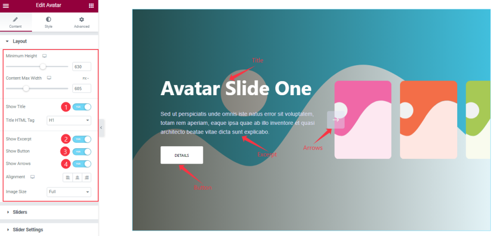
The first section lets you customize the item Minimum Height to adjust the net height of all slides and also set the Content Max Width.
Then you will get the Show Title, Show Excerpt, Show Button, and Show Arrows switchers which you can turn on/off to show/hide these elements from the slider. The Alignment option below works on the text content.
Also, you can change the dimension of all images inside the Avatar slider by using the Image Size option.
Sliders Section Customizations
Step-1
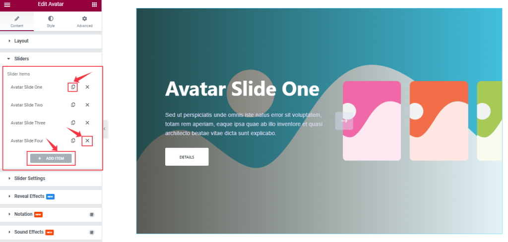
Go to Content > Sliders
In this section, you can easily add an Avatar slider item by clicking Add Item button. Otherwise, you can easily increase your Item by clicking the Duplicate Sign, and you can also decrease your item by clicking the cross sign.
Step-2
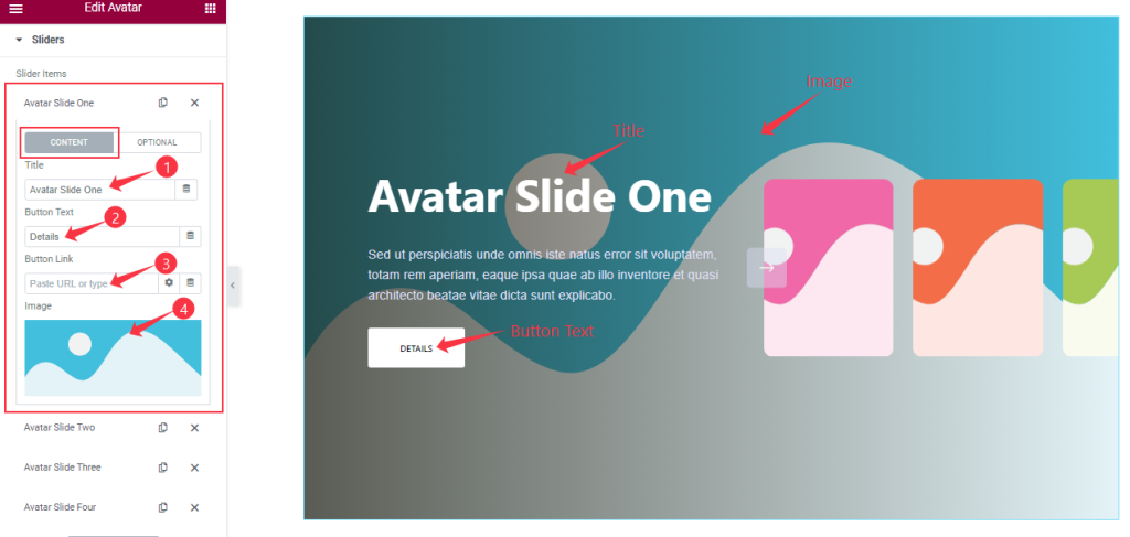
Clicking on an item box, you will see two subsections (Content and Optional). In content mode, you can change the Title and Button Text, Button Link, and item Image.
Step-3
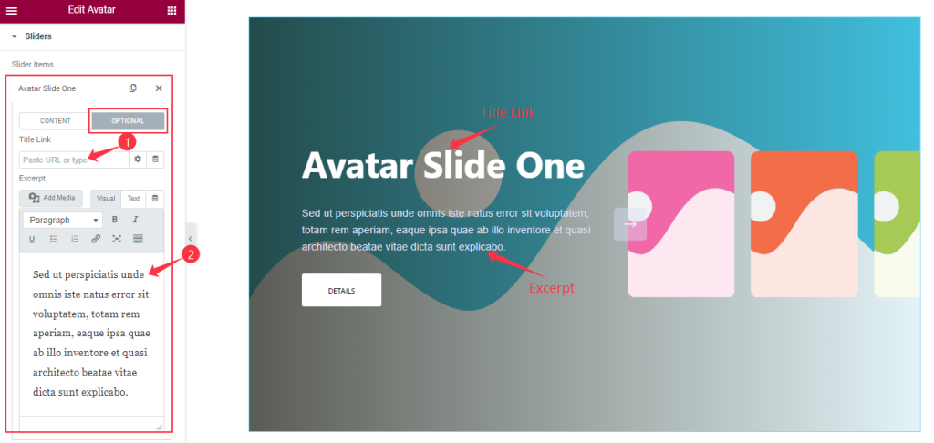
In the Optional subsection, you are able to add a Title Link and customize the slide Excerpt. All Avatar slider items will offer the stated options for customization.
Customizations of Slider Settings
Go to Content > Slider Settings.
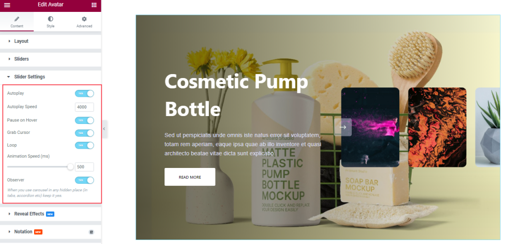
In this section, you will be able to see another bunch of Switchers and fields such as Auto Play, Auto Play speed, Pause On Hover, Grab Cursor, Loop, Animation Speed, and Observer.
What they do-
Autoplay switcher: If you Enable the Autoplay switcher button, your slider will slide into Autoplay mode, and you can set the Autoplay Speed as your wish.
Pause on Hover: If you activate the pause on Hover button, when visitors Hover the mouse cursor on the slider, then your slider will Hold, otherwise your slider will slide on Autoplay.
Grab The Cursor: Your mouse pointer icon will be changed into a grab cursor. Visitors can slide your slider manually with your mouse cursor.
Loop: When you activate the Loop switcher button, your slider will loop at a certain time interval. You also set up the loop animation speed here.
Observer: If you enable the option, then you are able to use the slider/carousel in any hidden places (such as in tabs, Accordion, etc).
Work With The Style Tab
Items Section Customizations
Go to Style > Items
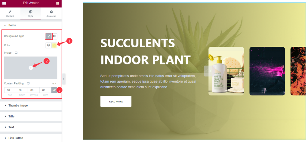
The first section lets you change the Background Type (Classic or Gradient), Background Color, and adjust Content Padding for Avatar slider. Note that you can add an image as the slider Background from the options.
Customizations Of Thumbs Image Section
Go to Style > Thumbs Image
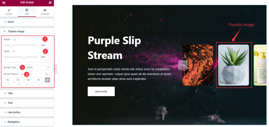
For the Thumbs Image section, you can adjust the Thumbs Image Height, and Width to specify the size of the thumbs on the display. Also, you can add a Border Type for the thumbs and then customize Border Radius as your need.
Style The Title Section
Go to Style > Title
Step-1
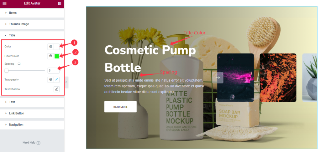
This section offers Title color, Title Hover color, Typography, Spacing, and Text Shadow customizations. You can start with the Title Color and Hover Color first and then adjust the Spacing between the title and everything below it.
Step-2
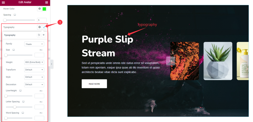
The Typography option expands into Font Family, Size, Weight, Transform, Style, decoration, Line Height, Letter Spacing, and Word Spacing. Everything here helps you stylize the title font.
Step-3
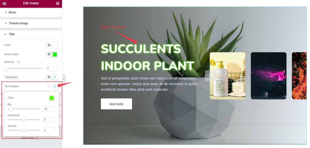
The Text Shadow (Color, Blur, Horizontal, Vertical) options let you add 3D-like text effects behind the actual title text.
Customization The Text Section
Go to Style > Text
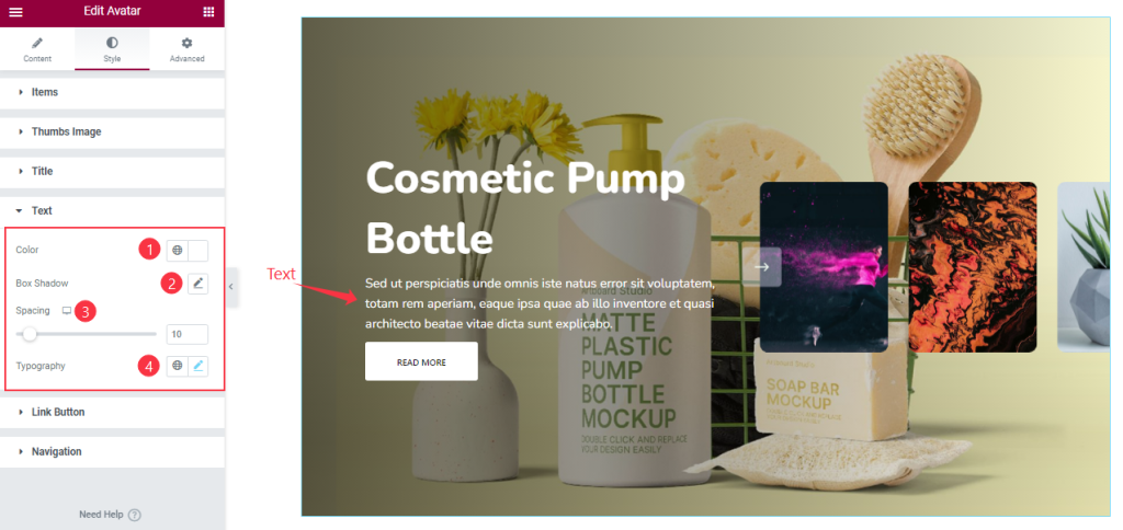
In this section, you can edit the text Color and add a Box Shadow for your text content. Here you also can adjust the Spacing between the text and button and customize the Typography to stylize the font.
Link Button Section Customizations
Go to Style > Link Button
Step-1
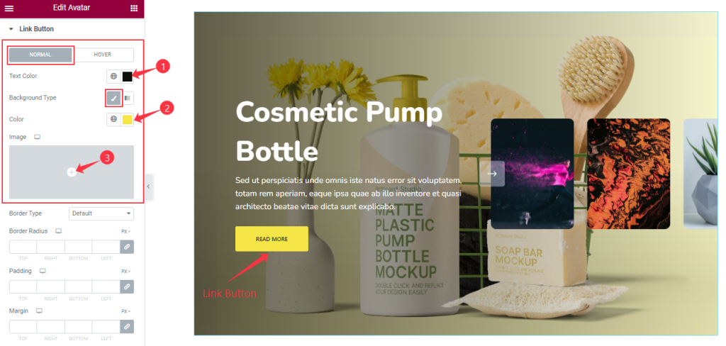
The Button section lets you customize the button appearance using two modes, Normal and Hover.
In Normal mode, you can easily change the Button Text Color, Background Type, and Background Color.
Step-2
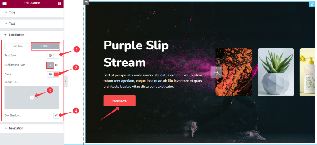
Here in Hover mode, you will get similar controls as the normal mode.
Step-3
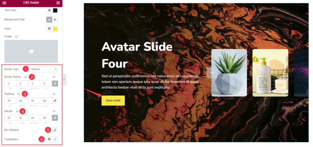
There are more options such as Border Type, Padding, Border Radius, Box Shadow, and Typography.
Navigation Section Customization
Go to Style > Navigation
Step-1
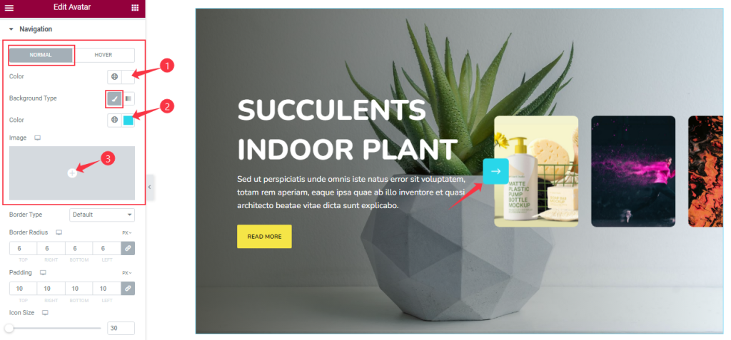
The navigation section starts with two modes; Normal and Hover.
You can change the Navigation Color and Background Type in Normal Mode.
Step-2
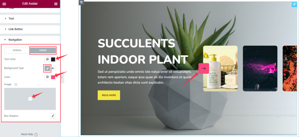
Here in Hover mode, you will get a similar set of controls with the addition of Box Shadow option to modify the appearance of the Avatar slider just like how it’s in the normal mode.
Step-3
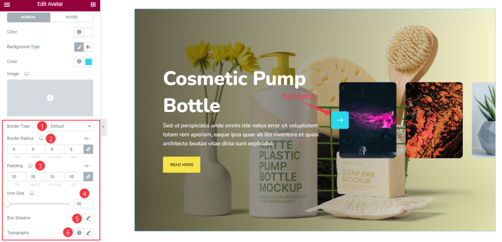
After that, you can set the Border Type, Width, Border Color, Border Radius, Icon Size, Box Shadow, and Typography for the navigation arrows.
All done! You have successfully customized the Avatar Slider widget on your website.
Video Assist
Watch this quick video to learn more about the Avatar Slider widget.
Thanks for staying with us.