The Astoria Slider is a wonderful slider widget for decorating your hero page with the perfect and elegant-looking slide. Equipped with social share buttons, the slider can easily catch your visitor’s eyes, enough to boost the first impression to the maximum.
Let’s explore the controls now.
Inserting the Astoria Slider widget

You can add this Astoria Slider addon to WordPress by opening the page you want to use it on in Elementor and then dragging and dropping the Astoria slider widget into that page. Please note that you need both Elementor and Prime Slider installed before you can use this widget.
Work With The Content Tab
Layout Section Customizations
Go to Content > Layout.
Step-1
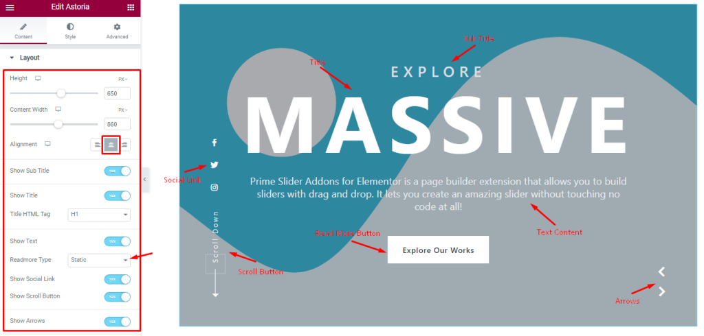
In this section, you can adjust the Height and Content Width of the slides. Note that too little height can collapse some of the content in the slider so be careful to adjust it.
The Alignment option works on the text content so you can easily select the best text position on the Astoria Slider.
The bunch of switchers below are Show Title, Show Sub Title, Show Text, ReadMore Type, Show Social Link, Show Scroll Button, and Show Arrows. Turning the switchers on will make those elements/features visible on the display and vice-versa.
Step-2
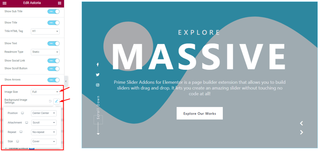
Then below, you can change the Image Size for all images on the Astoria slider. Additionally, you can customize the Background Image Settings option (Image Position, Attachment, Repeat, and Size) to further reposition the background images.
Sliders Section Customizations
Go to Content > Sliders
Step-1
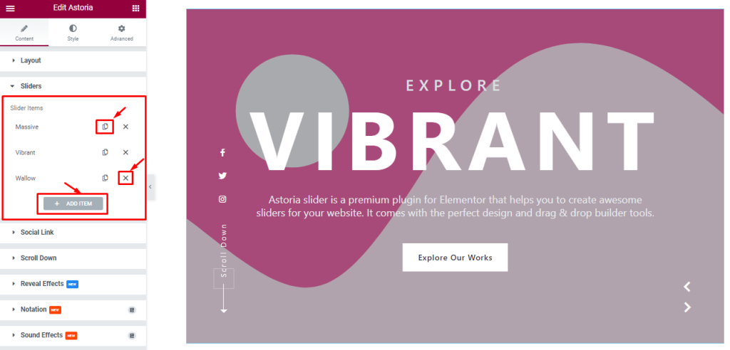
In this section, you can easily add an Escape slider item by clicking Add Item button. Otherwise, you can easily increase your Item by clicking the Duplicate Sign, and you can also decrease your item by clicking the cross sign.
Step-2
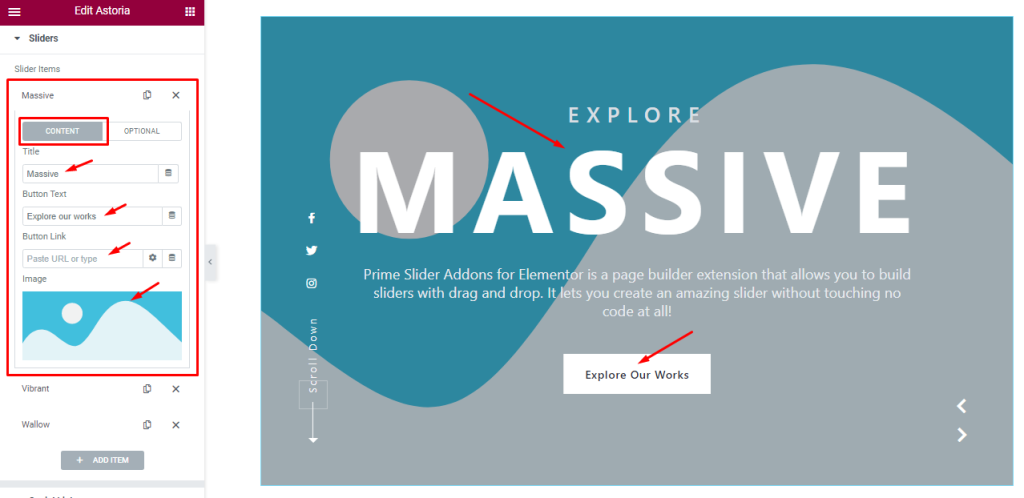
Clicking on an item box, you will see two subsections (Content and Optional). In content mode, you can change the Title and Read More Text, Button Link, and Astoria slider item Image.
Step-3
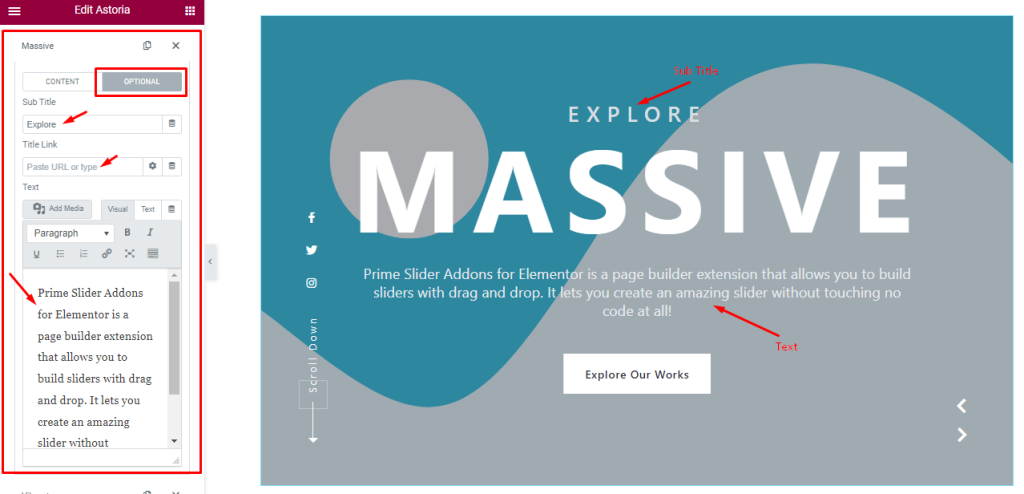
In the Optional subsection, you are able to change the Sub Title, add a Title Link, and customize the slide description Text. All Astoria slider items will offer the stated options for customization.
Customizations of Social Link Section
Go to Content > Social Link
Step-1
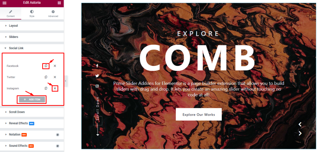
Similar to the Sliders section, the Social links in the Astoria Slider also come in boxes. You can duplicate current ones, reduce them by clicking the cross icon, or add new ones with the Add Item button.
Step-2
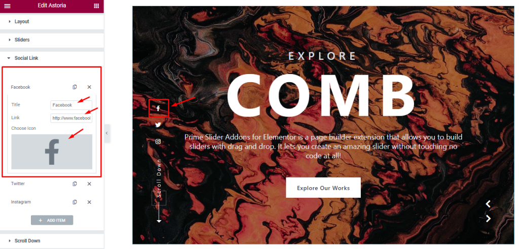
Clicking on a social link box, you can change its Title, select the target social link, and a custom Icon to symbolize the social link.
Work With The Scroll Down Section
Go to Content > Scroll Down
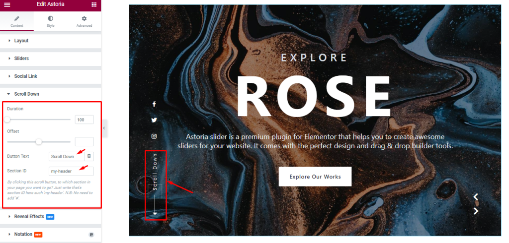
You may have noticed a Scroll Down button just below the social links on the Astoria Slider.
In this section, you can change the Scroll Duration and Offset value to adjust the transition time for the scroll-down button to act.
You can change the Button Text and in the Section ID field, you can insert a CSS ID of the target section within the current page where you are using the Astoria Slider.
Work With The Style Tab
Customization of Sliders Section
Go to Style > Sliders
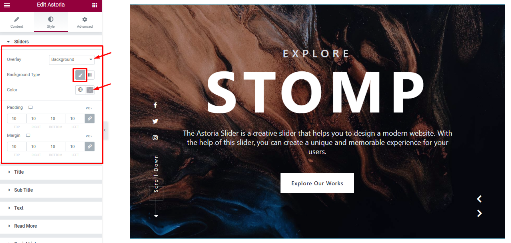
The first section inside the Style tab lets you add an Overlay color (Background, and Blend) to tune up the background of the slides.
Choosing Background for the Overlay lets you select a Background Type (Classic and Gradient). The classic type lets you add a plain background color with custom opacity. The rest two options are Padding and Margin.
Style The Title Section
Go to Style > Title
Step-1
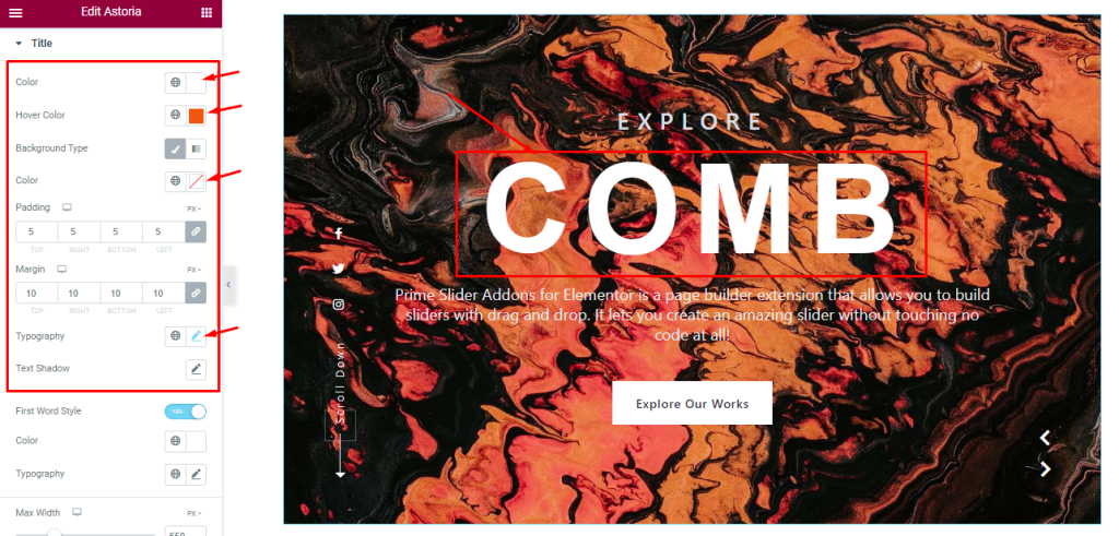
In this section, you will get some options to customize the Title Color, Title Hover Color, Background Type, and Background Color as your wish.
You can also customize the Padding, Margin, and Typography for the title. The Text Shadow option gives you the ability to add a 3D-like text-shadow.
Step-2
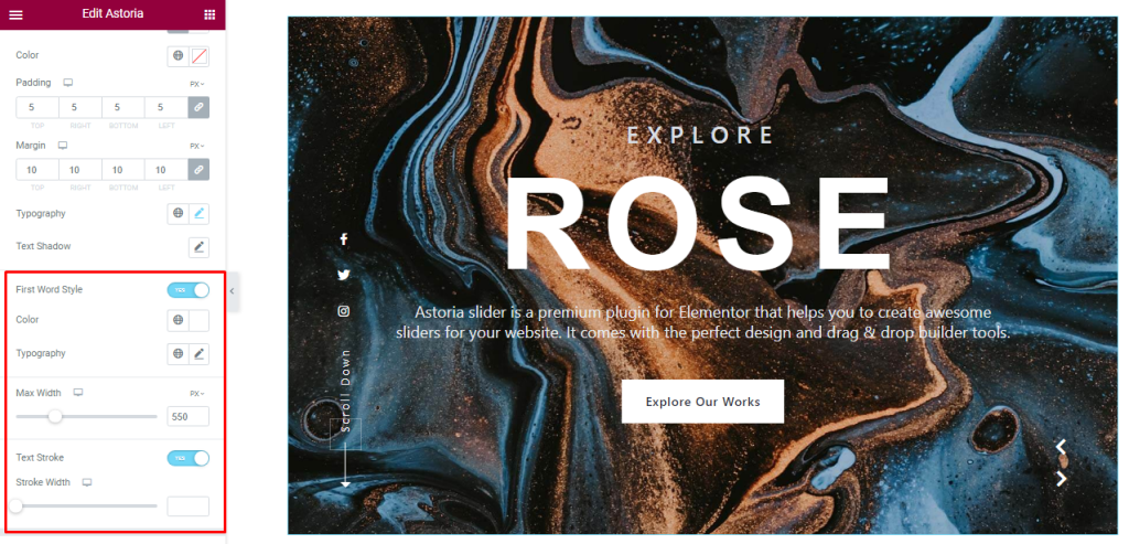
Turning on the First Word Style switcher pops a Color and Typography option to stylize the first word of the title text (titles with a single word will not have the dual font customization). And again, you can configure a Text Stroke Width for the title.
The Max Width scrollbar lets you adjust the area of the title container.
Customization Of Sub Title Section
Go to Style > Sub Title
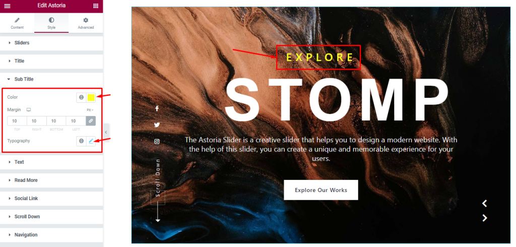
In this section, you can change the Sub Title color, set a custom Margin and customize the Typography.
Text Section Customizations
Go to Style > Text
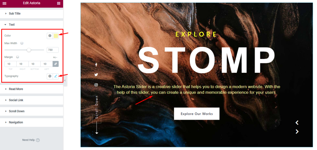
For text, there is an additional content Max Width scrollbar option, apart from the color, margin, and typography options.
Style The Read More Button
Go to Style > Read More
Step-1
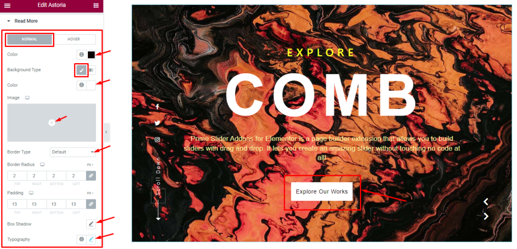
The Button section is divided into Normal and Hover modes.
In Normal mode, you change the Button text Color, Background Type, Background Color, Border Type, Padding, Border Radius, Box Shadow, and Typography.
Step-2
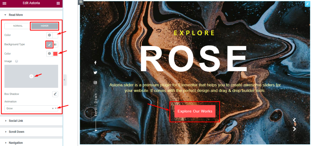
In Hover mode, you will get text Color, Background Type, and Box Shadow options to add a hover effect to the button. Also, you can configure an Animation for button hover.
Social Link Section Customizations
Go to Style > Social Link
Step-1
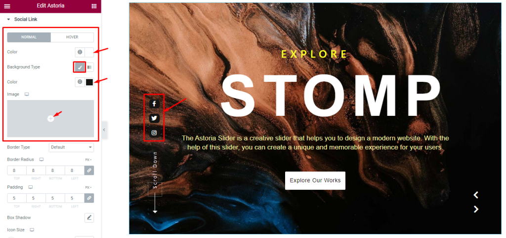
Here, you can change between two modes, in Normal mode, you change the Social Link Icon Color, Background Type, and Background Color. Note that you can add images as the Social Link Background from the options.
Step-2
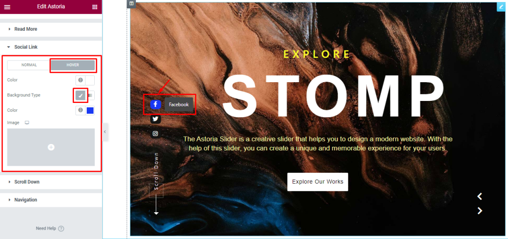
Here in Hover mode, you will get a similar set of controls to modify the appearance of this section like normal mode.
Step-3
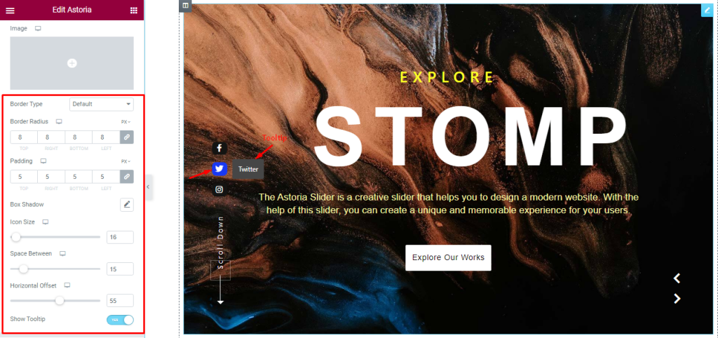
From the rest of the options below, you can adjust the Icon Size, Space Between, and Horizontal Offset position as your working demand.
If you want then you can Enable the Tooltip switcher for showing your icon Tooltip. Here, you also set the Border Type, Border Radius, Padding, and Box Shadow from this section.
Style The Scroll Down Section
Go to Style > Scroll Down
Step-1
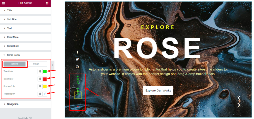
Here, you can change between two modes. In Normal mode, you can change the Text Color, Icon Color, Border Color, and Typography to decorate your Scroll Down button.
Step-2
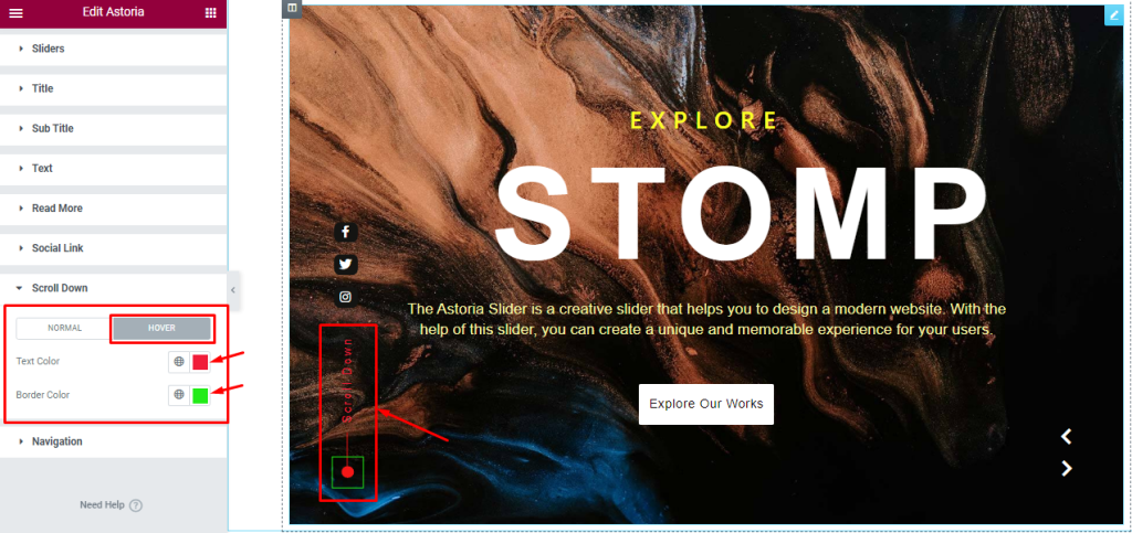
In Hover Mode, you can easily customize the Text Color and Border Color as your working demand.
Navigation Section Customization
Go to Style > Navigation
Step-1
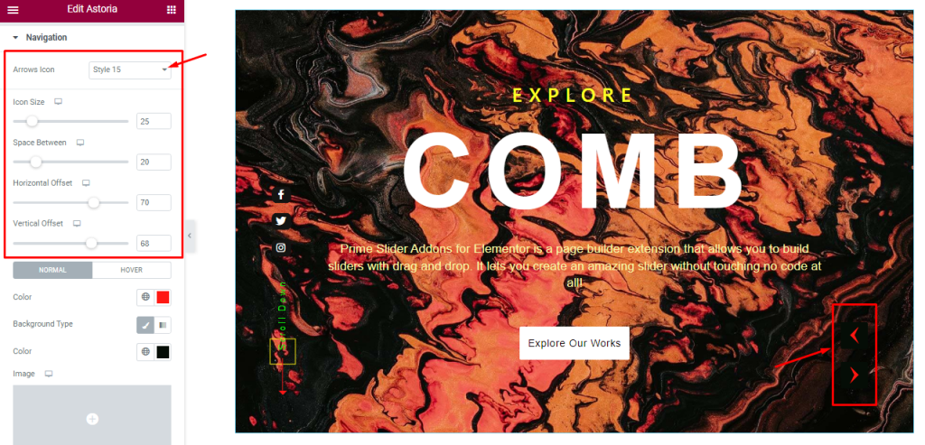
In this section, you will get to customize the Icon Size, Space Between, Horizontal Offset, and Vertical Offset for the arrow navigation. The first option Arrows Icon lets you select an arrowhead icon from 23 styles of them.
Step-2
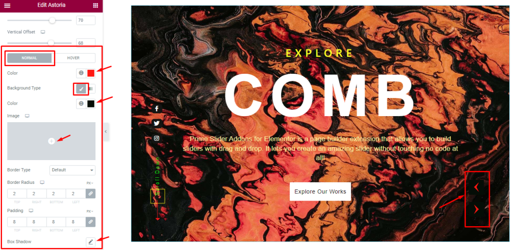
In Normal mode, you can change the arrow icon color, Background color, border, radius, padding, and box shadow.
Step-3
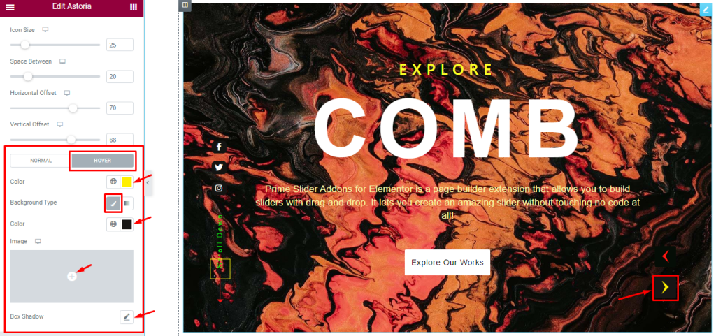
For Hover mode, arrow icon Color, Background color, and Box shadow options are available.
All done! You have successfully customized the Astoria Slider widget on your website.
Video Assist
You can watch this quick video to learn more about the Astoria Slider widget.
Thanks for staying with us.