In this documentation, we will show you how to customize the Accordion widget presented by Element Pack Pro.
Inserting The Accordion Widget
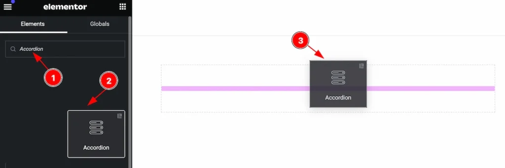
Inserting the widget by following this,
- Search by the Accordion widget name.
- Then select the appear widget ( with Element Pack Pro logo T.R corner).
- After Drag and Drop it on the Elmentor Editor page.
Content Tab
The Content tab controller displayed here offers the flexibility to adjust the layout of the widget according to your preferences.
Accordion Section
Go to Content > Accordion
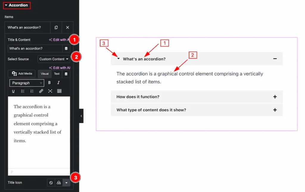
Set content for the accordion items,
- Title & Content: Set the heading for the accordion item.
- Select Source: Select source for the accordion item (e.g.: Custom Content, Elementor Template, AE Template).
- Title Icon: Select the icon for the title of the accordion item.
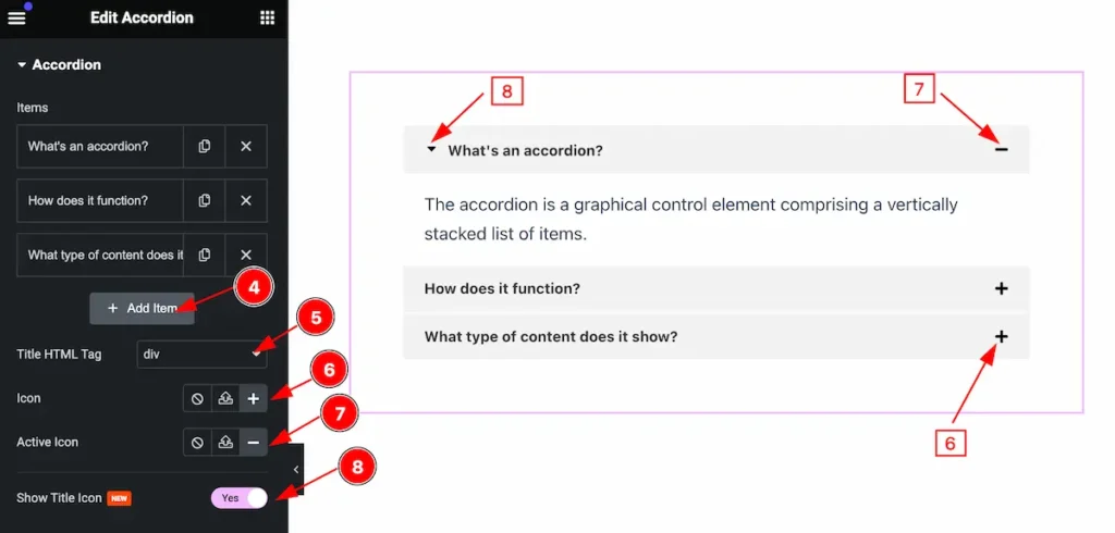
- Click the ” + Add Item ” button to add more items to the accordion.
- Title HTML Tag: Set any HTML Tag for Title ( H1, H2, H3, H4, H5, H6, p, span ). The title tag is essential for both user experience and search engine ooptimization (SEO).
- Icon: Select the Icon for the Accordion item.
- Active Icon: Set the Icon for the active item.
- Show Title Icon: Enable the switcher to show the Title Icon.
Additional Section
Go to Content > Additional
This section provides control to change the visual appearance changes,
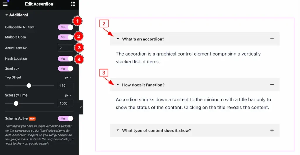
- Collapsable All Item: Enable the swither to make collapsable all accordion items.
- Multiple Open: Enable it to open multiple items at a time.
- Active Item No: Set Number to initially open the item active.
- Hash Location: Referred to as a URL fragment or anchor, it is a way to direct a web browser to a specific part of a web page. It is represented by a hash symbol (
#) followed by an identifier.
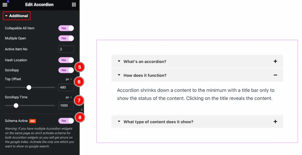
- Scrollspy: Enable the switcher to activate the Scrollspy.
- Top Offset: Set the top offset, you need to consider the height of any fixed navigation bar or header that may cover part of the section when scrolling.
- Scrollspy Time: Adding a smooth scrolling effect with Scrollspy can enhance user experience by providing a seamless transition between sections.
- Schema Active: Implementing schema for an “active” state in a Scrollspy can enhance your website’s SEO by providing structured data that search engines understand.
Style Tab
Provide the controller to make the visual appearance or presentation of the tabs. This includes aspects that are visually appealing and cohesive with the overall design of the interface.
Item Section
Go to Style > Item
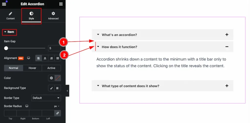
This section provides a control for the items section, Making the items visually interactive,
- Item Gap: Set the gap between the items.
- Alignment: Make the item content alignment (e.g.: Left, Center, Right, Justify).
Normal State for Item
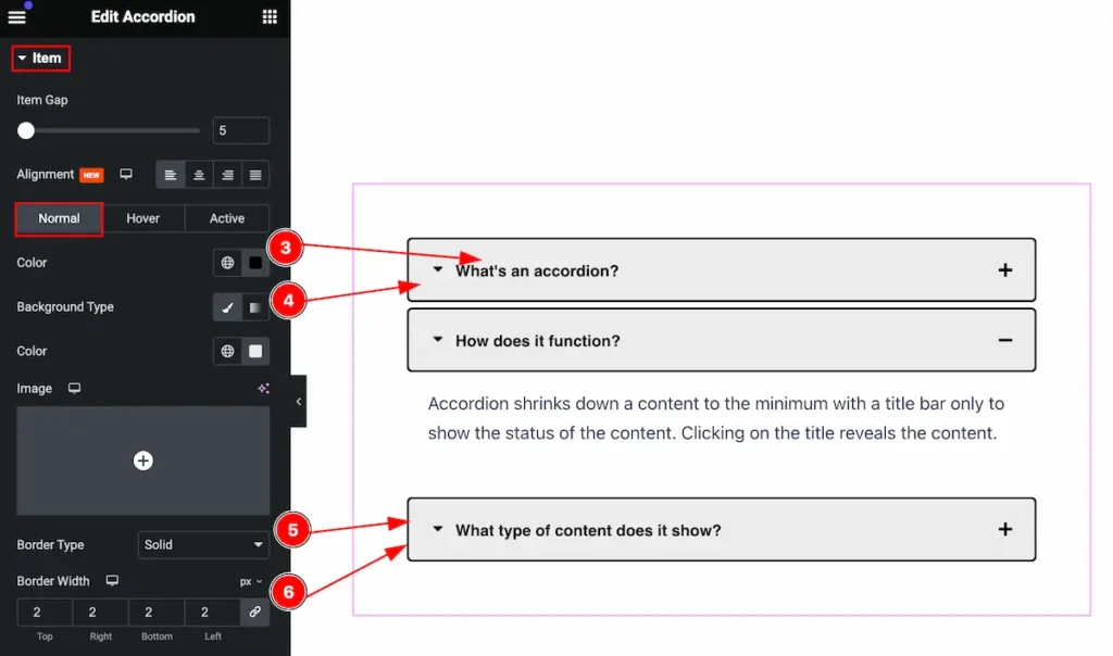
The changes will appear in a normal state,
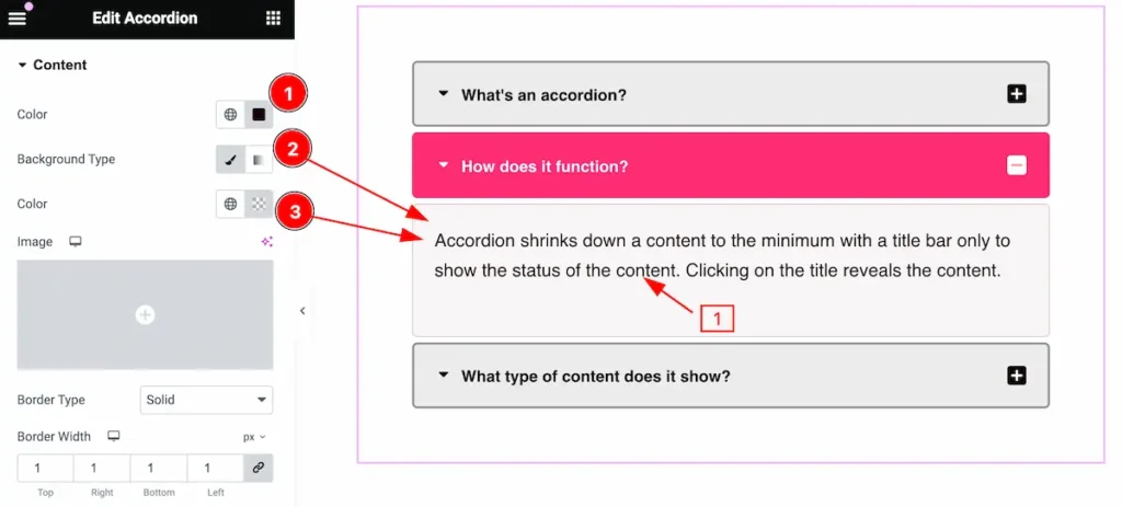
- Color: Set the color for the text.
- Background Type: Set the background type.
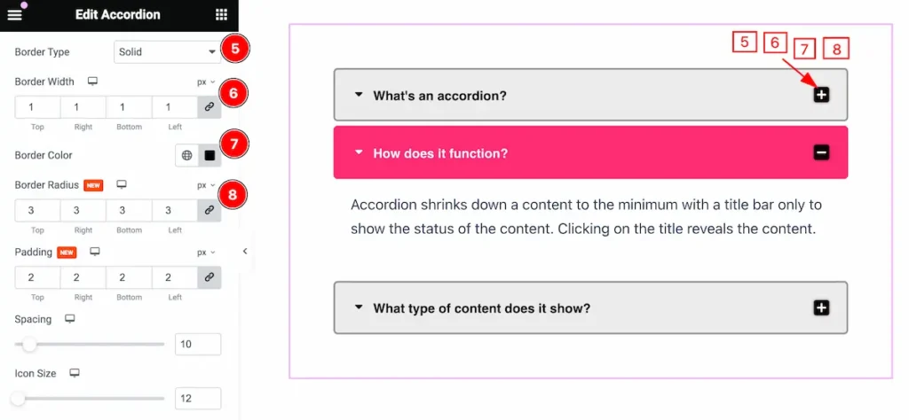
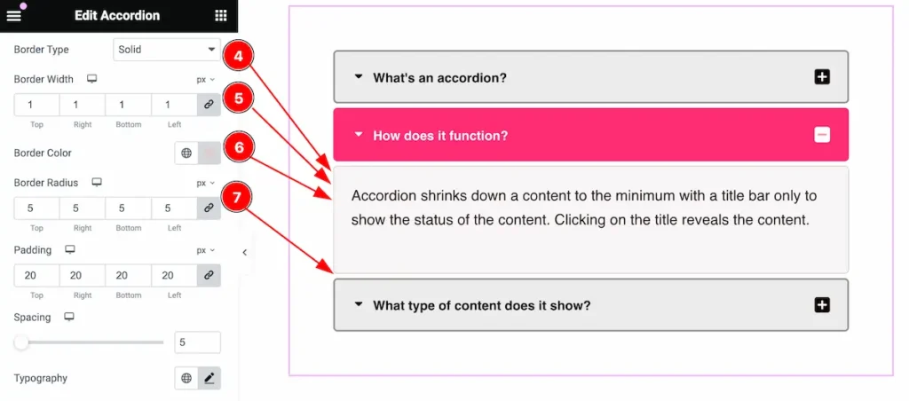
- Border Type: Set the border type for the item (e.g.: Default, Solid, Double, Dashed. etc.).
- Border Width: Set the width for the border.
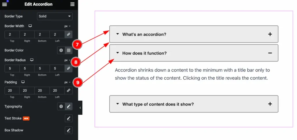
- Border Color: Set the color for the border.
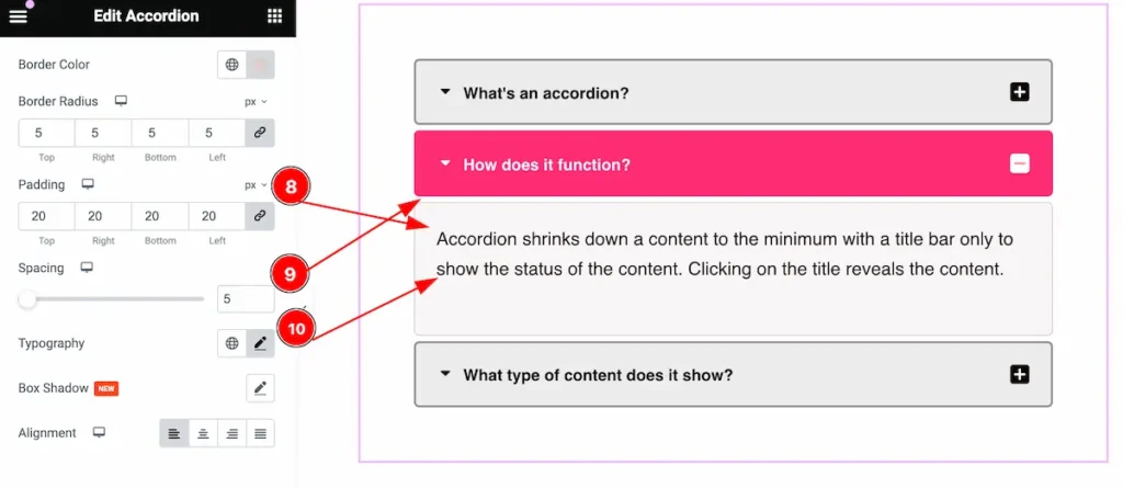
- Border Radius: Make the border corner edges rounded by setting the border-radius.
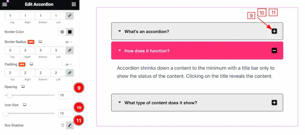
- Padding: Set the padding for the items.
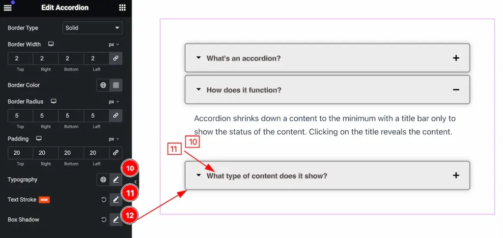
- Typography: Set the typography for the text.
- Text Stroke: Set stroke for the text.
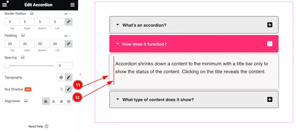
- Box Shadow: Make the shadow for the box.
Hover State for Item
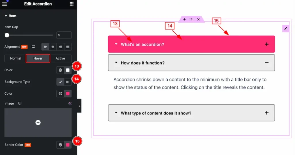
The changes will appear when hovering over the items,
- Color: Set the color for the text.
- Background Type: Set the type for the background.
- Border Color: Set the border color.
Active State for Item
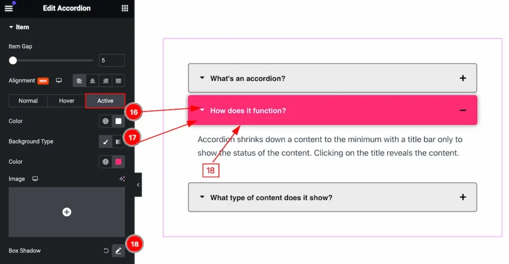
The changes will appear when the item is active,
- Color: Set the color for the text.
- Background Type: Set the type for the background.
- Border Color: Set the border color.
Title Icon Section
Go to Style > Title Icon
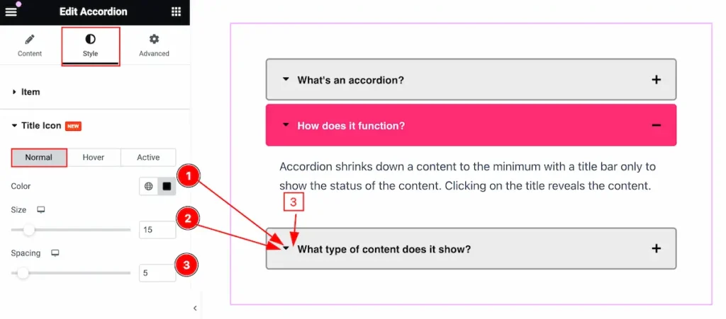
Normal State for Title Icon
Make the customization for the Normal Item,
- Color: Set the color for the title icon.
- Size: Set the size for the title icon.
- Spacing: Set spacing between the heading and the icon.
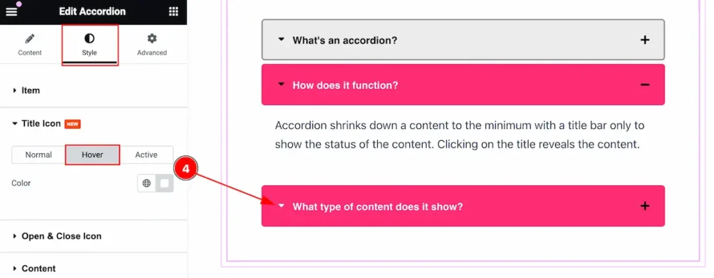
Hover State for Title Icon
Changes will appear on hover,
- Color: Set the color for the title icon.
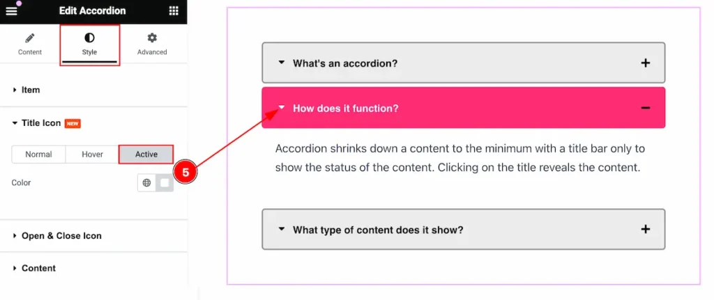
Active State for Title Icon
The changes will appear on active items,
- Color: Set the color for the Title Icon.
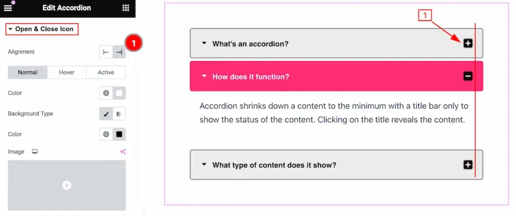
Open & Close Icon Section
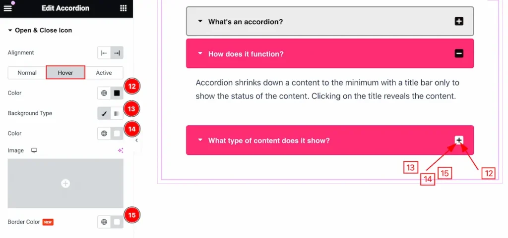
Go to Style > Open & Close Icon
Make the Open and Close Icon more customizable,
- Alignment: Set the alignment for the Icon ( e.g.: Left, Right ).
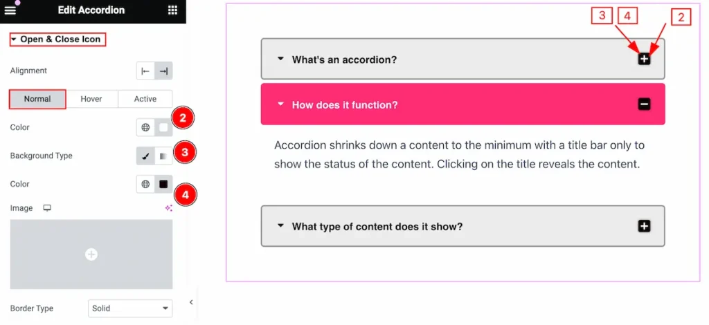
Normal State for Open & Close Icon
Make the visual appearance changes by following this,
- Color: Set the color for the Icon.
- Background Type: Select the type for the background.
- Color: Set the color for the icon.
- Border Type: Set the type for the border.
- Border Width: Set the width for the border.
- Border Color: Set color for the border.
- Border Radius: Make the border radius by following it.
- Spacing: Set the spacing for the Icon.
- Icon Size: Set the size for the icon.
- Box Shadow: Set the shadow for the icon.
Hover State for Open & Close Icon
Set the hover state for the open & close icon,
- Color: Set the color for the Icon.
- Background Type: Set the background type.
- Color: Set the color for it.
- Border Color: Set the border color.
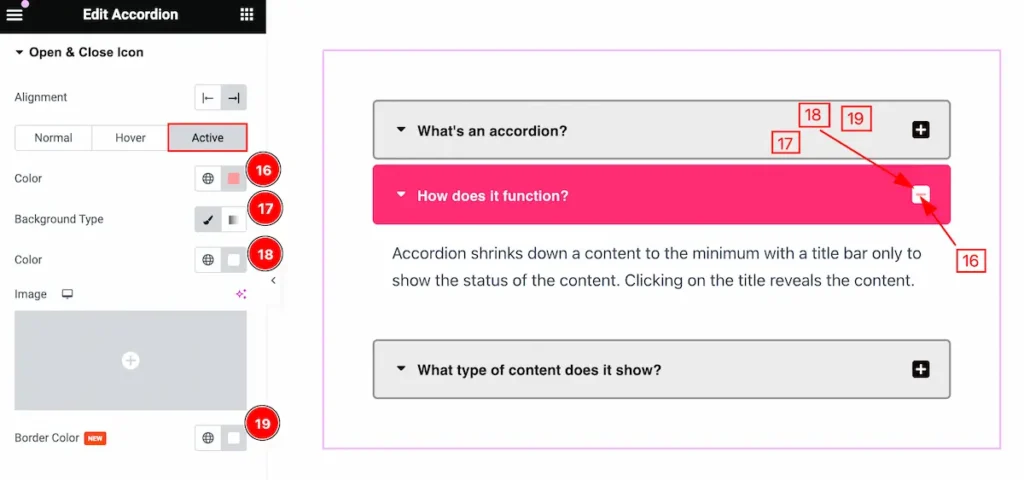
Active State for Open & Close Icon
Make the active item for the open & close icons,
- Color: Set the color for the icon.
- Background Type: Set the background type.
- Color: Set the color.
- Border Color: Set the border color for the icon.
Content Section
Go to Style > Content
Make the content section more customizable,
- Color: Set the color for the content.
- Background Type: Set the background type for the content.
- Color: Set the color for the background.
- Border Type: Set the type for the border.
- Border Width: Set the width for the border.
- Border Color: Set the color for the border.
- Border Radius: Make the border radius.
- Padding: Set the padding for the content.
- Spacing: Make space for the content.
- Typography: Set the typography for content.
- Box Shadow: Set the shadow for the content item.
- Alignment: Make the alignment for the content.
Video Assist
You can watch the video above to learn about the Accordion widget.
Please visit the demo page for examples.
Thanks for staying with us.