This documentation provides comprehensive insights into the Image Hotspot Block developed by Zoloblocks.
Adding a block to the editor
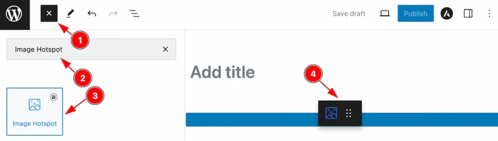
- Click the Toggle Block Inserter icon and a sidebar will appear on the left side, All the blocks will be visible here.
- Search by the Image Hotspot block name.
- Then select the appear blocks ( with zoloblocks logo T.R corner).
- After Drag and Drop it on the page.
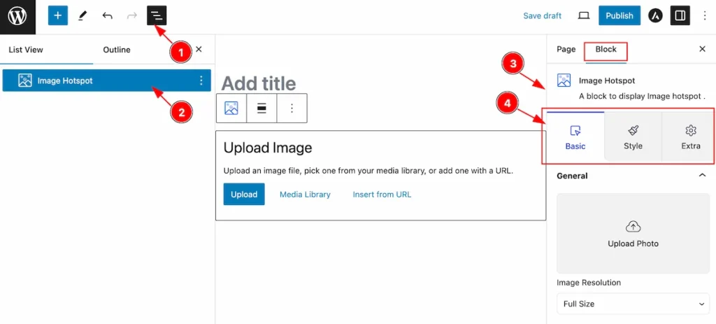
After Inserting the blocks, Follow this.
- Click on the Document Overviewer button and the Blocks list view will appear.
- Here appears the Image Hotspot block.
- After on the right side, Click on the Block. Then the Image Hotspot details appear.
- Here, it shows all the control tabs( Basic, Style, Extra ) of a block.
Basic Tab
The Basic tab controller displayed here offers the flexibility to adjust the layout of blocks according to your preferences.
General Section
Go to Basic > General
Upload Image
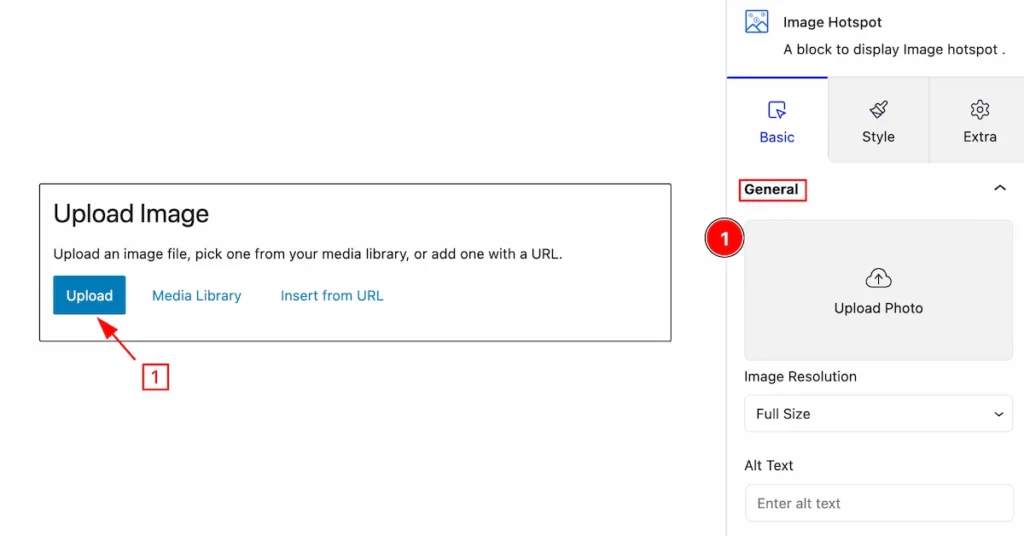
- Upload Photo: Click on the Upload button and the media library will appear, Click on it and select an image.
Image Resolution Set
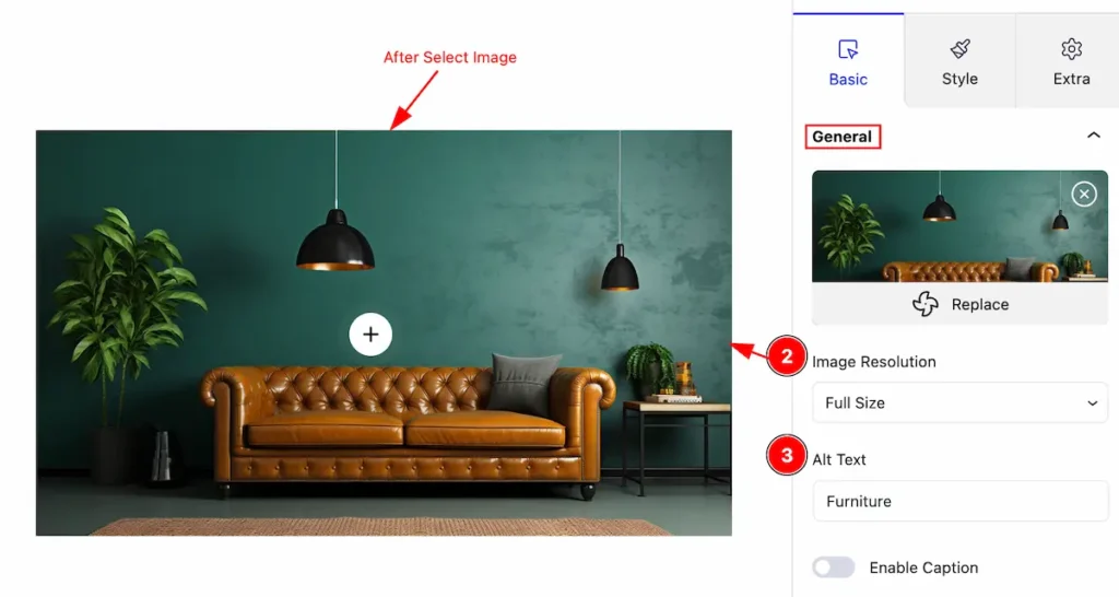
- Image Resolution: Set the resolution for the image ( e.g.: Thumbnail, Medium, Large, Full Size).
- Alt Text: Set the alt text for the image. It helps with SEO Optimization.
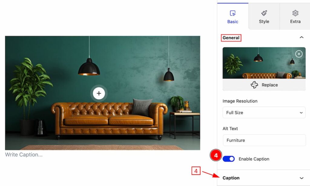
- Enable Caption: Enable the switcher to show the caption.
Caption Section
Go to Basic > Caption
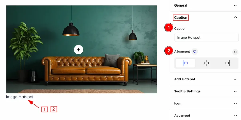
Set caption for the Image,
- Caption: Set the caption for the image.
- Alignment: Set alignment for the image.
Add Hotspot Section
Go to Basic > Add Hotspot
Add Hotspot Item
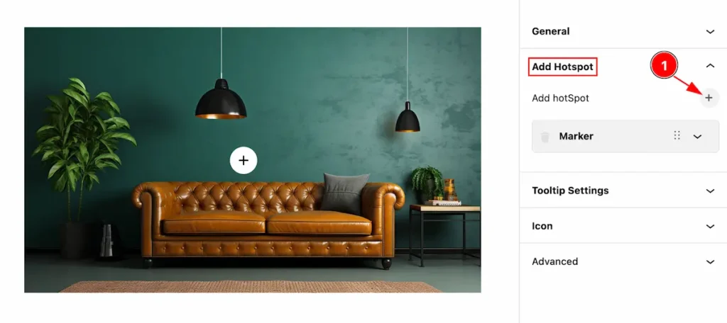
- Click on the ” + ” icon to add new add hotspot item, You can add as many you can.
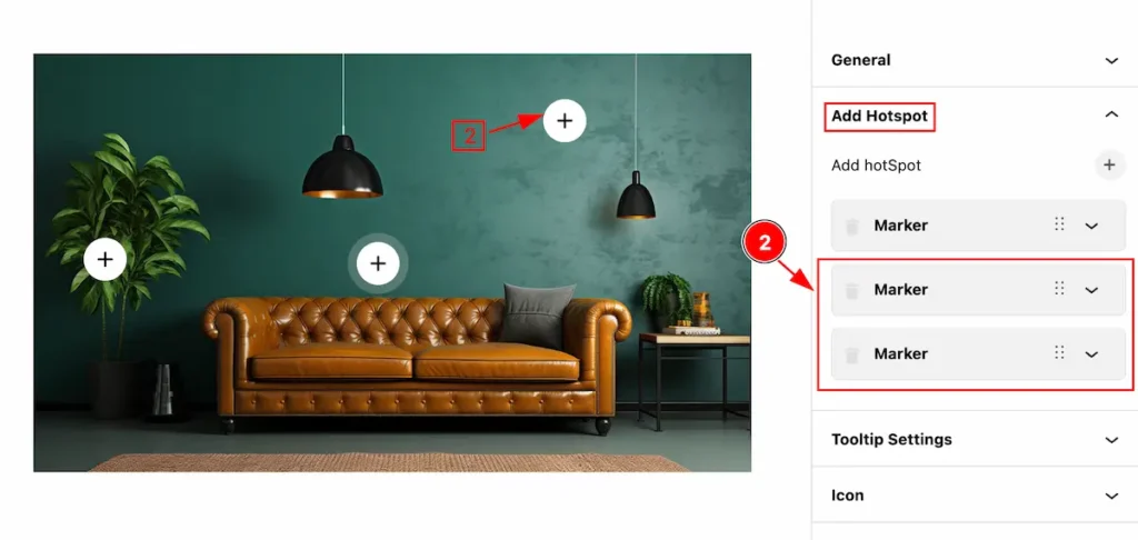
- Added hotspot item appears.
Edit Hotspot Item
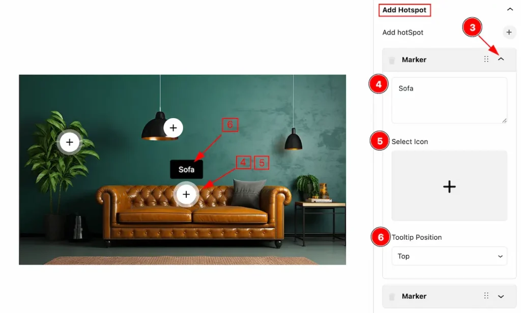
- Click on the ” Carrot ” icon and the items vissible option will appear.
- Set the hotspot text.
- Select Icon: Click on it and select icon from the Icon library.
- Tooltip Position: Set position for the tooltip(e.g.: Top, Right, Bottom, Left, etc. ).
Remove Add Hotspot Item
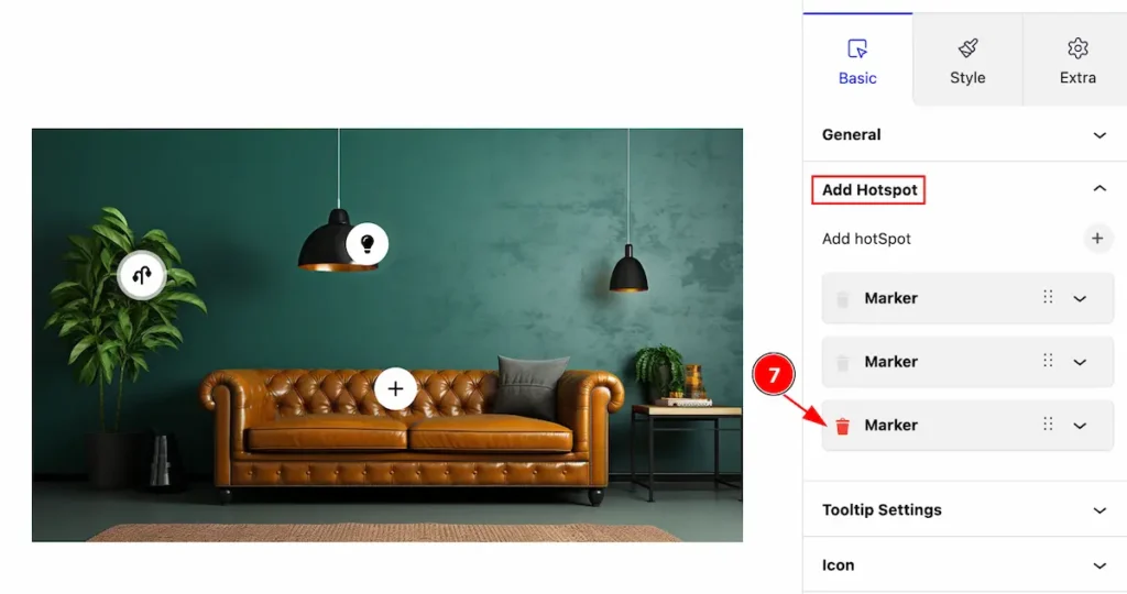
- Click on the ” Trash ” icon to remove the hotspot item.
Tooltip Settings Section
Go to Basic > Tooltip Settings
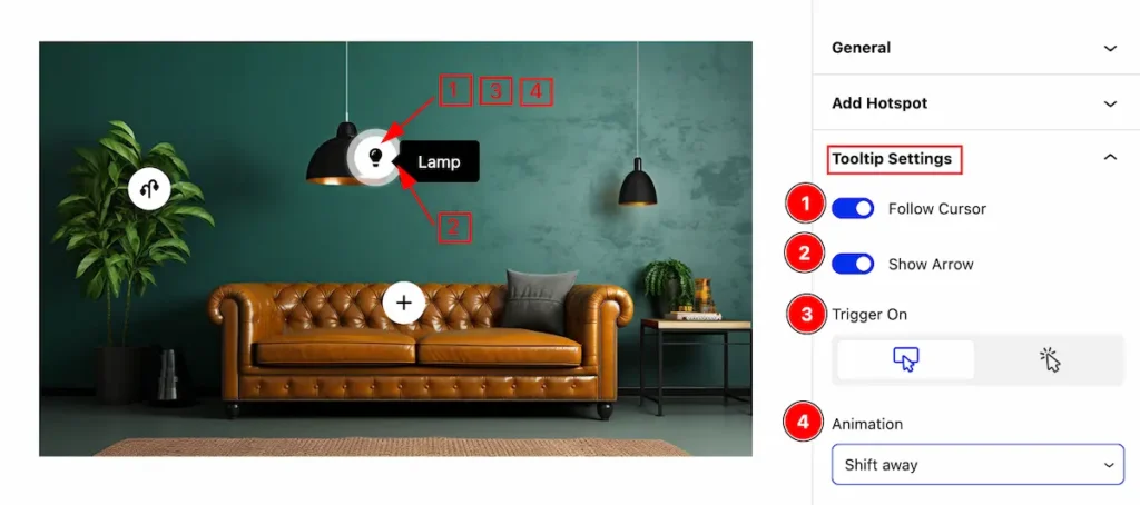
Set tooltip settings,
- Follow Cursor: Enable the switcher to appear the tooltip by following the cursor
- Show Arrow: Emable the switcher to show the Arrow.
- Trigger On: Set the trigger for the tooltip (e.g.: Hover, Click).
- Animation: Set the animation for the tooltip ( e.g.: Shift Away, Shift Forward, Scale, Perspective ).
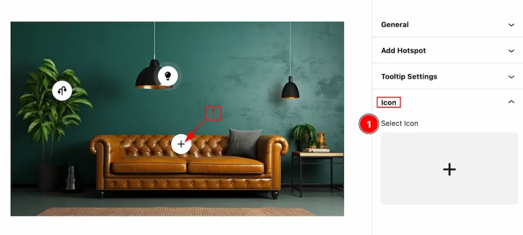
Icon Section
Go to Basic > Icon
Set icon for the tooltip,
- Select Icon: Select the icon for the hotspot from the icon library.
Style Tab
Provide the controller to make the visual appearance or presentation of the tabs. This includes aspects visually appealing and cohesive with the overall design of the interface.
Image Section
Go to Style > Image
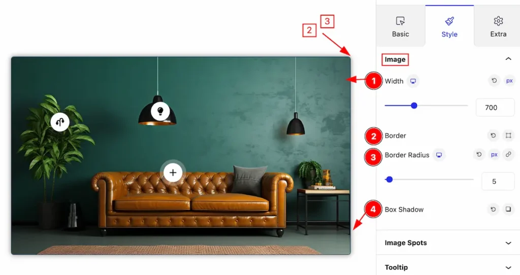
Make the image section custimization by following,
- Width: Set width for the image.
- Border: Set the border for the image.
- Border Radius: Make the border radius by following this.
- Box Shadow: Set the box shadow.
Image Spots Section
Go to Style > Image Spots
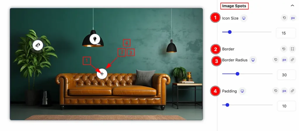
Make the image spots stylish by following ,
- Icon Size: Set the size for the image spots.
- Border: Set the border for the spots
- Border Radius: Set the radius for the border.
- Padding: Set the padding for the image spots.
Normal State for Image Spot
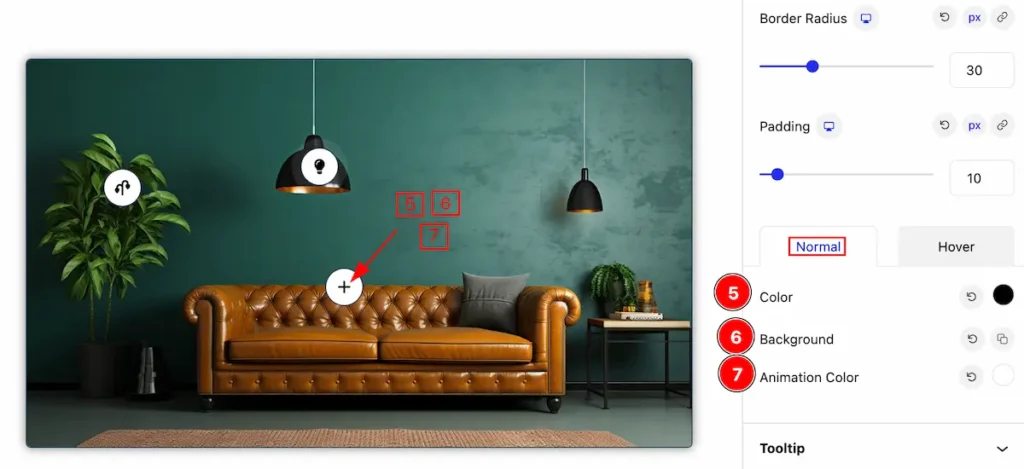
- Color: Set the color for the hotspot icon.
- Background: Set the background for the image hotspot.
- Animation Color: Set the color for the animation.
Hover State for Image Spot
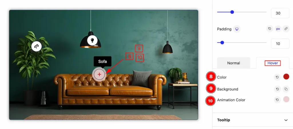
The change will appear on mouse hover,
- Color: Set the color for the hotspot icon.
- Background: Set the background for the image hotspot.
- Animation Color: Set the color for the animation.
Tooltip Section
Go to Style > Tooltip
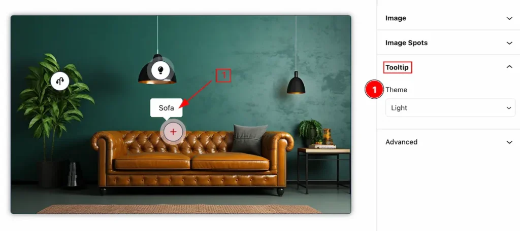
- Theme: Select theme for the image hotspot (e.g.: Dark, Light).
Extra Tab Control
The extra tabs provide the controls of any blocks. You can make different visual layouts by following these Controls.
Click to learn more>>.
Video Assist
Video Tutorial coming soon!
Check the Demo Page.
Thanks for being with us!
