This documentation provides comprehensive insights into the Fancy List Blocks developed by Zoloblocks.
Adding a block to the editor
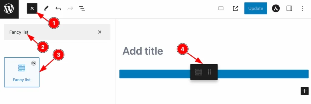
- Click the Toggle Block Inserter icon and a sidebar will appear on the left side, All the blocks will be visible here.
- Search by the Fancy List block name.
- Then select the appear blocks ( with zoloblocks logo T.R corner).
- After Drag and Drop it on the page.
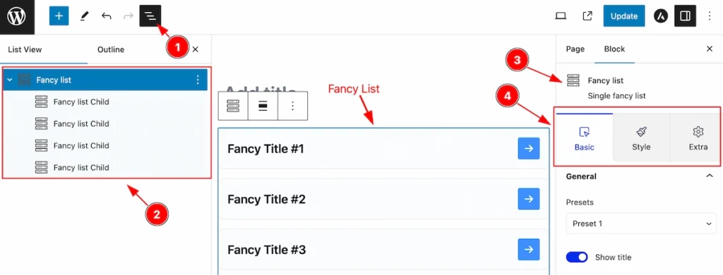
After Inserting the blocks, Follow this.
- Click on the Document Overviewer button and the Blocks list view will appear.
- Here appears the Fancy list and its child block.
- After on the right side, Click on the Block. Then the fancy list details appear.
- Here show all the control tabs( Basic, Style, Extra ) of a block.
Basic Tab (Parents Blocks)
The Basic tab controller displayed here offers the flexibility to adjust the layout of blocks according to your preferences. Customize for the Parent’s blocks. Any changes applied will all items
General Section
Go to Basic > General
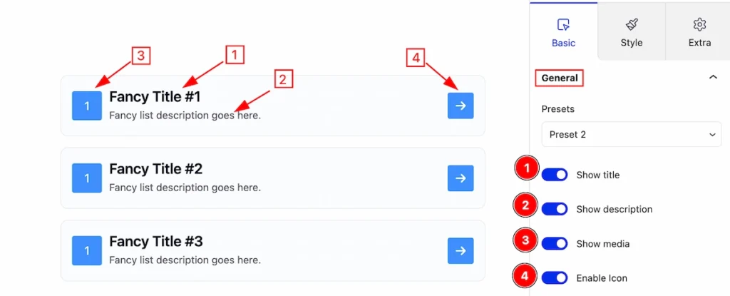
In this section, you can set the general controls of accordion,
- Show Title: Enable this switcher will show the Title.
- Show Description: To show the description please enable the switcher.
- Show Media: Enabling this switcher will allow you to show the Media.
- Enable Icon: Enabling this switcher to show the Icon.
Gird Section
Go to Basic > Grid
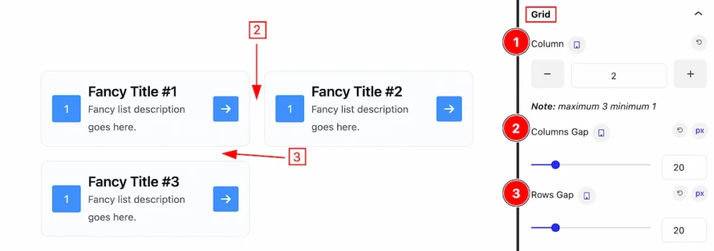
This section provides control to customize the grid for the fancy list items.
- Column: Set the column number for the items.
- Columns Gap: Set the gap between the columns.
- Rows Gap: Set the gap between the rows.
Media Section
Go to Basic > Media
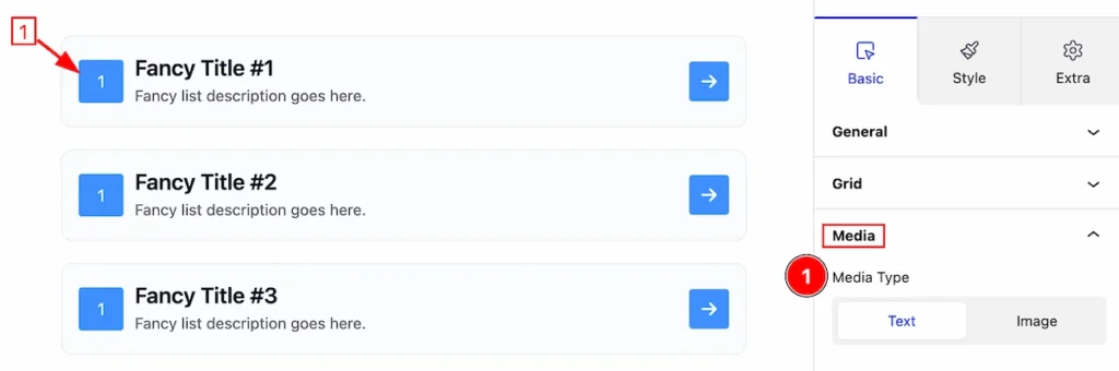
In this section, you can set the media type,
- Media Type: Set the media type Text to show the text.
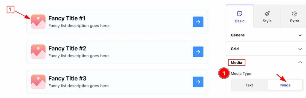
- Media Type: Select the Image as a media type.
Style Tab (Parents Blocks)
Provide the controller to make the visual appearance or presentation of the tabs. This includes aspects visually appealing and cohesive with the overall design of the interface.
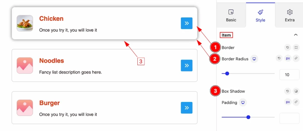
Item Section
Go to Style > Item
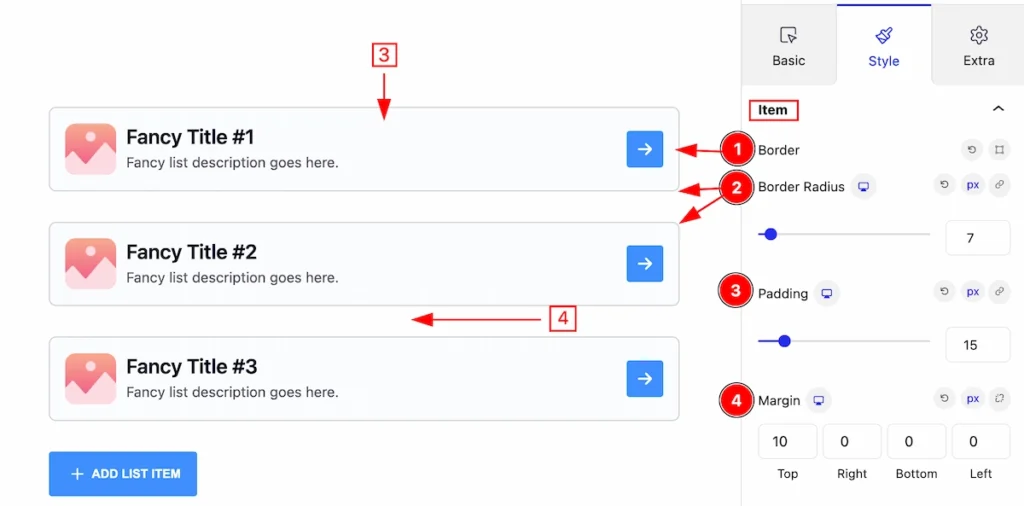
This section has several controls to customize the Item of the Fancy list.
- Border: Set the border for the item.
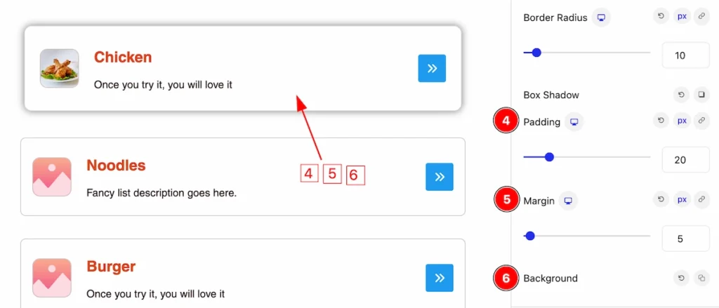
- Border Radius: Set the border radius of the item.
- Padding: Set padding for the inner space of the item.
- Margin: Set margin for outer space.
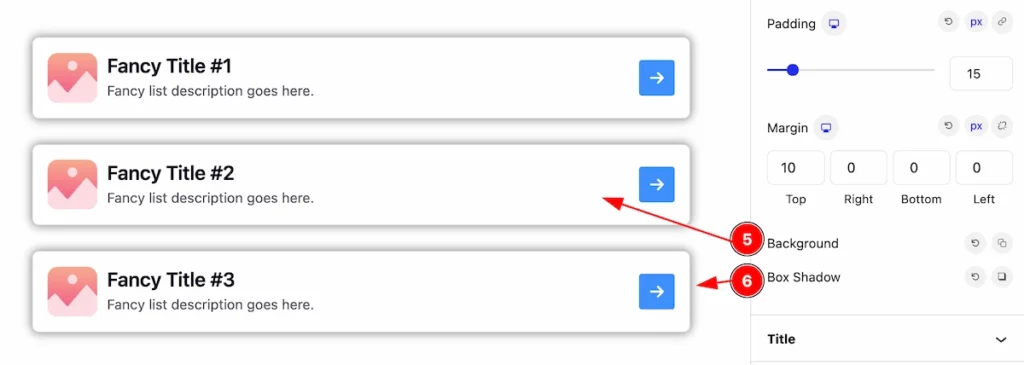
- Background: Set the background for the item.
- Box Shadow: Set the box shadow of the item.
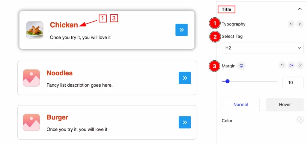
Title Section
Go to Style > Title
Here you can customize the appearance of the Title,
- Typography: Set the typography of the Title.
- Title Tag: Set any HTML Tag for Title ( H1, H2, H3, H4, H5, H6, p, span ). The title tag is essential for both user experience and search engine optimization (SEO).
- Margin:
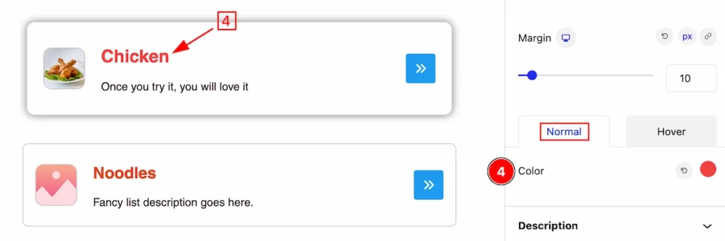
Normal State of Title
- Color: Set the Color for the Title, in a normal state.
Hover State of Title
- Hover Color: Set the hover color for this title, It will work on mouse hover.
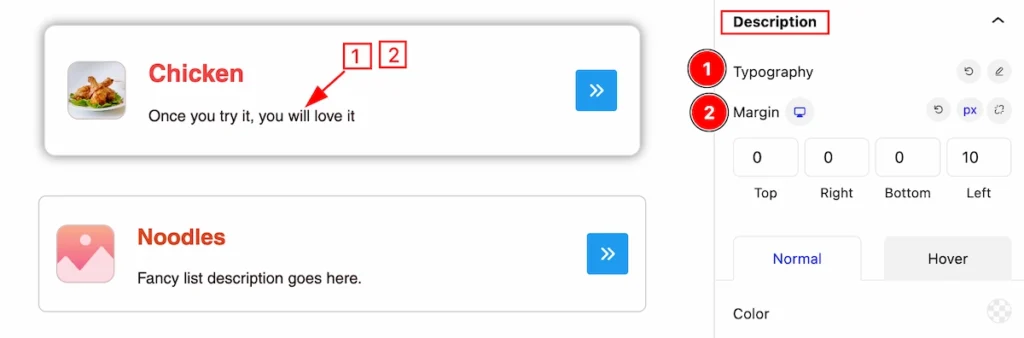
Description Section
Go to Style > Description
This section provides controls to change the appearance of the description,
- Typography: Set the typography for the description.
- Magin: Set margin for the outer spacing of the description.
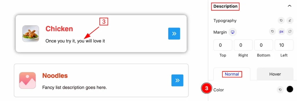
Normal State of Description
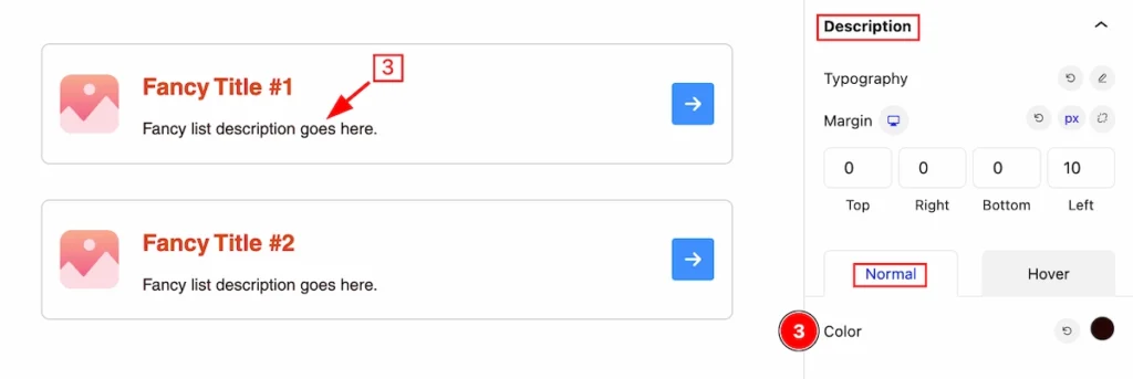
- Color: Set the color for this description, in the normal state.
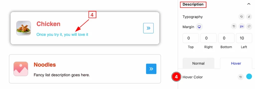
Hover State of Description
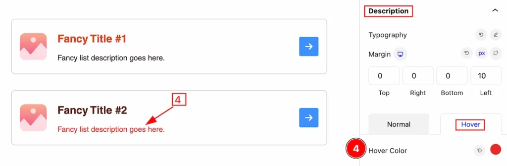
- Hover Color: Set the Hover color for this description, It works on the hover state.
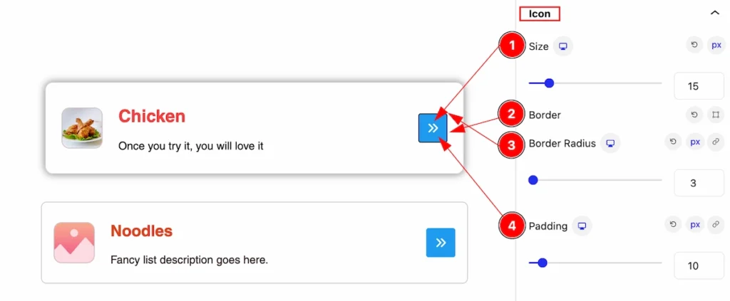
Icon Section
Go to Style > Icon
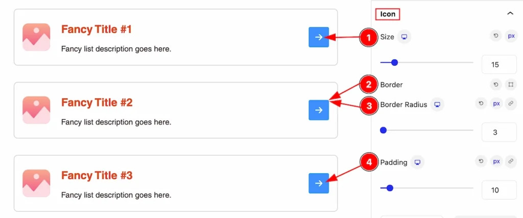
This section provides control for the Icon,
- Size: Set the size of the icon.
- Border: Set the border of this icon.
- Border Radius: Set the border radius for this icon.
- Padding: Set padding for inner spacing.
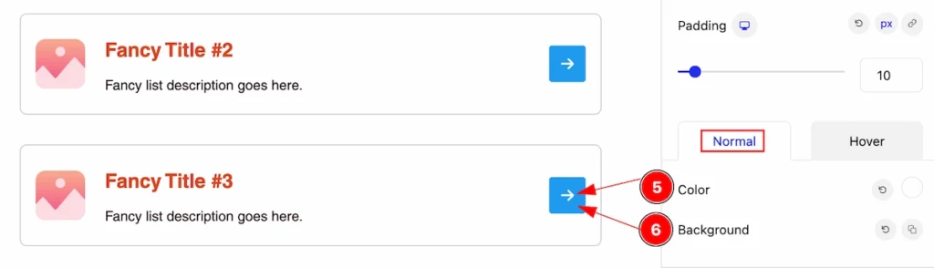
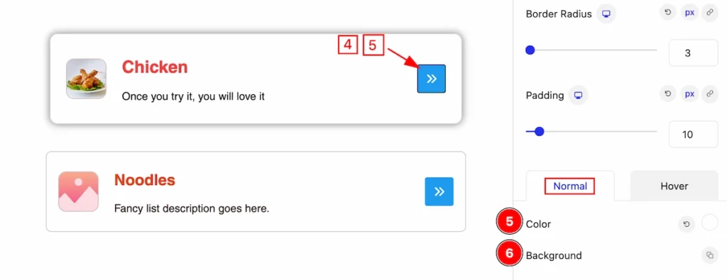
Normal State of Icon
- Color: Set the color of the icon.
- Background: Set the background for the icon.
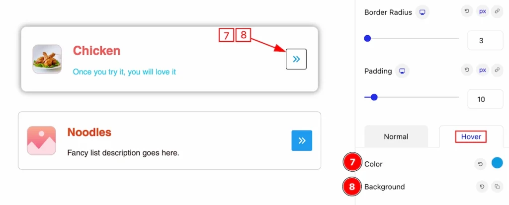
Hover State of Icon
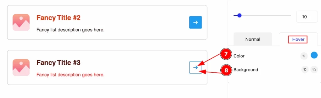
- Color: Set the color for the icon in the hover state.
- Background: Set the Background for the icon in the hover state.
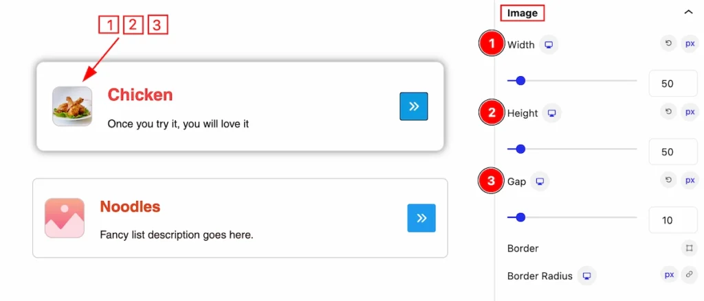
Image Section
Go to Style > Image
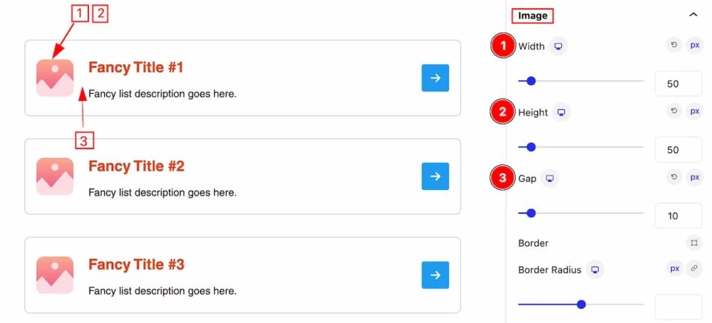
This section provides controls of the Image,
- Width: Set the width of the image.
- Height: Set the Height of the image.
- Gap: Set the gap between the image and the icon.
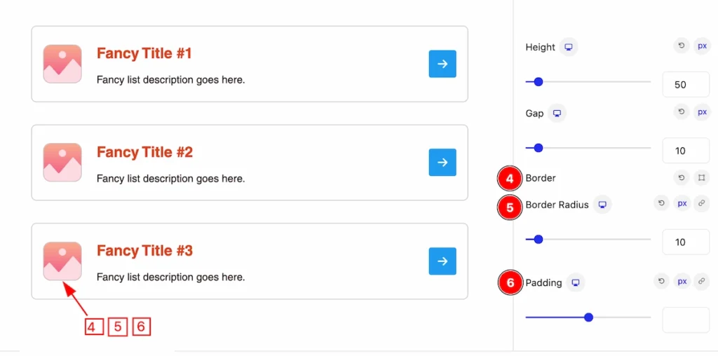
- Border: Set the border of the image.
- Border Radius: Set the border corner edges rounded by following the radius.
- Padding: Set the padding for the image.
Fancy List (Child Blocks)
Here we will work with the Child blocks of Fancy List. The changes will applied to the relevant item only. Let’s follow this.
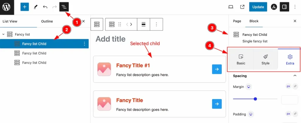
- Click on the Document Overviewer button and the Blocks list view will appear.
- Select the Fancy List Child block under the Fancy List parent blocks.
- On the right side, the selected Fancy List Child details will appear.
- The Fancy List Child controls will appear here. ( Basic, Style, Extra ).
Basic Tab ( Child Block )
This tab provides control to customize the child item of the Fancy list child.
Content Section
Go to Basic > Content
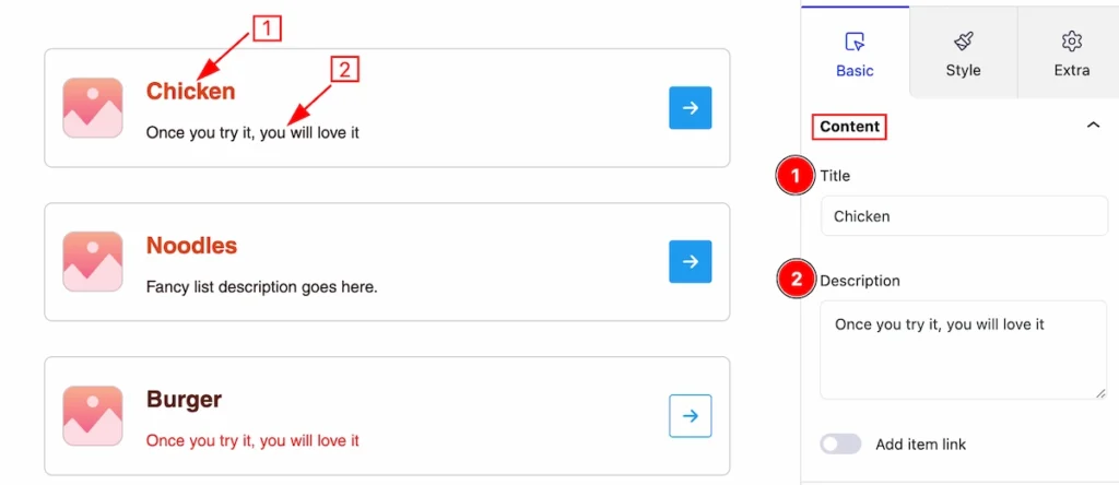
In this section, you can set the content for the fancy list child item.
- Title: Set the title for the single item.
- Description: Set the description for the child item.
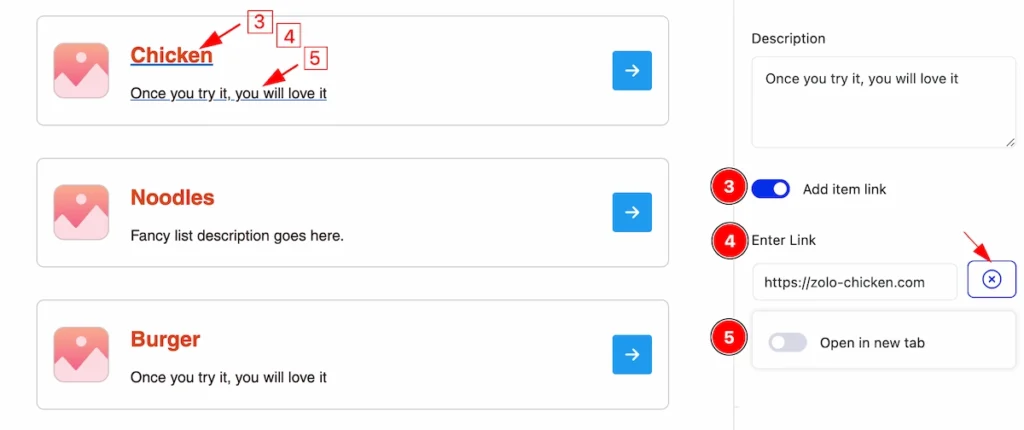
- Add item link: Enable the switcher will allow you to set a link for the item.
- Enter Link: Set the link for the relevant item.
- Open in new tab: This switcher works on navigating the link. Disable this to open default.
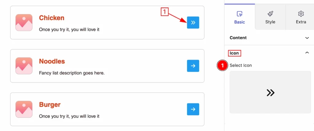
Icon Section
Go to Basic > Icon
Here set the icon for the single item.
- Select Icon: Click on it and an icon library will open then select any icon you prefer.
Media Section
Go to Basic > Media
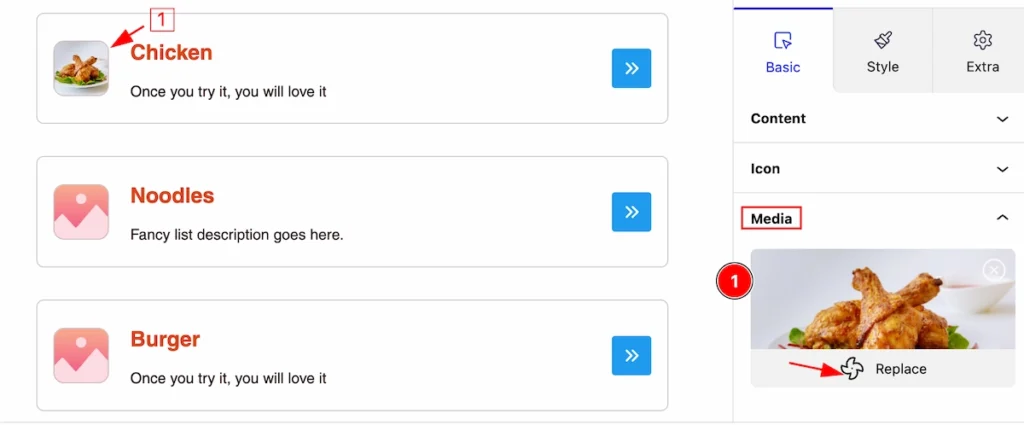
This section provides controls for selecting the media,
- Click on the Replate and it will open a media library, select any media image that you prefer.
Style Tab ( Child Block )
This tab provides the controls of the Fancy List Child Items. The changes will apply only to relevant items. Let’s Explore all the controls.
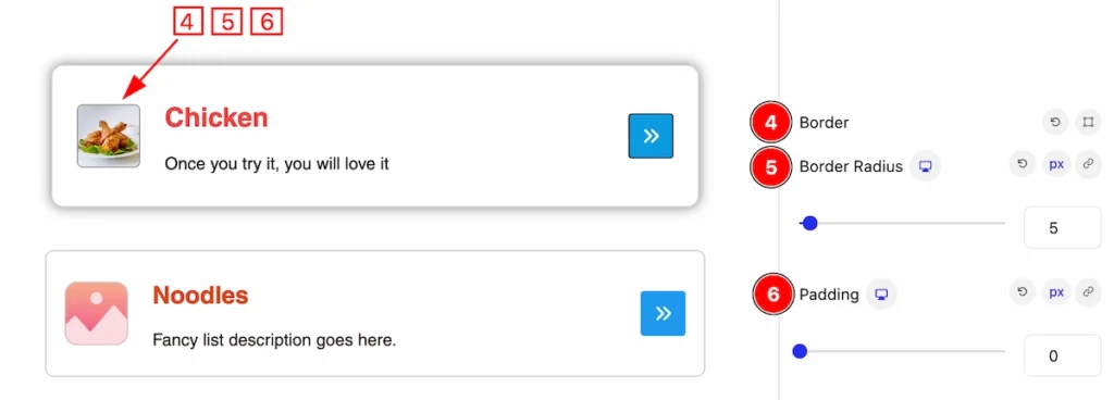
Item Section
Go to Style > Item
In this section, you can customize the item for interactive style,
- Border: Set the border for the single item.
- Border Radius: Make the border radius by following it.
- Box Shadow: Set the shadow of the box.
- Padding: Set the padding of the item.
- Margin: Set the margin for the item.
- Background: Set the background color of the item.
Title Section
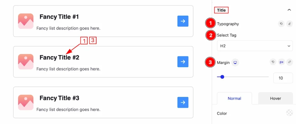
Go to Style > Title
This section provide the customization of the Title,
- Typography: Set the typography for the Title.
- Select Tag: Set any HTML Tag for Title ( H1, H2, H3, H4, H5, H6, p, span ). The title tag is essential for both user experience and search engine optimization (SEO).
- Margin: Set the margin for the title.
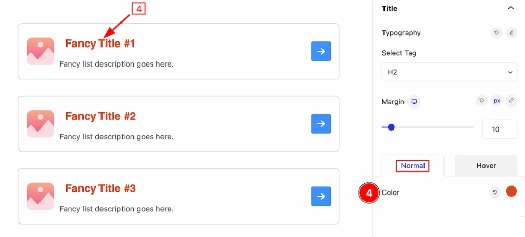
Normal State of Title
- Color: Set the color for the Title in a normal state.
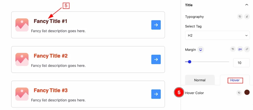
Hover State of Title
- Hover Color: Set the hover color for the Title.
Description Section
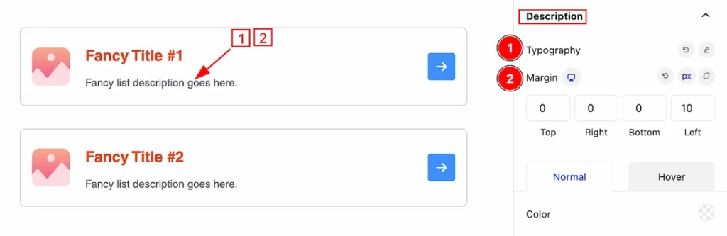
Go to Style > Description
This section provides the control to customize the Descriptions,
- Typography: Set the typography for the description.
- Margin: Set margin for the description.
Normal State of Description
- Color: Set the color of the description. It appears in a normal state.
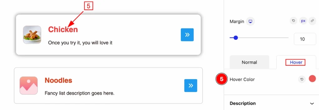
Hover State of Description
- Hover Color: Set the hover color for the descriptions. it will work after hovering over it.
Icon Section
Go to Style > Icon
This section provides controls to customize the Icon,
- Size: Set the size of the icon.
- Border: Set the border for the icon.
- Border Radius: Set border radius for this Icon.
Normal State of Icon
- Color: Set the color of the Icon.
- Background:
Hover State of Icon
- Color: Set the color of the Icon.
- Background: Set the background color for the icon. It will work on hover.
Image Section
Go to Style > Image
This section provides controls to customize the image,
- Width: Set the width of the image.
- Height: Set the height of the image.
- Gap: Set between the image and content.
- Border: Set the border of the Image.
- Border Radius: Set border radius for making corner edges rounded.
- Padding: Set the padding of the Image.
Extra Tab Controls
The extra tabs provide the controls of any blocks. You can make different visual layouts by following these Controls.
Click to learn more>>.
Video Assist
Video Tutorial Coming Soon! Check the demo page.
Thanks for being with us!