This documentation provides comprehensive insights into the Data Table Block developed by Zoloblocks.
Adding a block to the editor
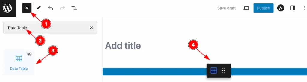
- Click the Toggle Block Inserter icon and a sidebar will appear on the left side, All the blocks will be visible here.
- Search by the Data Table block name.
- Then select the appear blocks ( with zoloblocks logo T.R corner).
- After Drag and Drop it on the page.
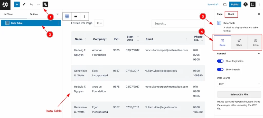
After Inserting the blocks, Follow this.
- Click on the Document Overviewer button and the Blocks list view will appear.
- Here appears the Data Table block.
- After on the right side, Click on the Block. Then the Data Table details appear.
- Here shows all the control tabs( Basic, Style, Extra ) of a block.
Basic Tab
The Basic tab controller displayed here offers the flexibility to adjust the layout of blocks according to your preferences.
General Section
Go to Basic > General
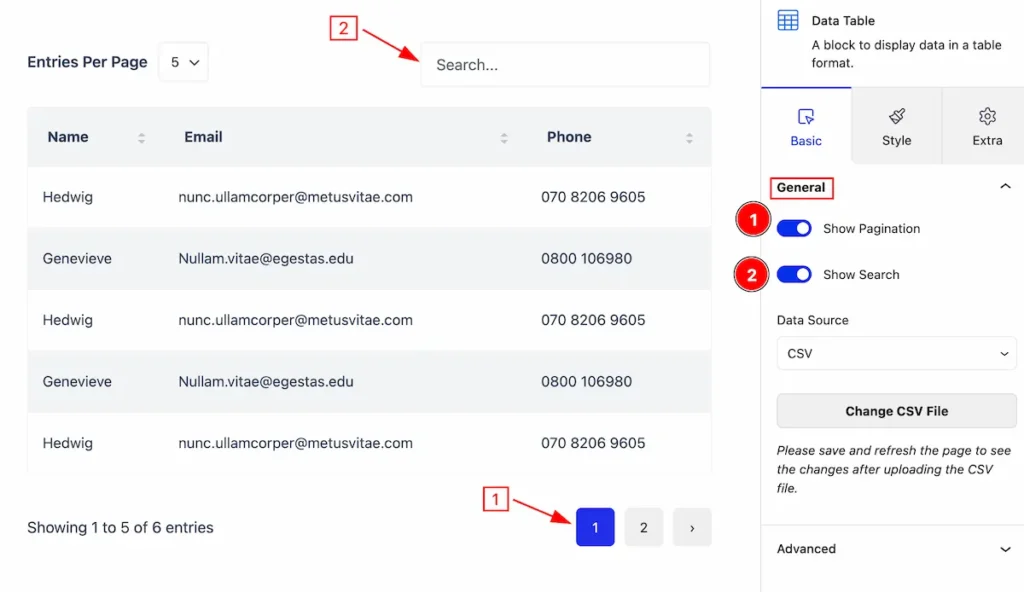
This section provides a control for the general section,
- Show Pagination: Enable the switcher to show the pagination.
- Show Search: Enable the switcher to show the Search box.
Change CSV File
- Data Source: Select the data source (e.g.: CSV, Google Sheets).
- Change CSV File: Click on the ” change csv file button ” and upload new csv file.
Style Tab
Provide the controller to make the visual appearance or presentation of the tabs. This includes aspects visually appealing and cohesive with the overall design of the interface.
Entries Per Page
Go to Style > Entries Per Page
Make the customization for the entries tab, and Make the basic appearance changes.
Per Page Tab
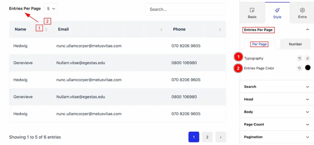
- Typography: Set the typography for the Entries per page
- Entries Page Color: Set entries page color.
Number Tab
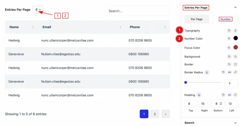
- Typography: Set the typography for the number.
- Number Color: Set the color for the number.
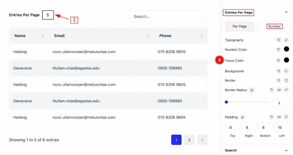
- Focus Color: Set the focus color.
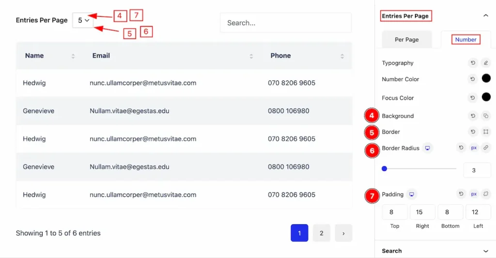
- Background: Set the background color.
- Border: Set the border for the number.
- Border Radius: Set the border-radius.
- Padding: Set padding for the
Search Section
Go to Style > Search
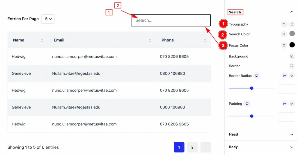
- Typography: Set the typography for the search.
- Search Color: Set the search color.
- Focus Color: Set the focus color.
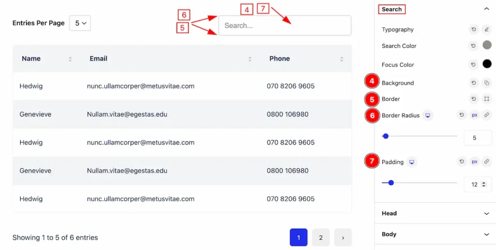
- Background: Set the background for the search.
- Border: Set the border.
- Border Radius: Set the border radius.
- Padding: Set the padding.
Head Section
Go to Style > Head
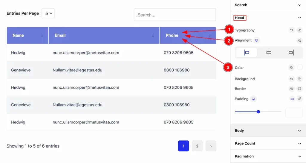
This section provides control to customize the Head section,
- Typography: Set the typography for the head.
- Alignment: Set the alignment for the head.
- Color: Set the color for the head.
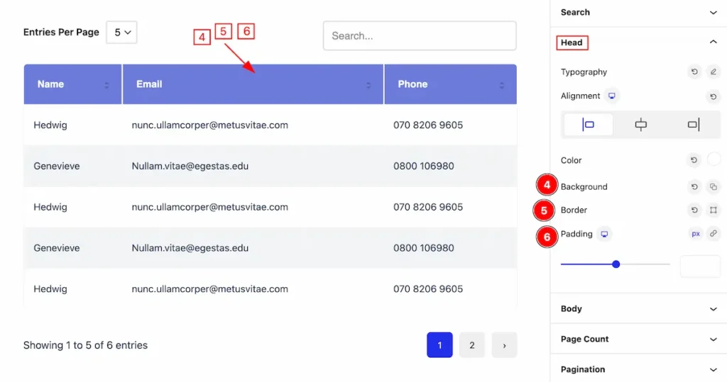
- Background: Set the background for th head.
- Border: Set the border.
- Padding: Set inner spacing by setting the padding.
Body Section
Go to Style > Body
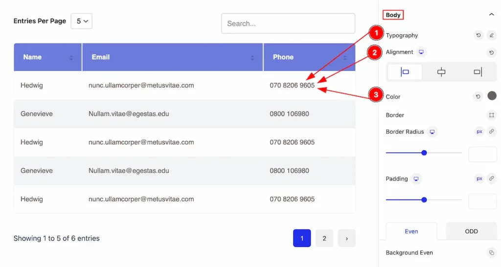
Make the body section customization by following the controls,
- Typography: Set the typography for the body.
- Alignment: Set the alignment for the body.
- Color: Set the color for the body.
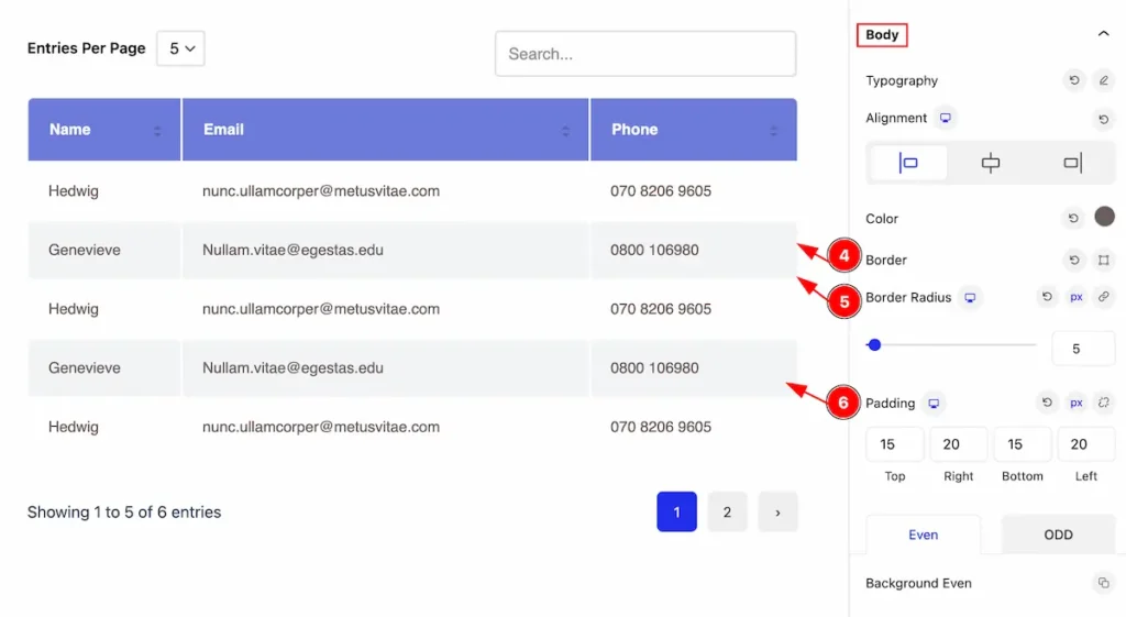
- Border: Set the border for th head.
- Border Radius: Set the border corner edges rounded.
- Padding: Set inner spacing by setting the padding.
Even Tab
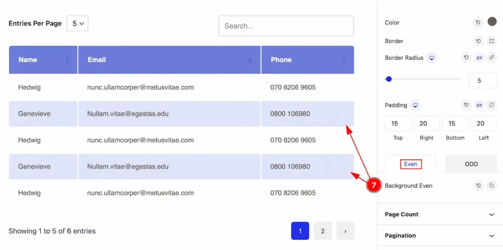
- Background Even: Set the background for the Even.
ODD Tab
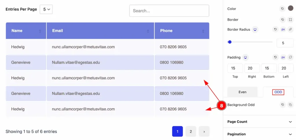
- Background Odd: Set the background for the Odd.
Page Count Section
Go to Style > Page Count
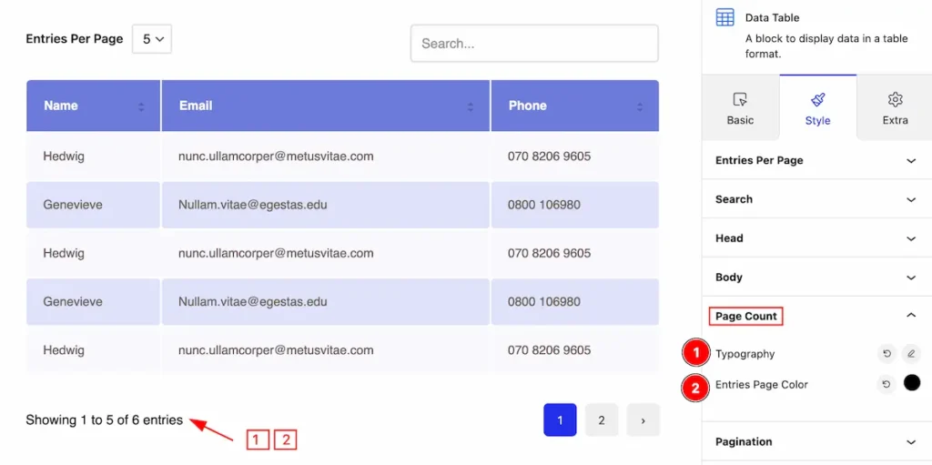
Make this page count customization,
- Typography: Set the typography for the page count.
- Entries Page Color: Set the entries page color.
Pagination Section
Go to Style > Pagination
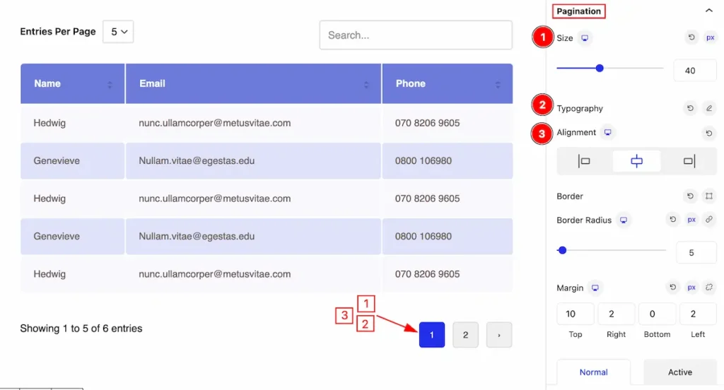
Make the pagination section more customizable the appearances changes,
- Size: Set the size for the pagination number.
- Typography: Set the typography.
- Alignment: Set the alignment for the typography.
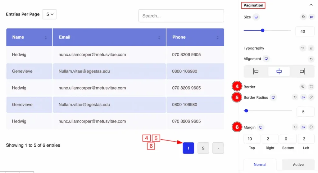
- Border: Set the border for the pagination.
- Border Radius: Set the radius for the border.
- Margin: Set margin for pagination.
Normal tab
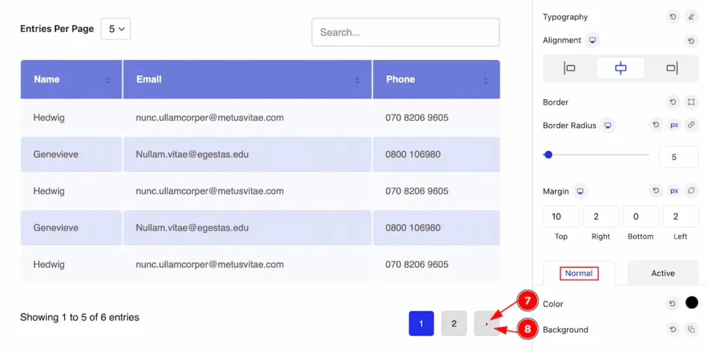
- Color: Set the color for the pagintion.
- Background: Set the backgroud for the normal.
Active Tab
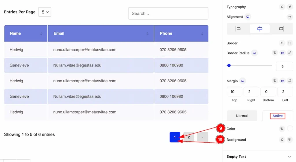
The changes appears for the normal tab,
- Color: Set the color for the pagintion.
- Background: Set the backgroud for the normal.
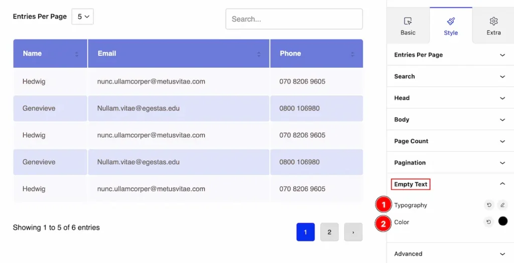
Empty Text Section
Go to Style > Empty Text
Set appearacne change sfor the empty text,
- Typography: Set the typography for the empty text.
- Color: Set the color for the text.
Extra Tab Control
The extra tabs provide the controls of any blocks. You can make different visual layouts by following these Controls.
Click to learn more>>.
Video Assist
Video Tutorial coming soon!
Check the Demo Page.
Thanks for being with us!
