This documentation provides comprehensive insights into the Counter blocks developed by Zoloblocks.
Adding a block to the editor
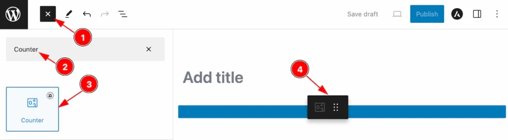
- Click the Toggle Block Inserter icon and a sidebar will appear on the left side, All the blocks will be visible here.
- Search by the Counter block name.
- Then select the appear blocks ( with zoloblocks logo T.R corner).
- After Drag and Drop it on the page.
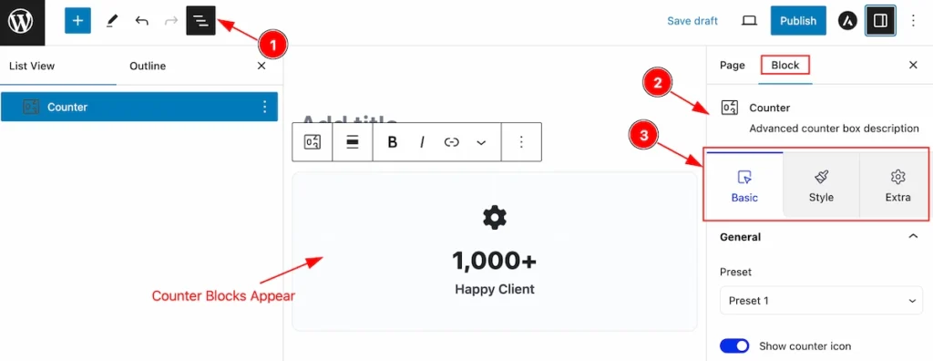
After Inserting the blocks, Follow this.
- Click on the Document Overviewer button and the Blocks list view will appear.
- After on the right side, Click on the Block. Then the advanced icon box details appear.
- Here show all the control tabs( Basic, Style, Extra ) of a block.
Basic Tab
The Basic tab controller displayed here offers the flexibility to adjust the layout of blocks according to your preferences.
General Section
Go to Basic > General
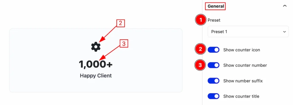
This section provides the controls for the Layout of the Counter block,
- Presets: It’s a predefined design, Select any of them.
- Show counter icon: Enable the switcher which will show the Icon.
- Show counter number: Enable the switcher to show the counter number.
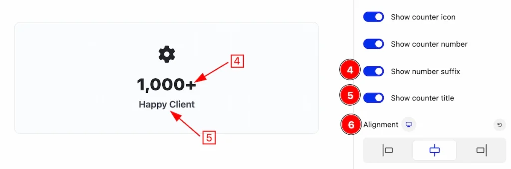
- Show number suffix: Enable the switcher to show the Suffix after the counter number.
- Show counter title: Enable this switcher to show the title.
- Alignment: Set the alignment for the content ( Left, Center, Right ).
Content Section
Go to Style > Content
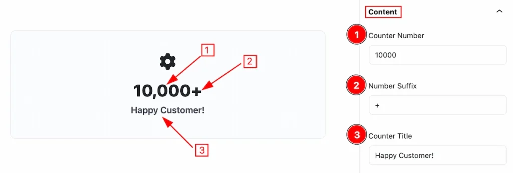
In this section, you can set the content of the counter block.
- Counter Number: Enter the counter number.
- Number Suffix: Set the Number Suffix.
- Counter Title: Set the Title for the Counter.
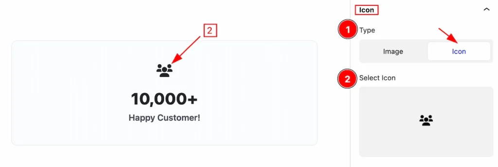
Icon Section
Go to Basic > Icon
This section provides controls to select the Icon,
- Type: Two types are available here ( Image or Icon ). Selected the Icon.
- Select Icon: Select the Icon from the Icon library.
Style Tab
Provide the controller to make the visual appearance or presentation of the tabs. This includes aspects visually appealing and cohesive with the overall design of the interface.
Container Section
Go to Style > Container
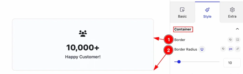
In this section, you can customize the container,
- Border: Set the border for the container.
- Border Radius: Make the border corner edges rounded.
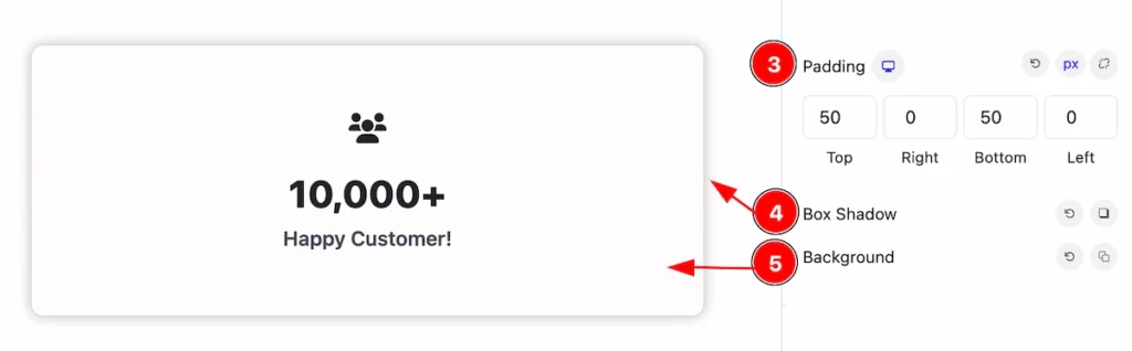
- Padding: Set the padding of the container.
- Box Shadow: Make the shadow of the container.
- Background: Set the background of the container.
Media Section
Go to Style > Media
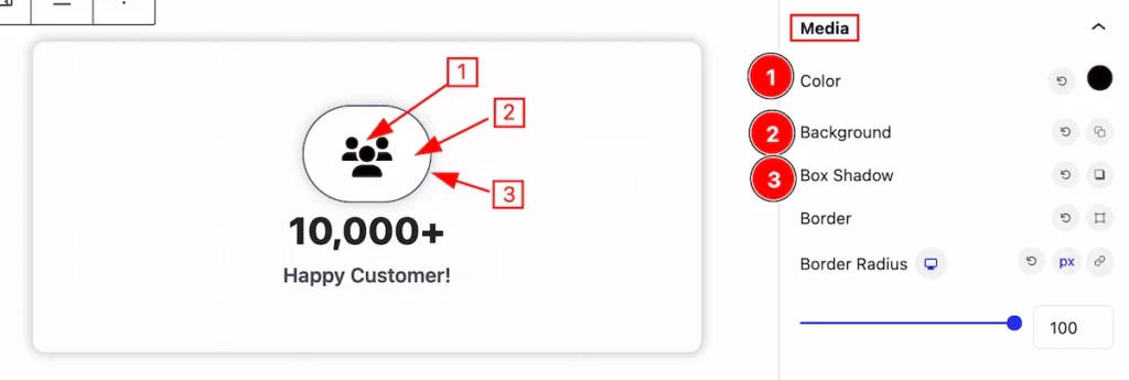
In this section, You can set the controls for this media,
- Color: Set the media color.
- Background: Set the background of the button.
- Box Shadow: Set the box shadow of the media.
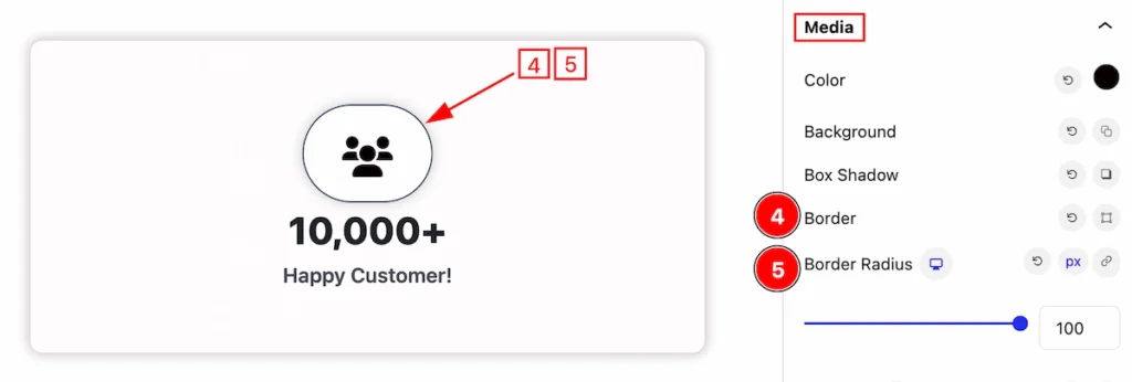
- Border: Set the border for the media.
- Border Radius: Set the border-radius.
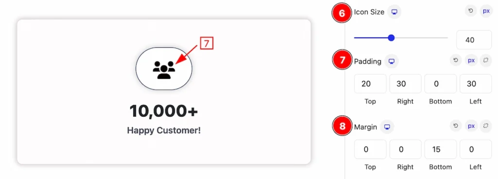
- Icon Size: Set the size for the icon.
- Padding: Set the padding for media.
- Margin: Set the margin for media.
Counter Section
Go to Style > Counter
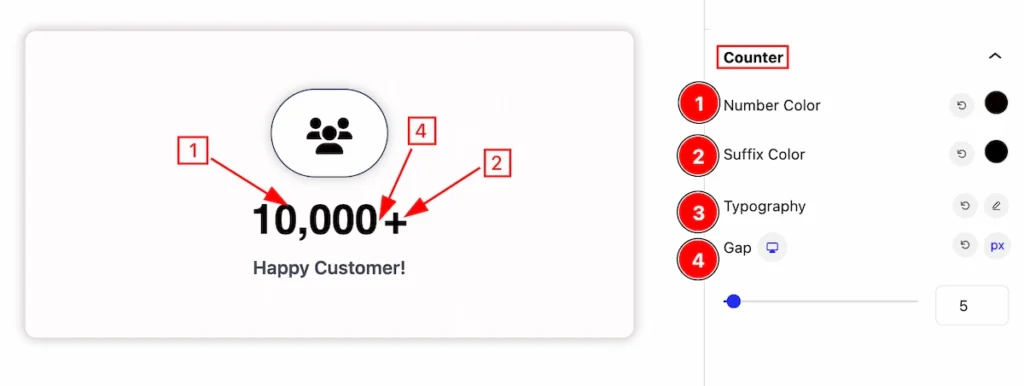
This section provides controls, You can set the counter stylish,
- Number Color: Set the color of the number.
- Suffix Color: Set the color of the suffix.
- Typography: Set the typography for the counter.
- Gap: Add space by following the Gap.
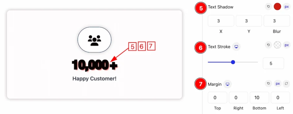
- Text Shadow: Set the text shadow for the Counter.
- Text Stroke: Set the text stroke for the counter.
- Margin: Set margin for the text.
Title Section
Go to Style > Title
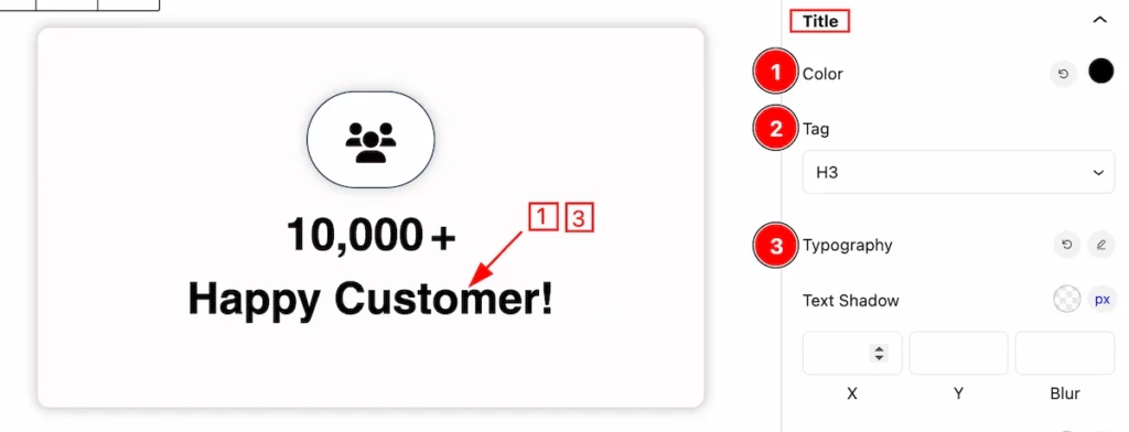
This section provides the controls to customize the Title,
- Color: Set the color for the Title.
- Title Tag: Set any HTML Tag for Title ( H1, H2, H3, H4, H5, H6, p, span ). The title tag is essential for both user experience and search engine optimization (SEO).
- Typography: Set the typography for the Title.
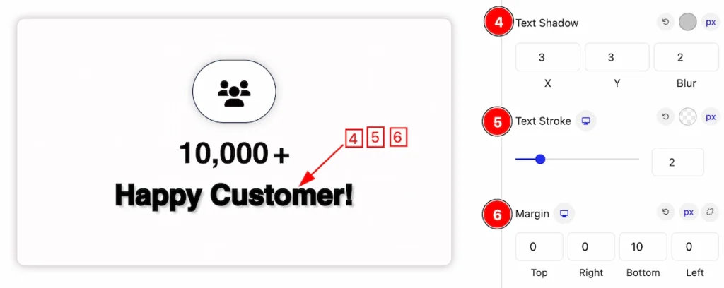
- Text Shadow: Set the text shadow for the title.
- Text Stroke: Set the text stroke for the title.
- Margin: Set the margin for the title.
Extra Tab Control
The extra tabs provide the controls of any blocks. You can make different visual layouts by following these Controls.
Click to learn more>>.
Video Assist
Video Tutorial for learning more.
Check the Demo Page.
Thanks for being with us!