This documentation provides comprehensive insights into the Accordion Blocks developed by Zoloblocks.
Adding a block to the editor
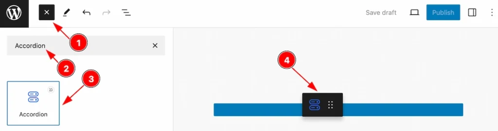
- Click the Toggle Block Inserter icon and a sidebar will appear on the left side, All the blocks will be visible here.
- Search by the Accordion block name.
- Then select the appear blocks ( with zoloblocks logo T.R corner).
- After Drag and Drop it on the page.
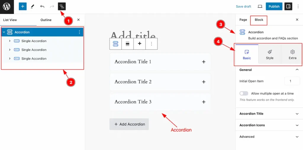
After Inserting the blocks, Follow this.
- Click on the Document Overviewer button and the Blocks list view will appear.
- Here appears the Accordion block.
- After on the right side, Click on the Block. Then the Post Grid details appear.
- Here show all the control tabs( Basic, Style, Extra ) of a block.
Basic Tab (Parents Blocks)
The Basic tab controller displayed here offers the flexibility to adjust the layout of blocks according to your preferences. Customize for the Parent’s blocks. Any changes applied will all items.
General Section
Go to Basic > General
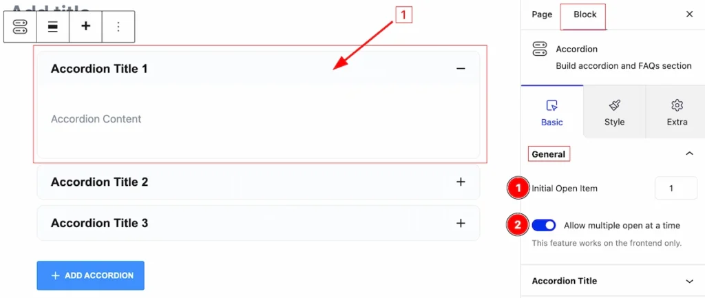
In this section, you can set the general controls of accordion,
- Initial Open Item: It allows one to open an accordion initially. Select any accordion number to open.
- Allow multiple open at a time: Enabling this switcher will allow open multiple accordions at a time.
[ This features work on the front only ]
Accordion Title
Go to Basic > Accordion
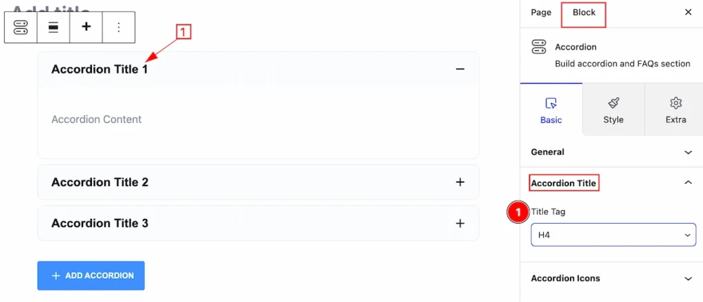
Here you can set the Accordion Title HTML tag,
- Title Tag: Set any HTML Tag for Title ( H1, H2, H3, H4, H5, H6, p, span ). The title tag is essential for both user experience and search engine optimization (SEO).
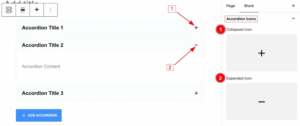
Accordion Icons
Go to Basic > Accordion Icons
In this section, You can set the Accordion Icons,
- Collapsed Icon: Set the Icon for the accordion collapsed item, Click and select the Icon from the Library.
- Expanded Icon: Set Icon for accordion expanded item, Choose an icon from the Icon library.
Style Tab (Parents Blocks)
Provide the controller to make the visual appearance or presentation of the tabs. This includes aspects visually appealing and cohesive with the overall design of the interface.
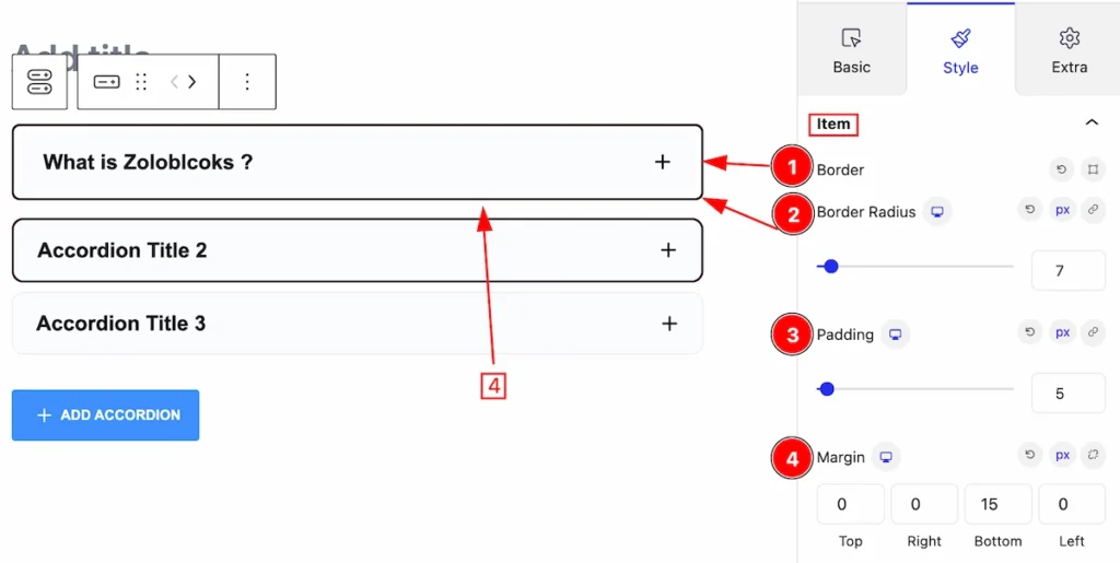
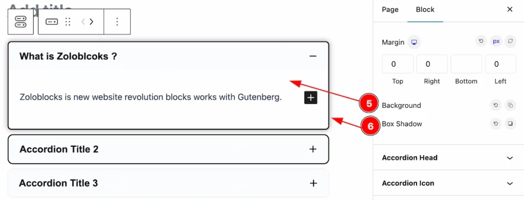
Item Section
Go to Style > Item
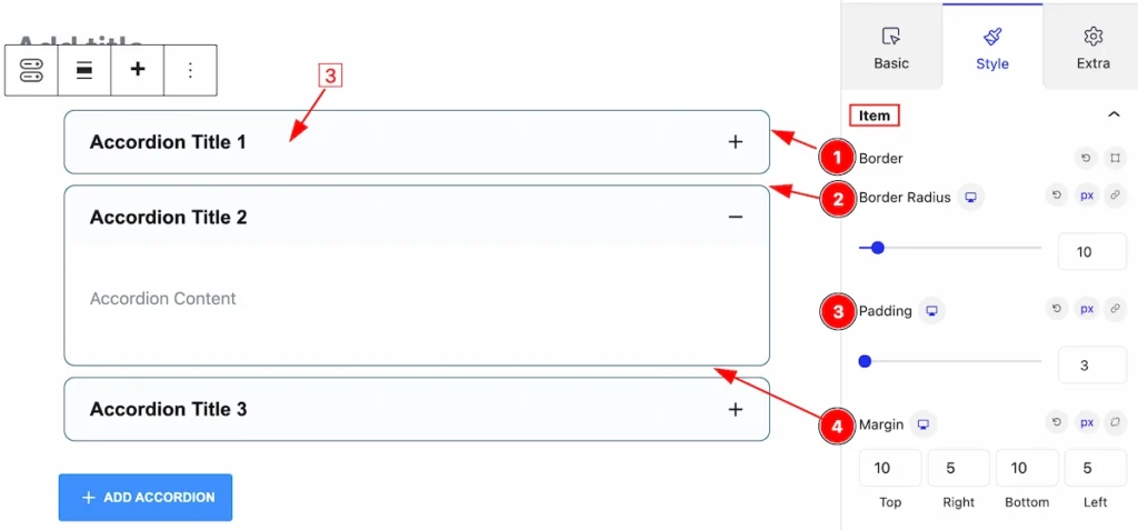
In this item section, You can set the accordion items customizable,
- Border: Set the border for the accordion.
- Border Radius: Set the border corner edge round.
- Padding: Set inner spacing for the accordion items.
- Margin: Set the margin according to the spacing from one to another.
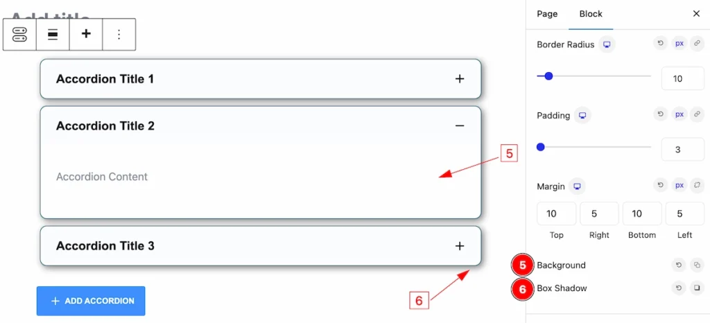
- Background: Set background for the accordion items.
- Box Shadow: Make the shadow for the items.
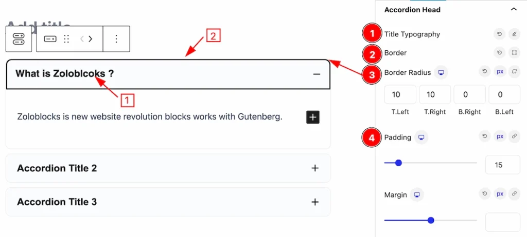
Accordion Head Section
Go to Style > Accordion Head
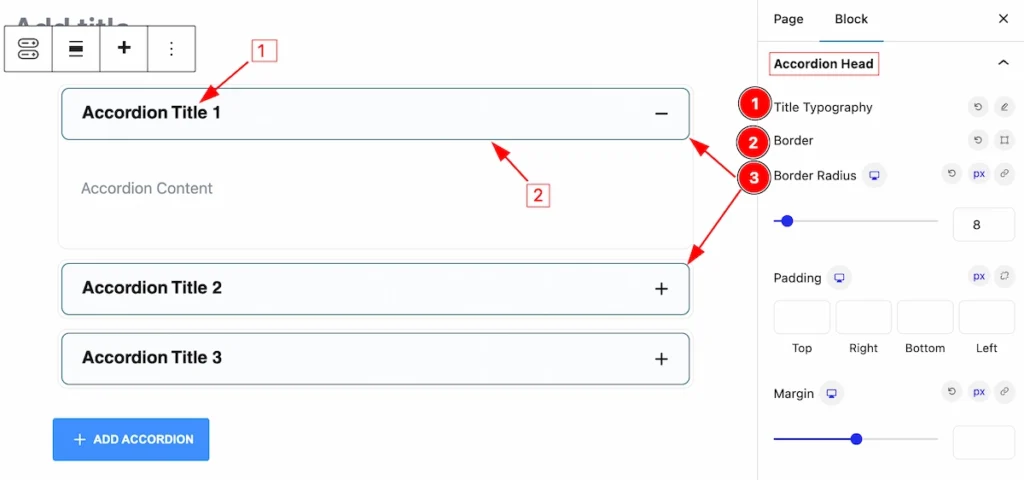
In this section, set the Accordion Head more stylish,
- Title Typography: Set the Typography for this Accordion Head.
- Border: Set the Border for heading.
- Border Radius: Set the border corner edge rounded.
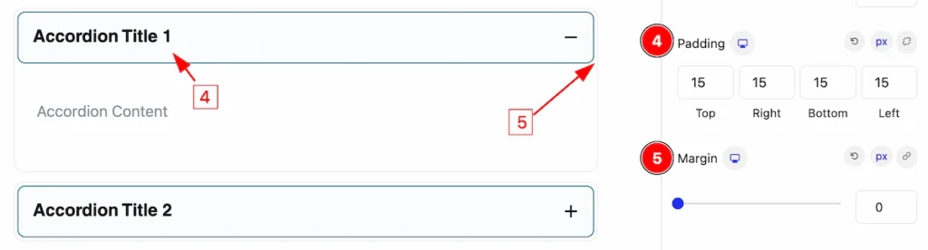
- Padding: Make the inner space of the accordion head.
- Margin: Set Margin for outer space.
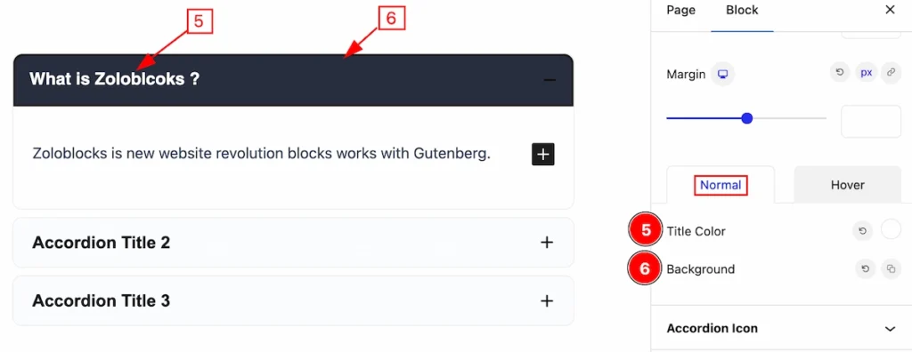
Normal State Accordion Head
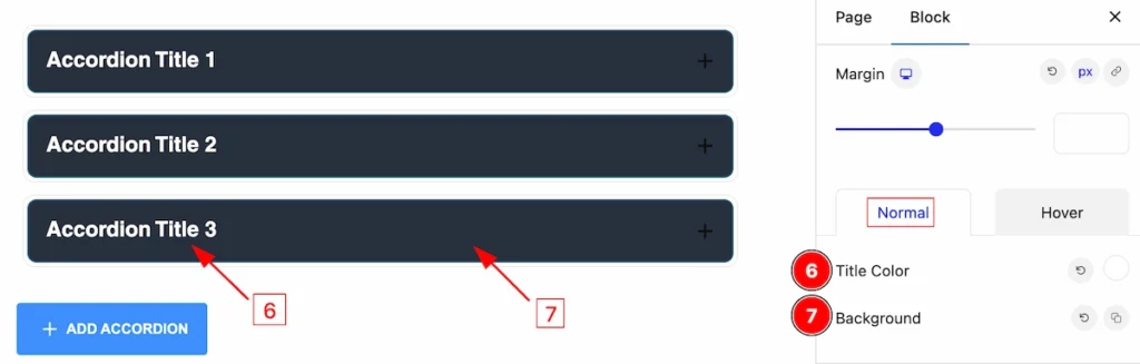
Set the head in a normal state,
- Title Color: Set the color of the Title.
- Background: Set the Background of the Accordion Head.
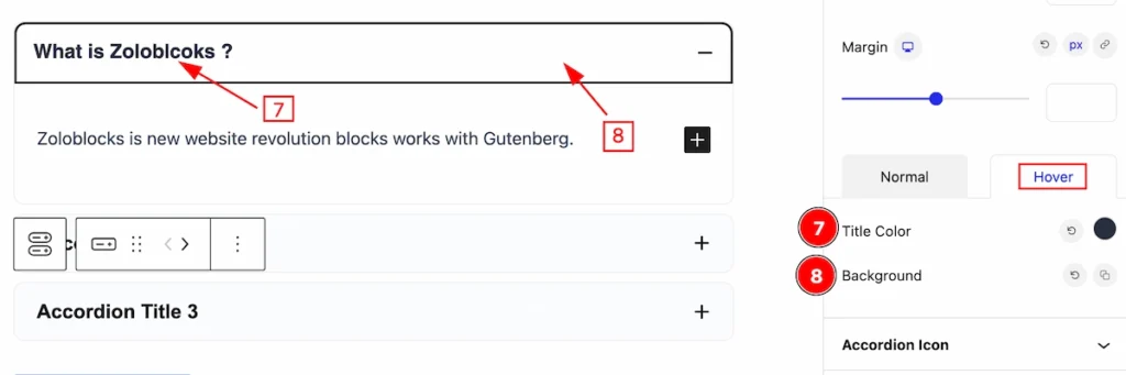
Hover State Accordion Head
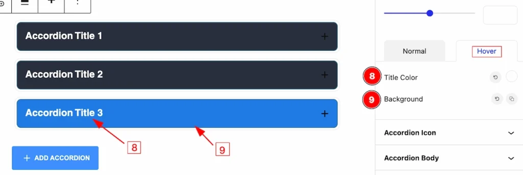
Set the head in a hover state, it works on mouse hovering.
- Title Color: Set the color of the Title.
- Background: Set the Background of the Accordion Head.
Accordion Icon Section
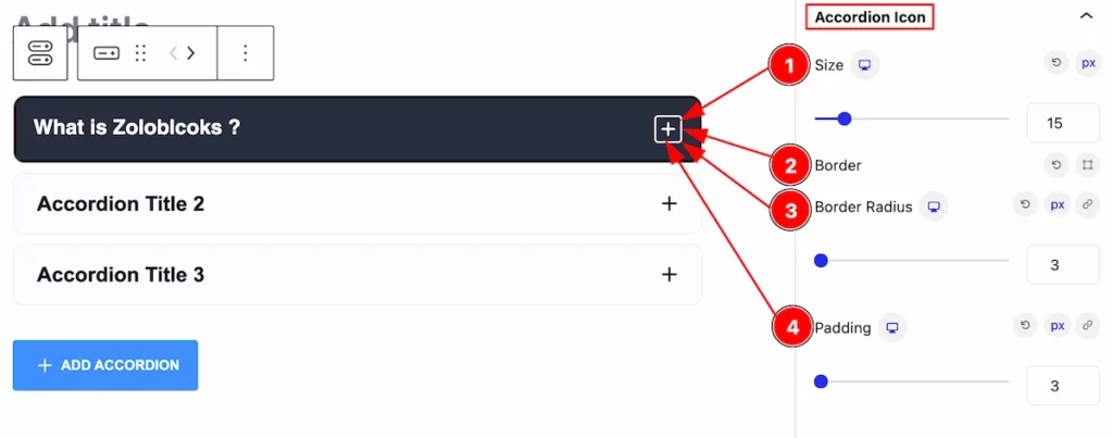
Go to Style > Accordion
Customize the icon by following this section,
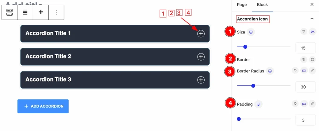
- Size: Set the Size of the Icon.
- Border: Set the Border of the Icon.
- Border Radius: Make the border corner round edges.
- Padding: Make inner space by setting the Padding.
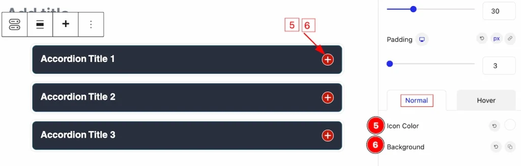
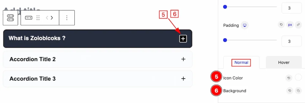
Normal State Accordion Icon
In this normal state, you can set,
- Icon Color: Set the color of Icon.
- Background: Set the Background of the icon.
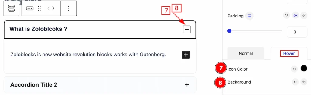
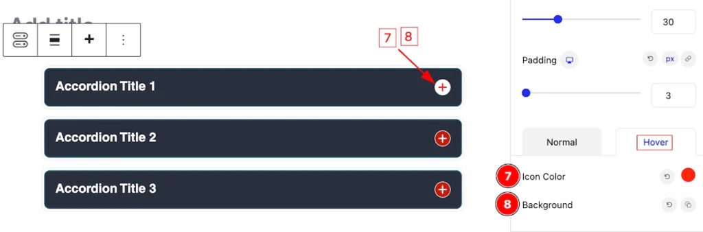
In this Hover state, you can set,
- Icon Color: Set the color of Icon.
- Background: Set the Background of the icon.
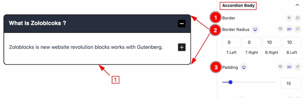
Accordion Body Section
Go to Style > Accordion Body
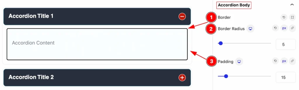
This section provides the styling control of the accordion body,
- Border: Set the Border of the accordion head.
- Border Radius: Set the border corner edges rounded.
- Padding: Set padding for the inner space of the body.
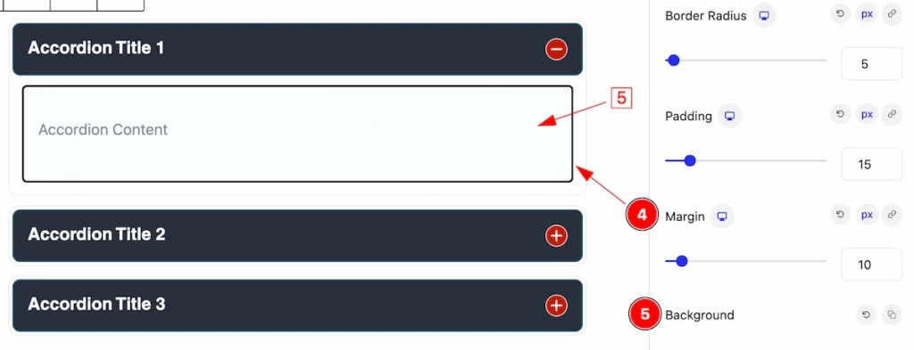
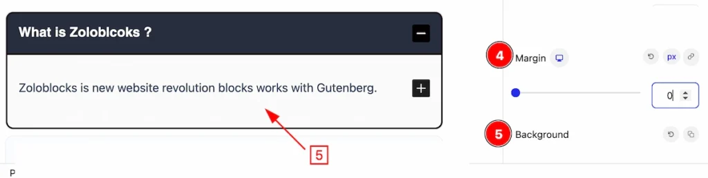
- Margin: Set the margin for the accordion body.
- Background: Set the background for this body.
Active Accordion Section
Go to Style > Active Accordion
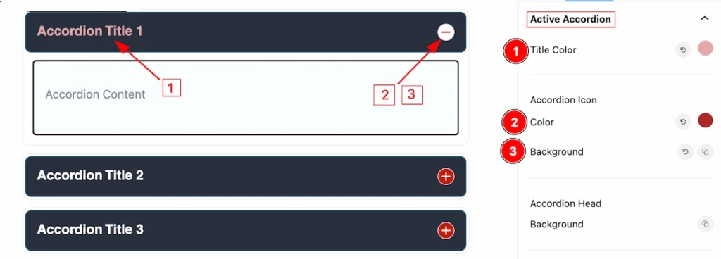
In this section, you can set the style for the Active item of the accordion. It works on active items only.
- Title Color: Set the Color for the Title of the Accordion Item.
- Color: Set the Color for the Accordion Icon.
- Background: Set the Background for the Accordion Icon.
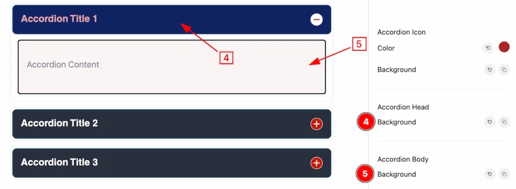
- Background: Set the Background for the Accordion Head.
- Background: Set the Background for the Accordion Body.
Single Accordion (Child Blocks)
Here we will work with the Child blocks of Accordion. The changes will applied to the relevant item only. Let’s follow this.
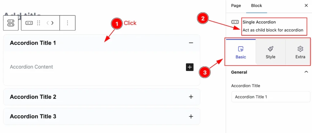
- Click any item of the Accordion blocks.
- On the right side, the selected Single Accordion details will appear.
- The Single Accordion controls will appear here.
Set Accordion Title
Go to Basic > General
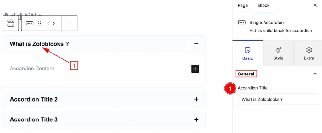
Here you can set the Title for this Accordion Title,
- Accordion Title: Input field you can set the Title.
Add Content of Accordion
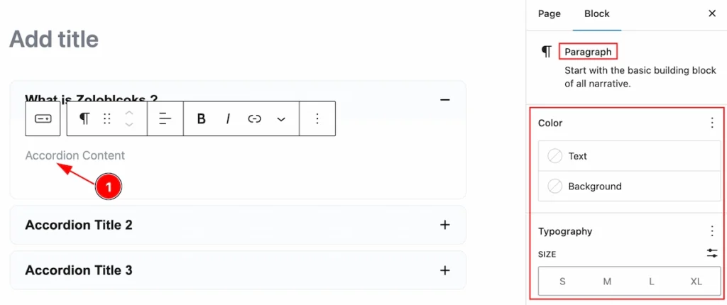
- Click on the Accordion Content Place holder, and A default Paragraph block control will appear on the left.
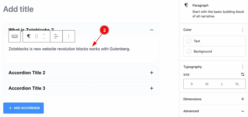
- You can set the Paragraph on for accordion. By following you can add any text.
Add a New Single Accordion
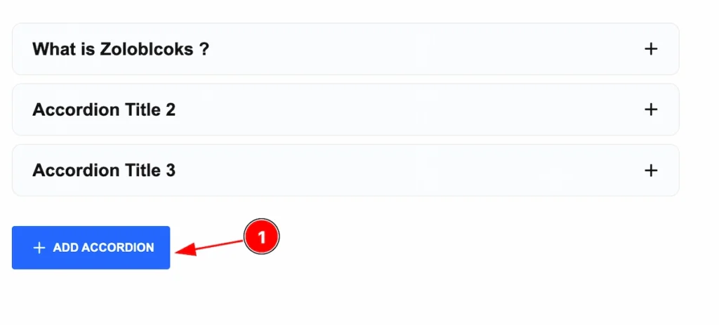
- Click on the ” + ADD ACCORDION ” button to add a new single accordion.
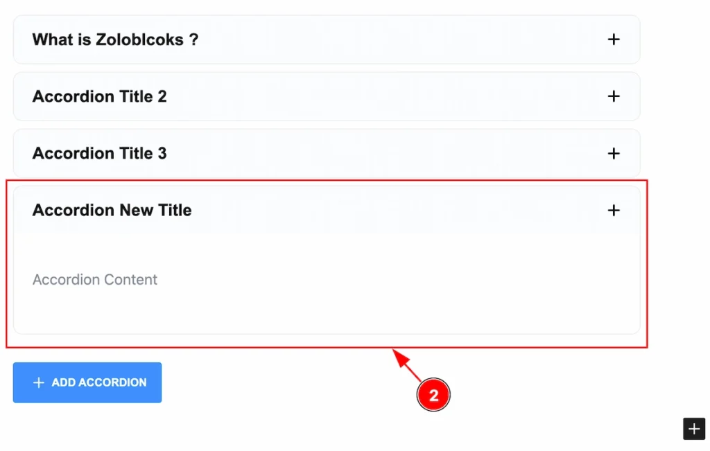
- After a new single accordion item appears, You can set the Title and Content. Following this you can add as many items you want.
Add Any Blocks on the Accordion
Accordion blocks provide an amazing feature, you can add any blocks you prefer to show here.
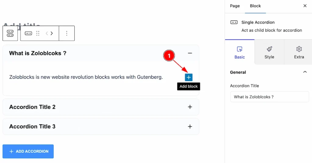
- Click on the ” Add block ” icon on the right side. Then a block popover will appear.
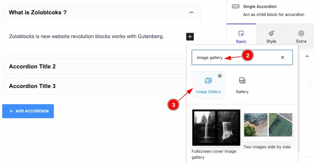
- Search by block name and Blocks will appear
- Then Select the right block you want to work with. (Selected Zoloblocks block seeing the icon on the top right corner).
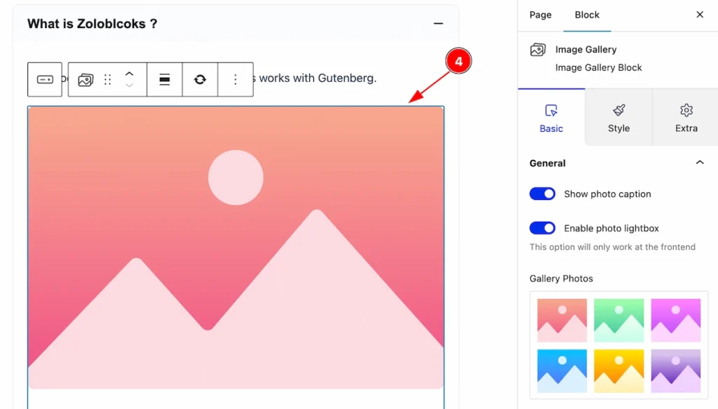
- Selected blocks will appear and the controls too. Select images for Image Gallery blocks.
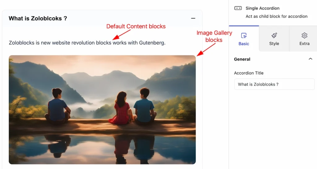
Following that, add as many blocks as you prefer, Here are Two blocks, Default Content blocks ( Paragraph ) and Image gallery blocks.
Style Tab ( Child Block )
This tab provides the controls of the Single Accordion Items. The changes will apply only to relevant items. Let’s Explore all the controls.
Item Section
Go to Style > Item
In this section, you can customize a single item of accordion,
- Border: Set the Border for the accordion item.
- Border Radius: Set the Border Radius to make the corner edge rounded.
- Padding: Make the inner space of the item.
- Margin: Set margin for the Accordion Items.
- Background: Set the background of the single item.
- Box Shadow: Set Box Shadow for the accordion item.
Accordion Head Section
Go to Style > Accordion Head
In this section, you can make the accordion head more stylish.
- Title Typography: Set the typography for the Accordion Head.
- Border: Set the Border for the accordion head.
- Border Radius: Make the inner space of the item.
- Padding: Make the inner space of the item.
Normal State Accordion Head
- Title Color: Set the Title Color of the accordion head.
- Background: Set the Background of the accordion Head.
Hover State Accordion Head
- Title Color: Set the Title Color of the accordion head. Works on mouse hover.
- Background: Set the Title Color of the accordion head. Works on mouse hover.
Accordion Item Section
Go to Style > Accordion Item
In this section, you can set the accordion icon more interactive,
- Size: Set the size of the Icon.
- Border: Set the Border or the Icon.
- Border Radius: Make border corner edges round.
- Padding: Make the inner space of the icon.
Normal State Accordion Item
- Icon Color: Set the Icon color.
- Background: Set the Background for Icon.
Hover State Accordion Item
- Icon Color: Set the Icon color for the hover state, See changes on mouse hover.
- Background: Set the Background for Icon for hover state See changes on mouse hover.
Accordion Body Section
Go to Style > Accordion Body
This section provides the controls of the accordion body, Sets your own customization,
- Border: Set the border for the single accordion body.
- Border Radius: Set the border corner edges round by following it.
- Padding: Make inner space for the Accordion Single Items.
- Margin: Setting the margin will make space in the accordion item.
- Background: Set the background for the accordion single item.
Extra Tab Controls
The extra tabs provide the controls of any blocks. You can make different visual layouts by following these Controls.
Click to learn more>>.
Video Assist
The Video help you to learn more about the block. Please visit the demo page for examples.
Thanks for being with us.