This documentation provides comprehensive insights into the Team Grid Blocks developed by Zoloblocks.
Adding a block to the editor
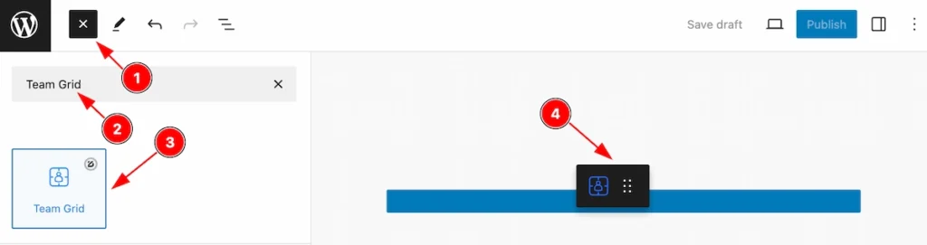
- Click the Toggle Block Inserter icon and a sidebar will appear on the left side, All the blocks will be visible here.
- Search by the Team Grid block name.
- Then select the appear block ( with zoloblocks logo T.R corner).
- After Drag and Drop it on the page.
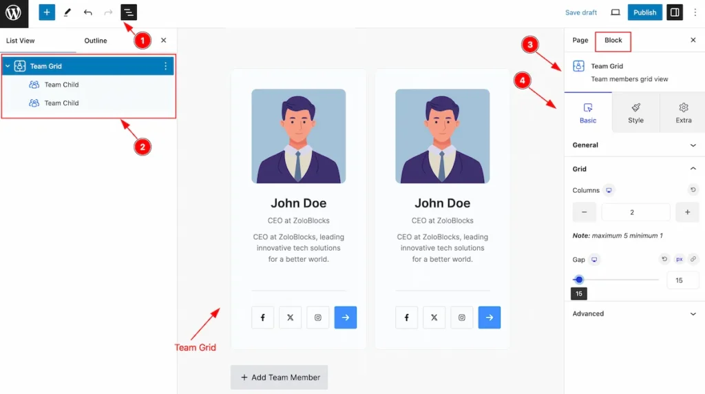
After Inserting the blocks, Follow this.
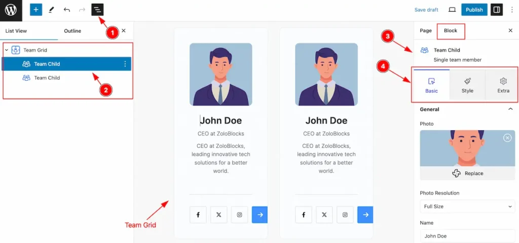
- Click on the Document Overviewer button and the Blocks list view will appear.
- Here appears the Team Grid and its child block.
- After on the right side, Click on the Block. Then the Team Grid details appear.
- Here show all the control tabs( Basic, Style, Extra ) of a block.
Basic Tab (Parents Blocks)
The Basic tab controller displayed here offers the flexibility to adjust the layout of blocks according to your preferences. Customize for the Parent’s blocks. Any changes will applied to all items.
General Section
Go to Basic > General
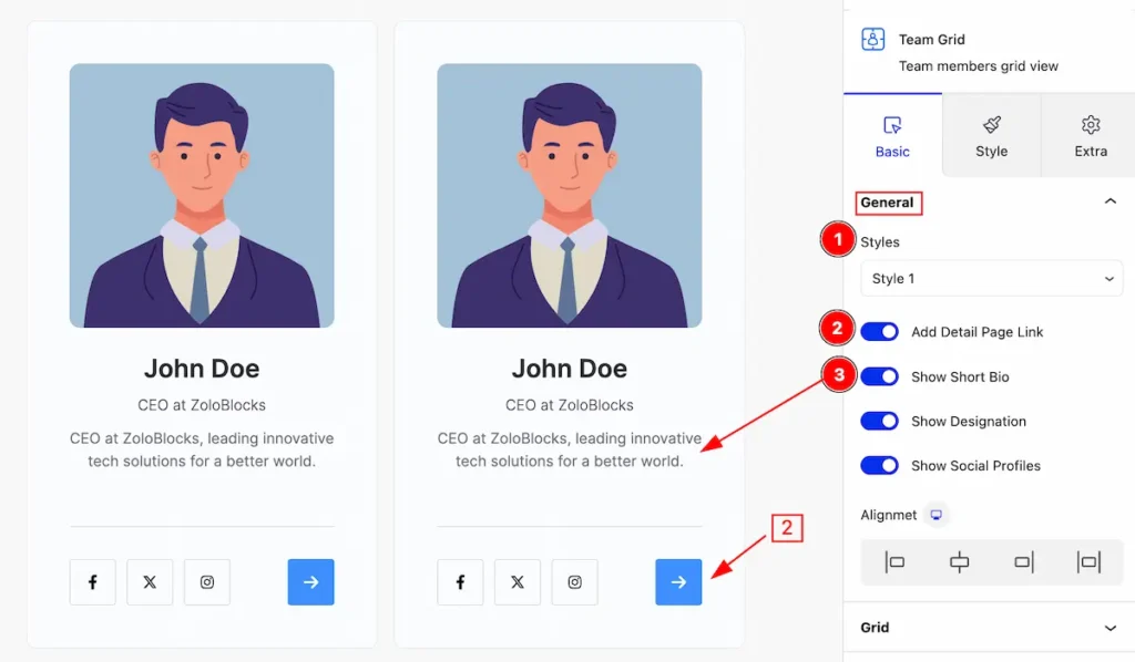
This section provides controls for changing the appearance of the team grid,
- Styles: Click on the styles selector and the pre-made styles will appear. you can select any.
- Add Detail Page Link: Enable the switcher to open the details page.
- Show Short Bio: Enable the switcher to show the Short Bio.
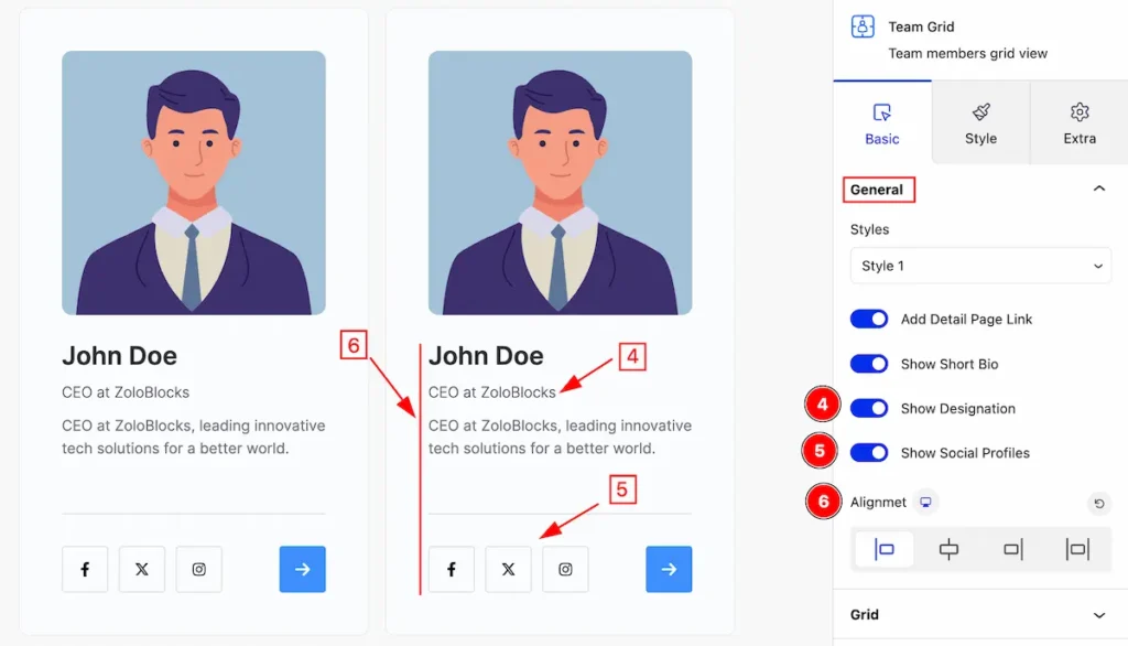
- Show Designation: Enable the switcher to show the designation.
- Show Social Profiles: Enable the switcher to show Social Profiles.
- Alignment: Set alignment for the items ( Left, Center, Right, Justify ).
Grid Section
Go to Basic > Grid
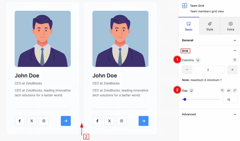
This section provides control for the grid,
- Columns: Set the number for the columns.
- Gap: Set the gap between the columns.
Style Tab (Parents Blocks)
Provide the controller to make the visual appearance or presentation of the tabs. This includes aspects visually appealing and cohesive with the overall design of the interface.
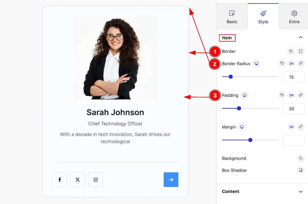
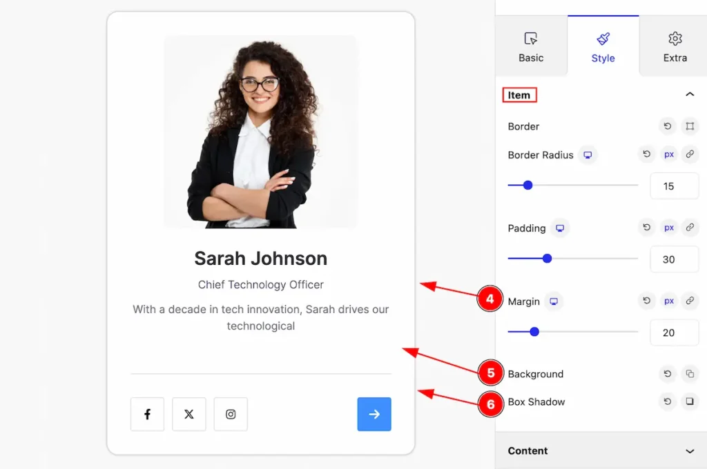
Item Section
Go to Style > Item
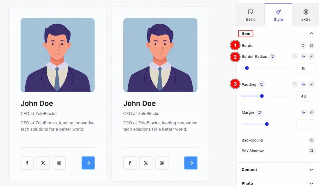
This section provides control for the item tab,
- Border: Set border for the team grid items.
- Border Radius: Set border-radius.
- Padding: Make inner space by adding the padding.
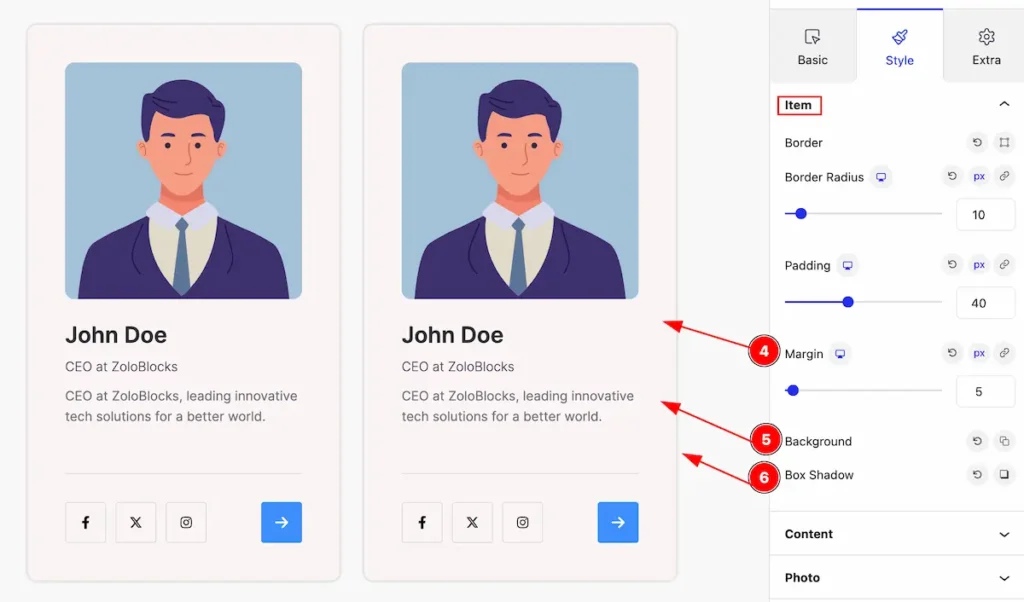
- Margin: Set the margin for the item.
- Background: Set background for the item.
- Box Shadow: Set the box shadow.
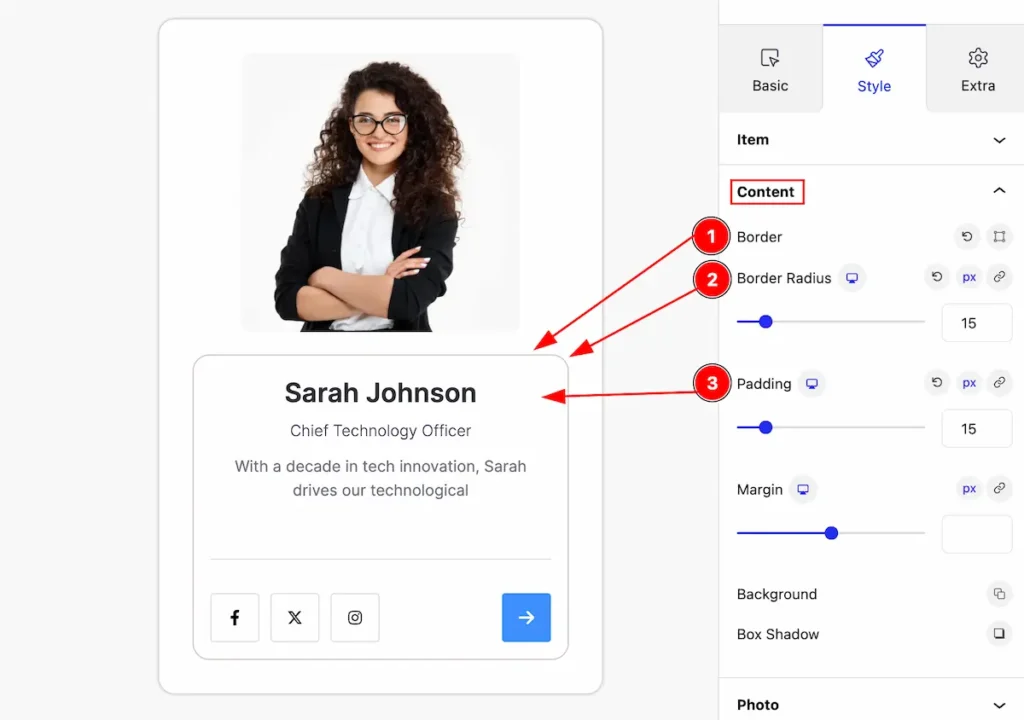
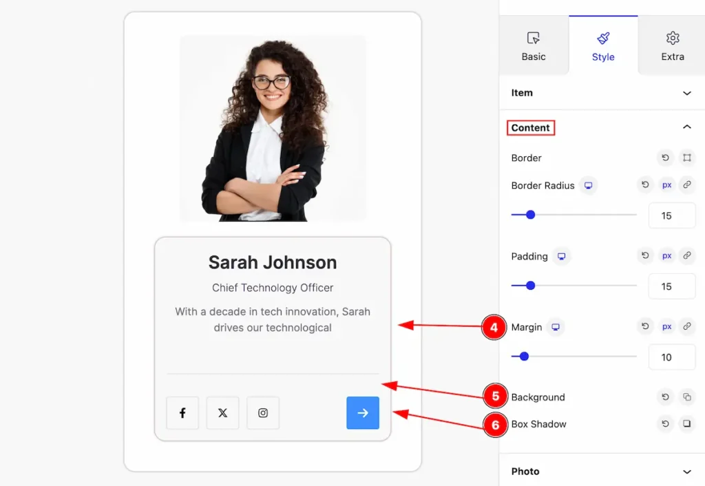
Content Section
Go to Style > Content
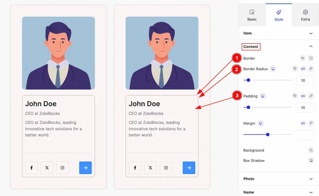
This section provides control for the content,
- Border: Set a border for the content.
- Border Radius: Make the border-radius.
- Padding: Set padding for the content.
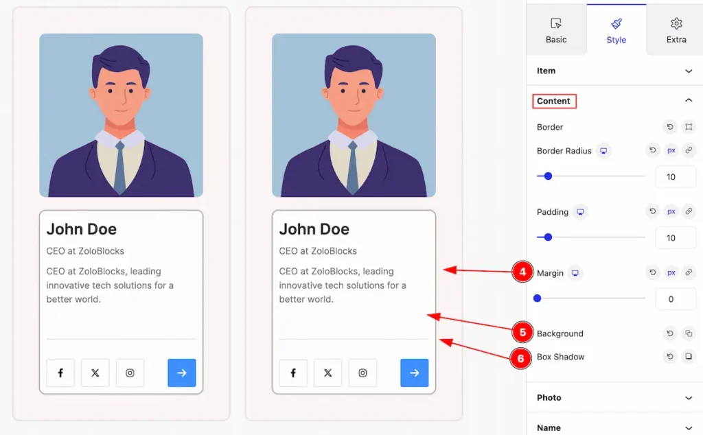
- Margin: Set the margin for the content.
- Background: Set background for the content.
- Box Shadow: Set the box shadow.
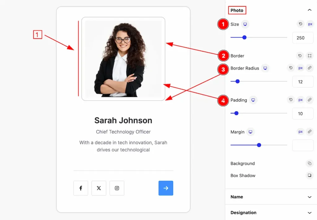
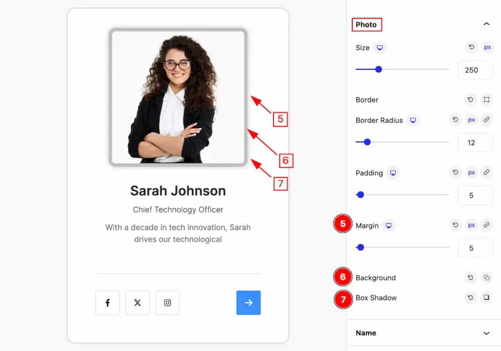
Photo Section
Go to Style > Photo
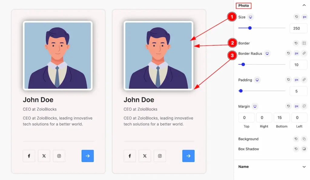
Make the photo more visually stylish by following,
- Size: Set the size for the photo.
- Border: Set a border for the photo.
- Border Radius: Make the border-radius.
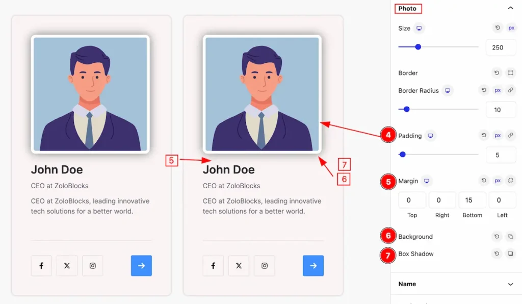
- Padding: Set padding for the photo.
- Margin: Set the margin for the photo.
- Background: Set background for the photo.
- Box Shadow: Set the box shadow.
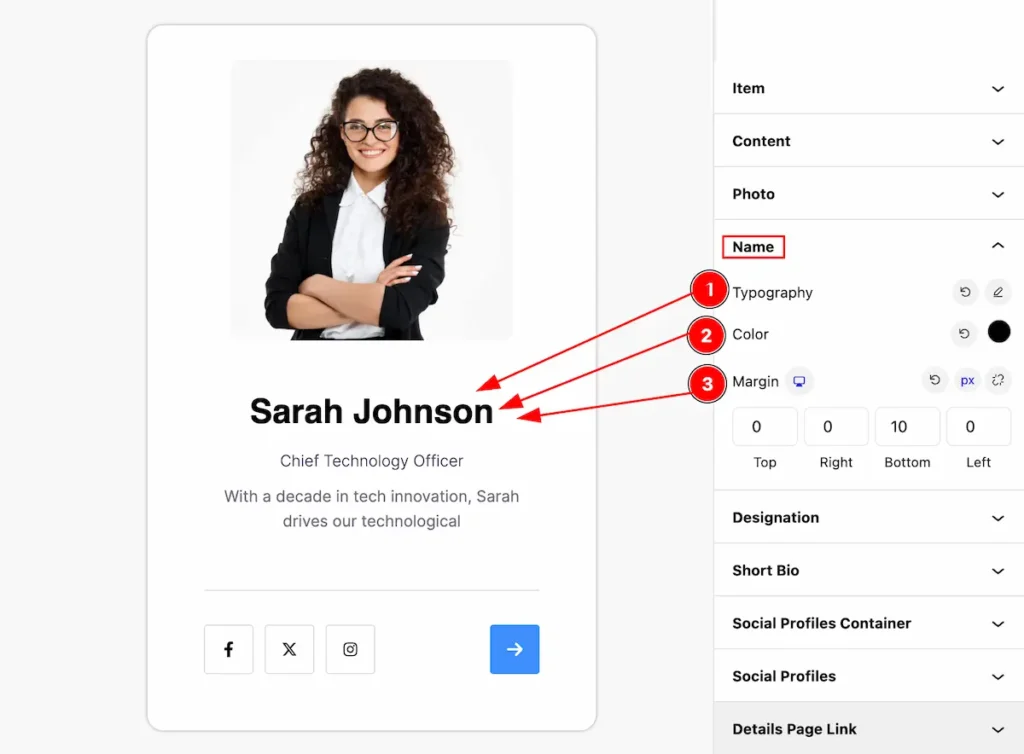
Name Section
Go to Style > Name
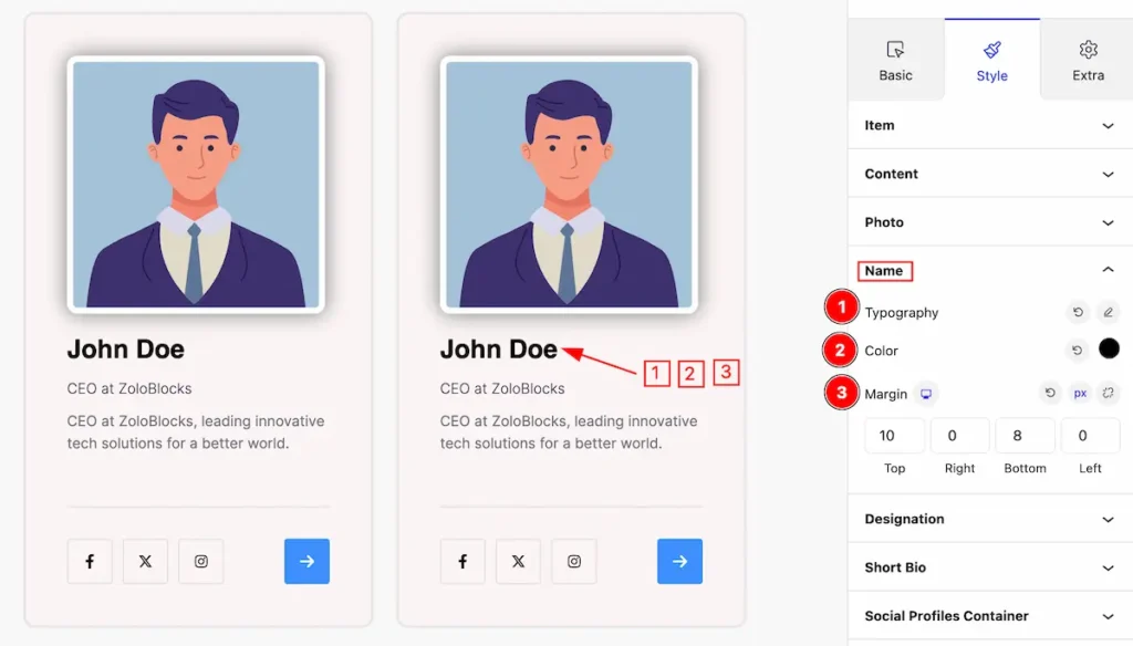
This section provides control for the name,
- Typography: Set the typography for the name.
- Color: Set color for the name.
- Margin: Set outer space for the name.
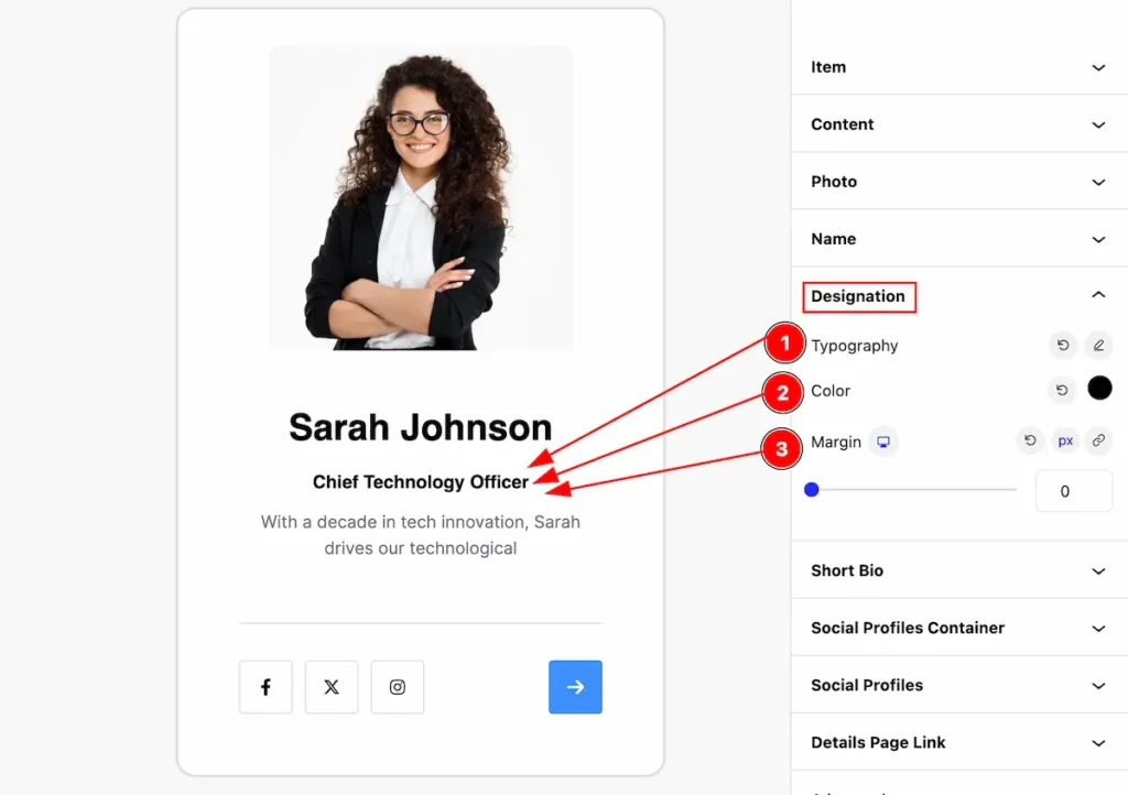
Designation Section
Go to Style > Designation
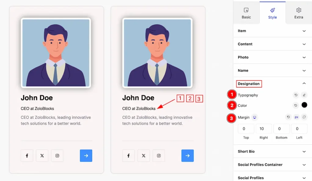
Make the designation section more customizable by following it.
- Typography: Set the typography for the designation.
- Color: Set color for the designation.
- Margin: Set outer space for the designation.
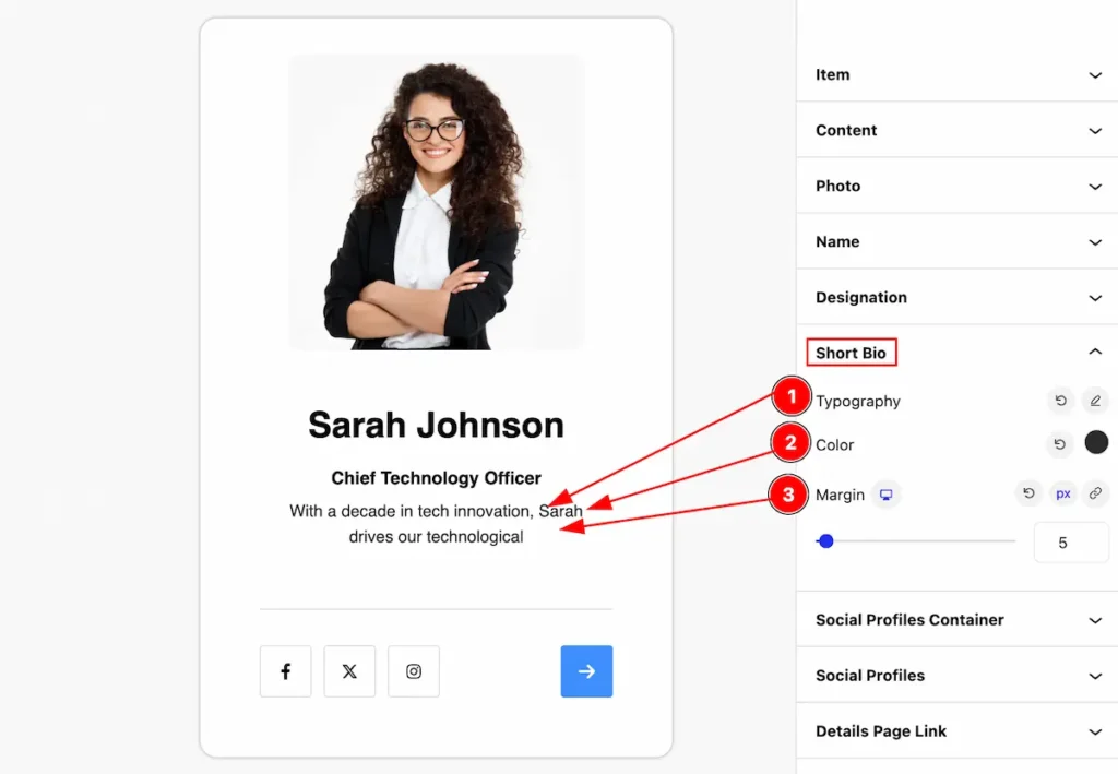
Short Bio Section
Go to Style > Short Bio
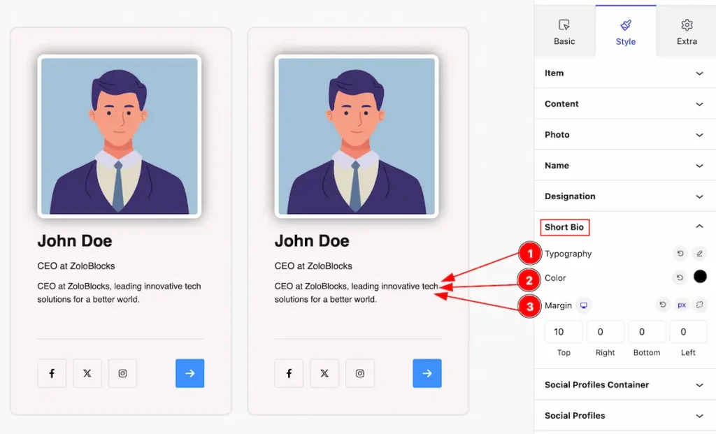
Make the Short Bio section more customizable by following it.
- Typography: Set the typography for the short bio.
- Color: Set color for the short bio.
- Margin: Set outer space for the short bio.
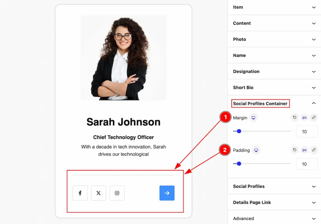
Social Profiles Container Section
Go to Style > Social Profiles Container
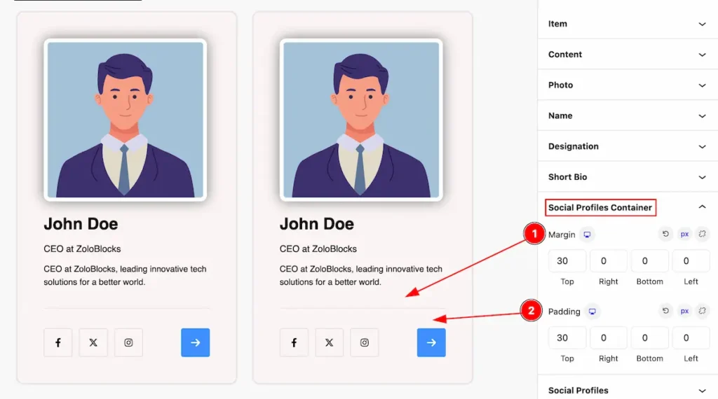
Make the social profile container visually great by following the,
- Margin: Set the margin for the container.
- Padding: Set inner space by setting the padding.
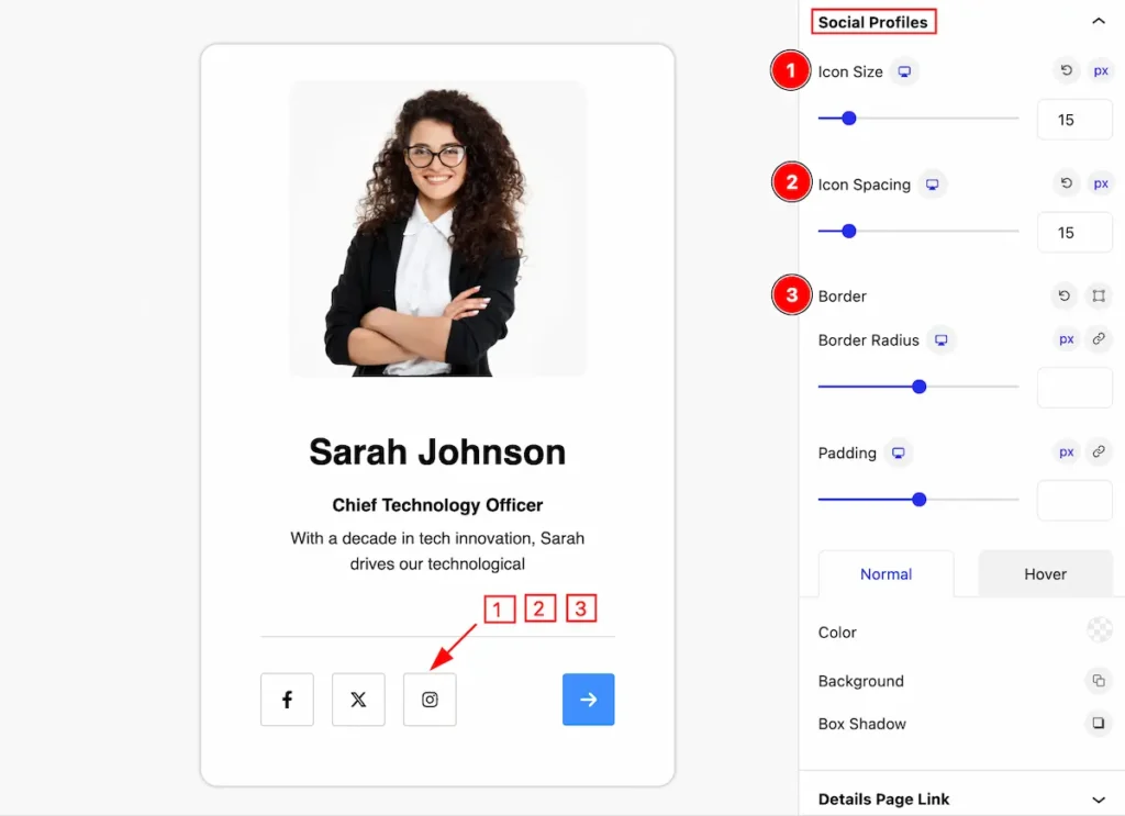
Social Profiles Section
Go to Style > Social Profiles Section
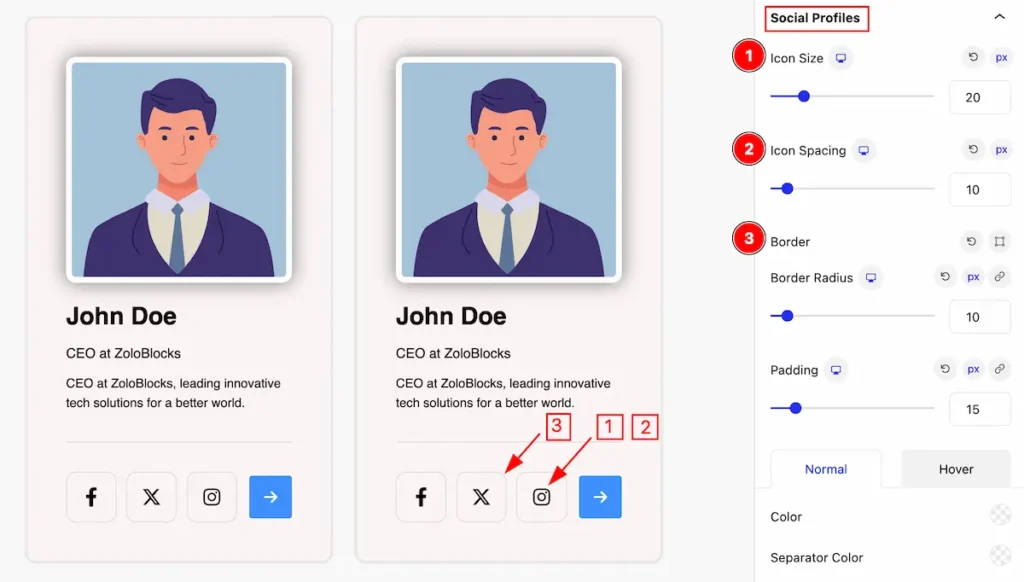
Make changes to the visual appearance of the social profiles,
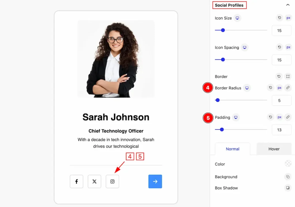
- Icon Size: Set the Icon size for social profiles.
- Icon Spacing: Set spacing for the social profiles.
- Border: Set a border for the social profiles.
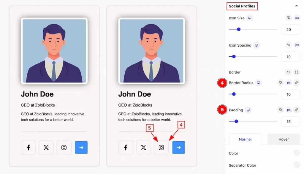
- Border Radius: Set the radius for the social profiles.
- Padding: Set padding for the social profiles.
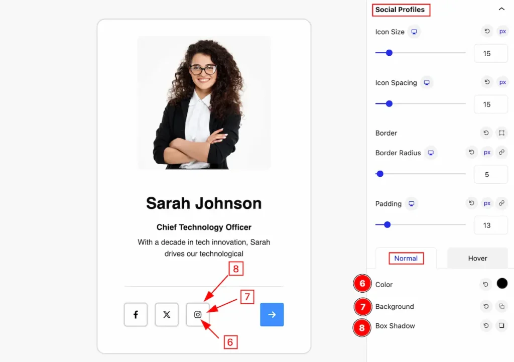
Normal State for Social Profiles
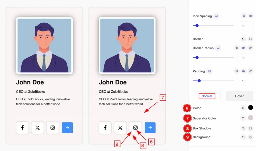
The changes will appear in the normal,
- Color: Set color for the Social Profiles.
- Separator Color: Set the separator color.
- Box Shadow: Make the shadow for the color.
- Background: Set the background to be visually attractive.
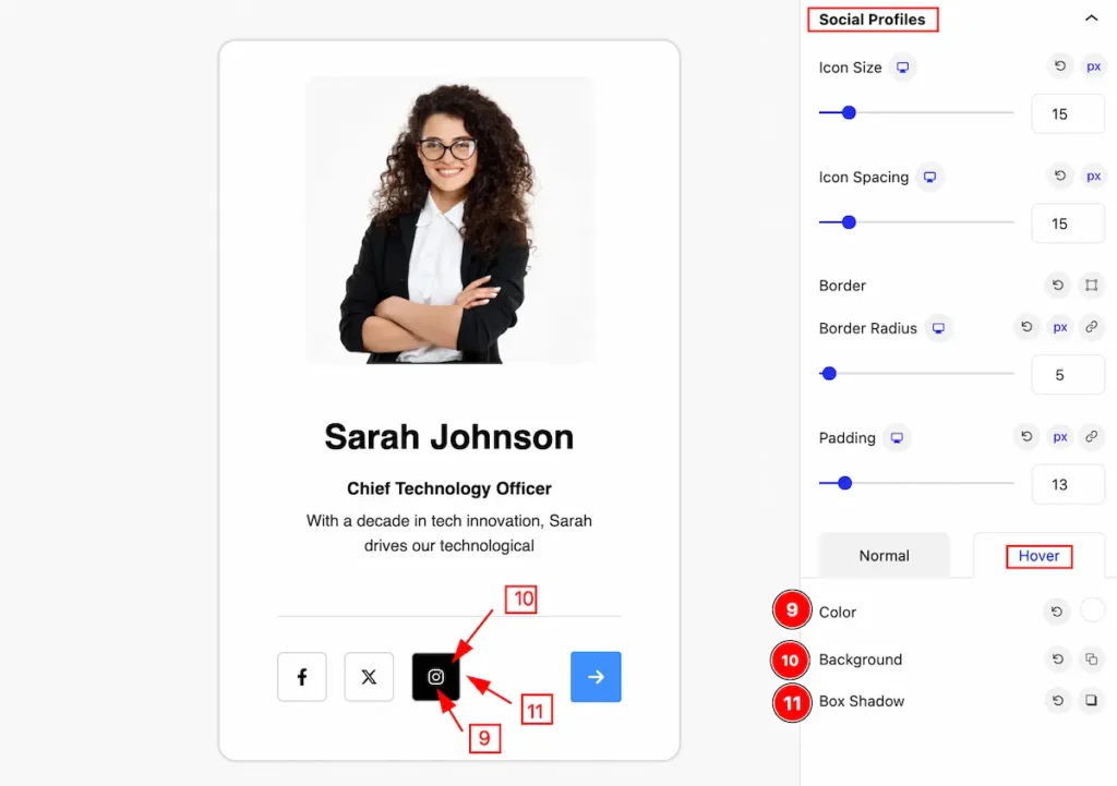
Hover State for Social Profiles
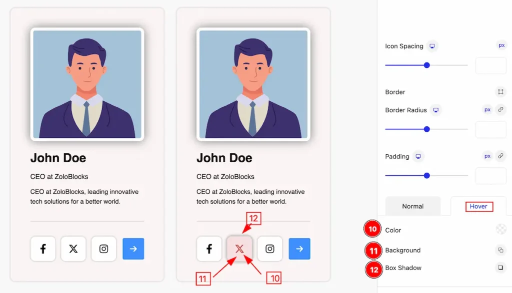
The changes will appear on mouse hover,
- Color: Set the color for the
- Background: Set the background to be visually attractive.
- Box Shadow: Make the shadow for the color.
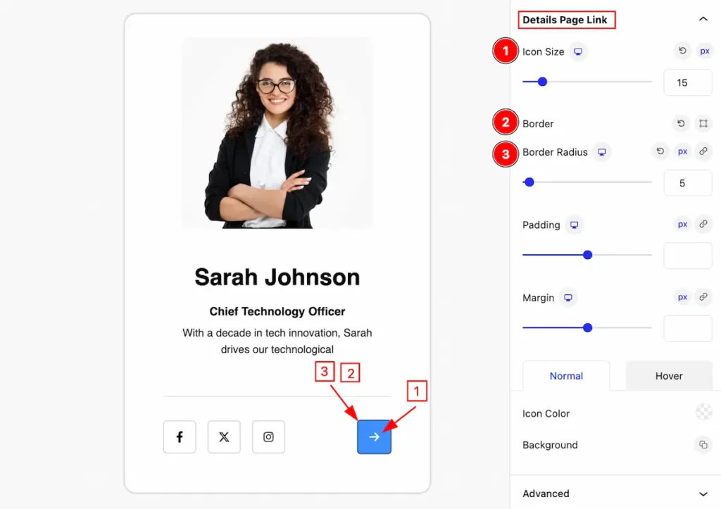
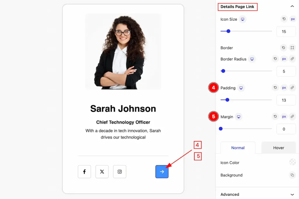
Details Page Link Section
Go to Style > Details Page Link
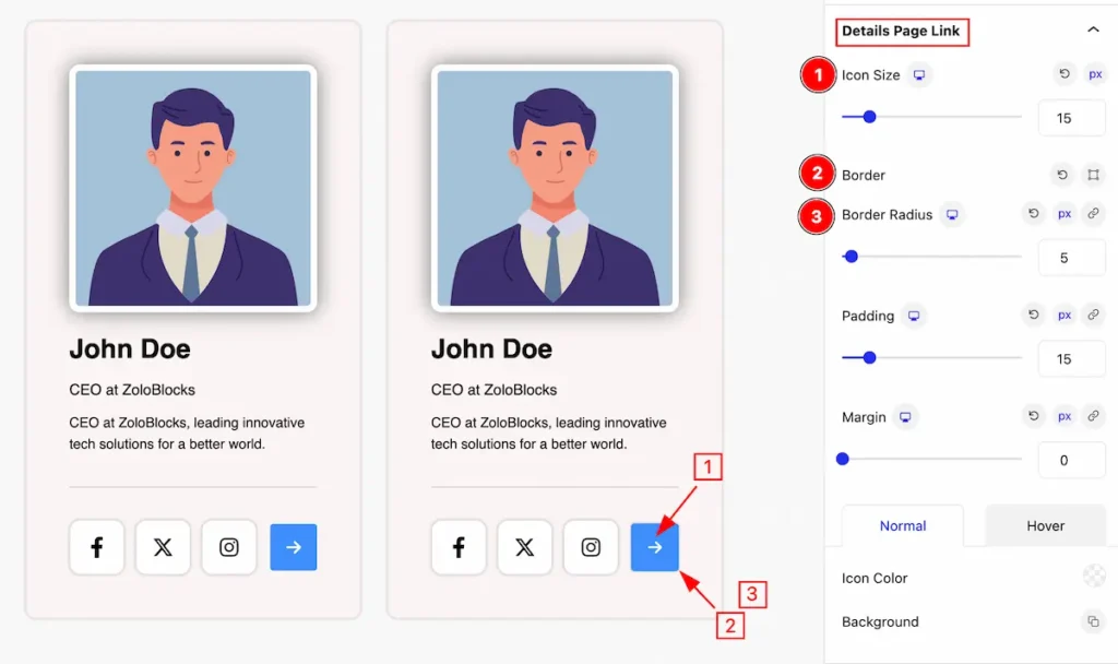
Make changes to the visual appearance of the details page link,
- Icon Size: Set the Icon size for the details page link.
- Icon Spacing: Set spacing for the details page link.
- Border: Set a border for the details page link.
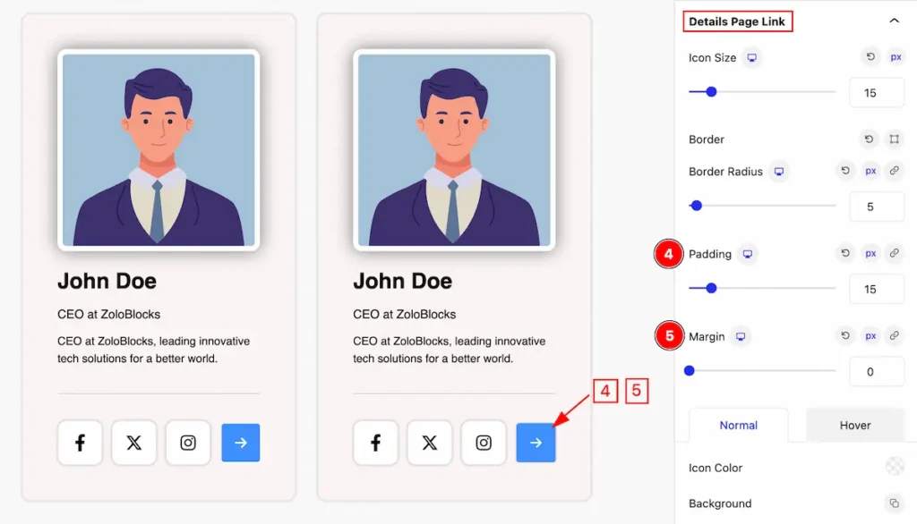
- Border Radius: Set the radius for the details page link.
- Padding: Set padding for the details page link.
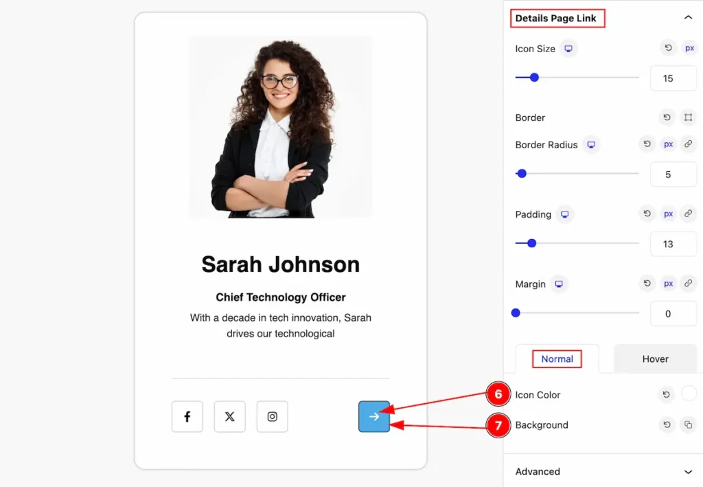
Normal State for Details Page Link
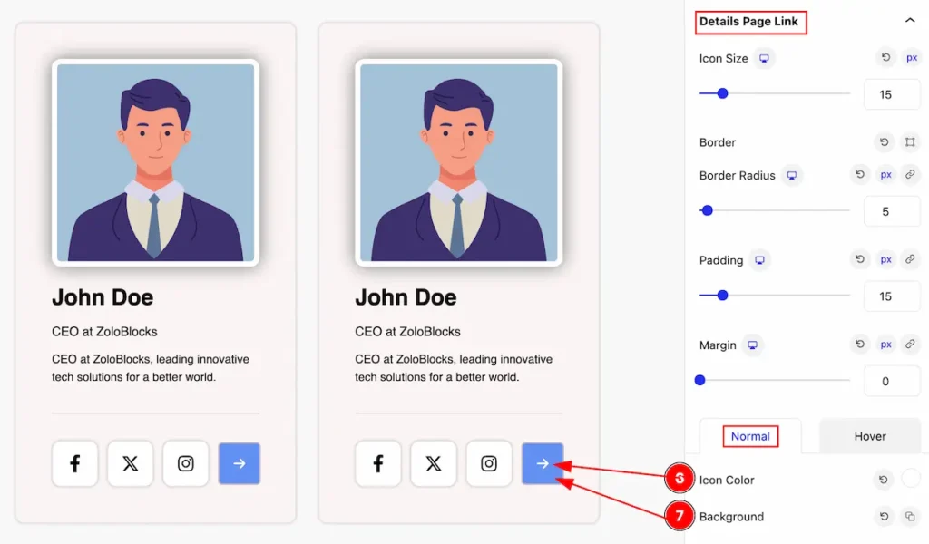
The changes will appear in the normal,
- Color: Set the color for the details link page.
- Background: Set the background for the details link page to be visually attractive.
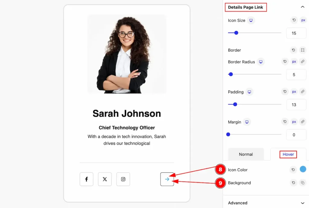
Hover State for Details Page Link
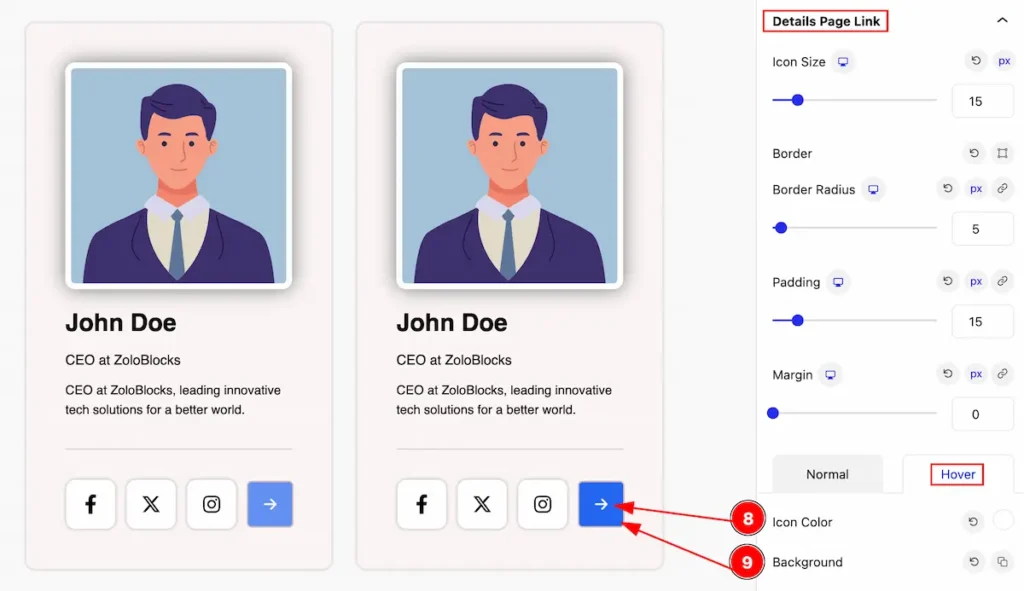
The changes will appear on mouse hover over it,
- Color: Set the color for the details link page.
- Background: Set the background for the details link page to be visually attractive.
Team Grid (Child Blocks)
Here we will work with the Child blocks of the Team Grid. The changes will applied to the relevant item only. Let’s follow this.
- Click on the Document Overviewer button and the Blocks list view will appear.
- Select the Team Grid Child block under the Team Grid parent blocks.
- On the right side, the selected Team Grid Child details will appear.
- The Team Grid Child controls will appear here. ( Basic, Style, Extra ).
Basic Tab ( Child Block )
This tab provides control to customize the child item of the Team Grid child.
General Section
Go to Basic > General
Upload Photo For Team Child Item
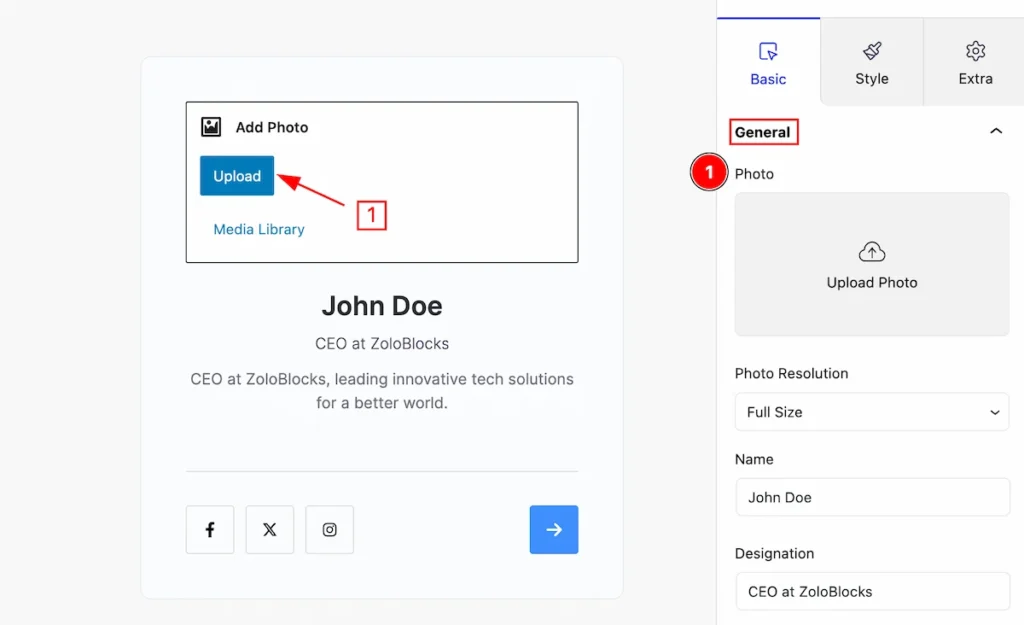
- Photo: Click on the photo section and Photo Upload button will appear Click on it and upload photo.
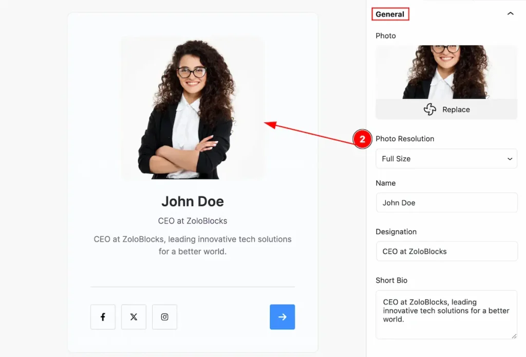
- Photo Resolution: Set resolution for the photo ( e.g.: Thumbnail, Medium, Large, Full Size).
Set Content for Team Child Item
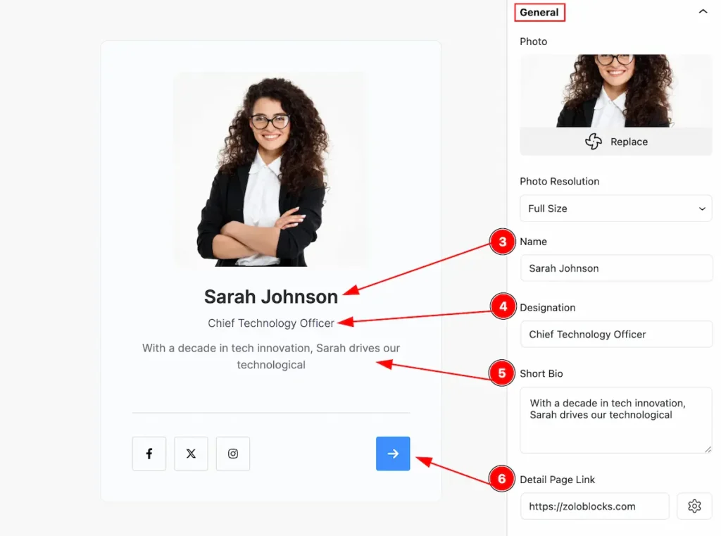
- Name: Set name for the child item.
- Designation: Set designnation.
- Short Bio: Set short bio for the team child item.
- Detail Page Link: Set the link for navigating details page.
Social Profiles Section
Go to Basic > Social Profiles
Add New Social Profiles Item
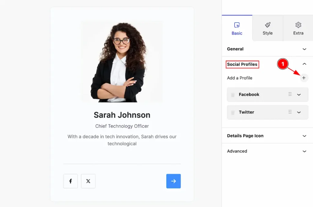
- Click on the ” + ” Icon to add new social profile item.
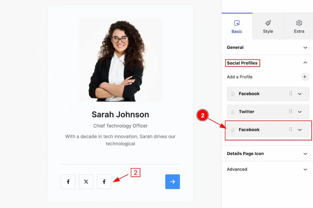
- After adding new content the Social Profile item appears.
Edit Social Profiles Item
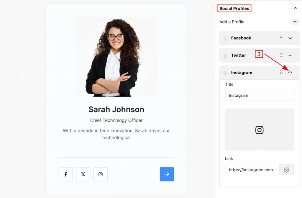
- Click on the ” Carrot ” icon and toggle will open for editing.
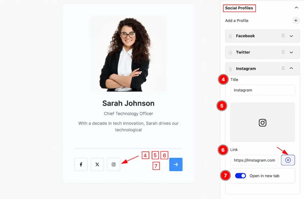
- Title: Set the title for the social profiles item.
- Icon: Select icon from icon library for the child item.
- Link: Set the link for the social item.
- Open in new tab: Enable the switcher to open a new tab.
Remove Social Profiles Item
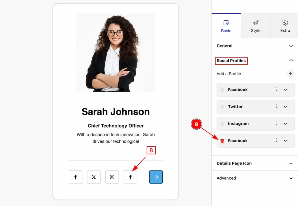
- Click on the ” Trash ” Icon to remove relevant item from Social Profiles Item.
Details Page Icon Section
Go to Basic > Details Page Icon
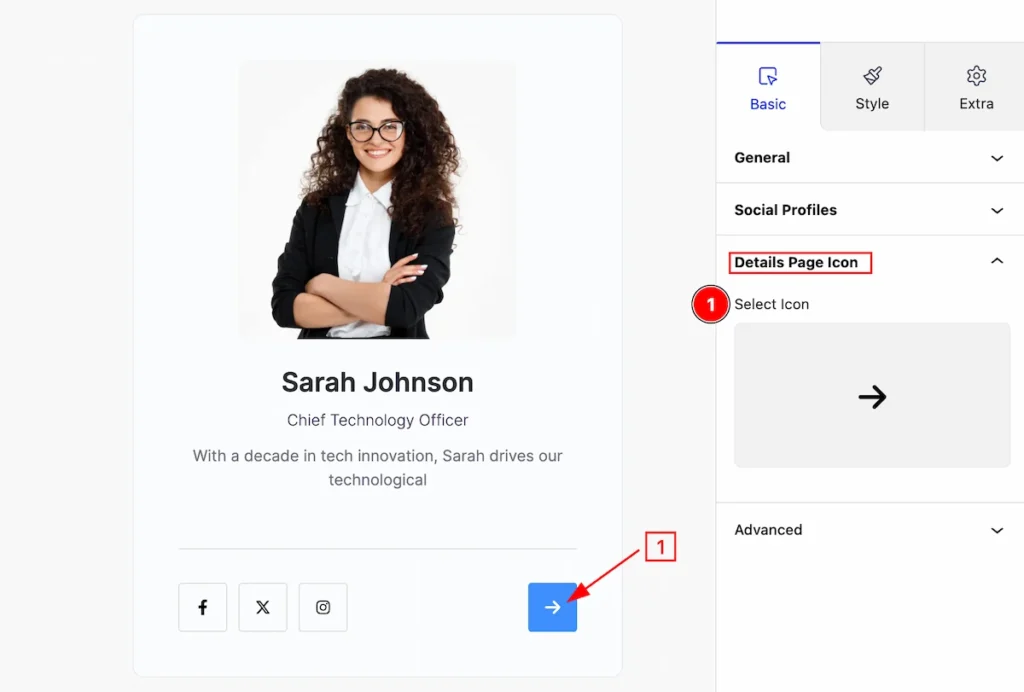
- Select Icon: Click on the icon and select icon from the icon library.
Style Tab ( Child Block )
This tab provides the controls of the Team Grid Child Items. The changes will apply only to relevant items. Let’s Explore all the controls.
Item Section
Go to Style > Item
Set visual apperance change by following the item controls,
- Border: Set the border for the child item.
- Border Radius: Set border corner edges rounded by setting radius.
- Padding: Set inner space by add padding.
- Margin: Set margin for the item.
- Background: Set background for the item.
- Box Shadow: Set the box shadow for the item.
Content Section
Go to Style > Content
Set visual apperance change by following the content controls,
- Border: Set the border for the content.
- Border Radius: Set border corner edges rounded by setting radius.
- Padding: Make inner space by add padding.
- Margin: Set margin for the content.
- Background: Set background for the content.
- Box Shadow: Set the box shadow for the content.
Photo Section
Go to Style > Photo
Make the photo more visually attractive by following the controls,
- Size: Set the size for the photo.
- Border: Set border for the photo.
- Border Radius: Ser the border corner edges rounded by setting the radius.
- Padding: Make inner space by setting the padding.
- Margin: Set margin for the photo.
- Background: Set background for the photo.
- Box Shadow: Set the box shadow for the photo.
Name Section
Go to Style > Name
Make the name more stylish by following this,
- Typography: Set the typography for the name.
- Color: Set color for it.
- Margin: Make outer space by setting margin.
Designation Section
Go to Style > Designation
Make the desingation more stylish by following this,
- Typography: Set the typography for the designation.
- Color: Set color for it.
- Margin: Make outer space by setting margin.
Short Bio Section
Go to Style > Short Bio
Make the short bio more stylish by following this,
- Typography: Set the typography for the short bio.
- Color: Set color for it.
- Margin: Make outer space by setting margin.
Social Profile Container Section
Go to Style > Social Profile Container
Make room for the social profile container,
- Margin: Set margin for the profile containers.
- Padding: Set padding for the profile containers.
Social Profiles Section
Go to Style > Social Profiles
Make the social profile more visually great by following the Social Profiles controls,
- Icon Size: Set the size for the social profiles icon.
- Icon Spacing: Set space between the icons.
- Border: Set border for the icon.
- Border Radius: Set the border radius for the icon.
- Padding: Make inner spca by setting the padding.
Normal State for the Social Profiles
Make customization for the social profiles for normal state,
- Color: Set the color for the social profiles.
- Background: Set the background for the social profiles.
- Box Shadow: Make the shadow for the social profiles.
Hover State for the Social Profiles
The chnges will appera on mouse hover over the social profiles,
- Color: Set color for the icon.
- Background: Set the background color for the social profiles.
- Box Shadow: Set the shadow for the icons.
Details Page Link Section
Go to Style > Details Page Link
Make the social profile more visually great by following the Details Page Link controls,
- Icon Size: Set the size for the details page link.
- Icon Spacing: Set space between the details page link.
- Border: Set border for the icon.
- Border Radius: Set the border radius for the icon.
- Padding: Make inner spca by setting the padding.
Normal State for the Details Page Link
The changes will appear on normal state,
- Icon Color: Set icon color for the details page link.
- Background: Set background for details page link.
Hover State for the Details Page Link
The chnges will appera on mouse hover over the ,
- Color: Set color for the icon.
- Background: Set the background color for the details link page.
- Box Shadow: Set the shadow for the icons.
Extra Tab Controls
The extra tabs provide the controls of any blocks. You can make different visual layouts by following these Controls.
Click to learn more>>.
Video Assist
Video Tutorial Coming Soon!. Check the Demo Page.
Thanks for being with us!
