The Knily Slider widget is a full-width slider widget, packed with a wide base display and floating thumb tabs. This slider can occupy your hero section to show your most treasured post with style.
Let’s explore the usage and controls of the slider widget below.
Inserting The Knily Slider widget
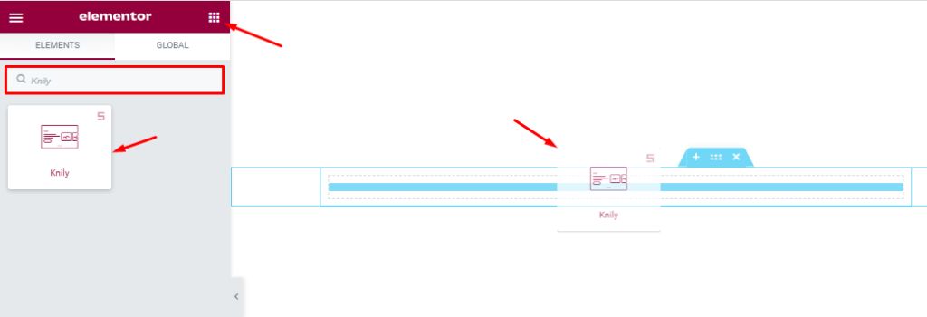
You can add this slider to WordPress by opening the page you want to use it on in Elementor and then dragging and dropping the Knily slider widget into that page. Please note that you need both Elementor and Prime Slider installed before you can use this widget.
Work With The Content Tab
Layout Section Customizations
Go to Content > Layout
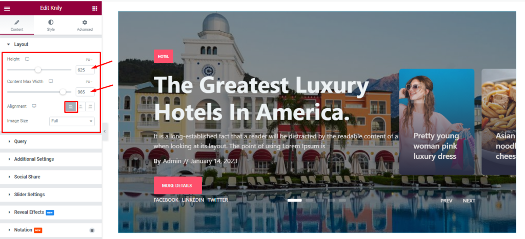
Here, you can adjust the item Height scrollbar to set the net height of all slides and also can set the Content Max Width for showing your post content in a fixed range on your slides. The Alignment option works on the text content so you can easily select the best text position on the Knily Slider widget.
Also, the controls let you set a custom image dimension for all slider images through the Image Size option.
Query Section Customizations
Go to Content > Query.
This section works for setting the source location of data that you need to display by references like Author, Categories, Tags, and Formats. The references can be different in accordance with the source location.
Step-1
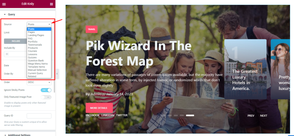
With the Source option, you can easily select the primary source of items that will be displayed on the slider. The source could be posts, pages, portfolios, etc.
Step-2
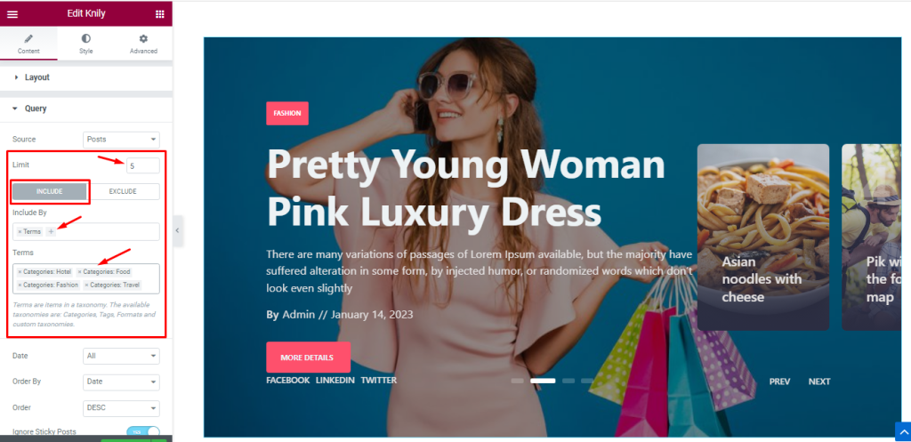
Then comes the post limit option that lets you set the number of posts in the query.
The Include / Exclude filters let you show or hide posts based on Terms (tags, categories, post names, etc.) & Authors.
While the Include field shows only the selected items and hides every other.
Step-3
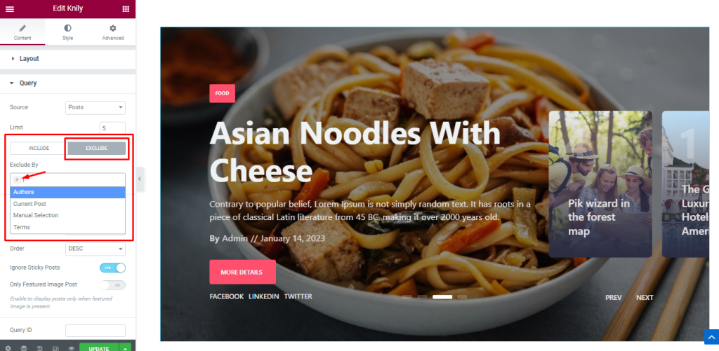
The Exclude option hides the selected ones and shows the rest.
Step-4
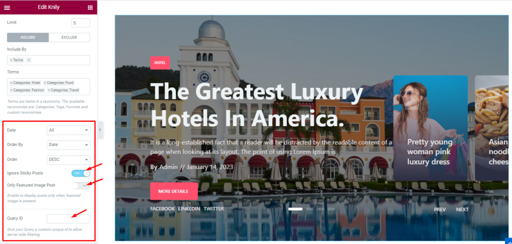
Date, Order By, and Order controls are here to arrange the data you want to display through Random, Title, Date, or Menu order wise and also with ascending or descending order.
The two switchers (Ignore Sticky Posts, Only Featured Image Posts) let you avoid sticky posts and posts without feature images from the display. Here, you can also set the Query ID that gives your Query a custom unique id to allow server-side filtering.
Work With Additional Section
Go to Content > Additional
Step-1
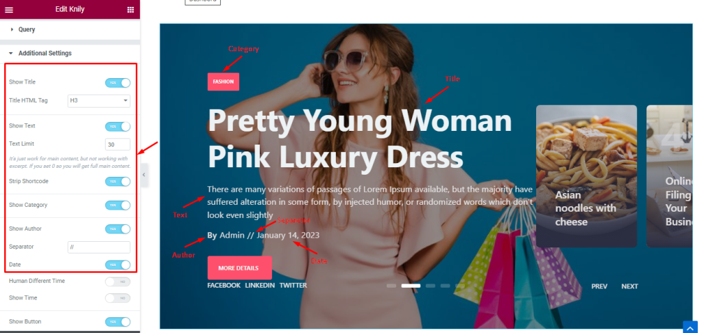
In the Additional section, you will find a bunch of switchers like Show Title, Show Text, Show Category, Show Author, Separator, and Date. Turning the switchers ON will make them appear on the Knily slider widget and hides them when turned off.
Step-2
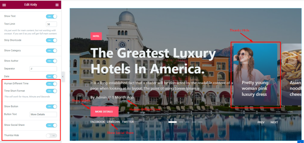
The Human Different Time, Time Short Format, Show Button, and Show Social Share switchers also act in the same manner to show/hide those features.
If you turn on the Thumbs Hide switcher, the Knily Slider widget Thumbs will hide from the display.
Customize The Social Share Section
Go to Content > Social Share
Step-1
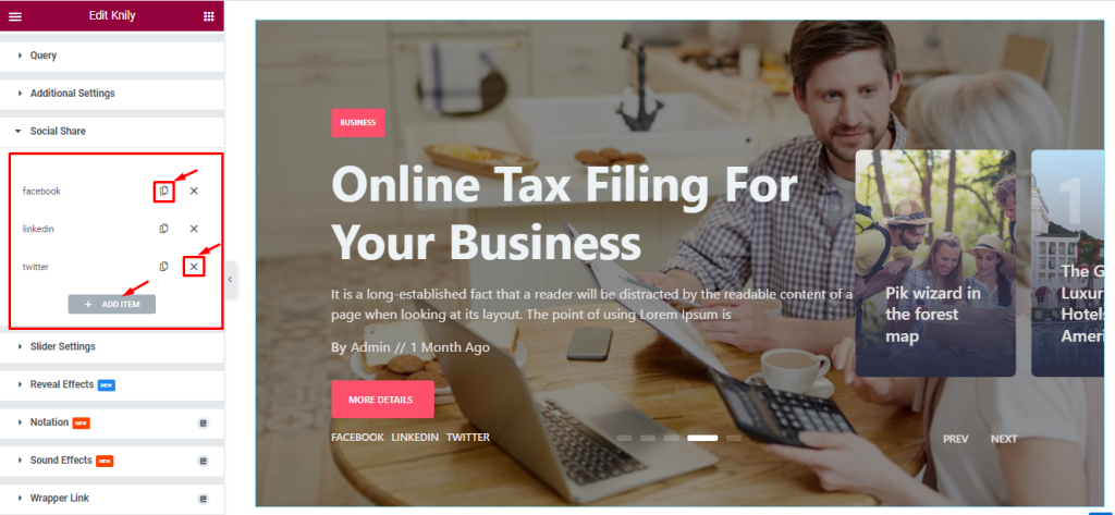
In this section, you can easily add a Social Share item by clicking Add Item button. Otherwise, you can easily increase your Item by clicking the Duplicate Sign symbol and if you want then you can easily remove/decrease the Item by clicking the Cross Sign.
Step-2
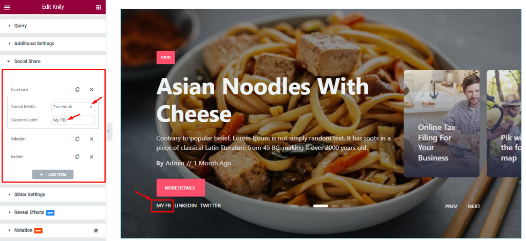
Each social media item lets you select a pre-defined social media platform from a wide range of options.
Customizations of Slider Settings
Go to Content > Slider Settings.
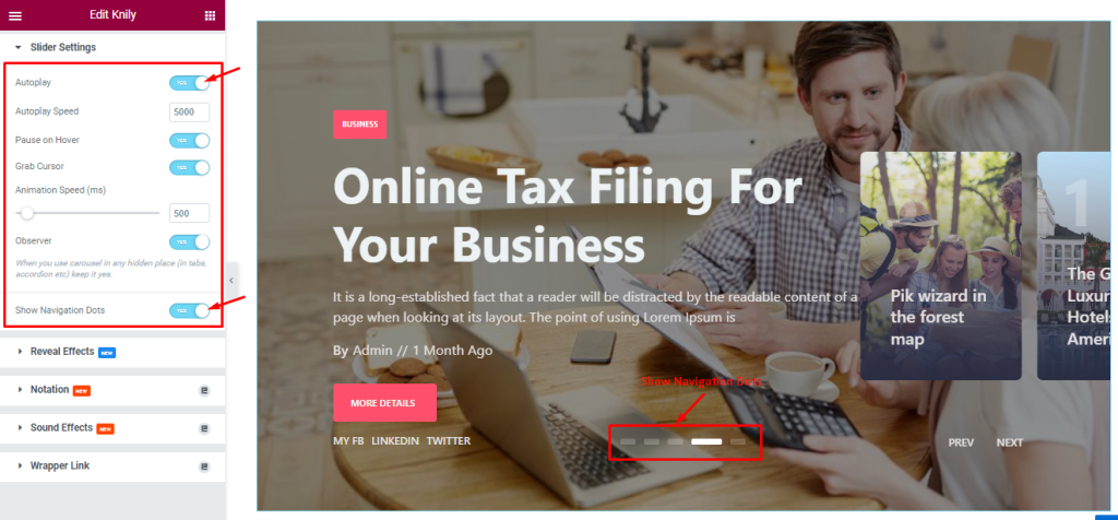
In this section, you will be able to see a bunch of Switchers like Auto Play, Auto Play speed, Pause On Hover, Grab Cursor, Animation Speed, Observer, and Show Navigation Dots.
What they do-
Autoplay: If you Enable the Autoplay switcher button, your slider will slide into Autoplay mode, and you can set the Autoplay Speed as your wish.
Pause On Hover: Enabling this switcher will make the slider pause when your visitors hover over the slider.
Grab Cursor: Your mouse pointer icon will be changed into a grab cursor. Visitors can slide your slider manually with your mouse cursor.
Observer: If you enable the option then you are able to use the slider/carousel in any hidden places (such as in tabs, Accordion, etc).
Show Navigation Dots: Enable it to show dots navigation at the bottom part of the slider.
Style tab for customizing widget interface Appearance
Sliders Section Customizations
Go to Style > Sliders.
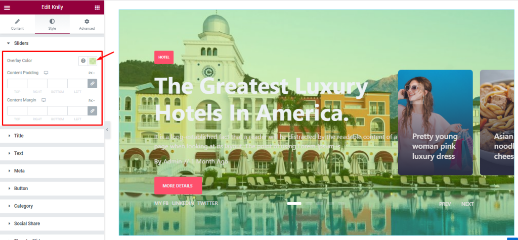
In this section, you can change the Overlay color for your sliders which shows over the features slider or over the background image. Here, you can set the Content Padding and Margin for showing your text content in a fixed range.
Style The Title Section
Go to Style > Title
Step-1
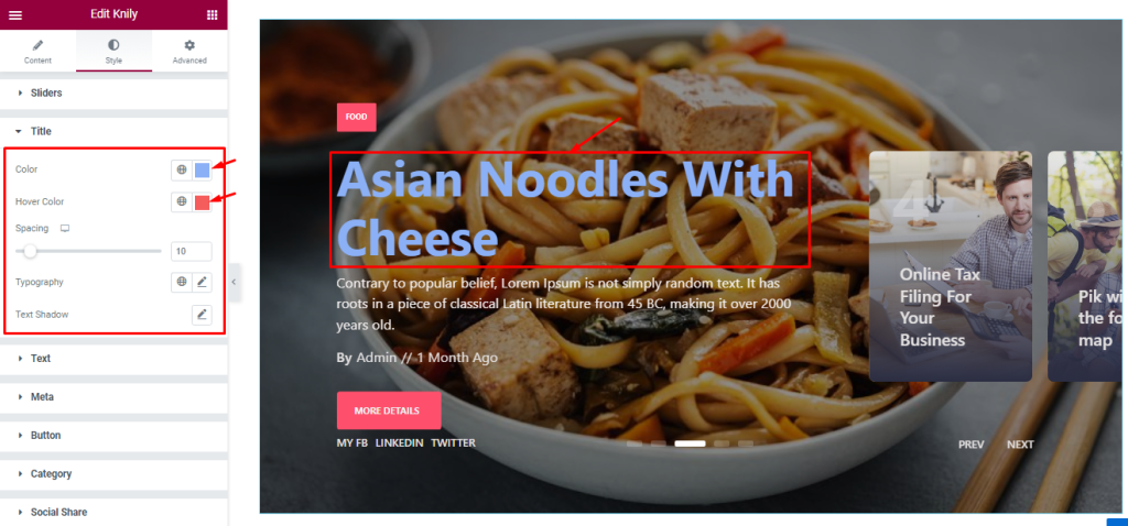
Here, you will see options to customize the title color, title Hover color, Typography, Spacing, and add Text Shadow. The spacing adjustments is responsible for the distance between the title and the rest of the content below it.
Step-2
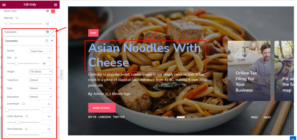
Here, you can customize the Typography (Font Family, Size, Weight, Transform, Style, decoration, Line Height, Letter Spacing, and Word Spacing.) to change the font style.
Step-3
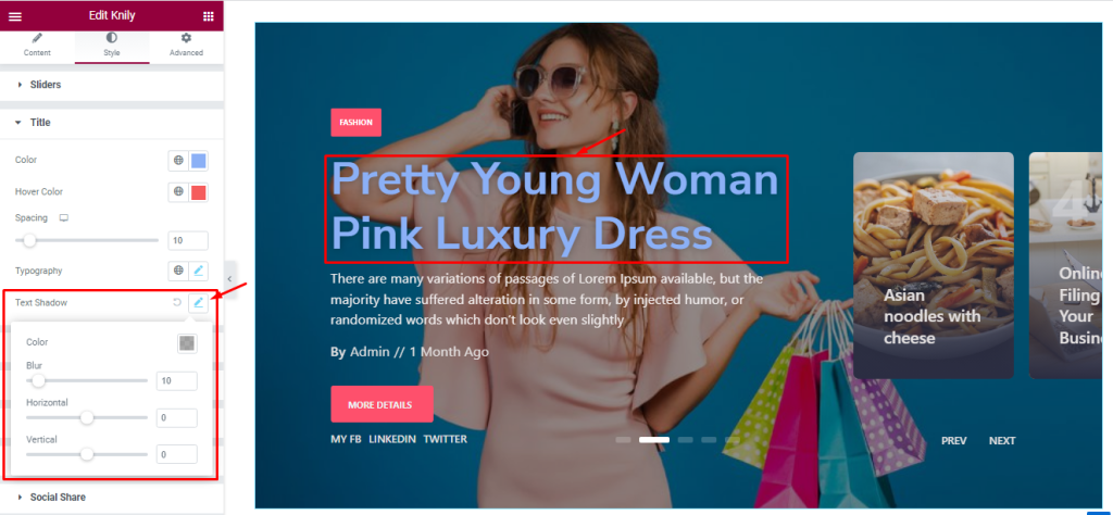
The Text Shadow (Color, Blur, Horizontal, Vertical) option lets you add a realistic shadow behind the title text to boost the visuals.
Customization The Text Section
Go to Style > Text
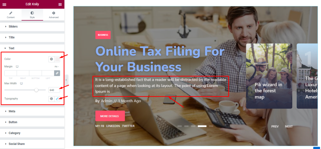
In this section, you can edit the text Color and adjust the Margin for your text content. You can also set the Max Width to control the spread of the text area in a fixed range and customize the Typography as before.
Style The Meta Section
Go to Style > Meta

Here, you will see the options to customize the Meta Color and Hover Color. you can adjust the Spacing between each meta and other content and customize Typography like before.
Button Section Customizations
Go to Style > Button
Step-1
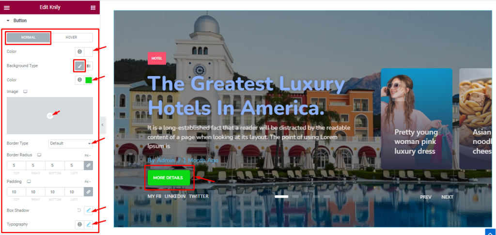
The Button section lets you customize the button appearance using two modes, Normal and Hover.
In Normal mode, you can easily change the Button Text Color, Background Type, Background Color, Border Type, Padding, Border Radius, Box Shadow, and Typography. Note that you can add images as the Button Background from the options.
Step-2
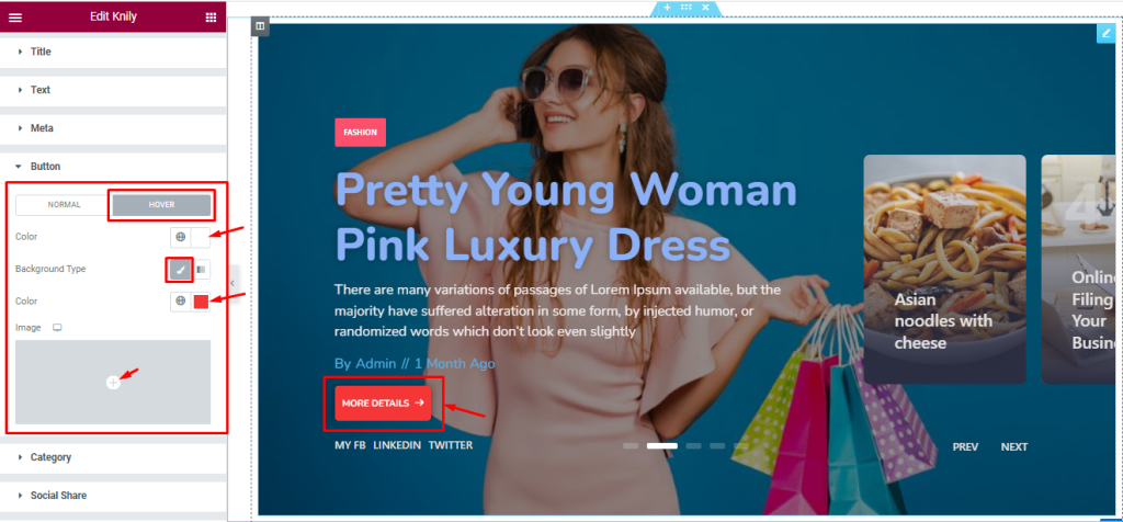
Here in Hover mode, you will get text Color and background type controls to modify the appearance of the Button.
Category Section Customizations
Step-1
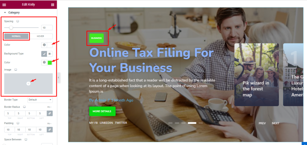
Go to Style > Category
Here, the first scrollbar option lets you adjust the Spacing between the category and the rest of the content. Below, you will see two subsections (Normal and Hover).
In Normal mode, you can set the Category text color, Background color/image.
Step-2
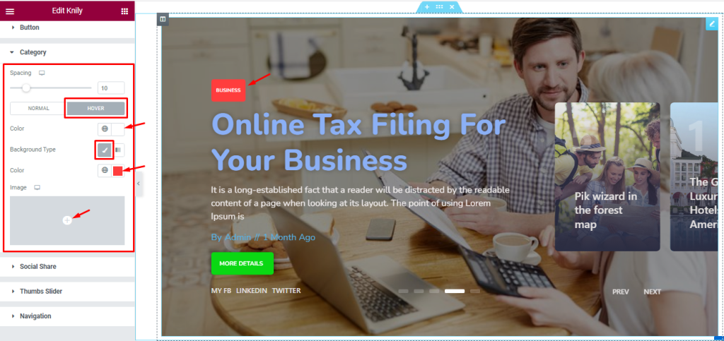
Here in Hover mode, you will get a similar set of controls to modify the appearance of the Category section like normal mode. please try it yourself.
Step-3
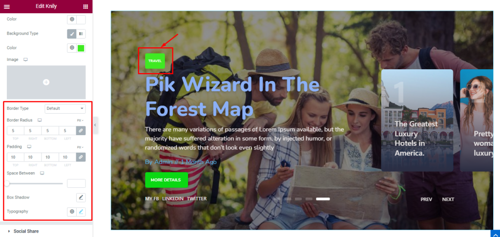
Back into the Normal subsection. Below, you can set the Border Type, Border Radius, Padding, Box Shadow, and Typography for the category text of the Knily slider widget.
Style The Social Share Section
Go to Style > Social Share
Step-1
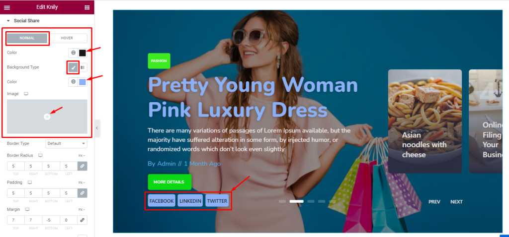
Same as the Category, the Social Share section also divides into normal and hover modes.
In Normal mode, you can change the Social Share Text Color, Background Type, and Background Color. Note that you can add images as the Social Share Background from the options.
Step-2
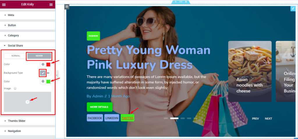
Here in Hover mode, you will get a similar set of controls to modify the appearance of the Social Share section like normal mode. please try it yourself.
Step-3
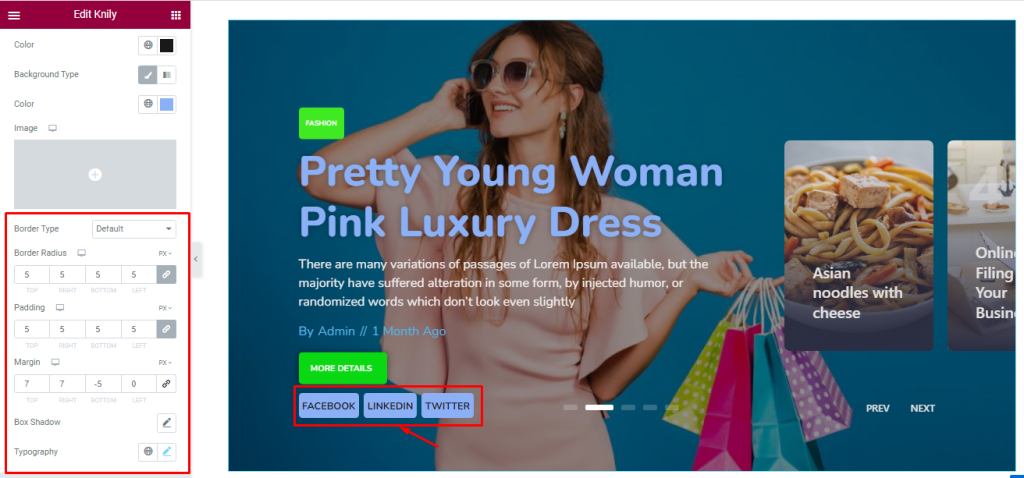
Lastly, scrolling down a bit will reveal the last set of options we already mentioned above. Use them to change the final look of the Social Share part of the slider.
Work With The Thumbs Slider Section
Go to Style > Thumbs Slider
Step-1
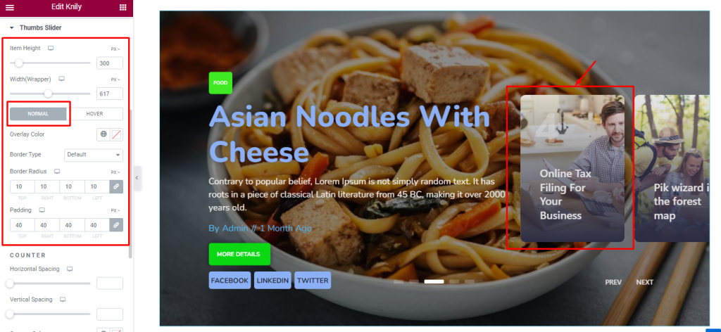
In this section, you can set the Thumbs Slider Item Height and Width as your wish to set up the best position on your slide.
From below, the options are divided into two subsections; Normal and Hover.
In Normal mode, you can change the Background Overlay Color and set the Border Type, Border Radius, and Padding.
Step-2
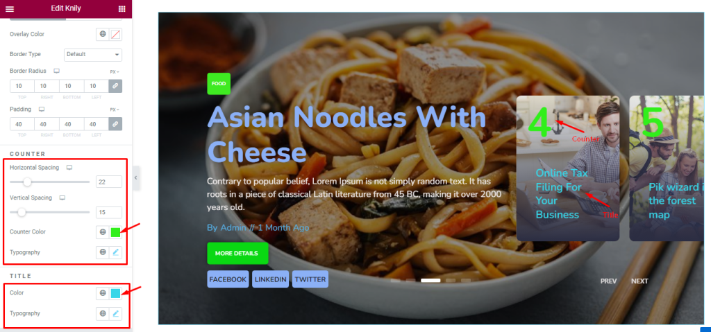
Below, you will find the options to adjust the Horizontal Spacing and Vertical Spacing for the Counter, along with Counter Color and Typography.
There are separate color and typography options for the title of the thumbs.
Step-3
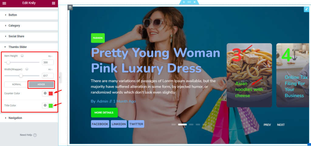
Here In Hover Mode, you can change the Counter Color, and Title Color to provide hover effects.
Customize The Navigation Section
Go to Style > Navigation
Step-1
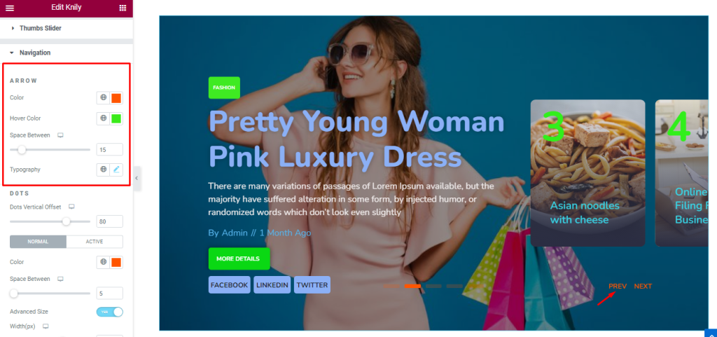
Here, the controls are divided for the Arrow and Dots navigation. For the arrow, you can change the icon Color, and Hover Color like before. you also adjust the Space between the Arrow text and customize the Typography from here.
Step-2
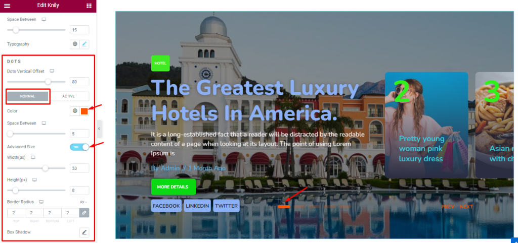
For the Dots, you can adjust the Vertical Offset using a scrollbar.
Then in Normal Mode, you can set the value of Color, Space Between, Height, Width, and Border Radius. you also add the Box shadow to add a layer of color under the slides which adds a 3D-like feature to the eyes.
Note that, you must turn on the advanced size switcher to get the extra customization options for the Dots.
Step-3
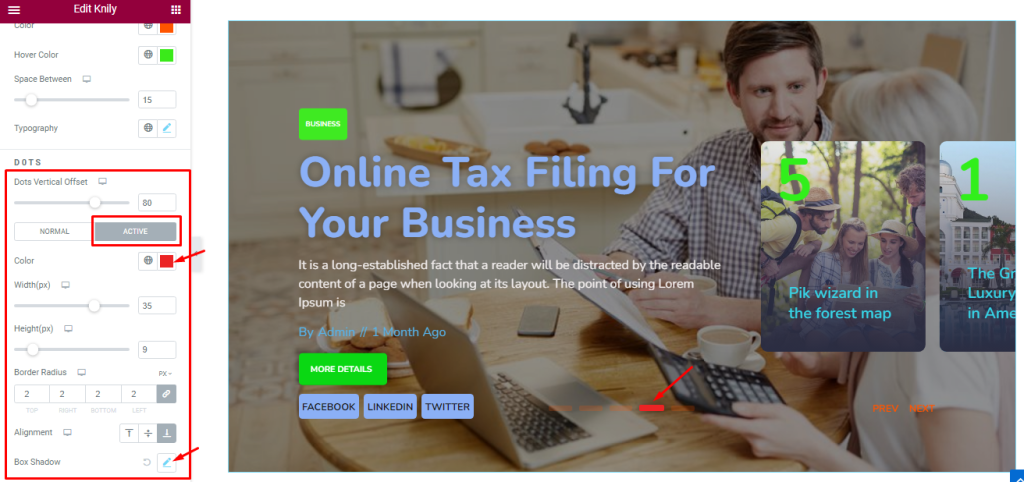
In Active Mode, you will get a similar set of controls to modify the appearance of the Navigation section like normal mode.
All done! You have successfully customized the Knily Slider widget on your website.
Video Assist
You can watch this quick video to learn more about the Knily Slider widget.
Thanks for staying with us.