Flexure Slider is a full-width slider widget with an eye-catchy background synchronization. It has a tab-like layout that changes the background images by simply hovering over the titles.
Let’s explore the customizations.
Inserting the Flexure Slider widget
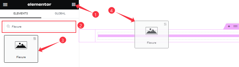
You can add this Flexure Slider addon to WordPress by opening the page you want to use it on in Elementor and then dragging and dropping the Flexure slider widget into that page. Please note that you need both Elementor and Prime Slider installed before you can use this widget.
Sliders Section Customizations
Go to Content > Sliders
Step-1
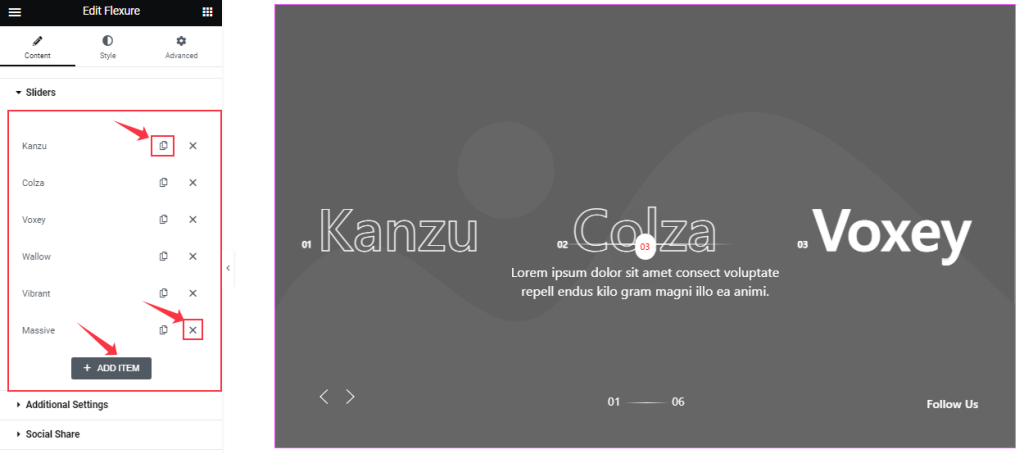
In the Sliders section, you can easily add a Flexure slider item by clicking Add Item button. Otherwise, you can easily increase your Item by clicking the Duplicate Sign, and you can also decrease your item by clicking the Cross sign.
Step-2
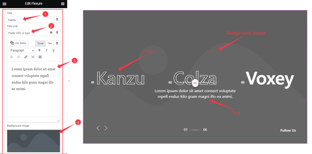
Clicking on a slider item lets you change the Title name, add a title Link, a description Text, and the Background Image of the slide.
Each time you are working with a Flexure Slider item, these options will remain the same. There is no limit to the number of slides/items you can add from the Sliders section.
Customizations of Additional Settings
Go to Content > Additional Settings
Step-1
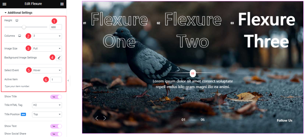
Come to the Additional Settings section. Here, you can set the Item Height to adjust the net height of all slides. Also, set the Slider Image Size and customize the Background Image settings as your working demand. You can change the Number of Columns for your slides and set the slider animation effect trigger upon Hover or Click from the Select Event option.
You can keep one slide as an Active Item and display it from the start.
Step-2
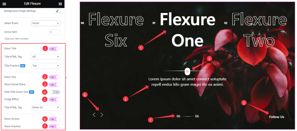
Below, you will find the Show Title, Show Text, Show Social Share, Hide Title Count Text, Image Effect, Show Arrows, and Show Fraction switchers which you can turn on/off to show/hide these elements from the slider.
Customizations Of The Social Share Section
Go to Content > Social Share
Step-1
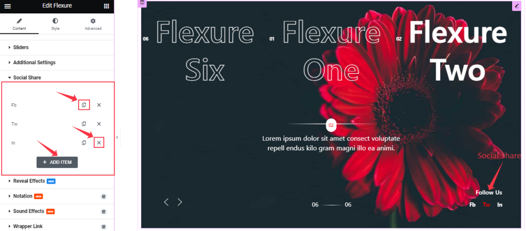
Similar to the Sliders section, the Social Share icons in the Flexure Slider also come in box shape options. You can duplicate current ones, reduce them by clicking the Cross icon, or add new ones with the Add Item button.
Step-2
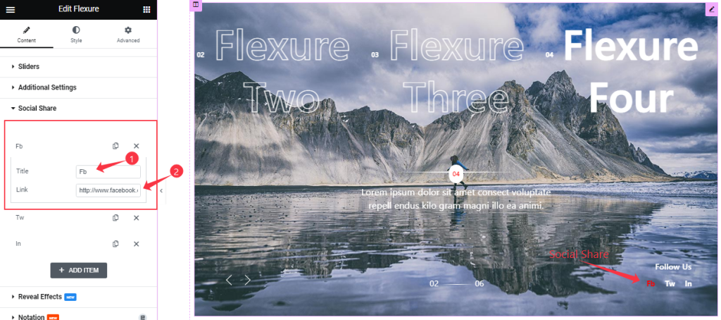
Each social share box/item gives you a Title and Link field to onboard social links as text-type buttons.
Work With The Style Tab
Style The Title Section
Go to Style > Title
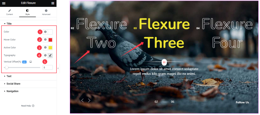
For the Title, you can change the Title Color, Hover Color, Active Color, and Typography, and adjust the Vertical Offset as your working demand.
Text Section Customizations
Go to Style > Text
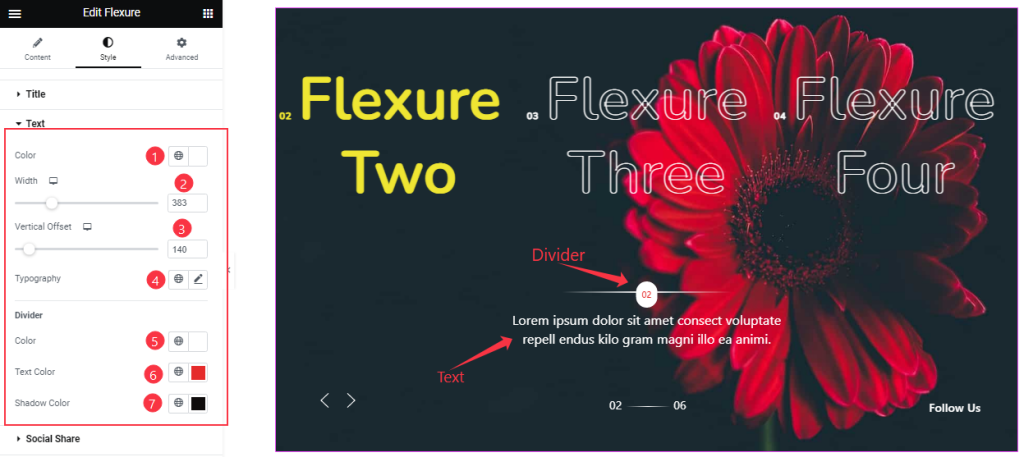
For the text part, you can customize the Text Color, Divider Color, Divider Text Color, and Shadow Color and adjust the Text Width, Vertical Offset, and set the Typography as your wish.
Customizations Of The Social Share Section
Go to Style > Social Share
Step-1
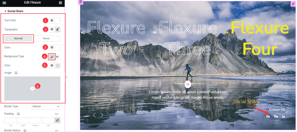
In the social share section, you can customize the Text Color and Typography for the “Follow Us” text above the social share icons.
Then, the options get divided into Normal and Hover modes. For normal mode, you can change the icon Text Color, icon Background Type, and Typography.
Step-2
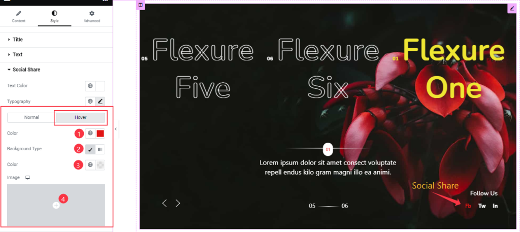
The Hover mode also has the same options as the previous part.
Step-3
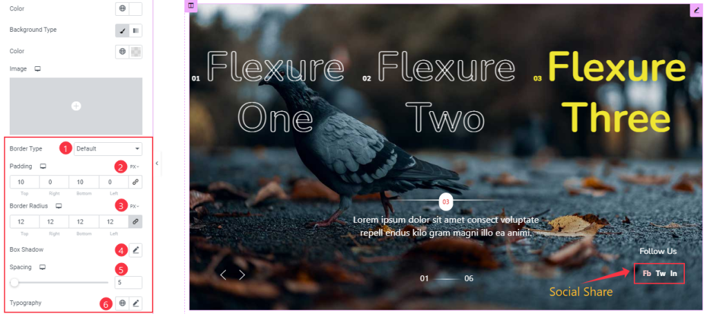
But below inside the normal subsection, you can customize the Border Type, Border Radius, Padding, and Spacing to your working demand. Also, you may add a Box shadow and customize Typography like before.
Work with the Navigation Section
Go to Style > Navigation
There are two navigation systems for the Flexure slider widget; Fraction & Arrows.
Step-1
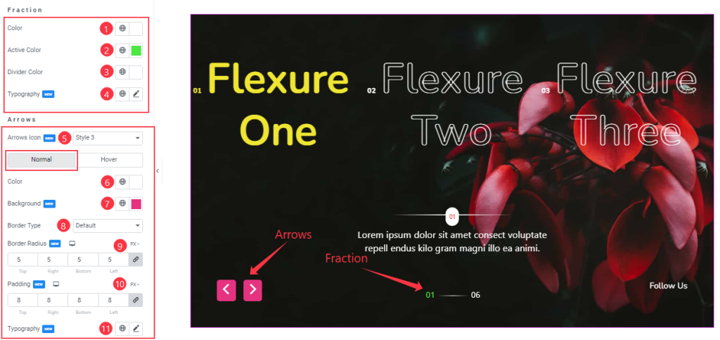
From the first segment, you can change the Fraction Color, Active Color, Divider Color, and Typography.
The second segment lets you customize the arrows, starting with the Arrows Icon option, where you can pick from 23 pre-designed arrowhead styles.
Then the options get divided into Normal and Hover modes. Here, you can change the Arrows Color, Background Color, Border Type, Border Radius, Padding, and Typography easily.
Step-2
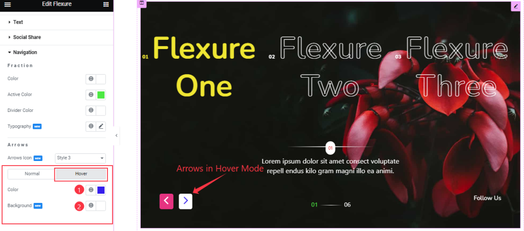
In Hover Mode, you can change the Arrows Color and Background Color to give it a hover effect.
All done! You have successfully customized the Flexure Slider widget on your website.
Video Assist
You can watch this quick video and visit the demo page to learn more about the Flexure Slider widget.
Thanks for staying with us.