This documentation provides comprehensive insights into the Pricing Table Block developed by Zoloblocks.
Adding a block to the editor
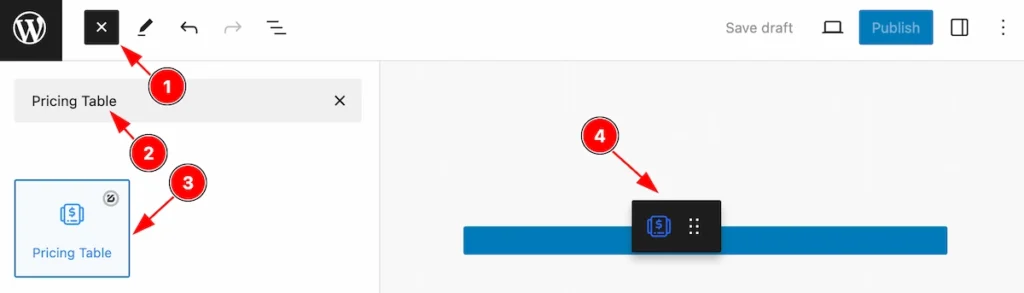
- Click the Toggle Block Inserter icon and a sidebar will appear on the left side, All the blocks will be visible here.
- Search by the Pricing Table block name.
- Then select the appear blocks ( with zoloblocks logo T.R corner).
- After Drag and Drop it on the page.
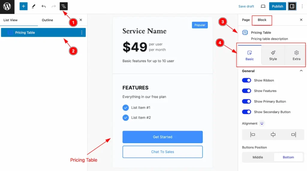
After Inserting the blocks, Follow this.
- Click on the Document Overviewer button and the Blocks list view will appear.
- Here appears the Pricing Table block.
- After on the right side, Click on the Block. Then the Pricing Table details appear.
- Here show all the control tabs( Basic, Style, Extra ) of a block.
General Section
Go to Basic > General
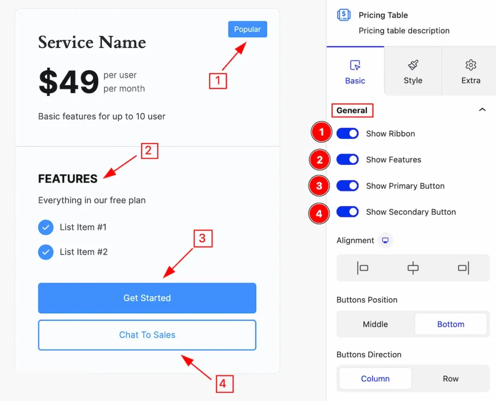
This section provides control for the pricing table,
- Show Ribbon: Enable the switcher to show the Ribbon for the pricing table.
- Show Features: Enable the switcher to show features.
- Show Primary Button: Enable the switcher to show the primary button.
- Show Secondary Button: Enable the switcher to show the secondary button.
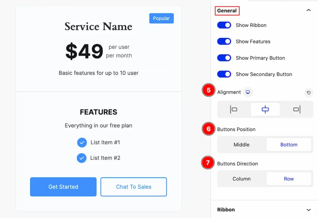
- Alignment: Set the alignment for the content( e.g.: left, center, middle ).
- Buttons Position: Set the button position ( e.g.: Middle, Bottom ).
- Buttons Direction: Set the button direction ( e.g.: Column, Row ).
Ribbon Section
Go to Basic > Ribbon
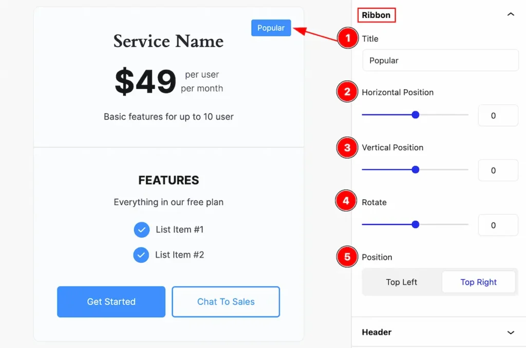
Make the ribbon section more customizable,
- Title: Set the title for the ribbon.
- Horizontal Position: Set the position in the horizontal of the ribbon.
- Vertical Position: Set the position in vertical for the ribbon.
- Rotate: Make a rotation of the ribbon.
- Position: Set the position for the Ribbon ( Top Left, Top Right )
Header Section
Go to Basic > Header
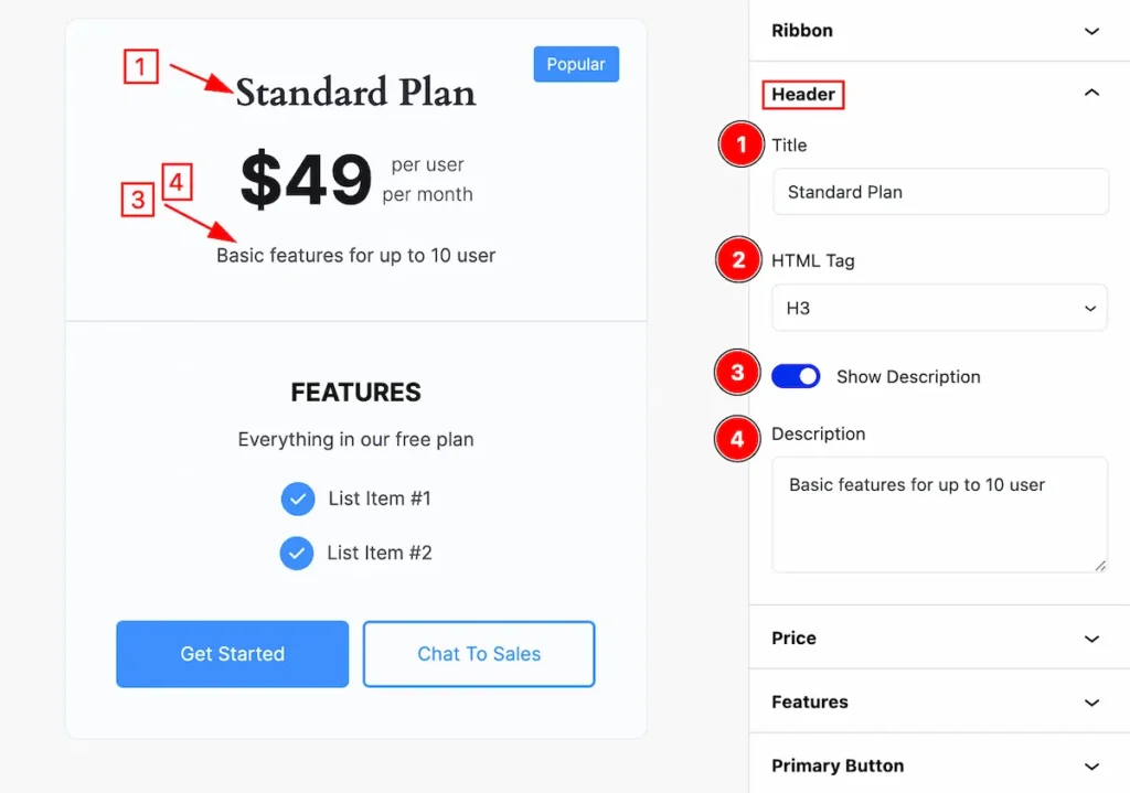
Customize the header section by following it,
- Title: Set the title for the header.
- HTML Tag: Set any HTML Tag for Title ( H1, H2, H3, H4, H5, H6, p, span ). The title tag is essential for both user experience and search engine optimization (SEO).
- Show Description: Enable the switcher to show the description.
- Description: Set the description for the header.
Price Section
Go to Basic > Price
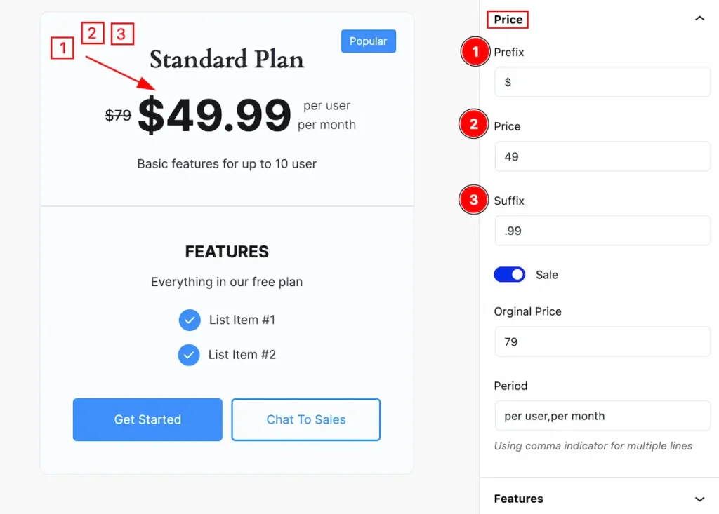
This section provides control to set the price,
- Prefix: Set the prefix for the price.
- Price: Set the price.
- Suffix: Set the suffix for the price.
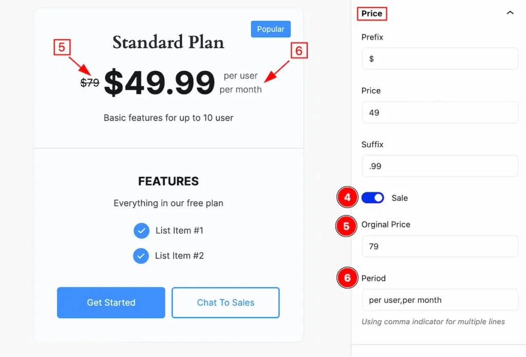
- Sale: Enable the switcher to show the sale price.
- Original Price: Set the original price.
- Period: Set the period for the price.
Features Section
Go to Basic > Features
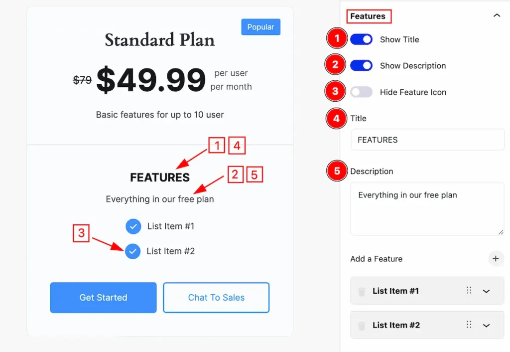
This section provides control to work with the features,
- Show Title: Enable the switcher to show the Title.
- Show Description: Enable the switcher to show the description.
- Hide Feature Icon: Disable it to show the feature icon.
- Title: Set the title for the feature.
- Description: Set the description.
Add New Feature Item
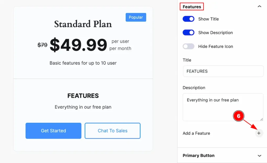
- Click on the ” Plus ” icon to show the add new feature items list.
Set Content For Feature Item
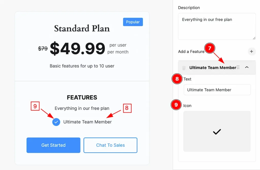
- Click on the newly added item and appear text box and icon selector.
- Text: Set the text for the featured item.
- Icon: Set the icon for the item.
Remove Feature Item
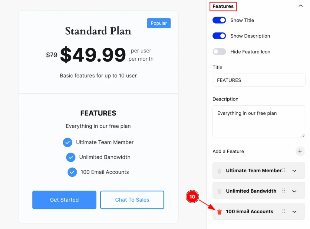
- Trash Icon: Click on the trash icon to remove any particular item.
Primary Button Section
Go to Basic > Primary Button
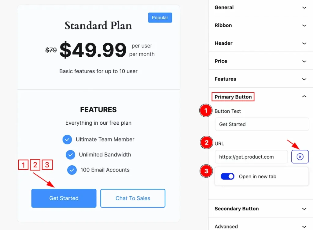
Set customization for the primary button,
- Button Text: Set the text for the primary button.
- URL: Set the URL to navigate the button.
- Open in new tab: Enable the switcher to open the link on a new tab.
Secondary Button
Go to Basic > Secondary Button
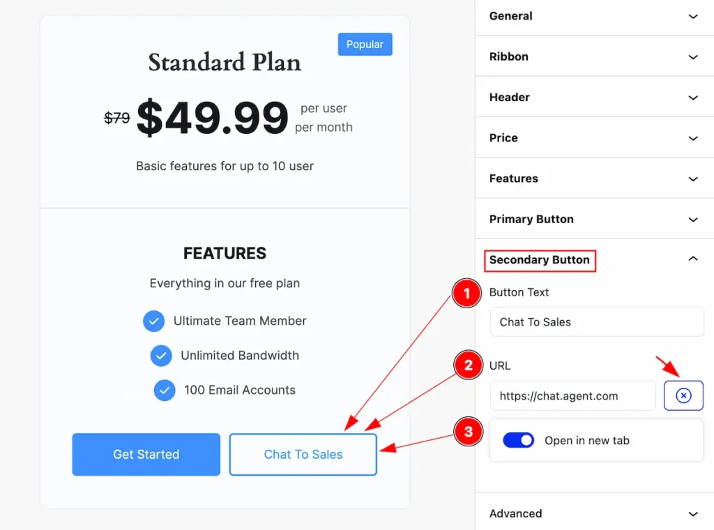
This section provides controls to customize the secondary button,
- Button Text: Set the text for the secondary button.
- URL: Set the URL to navigate the button.
- Open in new tab: Enable the switcher to open the link on a new tab.
Style Tab
Provide the controller to make the visual appearance or presentation of the tabs. This includes aspects visually appealing and cohesive with the overall design of the interface.
Item Container
Go to Style > Item Container
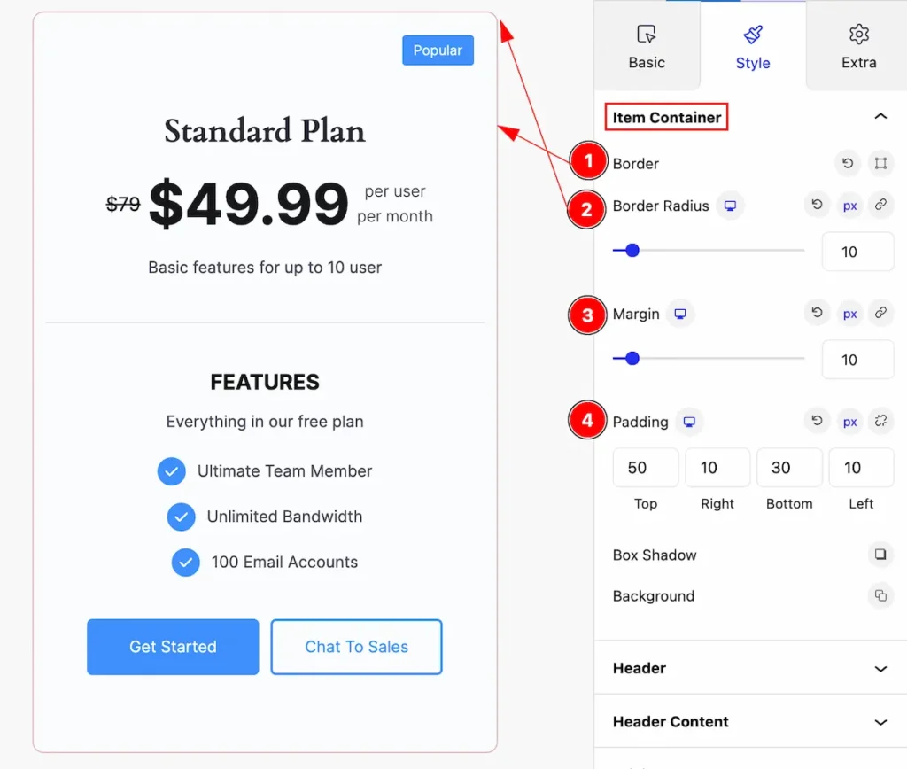
This section provides controls to change the appearance of the items container,
- Border: Set the border for the item container.
- Border Radius: Set the border corner edges rounded by setting the radius.
- Margin: Set margin for the content.
- Padding: Make inner space by setting the padding.
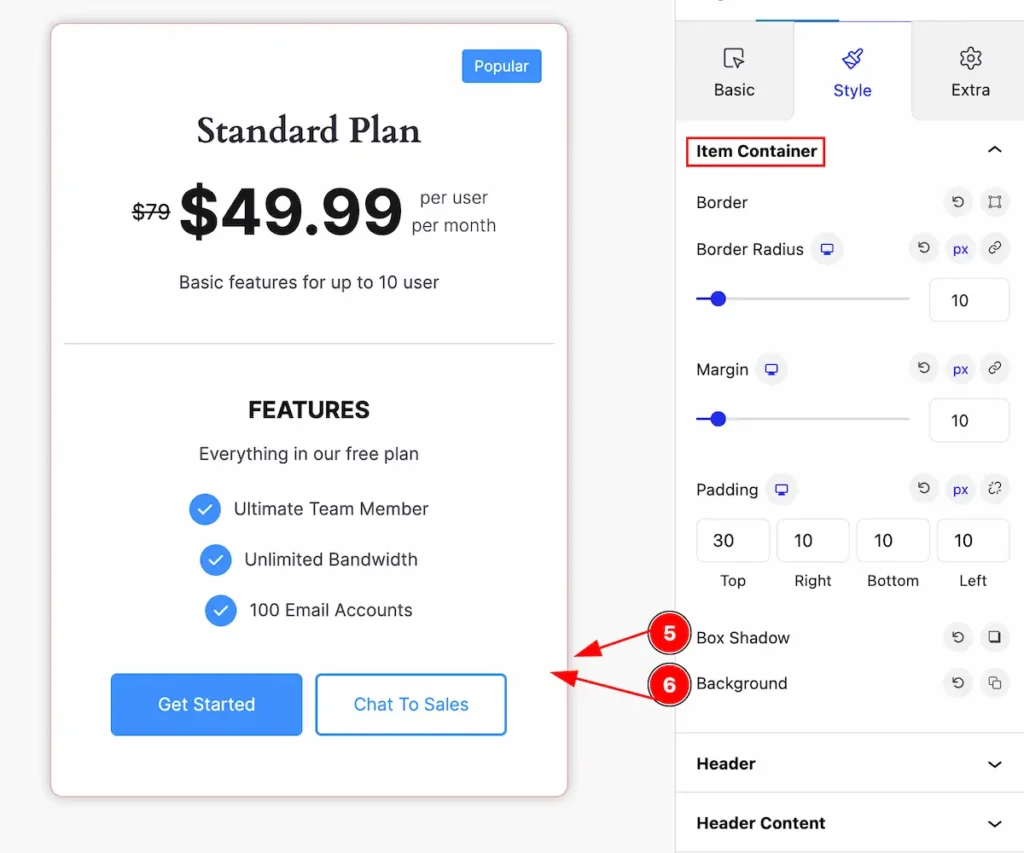
- Box Shadow: Set the box shadow of the item container.
- Background: Set the background for the item.
Header Section
Go to Style > Header
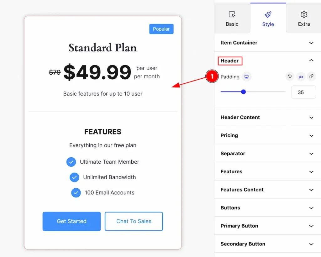
This section provides control for the header,
- Padding: Set inner space for the header.
Header Content Section
Go to Style > Header Content
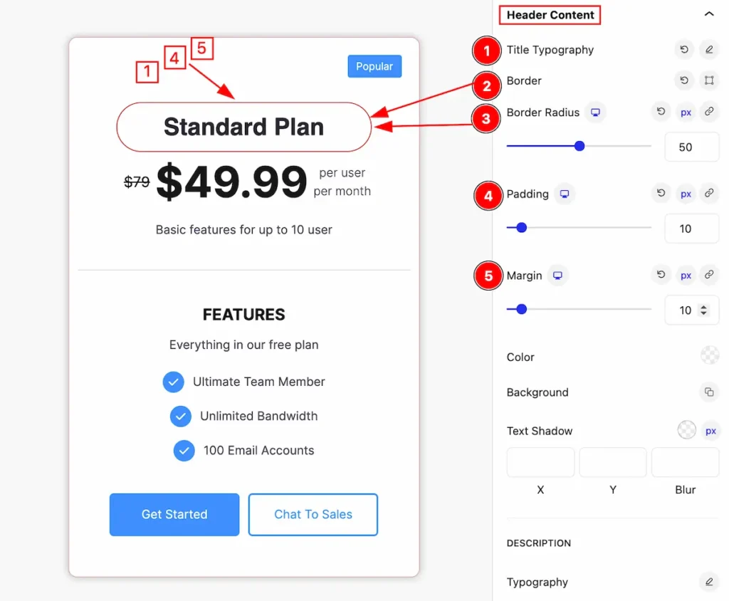
This section provides control for the header content,
- Title Typography: Set the typography for the Title.
- Border: Set the border for the Header content.
- Border Radius: Make the border corner edges rounded by setting the radius.
- Padding: Set inner space for the header content.
- Margin: Set the margin for the header content.
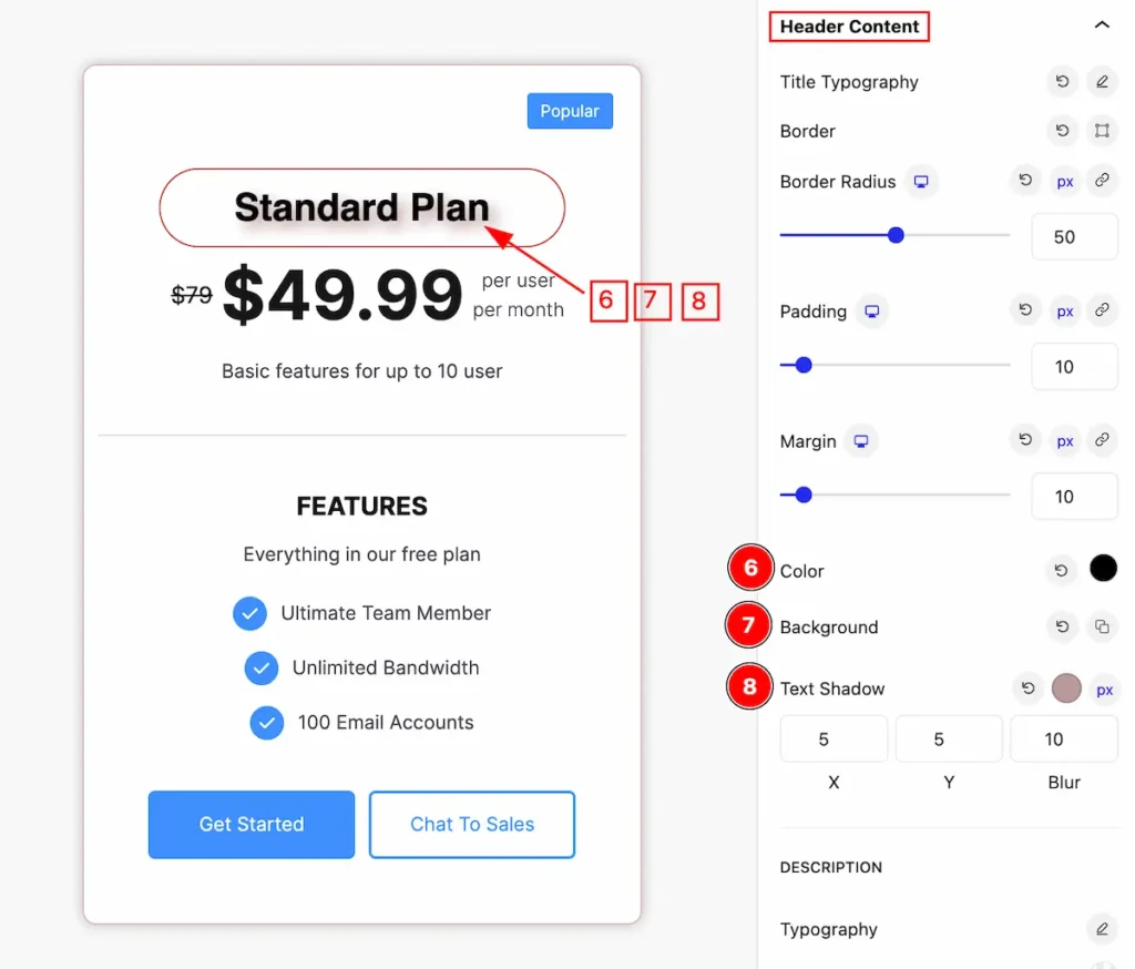
- Color: Set the color for the Header content.
- Background: Set the background color.
- Text Shadow: Make the Title text shadow.
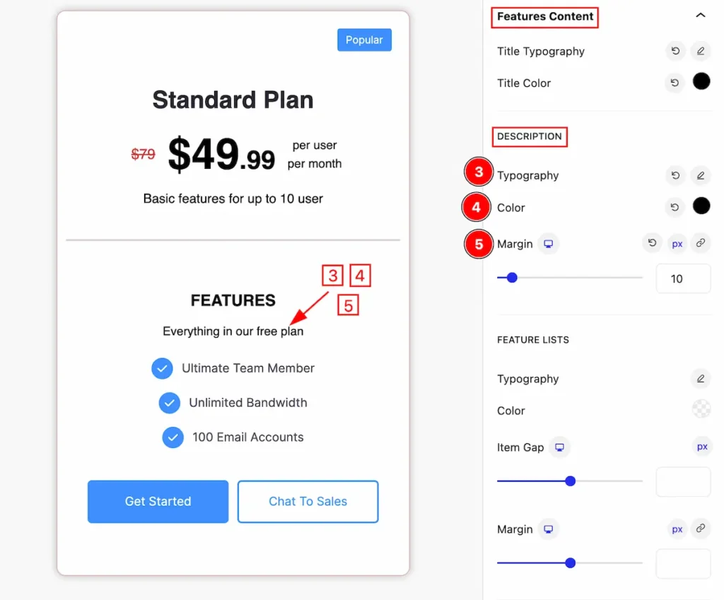
DESCRIPTION
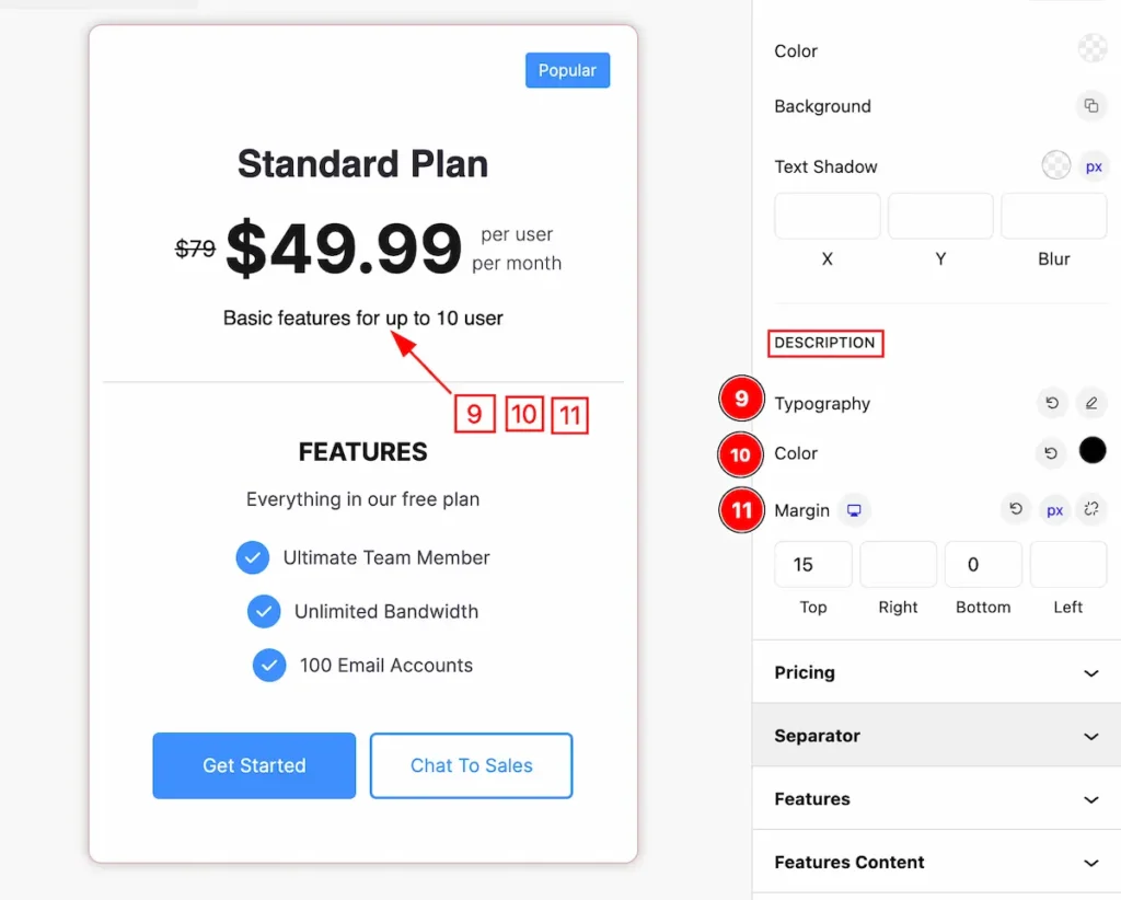
- Typography: Set the typography for the description.
- Color: Set color for the description.
- Margin: Set margin for it.
Pricing Section
Go to Style > Pricing
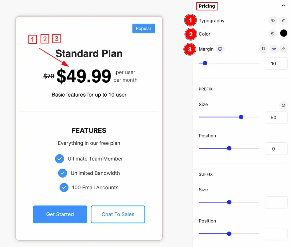
This section provides control for the pricing and makes appearance changes by following it.
- Typography: Set the typography for the pricing.
- Color: Set color for it.
- Margin: Set margin for the pricing.
PREFIX
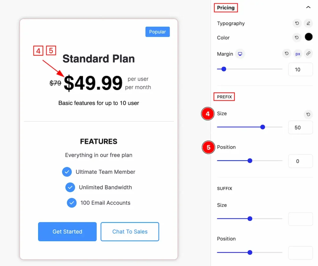
- Size: Set the size for the prefix of the pricing.
- Position: Set the position of the prefix.
SUFFIX
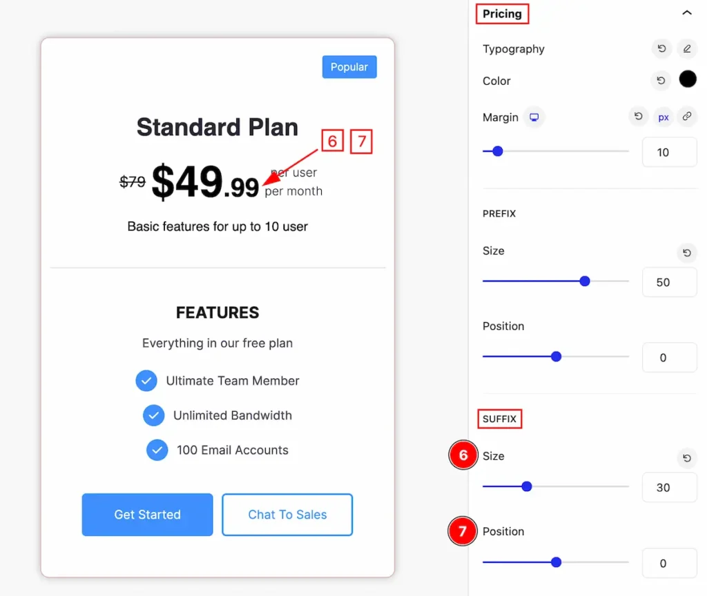
- Size: Set the size for the suffix of the pricing.
- Position: Set the position of it.
ORIGINAL PRICE
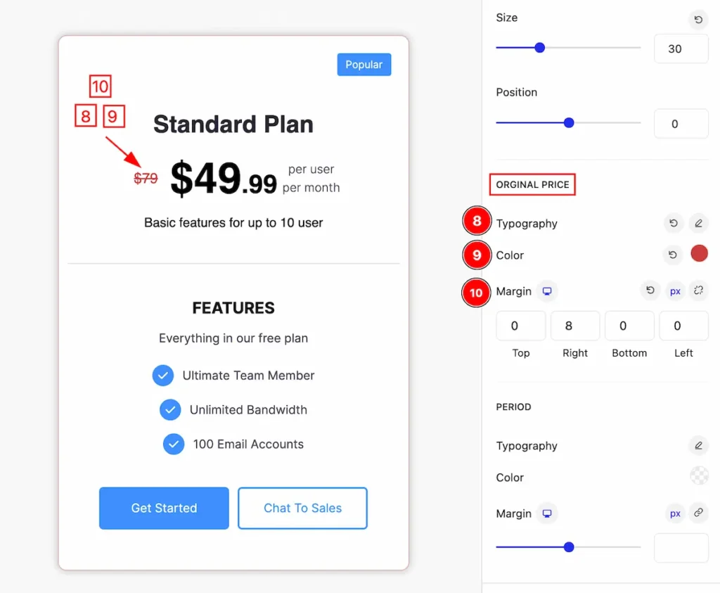
- Typography: Set the typography for the original price.
- Color: Set the color for it.
- Margin: Make outer space by setting the margin.
PERIOD
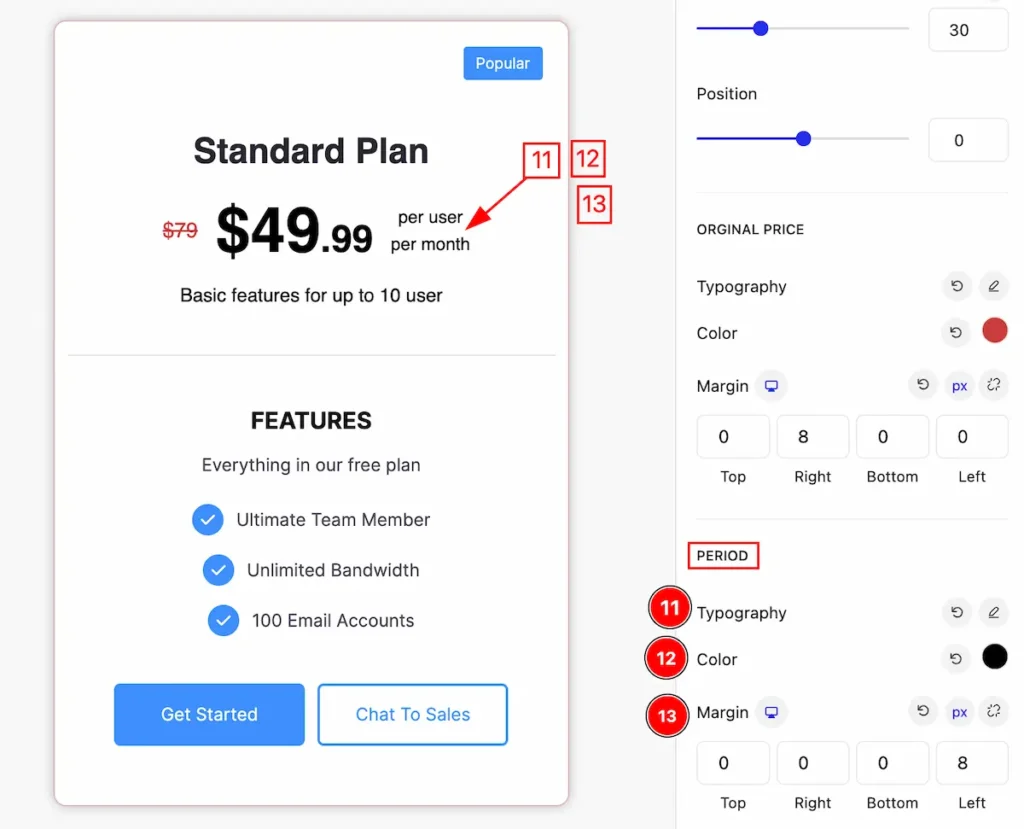
- Typography: Set the typography for the Period.
- Color: Set color for it.
- Margin: Set the margin for the period
Separator Section
Go to Style > Separator
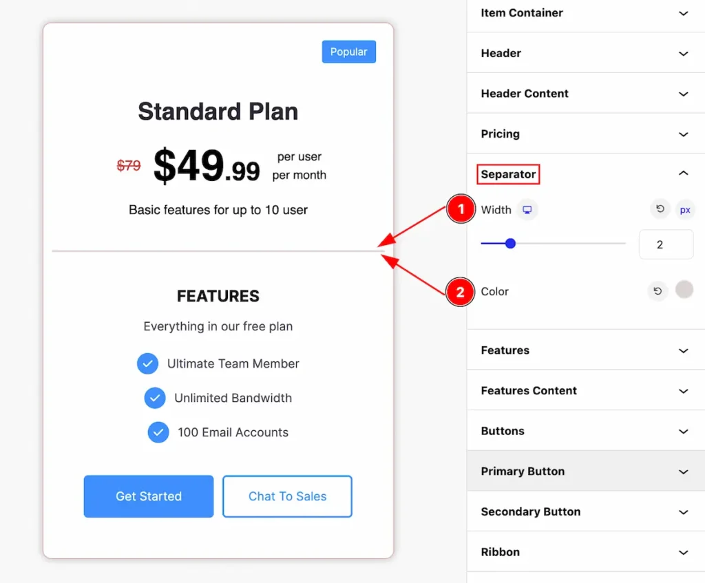
- Width: Set the width for the separator.
- Color: Set the Color for the Separator.
Features Section
Go to Style > Features
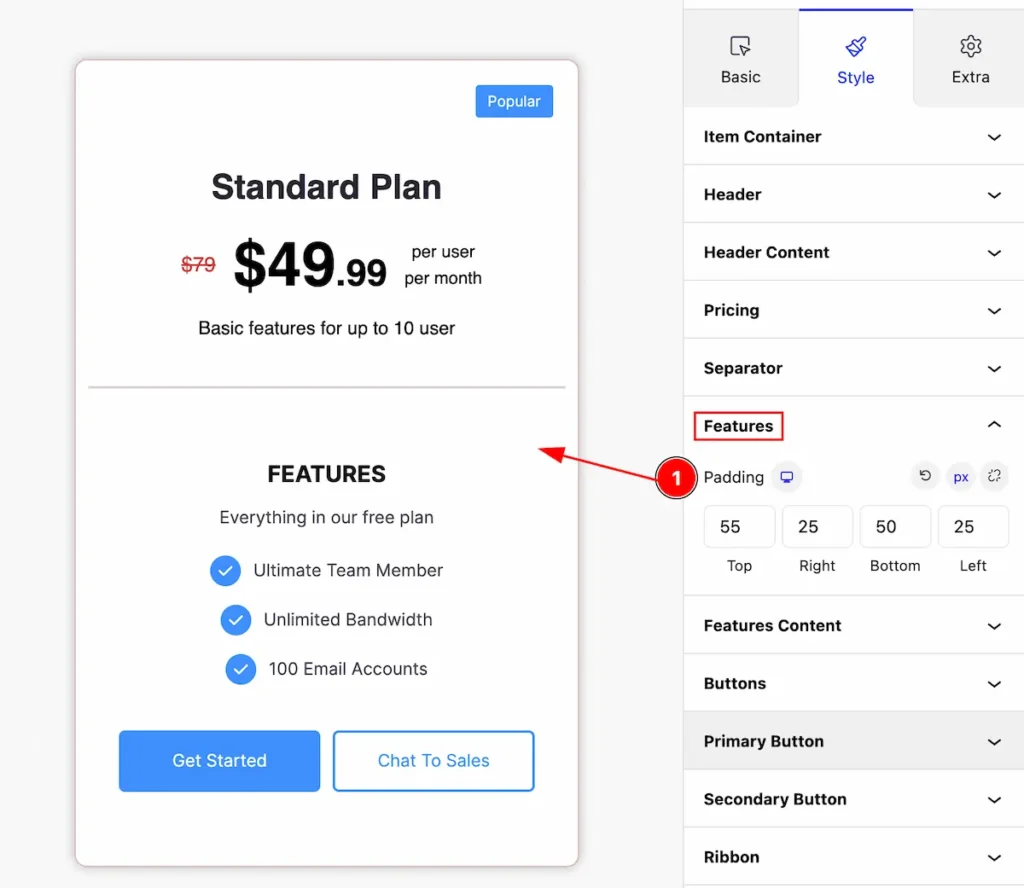
Make the features customization,
- Padding: Set the padding for the features.
Features Content Section
Go to Style > Features Content
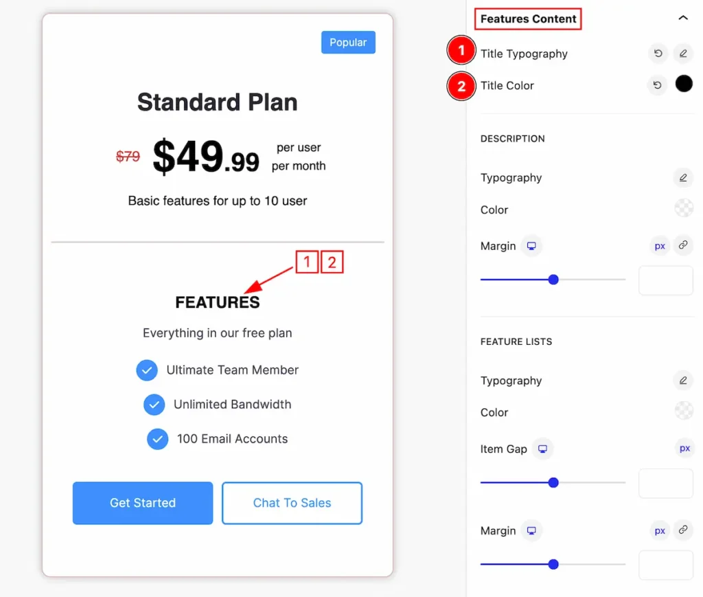
Make the features content stylish by following the controls,
- Title Typography: Set the typography for the title.
- Title Color: Set the color for the title of the feature content.
DESCRIPTION
- Typography: Set typography for the description of the feature content.
- Color: Set color for the description.
- Margin: Make outer space by setting the Margin.
FEATURE LISTS
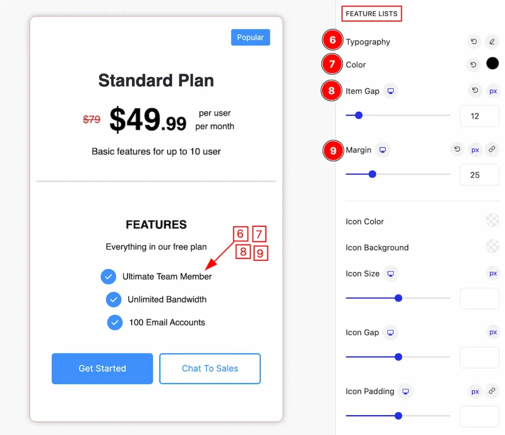
- Typography: Set the typography for the feature lists.
- Color: Set color for lists.
- Item Gap: Make a gap between the feature list items.
- Margin: Make outer space from the list of items.
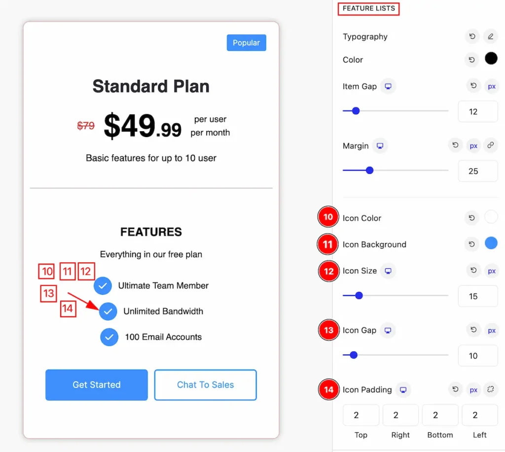
- Icon Color: Set the color for the icon.
- Icon Background: Set the background of the icon.
- Icon Size: Set the size of the icon.
- Icon Gap: Set the gap between the icon
- Icon Padding: Make the inner space by adding the padding.
Buttons Section
Go to Style > Buttons
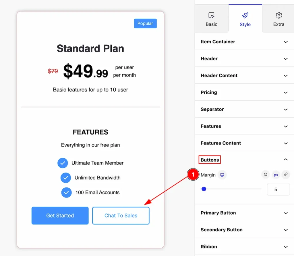
Make customization for the buttons,
- Margin: Set the margin for the buttons.
Primary Button Section
Go to Style > Primary Button
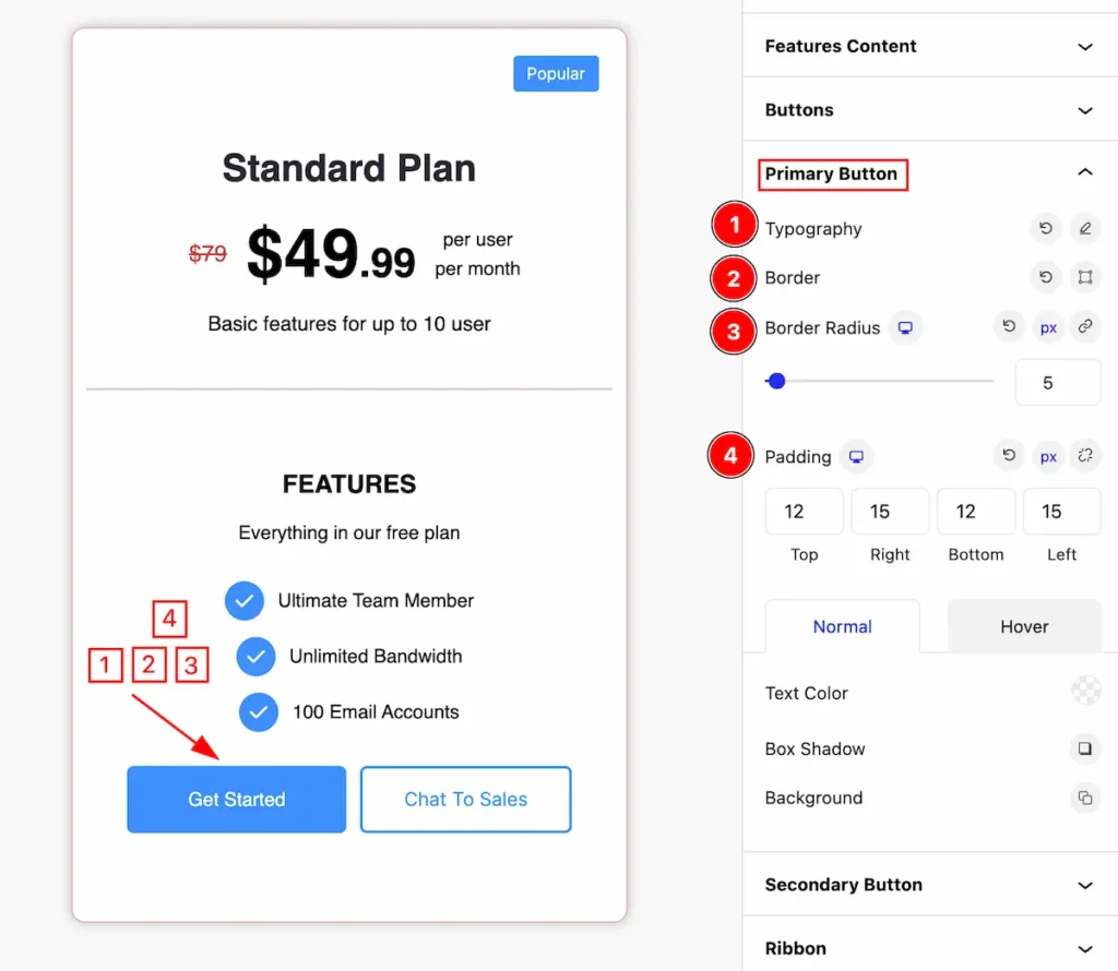
Make the primary button more customization for the appearances,
- Typography: Set the typography for the primary button.
- Border: Set the border for the button.
- Border Radius: Make the primary button corner radius.
- Padding: Set inner spacing by adding the padding.
Normal State of Primary Button
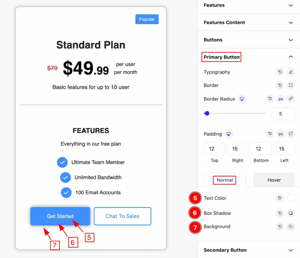
- Text Color: Set the color for the text.
- Box Shadow: Set the box shadow for the primary button.
- Background: Set the background for the button.
Hover State of Primary Button
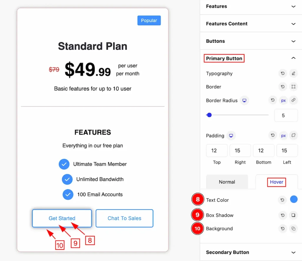
- Text Color: Set the text color for the button that works on mouse hover-over.
- Box Shadow: Set the box shadow for the button.
- Background: Set the background color for the primary button for the hover state.
Secondary Button Section
Go to Style > Secondary Button
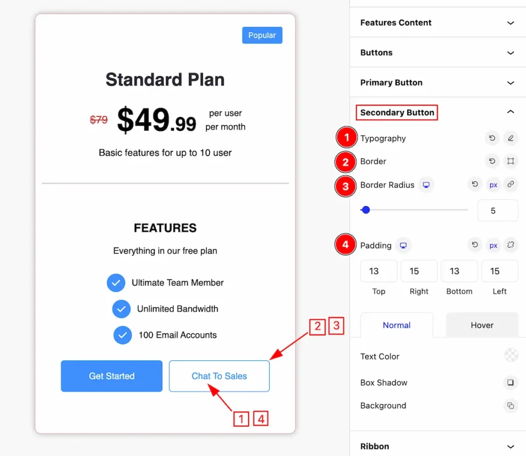
Make the primary button more customization for the appearances,
- Typography: Set the typography for the secondary button.
- Border: Set the border for the button.
- Border Radius: Make the secondary button corner radius.
- Padding: Set inner spacing by adding the padding.
Normal State of Secondary Button
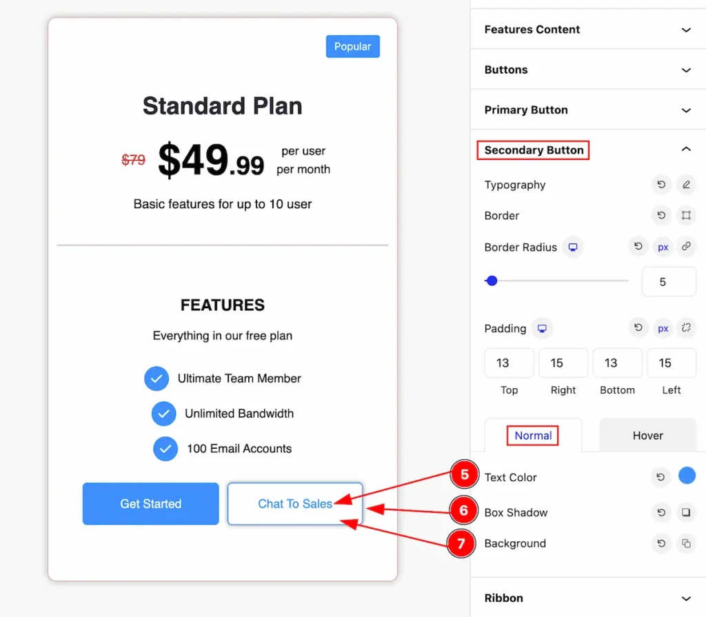
- Text Color: Set the color for the text.
- Box Shadow: Set the box shadow for the secondary button.
- Background: Set the background for the button.
Hover State of Secondary Button
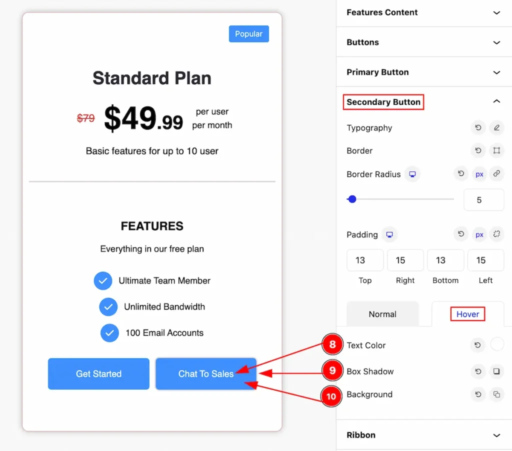
- Text Color: Set the text color for the button that works on mouse hover-over.
- Box Shadow: Set the box shadow for the button.
- Background: Set the background color for the secondary button for the hover state.
Ribbon Section
Go to Style > Ribbon
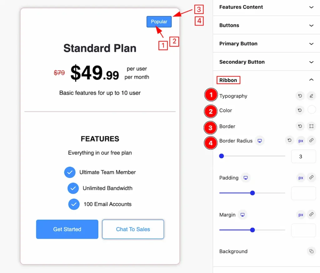
Make the ribbon more customizable by following it,
- Typography: Set the typography for the ribbon.
- Color: Set the color for the ribbon.
- Border: Set the border for it.
- Border Radius: Make the border corner edges rounded.
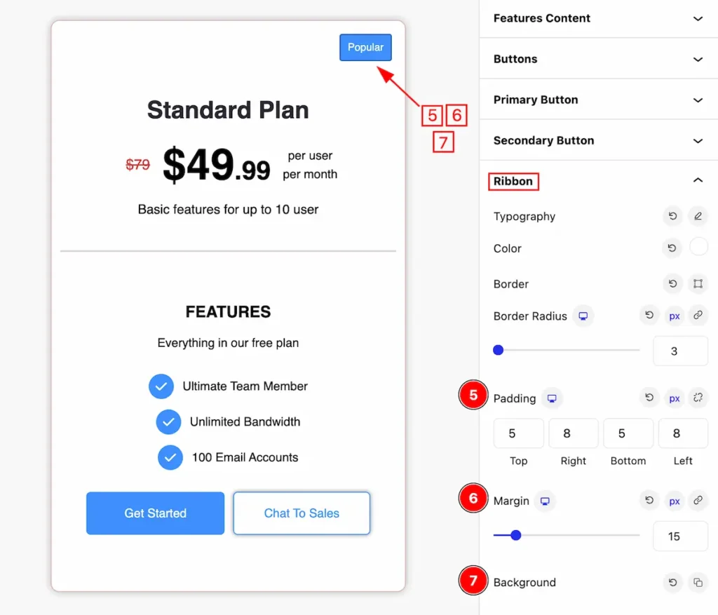
- Padding: Set the padding for the ribbon.
- Margin: Set the margin for the ribbon.
- Background: Set the background for the ribbon.
Extra Tab Control
The extra tabs provide the controls of any blocks. You can make different visual layouts by following these Controls.
Click to learn more>>.
Video Assist
Video Tutorial for learning more.
Check the Demo Page.
Thanks for being with us!