This documentation provides comprehensive insights into the Countdown Block developed by Zoloblocks.
Adding a block to the editor
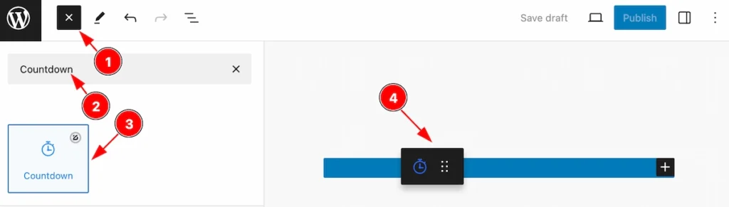
- Click the Toggle Block Inserter icon and a sidebar will appear on the left side, All the blocks will be visible here.
- Search by the Countdown block name.
- Then select the appear blocks ( with zoloblocks logo T.R corner).
- After Drag and Drop it on the page.
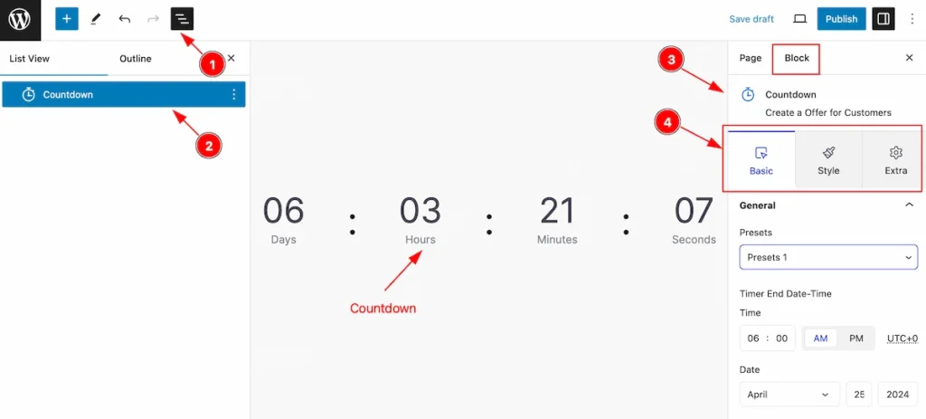
After Inserting the blocks, Follow this.
- Click on the Document Overviewer button and the Blocks list view will appear.
- Here appears the Countdown block.
- After on the right side, Click on the Block. Then the Countdown details appear.
- Here show all the control tabs( Basic, Style, Extra ) of a block.
Basic Tab
The Basic tab controller displayed here offers the flexibility to adjust the layout of blocks according to your preferences.
General Section
Go to Basic > General
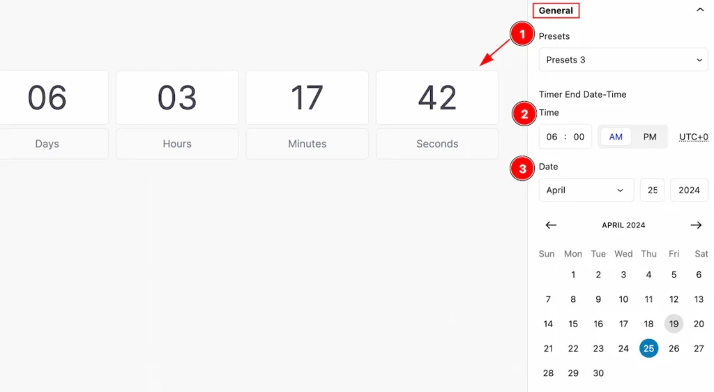
This section provides control for the general section,
- Presets: Click on the presets selector and the pre-made styles will appear. you can select any.
- Time: Set the time for the countdown.
- Date: Set the date for the countdown.
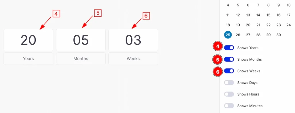
- Shows Years: Enable the switcher to show the years.
- Shows Months: Enable the switcher to show the months.
- Shows Weeks: Enable the switcher to show the weeks.
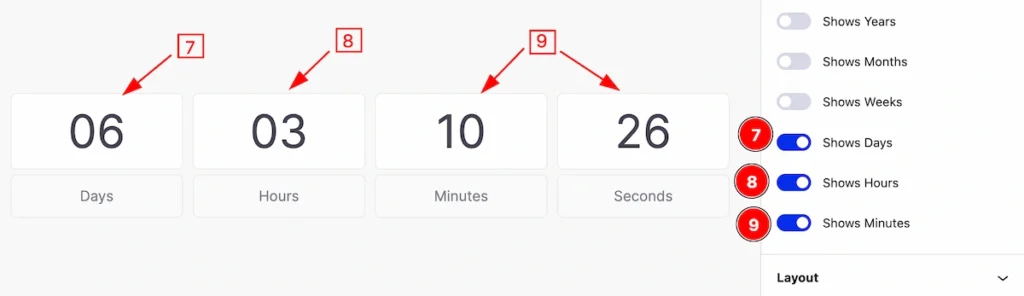
- Shows Days: Enable the switcher to show the days.
- Shows Hours: Enable the switcher to show the hours.
- Shows Minutes: Enable the switcher to show the minutes.
Layout Section
Go to Basic > Layout
This section provides the layout controls for the countdown.
Layout Type Flex
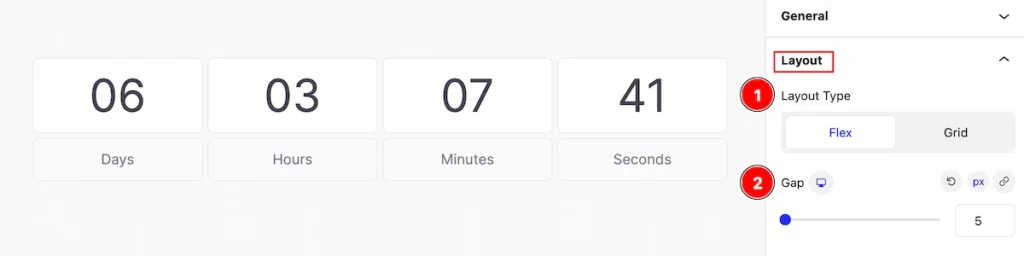
- Layout Type: Select the layout type Flex. Flex items will grow or shrink to fit the space available in its Flex container.
- Gap: Set the gap between the items.
Layout Type Grid
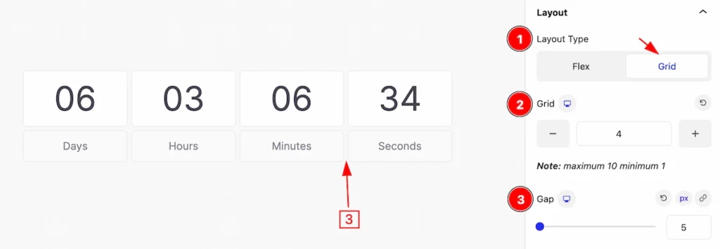
- Layout Type: Select the layout type Grid. A layout grid is a structured framework used in graphic design and web design to organize and arrange elements within a visual composition.
- Grid: Set the grid number for the layout.
- Gap: Set the gap between the items.
Labels Section
Go to Basic > Labels
This section provides controls for the labels,
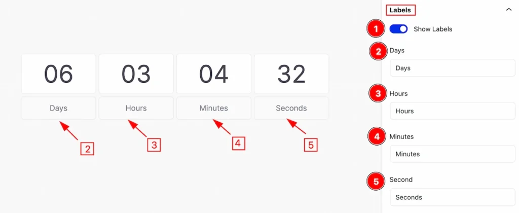
- Show Labels: Enable the switcher to customize the labels.
- Days: Set the day’s content.
- Hours: Set the Hours.
- Minutes: Set the minutes.
- Second: Set the second.
Style Tab
Provide the controller to make the visual appearance or presentation of the tabs. This includes aspects that are visually appealing and cohesive with the overall design of the interface.
Item
Go to Style > Item
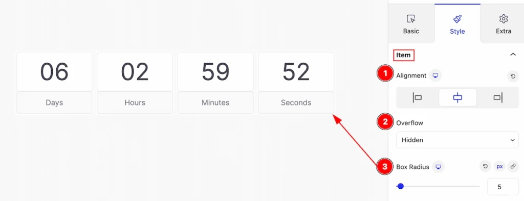
This section provides controls to change the appearance of the items.
- Alignment: Set the alignment for the item ( e.g.: left, center, right ).
- Overflow: Set the overflow for the item ( e.g.: Auto, Visible, Hidden, Clip. etc. ).
- Box Radius: Set the radius for the box.
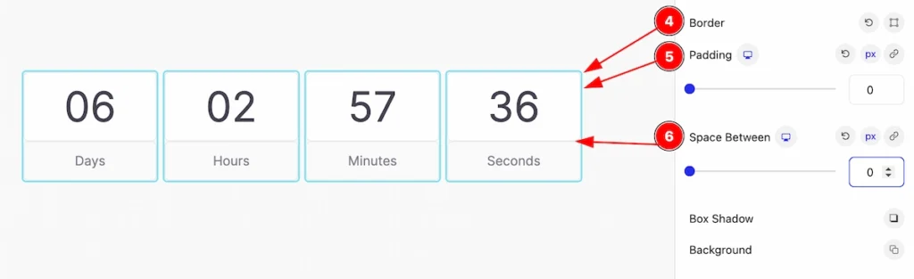
- Border: Set the border for the countdown item.
- Padding: Set padding for the items.
- Space Between: Set the space between the item.
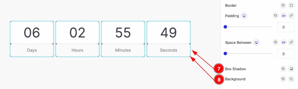
- Box Shadow: Set the shadow for the box item.
- Background: Set the background for the box.
Number Section
Go to Style > Number
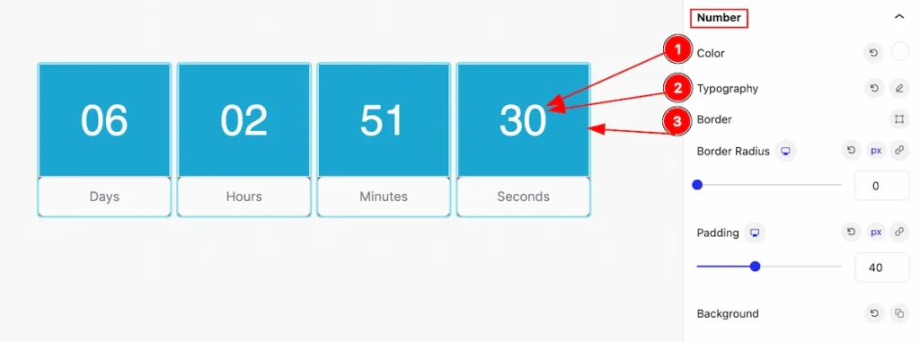
This section provides control for the number,
- Color: Set the color for the number.
- Typography: Set the typography for the number.
- Border: Set the border.
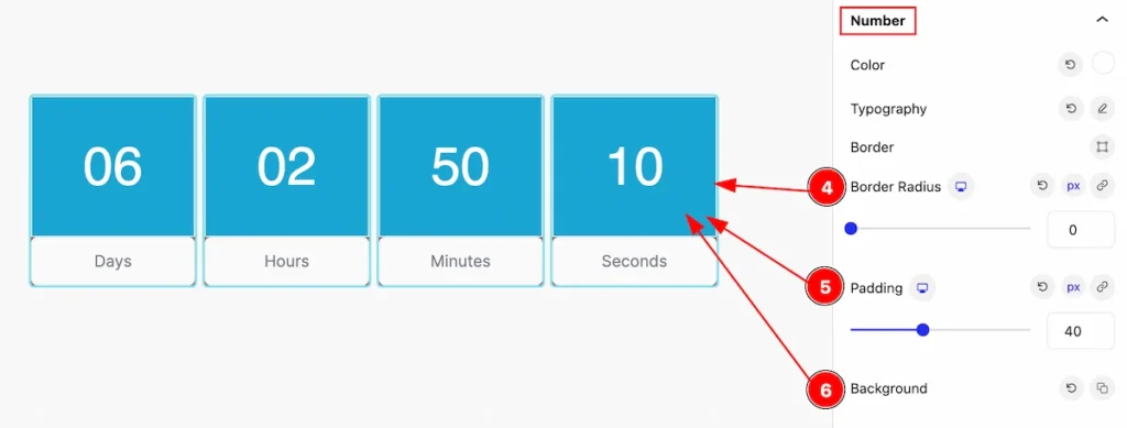
- Border Radius: Set the radius for the border.
- Padding: Set padding for the content.
- Background: Set the background for the countdown item.
Label Section
Go to Style > Label
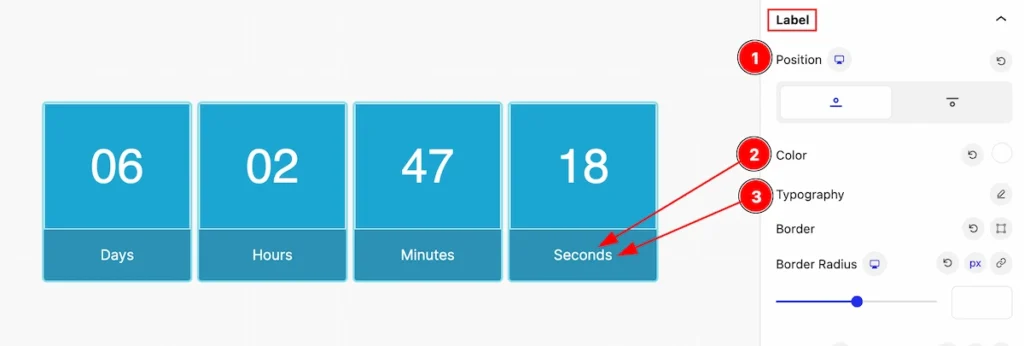
This section provides a control for the label,
- Position: Set the position for the label( e.g.: Top, Bottom ).
- Color: Set the color for the label.
- Typography: Set typography for the label.
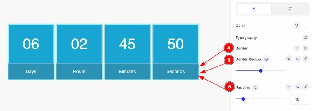
- Border: Set the border for the labels.
- Border Radius: Set the radius for the border.
- Padding: Set padding for the inner space.
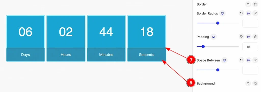
- Space Between: Set space between the label and number.
- Background: Set the background for the items.
Extra Tab Control
The extra tabs provide the controls of any blocks. You can make different visual layouts by following these Controls.
Click to learn more>>.
Video Assist
Video Tutorial Coming Soon! Check the demo page.
Thanks for being with us!